7 Best Next.js 16 Admin Dashboards With shadcn/ui 2026
Next.js 16 has redefined how developers build production-grade admin dashboards. Combined with React 19, Tailwind CSS v4, and the component quality of shadcn/ui, this stack delivers server-side rendering, static exports, and app router flexibility — all in one framework. The five templates below are purpose-built on this exact stack, each targeting a specific industry vertical while sharing a common architecture of TypeScript 5, Recharts 3, TanStack Table, and Framer Motion animations.
Whether you need a DevOps command center, healthcare management system, SaaS analytics hub, or a general-purpose admin panel, these DashboardPack templates ship with 50-125+ pages, dark/light themes, RTL support, i18n, and a live theme customizer out of the box.
Best Next.js 16 Admin Dashboards With shadcn/ui
1. Apex
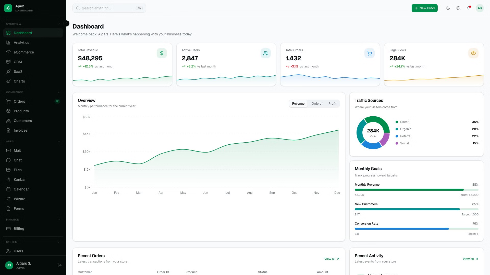
Apex is the most comprehensive admin dashboard in the DashboardPack lineup, shipping with 125+ static routes and five distinct dashboard variants covering Overview, Analytics, eCommerce, CRM, and SaaS use cases. Built on Next.js 16 with App Router and static export, Apex delivers production-ready performance with zero server runtime requirements.
The template includes 35 vendored shadcn/ui primitives built on Radix UI, 20+ application pages (Chat, Mail, File Manager, Kanban Board, Calendar), full CRUD operations with TanStack Table v8, 10 chart types via Recharts 3, and 8 authentication pages including 2FA flows. A live theme customizer with 6 color presets, Command Palette (Cmd+K), CSV export, and i18n support for 3 languages round out what is arguably the most complete Next.js admin template available today.
2. Signal
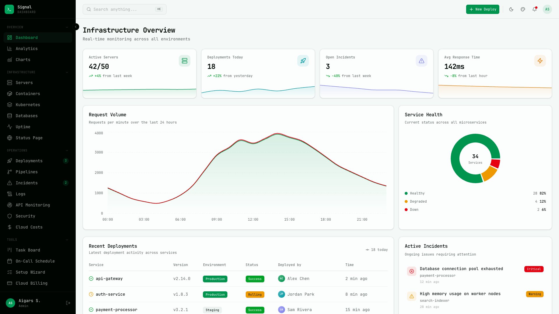
Signal takes a bold, terminal-inspired design approach that feels right at home in a DevOps environment. With JetBrains Mono typography and a dark-first color palette, this 57+ page dashboard is purpose-built for engineering teams managing infrastructure at scale. The template includes 13 domain-specific pages: Server Fleet, Containers, Deployments, Incidents, Log Explorer, Uptime Monitor, CI/CD Pipelines, Databases, Security Audit, API Monitoring, Kubernetes, Cloud Costs, and a public Status Page.
Beyond the DevOps pages, Signal also ships with an analytics dashboard, calendar, kanban board, team management, notification center, and comprehensive settings panels. Six color presets (Matrix, Cyan, Violet, Amber, Red, Frost) and three density modes let you fine-tune the visual feel. If your team lives in terminals and dashboards, Signal speaks your language.
3. Flux
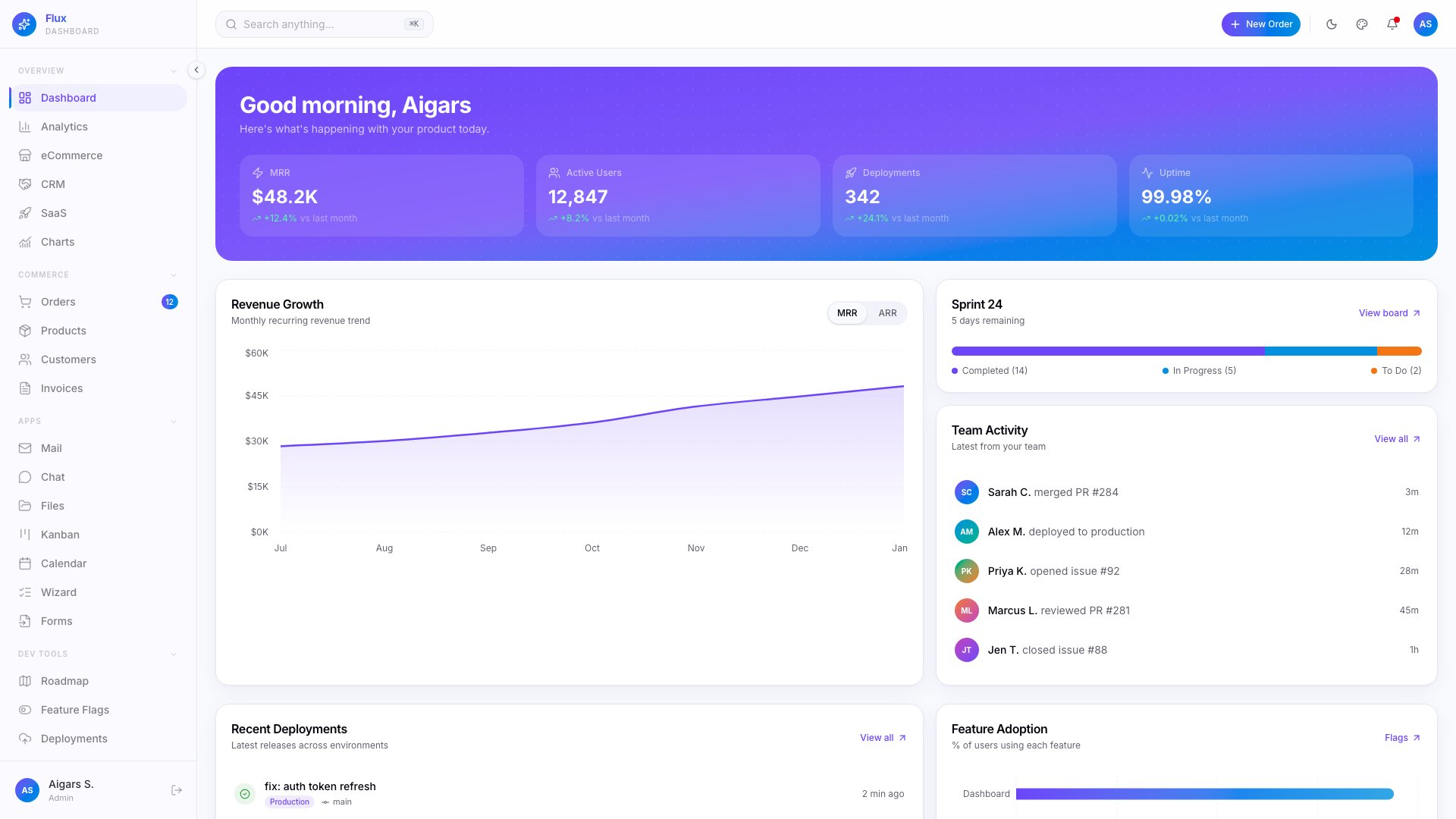
Flux brings a gradient-forward, animated design language tailored for dev tools, SaaS products, and startup teams. With 64+ pages across five dashboard variations (Overview, Analytics, eCommerce, CRM, SaaS), the template covers every essential admin workflow while maintaining a visually distinctive identity that stands apart from the typical flat dashboard aesthetic.
What sets Flux apart is its combination of 7 specialty pages (Product Roadmap, Feature Flags, Deployment Log) with a live theme customizer offering 6 color presets and 300+ color scheme combinations. Dark, light, and system themes are fully supported alongside RTL layouts, Command Palette (Cmd+K), and i18n for English, German, and French. The 35 shadcn/ui primitives and Framer Motion animations give every interaction a polished, premium feel.
4. Ember
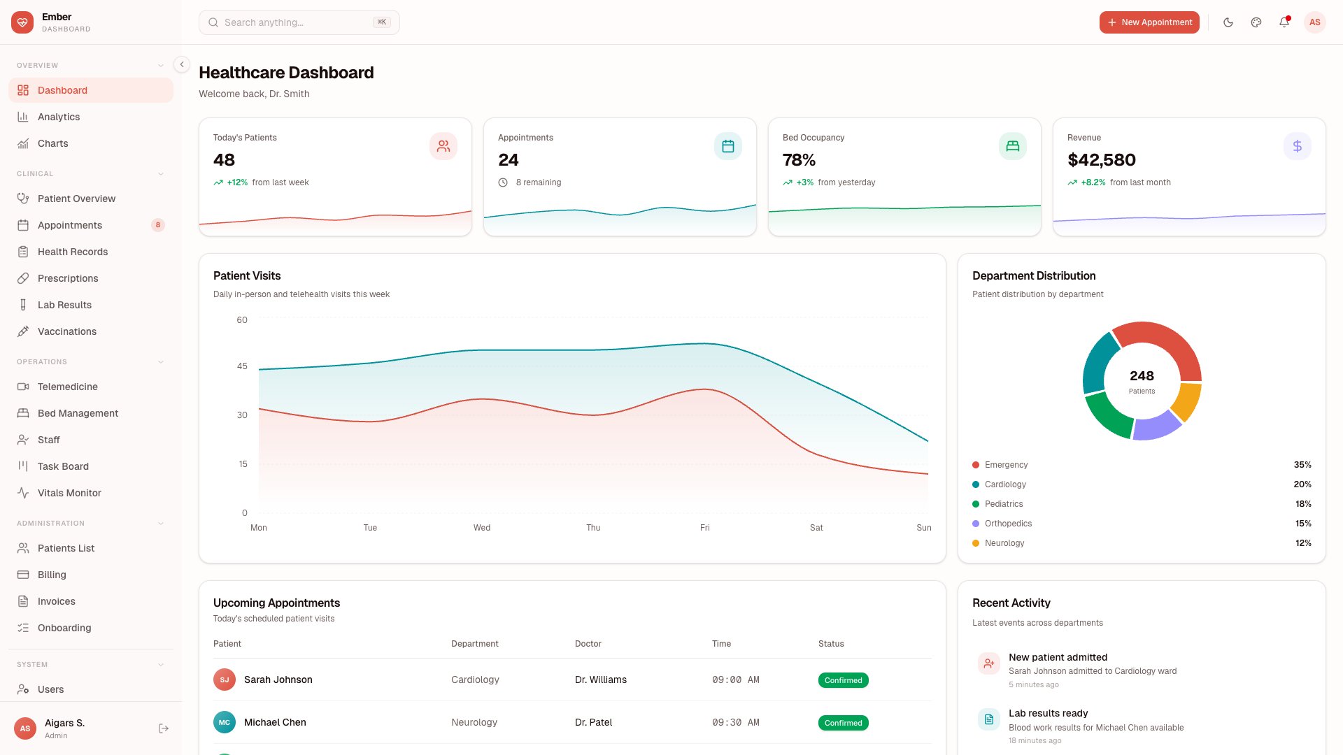
Ember is purpose-built for healthcare applications, delivering 50+ pages with five dashboard variants designed around medical practice workflows. The template includes dedicated modules for Patient Management, Appointments & Scheduling, Vitals Monitor, Prescriptions, Lab Results, Vaccinations, Health Records, Bed Management, Staff Management, Telemedicine sessions, and Billing — covering the full spectrum of clinic and hospital operations.
Under the hood, Ember leverages TanStack Table v8 for complex patient data grids, Leaflet for interactive facility maps, TipTap for rich-text medical notes, and Recharts 3 for patient analytics and vitals visualization. The template also includes comprehensive authentication flows with 2FA, a Storybook instance for component documentation, and a full testing suite with Vitest and Playwright. If you’re building a healthcare SaaS or internal clinic management tool, Ember gives you an enormous head start.
5. Zenith
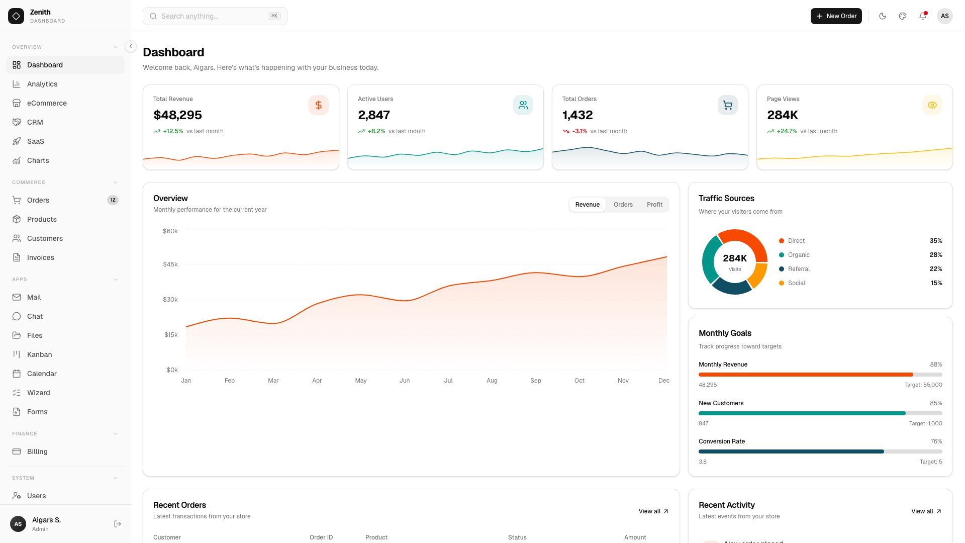
Zenith takes a radically different design direction with an ultra-minimal, achromatic aesthetic that lets your data and content take center stage. With 50+ static routes and six dashboard variations (Overview, Analytics, eCommerce, CRM, SaaS, Finance), this template proves that restraint in design can be just as powerful as bold color choices.
The template ships with 34 vendored shadcn/ui components, 20+ app pages including AI Chat, Kanban Board, Calendar, multi-step Wizard, and a Rich Text Editor powered by TipTap 3. Interactive maps via Leaflet, full CRUD operations, and project management tools round out the feature set. A live theme customizer with three density levels, Storybook integration, and a built-in documentation site make Zenith as developer-friendly as it is visually refined.
6. Vault
$69+ • DashboardPack
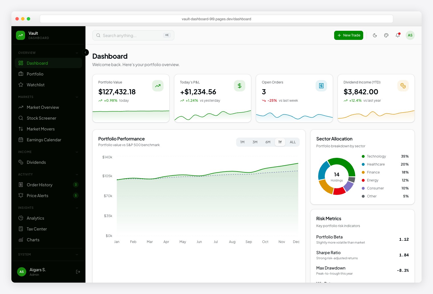
A Robinhood-inspired investment dashboard with Plus Jakarta Sans for readability and Geist Mono for financial data precision. Ships 57+ pages spanning 13 investment modules: Portfolio, Watchlist, Market Overview, Stock Screener, Market Movers, Earnings Calendar, Dividends, Order History, Price Alerts, Analytics, Tax Center, and Stock Detail. Dark/light themes, 6 color presets, 10+ chart types.
7. Fortress
$69+ • DashboardPack
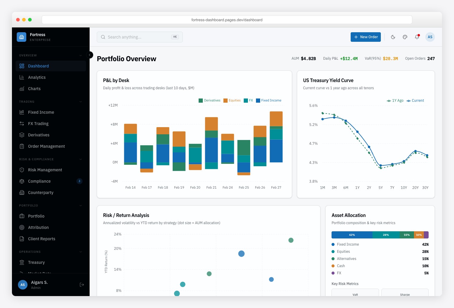
A Bloomberg-inspired institutional finance dashboard built for trading desks, risk management teams, and compliance officers who need dense, data-heavy interfaces. Ships 57+ pages with 13 finance-specific pages covering multi-asset trading (Fixed Income, FX, Derivatives), risk analytics, and regulatory compliance monitoring. Framer Motion animations, Vitest + Playwright testing, and Storybook documentation.
Comments (No Comments)