7 Best Next.js 16 Admin Dashboards With shadcn/ui 2026
The seven best Next.js 16 admin dashboards with shadcn/ui in 2026 are Apex (125+ pages, general-purpose), Signal (DevOps), Flux (SaaS/startups), Ember (healthcare), Zenith (minimal/white-label), Vault (fintech), and Fortress (institutional finance). All seven are built by DashboardPack on an identical core stack — Next.js 16, React 19, TypeScript 5, Tailwind CSS v4, and vendored shadcn/ui components on Radix UI — and ship with dark/light themes, RTL support, i18n, and a live theme customizer.
shadcn/ui is an open-source React component collection built on Radix UI primitives and styled with Tailwind CSS. Unlike traditional component libraries (Material UI, Ant Design), shadcn/ui components are copied directly into your project source code, giving you full ownership with zero package dependency lock-in — a significant advantage for admin dashboards that require heavy customization of tables, forms, and navigation.
For broader options, see our roundups of shadcn admin dashboard templates (25 free + premium picks) and Next.js admin dashboard templates.
Quick Picks
- Most pages: Apex — 125+ routes, 5 dashboard variants, full CRUD with TanStack Table v8
- Best for DevOps: Signal — 13 infrastructure views (Kubernetes, CI/CD, Log Explorer)
- Best design: Flux — gradient-forward with Framer Motion animations, 300+ color combos
- Best for healthcare: Ember — 11 medical modules including Telemedicine and Vitals Monitor
- Best for white-label: Zenith — achromatic design adapts to any brand with minimal CSS changes
Comparison Table
| Template | Pages | Price | Vertical | Key Differentiator |
|---|---|---|---|---|
| Apex | 125+ | From $69 | General-purpose | 5 dashboard variants, largest component library |
| Signal | 57+ | From $69 | DevOps / SRE | 13 infrastructure views, JetBrains Mono typography |
| Flux | 64+ | From $69 | SaaS / Startups | Gradient design, Feature Flags page, 300+ color combos |
| Ember | 50+ | From $69 | Healthcare | 11 medical modules, Vitest + Playwright testing |
| Zenith | 50+ | From $69 | Enterprise / White-label | Achromatic design, 3 density levels, Storybook docs |
| Vault | 57+ | From $69 | Fintech / Investing | 13 investment modules, candlestick charts |
| Fortress | 57+ | From $69 | Institutional Finance | Bloomberg-inspired density, compliance monitoring |
All seven templates share the same core stack: Next.js 16 with App Router and static export (output: 'export'), React 19, TypeScript 5, Tailwind CSS v4 with OKLCh color tokens, vendored shadcn/ui primitives on Radix UI, Recharts 3, TanStack Table v8, and Framer Motion. They deploy to any static host (Cloudflare Pages, Vercel, Netlify) with zero server runtime.
Best Next.js 16 Admin Dashboards With shadcn/ui
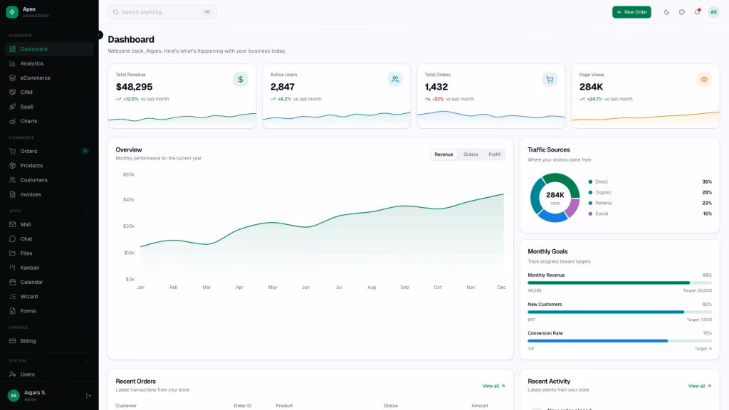
1. Apex
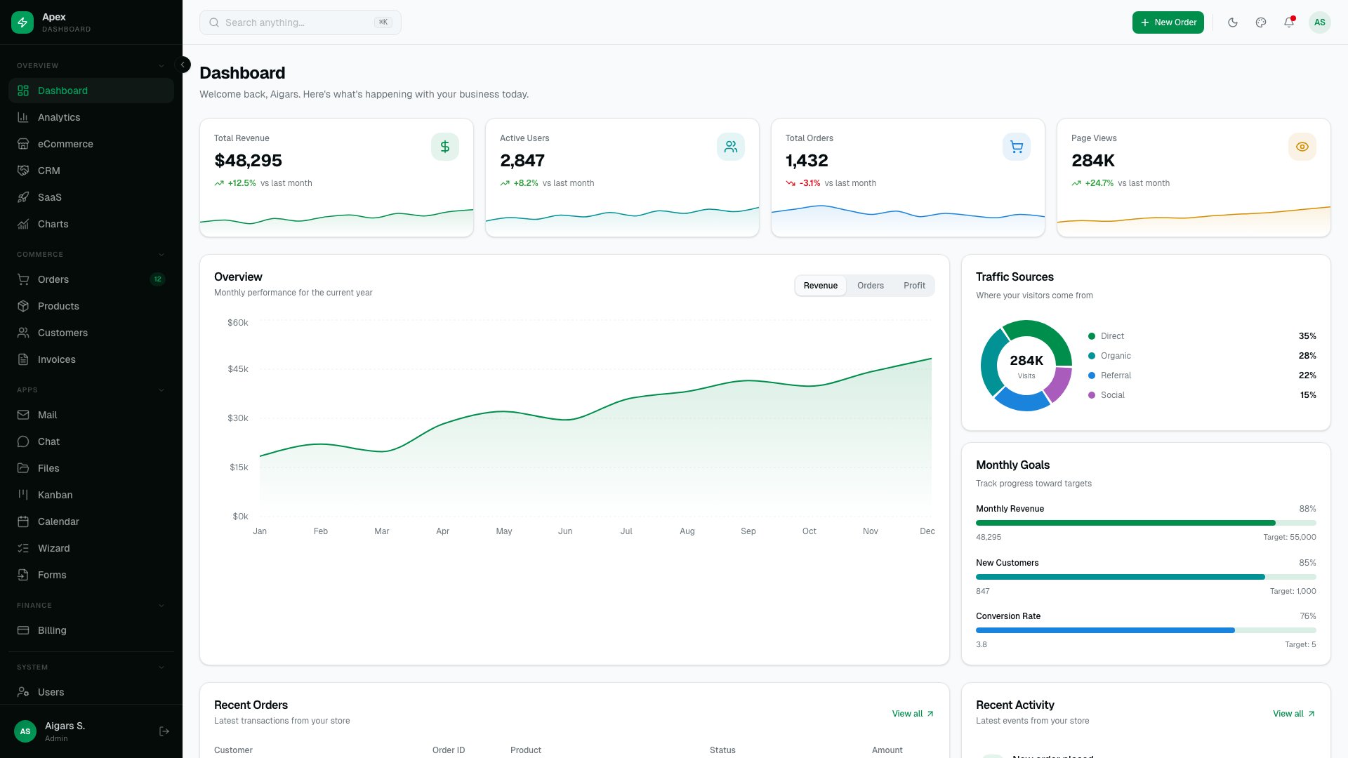
Why we like it: 125+ static routes and 5 dashboard variants (Overview, Analytics, eCommerce, CRM, SaaS) mean you rarely build custom pages from scratch.
Built by the team behind AdminLTE (45,000+ GitHub stars, 28,000+ forks), Apex represents the premium evolution of the most-downloaded open-source admin template. The static export architecture means zero server runtime in production — deploy to Cloudflare Pages, Vercel, or S3.
2. Signal
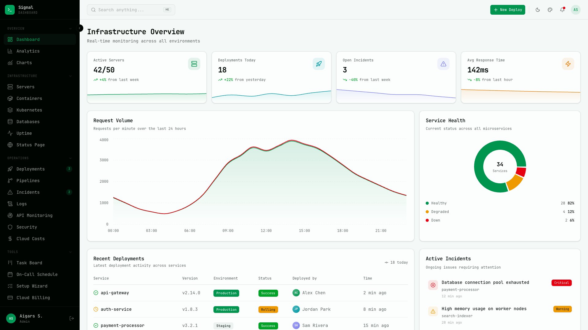
Why we like it: 13 infrastructure-specific views (Server Fleet, Kubernetes, CI/CD Pipelines, Log Explorer) make Signal the only Next.js dashboard built specifically for DevOps.
Terminal-inspired design with JetBrains Mono typography and 57+ pages. The 13 domain-specific views cover Server Fleet, Containers, Deployments, Incidents, Log Explorer, Uptime Monitor, CI/CD Pipelines, Databases, Security Audit, API Monitoring, Kubernetes, Cloud Costs, and a public Status Page. Six color presets and three density modes. Also available as a Laravel variant.
3. Flux
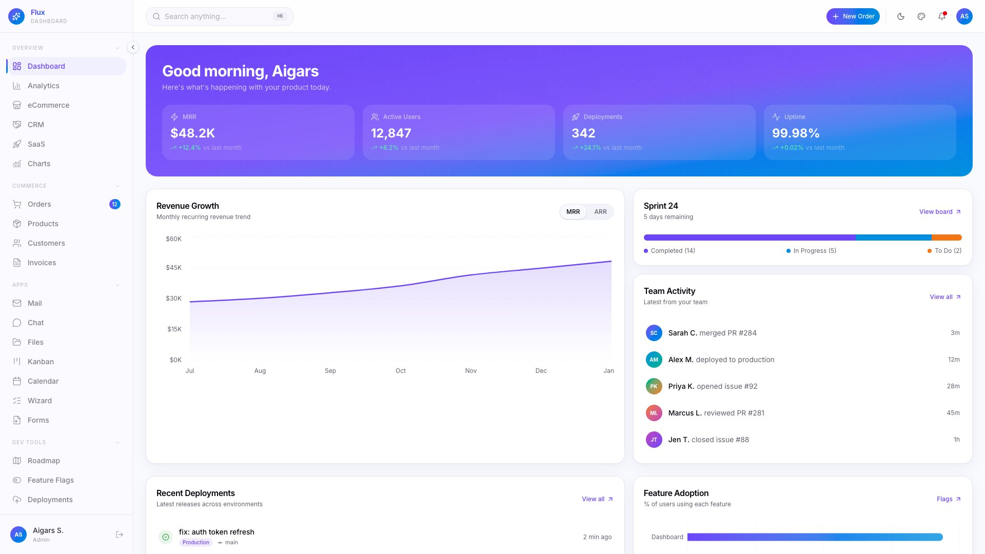
Why we like it: 7 specialty pages (Product Roadmap, Feature Flags, Deployment Log) and 300+ color scheme combinations make Flux uniquely suited for SaaS products.
Gradient-forward design with Framer Motion animations across 64+ pages and 5 dashboard variants (Overview, Analytics, eCommerce, CRM, SaaS). The 35 shadcn/ui primitives, dark/light/system themes, RTL, Command Palette, and i18n for 3 languages round out a template built specifically for developer tools and SaaS products.
4. Ember
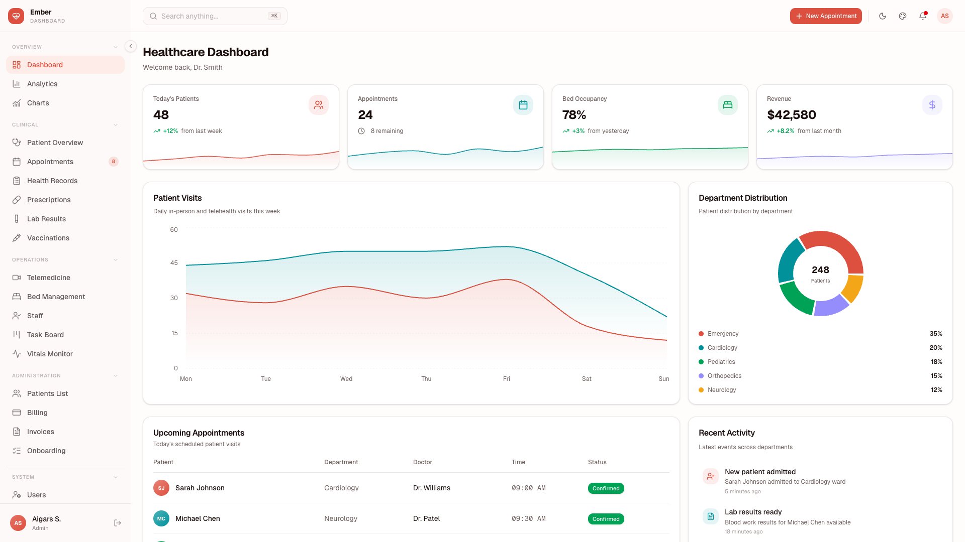
Why we like it: 11 healthcare-specific modules (Patient Management, Vitals Monitor, Telemedicine, Prescriptions) make Ember the only Next.js dashboard built for medical SaaS.
Purpose-built for healthcare with 50+ pages covering Patient Management, Appointments, Vitals Monitor, Prescriptions, Lab Results, Vaccinations, Health Records, Bed Management, Staff Management, Telemedicine, and Billing. Uses TanStack Table v8 for patient data grids, Leaflet for facility maps, TipTap for medical notes, and Recharts 3 for vitals visualization. Includes Vitest + Playwright testing — essential for healthcare compliance.
5. Zenith
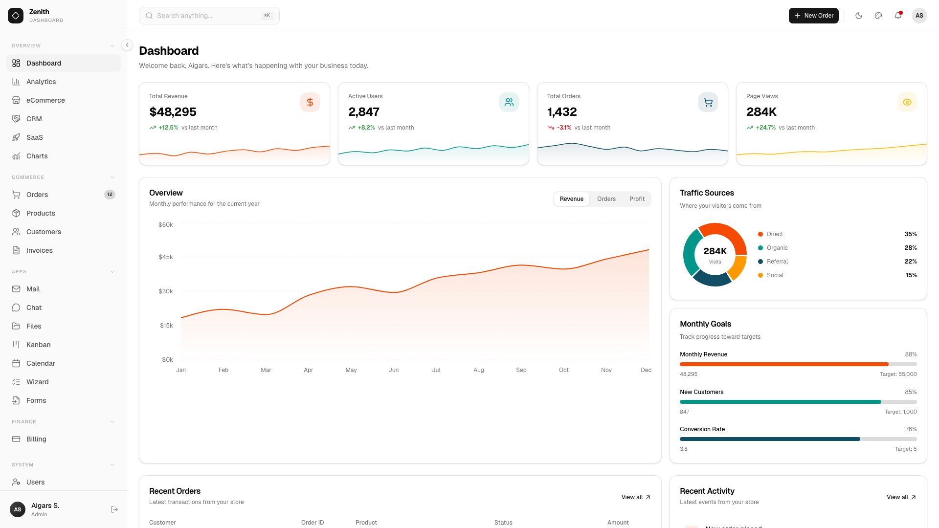
Why we like it: Achromatic design means Zenith adapts to any brand identity with minimal CSS changes — the easiest template to rebrand on this list.
Ultra-minimal design with 50+ routes and 6 dashboard variants (Overview, Analytics, eCommerce, CRM, SaaS, Finance). Ships with 34 vendored shadcn/ui components, AI Chat, Kanban Board, Calendar, multi-step Wizard, Rich Text Editor (TipTap 3), Leaflet maps, and full CRUD. Live theme customizer with 3 density levels, Storybook integration, and built-in documentation site.
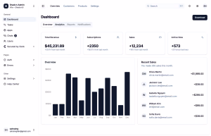
6. Vault
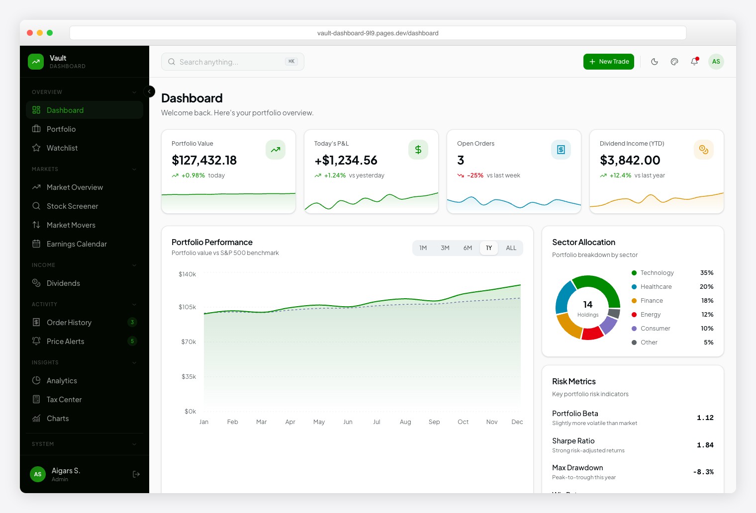
Why we like it: 13 investment modules and 10+ chart types (including candlestick and treemap) cover the same data patterns used by professional trading platforms.
Robinhood-inspired design with Plus Jakarta Sans for readability and Geist Mono for financial data. 57+ pages spanning Portfolio, Watchlist, Market Overview, Stock Screener, Market Movers, Earnings Calendar, Dividends, Order History, Price Alerts, Analytics, Tax Center, and Stock Detail. Dark/light themes with 6 color presets and RTL support.
7. Fortress
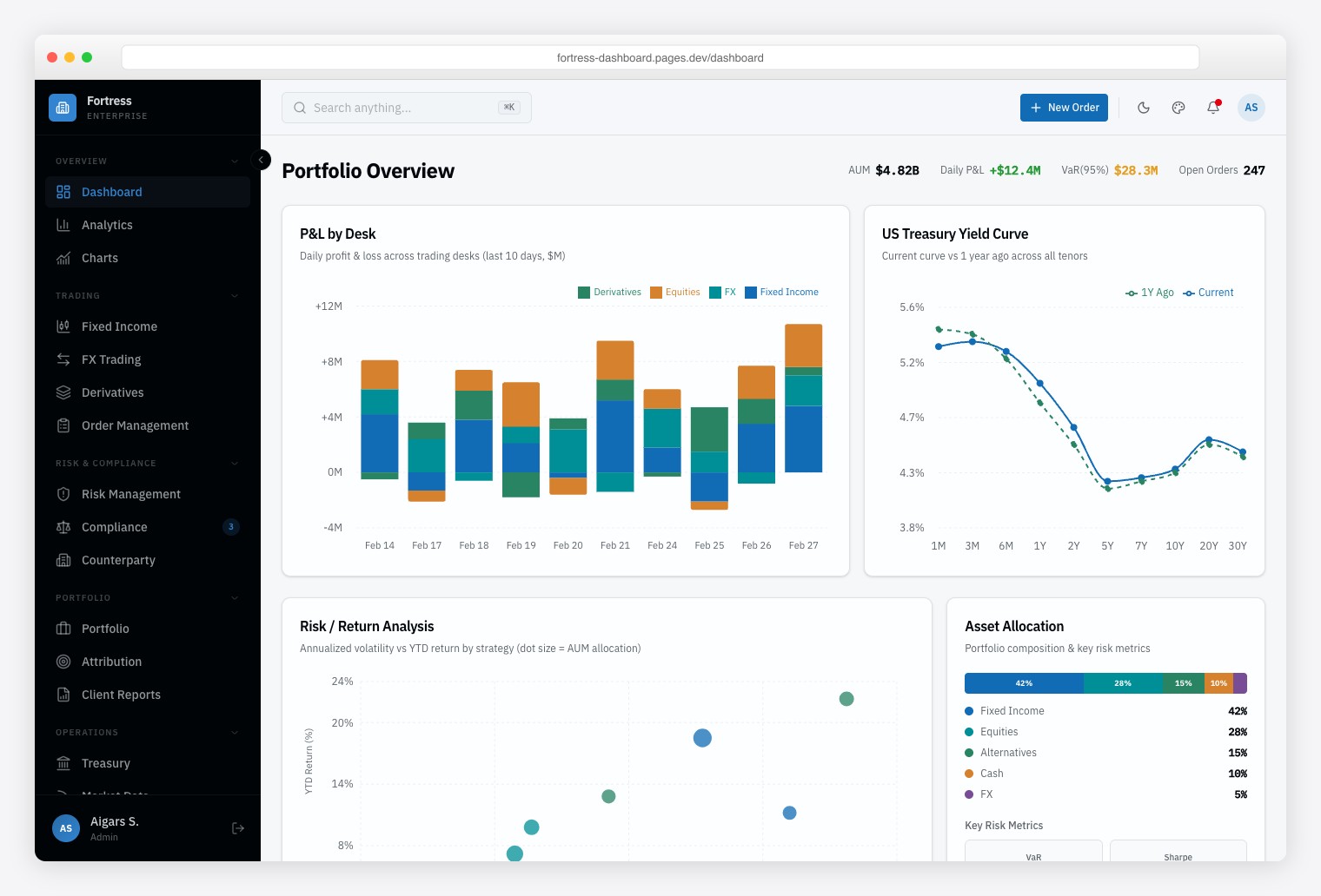
Why we like it: Bloomberg-inspired data density with multi-panel layouts for trading desks, risk management, and regulatory compliance — built for users who need 50+ data points on one screen.
Institutional finance dashboard with 57+ pages and 13 finance-specific modules covering multi-asset trading (Fixed Income, FX, Derivatives), risk analytics, and regulatory compliance. Information-dense multi-panel layouts mirror professional trading terminals. Framer Motion animations used sparingly to maintain speed. Vitest + Playwright testing and Storybook documentation included.
How to Choose the Right Next.js + shadcn/ui Dashboard
- Industry vertical: Healthcare → Ember. DevOps → Signal. Retail finance → Vault. Institutional finance → Fortress. The pre-built modules save weeks vs. adapting a general-purpose dashboard.
- Page count: Apex (125+ pages) for maximum flexibility. The vertical templates (50–57 pages) stay lean and focused.
- Design aesthetic: Flux for gradient-heavy modern branding. Signal for terminal-inspired dark UI. Zenith for minimal neutrality.
- White-label / rebranding: Zenith‘s achromatic palette is easiest to rebrand. Flux‘s 300+ color combinations offer the most theming flexibility.
- Testing suite: Ember, Fortress, and Zenith include Storybook + Vitest + Playwright — important for larger teams and regulated industries.
All seven share the same core architecture, so migrating between them mid-project is straightforward. For free and open-source alternatives, see our 25 best shadcn admin dashboard templates roundup.
Frequently Asked Questions
Do these templates require a Node.js server in production?
No. All seven use Next.js static export (output: 'export'), generating plain HTML, CSS, and JavaScript. Deploy to Cloudflare Pages, Vercel, Netlify, or S3 without a Node.js server.
Can I connect these to my own backend API?
Yes. The templates ship with mock data for demonstration. Replace the data-fetching functions with calls to your REST API or GraphQL endpoint. TanStack Table v8 already supports server-side pagination, sorting, and filtering patterns.
What is shadcn/ui and why does it matter for admin dashboards?
shadcn/ui is an open-source collection of React components built on Radix UI primitives and styled with Tailwind CSS. Components are copied into your project source code (not installed as a dependency), giving you full ownership to customize tables, forms, and navigation without version conflicts or upstream breaking changes.
Are the templates accessible and RTL-ready?
Yes. The underlying Radix UI components include ARIA attributes, keyboard navigation, and focus management. All seven templates support right-to-left (RTL) layouts for Arabic, Hebrew, and other RTL language markets.
What is the difference between Vault and Fortress for finance?
Vault targets retail investors and fintech startups — think Robinhood-style interfaces with portfolio tracking and stock screeners. Fortress targets institutional finance — Bloomberg Terminal-style data density for trading desks, risk management, and compliance officers.
Which template has the best testing and documentation?
Ember, Fortress, and Zenith ship with Storybook for component documentation plus Vitest and Playwright for unit and end-to-end testing. Apex includes the largest component library but does not bundle a test suite.
You Might Also Like