17 Bootstrap Sidebar Examples to Copy-Paste (2026)
Bootstrap ships a navbar but no sidebar — and since almost every admin panel, dashboard, and docs site runs on one, “bootstrap sidebar” never stops being searched. Here are 17 copy-paste Bootstrap 5 sidebar examples — from the basic fixed column to offcanvas drawers, responsive hybrids, icon rails, hover-expand, double sidebars, and the full AdminLTE-style anatomy — each with a screenshot, complete code, and the accessibility notes that separate working nav from decorative markup. Everything runs on Bootstrap 5.3 utilities plus its own Collapse, Offcanvas, Tooltip, and Scrollspy plugins; custom CSS appears only where the framework has no primitive (and never more than a dozen lines).
Jump to a sidebar
- Basic fixed sidebar — The starting point
- Collapsible treeview sidebar (AdminLTE-style) — Collapsible menu groups
- Offcanvas sidebar (mobile drawer) — Bootstrap’s own drawer component
- Responsive hybrid: fixed on desktop, drawer on mobile — The pattern every responsive admin needs, and the least-known trick on this page
- Dark sidebar on a light page — Scoped dark sidebar on a light page
- Icon-only mini sidebar (rail) with tooltips — The icon rail
- Hover-expand sidebar (mini → full) — The mini rail that grows on hover
- Sidebar with profile header & pinned footer — Three-zone sidebar
- Double sidebar (icon rail + panel) — The Slack/Discord pattern
- Right-side settings panel (offcanvas-end) — offcanvas-end slides from the right
- Sidebar with search & badges — Navigation with a search input (input-group-sm) and count badges pushed right via ms-auto. Badge colors carry meaning
- Toggle-collapse sidebar (push layout) — The push-collapse desktop pattern
- Vertical pills sidebar (settings pages) — The settings-page sidebar
- E-commerce filter sidebar — The e-commerce filter rail
- Docs sidebar with scrollspy — Docs-style section nav wired to Bootstrap Scrollspy
- Full admin sidebar (brand, treeview, user) — The full classic
- Brand-color sidebar — The SaaS brand sidebar
1. Basic fixed sidebar
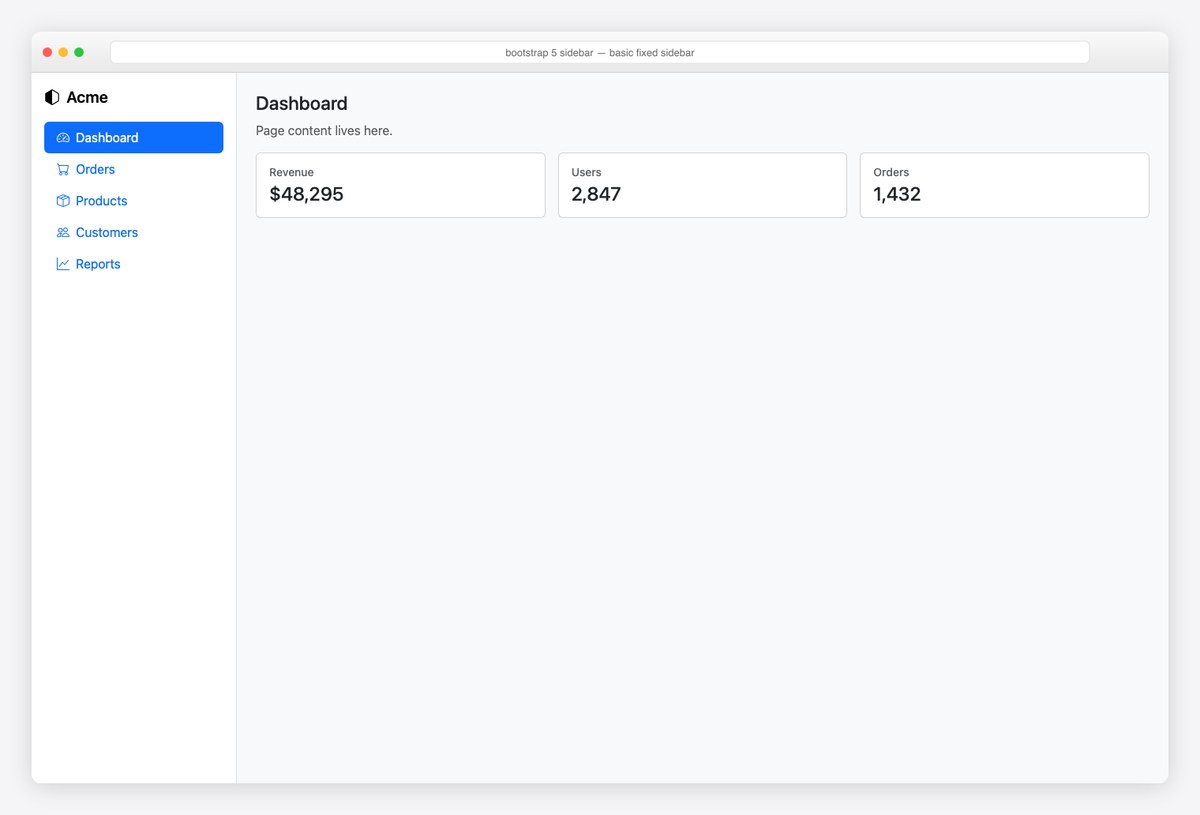
The starting point: a fixed-width flex column beside a flex-grow-1 content area, nav-pills flex-column for the links. No positioning hacks — the whole layout is one d-flex wrapper. Every other sidebar on this page grows from this skeleton.
<div class="d-flex" style="min-height: 100vh">
  <nav class="d-flex flex-column flex-shrink-0 p-3 bg-body border-end" style="width: 260px" aria-label="Main navigation">
    <a href="#" class="d-flex align-items-center mb-3 link-body-emphasis text-decoration-none fs-5 fw-semibold">
      <i class="bi bi-hexagon-half me-2"></i>Acme
    </a>
    <ul class="nav nav-pills flex-column mb-auto">
      <li class="nav-item"><a class="nav-link active" aria-current="page" href="#"><i class="bi bi-speedometer2 me-2"></i>Dashboard</a></li>
      <li class="nav-item"><a class="nav-link" href="#"><i class="bi bi-cart me-2"></i>Orders</a></li>
      <li class="nav-item"><a class="nav-link" href="#"><i class="bi bi-box-seam me-2"></i>Products</a></li>
      <li class="nav-item"><a class="nav-link" href="#"><i class="bi bi-people me-2"></i>Customers</a></li>
      <li class="nav-item"><a class="nav-link" href="#"><i class="bi bi-graph-up me-2"></i>Reports</a></li>
    </ul>
  </nav>
  <main class="flex-grow-1 p-4"><!-- page content --></main>
</div>
2. Collapsible treeview sidebar (AdminLTE-style)
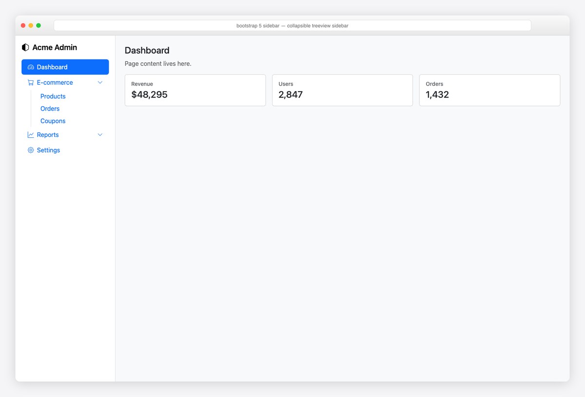
Collapsible menu groups — the AdminLTE signature — from pure Bootstrap Collapse: a nav-link button toggles each collapse block of child links. The border-start ps-2 on the child list draws the classic treeview guide line.
<div class="d-flex" style="min-height: 100vh">
  <nav class="d-flex flex-column flex-shrink-0 p-3 bg-body border-end" style="width: 260px">
    <a href="#" class="mb-3 link-body-emphasis text-decoration-none fs-5 fw-semibold"><i class="bi bi-hexagon-half me-2"></i>Acme Admin</a>
    <ul class="nav nav-pills flex-column mb-auto">
      <li class="nav-item"><a class="nav-link active" href="#"><i class="bi bi-speedometer2 me-2"></i>Dashboard</a></li>
      <li class="nav-item">
        <button class="nav-link w-100 text-start d-flex align-items-center" data-bs-toggle="collapse" data-bs-target="#menu-shop" aria-expanded="true" aria-controls="menu-shop">
          <i class="bi bi-cart me-2"></i>E-commerce <i class="bi bi-chevron-down ms-auto small"></i>
        </button>
        <div class="collapse show" id="menu-shop">
          <ul class="nav flex-column ms-4 border-start ps-2">
            <li><a class="nav-link py-1" href="#">Products</a></li>
            <li><a class="nav-link py-1" href="#">Orders</a></li>
            <li><a class="nav-link py-1" href="#">Coupons</a></li>
          </ul>
        </div>
      </li>
      <li class="nav-item">
        <button class="nav-link w-100 text-start d-flex align-items-center collapsed" data-bs-toggle="collapse" data-bs-target="#menu-reports" aria-expanded="false" aria-controls="menu-reports">
          <i class="bi bi-graph-up me-2"></i>Reports <i class="bi bi-chevron-down ms-auto small"></i>
        </button>
        <div class="collapse" id="menu-reports">
          <ul class="nav flex-column ms-4 border-start ps-2">
            <li><a class="nav-link py-1" href="#">Sales</a></li>
            <li><a class="nav-link py-1" href="#">Traffic</a></li>
          </ul>
        </div>
      </li>
      <li class="nav-item"><a class="nav-link" href="#"><i class="bi bi-gear me-2"></i>Settings</a></li>
    </ul>
  </nav>
  <main class="flex-grow-1 p-4"><!-- page content --></main>
</div>
3. Offcanvas sidebar (mobile drawer)
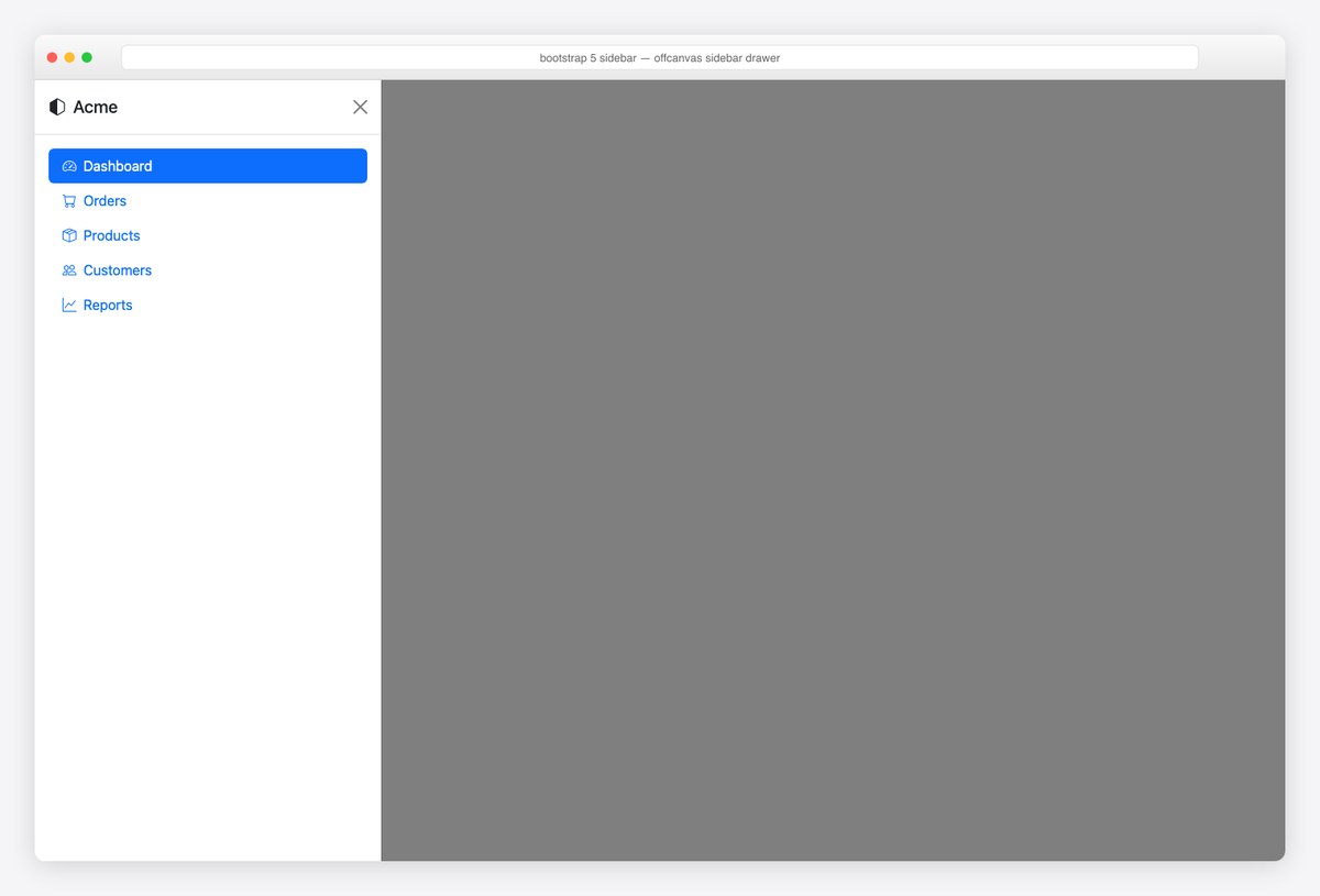
Bootstrap’s own drawer component: hidden by default, slides in on toggle, traps focus, closes on Escape — accessibility handled by the framework. This is the correct mobile sidebar; screenshot shows it open over the backdrop.
<!-- Toggle button (usually in your navbar) -->
<button class="btn btn-primary m-3" data-bs-toggle="offcanvas" data-bs-target="#appSidebar" aria-controls="appSidebar">
  <i class="bi bi-list me-1"></i> Menu
</button>

<div class="offcanvas offcanvas-start" tabindex="-1" id="appSidebar" aria-labelledby="appSidebarLabel">
  <div class="offcanvas-header border-bottom">
    <h5 class="offcanvas-title" id="appSidebarLabel"><i class="bi bi-hexagon-half me-2"></i>Acme</h5>
    <button type="button" class="btn-close" data-bs-dismiss="offcanvas" aria-label="Close"></button>
  </div>
  <div class="offcanvas-body">
    <ul class="nav nav-pills flex-column">
      <li class="nav-item"><a class="nav-link active" aria-current="page" href="#"><i class="bi bi-speedometer2 me-2"></i>Dashboard</a></li>
      <li class="nav-item"><a class="nav-link" href="#"><i class="bi bi-cart me-2"></i>Orders</a></li>
      <li class="nav-item"><a class="nav-link" href="#"><i class="bi bi-box-seam me-2"></i>Products</a></li>
      <li class="nav-item"><a class="nav-link" href="#"><i class="bi bi-people me-2"></i>Customers</a></li>
      <li class="nav-item"><a class="nav-link" href="#"><i class="bi bi-graph-up me-2"></i>Reports</a></li>
    </ul>
  </div>
</div>
4. Responsive hybrid: fixed on desktop, drawer on mobile
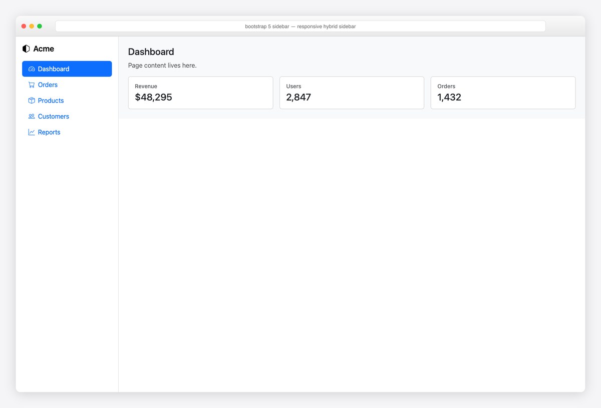
The pattern every responsive admin needs, and the least-known trick on this page: offcanvas-lg makes one markup block behave as a drawer below the lg breakpoint and a normal fixed column above it. One sidebar, zero duplication.
<!-- offcanvas-lg: a real offcanvas below lg, a normal column at lg and up -->
<div class="d-flex" style="min-height: 100vh">
  <nav class="offcanvas-lg offcanvas-start d-lg-flex flex-column flex-shrink-0 bg-body border-end" style="width: 260px" tabindex="-1" id="hybridSidebar" aria-labelledby="hybridSidebarLabel">
    <div class="offcanvas-header border-bottom d-lg-none">
      <h5 class="offcanvas-title" id="hybridSidebarLabel">Acme</h5>
      <button type="button" class="btn-close" data-bs-dismiss="offcanvas" data-bs-target="#hybridSidebar" aria-label="Close"></button>
    </div>
    <div class="offcanvas-body d-lg-flex flex-column p-3">
      <a href="#" class="d-none d-lg-block mb-3 link-body-emphasis text-decoration-none fs-5 fw-semibold"><i class="bi bi-hexagon-half me-2"></i>Acme</a>
      <ul class="nav nav-pills flex-column mb-auto">
        <li class="nav-item"><a class="nav-link active" aria-current="page" href="#"><i class="bi bi-speedometer2 me-2"></i>Dashboard</a></li>
      <li class="nav-item"><a class="nav-link" href="#"><i class="bi bi-cart me-2"></i>Orders</a></li>
      <li class="nav-item"><a class="nav-link" href="#"><i class="bi bi-box-seam me-2"></i>Products</a></li>
      <li class="nav-item"><a class="nav-link" href="#"><i class="bi bi-people me-2"></i>Customers</a></li>
      <li class="nav-item"><a class="nav-link" href="#"><i class="bi bi-graph-up me-2"></i>Reports</a></li>
      </ul>
    </div>
  </nav>
  <div class="flex-grow-1">
    <header class="d-lg-none border-bottom p-2">
      <button class="btn btn-outline-secondary" data-bs-toggle="offcanvas" data-bs-target="#hybridSidebar" aria-controls="hybridSidebar"><i class="bi bi-list"></i></button>
    </header>
    <main class="p-4"><!-- page content --></main>
  </div>
</div>
5. Dark sidebar on a light page
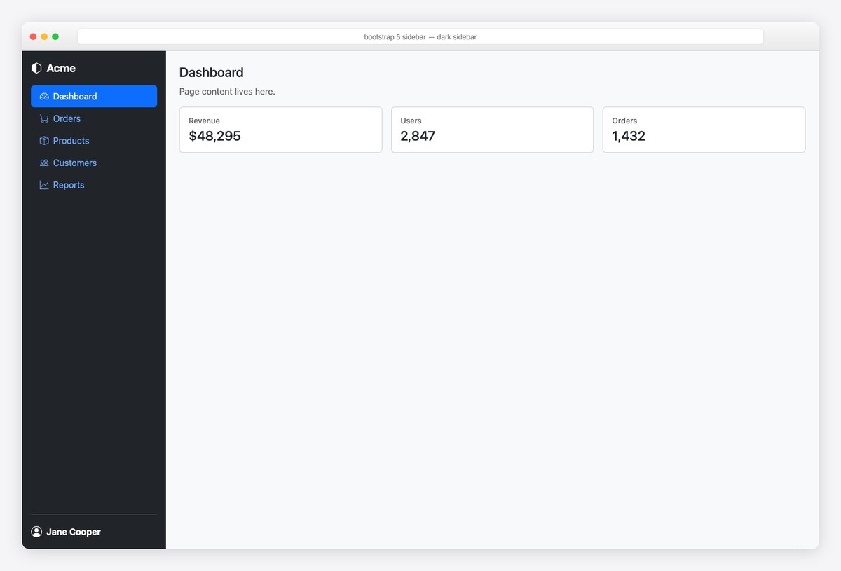
Scoped dark sidebar on a light page: text-bg-dark + data-bs-theme="dark" on the nav re-tints the pills, links, and divider automatically. The bottom user row is the classic place for the account link.
<div class="d-flex" style="min-height: 100vh">
  <nav class="d-flex flex-column flex-shrink-0 p-3 text-bg-dark" style="width: 260px" data-bs-theme="dark">
    <a href="#" class="d-flex align-items-center mb-3 text-white text-decoration-none fs-5 fw-semibold">
      <i class="bi bi-hexagon-half me-2"></i>Acme
    </a>
    <ul class="nav nav-pills flex-column mb-auto">
      <li class="nav-item"><a class="nav-link active" aria-current="page" href="#"><i class="bi bi-speedometer2 me-2"></i>Dashboard</a></li>
      <li class="nav-item"><a class="nav-link" href="#"><i class="bi bi-cart me-2"></i>Orders</a></li>
      <li class="nav-item"><a class="nav-link" href="#"><i class="bi bi-box-seam me-2"></i>Products</a></li>
      <li class="nav-item"><a class="nav-link" href="#"><i class="bi bi-people me-2"></i>Customers</a></li>
      <li class="nav-item"><a class="nav-link" href="#"><i class="bi bi-graph-up me-2"></i>Reports</a></li>
    </ul>
    <hr>
    <a href="#" class="d-flex align-items-center text-white text-decoration-none">
      <i class="bi bi-person-circle me-2 fs-5"></i><strong>Jane Cooper</strong>
    </a>
  </nav>
  <main class="flex-grow-1 p-4"><!-- page content --></main>
</div>
6. Icon-only mini sidebar (rail) with tooltips
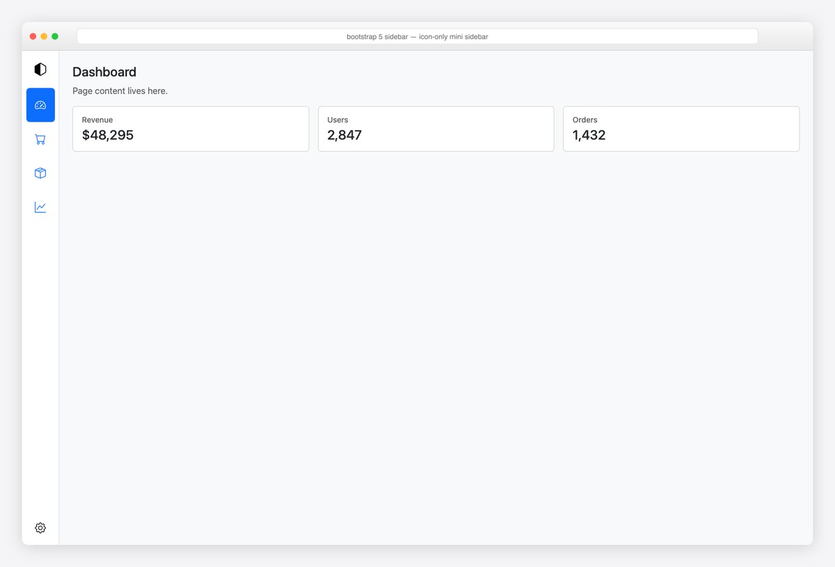
The icon rail: 68px wide, icon-only links with Bootstrap Tooltips on hover and aria-labels for screen readers (never ship icon-only nav without both). A common pairing is rail-on-tablet, full-sidebar-on-desktop.
<div class="d-flex" style="min-height: 100vh">
  <nav class="d-flex flex-column flex-shrink-0 bg-body border-end align-items-center py-3" style="width: 68px">
    <a href="#" class="mb-3 link-body-emphasis" aria-label="Acme home"><i class="bi bi-hexagon-half fs-4"></i></a>
    <ul class="nav nav-pills flex-column mb-auto text-center">
      <li><a class="nav-link active py-3" href="#" data-bs-toggle="tooltip" data-bs-placement="right" data-bs-title="Dashboard" aria-label="Dashboard"><i class="bi bi-speedometer2 fs-5"></i></a></li>
      <li><a class="nav-link py-3" href="#" data-bs-toggle="tooltip" data-bs-placement="right" data-bs-title="Orders" aria-label="Orders"><i class="bi bi-cart fs-5"></i></a></li>
      <li><a class="nav-link py-3" href="#" data-bs-toggle="tooltip" data-bs-placement="right" data-bs-title="Products" aria-label="Products"><i class="bi bi-box-seam fs-5"></i></a></li>
      <li><a class="nav-link py-3" href="#" data-bs-toggle="tooltip" data-bs-placement="right" data-bs-title="Reports" aria-label="Reports"><i class="bi bi-graph-up fs-5"></i></a></li>
    </ul>
    <a href="#" class="link-body-emphasis" data-bs-toggle="tooltip" data-bs-placement="right" data-bs-title="Settings" aria-label="Settings"><i class="bi bi-gear fs-5"></i></a>
  </nav>
  <main class="flex-grow-1 p-4"><!-- page content --></main>
</div>

<script>
  // enable tooltips
  document.querySelectorAll('[data-bs-toggle="tooltip"]').forEach(el => new bootstrap.Tooltip(el))
</script>
7. Hover-expand sidebar (mini → full)
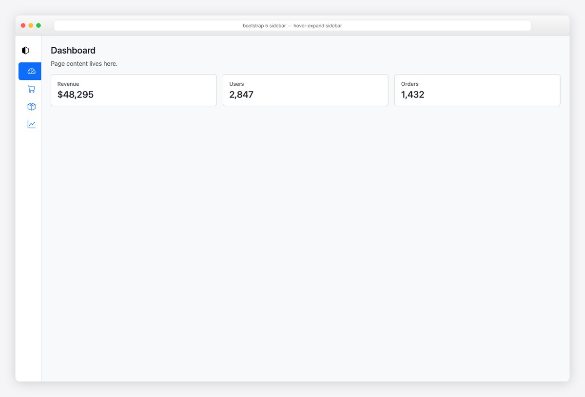
The mini rail that grows on hover — ~10 lines of CSS on top of the rail: animate width, fade the labels, and include :focus-within so keyboard users get the expanded state too. Screenshot shows the resting (collapsed) state.
<style>
  .sidebar-hover { width: 68px; transition: width .2s ease; overflow: hidden; white-space: nowrap; }
  .sidebar-hover:hover, .sidebar-hover:focus-within { width: 240px; }
  .sidebar-hover .label { opacity: 0; transition: opacity .15s ease; }
  .sidebar-hover:hover .label, .sidebar-hover:focus-within .label { opacity: 1; }
</style>

<div class="d-flex" style="min-height: 100vh">
  <nav class="sidebar-hover d-flex flex-column flex-shrink-0 bg-body border-end p-2">
    <a href="#" class="nav-link link-body-emphasis d-flex align-items-center py-3">
      <i class="bi bi-hexagon-half fs-5 mx-2"></i><strong class="label">Acme</strong>
    </a>
    <ul class="nav nav-pills flex-column mb-auto">
      <li><a class="nav-link active d-flex align-items-center" href="#"><i class="bi bi-speedometer2 fs-5 mx-2"></i><span class="label">Dashboard</span></a></li>
      <li><a class="nav-link d-flex align-items-center" href="#"><i class="bi bi-cart fs-5 mx-2"></i><span class="label">Orders</span></a></li>
      <li><a class="nav-link d-flex align-items-center" href="#"><i class="bi bi-box-seam fs-5 mx-2"></i><span class="label">Products</span></a></li>
      <li><a class="nav-link d-flex align-items-center" href="#"><i class="bi bi-graph-up fs-5 mx-2"></i><span class="label">Reports</span></a></li>
    </ul>
  </nav>
  <main class="flex-grow-1 p-4"><!-- page content --></main>
</div>
8. Sidebar with profile header & pinned footer
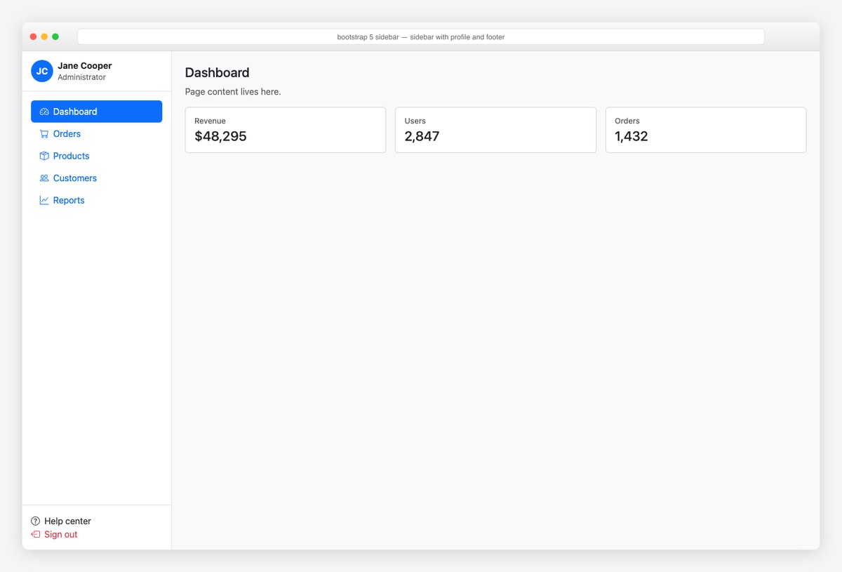
Three-zone sidebar: profile header, scrollable nav, pinned footer (help + sign out). The flex column with mb-auto on the nav is what pins the footer without any positioning.
<div class="d-flex" style="min-height: 100vh">
  <nav class="d-flex flex-column flex-shrink-0 bg-body border-end" style="width: 270px">
    <div class="p-3 border-bottom d-flex align-items-center gap-2">
      <span class="rounded-circle bg-primary text-white d-inline-flex align-items-center justify-content-center" style="width:40px;height:40px"><strong>JC</strong></span>
      <div class="lh-sm">
        <strong class="d-block">Jane Cooper</strong>
        <span class="small text-body-secondary">Administrator</span>
      </div>
    </div>
    <ul class="nav nav-pills flex-column p-3 mb-auto">
      <li class="nav-item"><a class="nav-link active" aria-current="page" href="#"><i class="bi bi-speedometer2 me-2"></i>Dashboard</a></li>
      <li class="nav-item"><a class="nav-link" href="#"><i class="bi bi-cart me-2"></i>Orders</a></li>
      <li class="nav-item"><a class="nav-link" href="#"><i class="bi bi-box-seam me-2"></i>Products</a></li>
      <li class="nav-item"><a class="nav-link" href="#"><i class="bi bi-people me-2"></i>Customers</a></li>
      <li class="nav-item"><a class="nav-link" href="#"><i class="bi bi-graph-up me-2"></i>Reports</a></li>
    </ul>
    <div class="p-3 border-top">
      <a href="#" class="nav-link px-0"><i class="bi bi-question-circle me-2"></i>Help center</a>
      <a href="#" class="nav-link px-0 text-danger"><i class="bi bi-box-arrow-left me-2"></i>Sign out</a>
    </div>
  </nav>
  <main class="flex-grow-1 p-4"><!-- page content --></main>
</div>
9. Double sidebar (icon rail + panel)
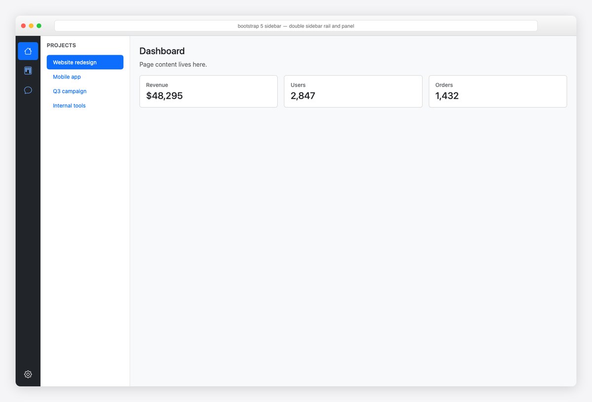
The Slack/Discord pattern: a dark 64px workspace rail beside a light 230px context panel. Two flex columns, two aria-labels — this is also how multi-product admin suites keep global and local navigation separate.
<div class="d-flex" style="min-height: 100vh">
  <nav class="d-flex flex-column flex-shrink-0 text-bg-dark align-items-center py-3" style="width: 64px" data-bs-theme="dark" aria-label="Workspaces">
    <ul class="nav nav-pills flex-column mb-auto text-center">
      <li><a class="nav-link active py-2 mb-1" href="#" aria-label="Home"><i class="bi bi-house fs-5"></i></a></li>
      <li><a class="nav-link py-2 mb-1" href="#" aria-label="Projects"><i class="bi bi-kanban fs-5"></i></a></li>
      <li><a class="nav-link py-2 mb-1" href="#" aria-label="Messages"><i class="bi bi-chat fs-5"></i></a></li>
    </ul>
    <a href="#" class="text-white" aria-label="Settings"><i class="bi bi-gear fs-5"></i></a>
  </nav>
  <nav class="d-flex flex-column flex-shrink-0 bg-body border-end p-3" style="width: 230px" aria-label="Project pages">
    <h6 class="text-uppercase small fw-bold text-body-secondary mb-3">Projects</h6>
    <ul class="nav nav-pills flex-column mb-auto small">
      <li><a class="nav-link active py-2" href="#">Website redesign</a></li>
      <li><a class="nav-link py-2" href="#">Mobile app</a></li>
      <li><a class="nav-link py-2" href="#">Q3 campaign</a></li>
      <li><a class="nav-link py-2" href="#">Internal tools</a></li>
    </ul>
  </nav>
  <main class="flex-grow-1 p-4"><!-- page content --></main>
</div>
10. Right-side settings panel (offcanvas-end)
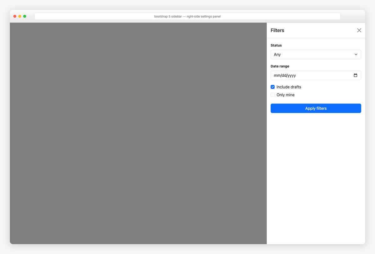
offcanvas-end slides from the right — the natural home for filters, settings, and detail panels that shouldn’t displace the page. Same accessibility behavior as the left drawer.
<button class="btn btn-outline-secondary m-3 float-end" data-bs-toggle="offcanvas" data-bs-target="#settingsPanel" aria-controls="settingsPanel">
  <i class="bi bi-sliders me-1"></i> Filters
</button>

<div class="offcanvas offcanvas-end" tabindex="-1" id="settingsPanel" aria-labelledby="settingsPanelLabel">
  <div class="offcanvas-header border-bottom">
    <h5 class="offcanvas-title" id="settingsPanelLabel">Filters</h5>
    <button type="button" class="btn-close" data-bs-dismiss="offcanvas" aria-label="Close"></button>
  </div>
  <div class="offcanvas-body">
    <label class="form-label small fw-bold">Status</label>
    <select class="form-select mb-3"><option>Any</option><option>Active</option><option>Archived</option></select>
    <label class="form-label small fw-bold">Date range</label>
    <input type="date" class="form-control mb-3" aria-label="From date">
    <div class="form-check mb-2"><input class="form-check-input" type="checkbox" id="f1" checked><label class="form-check-label" for="f1">Include drafts</label></div>
    <div class="form-check mb-4"><input class="form-check-input" type="checkbox" id="f2"><label class="form-check-label" for="f2">Only mine</label></div>
    <button class="btn btn-primary w-100">Apply filters</button>
  </div>
</div>
11. Sidebar with search & badges
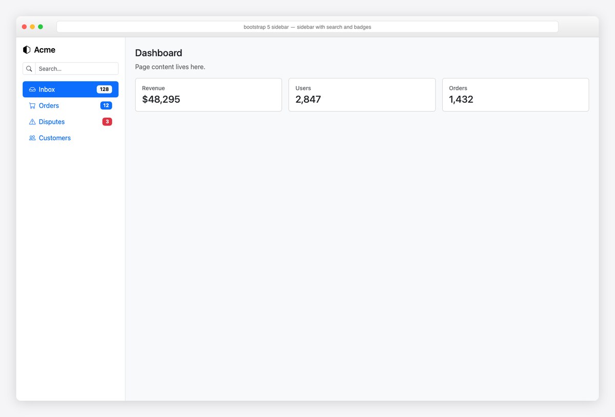
Navigation with a search input (input-group-sm) and count badges pushed right via ms-auto. Badge colors carry meaning — neutral for counts, text-bg-danger for needs-attention.
<div class="d-flex" style="min-height: 100vh">
  <nav class="d-flex flex-column flex-shrink-0 bg-body border-end p-3" style="width: 270px">
    <a href="#" class="mb-3 link-body-emphasis text-decoration-none fs-5 fw-semibold"><i class="bi bi-hexagon-half me-2"></i>Acme</a>
    <div class="input-group input-group-sm mb-3">
      <span class="input-group-text bg-body"><i class="bi bi-search"></i></span>
      <input type="search" class="form-control" placeholder="Search…" aria-label="Search navigation">
    </div>
    <ul class="nav nav-pills flex-column mb-auto">
      <li class="nav-item"><a class="nav-link active d-flex align-items-center" href="#"><i class="bi bi-inbox me-2"></i>Inbox <span class="badge text-bg-light ms-auto">128</span></a></li>
      <li class="nav-item"><a class="nav-link d-flex align-items-center" href="#"><i class="bi bi-cart me-2"></i>Orders <span class="badge text-bg-primary ms-auto">12</span></a></li>
      <li class="nav-item"><a class="nav-link d-flex align-items-center" href="#"><i class="bi bi-exclamation-triangle me-2"></i>Disputes <span class="badge text-bg-danger ms-auto">3</span></a></li>
      <li class="nav-item"><a class="nav-link d-flex align-items-center" href="#"><i class="bi bi-people me-2"></i>Customers</a></li>
    </ul>
  </nav>
  <main class="flex-grow-1 p-4"><!-- page content --></main>
</div>
12. Toggle-collapse sidebar (push layout)
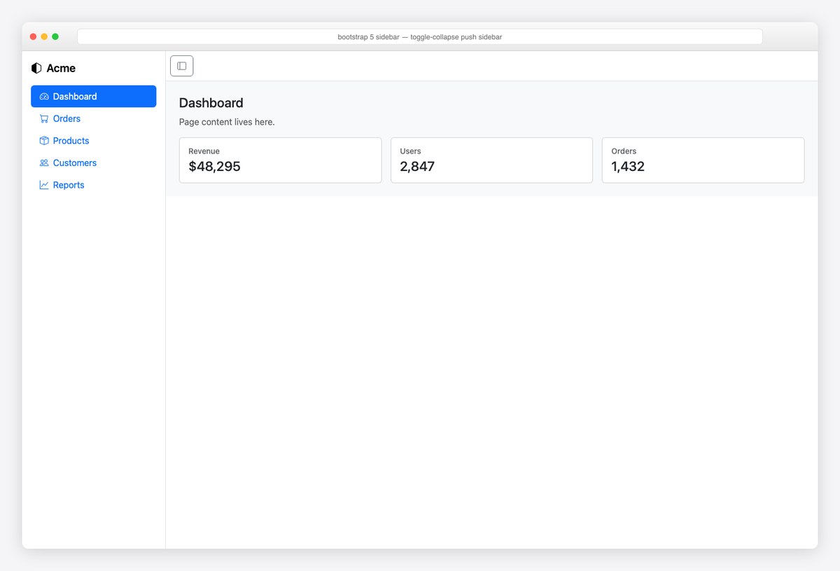
The push-collapse desktop pattern: a negative-margin transition slides the sidebar out and the content reflows to full width. Three lines of CSS and a one-line classList.toggle — no library needed. Remember to flip aria-expanded.
<style>
  #pushSidebar { width: 260px; transition: margin-left .25s ease; }
  #pushSidebar.collapsed { margin-left: -260px; }
</style>

<div class="d-flex overflow-hidden" style="min-height: 100vh">
  <nav id="pushSidebar" class="d-flex flex-column flex-shrink-0 bg-body border-end p-3">
    <a href="#" class="mb-3 link-body-emphasis text-decoration-none fs-5 fw-semibold"><i class="bi bi-hexagon-half me-2"></i>Acme</a>
    <ul class="nav nav-pills flex-column mb-auto">
      <li class="nav-item"><a class="nav-link active" aria-current="page" href="#"><i class="bi bi-speedometer2 me-2"></i>Dashboard</a></li>
      <li class="nav-item"><a class="nav-link" href="#"><i class="bi bi-cart me-2"></i>Orders</a></li>
      <li class="nav-item"><a class="nav-link" href="#"><i class="bi bi-box-seam me-2"></i>Products</a></li>
      <li class="nav-item"><a class="nav-link" href="#"><i class="bi bi-people me-2"></i>Customers</a></li>
      <li class="nav-item"><a class="nav-link" href="#"><i class="bi bi-graph-up me-2"></i>Reports</a></li>
    </ul>
  </nav>
  <div class="flex-grow-1">
    <header class="border-bottom p-2">
      <button class="btn btn-outline-secondary" onclick="document.getElementById('pushSidebar').classList.toggle('collapsed')" aria-label="Toggle sidebar" aria-expanded="true">
        <i class="bi bi-layout-sidebar"></i>
      </button>
    </header>
    <main class="p-4"><!-- content reflows when the sidebar collapses --></main>
  </div>
</div>
13. Vertical pills sidebar (settings pages)
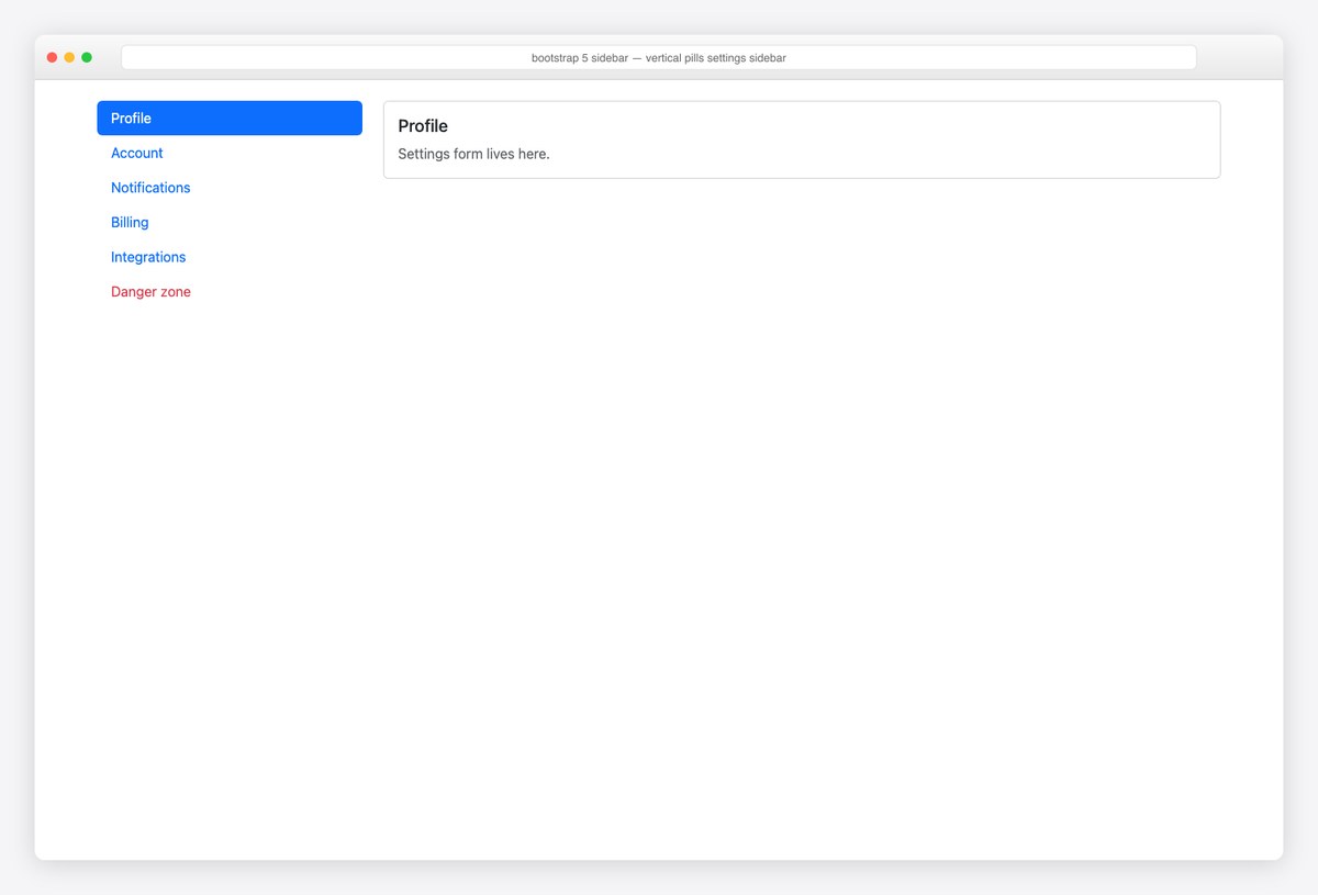
The settings-page sidebar: vertical nav-pills in a grid column, sticky-top so it follows the scroll. This is the lightweight pattern for section navigation inside a page, not app-level chrome.
<div class="container py-4">
  <div class="row g-4">
    <div class="col-md-3">
      <nav class="nav nav-pills flex-column sticky-top" style="top: 1rem" aria-label="Settings sections">
        <a class="nav-link active" aria-current="page" href="#">Profile</a>
        <a class="nav-link" href="#">Account</a>
        <a class="nav-link" href="#">Notifications</a>
        <a class="nav-link" href="#">Billing</a>
        <a class="nav-link" href="#">Integrations</a>
        <a class="nav-link text-danger" href="#">Danger zone</a>
      </nav>
    </div>
    <div class="col-md-9">
      <div class="card"><div class="card-body"><h5>Profile</h5><p class="text-body-secondary mb-0">Settings form lives here.</p></div></div>
    </div>
  </div>
</div>
14. E-commerce filter sidebar
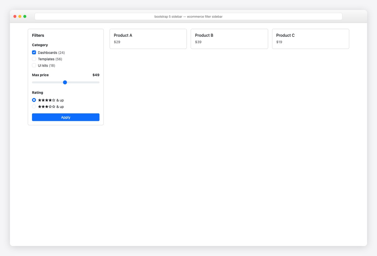
The e-commerce filter rail: checkbox groups with counts, a form-range price slider, radio ratings, one Apply button. In a card so it reads as a control panel; pairs with offcanvas (example 3) to become a mobile filter drawer.
<div class="container py-4">
<div class="row g-4">
<aside class="col-lg-3">
<div class="card">
<div class="card-body">
<h6 class="fw-bold mb-3">Filters</h6>
<label class="form-label small fw-bold">Category</label>
<div class="form-check"><input class="form-check-input" type="checkbox" id="c1" checked><label class="form-check-label small" for="c1">Dashboards <span class="text-body-secondary">(24)</span></label></div>
<div class="form-check"><input class="form-check-input" type="checkbox" id="c2"><label class="form-check-label small" for="c2">Templates <span class="text-body-secondary">(56)</span></label></div>
<div class="form-check mb-3"><input class="form-check-input" type="checkbox" id="c3"><label class="form-check-label small" for="c3">UI kits <span class="text-body-secondary">(18)</span></label></div>
<label for="priceRange" class="form-label small fw-bold d-flex justify-content-between">Max price <span>$49</span></label>
<input type="range" class="form-range mb-3" id="priceRange" min="0" max="100" value="49">
<label class="form-label small fw-bold">Rating</label>
<div class="form-check"><input class="form-check-input" type="radio" name="rating" id="r1" checked><label class="form-check-label small" for="r1">★★★★☆ & up</label></div>
<div class="form-check mb-3"><input class="form-check-input" type="radio" name="rating" id="r2"><label class="form-check-label small" for="r2">★★★☆☆ & up</label></div>
<button class="btn btn-primary btn-sm w-100">Apply</button>
</div>
</div>
</aside>
<div class="col-lg-9">
<div class="row g-3">
<div class="col-md-4"><div class="card"><div class="card-body"><h6 class="mb-1">Product A</h6><span class="text-body-secondary small">$29</span></div></div></div>
<div class="col-md-4"><div class="card"><div class="card-body"><h6 class="mb-1">Product B</h6><span class="text-body-secondary small">$39</span></div></div></div>
<div class="col-md-4"><div class="card"><div class="card-body"><h6 class="mb-1">Product C</h6><span class="text-body-secondary small">$19</span></div></div></div>
</div>
</div>
</div>
</div>
15. Docs sidebar with scrollspy
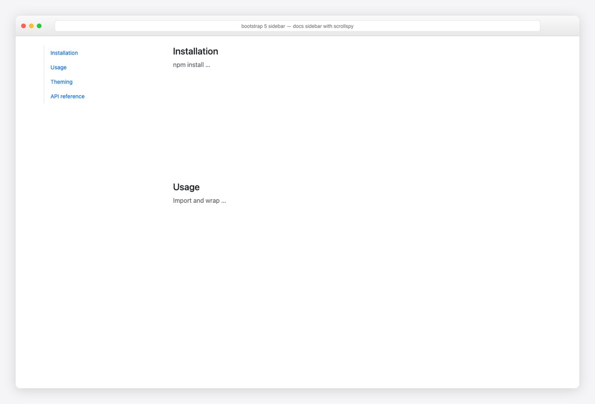
Docs-style section nav wired to Bootstrap Scrollspy: data-bs-spy="scroll" on the content pane highlights the current section link as you read. Add data-bs-smooth-scroll="true" and anchors glide.
<div class="container py-4">
  <div class="row g-4">
    <div class="col-md-3">
      <nav id="docsNav" class="nav flex-column sticky-top border-start small" style="top: 1rem" aria-label="On this page">
        <a class="nav-link" href="#s-install">Installation</a>
        <a class="nav-link" href="#s-usage">Usage</a>
        <a class="nav-link" href="#s-theming">Theming</a>
        <a class="nav-link" href="#s-api">API reference</a>
      </nav>
    </div>
    <div class="col-md-9" data-bs-spy="scroll" data-bs-target="#docsNav" data-bs-smooth-scroll="true" style="height: 70vh; overflow-y: auto" tabindex="0">
      <h4 id="s-install">Installation</h4><p class="text-body-secondary">npm install …</p><div style="height:30vh"></div>
      <h4 id="s-usage">Usage</h4><p class="text-body-secondary">Import and wrap …</p><div style="height:30vh"></div>
      <h4 id="s-theming">Theming</h4><p class="text-body-secondary">CSS variables …</p><div style="height:30vh"></div>
      <h4 id="s-api">API reference</h4><p class="text-body-secondary">Props and events …</p><div style="height:30vh"></div>
    </div>
  </div>
</div>
16. Full admin sidebar (brand, treeview, user)
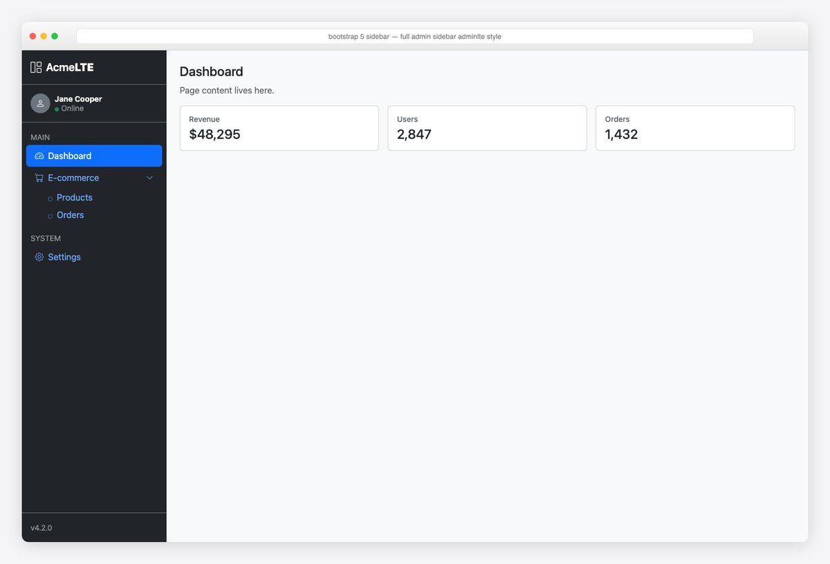
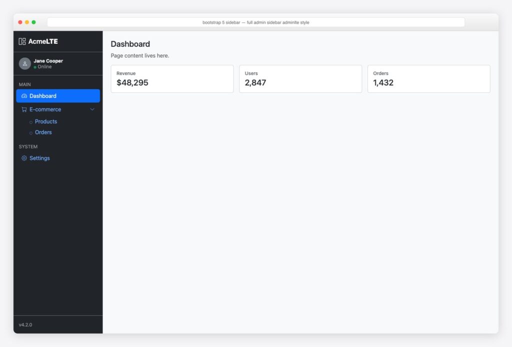
The full classic: brand bar, user panel with online dot, labeled menu sections, expanded treeview, version footer — the AdminLTE anatomy in pure Bootstrap 5.3. If you want this maintained as real components instead, it’s the sidebar from our official React and Angular libraries.
<div class="d-flex" style="min-height: 100vh">
  <nav class="d-flex flex-column flex-shrink-0 text-bg-dark" style="width: 265px" data-bs-theme="dark">
    <a href="#" class="d-flex align-items-center p-3 text-white text-decoration-none border-bottom border-secondary">
      <i class="bi bi-grid-1x2 me-2 fs-5"></i><span class="fs-5 fw-semibold">Acme<b>LTE</b></span>
    </a>
    <div class="p-3 d-flex align-items-center gap-2 border-bottom border-secondary">
      <span class="rounded-circle bg-secondary d-inline-flex align-items-center justify-content-center" style="width:36px;height:36px"><i class="bi bi-person"></i></span>
      <div class="lh-sm small"><strong class="d-block">Jane Cooper</strong><span class="text-white-50"><i class="bi bi-circle-fill text-success me-1" style="font-size:.5rem"></i>Online</span></div>
    </div>
    <ul class="nav nav-pills flex-column mb-auto p-2">
      <li class="nav-item small text-uppercase text-white-50 px-2 pt-2 pb-1">Main</li>
      <li><a class="nav-link active" href="#"><i class="bi bi-speedometer2 me-2"></i>Dashboard</a></li>
      <li>
        <button class="nav-link w-100 text-start d-flex align-items-center" data-bs-toggle="collapse" data-bs-target="#lte-ecom" aria-expanded="true" aria-controls="lte-ecom">
          <i class="bi bi-cart me-2"></i>E-commerce <i class="bi bi-chevron-down ms-auto small"></i>
        </button>
        <div class="collapse show" id="lte-ecom">
          <ul class="nav flex-column ms-4">
            <li><a class="nav-link py-1" href="#"><i class="bi bi-circle me-2" style="font-size:.5rem"></i>Products</a></li>
            <li><a class="nav-link py-1" href="#"><i class="bi bi-circle me-2" style="font-size:.5rem"></i>Orders</a></li>
          </ul>
        </div>
      </li>
      <li class="nav-item small text-uppercase text-white-50 px-2 pt-3 pb-1">System</li>
      <li><a class="nav-link" href="#"><i class="bi bi-gear me-2"></i>Settings</a></li>
    </ul>
    <div class="p-3 border-top border-secondary small text-white-50">v4.2.0</div>
  </nav>
  <main class="flex-grow-1 p-4 bg-body-tertiary"><!-- page content --></main>
</div>
17. Brand-color sidebar
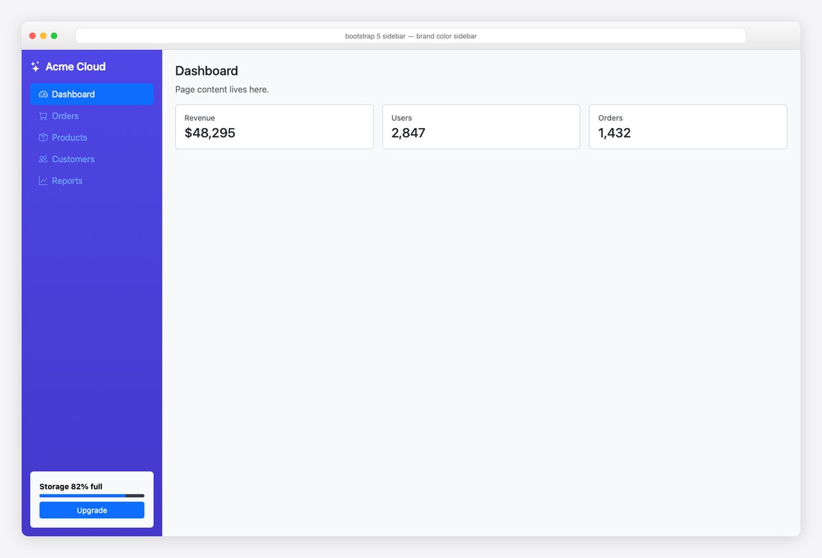
The SaaS brand sidebar: a gradient background (one inline style), data-bs-theme="dark" for legible pills on the color, and the upgrade/usage card docked at the bottom — the pattern every freemium product recognizes.
<div class="d-flex" style="min-height: 100vh">
  <nav class="d-flex flex-column flex-shrink-0 p-3 text-white" style="width: 260px; background: linear-gradient(180deg, #4f46e5, #4338ca)" data-bs-theme="dark">
    <a href="#" class="d-flex align-items-center mb-3 text-white text-decoration-none fs-5 fw-semibold"><i class="bi bi-stars me-2"></i>Acme Cloud</a>
    <ul class="nav nav-pills flex-column mb-auto">
      <li class="nav-item"><a class="nav-link active" aria-current="page" href="#"><i class="bi bi-speedometer2 me-2"></i>Dashboard</a></li>
      <li class="nav-item"><a class="nav-link" href="#"><i class="bi bi-cart me-2"></i>Orders</a></li>
      <li class="nav-item"><a class="nav-link" href="#"><i class="bi bi-box-seam me-2"></i>Products</a></li>
      <li class="nav-item"><a class="nav-link" href="#"><i class="bi bi-people me-2"></i>Customers</a></li>
      <li class="nav-item"><a class="nav-link" href="#"><i class="bi bi-graph-up me-2"></i>Reports</a></li>
    </ul>
    <div class="card text-bg-light mt-3">
      <div class="card-body p-3 small">
        <strong class="d-block mb-1">Storage 82% full</strong>
        <div class="progress mb-2" style="height:6px"><div class="progress-bar" style="width:82%"></div></div>
        <a href="#" class="btn btn-primary btn-sm w-100">Upgrade</a>
      </div>
    </div>
  </nav>
  <main class="flex-grow-1 p-4"><!-- page content --></main>
</div>
Sidebar patterns worth knowing
- The responsive answer is
offcanvas-lg, not two sidebars: one markup block that’s a drawer on mobile and a column on desktop (example 4). It’s the least-known, most-useful class on this page. - Flex, never fixed positioning: a
d-flexwrapper with a fixed-width nav andflex-grow-1main handles height, scrolling, and footers withoutposition: fixedside effects. - Icon-only requires two things: a tooltip for sighted users and an
aria-labelfor everyone else — the rail (example 6) shows both. - Mark the current page with
aria-current="page"on the active link —.activealone is invisible to assistive tech. - Sidebar state belongs to the user: persist collapsed/expanded (example 12) to
localStorageso the choice survives reloads — the same pattern our official AdminLTE React/Angular libraries implement for you.
Prefer a ready-made sidebar? Download a full template
Rather start from a finished layout than assemble one? These free Bootstrap sidebar templates from Colorlib download as complete files — including the dashboard shell around the sidebar. Every example above is copy-paste code; the set below is ready-made templates.
Colorlib Sidebar V01 Live Preview Free Download
Colorlib Sidebar V02 Live Preview Free Download
Colorlib Sidebar V03 Live Preview Free Download
Colorlib Sidebar V04 Live Preview Free Download
Colorlib Sidebar V05 Live Preview Free Download
Colorlib Sidebar V06 Live Preview Free Download
Colorlib Sidebar V07 Live Preview Free Download
Colorlib Sidebar V08 Live Preview Free Download
Frequently asked questions
Does Bootstrap have a sidebar component?
Not as such — Bootstrap provides the building blocks (Offcanvas, Collapse, nav-pills, flex utilities) and leaves the sidebar to you. The 17 examples above assemble those primitives into every common sidebar pattern with no external libraries.
How do I make a responsive Bootstrap sidebar?
Use the offcanvas-lg pattern (example 4): the same element behaves as a slide-in drawer below the lg breakpoint and a normal fixed column above it. One markup block, no duplication, with Bootstrap handling focus and dismissal on mobile.
How do I make a collapsible sidebar in Bootstrap?
Two different asks, two answers: collapsible menu groups inside the sidebar use Bootstrap Collapse (example 2’s treeview); collapsing the whole sidebar to widen content uses the push pattern — a negative-margin CSS transition plus a toggle button (example 12).
How do I keep a Bootstrap sidebar full height?
Make the page a flex row: d-flex on a wrapper with min-height: 100vh, the sidebar as a flex column, and the content as flex-grow-1. The sidebar naturally runs full height, and mb-auto inside it pins footers without positioning.
Can I use these sidebars with AdminLTE?
They’re the same DNA — example 16 recreates the classic AdminLTE sidebar anatomy in pure Bootstrap 5.3, and the official @adminlte/react and @adminlte/angular libraries ship that sidebar as a typed, config-driven component (menu as data, active-link detection included).
More Bootstrap building blocks: our 18 Bootstrap footer examples and Bootstrap dashboard examples — or skip assembly entirely with the free admin panels roundup and the official AdminLTE React and AdminLTE Angular guides.

You Might Also Like