
18 Bootstrap Footer Examples to Copy-Paste (2026)

Every Bootstrap project needs a footer, and Bootstrap ships no footer component — which is why “bootstrap footer” stays one of the framework’s most-searched patterns. Here are 18 copy-paste Bootstrap 5 footer examples covering every case that actually comes up — from the basic copyright bar through multi-column, newsletter, dark, sticky, e-commerce, mobile-accordion, and international footers — each with a screenshot, the full code, and the accessibility details most snippets skip. All examples use Bootstrap 5.3 utilities only: no custom CSS required, dark-mode-ready via bg-body-* tokens.
Jump to a footer
- Basic centered footer — The one-liner every project starts with
- Multi-column link footer — The classic marketing-site footer
- Footer with newsletter signup — Email capture belongs where users end up — the footer converts surprisingly well. Note the visually-hidden label (accessibility without visual noise) and flex-shrink-0 on the button so it never squashes on small screens.
- Dark footer with social icons — A dark footer on a light site frames the page bottom. The trick is scoping
- Sticky footer (always at the bottom) — The most-asked footer question
- Admin dashboard footer (AdminLTE-style) — Dashboards need a quieter footer
- Footer with CTA band — The conversion pattern
- Minimal SaaS footer with locale picker — The modern minimal footer
- Contact info footer — The agency/local-business footer
- App download footer — The mobile-app companion footer
- Gradient brand footer — When the brand calls for color
- E-commerce footer with payment icons — The store footer
- Centered logo footer — The portfolio/studio pattern
- Trust-badges footer (two-deck) — The two-deck conversion footer
- Mobile-accordion footer — The mobile-space saver
- Footer with back-to-top — The long-page companion
- Blog footer with recent posts — The content-site footer
- International footer (language + currency) — The global-product footer
1. Basic centered footer

The one-liner every project starts with: a bg-body-tertiary bar, centered copyright, border-top for separation. The bg-body-* utilities (Bootstrap 5.3+) adapt automatically to dark mode — prefer them over the old bg-light.
<footer class="bg-body-tertiary text-center py-4 mt-auto border-top">
<div class="container">
<span class="text-body-secondary">© 2026 Acme Inc. All rights reserved.</span>
</div>
</footer>
2. Multi-column link footer
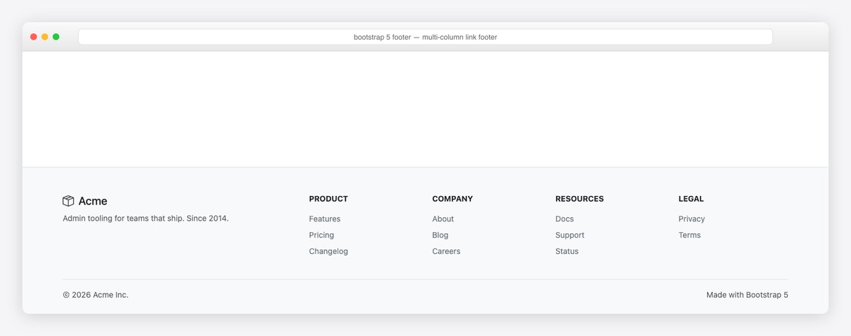
The classic marketing-site footer: brand column plus four link groups on the responsive grid, collapsing to two columns on phones (col-6 col-lg-2). The bottom strip separates legal from navigation. Use link-secondary text-decoration-none for quiet links that still meet contrast.
<footer class="bg-body-tertiary border-top mt-auto pt-5 pb-4">
<div class="container">
<div class="row g-4">
<div class="col-lg-4">
<h5 class="mb-2"><i class="bi bi-box-seam me-2"></i>Acme</h5>
<p class="text-body-secondary small mb-0">Admin tooling for teams that ship. Since 2014.</p>
</div>
<div class="col-6 col-lg-2">
<h6 class="text-uppercase small fw-bold mb-3">Product</h6>
<ul class="list-unstyled small">
<li class="mb-2"><a class="link-secondary text-decoration-none" href="#">Features</a></li>
<li class="mb-2"><a class="link-secondary text-decoration-none" href="#">Pricing</a></li>
<li class="mb-2"><a class="link-secondary text-decoration-none" href="#">Changelog</a></li>
</ul>
</div>
<div class="col-6 col-lg-2">
<h6 class="text-uppercase small fw-bold mb-3">Company</h6>
<ul class="list-unstyled small">
<li class="mb-2"><a class="link-secondary text-decoration-none" href="#">About</a></li>
<li class="mb-2"><a class="link-secondary text-decoration-none" href="#">Blog</a></li>
<li class="mb-2"><a class="link-secondary text-decoration-none" href="#">Careers</a></li>
</ul>
</div>
<div class="col-6 col-lg-2">
<h6 class="text-uppercase small fw-bold mb-3">Resources</h6>
<ul class="list-unstyled small">
<li class="mb-2"><a class="link-secondary text-decoration-none" href="#">Docs</a></li>
<li class="mb-2"><a class="link-secondary text-decoration-none" href="#">Support</a></li>
<li class="mb-2"><a class="link-secondary text-decoration-none" href="#">Status</a></li>
</ul>
</div>
<div class="col-6 col-lg-2">
<h6 class="text-uppercase small fw-bold mb-3">Legal</h6>
<ul class="list-unstyled small">
<li class="mb-2"><a class="link-secondary text-decoration-none" href="#">Privacy</a></li>
<li class="mb-2"><a class="link-secondary text-decoration-none" href="#">Terms</a></li>
</ul>
</div>
</div>
<div class="border-top pt-3 mt-4 d-flex justify-content-between small text-body-secondary">
<span>© 2026 Acme Inc.</span>
<span>Made with Bootstrap 5</span>
</div>
</div>
</footer>
3. Footer with newsletter signup
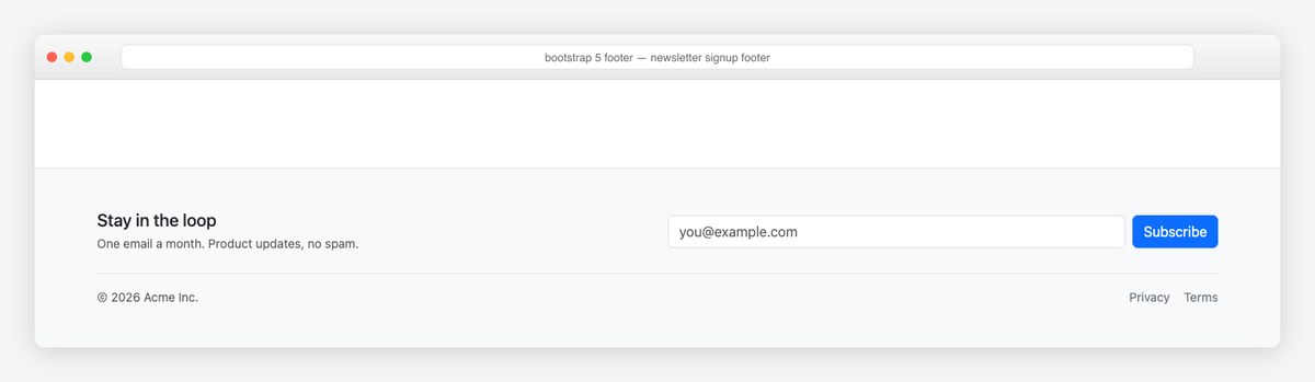
Email capture belongs where users end up — the footer converts surprisingly well. Note the visually-hidden label (accessibility without visual noise) and flex-shrink-0 on the button so it never squashes on small screens.
<footer class="bg-body-tertiary border-top mt-auto py-5">
<div class="container">
<div class="row g-4 align-items-center">
<div class="col-lg-6">
<h5 class="mb-1">Stay in the loop</h5>
<p class="text-body-secondary small mb-0">One email a month. Product updates, no spam.</p>
</div>
<div class="col-lg-6">
<form class="d-flex gap-2" action="#" method="post">
<label for="footer-email" class="visually-hidden">Email address</label>
<input type="email" class="form-control" id="footer-email" placeholder="[email protected]" required>
<button class="btn btn-primary flex-shrink-0" type="submit">Subscribe</button>
</form>
</div>
</div>
<div class="border-top pt-3 mt-4 d-flex flex-wrap justify-content-between small text-body-secondary">
<span>© 2026 Acme Inc.</span>
<div class="d-flex gap-3">
<a class="link-secondary text-decoration-none" href="#">Privacy</a>
<a class="link-secondary text-decoration-none" href="#">Terms</a>
</div>
</div>
</div>
</footer>
4. Dark footer with social icons
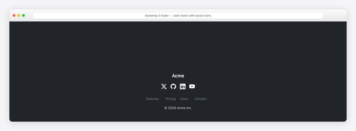
A dark footer on a light site frames the page bottom. The trick is scoping: data-bs-theme="dark" on the footer element alone re-tints every Bootstrap token inside it — no custom dark CSS. Social icons get aria-labels; icon-only links are invisible to screen readers without them.
<!-- add data-bs-theme="dark" on <footer> (or <html>) -->
<footer class="bg-dark text-light mt-auto py-5" data-bs-theme="dark">
<div class="container text-center">
<h5 class="mb-3">Acme</h5>
<div class="d-flex justify-content-center gap-3 mb-4 fs-4">
<a class="link-light" href="#" aria-label="X (Twitter)"><i class="bi bi-twitter-x"></i></a>
<a class="link-light" href="#" aria-label="GitHub"><i class="bi bi-github"></i></a>
<a class="link-light" href="#" aria-label="LinkedIn"><i class="bi bi-linkedin"></i></a>
<a class="link-light" href="#" aria-label="YouTube"><i class="bi bi-youtube"></i></a>
</div>
<ul class="list-inline small mb-3">
<li class="list-inline-item"><a class="link-secondary text-decoration-none" href="#">Features</a></li>
<li class="list-inline-item mx-3"><a class="link-secondary text-decoration-none" href="#">Pricing</a></li>
<li class="list-inline-item"><a class="link-secondary text-decoration-none" href="#">Docs</a></li>
<li class="list-inline-item mx-3"><a class="link-secondary text-decoration-none" href="#">Contact</a></li>
</ul>
<span class="text-body-secondary small">© 2026 Acme Inc.</span>
</div>
</footer>
5. Sticky footer (always at the bottom)

The most-asked footer question: keeping it at the bottom on short pages. Forget absolute positioning — the flexbox pattern is three classes: d-flex flex-column min-vh-100 on body, flex-grow-1 on main (or mt-auto on the footer). Works with any footer design on this page.
<!-- The flexbox pattern: body gets the classes, footer gets mt-auto -->
<body class="d-flex flex-column min-vh-100">
<main class="flex-grow-1">
<!-- page content -->
</main>
<footer class="bg-body-tertiary border-top py-3 mt-auto">
<div class="container d-flex justify-content-between small text-body-secondary">
<span>© 2026 Acme Inc.</span>
<span>v4.2.0</span>
</div>
</footer>
</body>
6. Admin dashboard footer (AdminLTE-style)

Dashboards need a quieter footer: a slim strip with copyright and app version, container-fluid to match the admin canvas. This mirrors AdminLTE’s own app-footer — in the official React/Angular libraries it’s the footer slot of the dashboard layout component.
<footer class="border-top bg-body py-2 mt-auto">
<div class="container-fluid d-flex flex-wrap justify-content-between align-items-center small">
<span class="text-body-secondary">
<strong>© 2026 <a href="#" class="text-decoration-none">Acme Admin</a>.</strong> All rights reserved.
</span>
<span class="text-body-secondary d-none d-sm-inline"><b>Version</b> 4.2.0</span>
</div>
</footer>
7. Footer with CTA band
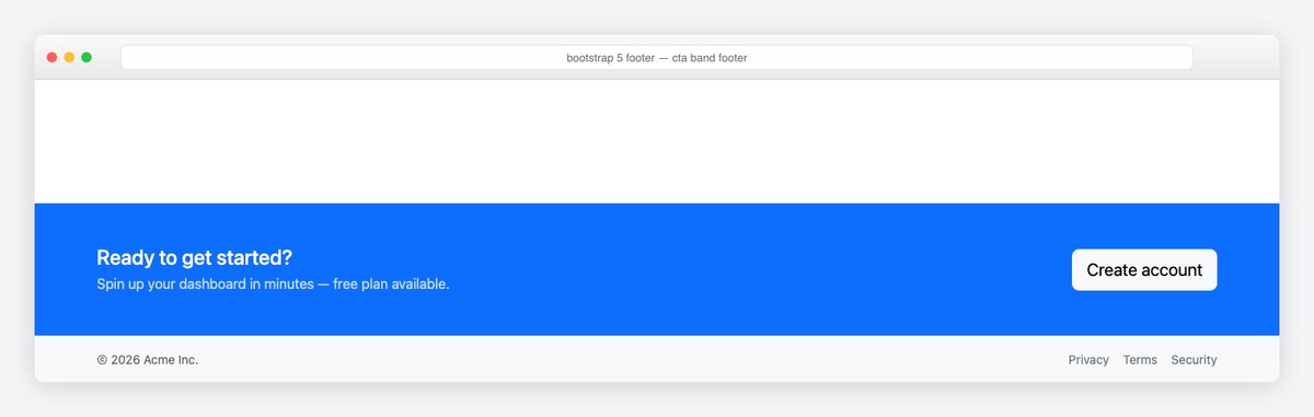
The conversion pattern: a primary-colored call-to-action band riding above the legal strip. Because the CTA band is just a bg-primary section inside , the whole unit stays semantically one footer. Swap bg-primary for a gradient class if your brand runs that way.
<footer class="mt-auto">
<div class="bg-primary text-white py-5">
<div class="container d-flex flex-wrap justify-content-between align-items-center gap-3">
<div>
<h4 class="mb-1">Ready to get started?</h4>
<p class="mb-0 opacity-75">Spin up your dashboard in minutes — free plan available.</p>
</div>
<a href="#" class="btn btn-light btn-lg flex-shrink-0">Create account</a>
</div>
</div>
<div class="bg-body-tertiary py-3 border-top">
<div class="container d-flex justify-content-between small text-body-secondary">
<span>© 2026 Acme Inc.</span>
<div class="d-flex gap-3">
<a class="link-secondary text-decoration-none" href="#">Privacy</a>
<a class="link-secondary text-decoration-none" href="#">Terms</a>
<a class="link-secondary text-decoration-none" href="#">Security</a>
</div>
</div>
</div>
</footer>
8. Minimal SaaS footer with locale picker

The modern minimal footer: single row, status badge (users increasingly expect a system-status signal), legal links, and a locale select. Everything stays on one line down to tablet, then wraps gracefully via flex-wrap.
<footer class="border-top mt-auto py-4">
<div class="container d-flex flex-wrap justify-content-between align-items-center gap-3 small">
<div class="d-flex align-items-center gap-2 text-body-secondary">
<i class="bi bi-box-seam"></i> <span>© 2026 Acme</span>
<span class="badge text-bg-success bg-opacity-75 ms-1"><i class="bi bi-check-circle me-1"></i>All systems normal</span>
</div>
<div class="d-flex align-items-center gap-3">
<a class="link-secondary text-decoration-none" href="#">Privacy</a>
<a class="link-secondary text-decoration-none" href="#">Terms</a>
<select class="form-select form-select-sm w-auto" aria-label="Language">
<option selected>English</option><option>Deutsch</option><option>Español</option>
</select>
</div>
</div>
</footer>
9. Contact info footer
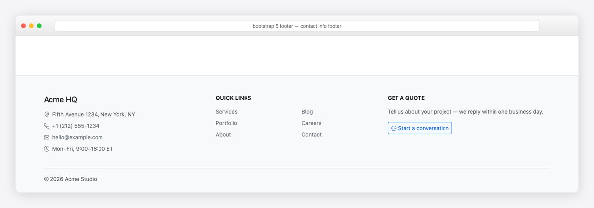
The agency/local-business footer: address, phone, email and hours with Bootstrap Icons, a compact link grid, and a quote CTA. tel: and mailto: links make the contact details tappable on mobile — a detail half the contact footers on the web still miss.
<footer class="bg-body-tertiary border-top mt-auto pt-5 pb-4">
<div class="container">
<div class="row g-4">
<div class="col-lg-4">
<h5 class="mb-3">Acme HQ</h5>
<ul class="list-unstyled small text-body-secondary">
<li class="mb-2"><i class="bi bi-geo-alt me-2"></i>Fifth Avenue 1234, New York, NY</li>
<li class="mb-2"><i class="bi bi-telephone me-2"></i><a class="link-secondary text-decoration-none" href="tel:+12125551234">+1 (212) 555-1234</a></li>
<li class="mb-2"><i class="bi bi-envelope me-2"></i><a class="link-secondary text-decoration-none" href="mailto:[email protected]">[email protected]</a></li>
<li><i class="bi bi-clock me-2"></i>Mon–Fri, 9:00–18:00 ET</li>
</ul>
</div>
<div class="col-lg-4">
<h6 class="text-uppercase small fw-bold mb-3">Quick links</h6>
<div class="row">
<div class="col-6"><ul class="list-unstyled small">
<li class="mb-2"><a class="link-secondary text-decoration-none" href="#">Services</a></li>
<li class="mb-2"><a class="link-secondary text-decoration-none" href="#">Portfolio</a></li>
<li class="mb-2"><a class="link-secondary text-decoration-none" href="#">About</a></li>
</ul></div>
<div class="col-6"><ul class="list-unstyled small">
<li class="mb-2"><a class="link-secondary text-decoration-none" href="#">Blog</a></li>
<li class="mb-2"><a class="link-secondary text-decoration-none" href="#">Careers</a></li>
<li class="mb-2"><a class="link-secondary text-decoration-none" href="#">Contact</a></li>
</ul></div>
</div>
</div>
<div class="col-lg-4">
<h6 class="text-uppercase small fw-bold mb-3">Get a quote</h6>
<p class="small text-body-secondary">Tell us about your project — we reply within one business day.</p>
<a href="#" class="btn btn-outline-primary btn-sm"><i class="bi bi-chat-dots me-1"></i>Start a conversation</a>
</div>
</div>
<div class="border-top pt-3 mt-4 small text-body-secondary">© 2026 Acme Studio</div>
</div>
</footer>
10. App download footer
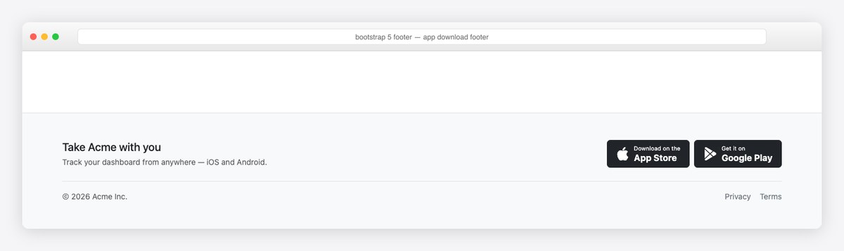
The mobile-app companion footer: hand-built App Store / Google Play buttons from btn btn-dark + Bootstrap Icons — no badge images to license, and they inherit dark mode automatically. flex-shrink-0 keeps the buttons intact when the row wraps.
<footer class="bg-body-tertiary border-top mt-auto py-5">
<div class="container">
<div class="row align-items-center g-4">
<div class="col-lg-6">
<h5 class="mb-1">Take Acme with you</h5>
<p class="text-body-secondary small mb-0">Track your dashboard from anywhere — iOS and Android.</p>
</div>
<div class="col-lg-6 d-flex gap-2 justify-content-lg-end">
<a href="#" class="btn btn-dark d-flex align-items-center gap-2 px-3">
<i class="bi bi-apple fs-4"></i>
<span class="text-start lh-sm"><small class="d-block" style="font-size:.65rem">Download on the</small><strong>App Store</strong></span>
</a>
<a href="#" class="btn btn-dark d-flex align-items-center gap-2 px-3">
<i class="bi bi-google-play fs-4"></i>
<span class="text-start lh-sm"><small class="d-block" style="font-size:.65rem">Get it on</small><strong>Google Play</strong></span>
</a>
</div>
</div>
<div class="border-top pt-3 mt-4 d-flex justify-content-between small text-body-secondary">
<span>© 2026 Acme Inc.</span>
<div class="d-flex gap-3"><a class="link-secondary text-decoration-none" href="#">Privacy</a><a class="link-secondary text-decoration-none" href="#">Terms</a></div>
</div>
</div>
</footer>
11. Gradient brand footer
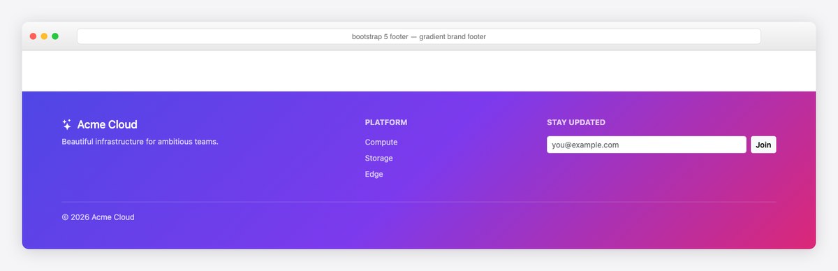
When the brand calls for color: a multi-stop gradient background with link-light + opacity-75 links and a white-on-gradient form. One inline style is the entire custom CSS budget; everything else is utilities. Check contrast — 4.5:1 minimum for the small links.
<footer class="text-white mt-auto py-5" style="background: linear-gradient(135deg, #4f46e5 0%, #7c3aed 50%, #db2777 100%)">
<div class="container">
<div class="row g-4">
<div class="col-lg-5">
<h5 class="mb-2"><i class="bi bi-stars me-2"></i>Acme Cloud</h5>
<p class="small opacity-75 mb-0">Beautiful infrastructure for ambitious teams.</p>
</div>
<div class="col-6 col-lg-3">
<h6 class="text-uppercase small fw-bold mb-3 opacity-75">Platform</h6>
<ul class="list-unstyled small">
<li class="mb-2"><a class="link-light text-decoration-none opacity-75" href="#">Compute</a></li>
<li class="mb-2"><a class="link-light text-decoration-none opacity-75" href="#">Storage</a></li>
<li class="mb-2"><a class="link-light text-decoration-none opacity-75" href="#">Edge</a></li>
</ul>
</div>
<div class="col-6 col-lg-4">
<h6 class="text-uppercase small fw-bold mb-3 opacity-75">Stay updated</h6>
<form class="d-flex gap-2" action="#">
<input type="email" class="form-control form-control-sm" placeholder="[email protected]" aria-label="Email">
<button class="btn btn-light btn-sm flex-shrink-0 fw-semibold" type="submit">Join</button>
</form>
</div>
</div>
<div class="border-top border-white border-opacity-25 pt-3 mt-4 small opacity-75">© 2026 Acme Cloud</div>
</div>
</footer>
12. E-commerce footer with payment icons
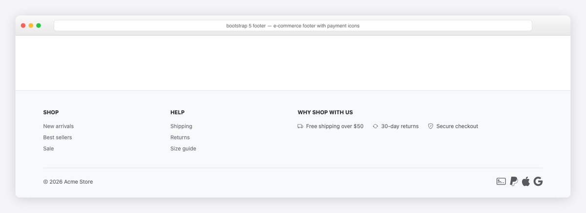
The store footer: shop/help link groups, a trust row (shipping, returns, secure checkout), and payment-method icons with aria-labels. Payment icons signal legitimacy at the exact moment of checkout doubt — keep them monochrome (text-body-secondary) so they don’t fight the CTA.
<footer class="bg-body-tertiary border-top mt-auto pt-5 pb-4">
<div class="container">
<div class="row g-4">
<div class="col-6 col-lg-3">
<h6 class="text-uppercase small fw-bold mb-3">Shop</h6>
<ul class="list-unstyled small">
<li class="mb-2"><a class="link-secondary text-decoration-none" href="#">New arrivals</a></li>
<li class="mb-2"><a class="link-secondary text-decoration-none" href="#">Best sellers</a></li>
<li class="mb-2"><a class="link-secondary text-decoration-none" href="#">Sale</a></li>
</ul>
</div>
<div class="col-6 col-lg-3">
<h6 class="text-uppercase small fw-bold mb-3">Help</h6>
<ul class="list-unstyled small">
<li class="mb-2"><a class="link-secondary text-decoration-none" href="#">Shipping</a></li>
<li class="mb-2"><a class="link-secondary text-decoration-none" href="#">Returns</a></li>
<li class="mb-2"><a class="link-secondary text-decoration-none" href="#">Size guide</a></li>
</ul>
</div>
<div class="col-lg-6">
<h6 class="text-uppercase small fw-bold mb-3">Why shop with us</h6>
<div class="d-flex flex-wrap gap-4 small text-body-secondary">
<span><i class="bi bi-truck me-2"></i>Free shipping over $50</span>
<span><i class="bi bi-arrow-repeat me-2"></i>30-day returns</span>
<span><i class="bi bi-shield-check me-2"></i>Secure checkout</span>
</div>
</div>
</div>
<div class="border-top pt-3 mt-4 d-flex flex-wrap justify-content-between align-items-center gap-2">
<span class="small text-body-secondary">© 2026 Acme Store</span>
<div class="d-flex gap-2 fs-4 text-body-secondary">
<i class="bi bi-credit-card-2-front" aria-label="Credit cards accepted"></i>
<i class="bi bi-paypal" aria-label="PayPal accepted"></i>
<i class="bi bi-apple" aria-label="Apple Pay accepted"></i>
<i class="bi bi-google" aria-label="Google Pay accepted"></i>
</div>
</div>
</div>
</footer>
13. Centered logo footer
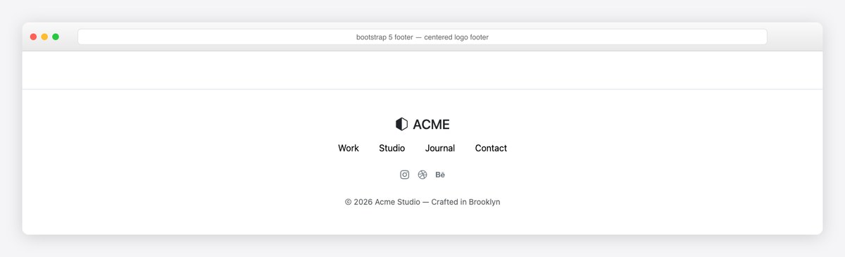
The portfolio/studio pattern: centered wordmark, one nav row, social icons, one-line colophon. link-body-emphasis gives the nav full-contrast links that still adapt to dark mode. Works best when the rest of the page is equally restrained.
<footer class="border-top mt-auto py-5 text-center">
<div class="container">
<h4 class="mb-3"><i class="bi bi-hexagon-half me-2"></i>ACME</h4>
<ul class="list-inline mb-4">
<li class="list-inline-item mx-3"><a class="link-body-emphasis text-decoration-none" href="#">Work</a></li>
<li class="list-inline-item mx-3"><a class="link-body-emphasis text-decoration-none" href="#">Studio</a></li>
<li class="list-inline-item mx-3"><a class="link-body-emphasis text-decoration-none" href="#">Journal</a></li>
<li class="list-inline-item mx-3"><a class="link-body-emphasis text-decoration-none" href="#">Contact</a></li>
</ul>
<div class="d-flex justify-content-center gap-3 mb-4 text-body-secondary">
<a class="link-secondary" href="#" aria-label="Instagram"><i class="bi bi-instagram"></i></a>
<a class="link-secondary" href="#" aria-label="Dribbble"><i class="bi bi-dribbble"></i></a>
<a class="link-secondary" href="#" aria-label="Behance"><i class="bi bi-behance"></i></a>
</div>
<span class="small text-body-secondary">© 2026 Acme Studio — Crafted in Brooklyn</span>
</div>
</footer>
14. Trust-badges footer (two-deck)
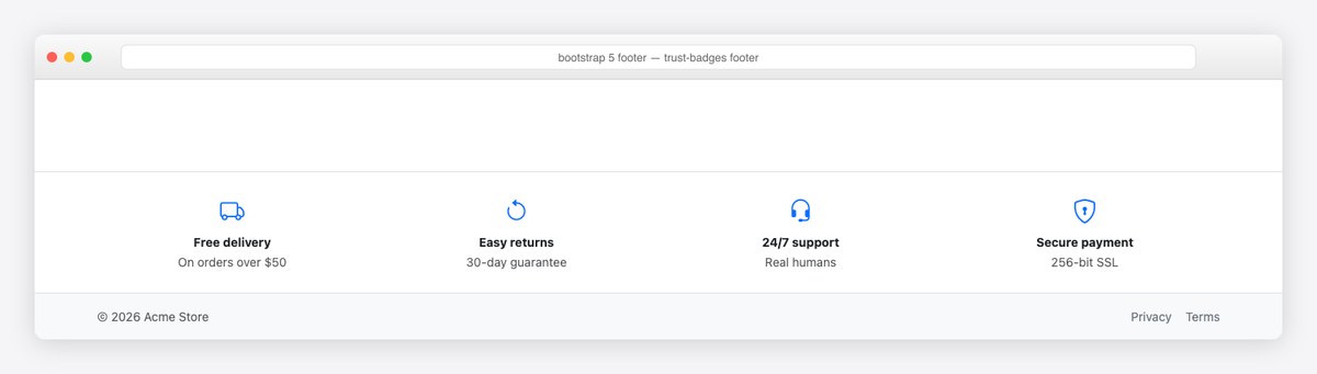
The two-deck conversion footer: a benefits row (free delivery, returns, support, security) above the legal strip. Each badge is icon + bold claim + one-line proof — scannable in a second. E-commerce sites A/B test this pattern for a reason.
<footer class="mt-auto">
<div class="border-top bg-body py-4">
<div class="container">
<div class="row text-center g-3">
<div class="col-6 col-lg-3"><i class="bi bi-truck fs-3 text-primary d-block mb-1"></i><strong class="small d-block">Free delivery</strong><span class="small text-body-secondary">On orders over $50</span></div>
<div class="col-6 col-lg-3"><i class="bi bi-arrow-counterclockwise fs-3 text-primary d-block mb-1"></i><strong class="small d-block">Easy returns</strong><span class="small text-body-secondary">30-day guarantee</span></div>
<div class="col-6 col-lg-3"><i class="bi bi-headset fs-3 text-primary d-block mb-1"></i><strong class="small d-block">24/7 support</strong><span class="small text-body-secondary">Real humans</span></div>
<div class="col-6 col-lg-3"><i class="bi bi-shield-lock fs-3 text-primary d-block mb-1"></i><strong class="small d-block">Secure payment</strong><span class="small text-body-secondary">256-bit SSL</span></div>
</div>
</div>
</div>
<div class="bg-body-tertiary border-top py-3">
<div class="container d-flex justify-content-between small text-body-secondary">
<span>© 2026 Acme Store</span>
<div class="d-flex gap-3"><a class="link-secondary text-decoration-none" href="#">Privacy</a><a class="link-secondary text-decoration-none" href="#">Terms</a></div>
</div>
</div>
</footer>
15. Mobile-accordion footer
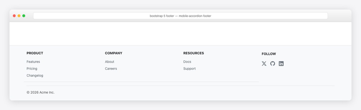
The mobile-space saver: link groups render as open columns on desktop but collapse into tappable accordions on phones — pure Bootstrap Collapse with d-lg-none toggle buttons and collapse d-lg-block lists. No JavaScript of your own; Bootstrap’s bundle handles it.
<!-- Link groups: open columns on desktop, tappable accordions on mobile -->
<footer class="bg-body-tertiary border-top mt-auto pt-4 pb-4">
<div class="container">
<div class="row">
<div class="col-lg-3 py-2 py-lg-0">
<h6 class="m-0">
<button class="btn w-100 text-start d-lg-none d-flex justify-content-between align-items-center px-0 fw-bold small text-uppercase" data-bs-toggle="collapse" data-bs-target="#f-product" aria-expanded="false" aria-controls="f-product">Product <i class="bi bi-chevron-down"></i></button>
<span class="d-none d-lg-block text-uppercase small fw-bold mb-3">Product</span>
</h6>
<ul class="list-unstyled small collapse d-lg-block mt-2" id="f-product">
<li class="mb-2"><a class="link-secondary text-decoration-none" href="#">Features</a></li>
<li class="mb-2"><a class="link-secondary text-decoration-none" href="#">Pricing</a></li>
<li class="mb-2"><a class="link-secondary text-decoration-none" href="#">Changelog</a></li>
</ul>
</div>
<div class="col-lg-3 py-2 py-lg-0">
<h6 class="m-0">
<button class="btn w-100 text-start d-lg-none d-flex justify-content-between align-items-center px-0 fw-bold small text-uppercase" data-bs-toggle="collapse" data-bs-target="#f-company" aria-expanded="false" aria-controls="f-company">Company <i class="bi bi-chevron-down"></i></button>
<span class="d-none d-lg-block text-uppercase small fw-bold mb-3">Company</span>
</h6>
<ul class="list-unstyled small collapse d-lg-block mt-2" id="f-company">
<li class="mb-2"><a class="link-secondary text-decoration-none" href="#">About</a></li>
<li class="mb-2"><a class="link-secondary text-decoration-none" href="#">Careers</a></li>
</ul>
</div>
<div class="col-lg-3 py-2 py-lg-0">
<h6 class="m-0">
<button class="btn w-100 text-start d-lg-none d-flex justify-content-between align-items-center px-0 fw-bold small text-uppercase" data-bs-toggle="collapse" data-bs-target="#f-resources" aria-expanded="false" aria-controls="f-resources">Resources <i class="bi bi-chevron-down"></i></button>
<span class="d-none d-lg-block text-uppercase small fw-bold mb-3">Resources</span>
</h6>
<ul class="list-unstyled small collapse d-lg-block mt-2" id="f-resources">
<li class="mb-2"><a class="link-secondary text-decoration-none" href="#">Docs</a></li>
<li class="mb-2"><a class="link-secondary text-decoration-none" href="#">Support</a></li>
</ul>
</div>
<div class="col-lg-3 py-2 py-lg-0">
<span class="text-uppercase small fw-bold d-block mb-3">Follow</span>
<div class="d-flex gap-3 fs-5">
<a class="link-secondary" href="#" aria-label="X (Twitter)"><i class="bi bi-twitter-x"></i></a>
<a class="link-secondary" href="#" aria-label="GitHub"><i class="bi bi-github"></i></a>
<a class="link-secondary" href="#" aria-label="LinkedIn"><i class="bi bi-linkedin"></i></a>
</div>
</div>
</div>
<div class="border-top pt-3 mt-3 small text-body-secondary">© 2026 Acme Inc.</div>
</div>
</footer>
16. Footer with back-to-top
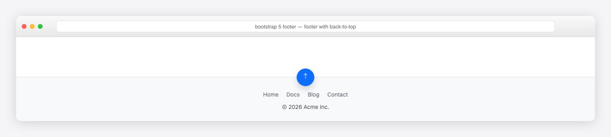
The long-page companion: a floating circular button pinned to the footer’s top edge via position-absolute top-0 start-50 translate-middle. The href="#top" anchor scrolls natively — add scroll-behavior: smooth on html for the easing.
<footer class="bg-body-tertiary border-top mt-auto py-4 position-relative">
<a href="#top" class="btn btn-primary position-absolute top-0 start-50 translate-middle rounded-circle shadow" style="width:44px;height:44px" aria-label="Back to top">
<i class="bi bi-arrow-up"></i>
</a>
<div class="container text-center pt-2">
<ul class="list-inline small mb-2">
<li class="list-inline-item mx-2"><a class="link-secondary text-decoration-none" href="#">Home</a></li>
<li class="list-inline-item mx-2"><a class="link-secondary text-decoration-none" href="#">Docs</a></li>
<li class="list-inline-item mx-2"><a class="link-secondary text-decoration-none" href="#">Blog</a></li>
<li class="list-inline-item mx-2"><a class="link-secondary text-decoration-none" href="#">Contact</a></li>
</ul>
<span class="small text-body-secondary">© 2026 Acme Inc.</span>
</div>
</footer>
17. Blog footer with recent posts
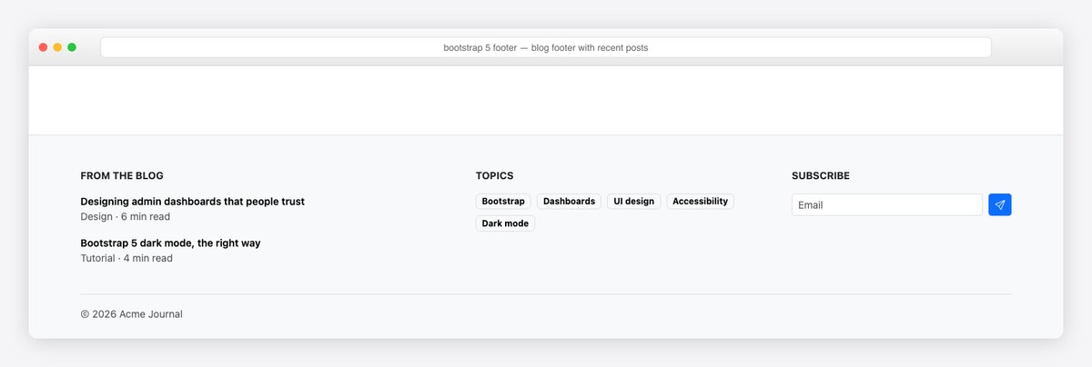
The content-site footer: two recent posts with category/read-time metadata, a tag cloud from badge links, and a compact subscribe form. Recent-post footers keep readers in the loop literally — internal linking that also helps crawlers.
<footer class="bg-body-tertiary border-top mt-auto pt-5 pb-4">
<div class="container">
<div class="row g-4">
<div class="col-lg-5">
<h6 class="text-uppercase small fw-bold mb-3">From the blog</h6>
<ul class="list-unstyled small">
<li class="mb-3">
<a class="link-body-emphasis text-decoration-none fw-semibold" href="#">Designing admin dashboards that people trust</a>
<span class="d-block text-body-secondary">Design · 6 min read</span>
</li>
<li class="mb-3">
<a class="link-body-emphasis text-decoration-none fw-semibold" href="#">Bootstrap 5 dark mode, the right way</a>
<span class="d-block text-body-secondary">Tutorial · 4 min read</span>
</li>
</ul>
</div>
<div class="col-lg-4">
<h6 class="text-uppercase small fw-bold mb-3">Topics</h6>
<div class="d-flex flex-wrap gap-2">
<a href="#" class="badge text-bg-light border text-decoration-none">Bootstrap</a>
<a href="#" class="badge text-bg-light border text-decoration-none">Dashboards</a>
<a href="#" class="badge text-bg-light border text-decoration-none">UI design</a>
<a href="#" class="badge text-bg-light border text-decoration-none">Accessibility</a>
<a href="#" class="badge text-bg-light border text-decoration-none">Dark mode</a>
</div>
</div>
<div class="col-lg-3">
<h6 class="text-uppercase small fw-bold mb-3">Subscribe</h6>
<form class="d-flex gap-2" action="#">
<input type="email" class="form-control form-control-sm" placeholder="Email" aria-label="Email">
<button class="btn btn-primary btn-sm" type="submit"><i class="bi bi-send"></i></button>
</form>
</div>
</div>
<div class="border-top pt-3 mt-4 small text-body-secondary">© 2026 Acme Journal</div>
</div>
</footer>
18. International footer (language + currency)

The global-product footer: legal links left, language and currency selects right, one row. Wire the selects to your i18n router; the markup stays this small. The bi-globe2 label keeps the language control recognizable at any width.
<footer class="border-top mt-auto py-4 bg-body">
<div class="container d-flex flex-wrap justify-content-between align-items-center gap-3 small">
<div class="d-flex align-items-center gap-3">
<span class="text-body-secondary">© 2026 Acme Global</span>
<a class="link-secondary text-decoration-none" href="#">Privacy</a>
<a class="link-secondary text-decoration-none" href="#">Terms</a>
<a class="link-secondary text-decoration-none" href="#">Cookies</a>
</div>
<div class="d-flex align-items-center gap-2">
<label class="text-body-secondary" for="f-lang"><i class="bi bi-globe2 me-1"></i></label>
<select class="form-select form-select-sm w-auto" id="f-lang" aria-label="Language">
<option selected>English (US)</option><option>Deutsch</option><option>Français</option><option>日本語</option>
</select>
<select class="form-select form-select-sm w-auto" aria-label="Currency">
<option selected>USD $</option><option>EUR €</option><option>GBP £</option>
</select>
</div>
</div>
</footer>
Footer patterns worth knowing
- Dark-mode-proof colors: use
bg-body,bg-body-tertiary,text-body-secondary, andlink-secondary— they re-map underdata-bs-theme="dark"; hard-codedbg-light/text-muteddon’t adapt as cleanly. - The sticky-footer answer is flexbox, not
position: fixed— fixed footers cover content on small screens and break with dynamic keyboards on mobile. - One
<footer>landmark per page. Screen readers list landmarks; a footer inside every card dilutes the signal. Use plain<div>s for card footers. - Icon links need names: every icon-only social link gets
aria-label; every decorative icon gets nothing (Bootstrap Icons render fine for screen readers when labeled at the link level). - Keep the legal strip separate from navigation — a bordered sub-row (examples 2, 3, 7) reads instantly and survives translation-induced text growth.
Prefer a ready-made footer? Download a full template
Not in the mood to wire up markup? These free Bootstrap footer templates from Colorlib ship as complete, downloadable files — grab one, drop in your content, and go. Every example above is copy-paste code; the set below is finished templates.
Bootstrap Footer V18 Live Preview Free Download
Bootstrap Footer V20 Live Preview Free Download
Bootstrap Footer V16 Live Preview Free Download
Bootstrap Footer V14 Live Preview Free Download
Bootstrap Footer V12 Live Preview Free Download
Bootstrap Footer V10 Live Preview Free Download
Bootstrap Footer V08 Live Preview Free Download
Bootstrap Footer V06 Live Preview Free Download
Frequently asked questions
Does Bootstrap have a footer component?
No — Bootstrap deliberately ships no footer component; footers are composed from the grid, flex utilities, and color tokens. That’s good news: the 18 examples above are pure Bootstrap 5.3 utility markup you can paste and restyle without fighting component CSS.
How do I keep the footer at the bottom of the page in Bootstrap?
Use the flexbox pattern: d-flex flex-column min-vh-100 on the body, flex-grow-1 on your main content (or mt-auto on the footer). The footer sits at the viewport bottom on short pages and flows naturally after content on long ones — no fixed positioning needed.
How do I make a Bootstrap footer dark?
Scope Bootstrap’s dark theme to the footer: add data-bs-theme=”dark” to the footer element and use body/token-based colors inside. Every Bootstrap color token re-maps automatically — no custom dark CSS.
Are these footers responsive?
Yes — the multi-column example collapses from five columns to two on phones via col-6 col-lg-2, and the single-row footers wrap with flex-wrap. Everything here is mobile-first standard Bootstrap grid behavior.
Can I use these footers in an admin dashboard?
Example 6 is exactly that — the slim AdminLTE-style admin footer. If you’re on the official AdminLTE React or Angular libraries, the dashboard layout component provides a footer slot where this markup drops in directly.
More Bootstrap building blocks: our guides to Bootstrap dashboard examples and free Bootstrap 5 templates — or the full admin shells in free admin panels and the AdminLTE customization guide.

You Might Also Like


