How to Build an Admin Dashboard with shadcn/ui and Next.js (2026 Guide)
Building an admin dashboard from scratch used to mean weeks of work on layout, navigation, data tables, and form components. With shadcn/ui and Next.js, you can scaffold a production-ready admin panel in hours — with accessible components, server-side rendering, and type safety built in.
This guide walks you through the key decisions, architecture patterns, and tools for building an admin dashboard with shadcn/ui and Next.js in 2026. Whether you’re starting from a template or building custom, these are the patterns that work in production. For ready-made options, browse our curated list of shadcn/ui templates that implement many of these patterns out of the box.
Why shadcn/ui + Next.js?
This stack has become the default choice for new React admin dashboards in 2026, and for good reason:
- You own the component code. shadcn/ui copies components into your project as local TypeScript files. No dependency version conflicts, no fighting library opinions, no breaking changes on upgrade.
- Radix UI accessibility. Every shadcn component is built on Radix UI primitives with WAI-ARIA compliance, keyboard navigation, and focus management — critical for enterprise admin tools.
- Next.js App Router. Server Components reduce client-side JavaScript, middleware handles auth and permissions, and the file-based routing maps naturally to admin panel pages.
- Tailwind CSS styling. Utility classes mean fast iteration without CSS-in-JS runtime overhead. Theme customization via CSS variables.
Step 1: Project Setup
The fastest way to start is with the shadcn CLI:
npx create-next-app@latest my-admin --typescript --tailwind --eslint --app --src-dir
cd my-admin
npx shadcn@latest init
The shadcn init command configures Tailwind CSS, adds a components.json file, and sets up the lib/utils.ts helper with the cn() function for merging class names. Choose the “Default” style and your preferred base color.
Then add the components you’ll need for a dashboard:
npx shadcn@latest add sidebar navigation-menu table card chart button input dialog sheet command dropdown-menu avatar badge separator
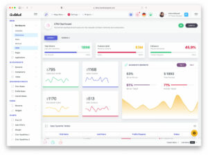
Step 2: Dashboard Layout Architecture
The standard admin dashboard layout uses Next.js nested layouts with a sidebar + main content area:
app/
├── (auth)/
│   ├── login/page.tsx
│   └── layout.tsx          # No sidebar
├── (dashboard)/
│   ├── layout.tsx          # Sidebar + header
│   ├── page.tsx            # Main dashboard
│   ├── users/page.tsx
│   ├── settings/page.tsx
│   └── analytics/page.tsx
└── layout.tsx              # Root layout
The route group (dashboard) shares a layout with a collapsible sidebar, while (auth) uses a centered layout without navigation. This pattern avoids layout flash when navigating between dashboard pages.
shadcn/ui’s Sidebar component (added in late 2024) provides a production-ready collapsible sidebar with mobile sheet fallback, keyboard shortcuts, and persistent state via cookies. Use it instead of building your own:
// app/(dashboard)/layout.tsx
import { SidebarProvider, SidebarTrigger } from "@/components/ui/sidebar"
import { AppSidebar } from "@/components/app-sidebar"

export default function DashboardLayout({ children }) {
  return (
    <SidebarProvider>
      <AppSidebar />
      <main className="flex-1">
        <SidebarTrigger />
        {children}
      </main>
    </SidebarProvider>
  )
}
Step 3: Data Tables with TanStack Table
The shadcn DataTable component wraps TanStack Table v8 with proper TypeScript generics. For admin dashboards, you’ll want server-side pagination, sorting, and filtering:
// Define columns with type safety
const columns: ColumnDef<User>[] = [
  { accessorKey: "name", header: "Name" },
  { accessorKey: "email", header: "Email" },
  { accessorKey: "role", header: "Role",
    cell: ({ row }) => <Badge>{row.getValue("role")}</Badge>
  },
  { id: "actions",
    cell: ({ row }) => <UserActions user={row.original} />
  },
]
For server-side operations, use searchParams in your page component to pass pagination and filter state to your database query. This keeps the URL bookmarkable and shareable — essential for admin tools where users share links to filtered views.
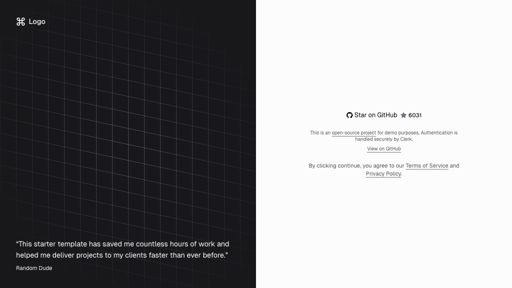
Step 4: Authentication & Authorization
Admin dashboards need auth with role-based access. The three most popular options in the shadcn/Next.js ecosystem:
| Solution | Type | Best For |
|---|---|---|
| Clerk | Hosted service | Fastest setup, organizations, RBAC, SSO |
| Auth.js (NextAuth) | Self-hosted library | Full control, multiple OAuth providers, JWT/DB sessions |
| Better Auth | Self-hosted library | New alternative to Auth.js with simpler API, 2FA, passkeys |
For most admin dashboards, Clerk gets you to production fastest — organizations, role management, impersonation, and audit logs are built in. For self-hosted requirements (HIPAA, data residency), Auth.js or Better Auth give you full control.
Protect routes using Next.js middleware:
// middleware.ts
import { clerkMiddleware, createRouteMatcher } from '@clerk/nextjs/server'

const isProtectedRoute = createRouteMatcher(['/dashboard(.*)'])

export default clerkMiddleware(async (auth, req) => {
  if (isProtectedRoute(req)) await auth.protect()
})
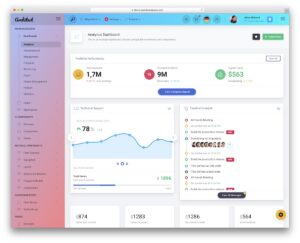
Step 5: Charts & Data Visualization
shadcn/ui includes a Chart component built on Recharts. For admin dashboards, combine it with Card components for KPI displays:
<div className="grid gap-4 md:grid-cols-2 lg:grid-cols-4">
  <Card>
    <CardHeader>
      <CardTitle>Total Revenue</CardTitle>
    </CardHeader>
    <CardContent>
      <div className="text-2xl font-bold">$45,231</div>
      <p className="text-muted-foreground">+20.1% from last month</p>
    </CardContent>
  </Card>
  {/* More KPI cards */}
</div>

<ChartContainer config={chartConfig}>
  <BarChart data={revenueData}>
    <Bar dataKey="revenue" fill="var(--color-revenue)" />
  </BarChart>
</ChartContainer>
For more advanced visualizations (real-time charts, complex dashboards), consider Tremor — a dashboard-focused component library built on the same Radix + Tailwind foundation as shadcn/ui.
Step 6: Command Palette (Cmd+K)
The Command component (based on cmdk) gives your admin panel a Spotlight-style search. Users can navigate between pages, search users, and trigger actions without reaching for the mouse:
npx shadcn@latest add command dialogWire it to Cmd+K / Ctrl+K with a global keyboard listener. Populate the command list with your admin routes and searchable entities. This single feature dramatically improves admin dashboard usability for power users.
Step 7: Dark Mode & Theming
shadcn/ui uses CSS variables for theming. Add next-themes for dark mode toggle:
npm install next-themesWrap your root layout with ThemeProvider and add a toggle button. All shadcn components automatically adapt to dark mode through the CSS variables defined in your globals.css. Custom colors can be changed by modifying the HSL values in the :root and .dark selectors.
Skip the Setup: Use a Template
If building from scratch isn’t the right call for your timeline, these templates implement everything above:
- next-shadcn-dashboard-starter (6,000+ stars) — Free. Next.js 16, Clerk auth, TanStack Tables, kanban, 6+ themes, RBAC. The most popular option.
- DashboardPack Zenith — Premium. Achromatic design, 50+ pages, 6 dashboard variants. Also available as Laravel 13 + Inertia.js.
- DashboardPack Apex — Premium. Comprehensive component library, dark/light themes. Laravel version includes Spatie permissions.
- next-forge (6,900+ stars) — Free. Full monorepo with app, docs, email, API, and Storybook. Opinionated but production-ready.
All of these templates use the same shadcn/ui + Next.js + Tailwind CSS foundation described in this guide. For a broader selection, see our full roundup of Next.js admin templates including options beyond shadcn/ui. The patterns are interchangeable — learn them once and you can work with any shadcn-based dashboard.
Production Checklist
Before shipping your shadcn/ui admin dashboard (and if you’re still evaluating options, our guide on how to choose an admin dashboard template can help narrow your decision):
- Middleware auth protection — Every dashboard route must require authentication.
- Role-based access — Different roles see different navigation items and have different permissions.
- Loading states — Use React Suspense boundaries and shadcn Skeleton components for server-fetched data.
- Error boundaries — Add
error.tsxfiles in route segments to catch and display errors gracefully. - Responsive design — The sidebar should collapse to a sheet on mobile. Test at 768px breakpoint.
- Keyboard navigation — Tab order, focus management, and the command palette should work without a mouse.
- Audit logging — Track who changed what and when. Use middleware or database triggers.
You Might Also Like