AdminLTE 4 Modals: Bootstrap 5 Markup, Variants, Form and Confirm Dialogs
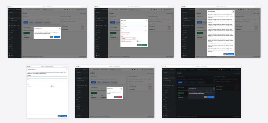
AdminLTE 4 has no modal component of its own — and that is the good news. Modals are plain Bootstrap 5.3, so the markup is the one in Bootstrap’s docs, the JavaScript is bootstrap.Modal, and nothing depends on jQuery any more. This guide shows the base markup inside an AdminLTE 4 page, the four variants you will actually use in an admin (centered, scrollable, fullscreen on small screens, static backdrop), a form modal with validation that closes itself on a valid submit, and a confirm-delete dialog opened from JavaScript. Every screenshot is a real page built on the v4 starter template.
What changed from AdminLTE 3
If you are porting v3 pages, the modal-related changes are all Bootstrap 4-to-5 changes:
| AdminLTE 3 (Bootstrap 4) | AdminLTE 4 (Bootstrap 5.3) |
|---|---|
data-toggle="modal" data-target="#id" | data-bs-toggle="modal" data-bs-target="#id" |
data-dismiss="modal" | data-bs-dismiss="modal" |
$('#id').modal('show') | bootstrap.Modal.getOrCreateInstance('#id').show() |
<button class="close">×</button> | <button class="btn-close" aria-label="Close"></button> |
.modal-header .close floated right | Flexbox header — no float, no × entity |
$(el).on('shown.bs.modal') | el.addEventListener('shown.bs.modal', …) |
Everything else — .modal-dialog, .modal-content, the header/body/footer split, the size classes — is unchanged. Bootstrap’s script is already on the page: the AdminLTE 4 install guide loads Popper, then bootstrap.min.js, then adminlte.min.js, and that order is all a modal needs.
Step 1: the base modal inside an AdminLTE 4 page
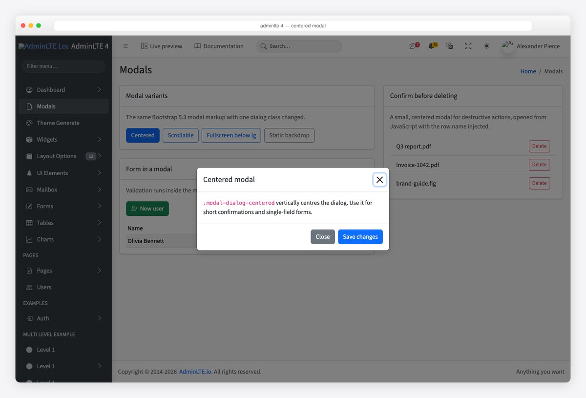
Put the trigger button wherever it belongs — in a card, a toolbar, a table row — and the modal itself at the end of .app-content or just before the closing body tag, outside any element with position: fixed or a transform. Here is the centered modal from the screenshot above:
<!-- Trigger -->
<button type="button" class="btn btn-primary" data-bs-toggle="modal" data-bs-target="#modalCentered">
  Centered
</button>

<!-- Modal -->
<div class="modal fade" id="modalCentered" tabindex="-1" aria-labelledby="modalCenteredLabel" aria-hidden="true">
  <div class="modal-dialog modal-dialog-centered">
    <div class="modal-content">
      <div class="modal-header">
        <h1 class="modal-title fs-5" id="modalCenteredLabel">Centered modal</h1>
        <button type="button" class="btn-close" data-bs-dismiss="modal" aria-label="Close"></button>
      </div>
      <div class="modal-body">
        <p class="mb-0"><code>.modal-dialog-centered</code> vertically centres the dialog.</p>
      </div>
      <div class="modal-footer">
        <button type="button" class="btn btn-secondary" data-bs-dismiss="modal">Close</button>
        <button type="button" class="btn btn-primary">Save changes</button>
      </div>
    </div>
  </div>
</div>
Three details matter in an admin template. The fs-5 on the title keeps an h1 at a sensible size — using a real heading is what screen readers announce when the dialog opens. tabindex="-1" lets Bootstrap move focus into the modal. And the modal sits outside .app-sidebar and .app-header, which are fixed-position containers that would otherwise clip the backdrop.
Step 2: the four variants an admin UI needs
One dialog class changes the behaviour; the content markup stays the same.
Scrollable body for long forms
.modal-dialog-scrollable scrolls the body instead of the page, so the header and the Save button stay put while the user works through a long form or a log.
<div class="modal-dialog modal-dialog-scrollable">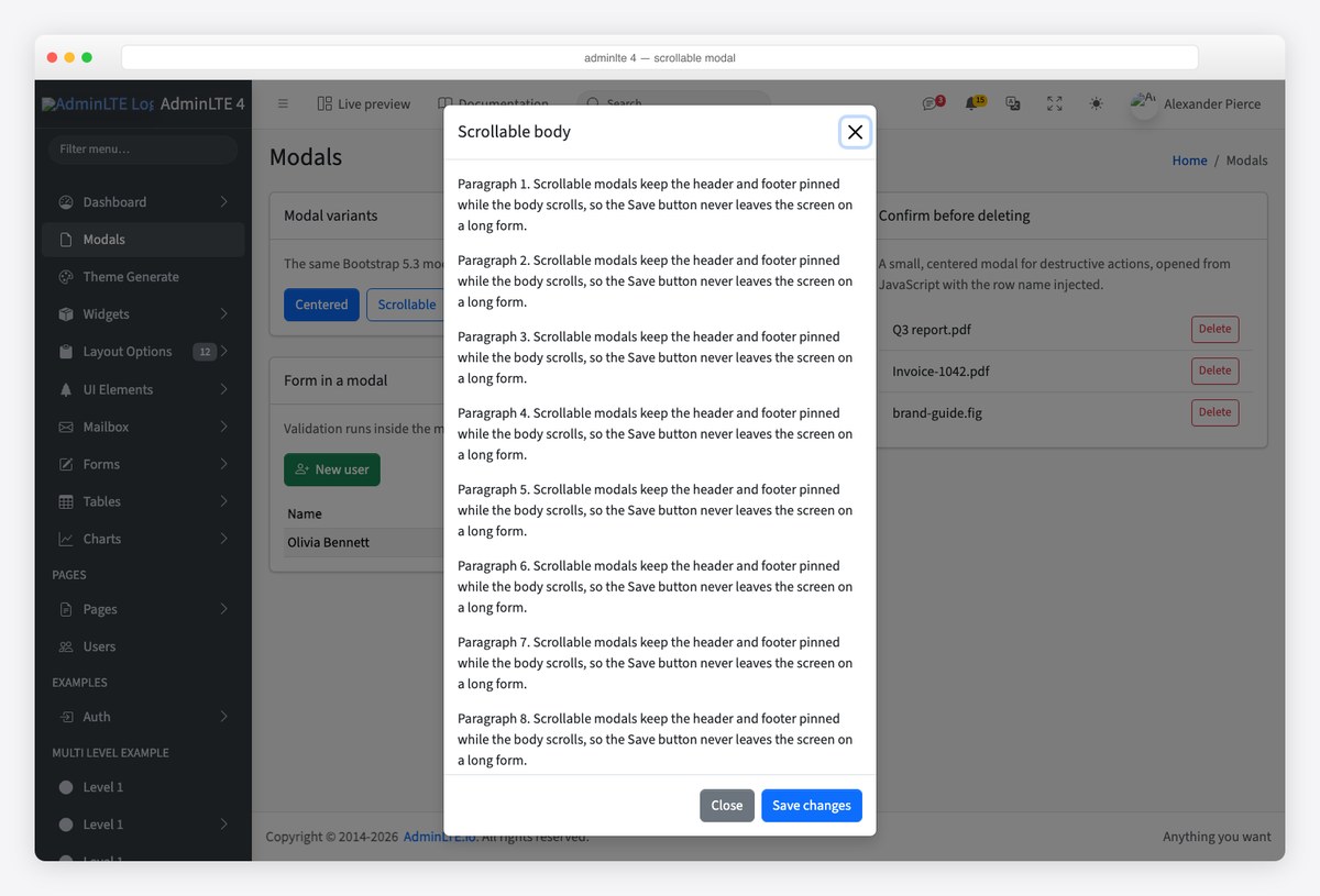
Fullscreen on phones and tablets
.modal-fullscreen-lg-down fills the screen below the lg breakpoint and falls back to a normal dialog on desktop — the right default for dense admin forms that are painful in a 500px box on a phone. The other breakpoints (-sm-down through -xxl-down) and the unconditional .modal-fullscreen exist too.
<div class="modal-dialog modal-fullscreen-lg-down">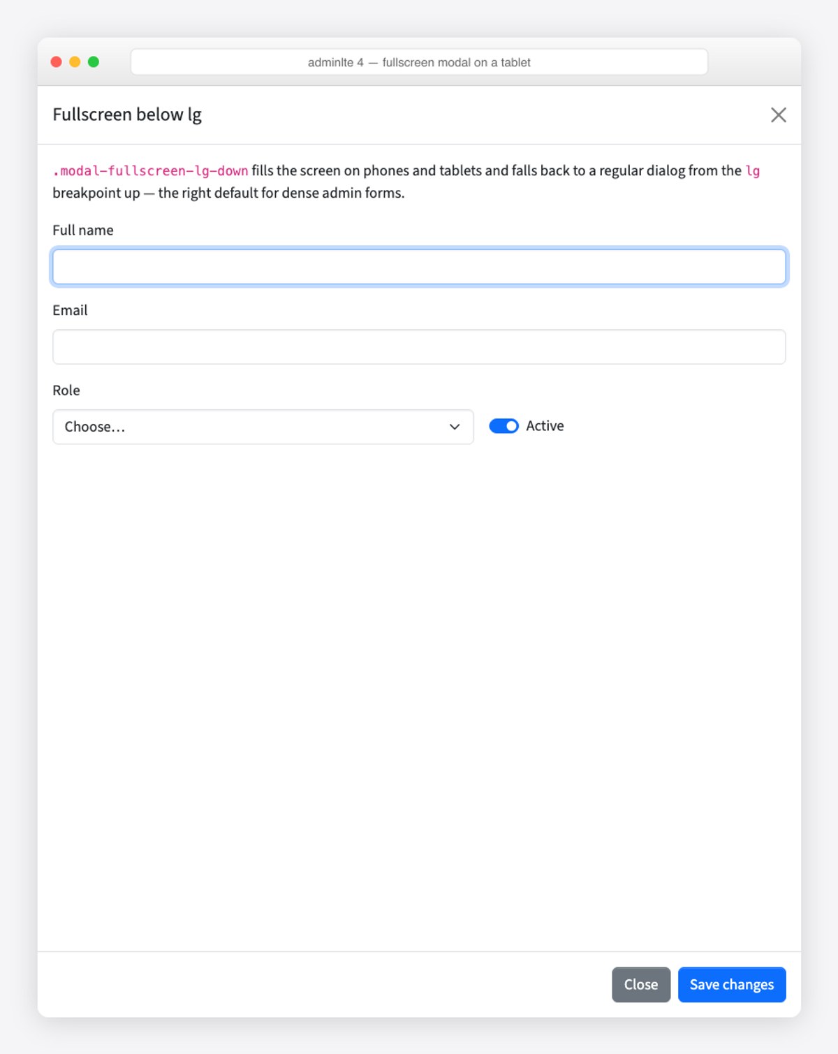
Static backdrop for unsaved work
Two data attributes on the modal element stop it closing on a backdrop click or the Escape key, so the only way out is a button you control:
<div class="modal fade" id="modalStatic" data-bs-backdrop="static" data-bs-keyboard="false" tabindex="-1" …>Sizes
Add .modal-sm, .modal-lg or .modal-xl next to .modal-dialog. Small is for confirmations, extra-large for embedded tables or previews; the default width suits most forms.
Step 3: a form inside a modal, with validation
The pattern every admin needs: a “New user” button opens a form, invalid input shows Bootstrap’s validation states without closing the dialog, and a valid submit closes it and updates the page. Put the form inside .modal-body and give it an id, so the submit button can live in the footer and reference it with the form attribute:
<div class="modal fade" id="modalNewUser" tabindex="-1" aria-labelledby="modalNewUserLabel" aria-hidden="true">
  <div class="modal-dialog modal-dialog-centered">
    <div class="modal-content">
      <div class="modal-header">
        <h1 class="modal-title fs-5" id="modalNewUserLabel">New user</h1>
        <button type="button" class="btn-close" data-bs-dismiss="modal" aria-label="Close"></button>
      </div>
      <div class="modal-body">
        <form id="new-user-form" class="needs-validation" novalidate>
          <div class="mb-3">
            <label for="nu-name" class="form-label">Full name</label>
            <input type="text" class="form-control" id="nu-name" required autofocus>
            <div class="invalid-feedback">Please enter a name.</div>
          </div>
          <div class="mb-3">
            <label for="nu-email" class="form-label">Email</label>
            <input type="email" class="form-control" id="nu-email" required>
            <div class="invalid-feedback">Enter a valid email address.</div>
          </div>
          <div class="row g-3">
            <div class="col-sm-7">
              <label for="nu-role" class="form-label">Role</label>
              <select class="form-select" id="nu-role" required>
                <option value="">Choose…</option>
                <option>Admin</option><option>Editor</option><option>Viewer</option>
              </select>
              <div class="invalid-feedback">Pick a role.</div>
            </div>
            <div class="col-sm-5 d-flex align-items-end">
              <div class="form-check form-switch mb-2">
                <input class="form-check-input" type="checkbox" role="switch" id="nu-active" checked>
                <label class="form-check-label" for="nu-active">Active</label>
              </div>
            </div>
          </div>
        </form>
      </div>
      <div class="modal-footer">
        <button type="button" class="btn btn-secondary" data-bs-dismiss="modal">Cancel</button>
        <button type="submit" form="new-user-form" class="btn btn-success">Create user</button>
      </div>
    </div>
  </div>
</div>
The JavaScript intercepts the submit, adds was-validated so Bootstrap shows the feedback messages, and only closes the modal when checkValidity() passes. Resetting the form on hidden.bs.modal means the next open starts clean:
const newUser = document.getElementById('modalNewUser');
const form = document.getElementById('new-user-form');

form.addEventListener('submit', (e) => {
  e.preventDefault();
  form.classList.add('was-validated');
  if (!form.checkValidity()) return;          // invalid: stay open, feedback is visible

  const name = form.querySelector('#nu-name').value;
  const email = form.querySelector('#nu-email').value;
  const role = form.querySelector('#nu-role').value;
  const active = form.querySelector('#nu-active').checked;
  document.querySelector('#users-added tbody').insertAdjacentHTML('afterbegin',
    '<tr><td>' + name + '</td><td>' + email + '</td><td>' + role + '</td>' +
    '<td><span class="badge text-bg-' + (active ? 'success' : 'secondary') + '">' +
    (active ? 'Active' : 'Inactive') + '</span></td></tr>');

  bootstrap.Modal.getInstance(newUser).hide();  // valid: close it
});

// Start clean next time
newUser.addEventListener('hidden.bs.modal', () => {
  form.reset();
  form.classList.remove('was-validated');
});

// Focus the first [autofocus] field every time any modal opens
document.addEventListener('shown.bs.modal', (e) => e.target.querySelector('[autofocus]')?.focus());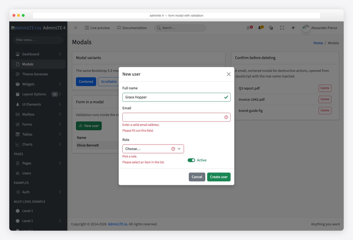
In a real app the submit handler posts to your API and adds the row from the response; the structure stays the same. If the request fails, leave the modal open and show the error inside .modal-body — closing on failure is the most common modal UX mistake in admin panels.
Step 4: a confirm dialog opened from JavaScript
Destructive actions should not use a data-attribute trigger, because you need to inject the record’s name and remember which row to act on. Create one small modal, get its instance once with getOrCreateInstance, and open it from your click handlers:
<div class="modal fade" id="modalDelete" tabindex="-1" aria-labelledby="modalDeleteLabel" aria-hidden="true">
  <div class="modal-dialog modal-dialog-centered modal-sm">
    <div class="modal-content">
      <div class="modal-header">
        <h1 class="modal-title fs-5" id="modalDeleteLabel">Delete file?</h1>
        <button type="button" class="btn-close" data-bs-dismiss="modal" aria-label="Close"></button>
      </div>
      <div class="modal-body">
        <p class="mb-0">Delete <strong id="delete-name">this file</strong>? This cannot be undone.</p>
      </div>
      <div class="modal-footer">
        <button type="button" class="btn btn-secondary" data-bs-dismiss="modal">Cancel</button>
        <button type="button" class="btn btn-danger" id="confirm-delete">Delete</button>
      </div>
    </div>
  </div>
</div>
const del = bootstrap.Modal.getOrCreateInstance('#modalDelete');
let pending = null;
document.querySelectorAll('.js-delete').forEach((btn) => {
btn.addEventListener('click', () => {
pending = btn.closest('li'); // remember the row
document.getElementById('delete-name').textContent = btn.dataset.name;
del.show();
});
});
document.getElementById('confirm-delete').addEventListener('click', () => {
pending?.remove(); // or: await fetch(...) then remove
del.hide();
});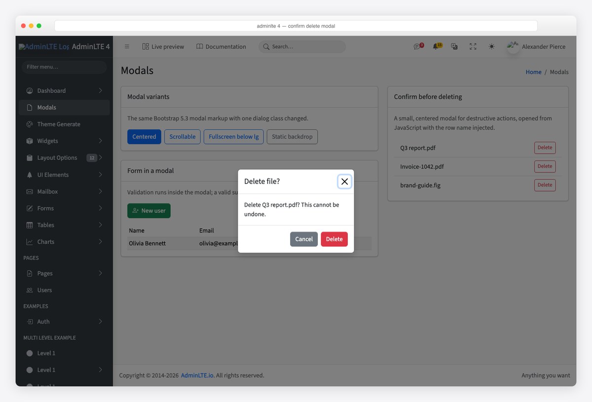
getOrCreateInstance accepts a selector string or an element and returns the same instance on every call, so you never end up with two Bootstrap objects fighting over one modal — the usual cause of a dialog that opens once and then refuses to close.
Step 5: events, dark mode and stacking
- Events:
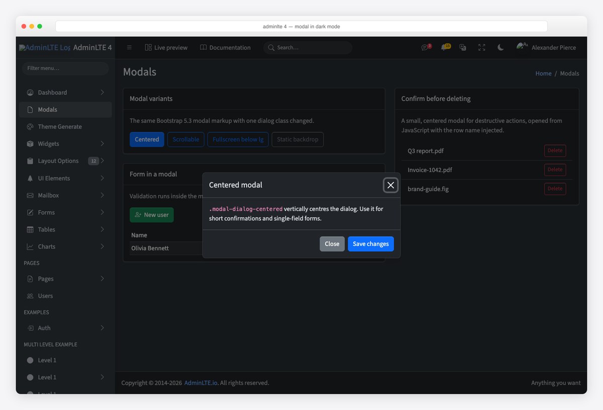
show.bs.modal,shown.bs.modal,hide.bs.modal,hidden.bs.modalfire on the modal element.show.bs.modalalso exposesevent.relatedTarget— the button that opened it — which is the cleanest way to pass a row’s data into a shared edit modal. - Dark mode: nothing to do. Modals read Bootstrap’s colour-mode variables, so with
data-bs-theme="dark"on the root element the dialog, backdrop and close button switch with the page. - Stacking: Bootstrap supports one modal at a time. If a flow needs a second step, swap the content of one modal or close the first on
hidden.bs.modaland open the second — nested modals are not supported. - Toasts instead: for a “saved” confirmation that needs no decision, use a Bootstrap toast, not a modal. Modals interrupt; toasts inform.
Where modals live in the AdminLTE 4 demo
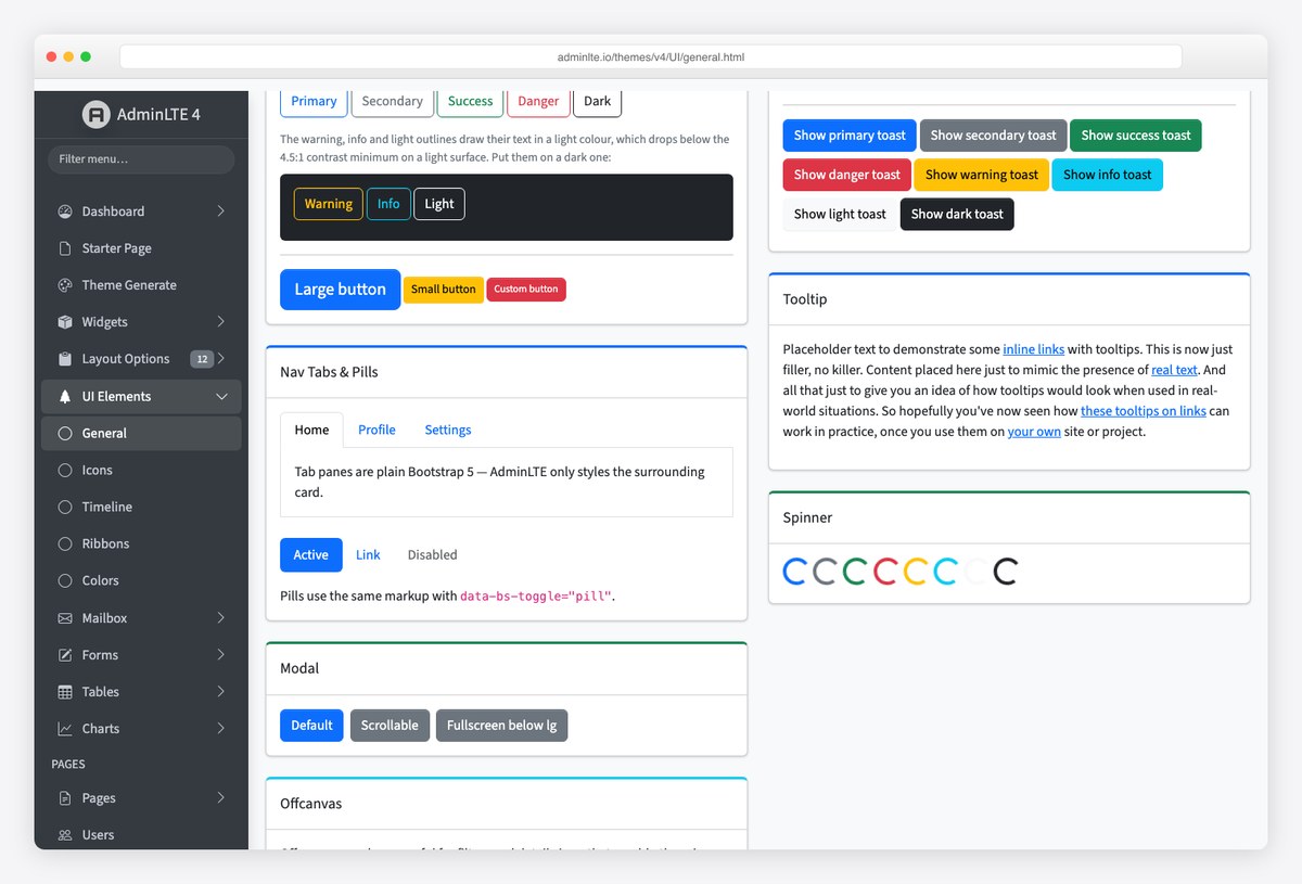
The General UI Elements page has a Modal card with the centered, scrollable and fullscreen-below-lg variants, next to the toasts, tooltips and spinners you will combine them with. View its source for the exact markup the template ships.
Frequently asked questions
How do I open a modal in AdminLTE 4?
Either with a button carrying data-bs-toggle=”modal” and data-bs-target=”#yourModalId”, or from JavaScript with bootstrap.Modal.getOrCreateInstance(‘#yourModalId’).show(). Both need Bootstrap 5’s JavaScript on the page, which AdminLTE 4’s standard setup already loads before adminlte.min.js.
Why does my modal not open in AdminLTE 4?
Nine times out of ten it is a Bootstrap 4 attribute: data-toggle and data-target must become data-bs-toggle and data-bs-target in Bootstrap 5. Next, check that bootstrap.min.js (or bootstrap.bundle.min.js) loads before your own script, and that the modal element is not inside the sidebar or header, which are fixed containers.
Does AdminLTE 4 need jQuery for modals?
No. AdminLTE 4 and Bootstrap 5 are both jQuery-free. Use the bootstrap.Modal class, addEventListener for the modal events, and querySelector for the elements — the examples in this guide use nothing else.
How do I put a form inside a modal and validate it?
Place the form in .modal-body with an id, reference it from a footer submit button via the form attribute, and handle the submit event: call preventDefault, add the was-validated class, return if checkValidity() fails, otherwise save and call the modal instance’s hide(). Reset the form on hidden.bs.modal.
Can I open one modal from another?
Bootstrap 5 does not support nested modals. Close the first on hidden.bs.modal and open the second, or swap the content of a single modal between steps.
How do I make a modal full screen on mobile only?
Use .modal-fullscreen-lg-down (or another breakpoint suffix) on .modal-dialog. The modal fills the screen below that breakpoint and behaves as a normal dialog above it.
Next: put a data table behind those buttons with the install guide as your base page, and see how the official wrappers expose the same modals as components in our React and Angular guides.

You Might Also Like