
How to Install AdminLTE 4: CDN, npm, Composer and Source Build

AdminLTE 4 is an HTML template, not a framework, so “installing” it means getting three CSS files and four scripts onto a page in the right order. This guide walks the four official paths — CDN tags, npm with a bundler, Composer for PHP projects, and building from source when you need to change SCSS variables — then shows you the layout classes and colour-mode switch you will touch on day one. Everything here is AdminLTE 4 on Bootstrap 5.3 with no jQuery; if you are still on v3, the migration guide covers the class renames first.
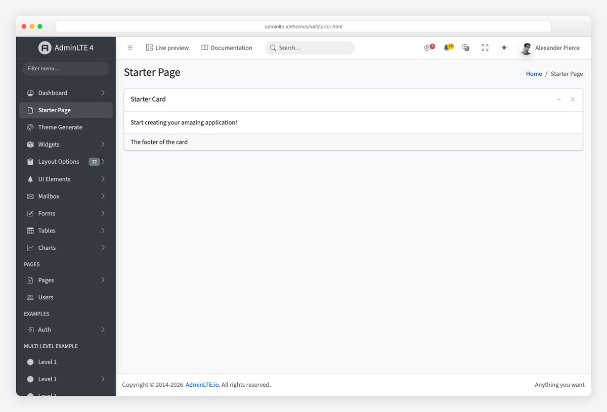
Which install path do you need?
| Path | Best for | What you get |
|---|---|---|
| 1. CDN tags | Prototypes, demos, server-rendered apps with no build step | A working page in about ten minutes, no install |
| 2. npm + bundler | Vite, webpack, Laravel Mix, Rails, any JavaScript build | Versioned dependency, tree-shaken CSS, one import line |
| 3. Composer | PHP projects that prefer Packagist over npm | The same dist folder under vendor/ |
| 4. Build from source | Changing SCSS variables, sidebar width, breakpoints | Dev server with hot reload, custom production build |
Whichever path you pick, the runtime is identical: Bootstrap 5.3, Popper, OverlayScrollbars (for the sidebar scrollbar), Bootstrap Icons and AdminLTE’s own CSS and JS. The template’s JavaScript only handles the layout — sidebar push, treeview, card collapse, fullscreen, colour mode — everything else (modals, dropdowns, tooltips) is plain Bootstrap.
Path 1: CDN tags (a working dashboard in ten minutes)
Create an empty HTML file and paste the official Getting Started snippets. Three stylesheets go in the head, four scripts before the closing body tag, in this order — Popper before Bootstrap, and AdminLTE last so its layout code finds Bootstrap ready:
<!-- In <head> -->
<link rel="stylesheet" href="https://cdn.jsdelivr.net/npm/[email protected]/font/bootstrap-icons.min.css" />
<link rel="stylesheet" href="https://cdn.jsdelivr.net/npm/[email protected]/styles/overlayscrollbars.min.css" />
<link rel="stylesheet" href="https://cdn.jsdelivr.net/npm/[email protected]/dist/css/adminlte.min.css" />
<!-- Before </body> -->
<script src="https://cdn.jsdelivr.net/npm/@popperjs/[email protected]/dist/umd/popper.min.js"></script>
<script src="https://cdn.jsdelivr.net/npm/[email protected]/dist/js/bootstrap.min.js"></script>
<script src="https://cdn.jsdelivr.net/npm/[email protected]/browser/overlayscrollbars.browser.es6.min.js"></script>
<script src="https://cdn.jsdelivr.net/npm/[email protected]/dist/js/adminlte.min.js"></script>Now the page itself. AdminLTE’s layout is five parts — .app-wrapper around everything, .app-header, .app-sidebar, .app-main and .app-footer — and the body carries the layout options as classes. This is the starter page’s own markup with the demo menu trimmed to two items (one of them a collapsible treeview); copy it as your first page:
<body class="layout-fixed sidebar-expand-lg bg-body-tertiary">
<div class="app-wrapper">
<!-- Header -->
<nav class="app-header navbar navbar-expand bg-body">
<div class="container-fluid">
<ul class="navbar-nav">
<li class="nav-item">
<a class="nav-link" data-lte-toggle="sidebar" href="#" role="button" aria-label="Toggle sidebar">
<i class="bi bi-list"></i>
</a>
</li>
</ul>
<ul class="navbar-nav ms-auto">
<li class="nav-item"><a class="nav-link" href="#"><i class="bi bi-person-circle"></i></a></li>
</ul>
</div>
</nav>
<!-- Sidebar -->
<aside class="app-sidebar bg-body-secondary shadow" data-bs-theme="dark">
<div class="sidebar-brand">
<a href="./index.html" class="brand-link">
<img src="./assets/img/AdminLTELogo.png" alt="AdminLTE Logo" class="brand-image opacity-75 shadow" />
<span class="brand-text fw-light">AdminLTE 4</span>
</a>
</div>
<div class="sidebar-wrapper">
<nav class="mt-2" aria-label="Main navigation">
<ul class="nav sidebar-menu flex-column" data-lte-toggle="treeview" data-accordion="false" id="navigation">
<li class="nav-item">
<a href="./index.html" class="nav-link active">
<i class="nav-icon bi bi-speedometer"></i>
<p>Dashboard</p>
</a>
</li>
<li class="nav-item">
<a href="#" class="nav-link">
<i class="nav-icon bi bi-people"></i>
<p>Users <i class="nav-arrow bi bi-chevron-right"></i></p>
</a>
<ul class="nav nav-treeview">
<li class="nav-item"><a href="./users.html" class="nav-link"><i class="nav-icon bi bi-circle"></i><p>All users</p></a></li>
<li class="nav-item"><a href="./roles.html" class="nav-link"><i class="nav-icon bi bi-circle"></i><p>Roles</p></a></li>
</ul>
</li>
</ul>
</nav>
</div>
</aside>
<!-- Content -->
<main class="app-main">
<div class="app-content-header">
<div class="container-fluid">
<div class="row">
<div class="col-sm-6"><h1 class="mb-0 fs-3">Starter Page</h1></div>
<div class="col-sm-6">
<nav aria-label="breadcrumb">
<ol class="breadcrumb float-sm-end">
<li class="breadcrumb-item"><a href="#">Home</a></li>
<li class="breadcrumb-item active" aria-current="page">Starter Page</li>
</ol>
</nav>
</div>
</div>
</div>
</div>
<div class="app-content">
<div class="container-fluid">
<div class="card">
<div class="card-header">
<h3 class="card-title">Starter Card</h3>
<div class="card-tools">
<button type="button" class="btn btn-tool" data-lte-toggle="card-collapse" aria-label="Collapse card">
<i data-lte-icon="expand" class="bi bi-plus-lg"></i>
<i data-lte-icon="collapse" class="bi bi-dash-lg"></i>
</button>
<button type="button" class="btn btn-tool" data-lte-toggle="card-remove" aria-label="Remove card">
<i class="bi bi-x-lg"></i>
</button>
</div>
</div>
<div class="card-body">Start creating your amazing application!</div>
<div class="card-footer">The footer of the card</div>
</div>
</div>
</div>
</main>
<!-- Footer -->
<footer class="app-footer">
<div class="float-end d-none d-sm-inline">Anything you want</div>
<strong>Copyright © <a href="https://adminlte.io" class="text-decoration-none">AdminLTE.io</a>.</strong> All rights reserved.
</footer>
</div>
<!-- the four script tags from the snippet above go here -->
</body>Open the file in a browser and you have the layout in the screenshot at the top of this article: a header with the sidebar toggle, a dark sidebar that becomes an off-canvas drawer under the lg breakpoint, one collapsible card and a footer. The live starter page is the same file if you want to compare.
Path 2: npm with a bundler
For a real project you want AdminLTE as a versioned dependency. Install the package plus the runtime peers it needs (Bootstrap ships Popper as its own dependency):
npm install admin-lte@4 bootstrap bootstrap-icons overlayscrollbarsThen import the CSS and JS once in your entry file. Bootstrap’s bundle must load before AdminLTE, and the AdminLTE import registers its layout behaviours globally:
// main.js (Vite, webpack, Laravel Mix, esbuild — any bundler)
// CSS
import 'bootstrap-icons/font/bootstrap-icons.css';
import 'overlayscrollbars/styles/overlayscrollbars.css';
import 'admin-lte/dist/css/adminlte.min.css';

// JS — Bootstrap first, then AdminLTE
import 'bootstrap';
import 'admin-lte';
Bootstrap’s own JavaScript classes stay available on window.bootstrap if you load it through a script tag; when you import it as a module, import what you need explicitly (import { Modal } from 'bootstrap') so your bundler can tree-shake the rest. The markup is the same skeleton as Path 1 — a bundler changes how the assets arrive, not the HTML.
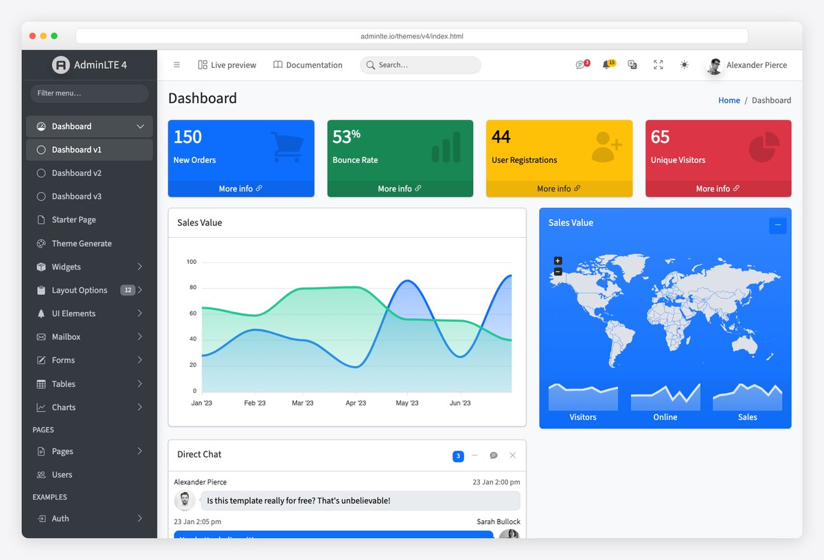
If your front end is a component framework rather than server-rendered pages, the AdminLTE team publishes official wrappers: see our guides to AdminLTE with React and Next.js, AdminLTE with Angular and AdminLTE with Laravel.
Path 3: Composer for PHP projects
The same package is on Packagist for teams that keep every dependency in composer.json:
composer require "almasaeed2010/adminlte:^4"That installs the repository under vendor/almasaeed2010/adminlte/, including the built dist/ folder. Publish or symlink dist/css and dist/js into your public directory (Laravel: a @vite import is cleaner — the Laravel guide above shows it), and load Bootstrap, Popper and the other peers from the CDN or your own asset pipeline. Composer gives you the files, not the peers.
Path 4: build from source
Clone the repository when you need to change something the CSS variables do not expose — sidebar width, breakpoints, the colour palette at the SCSS level. The build is Astro for the demo pages and Sass for the framework:
git clone https://github.com/ColorlibHQ/AdminLTE.git
cd AdminLTE
npm install
npm run dev          # dev server with hot reload at localhost:3000
npm run production   # one-off production build (clean + lint + compile)
Your compiled files land in dist/, ready to ship with either of the first two paths. Before you fork the SCSS, check the customization docs: most colour and spacing changes are CSS custom properties you can override in your own stylesheet without a build at all.
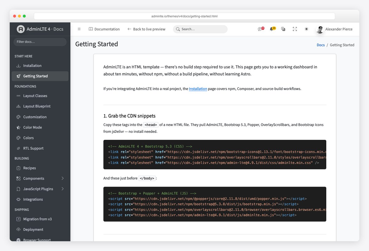
Understand the layout before you build pages
The layout options live on the body tag as classes, and the starter page’s layout-fixed sidebar-expand-lg bg-body-tertiary is the combination most apps keep. The ones you will reach for:
| Body class | Effect |
|---|---|
.layout-fixed | Fixed sidebar that scrolls independently of the content |
.sidebar-expand-lg | Sidebar shows from the lg breakpoint up and becomes an off-canvas drawer below it (also -sm, -md, -xl, -xxl) |
.sidebar-mini | Sidebar collapses to icons instead of hiding |
.sidebar-collapse | Start with the sidebar collapsed (needs .sidebar-mini) |
.fixed-header, .fixed-footer | Pin the header or footer to the viewport |
The header’s hamburger is a plain link with data-lte-toggle="sidebar"; AdminLTE’s script does the rest. Cards get the same treatment — data-lte-toggle="card-collapse" and card-remove on a button, with data-lte-icon="expand" and collapse on the two icons it swaps.
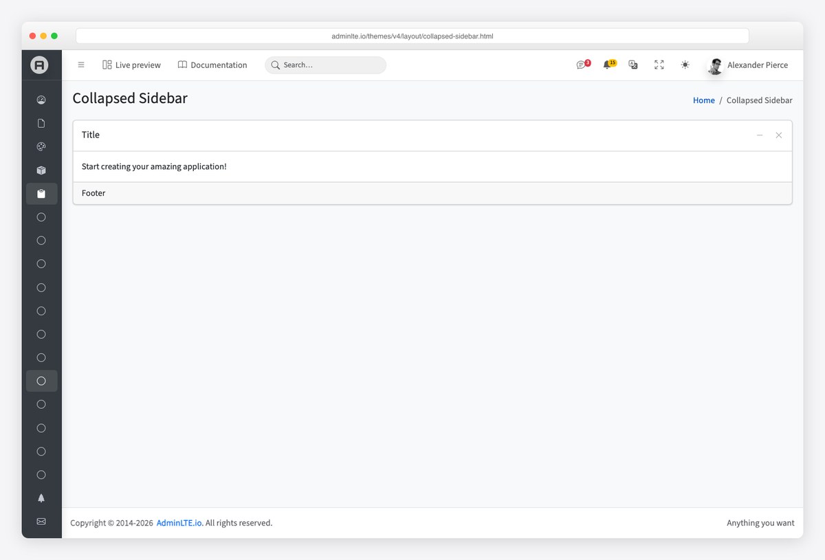
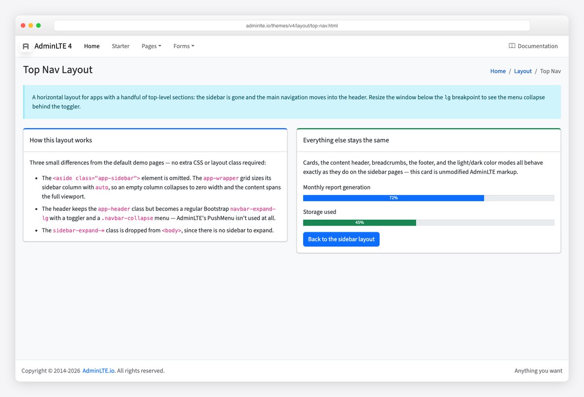
Every layout variant has a demo page under /layout/ — fixed sidebar, fixed header, collapsed sidebar, sidebar mini, top navigation without a sidebar, RTL, and a custom sidebar area. The top-nav layout below is the same skeleton with .app-sidebar removed and the menu moved into the header.
Turn on dark mode
AdminLTE 4 uses Bootstrap 5.3’s colour modes: set data-bs-theme="dark" on the html element and every component, including the sidebar, restyles. The demo’s header switcher stores the choice under the lte-theme key in localStorage and applies it before first paint, so there is no flash of the wrong theme on reload. If your app already manages its own theme, opt AdminLTE out with data-lte-color-mode="off" on the root element and set data-bs-theme yourself.
<!-- Force dark mode for the whole app -->
<html lang="en" data-bs-theme="dark">

<!-- Keep the sidebar dark while the rest of the page follows the user's choice -->
<aside class="app-sidebar bg-body-secondary shadow" data-bs-theme="dark">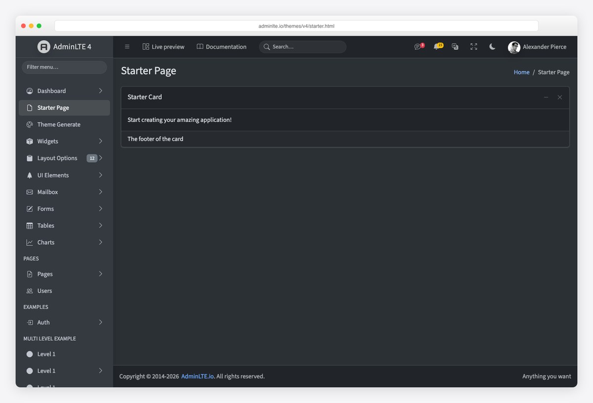
The colour-mode docs cover the auto setting (follow the OS) and the switcher markup. For design direction on dark admin UIs, our dark dashboard templates roundup collects the palettes and contrast rules that hold up.
Deployment checklist
- Pin versions. CDN tags without a version pick up breaking releases; the snippets above pin AdminLTE, Bootstrap and the peers.
- Load order: Popper, Bootstrap, OverlayScrollbars, AdminLTE. Dropdowns need Popper, and AdminLTE’s layout script expects Bootstrap present.
- Keep
bg-body-tertiaryon the body (or your own background) — cards are white on a tinted page by design. - Serve the fonts. The starter uses Source Sans 3 from a CDN; self-host it in production or set your own
--bs-body-font-family. - Check the deployment docs for the production build flags when you go the source route.
Frequently asked questions
Does AdminLTE 4 require jQuery?
No. AdminLTE 4 runs on Bootstrap 5.3 with vanilla TypeScript compiled to plain JavaScript. Nothing in the layout, treeview, card widgets or colour-mode switch touches jQuery, and Bootstrap 5 dropped it too. Plugins you add (a data table, a date picker, an editor) are your choice — the demo pages use jQuery-free ones.
Which Bootstrap version does AdminLTE 4 use?
Bootstrap 5.3, which is where colour modes (data-bs-theme) arrived. The CDN snippets load Bootstrap’s own bundle separately from AdminLTE, so you can update Bootstrap patch releases independently.
How do I install AdminLTE 4 with npm?
Run npm install admin-lte@4 bootstrap bootstrap-icons overlayscrollbars, then import admin-lte/dist/css/adminlte.min.css and admin-lte in your entry file after importing bootstrap. The HTML skeleton is the same as the CDN version; only the asset loading changes.
Can I use AdminLTE 4 with React, Angular, Vue or Laravel?
Yes. The AdminLTE team publishes official integrations for React/Next.js, Angular, Vue/Nuxt and Laravel, and the plain HTML template works inside any server-rendered framework. Our step-by-step guides cover React, Angular and Laravel.
How do I upgrade from AdminLTE 3 to 4?
Treat it as a Bootstrap 4-to-5 migration plus AdminLTE’s own class renames: data-toggle becomes data-bs-toggle, the wrapper classes are now .app-wrapper/.app-header/.app-sidebar/.app-main/.app-footer, and jQuery plugin calls become Bootstrap 5 instances. The official migration guide lists every renamed class.
Is AdminLTE free to use commercially?
Yes. AdminLTE is MIT-licensed, so you can use it in commercial and client projects without attribution in the UI, provided the licence text stays with the source.
Next steps: open the AdminLTE 4 live preview, keep the documentation beside you, and grab the source on GitHub. When you are ready to theme it, the customize AdminLTE guide picks up where this one stops.

You Might Also Like


