
10 Best SaaS Dashboard Design Examples & Trends (2026)

The best way to design a SaaS dashboard is to study the ones people love using. Below are 10 real SaaS dashboard design examples — Linear, Stripe, Vercel, Attio, PostHog, Hex, Retool, Mercury, Plausible, and Supabase — each with a fresh screenshot and the specific pattern worth stealing, plus the 2026 design trends behind them and the principles that make dashboards work.
Short on time? Linear is the reference for dark-first restraint, Stripe for data tables, and Attio for what AI-native dashboards actually look like.
Quick Picks
- Dark-first power tool: Linear — quiet chrome, keyboard-first density
- Financial data done right: Stripe — tables as the primary interface
- Extreme restraint: Vercel — monochrome system, color = meaning
- AI-native CRM: Attio — AI summaries as designed components
- Dense but approachable: PostHog — insight cards that answer one question
- AI-assisted analytics: Hex — notebooks published as living dashboards
- Internal-tool grammar: Retool — pragmatic component-grid layouts
- Premium fintech feel: Mercury — editorial polish that builds trust
- Radical simplicity: Plausible — a real public dashboard, one page
- Console wayfinding: Supabase — one page template, many tools
SaaS dashboard design trends for 2026
- AI-native, not AI-added. The leading dashboards (Attio, Hex) design AI output as a first-class surface — summaries, suggested actions, generated queries — rather than a chat widget floating over the old UI.
- Dark-first for power users. Tools people use all day (Linear, Supabase, Vercel) now design dark mode first and light mode second. See our full guide to dark mode dashboard templates and design.
- Quiet chrome, high density. Borders, shadows, and decoration keep shrinking; information density rises. Hierarchy comes from type weight and spacing, and color is reserved for state and meaning.
- Tables reclaim the throne. The chart-heavy dashboard era is fading — Stripe- and Linear-style interfaces lead with structured tables and use charts only where a trend genuinely needs a shape.
- Design-system consistency. The Tailwind/shadcn era means product dashboards, marketing sites, and docs increasingly share one visual language — users notice when they don’t.
The examples at a glance
| Product | Category | Signature pattern | Study it for |
|---|---|---|---|
| Linear | Project management | The dark-first standard for power tools | Quiet chrome & keyboard-first density |
| Stripe | Payments | The canonical financial dashboard | Data tables and reporting done right |
| Vercel | Developer platform | Monochrome minimalism as a system | Extreme restraint & observability views |
| Attio | CRM | The AI-native CRM dashboard | AI summaries as a first-class surface |
| PostHog | Product analytics | Dense analytics with personality | Making dense data approachable |
| Hex | Data workspace | AI-assisted analytics workspace | Notebook-to-dashboard publishing |
| Retool | Internal tools platform | The internal-tool design language | Pragmatic, component-grid layouts |
| Mercury | Banking | Fintech UI with editorial polish | Making financial data feel premium |
| Plausible Analytics | Web analytics | A live public dashboard you can inspect | One-page dashboards & chart restraint |
| Supabase | Backend platform | Developer console that stays friendly | Complex consoles with clear wayfinding |
10 SaaS dashboard design examples worth studying
1. Linear
The dark-first standard for power tools
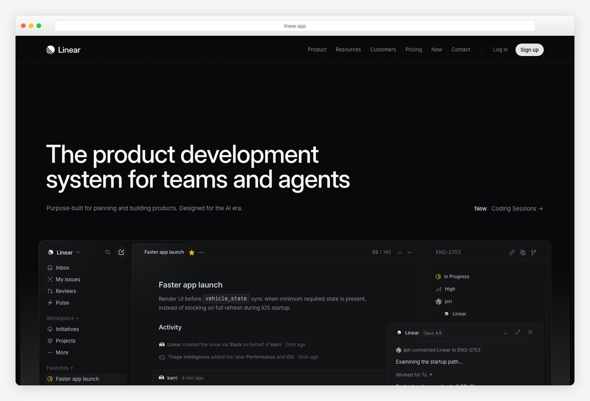
What to steal: Radical restraint — near-monochrome surfaces, one accent color, and information density that never feels crowded because everything non-essential is simply absent.
Linear defined the aesthetic that half the dashboards in this list now follow: dark-first, low-contrast panel borders, crisp typography, and interactions built for the keyboard before the mouse. Its issue views are a masterclass in showing exactly one level of detail at a time.
If your users live in your product for hours, Linear is the reference for reducing visual fatigue without reducing information.
2. Stripe
The canonical financial dashboard
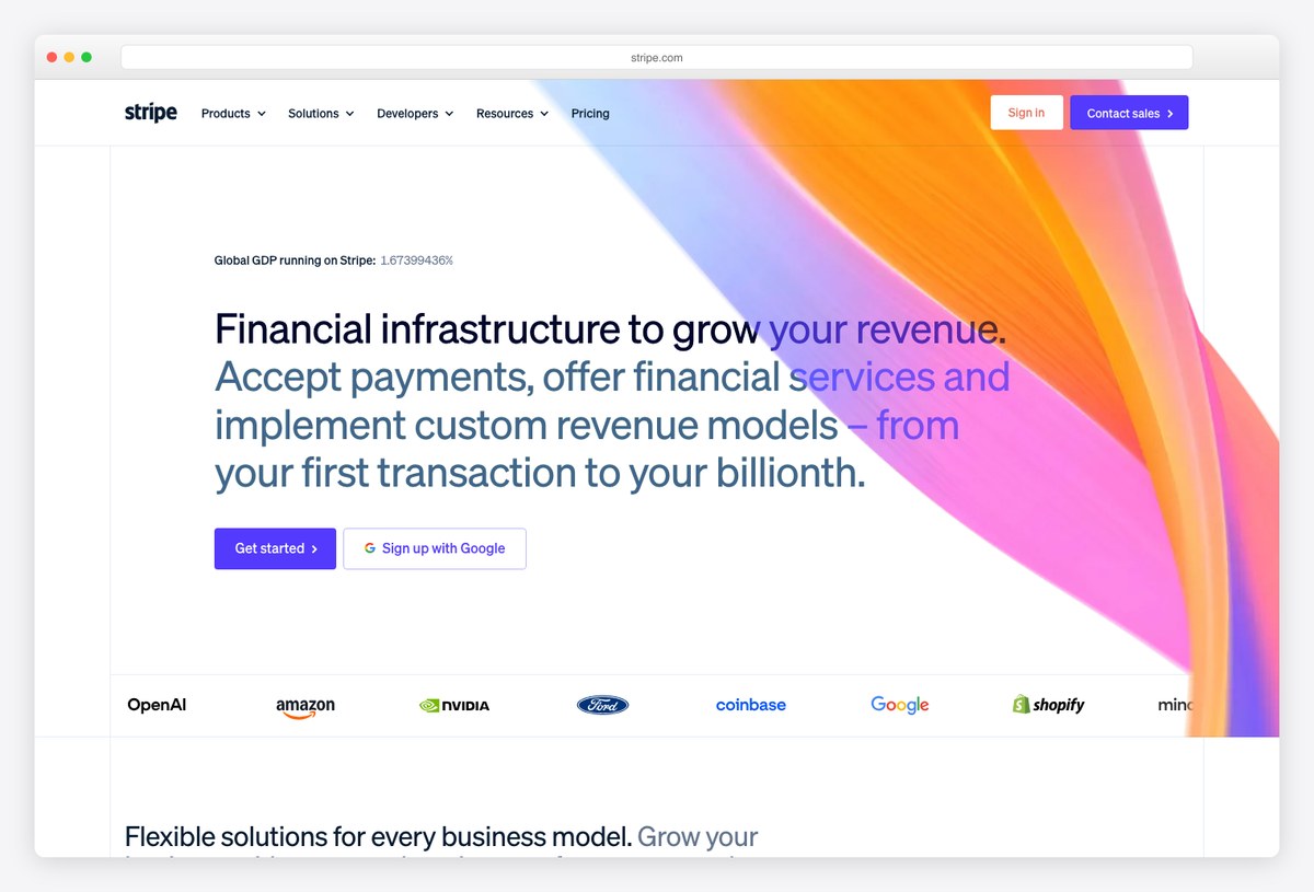
What to steal: The Stripe Dashboard treats tables as the primary interface — impeccable column alignment, inline sparklines, and drill-downs that never lose your place.
Stripe’s product UI has quietly educated a generation of developers on financial data display: right-aligned numerals, tabular figures, muted gridlines, and reports where the chart is a summary and the table is the truth. Its home screen balances KPIs, a revenue chart, and recent activity without a single decorative element.
Steal its restraint with charts: one hero metric visualized, everything else numeric.
3. Vercel
Monochrome minimalism as a system
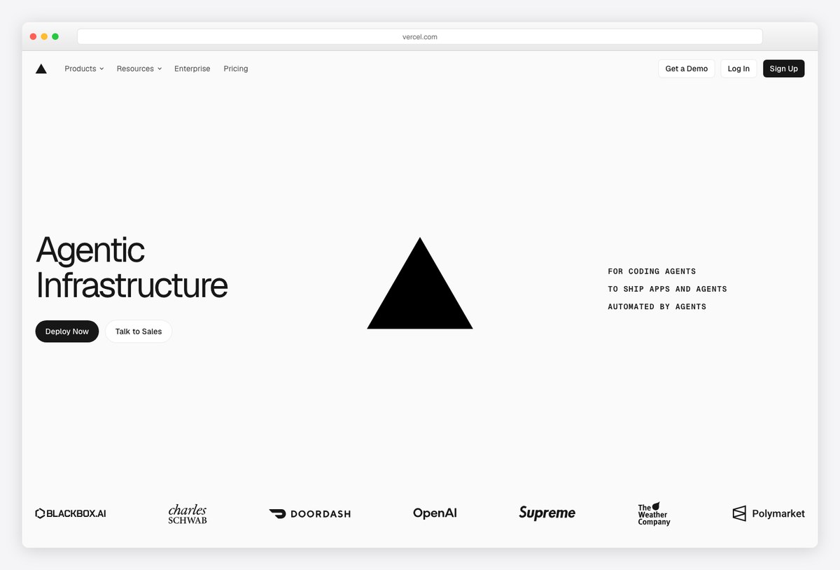
What to steal: A black-and-white design system where hierarchy comes entirely from spacing and type weight — plus deploy and observability dashboards that make logs and analytics feel calm.
Vercel’s dashboard proves you don’t need color to communicate structure: projects, deployments, and analytics live in a nearly monochrome UI where status colors (green/amber/red) carry all the semantic weight precisely because nothing else competes with them.
The lesson for admin panels: reserve color for meaning, not decoration.
4. Attio
The AI-native CRM dashboard
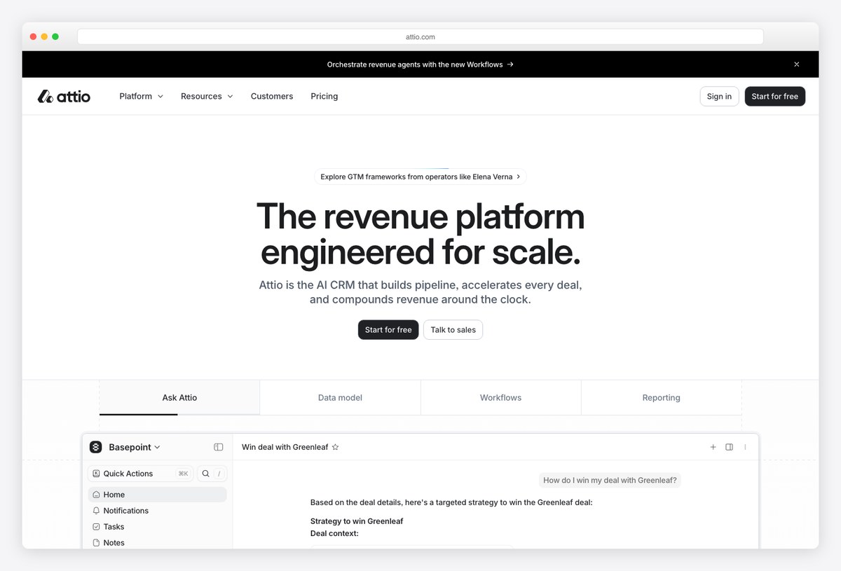
What to steal: “Ask Attio” sits inside the record view — the dashboard doesn’t just display pipeline data, it explains it and proposes the next action. This is the 2026 pattern to study.
Attio reimagines CRM around flexible data models and AI assistance: deal pages summarize context, suggest strategy, and surface the metrics that matter now, instead of forcing users to assemble reports. The visual language stays light and spreadsheet-fast while the intelligence layer does the heavy lifting.
When people say “AI-native dashboard,” this is what they mean — the AI output is a designed component, not a bolted-on chat bubble.
5. PostHog
Dense analytics with personality
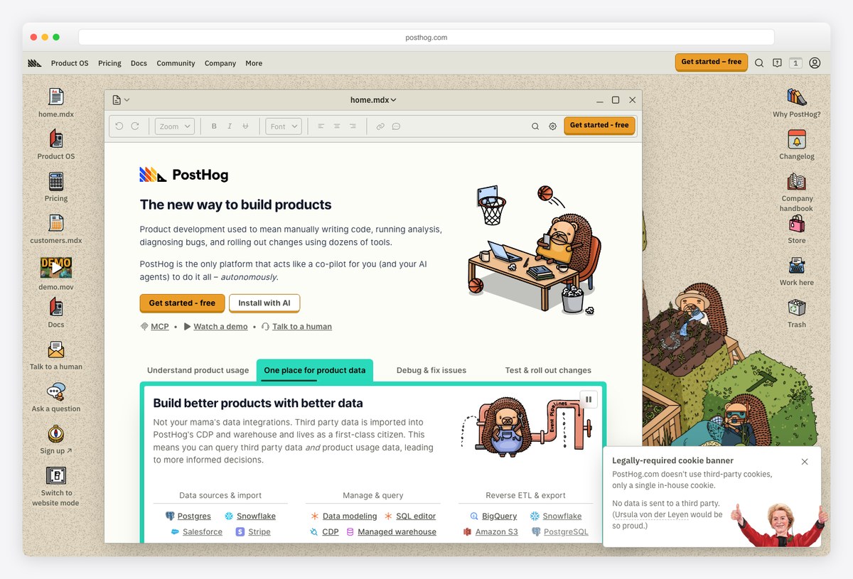
What to steal: PostHog packs funnels, session replays, and experiment results into one tool yet stays approachable — proof that personality (illustration, humor) and serious data UI can coexist.
PostHog’s dashboards handle brutal information density — multi-step funnels, cohort tables, feature-flag matrices — with clear grouping and consistent chart idioms. The playful brand voice does real UX work: it lowers the intimidation factor of a genuinely complex product.
Steal its insight cards: each visualization answers one question and states it as a title.
6. Hex
AI-assisted analytics workspace
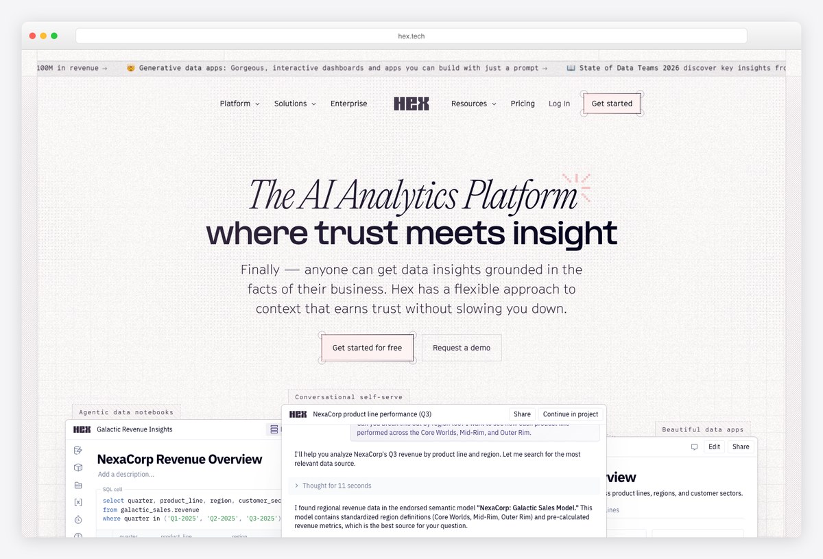
What to steal: Hex blurs the line between analysis and dashboard: notebooks become polished, interactive apps, and its AI assistant writes the queries — the “dashboard” is the published end of a live workflow.
Hex matters to dashboard design because it changes who builds them: analysts publish explorable apps with filters and inputs instead of static charts, and AI handles the SQL scaffolding. The output UI — clean cells, restrained charts, generous whitespace — is itself worth study.
A preview of dashboards as living documents rather than fixed screens.
7. Retool
The internal-tool design language
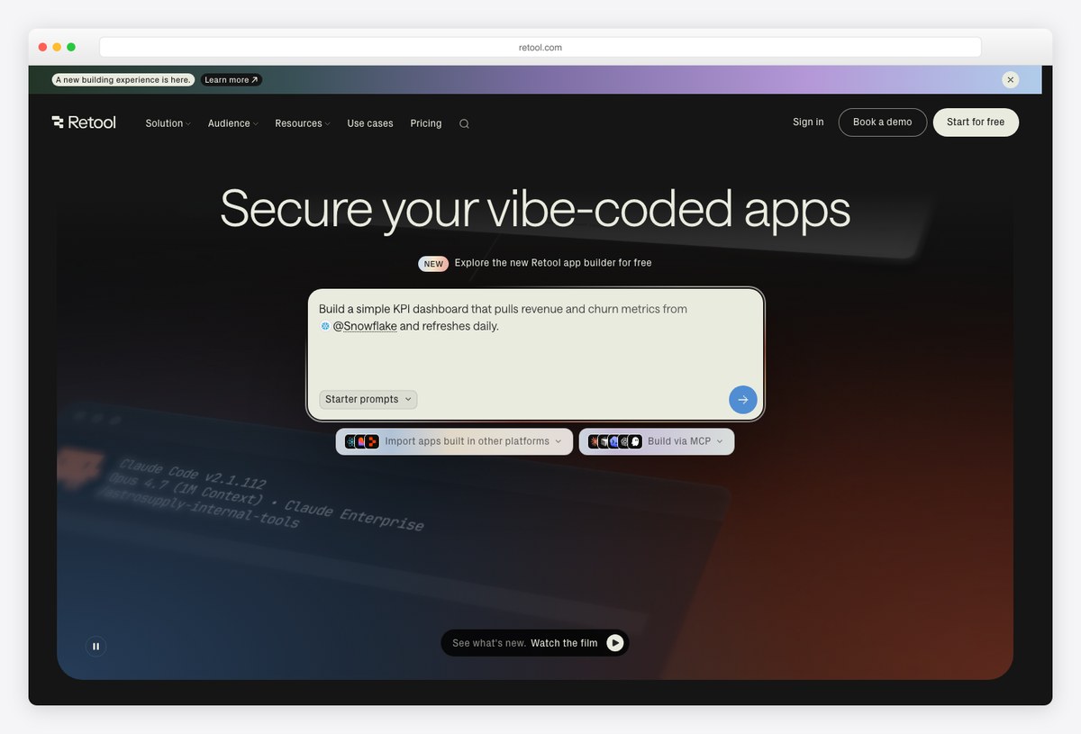
What to steal: Retool’s component grid — tables, forms, buttons, charts snapped to a strict layout — is the de-facto visual grammar of internal admin tools, optimized for speed of comprehension over beauty.
Thousands of internal dashboards are built in Retool, and its constraints are instructive: strong table defaults, obvious primary actions, and forms beside the data they edit. The aesthetic is deliberately plain — for ops tooling, familiarity beats novelty.
Steal its discipline: every admin screen answers “what am I looking at, and what can I do to it?”
8. Mercury
Fintech UI with editorial polish
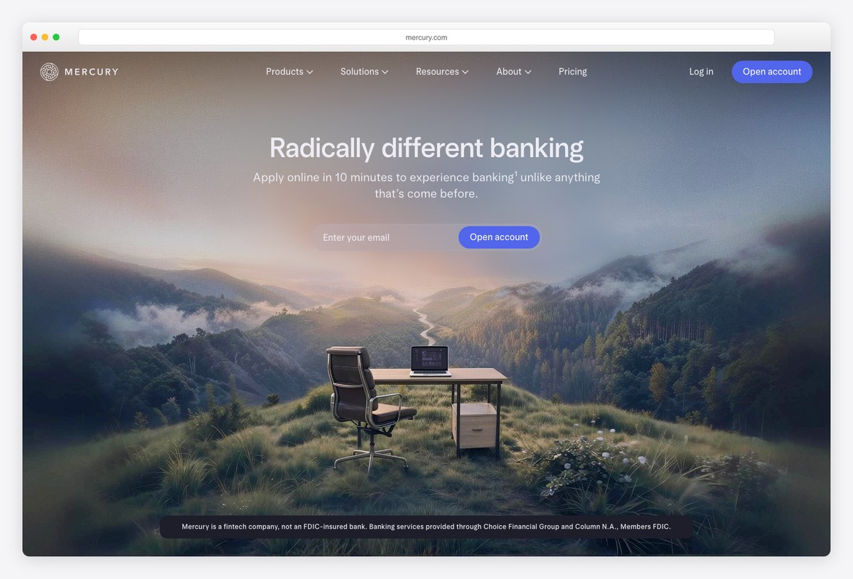
What to steal: Mercury proves a banking dashboard can feel like a designed product: editorial typography, disciplined color, and balance/transaction views that read like a well-set financial statement.
Mercury’s product consistently tops “best SaaS design” lists for good reason — it applies brand-level art direction to tables, cards, and charts without sacrificing scannability. Spending views, cash-flow charts, and account cards share one calm, confident visual voice.
The takeaway for dashboards holding money or metrics people worry about: visual calm builds trust.
9. Plausible Analytics
A live public dashboard you can inspect
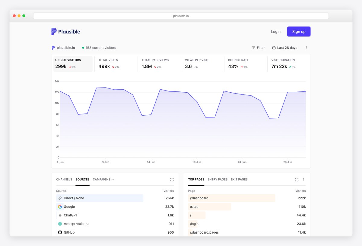
What to steal: Plausible publishes its own traffic dashboard publicly — a real, logged-out example you can study: one page, one chart, a handful of ranked lists, zero configuration burden.
Plausible’s single-page dashboard is the strongest argument for doing less: a visitors chart, top sources, top pages, countries, and devices — and that’s the whole product. Because their own stats are public, you can inspect a production dashboard with real data rather than marketing renders (our screenshot above is exactly that).
When in doubt, ship the Plausible-sized version of your dashboard first.
10. Supabase
Developer console that stays friendly
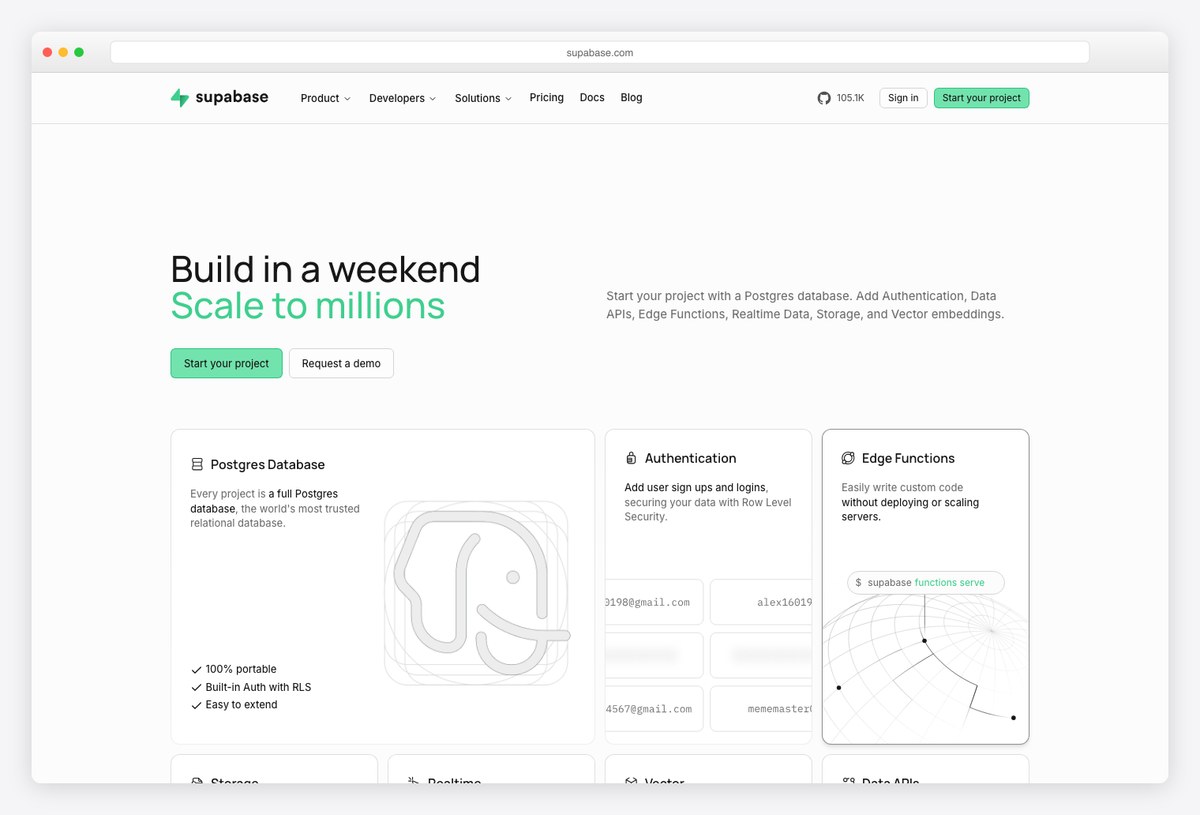
What to steal: A database console, auth manager, storage browser, and SQL editor in one product — Supabase keeps it navigable with strong iconography, a disciplined sidebar, and dark-mode-first theming.
Supabase’s dashboard handles the hardest wayfinding problem on this list: deeply technical, heterogeneous tools under one roof. Consistent page scaffolding (header, tabs, table) means a user who learns one section has learned them all — and its green-on-dark identity shows how a single brand color can carry a whole console.
Steal its structural consistency: one page template, many tools.
Design principles behind every good SaaS dashboard
- KPI hierarchy. Decide the one number a user must see, give it the top-left position and the largest type, and size everything else down from there. If everything is highlighted, nothing is.
- Progressive disclosure. Show the minimum needed for the next decision — summary first, drill-down on demand. Linear’s issue views and Stripe’s reports are the pattern executed perfectly.
- Design the empty state. New accounts see zeros. The best dashboards (Mercury, Supabase) treat the empty state as onboarding: what to connect, what will appear here, one clear action.
- Chart restraint. One meaningful trend chart beats five decorative ones. Numbers in a well-set table communicate faster than most visualizations (see Plausible’s single-chart product).
- Real-time where it matters — only there. Live-updating counts create attention; reserve them for metrics users act on, or the dashboard becomes a slot machine.
How to apply these examples to your own dashboard
Before the specifics, the checklist version — the patterns these ten products keep proving out:
- Cap the KPI count. One primary metric per view, a handful of secondary ones — Plausible and Mercury win by refusing to show everything.
- Progressive disclosure. Summary first, drill-down on demand — Stripe and PostHog bury complexity behind clicks, not in the first paint.
- Design dark and light together. Linear and Supabase treat dark mode as a first-class theme built on tokens, not an inverted afterthought.
- Design the empty and loading states. Vercel’s skeletons and Retool’s empty states carry as much design effort as the data views.
- Let AI summarize, keep humans drilling. Attio and Hex layer AI summaries on top of inspectable data — never AI instead of the data.
- Tables are the product. Attio, Retool, and Twenty-style CRMs invest most in density, inline edit, and keyboard support where users actually live.
A practical path from inspiration to shipped product:
- Pick your reference by product type: power tool → Linear; financial/metrics → Stripe and Mercury; analytics → Plausible and PostHog; internal ops → Retool.
- Steal patterns, not pixels: take Linear’s restraint or Stripe’s tables as rules (“color = state only”), not as a theme to copy.
- Then start from a template that already follows them: browse our SaaS admin dashboard templates and the wider dashboard templates roundup — most modern picks there already encode these conventions.
- Get the palette right early: our guide to admin dashboard color schemes covers the state-color discipline these products share.
Frequently asked questions
What makes a good SaaS dashboard design?
A clear KPI hierarchy (one primary number, everything else subordinate), progressive disclosure instead of everything-at-once, disciplined color reserved for state and meaning, strong table design, and a considered empty state. The products above differ in style but share exactly these fundamentals.
What are the biggest SaaS dashboard design trends in 2026?
AI-native interfaces where summaries and suggested actions are designed components (Attio, Hex), dark-first design for daily-use tools, quiet chrome with higher information density, a shift from chart-heavy layouts back to excellent tables, and design-system consistency across product, site, and docs.
Should a SaaS dashboard be dark or light?
Match usage intensity: tools used for hours daily (dev tools, project management, trading) increasingly default to dark with a light option; occasional-use business dashboards usually stay light-first. Either way, support both — users expect the toggle, and prefers-color-scheme makes the default automatic.
How many charts should a dashboard have?
Fewer than you think. Plausible runs a successful analytics product on essentially one chart plus ranked lists; Stripe leads with tables and uses charts as summaries. A good rule: visualize a metric only when its trend or shape carries the insight — otherwise show the number.
Where can I find templates that follow these design patterns?
Modern template ecosystems have absorbed these conventions — see our roundups of SaaS admin dashboard templates and dark mode dashboard templates, where picks like shadcn/ui- and Tailwind-based kits ship the quiet-chrome, table-first style these products pioneered.
Ready to build? Start from the best SaaS admin dashboard templates or the full dashboard templates collection — and if your product leans dark-first, our dark mode dashboard guide covers the contrast and color rules in depth.

You Might Also Like


