Best Admin Dashboard Color Schemes: A Developer’s Guide to Dashboard Design
Why Color Schemes Matter in Dashboard Design
A color scheme can make or break an admin dashboard. Get it right, and your users navigate effortlessly, spot critical alerts instantly, and work for hours without eye strain. Get it wrong, and even the most feature-rich dashboard feels amateur, confusing, or downright painful to use.
The challenge is that dashboard color design sits at the intersection of aesthetics, usability, and accessibility. You need enough contrast for readability, enough hierarchy to guide the eye, and enough personality to feel polished — all without overwhelming users who stare at your interface eight hours a day. Unlike marketing sites where bold colors grab attention for seconds, dashboards need palettes that hold up under sustained use.
This guide covers five proven admin dashboard color schemes, complete with hex codes, accessibility requirements, dark mode implementation, and lessons from frameworks like AdminLTE, Tabler, and Material Design. Whether you are building from scratch or customizing an existing template, you will walk away with a practical system for choosing and implementing dashboard colors that work.
If you just want a safe default: dark sidebar (#343a40) + white content area + blue primary accent (#0d6efd) + standard semantic colors. This works for 90% of admin dashboards.
The Five Dashboard Color Approaches
After analyzing dozens of popular admin templates and SaaS products, most dashboard color schemes fall into five categories. Each has trade-offs, and the best choice depends on your audience, brand requirements, and the type of data your dashboard displays.
1. Dark Sidebar + Light Content Area
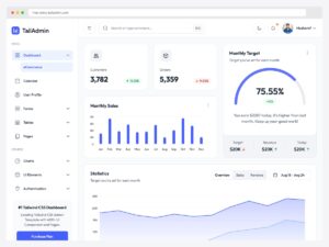
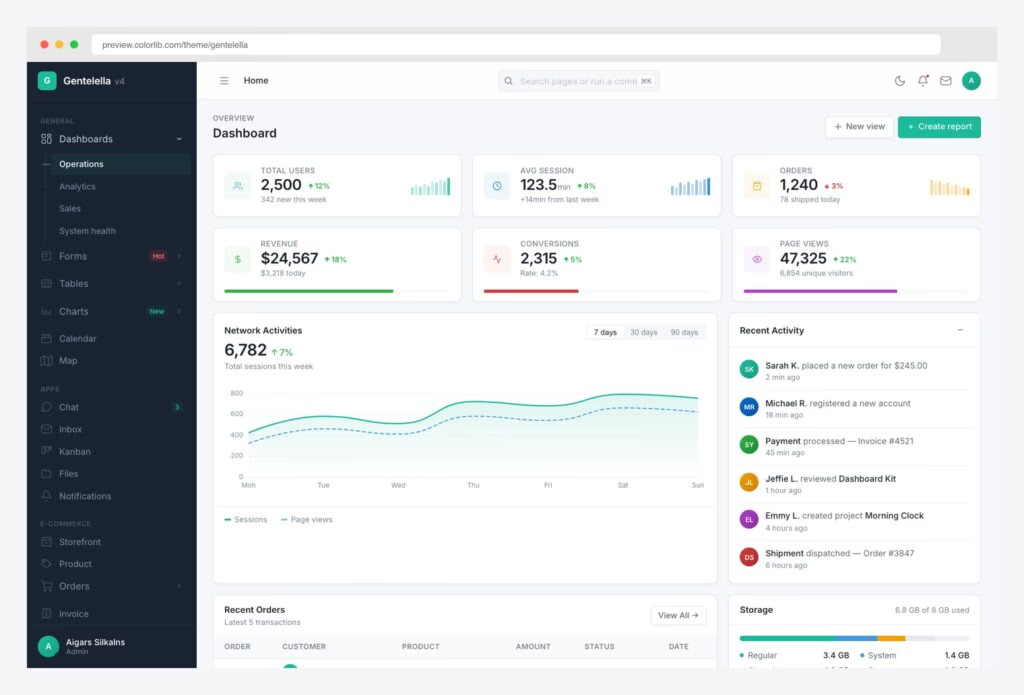
This is the most widely used dashboard color pattern, and for good reason. A dark navy or charcoal sidebar (#343a40, #1a1a2e) paired with a light content area (#f4f6f9) creates an immediate visual hierarchy. The sidebar anchors navigation in a high-contrast zone while the lighter content area gives data and forms room to breathe.
You will find this pattern in AdminLTE, WordPress admin, GitHub, AWS Console, and countless SaaS products. It works because the dark sidebar acts as a visual frame — your eye naturally focuses on the lighter, more prominent content area where the actual work happens. Navigation recedes into the periphery until you need it.
2. Full Dark Mode
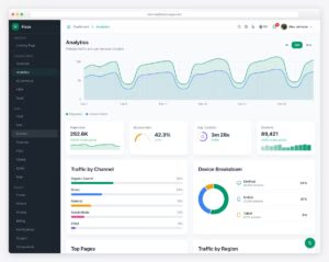
Full dark mode uses multiple dark surface levels to create depth: a #121212 base background, #1e1e1e for card surfaces, and #2d2d2d for elevated elements like dropdowns and modals. Text shifts to light grays (#e1e1e1 for primary, #8b949e for secondary) rather than pure white.
Dark mode has moved from a nice-to-have to an expected feature. Users working in low-light environments, monitoring real-time data overnight, or simply preferring reduced brightness all benefit. The key is creating enough surface-level differentiation — without it, dark mode interfaces feel like a flat, featureless void. If you’d rather start from a UI that was designed dark-first, browse our dark mode dashboard templates.
3. Light and Minimal
The all-white or light-gray approach strips away visual noise and relies on subtle borders, spacing, and typography for hierarchy. Stripe’s dashboard and Linear are prime examples. The background stays white or near-white, cards may not even have visible borders (just spacing), and color appears only in interactive elements and data.
This approach looks clean and modern but carries a risk: without a dark sidebar or strong color anchors, the interface can feel flat or directionless. It demands excellent typography, generous spacing, and very intentional use of the few colors you do introduce.
4. Colorful Accents on a Neutral Base
Take a neutral gray or white foundation and add one or two vivid accent colors for primary actions, active states, and key data points. This approach balances personality with professionalism. The neutral base keeps the interface calm, while the accent color draws attention exactly where you want it.
This is particularly effective for branded dashboards where you want to reinforce a company identity without painting every surface in brand colors. A single well-chosen accent on a neutral base goes further than you might expect.
5. Branded and Custom Enterprise
Enterprise dashboards sometimes need to match an existing corporate brand palette. This is the hardest approach to execute well because brand colors are chosen for marketing contexts — billboards, packaging, advertisements — not for interfaces where users spend hours. A vibrant brand red that looks great on a logo can be exhausting as a sidebar background.
The solution is to use brand colors sparingly: in the logo area, as accent colors for primary actions, and perhaps as a thin top bar. The rest of the interface should still follow neutral dashboard conventions.
Recommended Color Palettes
These palettes give you a practical starting point for both light and dark modes. The first table covers your base surface and text colors — the foundation that occupies 90% of the screen. The second lists the primary accent color of the frameworks and admin panels most dashboards are built on, any of which pairs with the base palette.
Base Palette: Light Mode and Dark Mode
| Role | Light Mode | Dark Mode |
|---|---|---|
| Page background | #f4f6f9 | #121212 |
| Card surface | #ffffff | #1e1e1e |
| Sidebar | #343a40 | #0d1117 |
| Primary text | #212529 | #e1e1e1 |
| Secondary text | #6c757d | #8b949e |
| Borders | #dee2e6 | #30363d |
Primary Accent Colors From Popular Frameworks
| Framework or panel | Primary color | Hex | Notes |
|---|---|---|---|
| Bootstrap 5.3 | Blue | #0d6efd | The default nearly everyone inherits |
| AdminLTE 4 | Blue | #0d6efd | Bootstrap’s blue; AdminLTE 3 used #007bff |
| Tabler | Blue | #066fd1 | A deeper, less saturated blue |
| Ant Design | Blue | #1677ff | Seed token everything else derives from |
| Tailwind CSS | Blue-600 | #2563eb | The shade most Tailwind dashboards pick |
| GitHub Primer | Blue | #0969da | Named by role, not hue |
| Material Design 3 | Purple | #6750a4 | Baseline scheme; Material 2 used #2196F3 |
| CoreUI | Indigo | #5856d6 | Earlier releases shipped #321fdb |
| Material Dashboard | Pink | #e91e63 | Blue is demoted to the info role |
| shadcn/ui | Near-black | #171717 | Hue lives in the chart tokens instead |
Blue is the default in most of them, and the reason is covered in the color psychology section below. The exceptions are just as instructive: CoreUI’s indigo-violet, Material Dashboard’s pink, and shadcn/ui’s near-black are all deliberate attempts to look unlike a stock admin panel, and each one pushes its hue somewhere else — into charts, into the info role, or out of the interface altogether.
Semantic Colors: The Universal Language of Dashboards
Semantic colors communicate status and meaning instantly. Success is green, danger is red, warnings are amber, and informational messages are blue. These associations are so deeply ingrained that violating them causes genuine confusion — users will hesitate, second-guess, and make mistakes.
| Status | Bootstrap 5 | Material Design | IBM Carbon |
|---|---|---|---|
| Success | #198754 | #4CAF50 | #24a148 |
| Danger | #dc3545 | #F44336 | #da1e28 |
| Warning | #ffc107 | #FFC107 | Context-dependent |
| Info | #0dcaf0 | #03A9F4 | #0f62fe |
A critical rule: semantic colors should never double as brand or accent colors. If your primary brand color is green, do not also use green for success states. Users will not know whether a green element means “this is a primary action” or “this operation succeeded.” Pick a brand color that sits outside the semantic palette, or adjust the shades enough to create clear visual distinction.
Also note that semantic colors need to work in both light and dark modes. In dark mode, you will typically need to increase the lightness of these colors slightly so they maintain adequate contrast against dark surfaces.
Color Psychology in Dashboard Design
Color psychology in dashboards is less about evoking emotions and more about leveraging learned associations. Users bring expectations shaped by years of using other software, and smart dashboard design works with those expectations rather than against them.
Why Blue Dominates Dashboard Design
Blue communicates trust, stability, and professionalism. It is the default primary color in Bootstrap, Material Design, Tailwind, AdminLTE, and most enterprise software. There is also a practical reason: blue has the widest range of usable shades and maintains readability across different backgrounds. It rarely conflicts with semantic colors (red, green, amber) and works for both conservative enterprise clients and modern SaaS products.
If you have no strong reason to choose another color, blue is the safest primary accent for any dashboard.
Dark Navy and Charcoal for Navigation
Dark sidebar colors (#343a40, #1a1a2e, #0d1117) project authority and create a stable frame around the interface. They also have the practical benefit of making white or light-colored navigation text and icons pop clearly, and they hide the visual “weight” of a navigation column that might otherwise compete with content.
Data Visualization Palettes
Charts and graphs need their own color strategy, separate from your UI palette:
- Categorical palettes use distinct hues to differentiate data series. Limit yourself to 5-7 colors maximum — beyond that, human perception cannot reliably distinguish categories. If you have more series, use grouping or interactive filtering instead.
- Sequential palettes use a single hue that ranges from light to dark to show magnitude or progression. Think light blue to dark blue for low-to-high values.
- Diverging palettes use two hues meeting at a neutral midpoint, ideal for data that has a meaningful center (like profit/loss, above/below average). A common choice is red-to-blue with white or light gray at zero.
Theory only gets you so far, so here are three categorical sets taken straight from shipping dashboards. The contrast between the two shadcn/ui rows is the useful part: the same five slots, re-picked for a light and a dark canvas.
Alert and Status Colors
The association between colors and alert levels is nearly universal in software: red signals errors and danger, green signals success and completion, amber signals warnings that need attention but are not critical, and blue signals neutral informational content. Deviating from these conventions forces users to consciously interpret what each color means instead of reacting instinctively — a costly cognitive tax in a dashboard context where speed matters.
Accessibility Requirements for Dashboard Colors
Accessibility is not optional polish. For admin dashboards used in workplaces, it may be a legal requirement under ADA, Section 508, or EN 301 549. Even without legal mandates, poor contrast and color-dependent interfaces slow down every user, not just those with disabilities.
Never use color alone to convey meaning. About 8% of men have red-green color deficiency. Always pair colors with icons, text labels, or patterns.
WCAG Contrast Ratios
| Element | Minimum Ratio (AA) | Enhanced Ratio (AAA) |
|---|---|---|
| Normal text (under 18px) | 4.5:1 | 7:1 |
| Large text (18px+ bold, or 24px+) | 3:1 | 4.5:1 |
| UI components and graphics | 3:1 | Not defined |
AA compliance is the minimum standard you should target. Every text/background combination in your dashboard needs to meet these ratios. This applies to both light and dark modes independently — passing in one mode does not excuse failing in the other.
Colorblind Safety
Approximately 8% of men and 0.5% of women have some form of color vision deficiency, with red-green deficiency (deuteranopia and protanopia) being the most common. In a dashboard used by a team of 25, statistically one or two people will struggle to distinguish red from green at equal brightness.
Practical steps for colorblind-safe dashboards:
- Never place red and green side by side at similar brightness levels, especially in charts or status indicators.
- Never rely on color alone to convey meaning. Pair colors with icons (a checkmark for success, an X for errors), text labels (“Approved,” “Rejected”), or patterns (striped vs. solid bars in charts).
- Test your palette with a colorblindness simulator — Chrome DevTools has one built in under Rendering > Emulate vision deficiencies.
Dark Mode and Eye Strain
Research from the Nielsen Norman Group found that light mode actually performs better for most users in terms of reading speed and accuracy. However, dark mode reduces subjective feelings of eye strain, particularly in low-light environments. The takeaway: always provide both options via a toggle. Do not force dark mode on all users, and do not dismiss it as merely cosmetic.
In dark mode, avoid pure black (#000000) backgrounds with pure white (#ffffff) text. This creates excessive contrast that causes halation — a visual effect where bright text appears to bleed into the dark background, making reading harder. Use dark grays (#121212 to #1e1e1e) with off-white text (#e1e1e1) instead.
Implementing Dark Mode With CSS Custom Properties
CSS custom properties (variables) are the recommended approach for dark mode in dashboards. They let you define your entire color system once and swap it by toggling a single class or responding to a media query.
Never use #000000 as your dark mode background. Pure black creates harsh contrast that causes halation (text bleeding into the background) and looks unnatural on modern screens. Use #121212 or #1e1e1e instead — your users’ eyes will thank you during long sessions.
The CSS Variable Approach
:root {
  --bg-page: #f4f6f9;
  --bg-card: #ffffff;
  --bg-sidebar: #343a40;
  --text-primary: #212529;
  --text-secondary: #6c757d;
  --border-color: #dee2e6;
  --accent-primary: #0d6efd;
}

.dark-mode {
  --bg-page: #121212;
  --bg-card: #1e1e1e;
  --bg-sidebar: #0d1117;
  --text-primary: #e1e1e1;
  --text-secondary: #8b949e;
  --border-color: #30363d;
  --accent-primary: #58a6ff;
}

/* Respect system preference as default */
@media (prefers-color-scheme: dark) {
  :root:not(.light-mode) {
    --bg-page: #121212;
    --bg-card: #1e1e1e;
    --bg-sidebar: #0d1117;
    --text-primary: #e1e1e1;
    --text-secondary: #8b949e;
    --border-color: #30363d;
    --accent-primary: #58a6ff;
  }
}

/* Usage */
body {
  background-color: var(--bg-page);
  color: var(--text-primary);
}

.card {
  background-color: var(--bg-card);
  border: 1px solid var(--border-color);
}
This pattern respects the user’s system preference by default but allows a manual toggle to override it. Store the preference in localStorage and apply the class before the page renders to avoid a flash of the wrong theme.
Bootstrap 5.3’s Built-in Dark Mode
If you are using Bootstrap 5.3 or later, dark mode support is built in. Add data-bs-theme="dark" to the <html> element to switch the entire page, or apply it to individual components for mixed-mode interfaces. Bootstrap handles color adjustments for all its components automatically.
Key Rules for Dark Mode Implementation
- No pure black. Use
#121212or darker grays as your base. Pure black looks unnatural on screens and creates excessive contrast. - Reduce saturation. Vivid colors that work on white backgrounds can feel garish on dark surfaces. Desaturate and slightly increase the lightness of your accent colors for dark mode.
- Shadows do not work in dark mode. Box shadows are invisible against dark backgrounds. Replace them with lighter borders (
1px solid #30363d) or use slightly elevated background colors to create separation between surfaces. - Respect the system preference but provide a manual toggle. The
prefers-color-schememedia query detects the OS setting. Always give users a manual override — they may want dark mode for your dashboard even if their OS is in light mode.
Color Palette Tools for Dashboard Designers
You do not need to pick colors from thin air. These tools help you generate harmonious palettes, check accessibility, and preview how colors look in a real interface context.
Of all the tools listed below, WebAIM’s Contrast Checker is the one you should bookmark immediately. It instantly tells you whether any foreground/background color pair meets WCAG AA and AAA standards. Use it every time you introduce a new color combination to your dashboard.
| Tool | URL | Best For |
|---|---|---|
| Coolors | coolors.co | Quick palette generation with lock and adjust |
| Adobe Color | color.adobe.com | Color wheel with harmony rules (complementary, triadic, etc.) |
| Realtime Colors | realtimecolors.com | Preview your palette on a live website mockup |
| Tailwind Colors | tailwindcss.com/docs/customizing-colors | Production-ready color scales with 10 shades per hue |
| Material Theme Builder | m3.material.io/theme-builder | Generating full Material Design 3 theme from a single color |
| WebAIM Contrast Checker | webaim.org/resources/contrastchecker | Checking WCAG contrast compliance for any color pair |
| Huetone | Building perceptually uniform color scales using OKLCH |
A practical workflow: start with Coolors or Adobe Color for initial palette exploration, preview it in context with Realtime Colors, generate full shade scales with Tailwind’s approach or Huetone, and validate every combination with WebAIM’s contrast checker.
Color Schemes From Popular Admin Templates
The palettes below are not approximations. Each one was read out of the project’s own source — compiled CSS custom properties, SCSS tokens, or theme seed files — so these are the values the template actually paints with. Every card renders the same miniature layout in that panel’s colors, which makes the differences in strategy visible at a glance: where the visual weight sits, how much saturation reaches the content area, and how far each project strays from the Bootstrap defaults.
Two things stand out once the eleven sit side by side. Nine of them put an off-white behind the cards rather than pure white, reserving #ffffff for the surfaces that need to come forward — the exceptions, Primer and shadcn/ui, both compensate with a visible border on every card. And white text on the primary color clears the 4.5:1 AA threshold in only seven of the eleven; three of the four that miss are the panels using a mid-tone green, teal, or pink, which is exactly why so many non-blue dashboards put dark text on their primary buttons. Ant Design’s blue lands at 4.10:1, close enough to matter for 14px button labels.
For a hands-on comparison of these templates and many more, see our roundup of free admin panel templates.
Building Your Own Dashboard Color Palette
If the recommended palettes above do not quite fit your needs, here is a step-by-step process for building a custom dashboard color scheme from scratch.
Step 1: Build Your Gray Scale
Start with 8-10 shades of gray, ranging from near-white (#f8f9fa) to near-black (#212529). These grays will handle the vast majority of your interface: backgrounds, borders, secondary text, disabled states, and dividers. Bootstrap’s gray scale is a reliable reference, but you can shift it warmer or cooler to match your brand personality. Cool grays feel more technical, while warm grays feel more approachable.
Step 2: Choose One Primary Accent Color
Pick a single color for primary actions: buttons, links, active navigation items, and focus rings. Blue is the safest choice. If your brand demands another color, make sure it has enough saturation to stand out against your gray scale and does not conflict with semantic colors. Purple, teal, and indigo are strong alternatives that avoid red/green/amber semantic territory.
Step 3: Define Semantic Colors
Establish your success (green), danger (red), warning (amber), and info (blue) colors. These should be visually distinct from each other and from your primary accent. Borrow from Bootstrap or Material Design if you want proven values — there is no prize for originality in semantic colors.
Step 4: Create 5-10 Shades Per Color
A single flat color value is not enough for a real interface. You need lighter shades for backgrounds (alert banners, badges, subtle highlights) and darker shades for hover states, active states, and focus rings. Generate a scale of 5-10 shades for each color. Huetone or the Tailwind palette structure are excellent references for creating perceptually even color scales.
Step 5: Test Every Contrast Combination
Methodically check every text/background combination against WCAG AA minimums. This includes body text on page backgrounds, text inside colored badges, placeholder text in inputs, and secondary text on card surfaces. It is tedious but non-negotiable. WebAIM’s contrast checker makes it fast.
Step 6: Build Dark Mode Variants
Take your palette and create a dark mode version. The general formula: backgrounds become dark grays, text becomes light grays, and accent colors get slightly desaturated and lightened so they do not look neon against dark surfaces. Test contrast ratios again — a color that passes on white may fail on #1e1e1e.
Step 7: Test With Colorblindness Simulators
Run your final palette through colorblindness simulations. Chrome DevTools (Rendering panel > Emulate vision deficiencies) lets you preview deuteranopia, protanopia, and tritanopia directly in the browser. If any two colors that carry different meanings become indistinguishable, adjust their lightness values until they separate, or add a secondary differentiator like an icon or pattern.
See These Color Schemes in Practice — Gentelella v4
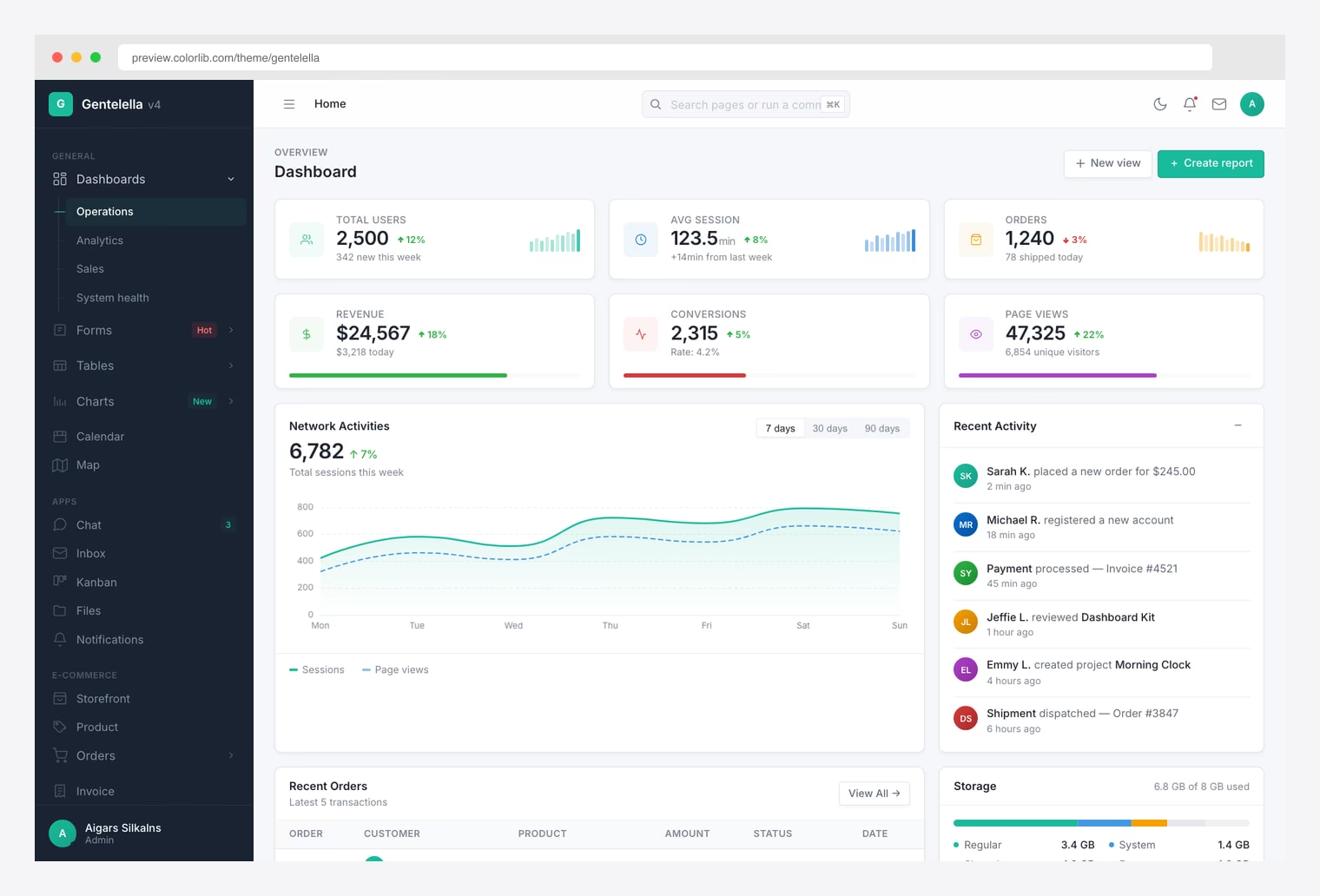
If you want to test the schemes in this guide on a real, fully-built dashboard rather than mocking palettes in Figma, Gentelella v4 is the easiest sandbox available. The free MIT-licensed template (21.3K GitHub stars) ships a live theme generator that lets you swap accent colours, surface tones, and dark-mode variants in real time across all 58 of its pages — including dashboards, forms, tables, charts, and the calendar — without recompiling Sass.
It’s a useful way to pressure-test a scheme against the things that usually break it: contrast on small text inside chart legends, focus rings on form inputs, badge colours over coloured backgrounds, and dark-mode surface elevation. v4 is built on Vite 8 with vanilla ES2022 JavaScript — no Bootstrap, no jQuery — and includes 20 Apache ECharts 6 chart types, so you can also see how your palette holds up against complex data visualisation. By the same Colorlib team behind AdminLTE.
Choosing the Right Color Scheme for Your Dashboard
The safest, most broadly effective starting point for any admin dashboard is a dark sidebar with a light content area and blue accents. It works because decades of software have trained users to expect this pattern, and it solves hierarchy, contrast, and navigation problems out of the box. If you want to explore templates with different visual approaches, our guide to the best AdminLTE alternatives covers options ranging from minimal to enterprise-grade designs. Every template in our free admin panels collection offers some variation of this approach.
But safe does not mean you are stuck with generic. The tools, palettes, and techniques in this guide give you everything you need to build a color system that reflects your brand while respecting usability and accessibility. Start with proven foundations, customize deliberately, test rigorously, and always give users the option to switch between light and dark.
For a broader selection of pre-built dashboards with various color schemes already applied, browse our collection of Bootstrap dashboard templates. If you want to skip the setup work and start with a professionally designed color system, explore our premium admin templates — they ship with multiple color schemes, dark mode support, and accessible defaults ready for production.

You Might Also Like