27 Best Bootstrap Login Forms 2026 – Free Templates

Looking for the perfect login form for your website or application? We’ve curated an extensive collection of 26 beautiful, responsive Bootstrap login forms that are completely free to use. Need other form types? Explore our Bootstrap contact forms and form templates. Each template features modern design principles, mobile responsiveness, and easy customization options.
Whether you need a minimal sign-in page, a creative split-screen design, or an enterprise-grade authentication portal, this collection has you covered. Almost all of them are built on Bootstrap, so they drop into an existing Bootstrap project without a fight — the one exception is Adminator Sign-In, included deliberately as a framework-free alternative for projects that do not run Bootstrap.
Quick Picks
- Best overall: Login Form V01 — Clean split-screen layout with brand imagery and responsive design
- Best minimal: Login Form V11 — Ultra-minimal with focus on typography and whitespace
- Best animated: Login Form V07 — Animated geometric background with transparent overlay
- Best dark mode: Login Form V03 — Dark gradient theme with glowing inputs and social login
- Best social login: Modern Auth — Sliding panels with smooth login/signup transitions
- Best split-screen: Login Form V08 — Diagonal split design with bold geometric shapes
What a login page template actually needs
A sign-in page is the smallest screen in most applications and the one users judge hardest, because it stands between them and the thing they came for. Before picking from the list below, it is worth knowing what separates a login template you can ship from one that looks good in a screenshot.
The fields, and nothing else
Identifier, password, submit. Every additional control on a login screen costs conversion, which is why the strongest templates here look almost empty. Three links earn their place — forgot password, create an account, and remember me — and each has a job: recovery, acquisition, and not making returning users retype credentials daily. Anything beyond those belongs on another screen.
Error messages that do not leak
This is the most common security mistake in free login templates, and it is invisible in a preview. A form that says “no account with that email” tells an attacker which addresses are registered, turning your login page into an account-enumeration tool. Use one message for both failures — something like “those details do not match an account” — and keep the specific reason server-side. Check what a template does here before you ship it, because most demo forms have no real validation at all and you will be writing it yourself.
Password manager and autofill support
A login form that fights password managers gets abandoned. That means real <label> elements rather than placeholder text pretending to be labels, a name and id on every input, and the right autocomplete tokens — autocomplete="username" and autocomplete="current-password". These are three attributes that take a minute to add and are missing from a surprising number of otherwise polished templates.
Accessibility that costs nothing
Labels tied to inputs, a visible focus ring, and errors announced rather than only coloured red. Placeholder-only labels are the usual failure: the moment someone types, the label disappears, which hurts everyone and breaks screen readers entirely. If a template shows floating labels, confirm they persist rather than vanish.
Mobile reality
Most sign-ins happen on a phone. The email field should use type="email" so the keyboard shows an @ key, tap targets need to clear roughly 44 pixels, and the submit button must stay reachable when the on-screen keyboard covers the bottom half of the screen. Full-screen background videos and animated canvases — several of which are genuinely beautiful below — are the first things to test on a mid-range Android device.
Where social login goes
If you offer social sign-in, put it above the email fields, not below. Users who signed up with Google will otherwise start typing an email, then discover the Google button and wonder which account they used. A clear divider between the two paths prevents the most common support ticket a login page generates.
A note on HTML, CSS and framework choice
Almost every template here is Bootstrap-based, which matters less than it sounds. A login page is a centred card with a form in it — there is very little framework-specific logic, so these convert to plain HTML and CSS, Tailwind, or a component framework with modest effort. What you are really buying is the layout and the visual treatment. If you do not run Bootstrap at all, start from Adminator Sign-In, which is framework-free by design.
uiCookies Login Forms — 10 Templates in One Pack
Free — HTML and CSS, no framework, one file per design
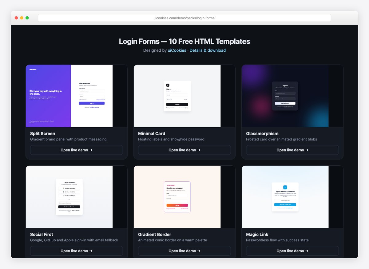
Everything else on this list is a single form. This entry is ten of them, which is useful when a project needs a sign-in screen, a registration screen and a password-reset screen that look like they belong together.
The set covers a split-screen layout, a floating-label card, glassmorphism, a social-first screen, a passwordless magic-link flow, a neobrutalist take, a SaaS screen with social proof, a combined login/registration tab view, a terminal-styled form and an animated gradient border. Each is one HTML file with the CSS inline, so there is no stylesheet to wire up and no build step.
Worth knowing before you pick it: these are front-end only, like most of the list — the form markup and validation states are done, but you still point the action at your own backend. From uiCookies, free for commercial use.
1. Login Form V01 – Minimal Split-Screen Design
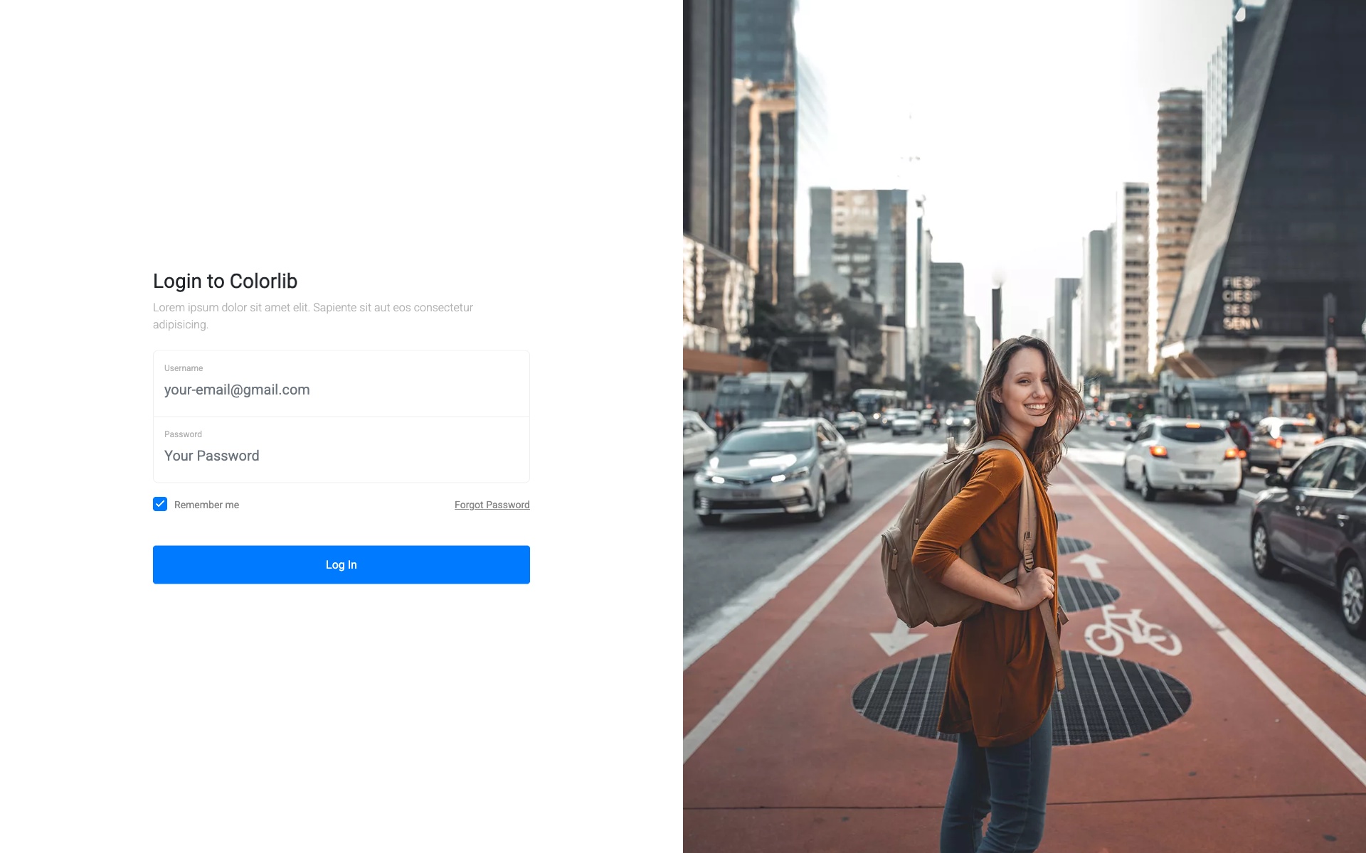
Why we like it: The split-screen layout elegantly balances brand imagery with a clean login area, and the responsive design adapts seamlessly to mobile.
A modern split-screen login form with a beautiful image panel on the left and a clean white login area on the right. Perfect for showcasing brand imagery while maintaining a professional login experience. The responsive design ensures the layout adapts beautifully on mobile devices.
2. Login Form V03 – Dark Theme Login
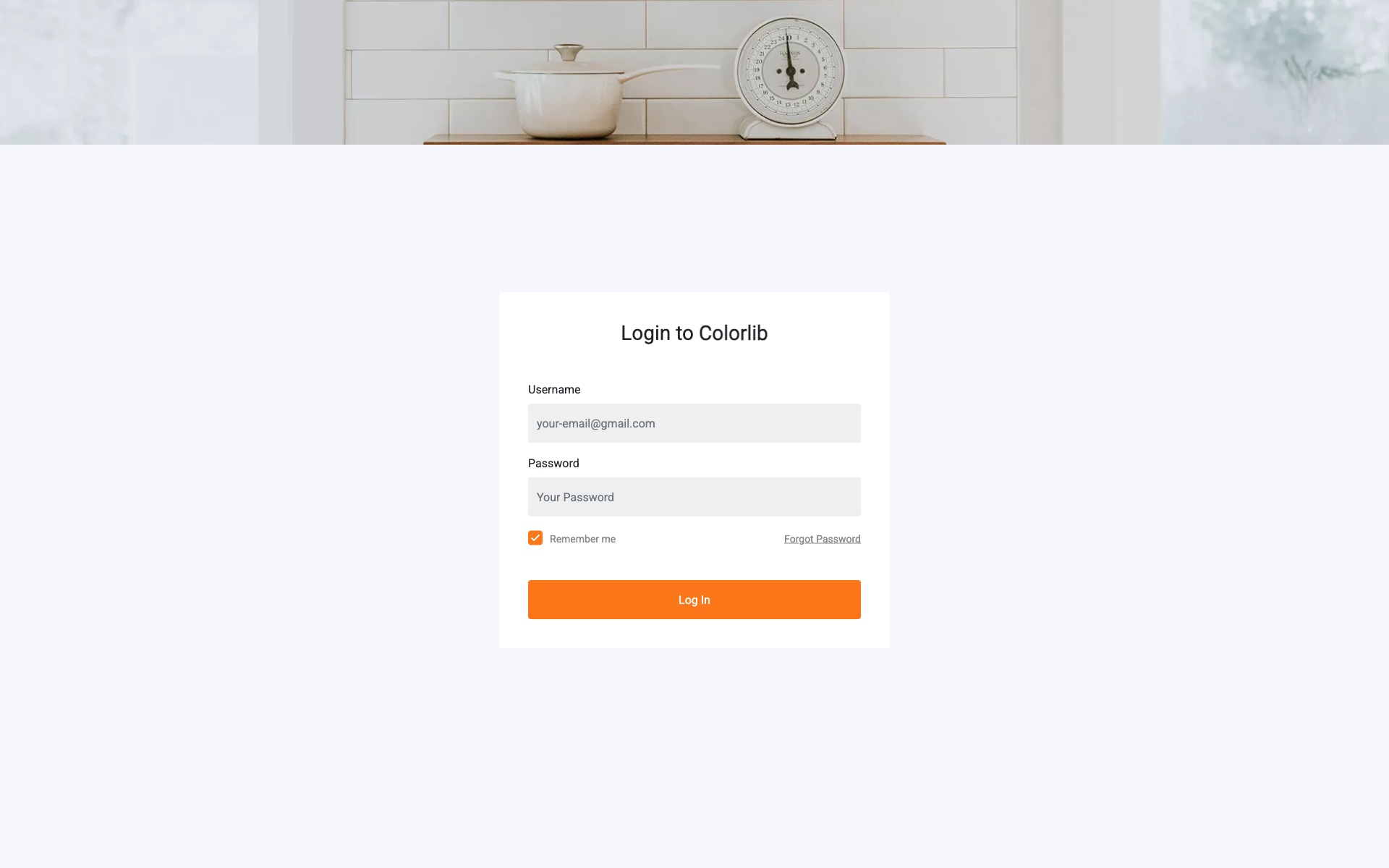
Why we like it: The dark gradient background with glowing input fields creates a striking visual that reduces eye strain in low-light environments.
Dark-themed login form with gradient background and glowing input fields. Includes social media login options and remember me functionality. The dark aesthetic is perfect for modern applications and reduces eye strain in low-light environments.
3. Login Form V05 – Material Design Login
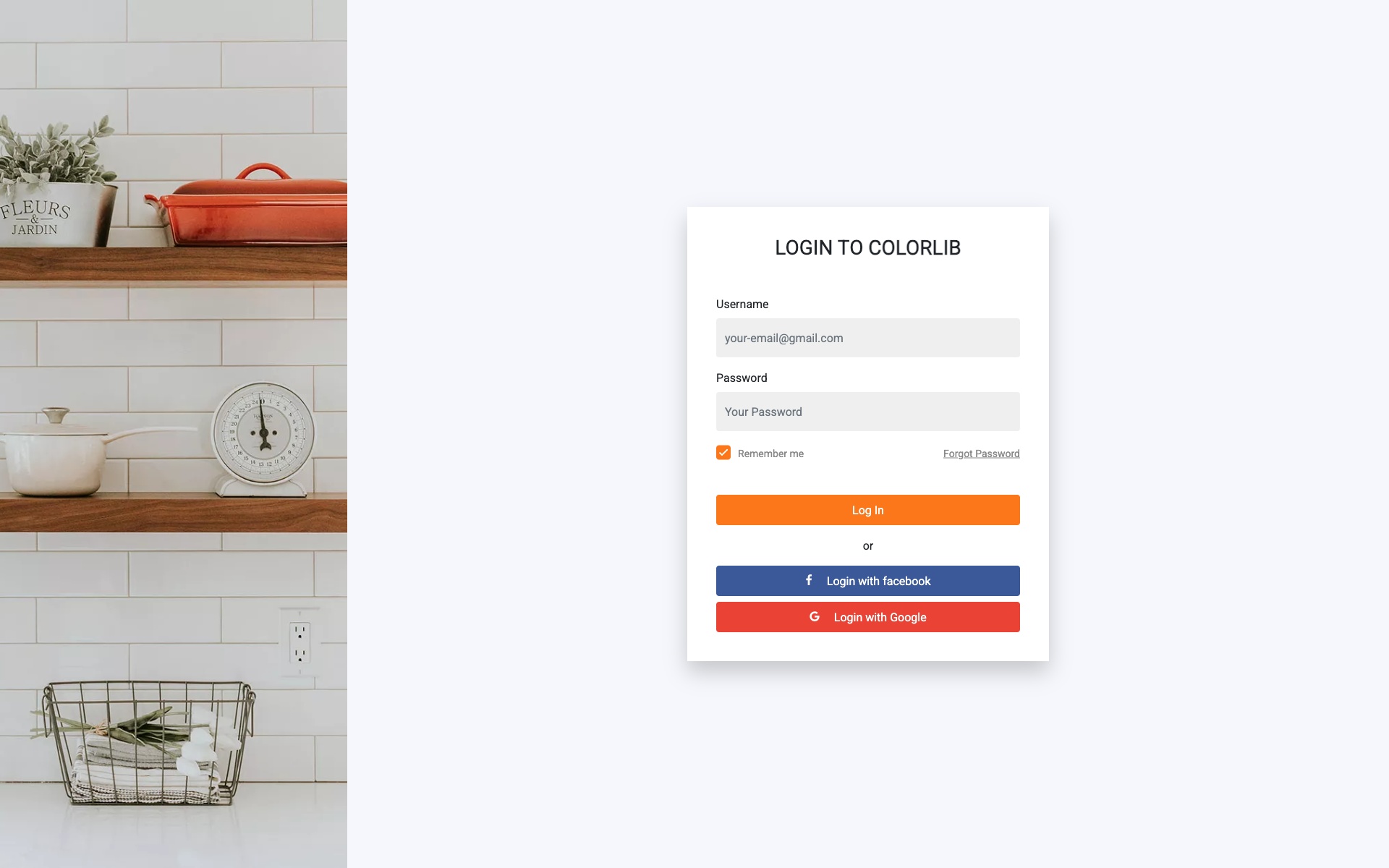
Why we like it: Floating label animations provide clear input field identification and a polished Material Design aesthetic.
Material Design inspired login form with floating labels, card-based layout, and subtle shadow effects for a modern appearance. The floating label animation provides excellent user experience and clearly indicates active input fields.
4. Login Form V07 – Animated Background Login
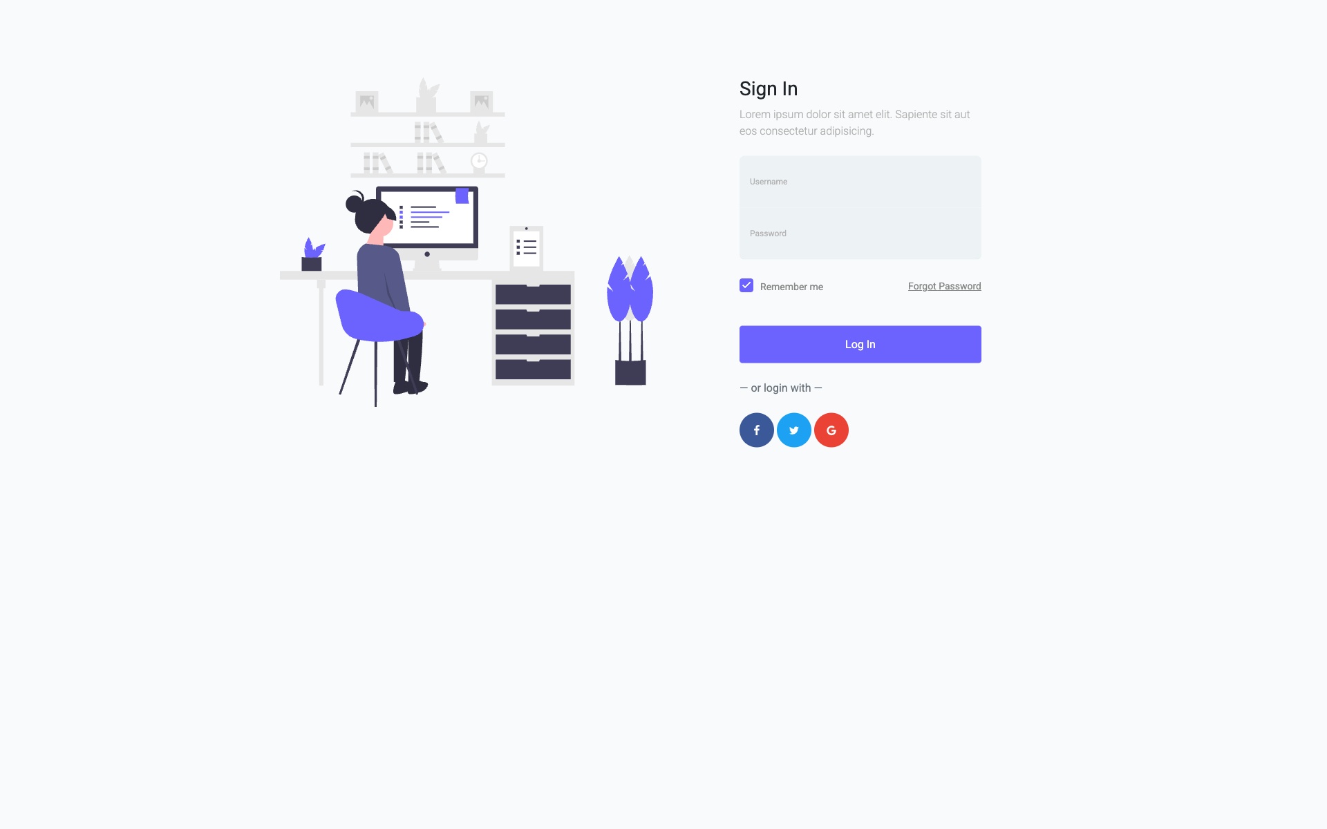
Why we like it: The animated geometric patterns create a memorable first impression without interfering with form usability.
Eye-catching login form with animated geometric background patterns and transparent form overlay. Perfect for tech and creative websites that want to make a strong first impression. The animations are smooth and don’t interfere with form usability.
5. Login Form V09 – Sidebar Login Panel
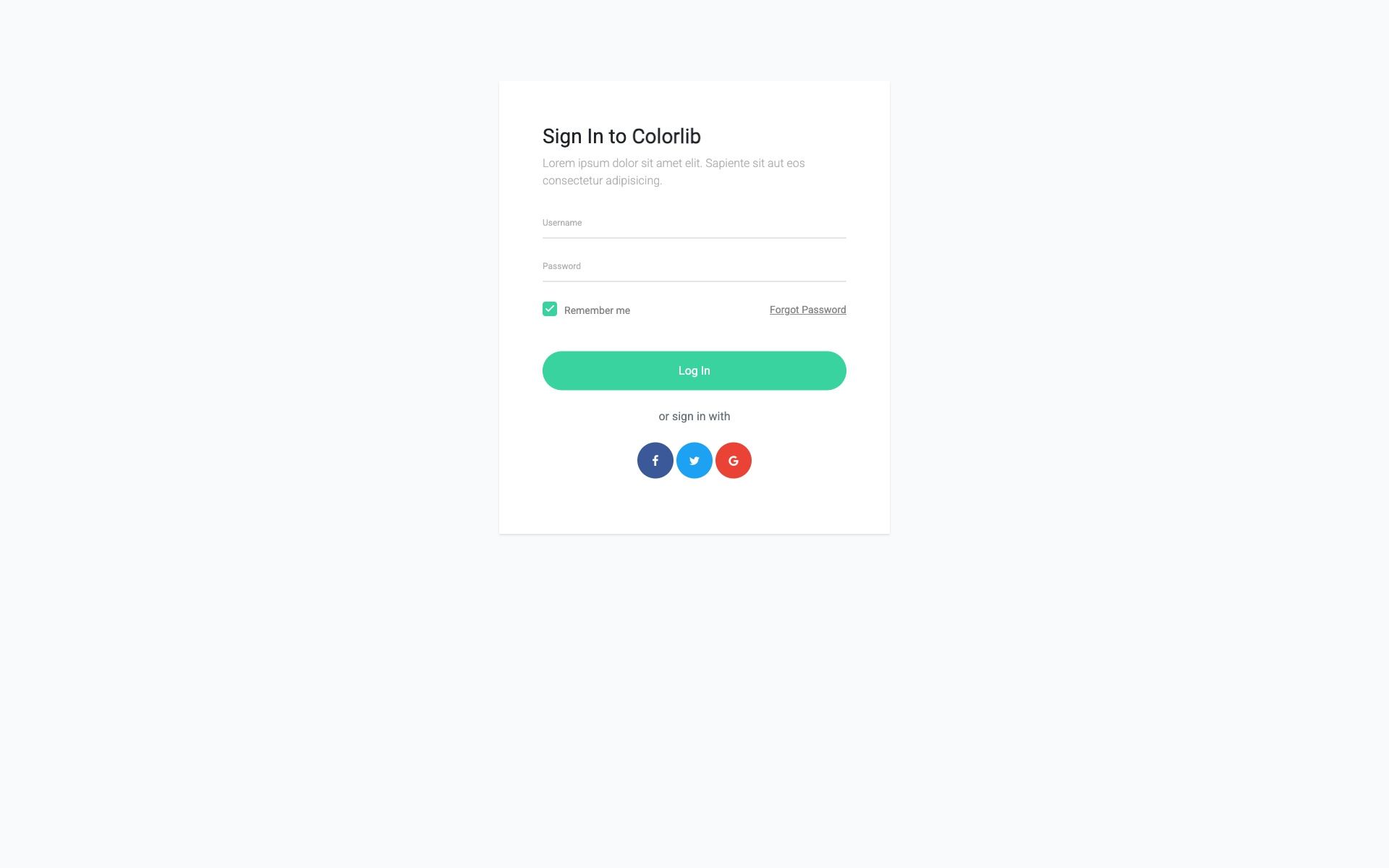
Why we like it: The sidebar approach maximizes visual space for background imagery while keeping the form prominently accessible.
Elegant sidebar-style login panel that slides in from the right with full-screen background image support. This design maximizes the use of visual space while keeping the login form prominently accessible.
6. Adminator Sign-In – Modern Split-Screen (Bootstrap-Free Alternative)
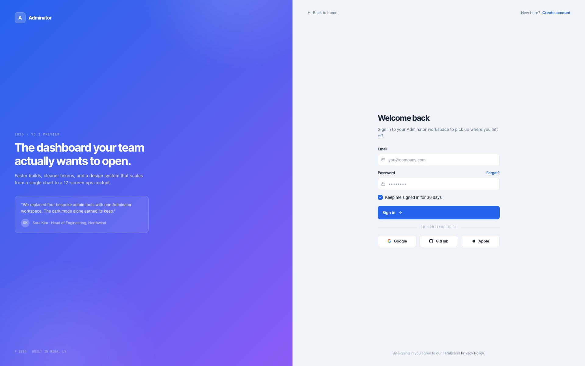
Why we like it: Ships as part of the Adminator 2026 dashboard — a brand-panel-on-the-left, form-on-the-right layout with Google / GitHub / Apple buttons and full keyboard accessibility.
Most templates in this roundup are Bootstrap-based; this one is the modern, framework-free alternative. Adminator’s 2026 v4 sign-in page uses a split-screen layout: a gradient brand panel on the left with marketing copy and a quote, and a centered sign-in form on the right with email + password fields, “keep me signed in” toggle, and three social-login buttons (Google, GitHub, Apple). The whole page works in light and dark mode and the form ships with HTML5 validation already wired up.
7. Login Form V11 – Ultra-Minimal Login
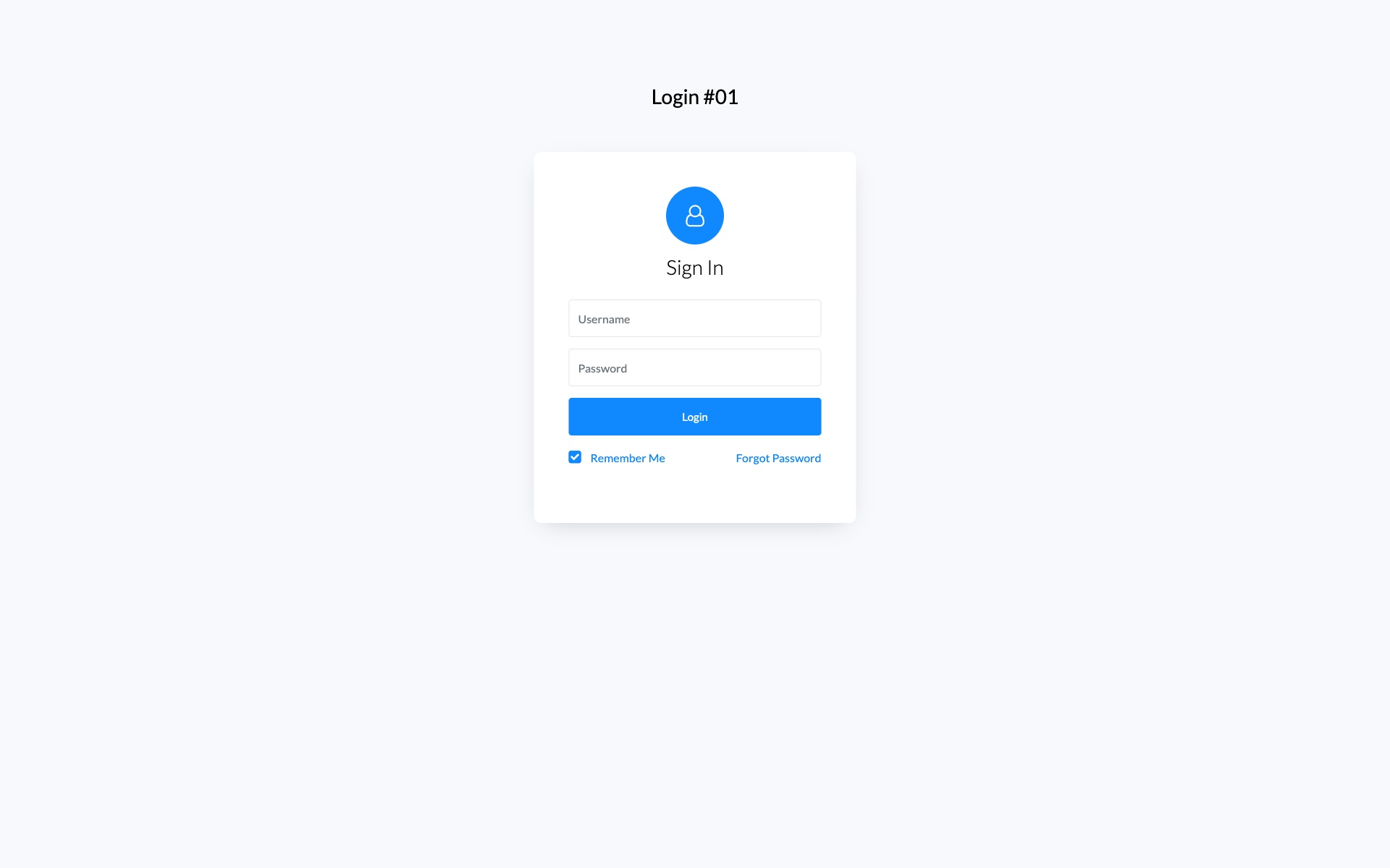
Why we like it: Distraction-free design that puts 100% focus on the login process with generous whitespace and clean typography.
Ultra-minimal login form focusing on typography and generous whitespace. Clean and distraction-free user experience that puts the focus entirely on the login process. Perfect for brands that value simplicity.
8. Login Form V13 – Gradient Card Login
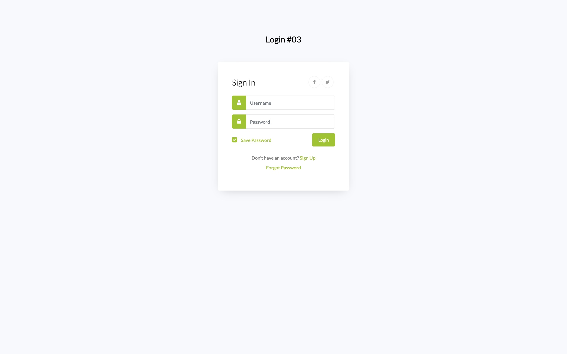
Why we like it: Smooth gradient transitions and soft shadows add visual interest while keeping the form professional and readable.
Beautiful gradient card-based login form with rounded corners, soft shadows, and smooth color transitions. The gradient design adds visual interest while maintaining professionalism and readability.
9. Login Form V15 – Video Background Login
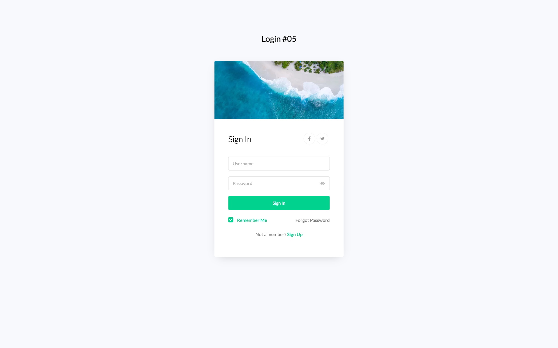
Why we like it: Video background support creates an immersive experience, with a semi-transparent overlay keeping the form readable.
Dynamic login form with video background support and semi-transparent overlay. Creates an immersive login experience perfect for entertainment, gaming, or creative industry websites.
10. Login Form V17 – Neumorphic Login Design
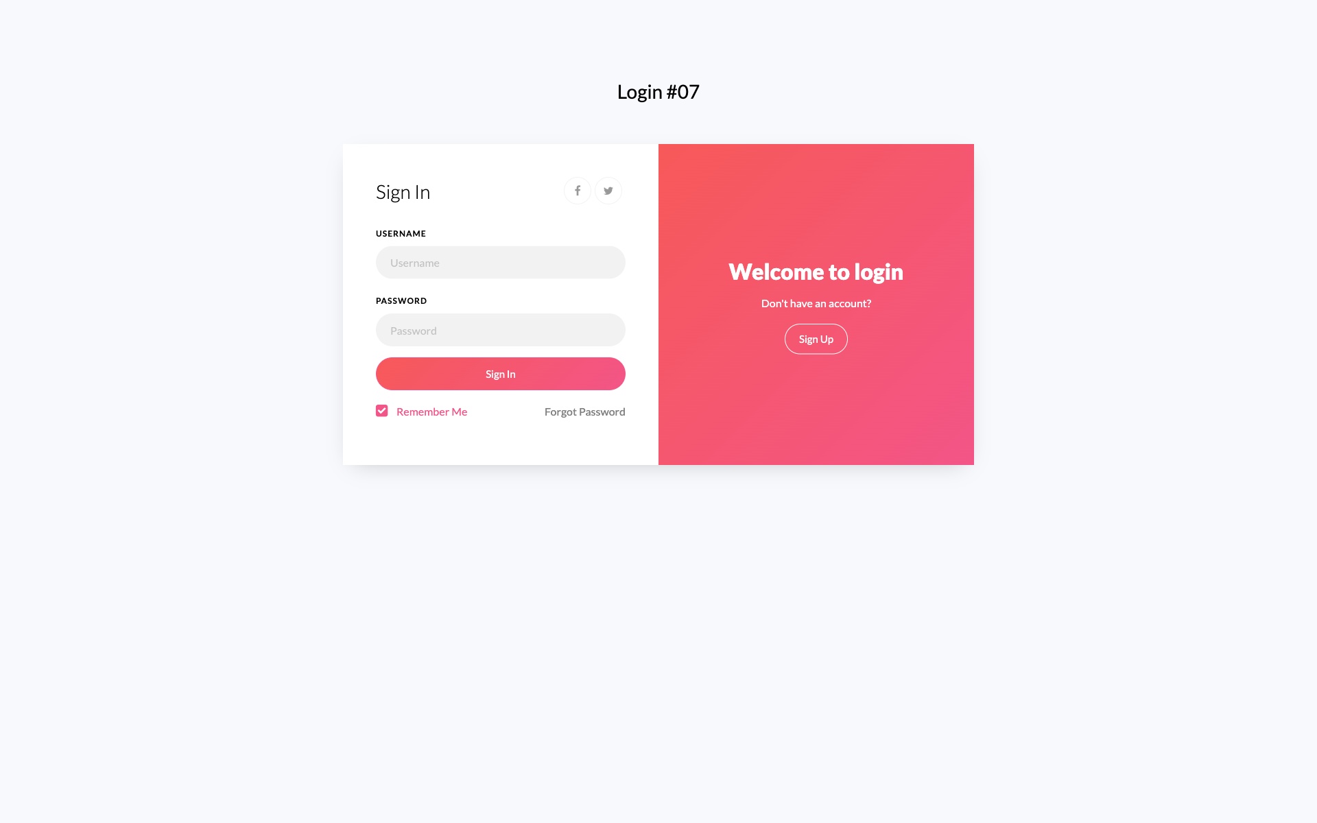
Why we like it: The neumorphic 3D effect creates depth without traditional borders, following one of the most popular modern design trends.
Trendy neumorphic design login form with soft shadows and extruded elements creating a 3D effect. This modern design trend creates depth without using traditional borders or harsh shadows.
11. Login Form V19 – Avatar-Focused Login
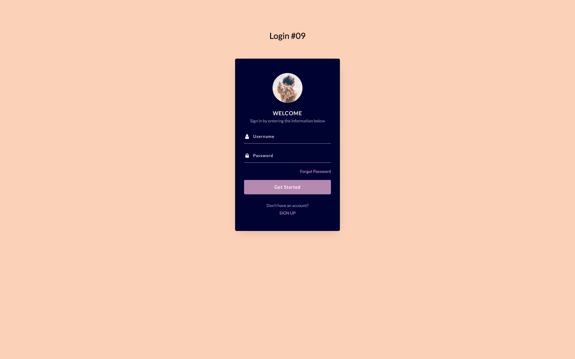
Why we like it: The avatar-focused layout adds a personal touch that enhances user identity and makes returning users feel welcomed.
Avatar-focused login form with vertical layout and user profile image display. Perfect for personalized user experiences and applications where user identity is important.
12. Login Form V02 – Classic Professional Login
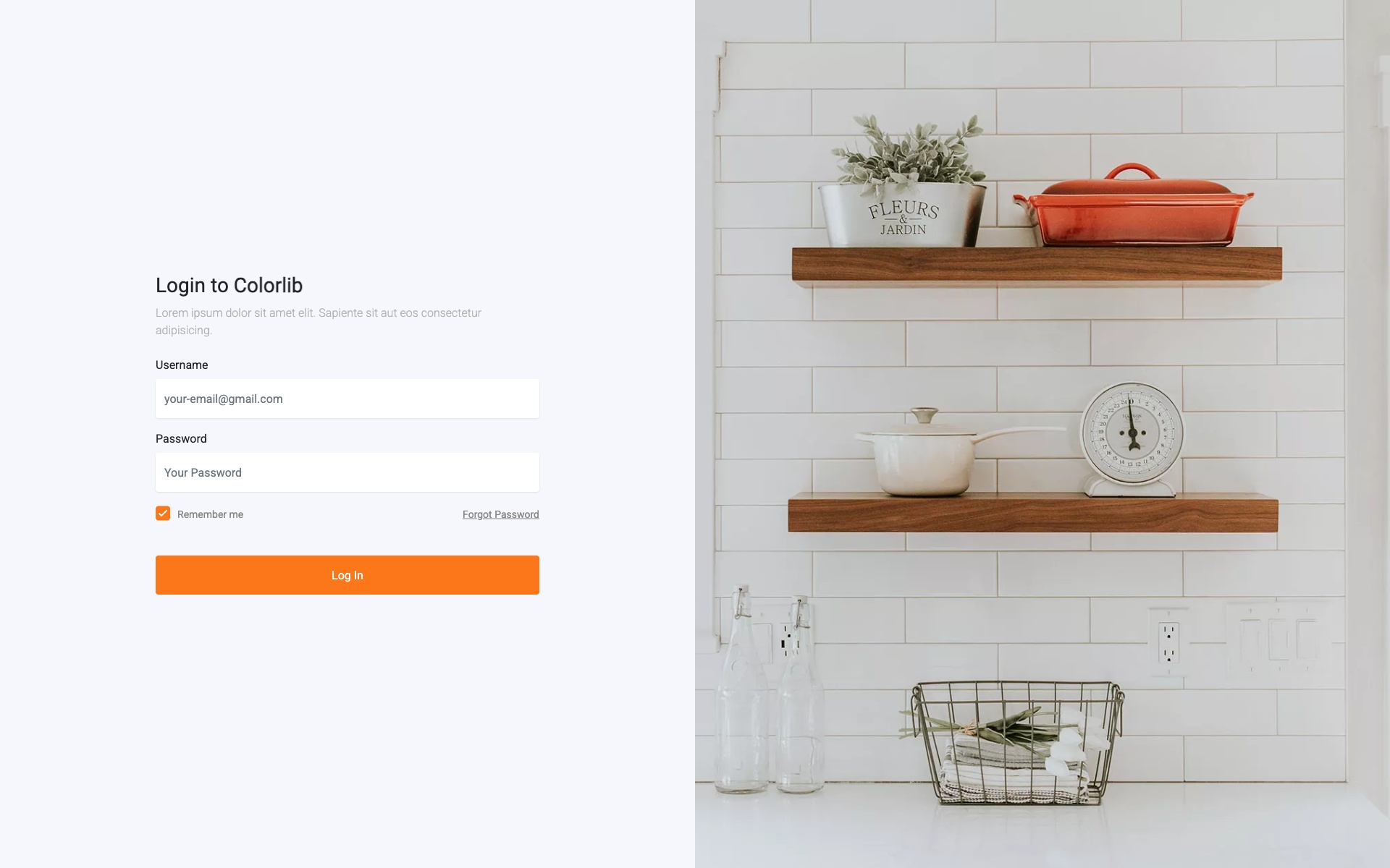
Why we like it: The classic blue accents and clean layout instill trust — exactly what enterprise users expect from a login page.
Traditional professional login form with blue accents and clean layout. Perfect for enterprise applications and business portals requiring a trustworthy and familiar interface.
13. Login Form V04 – Two-Tone Design
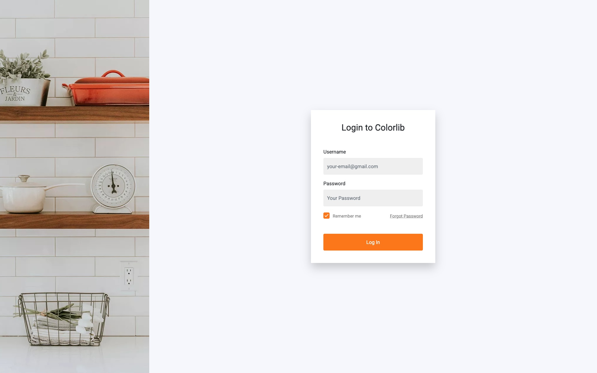
Why we like it: Bold contrasting colors create strong visual hierarchy that naturally guides users to the login fields.
Creative two-tone color scheme with bold typography. The contrasting colors create visual hierarchy and guide the user’s attention effectively to the login fields.
14. Login Form V06 – Centered Card Login
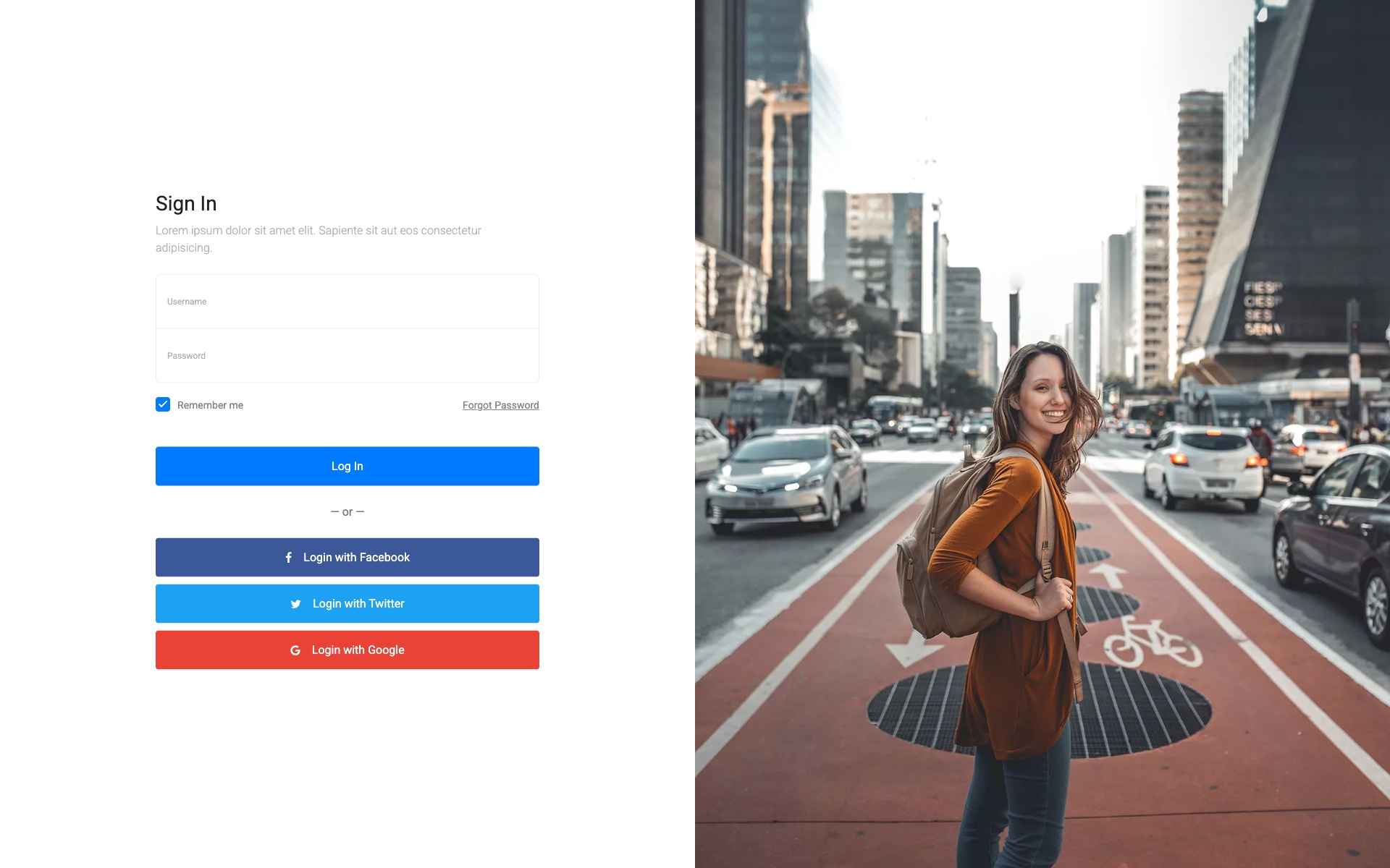
Why we like it: A timeless centered card pattern that works universally — impossible to go wrong with this classic approach.
Classic centered card design with shadow effects and clean typography. A timeless design that works for any type of website or application.
15. Login Form V08 – Diagonal Split Design
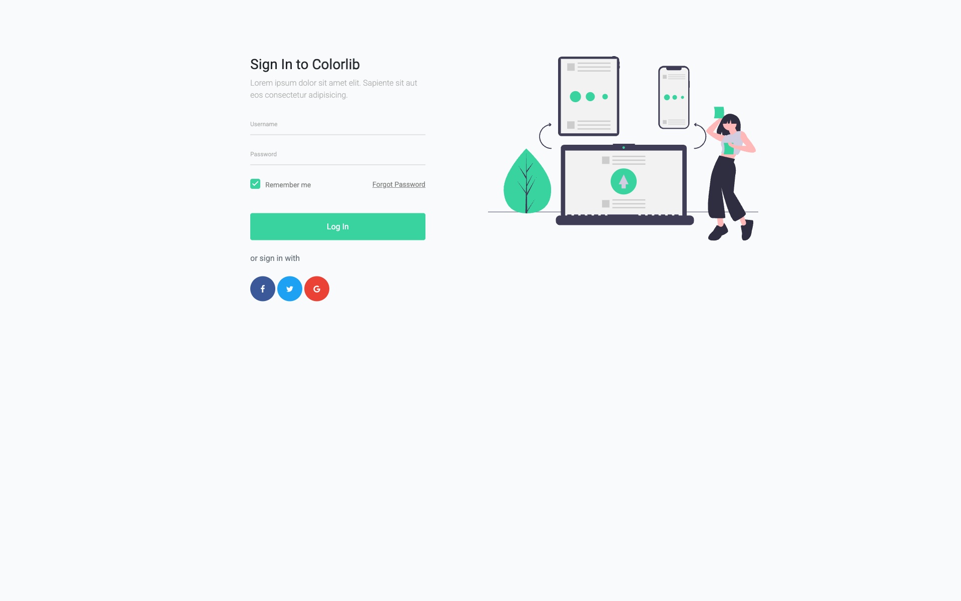
Why we like it: The diagonal geometric split adds dynamism and energy while still maintaining a professional appearance.
Unique diagonal split design creating visual interest with geometric shapes. The angular design adds dynamism while maintaining professional appearance.
16. Creative Login Form – Purple Gradient

Why we like it: The vibrant purple gradient makes a bold brand statement while the card design keeps the form clean and usable.
Vibrant purple gradient login form with modern card design and smooth color transitions. The bold color choice makes a strong brand statement while maintaining usability.
17. Professional Sign In – Business Blue
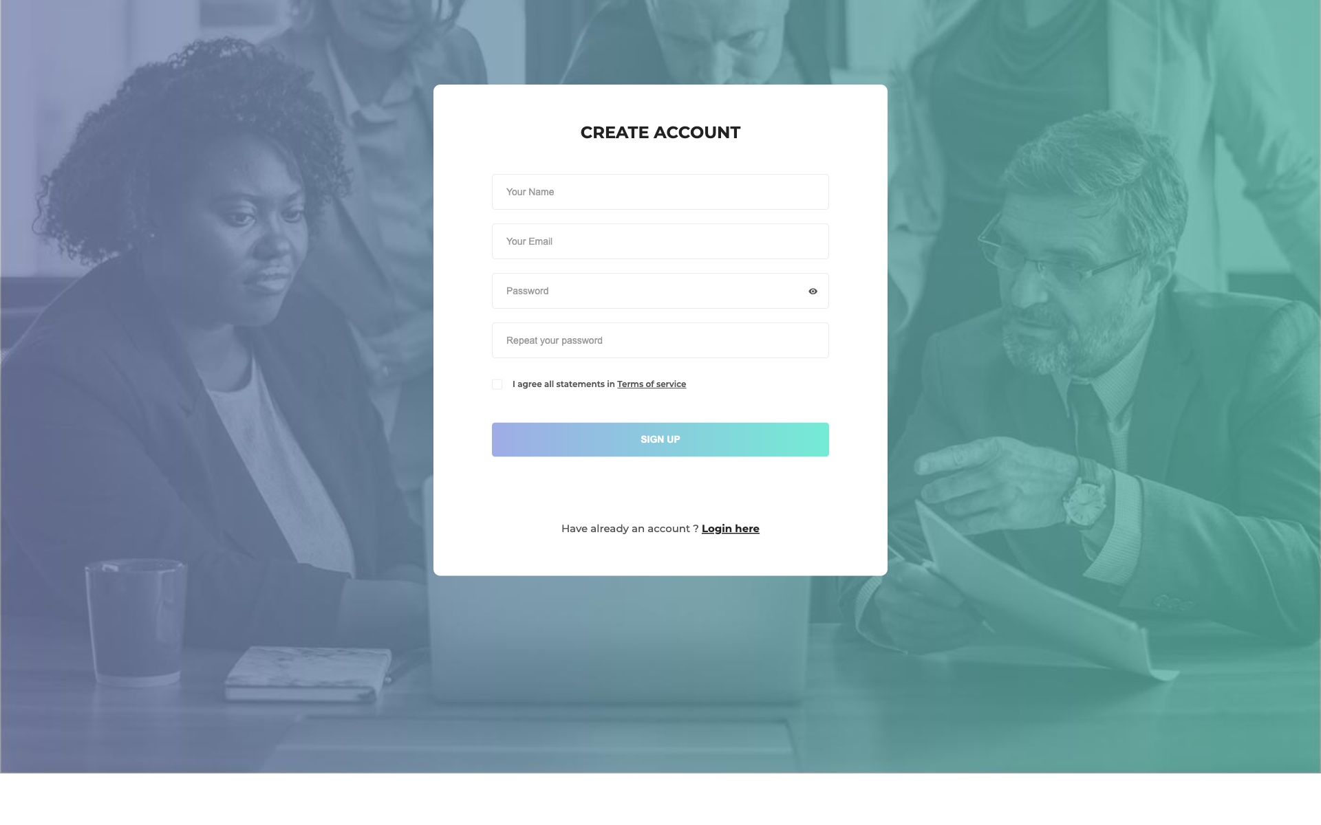
Why we like it: Conservative blue design that immediately communicates trust and professionalism — ideal for corporate environments.
Professional blue-themed sign-in form perfect for corporate and business applications. The conservative design instills trust and professionalism.
18. Soft Login Panel – Pastel Design
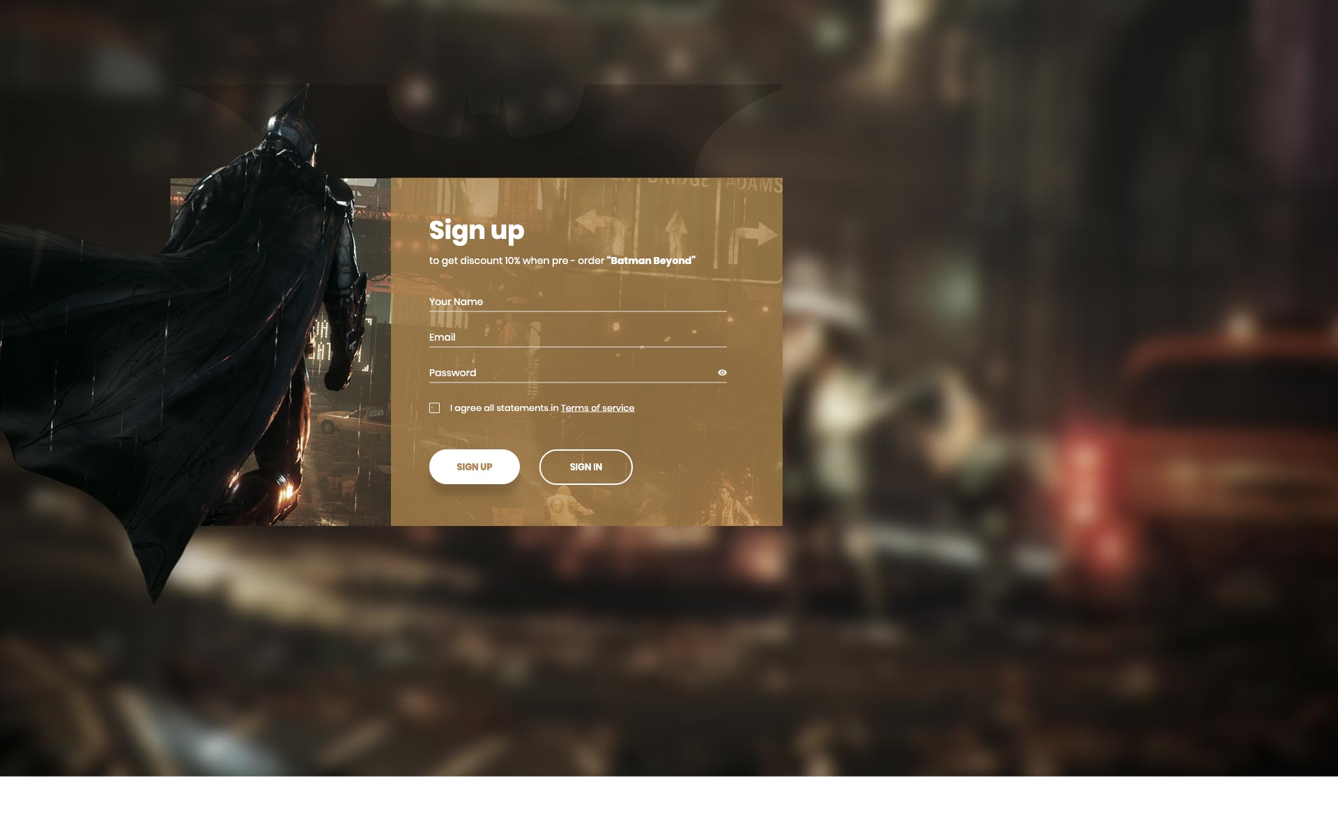
Why we like it: The soft pastel palette and rounded corners create an approachable, friendly feel perfect for non-technical audiences.
Soft and approachable login panel with rounded corners and pastel color palette. Ideal for wellness, lifestyle, or education platforms.
19. Two-Column Auth Form
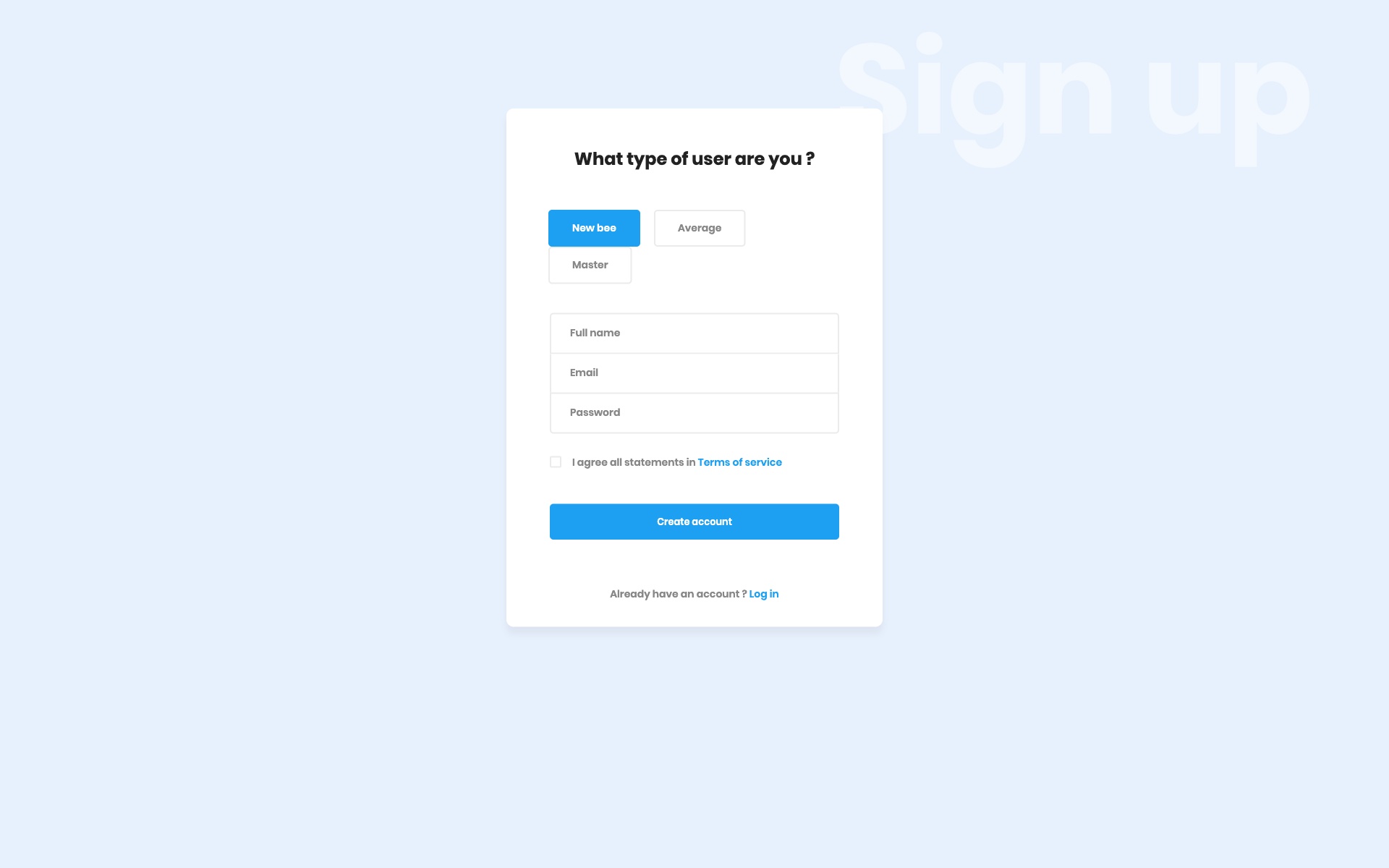
Why we like it: Combining login and registration in one view reduces friction for new users while keeping quick access for returning ones.
Efficient two-column layout allowing users to switch between login and registration seamlessly. Reduces friction for new users while maintaining quick access for returning users.
20. Icon-Enhanced Secure Login
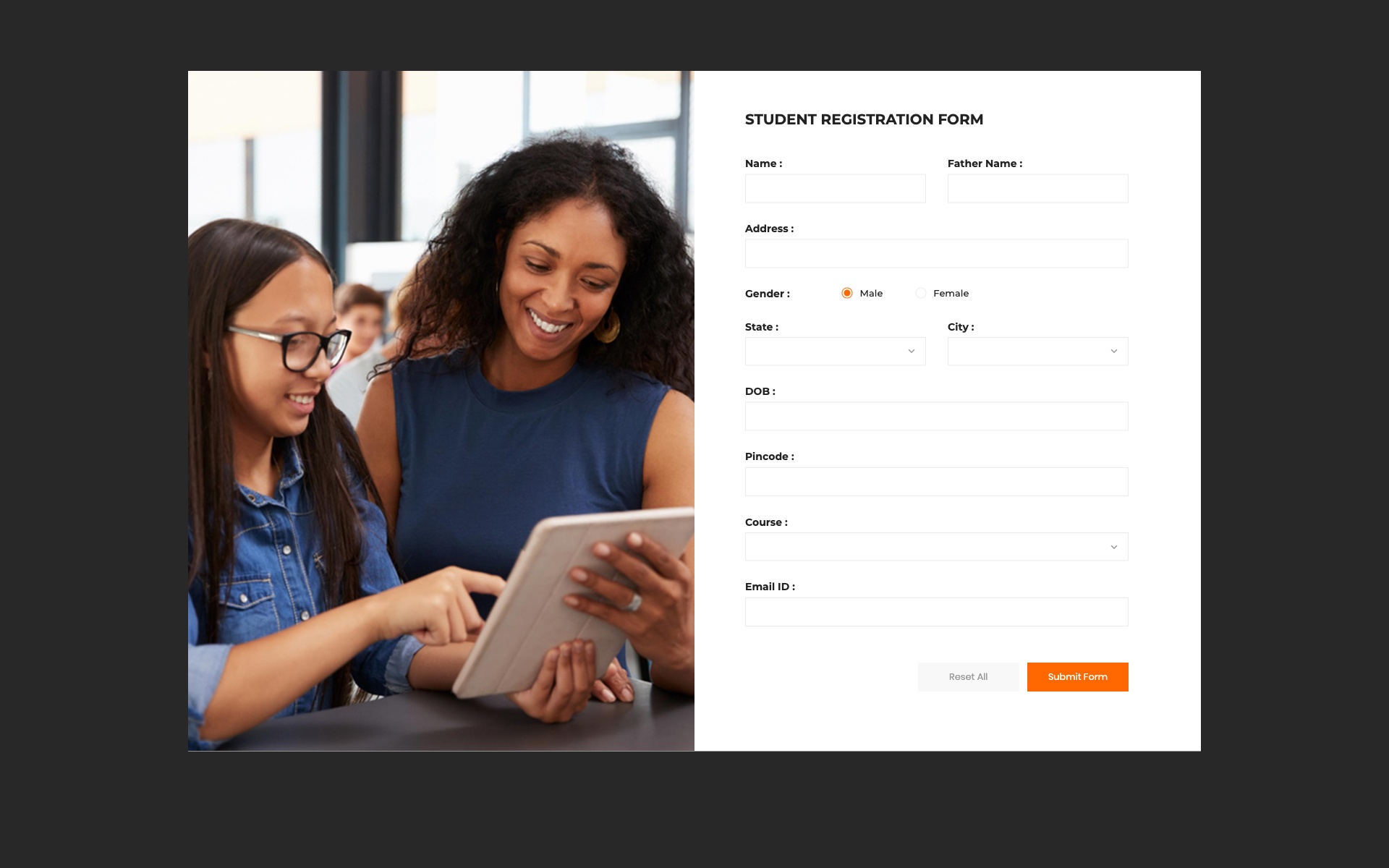
Why we like it: Icon-enhanced fields and security indicators help users quickly identify inputs and feel confident about data safety.
Security-focused login form with icon-enhanced fields and visual security indicators. The icons help users quickly identify input fields and security features.
21. Modern Auth – Sliding Panels
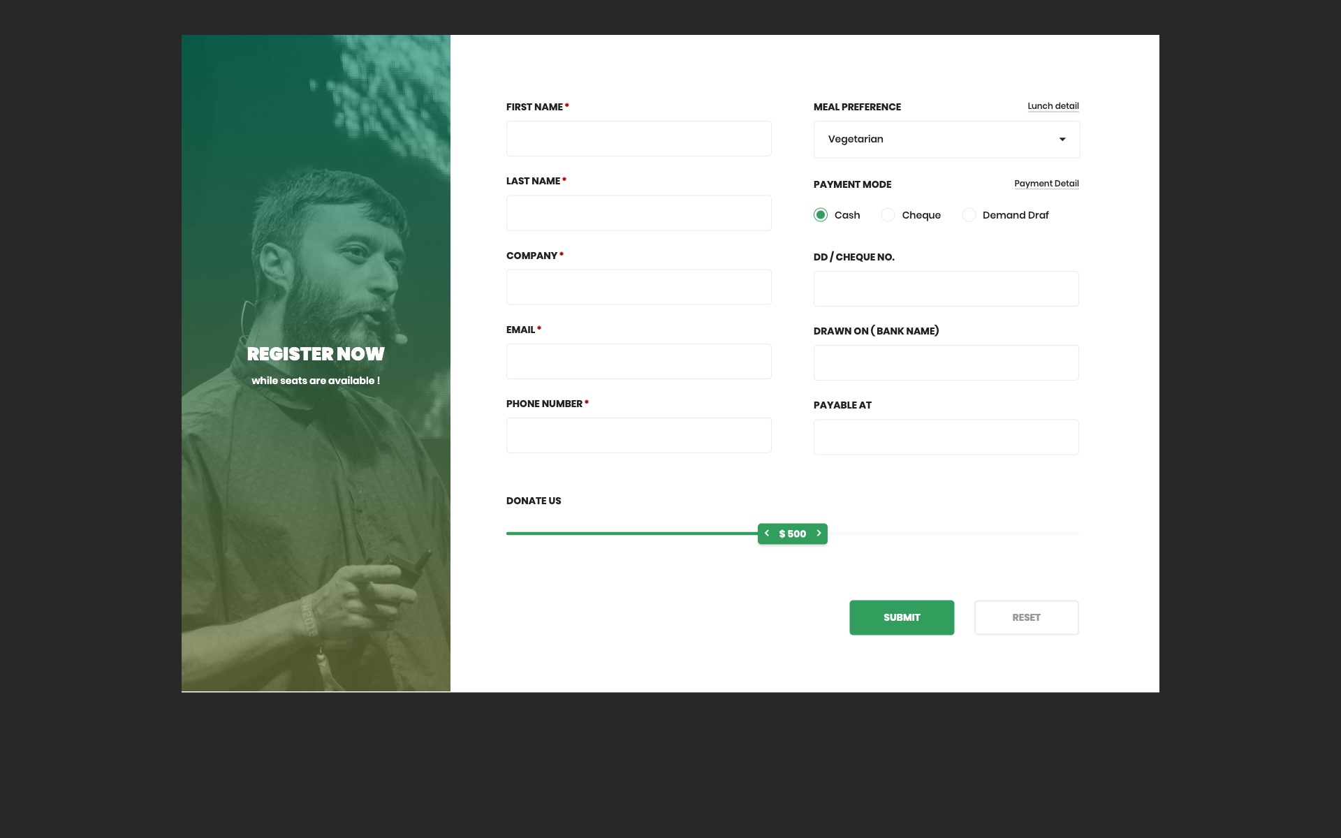
Why we like it: The sliding panel animation between login and signup creates a polished, app-like experience that reduces page navigation.
Interactive sliding panel design allowing smooth transitions between login and signup modes. The animation creates an engaging user experience.
22. Elegant Sign In – Centered Design
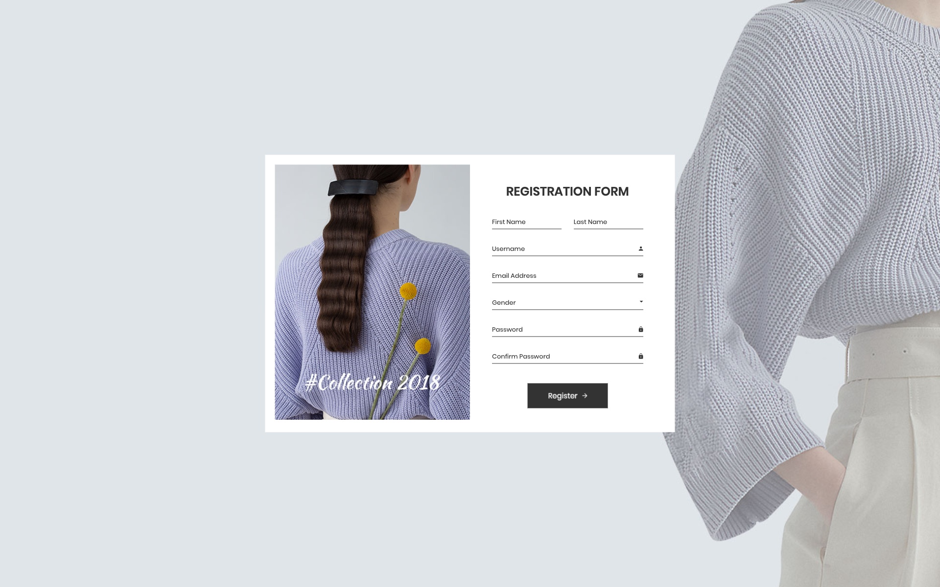
Why we like it: Perfectly balanced typography and visual hierarchy make this form effortless to use at first glance.
Elegantly centered login form with balanced typography and perfect visual hierarchy. The design focuses on clarity and ease of use.
23. Login Widget – Compact Design
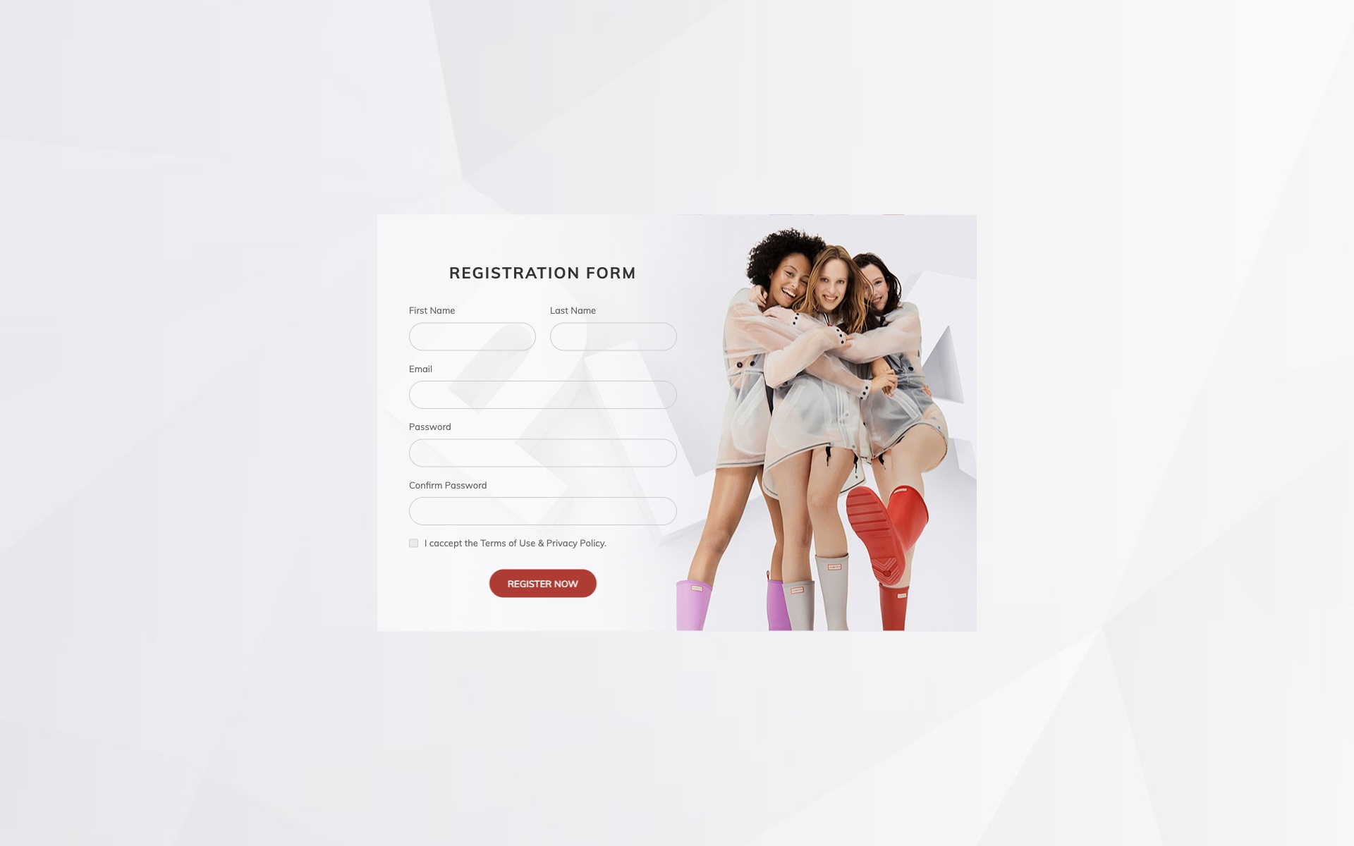
Why we like it: The compact footprint makes it uniquely versatile — embed it in a sidebar, modal, or any tight layout.
Compact and versatile login widget that can be easily embedded into any webpage layout. Perfect for sidebars or modal implementations.
24. Enterprise Access Portal
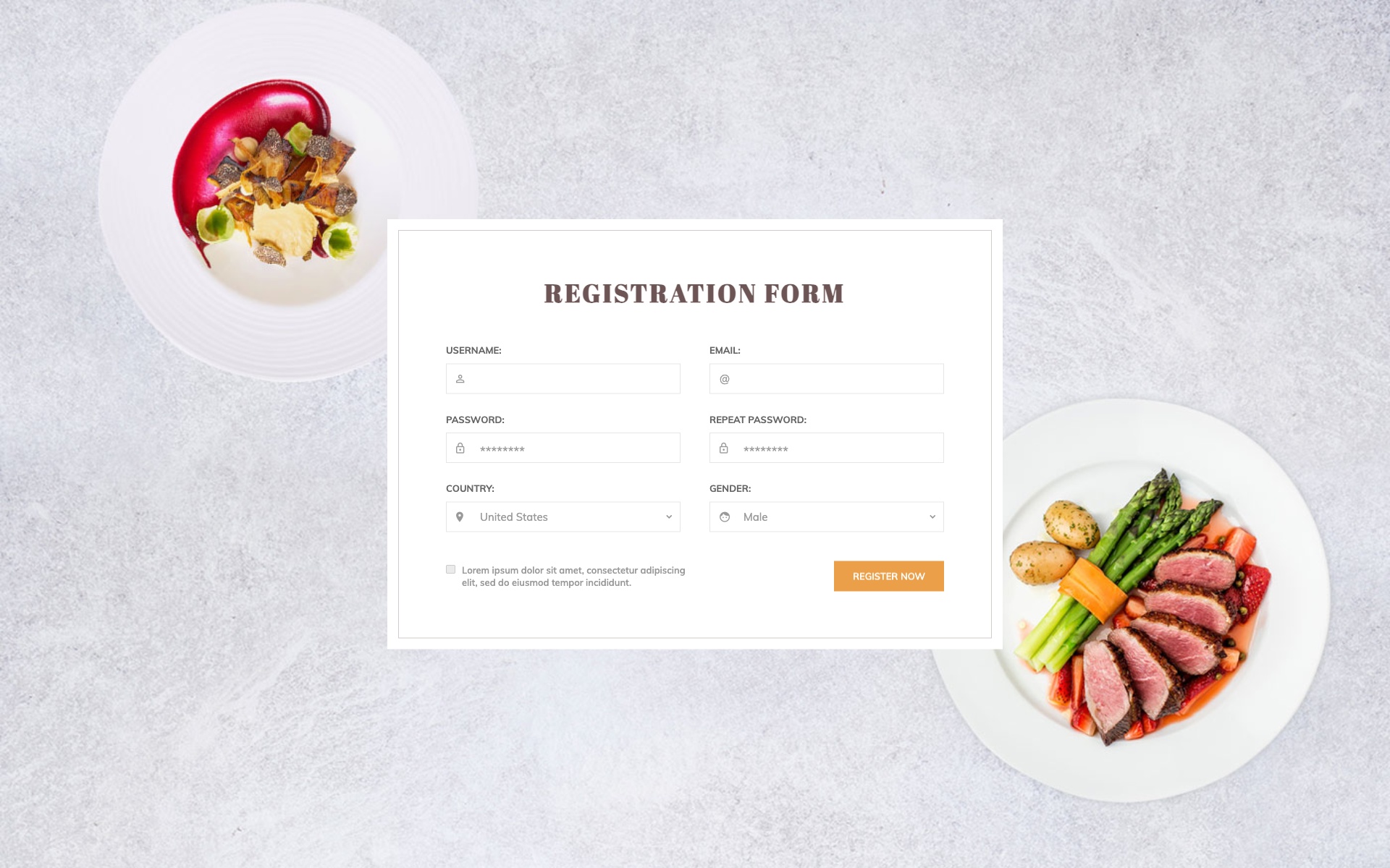
Why we like it: Enterprise-grade styling with a professional appearance that meets corporate authentication standards out of the box.
Enterprise-grade login portal with advanced security features and professional appearance. Designed for large organizations with complex authentication requirements.
25. Speed-Optimized Login
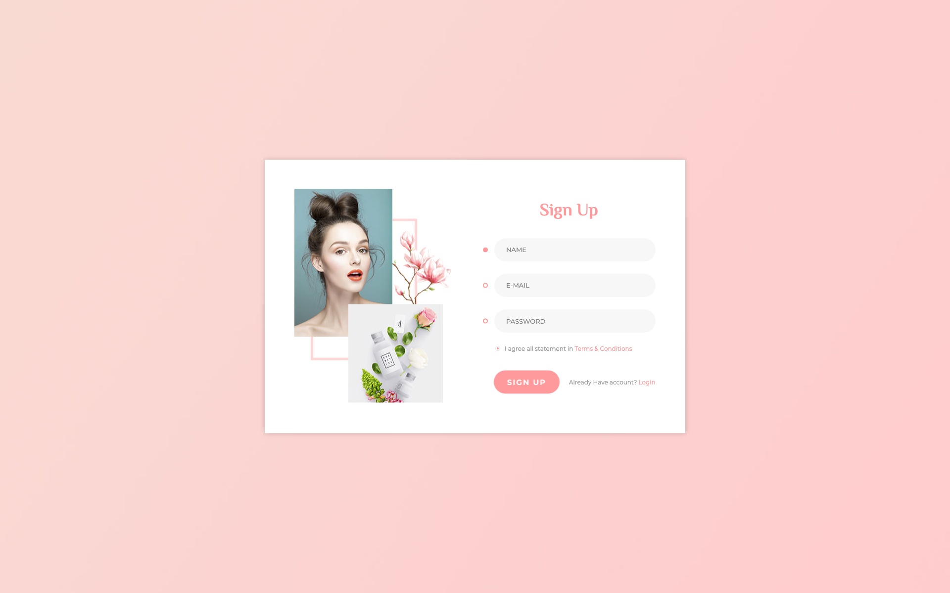
Why we like it: Every element is optimized for minimal loading time, making it ideal for users on slow connections or mobile networks.
Speed-optimized login form designed for minimal loading time and reduced user friction. Every element is optimized for performance.
26. Admin Dashboard Login

Why we like it: Role selection and dashboard access features make it ready-made for multi-user systems with different permission levels.
Admin-focused login form with role selection and dashboard access features. Perfect for multi-user systems with different permission levels.
Key Features Comparison
| Feature | Basic Forms | Advanced Forms | Enterprise Forms |
|---|---|---|---|
| Social Login Integration | Optional | Included | Customizable |
| Two-Factor Authentication | — | Optional | Built-in |
| Password Recovery | Link | Modal | Multi-step |
| Remember Me Option | Yes | Yes | Yes + Session Management |
| Form Validation | Client-side | Real-time | Advanced + Server-side |
Implementation Tips
Quick Integration Guide
- Download the template — Choose your preferred design from the collection above
- Extract files — Unzip the downloaded package to your project directory
- Link Bootstrap — Ensure Bootstrap CSS and JS are properly linked
- Customize colors — Modify the CSS variables to match your brand
- Add validation — Implement client and server-side form validation
- Connect backend — Link the form action to your authentication system
- Test responsiveness — Verify the form works on all device sizes
Conclusion
This comprehensive collection of 26 login forms provides everything you need to create professional, secure, and user-friendly authentication experiences. From minimal designs to feature-rich enterprise solutions, these templates cover every use case.
Remember that a well-designed login form is often the first interaction users have with your application. Make it count by choosing a template that aligns with your brand identity and with what users already expect a sign-in page to do. These are built on Bootstrap 5, and every one of them is free, responsive, and ready to drop into a project today.
Bootstrap login form FAQ
What should a login page include?
An identifier field, a password field, a submit button, and three links: forgot password, create an account, and remember me. That is genuinely the whole list. Every extra control on a sign-in screen costs conversion, so the strongest templates look almost empty — anything beyond those elements belongs on a different page.
How do I make a login form secure?
The template only gets you part of the way, since most free login forms ship with no real validation. The single most-missed rule is not revealing which field was wrong: a message saying “no account with that email” lets an attacker enumerate registered addresses. Use one generic failure message for both cases, enforce validation on the server rather than only in the browser, rate-limit attempts, and always serve the page over HTTPS.
Do these login templates work without Bootstrap?
Most are Bootstrap-based, but a login page is essentially a centred card containing a form, so there is little framework-specific logic to unpick — converting one to plain HTML and CSS, Tailwind, or a component framework is usually straightforward. What you are buying is the layout and visual treatment. If you want a framework-free starting point, the Adminator Sign-In entry is built that way deliberately.
Why does my login form not work with password managers?
Almost always because of missing markup. Password managers look for real label elements, a name and id on each input, and the correct autocomplete tokens — autocomplete=”username” on the identifier and autocomplete=”current-password” on the password field. Templates that use placeholder text in place of labels tend to break autofill, and the fix is a few attributes rather than a rewrite.
Should social login go above or below the email fields?
Above. Someone who originally signed up with Google will otherwise start typing an email address before noticing the Google button, then have to work out which account they used. Putting the social options first with a clear divider beneath them prevents the most common support request a login page generates.
Are these Bootstrap login forms free to use?
Yes, every template on this page is free. Check each entry for its licence before commercial use, and treat the demos as front-end starting points — they provide the markup and styling, while authentication itself, validation and session handling remain yours to implement on the server.

You Might Also Like