12 Best shadcn/ui Block Libraries 2026
Looking for the best shadcn-compatible block libraries to extend your shadcn/ui project? These 12 libraries cover everything from massive marketplaces with 6,000+ blocks to specialized animation kits, official chart components, premium block sets, and design-system-grade Figma + React combos.
In 2026, shadcn/ui is no longer a single library — it’s an ecosystem. The official shadcn/ui project ships the core 50+ components and a growing set of blocks, but the real productivity gains come from third-party libraries that extend it: animated effects from Magic UI and Aceternity, marketing pages from Tailark, advanced primitives from Origin UI, AI patterns from Cult UI, and massive block marketplaces from shadcn.io and Shadcnblocks. Every library on this list either installs through the shadcn CLI (npx shadcn add @library/component) or copy-pastes directly into a shadcn project.
We’ve grouped the 12 picks below into massive block marketplaces (shadcn.io, Shadcnblocks, 21st.dev), animation-focused libraries (Magic UI, Aceternity, Cult UI), specialty / category-focused (shadcn/ui Charts, Tailark, Origin UI), and polished newer libraries (ReUI, Skiper UI, MynaUI). Every demo URL has been opened, screenshotted, and verified clean as of May 2026.
Related reading: our shadcn/ui templates & starter kits, shadcn/ui SaaS starter kits, and shadcn/ui data table templates roundups.
Quick Picks
- Best free animated: Magic UI — 150+ animated components, 20.8k stars, MIT
- Best paid animated: Aceternity UI — 200+ motion-rich blocks for SaaS landing pages
- Largest catalog: shadcn.io — 6,000+ blocks across 56 categories
- Best for marketing: Tailark — 300+ high-conversion blocks, 4 cohesive themes
- Best for charts: shadcn/ui Charts — official Recharts-powered components
- Best for AI patterns: Cult UI — animated components + 100+ AI SDK agent patterns
- Best with Figma kit: Shadcnblocks — 1,557 blocks + V2 Figma library
- Best community marketplace: 21st.dev — YC-backed, AI Agents SDK
1. shadcn.io
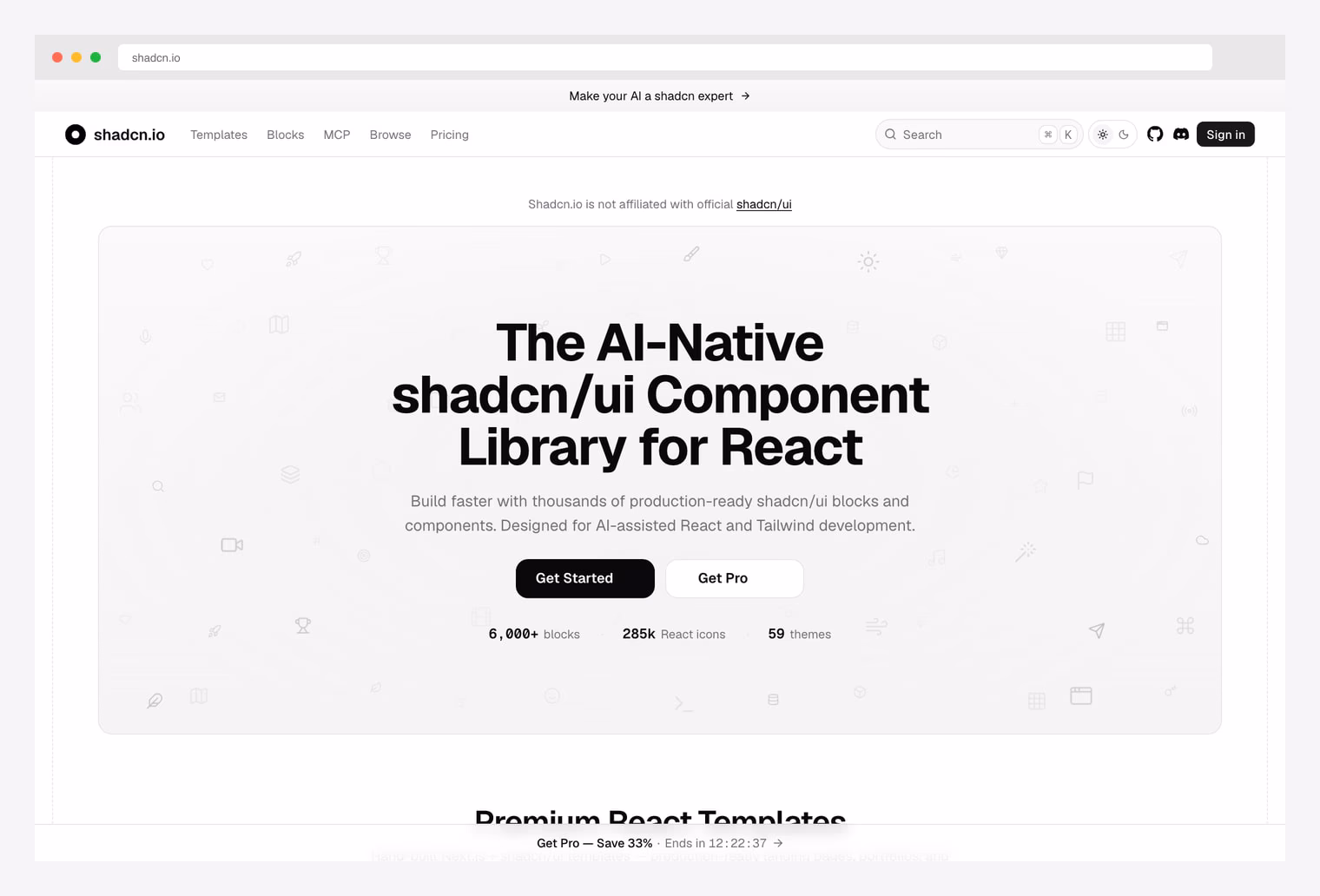
Why we like it: 6,000+ production-ready blocks across 56+ categories, 285k React icons, 59 themes — the most comprehensive shadcn/ui block marketplace, designed for AI-assisted React and Tailwind development.
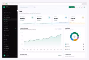
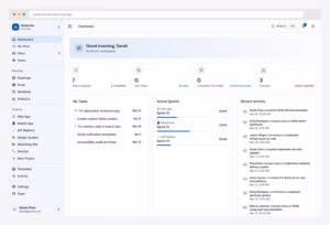
shadcn.io positions itself as “the AI-native shadcn/ui component library for React” — a phrase that captures both its scale (6,000+ blocks) and its workflow (AI agents installing components on demand). Browse organized categories from hero sections and pricing tables to dashboards, auth flows, and CRM tables, plus 285k icons and 59 ready themes. Free tier exposes a substantial preview library; the Pro tier unlocks the complete catalog plus premium templates. Note: shadcn.io is a community marketplace, not affiliated with the official shadcn/ui project.
2. Shadcnblocks
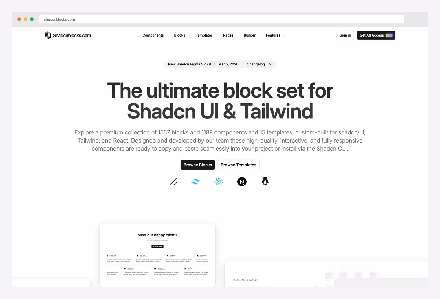
Why we like it: 1,557 blocks, 1,189 components, and 15 multi-page templates with first-class Figma kit. Multi-framework support spanning Next.js, Astro, Vue, and Svelte. The most “production-grade” workflow of any shadcn block marketplace.
Shadcnblocks is the polished, design-system-grade alternative to shadcn.io’s scale-first approach. The catalog ships 1,557 blocks plus 1,189 components plus 15 templates, all available across Next.js, React, Astro, Vue, and Svelte stacks. The differentiator: an official Figma kit (V2 launched March 2026) that mirrors every block, plus a Builder tool for assembling pages from blocks visually. Free blocks are copy-paste; Get All Access unlocks the complete catalog and Figma source.
3. 21st.dev
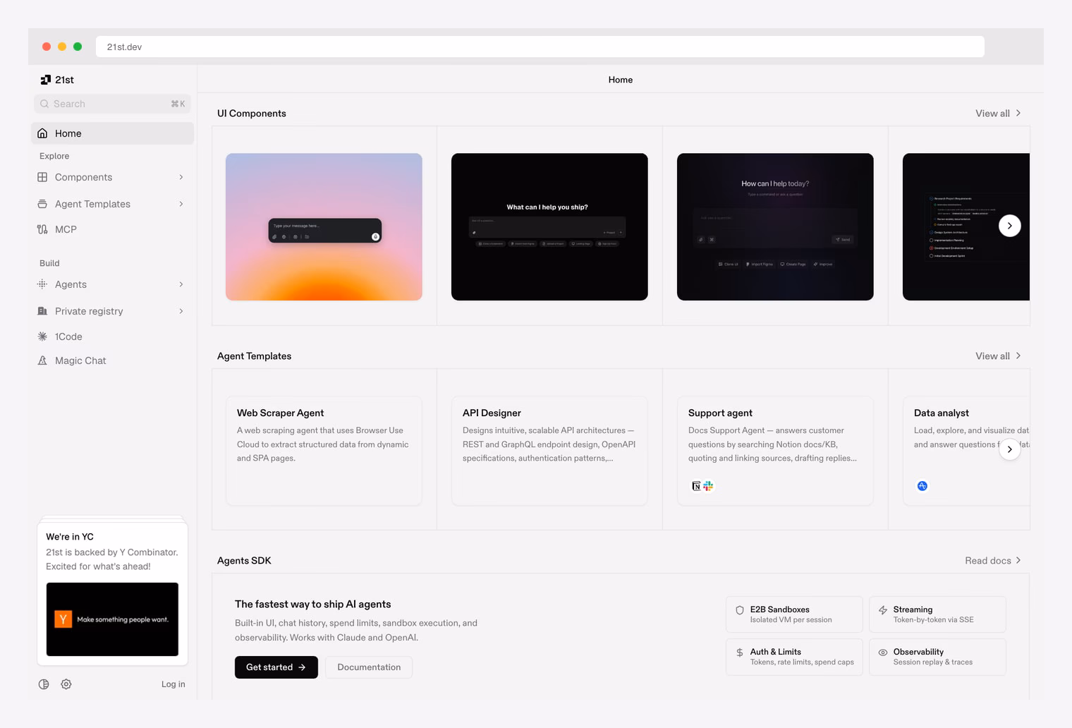
Why we like it: Community marketplace where developers publish shadcn-compatible blocks, plus an AI Agents SDK with E2B sandboxes, Auth & Limits, Streaming, and Observability. YC-backed. Different category than the curated marketplaces — wider variety, faster moving.
21st.dev is the community-driven cousin of shadcn.io — anyone can publish shadcn-compatible UI components, agent templates, and registry packages, and the platform handles distribution via the shadcn registry CLI. The home grid surfaces UI Components, Agent Templates (Web Scraper Agent, API Designer, Support agent, Data analyst), 1Code, Magic Chat, and a private registry for commercial blocks. The Agents SDK adds session-isolated VMs, streaming, rate limits, and replay observability — a direction the rest of the shadcn block ecosystem isn’t pursuing yet. Y Combinator-backed.
4. Magic UI

Why we like it: 150+ free animated components built with React + TypeScript + Tailwind + Motion. 20.8k GitHub stars. Designed specifically as a “perfect companion for shadcn/ui” — install via shadcn CLI, paste, ship.
Magic UI is the canonical free animated component library for shadcn/ui. The 150+ components cover terminal animations, marquees, particle effects, kinetic text, animated lists, bento grids, ripples, and bordered beams — patterns that elevate landing pages and product surfaces. All components install via the shadcn CLI and ship as TypeScript source you own (not a runtime dependency). The Pro tier adds 50+ landing-page blocks and complete templates ($199 one-time) for teams that want pre-assembled pages instead of components.
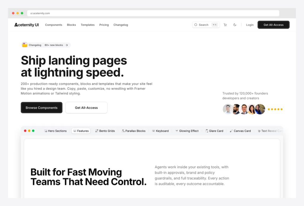
5. Aceternity UI
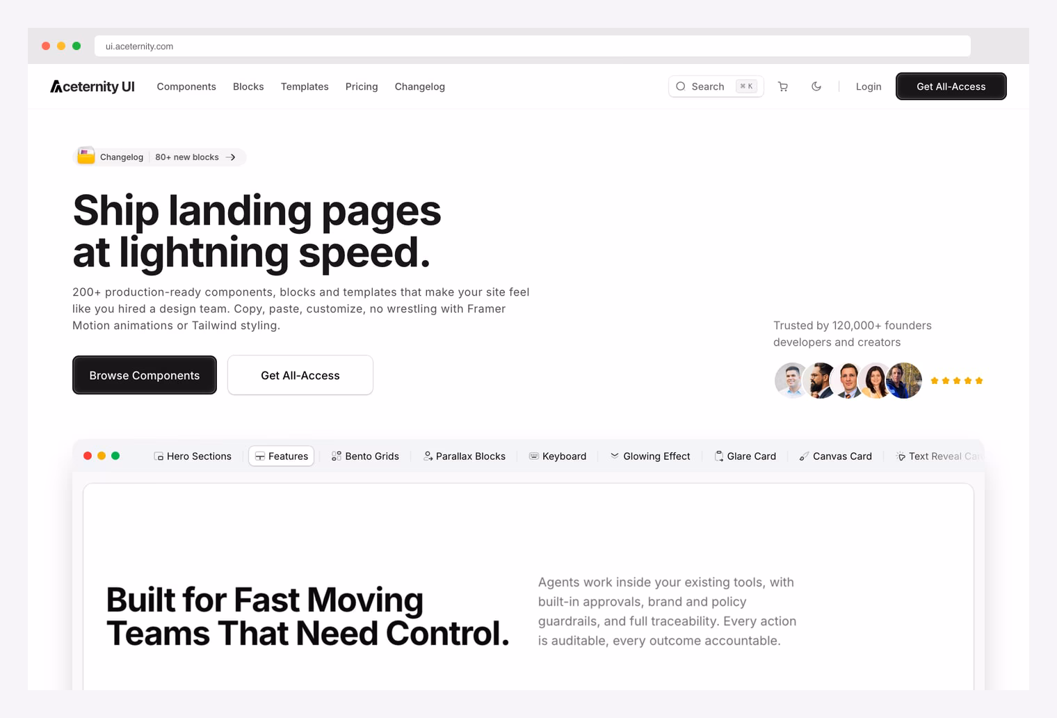
Why we like it: 200+ production-ready components, blocks, and templates with bento grids, parallax blocks, glare cards, canvas cards, glowing effects, hero sections — the most polished motion-rich shadcn block kit. Trusted by 120,000+ founders.
Aceternity UI is the flagship motion-rich block kit in the shadcn ecosystem. The 200+ components include hero sections, bento grids, parallax blocks, keyboard interactions, glowing effects, glare cards, canvas cards, text reveal cards, and feature sections — patterns that make a SaaS landing page feel “designed by an in-house team.” All copy/paste-friendly with no Framer Motion wrapper to fight. Free tier has the core components; Get All-Access ($249 one-time) unlocks the full library plus templates. Used in production by 120k+ developers including major YC startups.
6. Cult UI
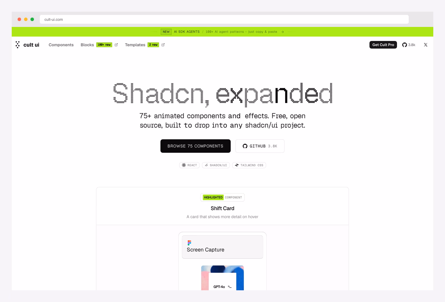
Why we like it: 3.8k GitHub stars. 75+ animated components plus 100+ AI SDK Agent patterns just-add-key. The bridge between shadcn UI and full-stack AI patterns — components like Shift Card, Screen Capture, and animated bento grids next to ready AI agent flows.
Cult UI bridges two worlds: shadcn-compatible animated UI components and full-stack AI agent patterns. The free open-source library ships 75+ components covering Shift Cards (cards that show more detail on hover), Screen Capture, animated grids, motion text, and form patterns. The Cult Pro tier adds 100+ AI SDK Agent patterns — copy-paste workflows for OpenAI, Google Gemini, and Anthropic Claude that you can drop into any Next.js + shadcn/ui app. Different niche than Magic UI: less landing-page eye-candy, more “AI-app glue.”
7. shadcn/ui Charts
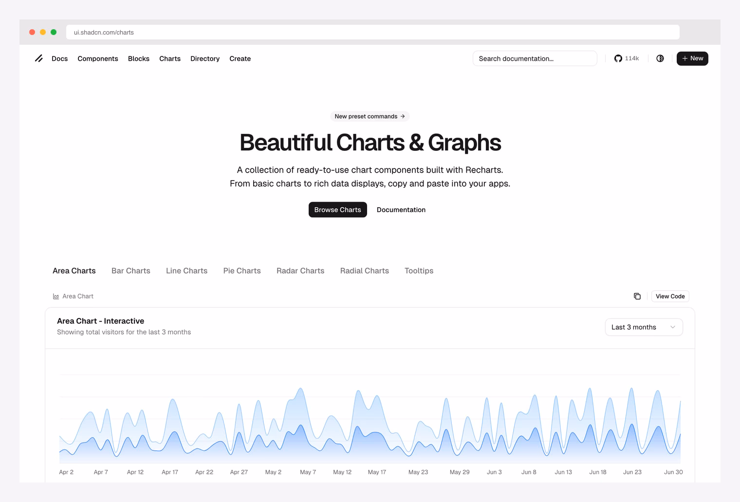
Why we like it: The official shadcn/ui chart collection. Recharts-powered, with Area / Bar / Line / Pie / Radar / Radial variants plus Tooltip presets. Maintained by the shadcn team — no third-party dependency, no version-skew risk.
Built on Recharts under the hood but exposed via shadcn-friendly APIs and CSS-variable theming, so charts inherit your project’s design tokens automatically. Install via the shadcn CLI (e.g. `npx shadcn add chart-area-interactive`). Free, MIT, and the right starting point for any shadcn dashboard that needs charts.
8. Tailark
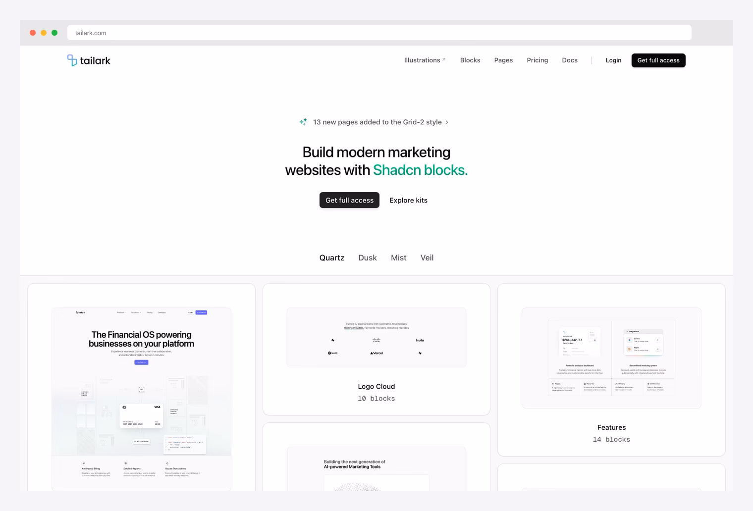
Why we like it: 300+ marketing-focused blocks with bespoke aesthetic and four cohesive themes (Quartz, Dusk, Mist, Veil). Tailark doesn’t try to be everything — it’s laser-focused on landing-page conversion surfaces.
Tailark is the specialty pick when you’re shipping a marketing site, not a dashboard. The 300+ blocks span hero sections, feature highlights, pricing tables, testimonials, FAQ, CTAs, footers, and 13 newer Grid-2 style pages added in the recent update. Four cohesive themes (Quartz, Dusk, Mist, Veil) keep entire pages on-brand without pixel-tweaking. The differentiator: the design language across blocks is more bespoke than the generic shadcn aesthetic — your landing page won’t look like every other shadcn-built SaaS. Get full access to the complete library and “Logo Cloud” + “Features” + “Pricing” page kits.
9. Origin UI (now COSS)
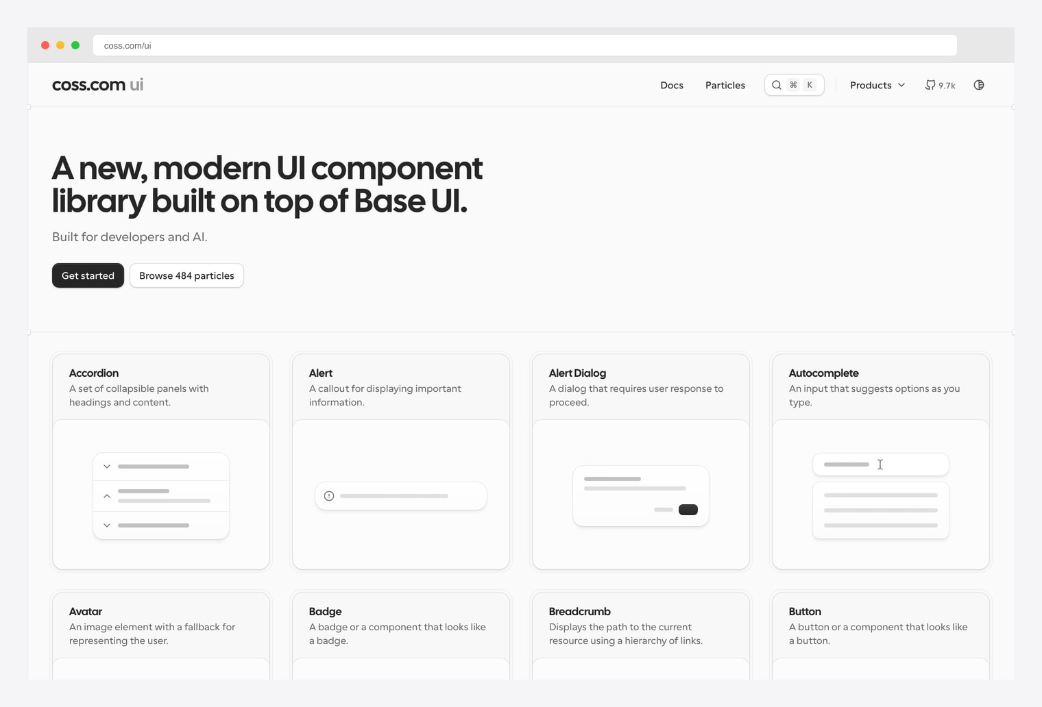
Why we like it: Origin UI rebranded to COSS in 2026 with 484 “particles” (advanced primitives) on top of Base UI — but the components remain Tailwind-based and copy/paste into any shadcn/ui project. Includes Accordion, Alert Dialog, Autocomplete, and other primitives shadcn/ui doesn’t ship.
Originally launched as Origin UI — a shadcn-compatible library of 400+ advanced primitives (timelines, rich dialogs, custom inputs) — the project rebranded to COSS in 2026 and shifted its base to Base UI (the Material team’s headless successor). Practically, the 484 “particles” remain Tailwind-based copy/paste components that drop into any shadcn/ui codebase: Accordion, Alert, Alert Dialog, Autocomplete, Avatar, Badge, Breadcrumb, Button, and many more — including patterns shadcn/ui doesn’t officially ship. 9.7k GitHub stars. Free, MIT-licensed.
10. ReUI
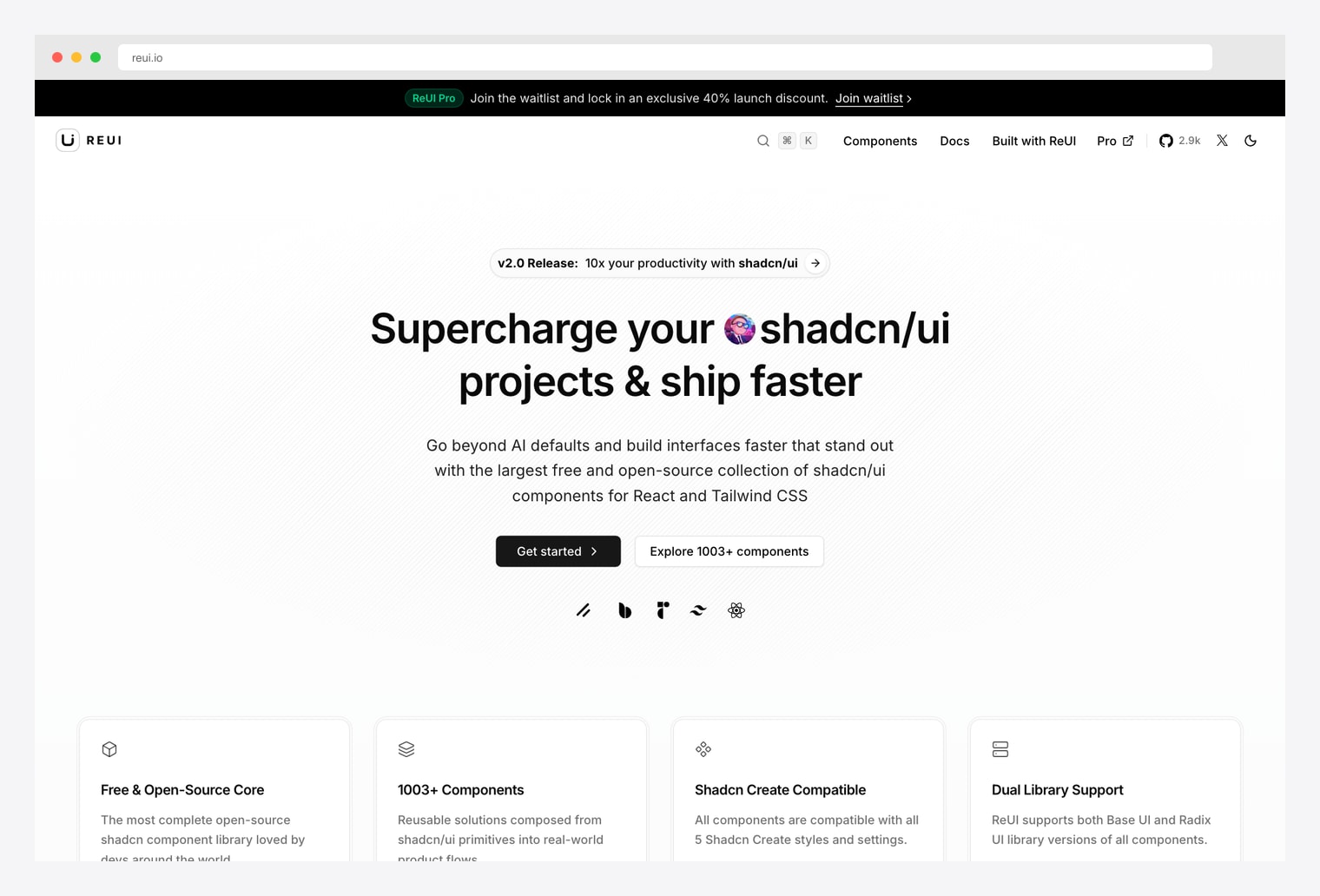
Why we like it: 2.9k GitHub stars. 1003+ free shadcn/ui components claiming to be “the largest free and open-source collection.” Dual library support (Base UI AND Radix UI primitives), Shadcn Create-compatible across all 5 styles and settings.
ReUI positions itself as “supercharge your shadcn/ui projects” with what it claims is the largest free open-source collection of shadcn/ui components on the internet — 1003+ components across forms, navigation, data display, feedback, and overlay categories. Two unique angles: dual library support (every component ships compatible versions for both Base UI and Radix UI primitives), and Shadcn Create compatibility across all 5 styles and settings without modification. ReUI Pro is on a waitlist with 40% launch discount for early adopters. Free MIT tier alone is the most ambitious free shadcn collection currently shipping.
11. Skiper UI
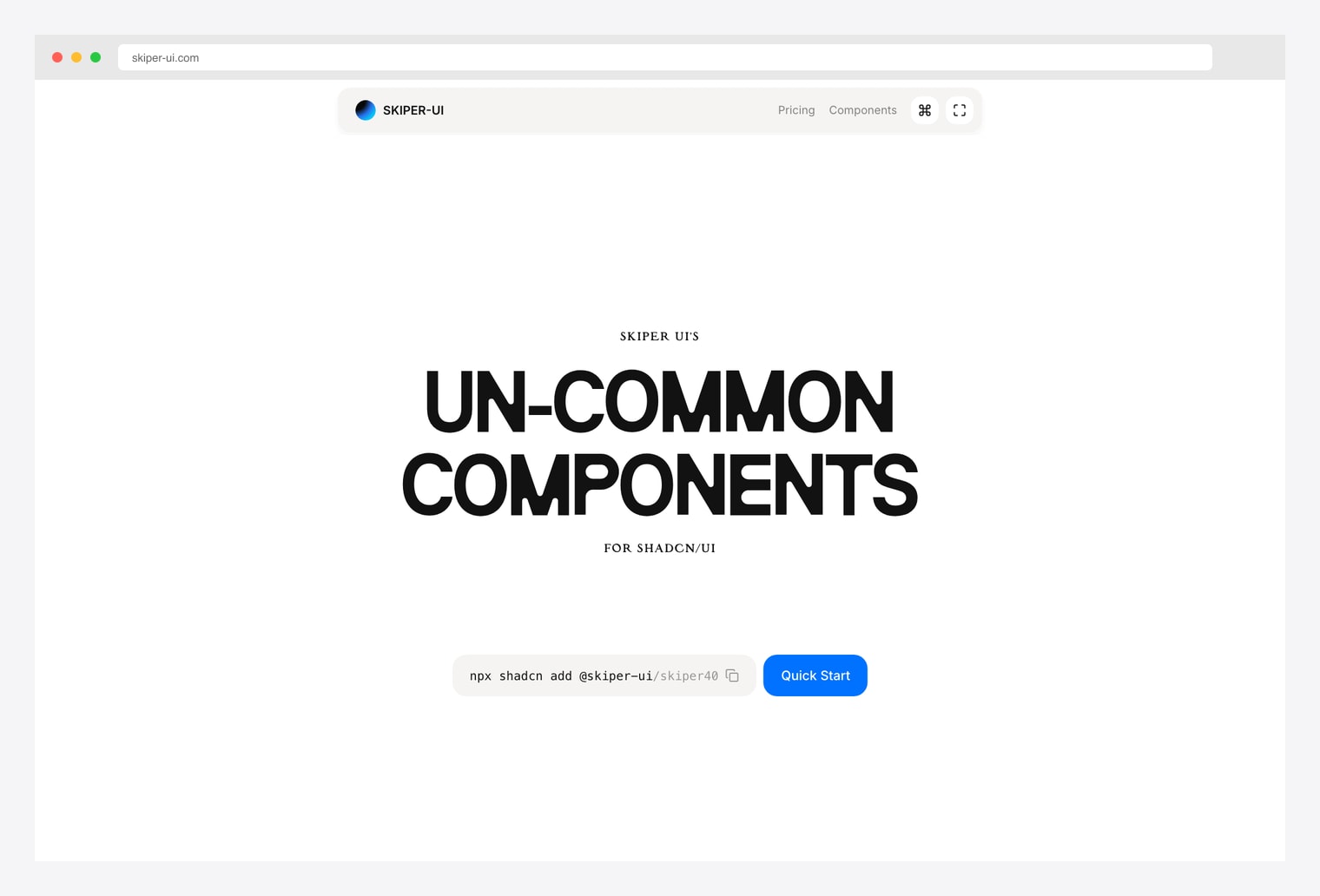
Why we like it: “Un-common components for shadcn/ui” — Skiper UI ships components you won’t find in the canonical shadcn library or in Magic UI / Aceternity. Production-ready, install via `npx shadcn add @skiper-ui/skiper40` and similar one-liners.
Skiper UI’s pitch is right in the brand: un-common components. While Magic UI and Aceternity cover the canonical animated patterns (marquees, kinetic text, glowing borders), Skiper UI focuses on patterns those libraries skip — distinctive form interactions, niche layout primitives, and components that feel “right” in modern design systems but aren’t obvious. Each component installs via a numbered shadcn registry path (`npx shadcn add @skiper-ui/skiper40`). Free tier exposes the catalog; the Pro tier (Skiper Pro) unlocks the complete library plus assets.
12. MynaUI
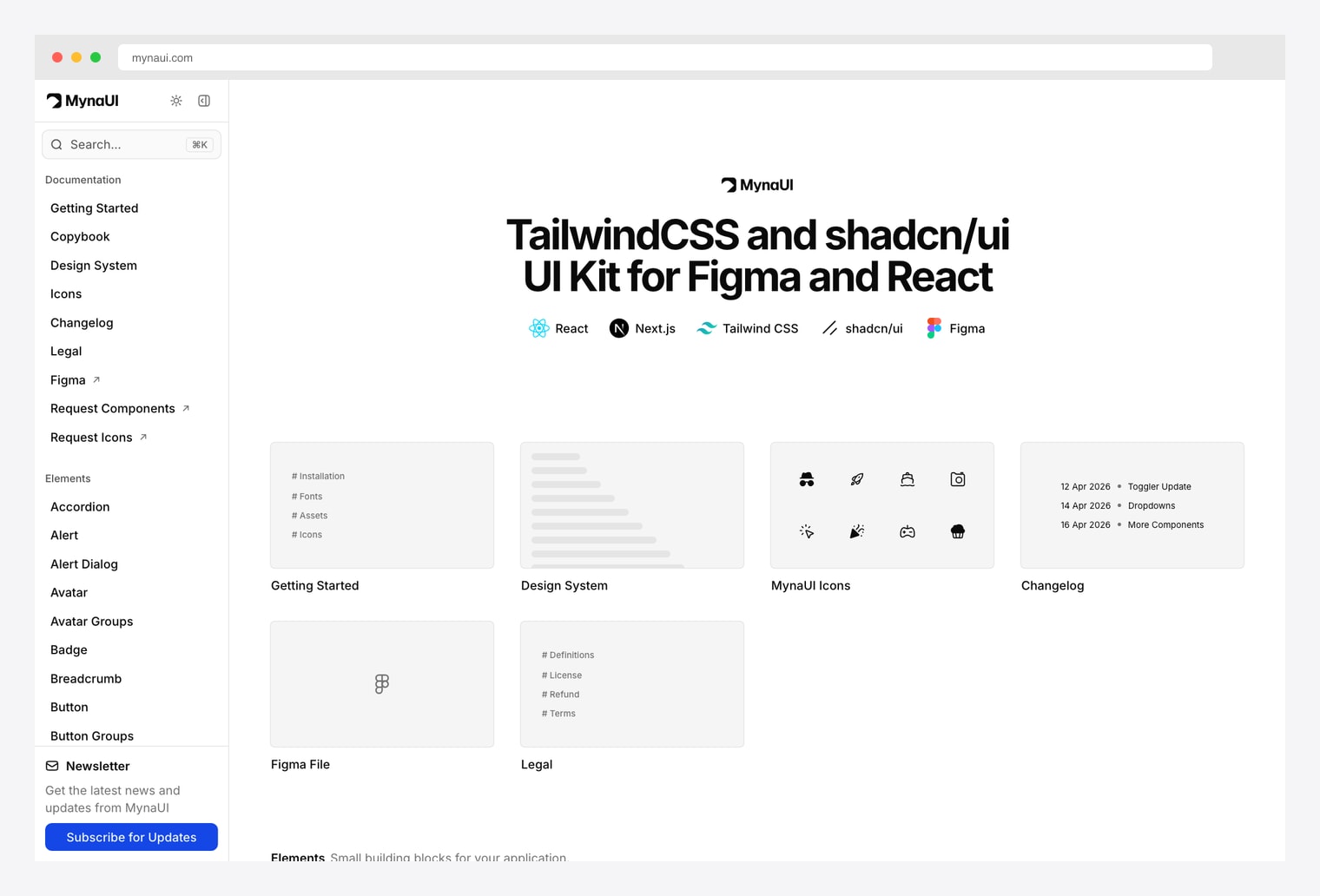
Why we like it: A Tailwind CSS + shadcn/ui UI Kit shipping both React components AND a Figma file with the same design system. 70+ Elements (Accordion, Alert, Avatar, Badge, Breadcrumb, Button…) plus a 12k+ icon set (MynaUI Icons).
MynaUI is the design-systems-first option in the lineup. The free Tailwind + shadcn/ui UI Kit ships React components matched to a Figma library (so designers and engineers stay in sync), 70+ Element building blocks (Accordion through Button Groups), and a separate MynaUI Icons package with 12k+ icons. The Copybook section provides usage guidance for each element pattern. Pro tier unlocks dashboards, marketing templates, and extended component variants. The right pick when designer-developer parity matters more than block volume.
How to Choose the Right shadcn Block Library
The 12 options split along three practical axes:
By what you’re building
- Marketing site / landing page: Tailark, Aceternity, Magic UI.
- SaaS dashboard: shadcn/ui Charts for graphs, Shadcnblocks or shadcn.io for the rest.
- AI app / chat product: Cult UI for AI patterns, plus our shadcn/ui AI chat templates roundup.
- Internal admin tool: Origin UI / COSS for advanced primitives, ReUI for component breadth, MynaUI for design-system parity.
By license & price
- Free MIT: Magic UI, Cult UI, shadcn/ui Charts, Origin UI / COSS, ReUI.
- Freemium (free tier + paid Pro): shadcn.io, Shadcnblocks, 21st.dev, Tailark, Skiper UI, MynaUI.
- Premium-first: Aceternity UI (free core, paid all-access).
By design language
- Canonical shadcn aesthetic: shadcn.io, Shadcnblocks, shadcn/ui Charts, ReUI, MynaUI.
- Motion-forward and bold: Magic UI, Aceternity, Cult UI.
- Bespoke / distinctive: Tailark, Skiper UI.
- System-grade primitives: Origin UI / COSS.
A practical pattern in 2026: start with shadcn.io or Shadcnblocks as your block source-of-truth, layer in Magic UI for animation polish, drop in shadcn/ui Charts for graphs, and reach for Aceternity when a section needs to feel “designed by an in-house team.” For AI products, add Cult UI patterns. None of these libraries fight each other — they all install via the shadcn CLI and ship as source code you own.
You Might Also Like