shadcn/ui Data Table: The Complete Guide + 10 Templates (2026)
There is no data-table component in shadcn/ui, and there never has been. Running npx shadcn@latest add data-table fails, because that item does not exist in the registry. What shadcn/ui gives you is a plain <Table> — seven styled markup wrappers with no behaviour — and a guide to building the rest yourself on top of TanStack Table.
That catches people out, so this piece covers both halves: how the shadcn data table actually works and what each feature costs you to add, then the templates and starters worth copying instead of starting from scratch.
One thing to know before you follow any other tutorial. The official docs were rewritten for TanStack Table v9 in August 2026, and the API changed enough that most guides you will find are now wrong — useReactTable became useTable, the get*RowModel options became a features object, and flexRender became a component. The migration was never noted in the changelog, which is why so much of the ecosystem has not caught up. The changes are below.
Quick Picks
- Official starting point: shadcn/ui Tasks example — the docs’ own table, on v9
- Already on TanStack v9: ReUI and next-shadcn-admin-dashboard — the two aligned with the new docs
- Most complete open-source table: tablecn — Notion-style filters, server-side everything
- Best filtering UX: OpenStatus Data Table Filters — the one to copy for faceted search
- Filters as a drop-in library: bazza/ui — adds Linear-style filters to a table you already have
- Commercial, batteries included: Shadcn UI Kit — has a free tier
What the shadcn/ui data table actually is
It is a guide, not a component — and the docs are explicit about why. In their own words: “Every data table or datagrid I’ve created has been unique. They all behave differently, have specific sorting and filtering requirements, and work with different data sources… It doesn’t make sense to combine all of these variations into a single component. If we do that, we’ll lose the flexibility that headless UI provides.”
So there are two separate things, and conflating them is the most common source of confusion:
- The
<Table>component —Table,TableBody,TableCaption,TableCell,TableHead,TableHeaderandTableRow. Styled markup, nothing else. No sorting, no pagination, no state. - The data table — that component plus TanStack Table, a headless library you install separately, which supplies all the behaviour and renders nothing.
npx shadcn@latest add table          # the <Table> component (markup only)
npm install @tanstack/react-table    # the behaviour — a separate install

npx shadcn@latest add data-table     # does not exist
Two details worth pinning down. The CLI is shadcn, not shadcn-ui — the old package was renamed and is now marked as no longer supported, so any tutorial still running npx shadcn-ui@latest predates the change. And if you want something closer to a ready-made table, the closest official thing is a block rather than a component: npx shadcn@latest add dashboard-01 ships a full data table implementation with drag-to-reorder rows, already on v9.
TanStack Table v9 changed the API
The shadcn docs moved to TanStack Table v9 in August 2026. Because the migration was never announced in the changelog, most blog posts, videos and Stack Overflow answers still show v8 — and v8 code does not run on v9. If you are copying from anywhere other than the current docs, check which of these you are looking at.
| v8 (most tutorials) | v9 (docs today) |
|---|---|
useReactTable(...) | useTable(...) |
getCoreRowModel(), getSortedRowModel() passed as options | createSortedRowModel() registered on a features object |
flexRender(cell.column.columnDef.cell, ...) | <table.FlexRender cell={cell} /> |
ColumnDef<Payment> | ColumnDef<DataTableFeatures, Payment> |
The shape of the change is that v9 is opt-in by feature. You declare a features object listing the behaviour you want, and anything you leave out is tree-shaken from the bundle. The core row model is always included, so you never register that one yourself.
The practical consequence for this list: most of the templates below are still on v8. That does not make them broken — v8 is stable and widely deployed — but it does mean their code will not line up with the documentation you are reading beside it. Where a project has already moved, it is called out.
The six patterns, and what each costs you
Everything below is something you add. This is roughly the order of effort:
- Pagination — cheapest. Register the pagination feature and the table paginates into pages of ten on its own. You only write the buttons, wired to
previousPage()/nextPage()andgetCanPreviousPage()/getCanNextPage(). - Sorting. The feature plus a piece of React state, an
onSortingChangehandler, and a header button callingcolumn.toggleSorting(). - Filtering. Same shape again, plus registering a filter function and an input that calls
setFilterValue(). Note the docs only demonstrate filtering a single column — faceted filtering across several is on you, which is exactly what the filter-focused projects below solve. - Column visibility. The feature, state, and a dropdown of checkboxes toggling
column.toggleVisibility(). - Row selection. The feature, plus a hand-written display column wiring checkboxes to
getIsAllPageRowsSelected()androw.toggleSelected(). - Row actions — no feature flag at all. Entirely hand-written: a display column returning a dropdown menu, reading the record from
row.original.
The docs do hand you three reusable pieces to shorten this — a sortable column header, a pagination bar and a column-visibility menu. Worth lifting rather than writing.
What the official guide does not cover
Three gaps matter, because they are the things that decide whether a table survives real data.
- Server-side pagination. The entire guide gives this one sentence and no code. Everything it demonstrates loads the full dataset into the browser and paginates in memory, which is fine for a few hundred rows and wrong for a few hundred thousand. If your data lives behind an API, this is the part you will actually spend your time on — and the reason to start from one of the server-side templates below rather than the docs.
- Virtualisation. Not covered anywhere. For very long lists you want windowing, and you will be reaching for a separate library.
- Column typing under v9. The features type is now threaded as the first generic through
ColumnDef,Column,TableandRow. The docs’ own reusable components are typed against their example’s feature set, so copy-pasting them into your project means retyping them against yours.
shadcn data table templates and starters
Ten implementations worth reading before you write your own, ordered roughly by how directly useful each is as a starting point. Where a project is still on TanStack v8, that is noted — it is the single most useful thing to know about each one right now.
1. shadcn/ui Official Tasks Example
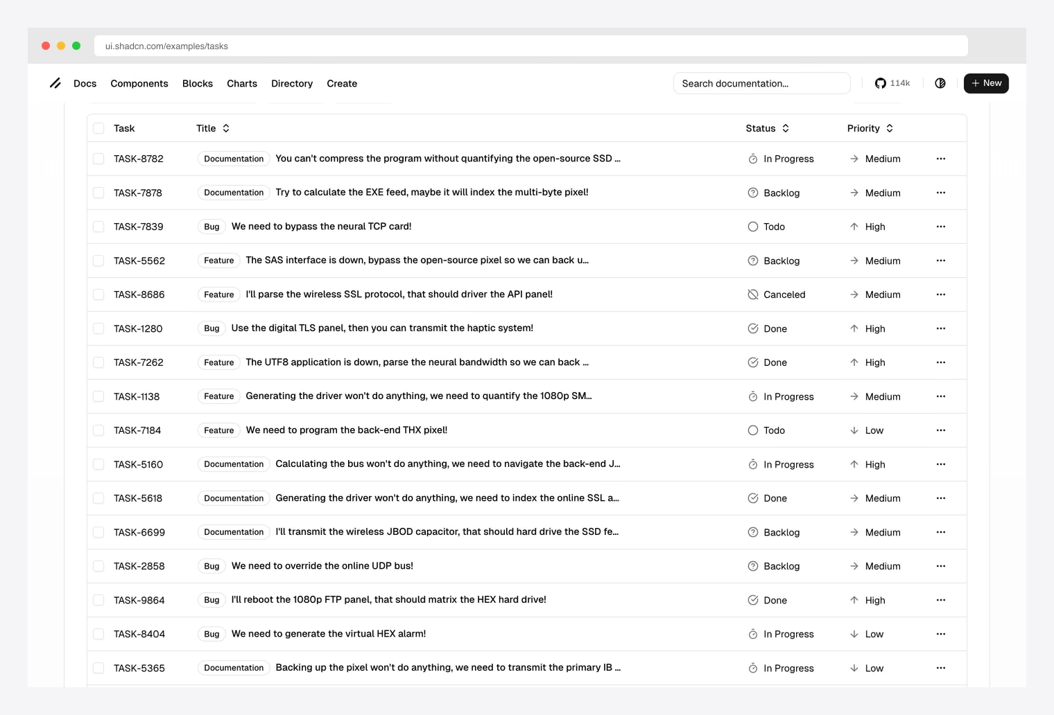
Why we like it: Studied by everyone building a shadcn data table. Faceted filters, View dropdown for column visibility, sortable columns, status iconography, priority arrows.
If you only have time to study one shadcn data table implementation, study this one. Source lives in the official shadcn-ui/ui repository.
2. ReUI
Why we like it: One of the very few libraries already migrated to TanStack Table v9, which means its code lines up with the documentation instead of contradicting it.
ReUI ships a data grid rather than a bare table — sorting, filtering, pagination, column sizing and selection assembled into components you install through the shadcn CLI. Being on v9 is the reason to look here first if you are starting today: you can read its source next to the official guide without mentally translating between two APIs.
It is a broad component library rather than a table-only project, so you are adopting more than one component if you buy into it wholesale — though the pieces install individually.
3. next-shadcn-admin-dashboard
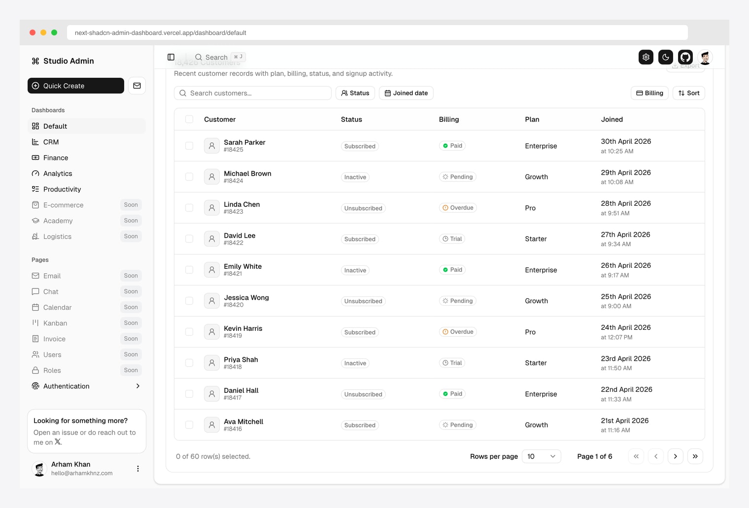
Why we like it: A customer-list table pattern (CRM-style) instead of the more common task-list pattern. Search, Status + Joined-date filters, Billing + Sort menus, status pills + billing pills + plan tier columns.
Same Arham Khan repo also covered in our shadcn CRM and e-commerce roundups. Pick this when your data table is more “customers + accounts” than “tasks + tickets”.
One of only two projects here already on TanStack v9, and the most actively developed of the open-source set. Server-rendered, so you can see the table without JavaScript.
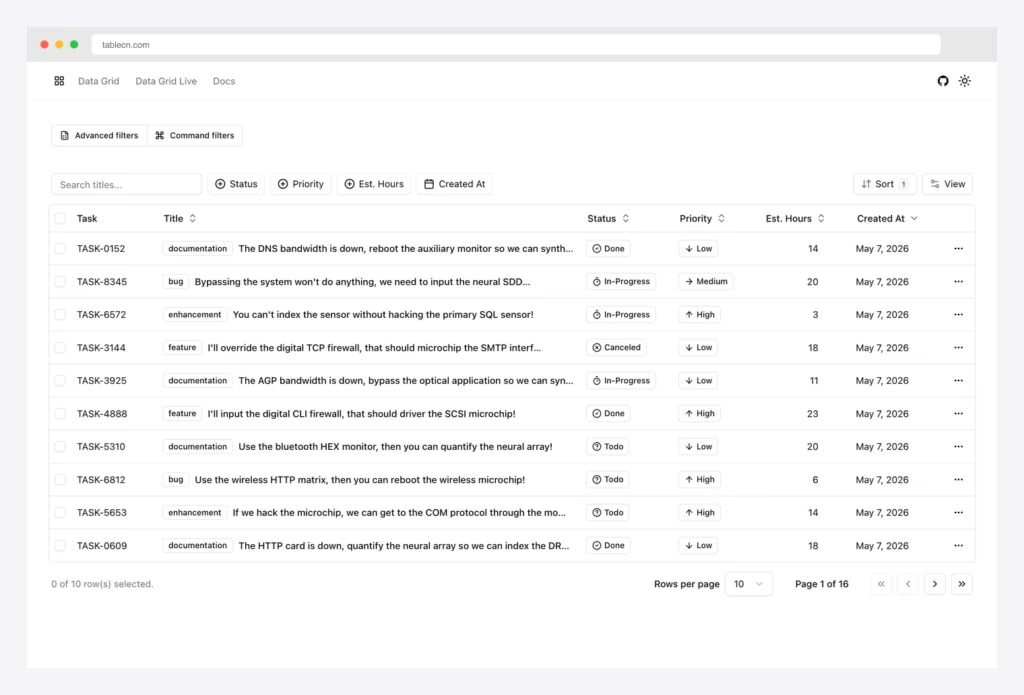
4. tablecn (sadmann7)
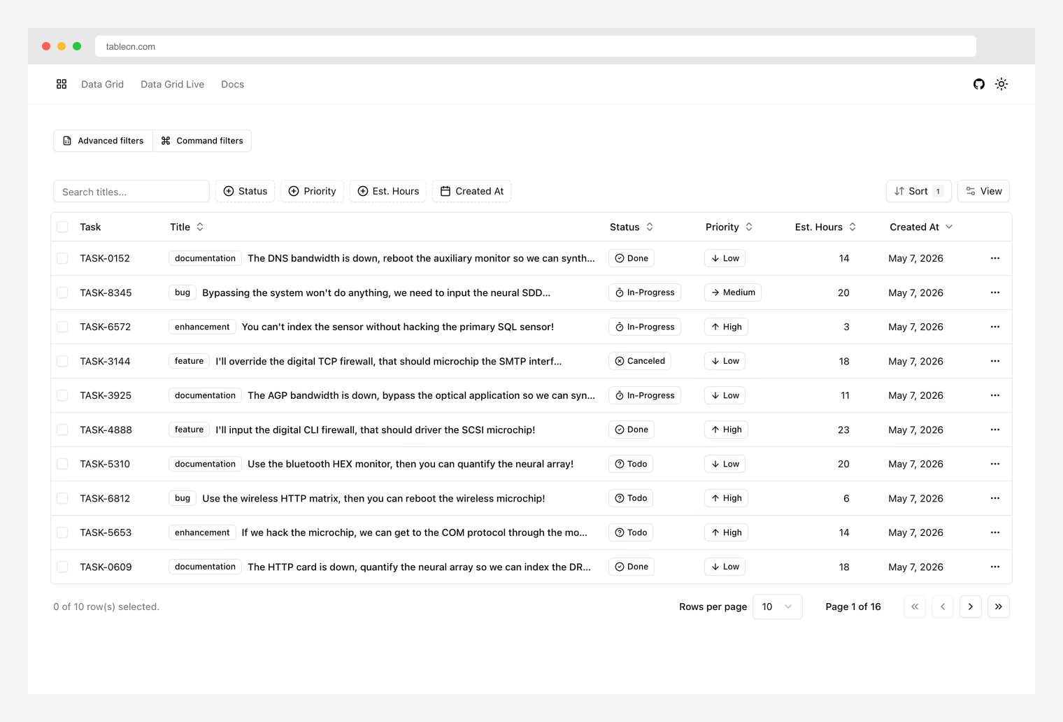
Why we like it: Notion/Airtable-style Advanced query-builder filters AND Linear-style Command palette filters in one table. Server-side everything (Drizzle + Postgres). Multi-column sort, faceted filters, column resize, column visibility, bulk actions on row select.
Bootstrapped from create-t3-app with full Zod validation. By sadmann7 — same author behind Skateshop. Strongest pick when you need a production-grade table on a real backend, not a UI mockup.
5. OpenStatus Data Table Filters
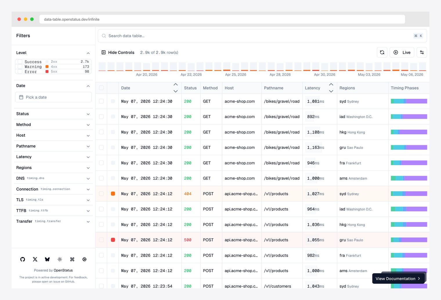
Why we like it: Purpose-built for log / observability tables: HTTP request logs, audit trails, network traces. URL-based filter state via nuqs means every filtered view is a shareable link.
Built and used in production by the OpenStatus team (status-page-as-a-service). Pick this when your table needs to live in a URL — log viewers, audit trails, observability dashboards.
Its landing page is now marketing rather than the table itself; the demo linked above goes straight to the working table. Still on v8.
6. shadcn-admin (satnaing) Tasks Page
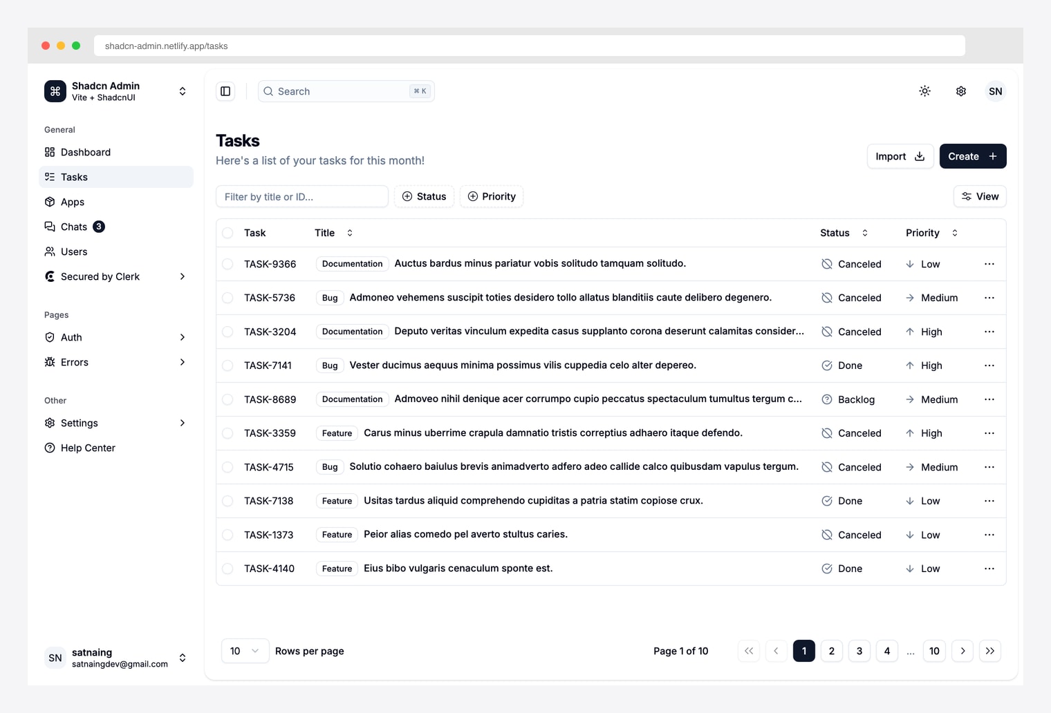
Why we like it: The most-forked free shadcn admin on GitHub. The /tasks page closely follows the official shadcn example but adds an Import button and tighter row layout.
Same template covered in our other shadcn roundups. Pick this when you want the table inside a complete admin (with sidebar, command palette, theme switcher) rather than a standalone example.
The most-starred of the admin starters, though development has been quiet for a few months and it remains on v8. It is a client-rendered SPA, so the table needs JavaScript to appear.
7. Kibo UI Table
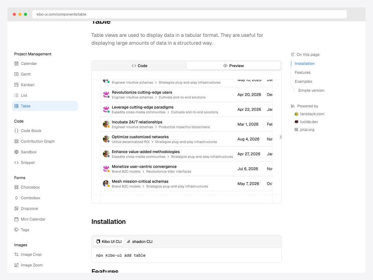
Why we like it: It packages the table as a single installable component with its own CLI, so you get a working sortable table in one command rather than assembling six features by hand.
Kibo is a component collection built on top of shadcn/ui, and its table is the part most relevant here: customisable and sortable columns with a Gantt-style feel, aimed at project and task data rather than generic records.
Because it wraps the assembly for you, it is a faster start than the docs and a less flexible one — you are working within its component API rather than TanStack’s.
8. bazza/ui Data Table Filter
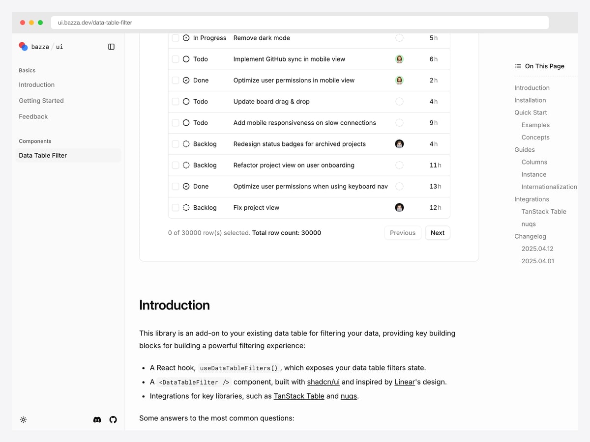
Why we like it: It is not a table — it is a filtering layer you bolt onto one you already have, which makes it the lowest-commitment way to fix the weakest part of the official guide.
The library gives you a hook exposing filter state and a filter component built with shadcn/ui and modelled on Linear’s filtering UX, with integrations for TanStack Table and for URL state so filters survive a refresh and can be shared as a link.
Its demo runs against thirty thousand rows, which is a more honest stress test than most examples here and worth clicking through before you decide how to handle filtering yourself.
9. Shadcn UI Kit Tasks Dashboard
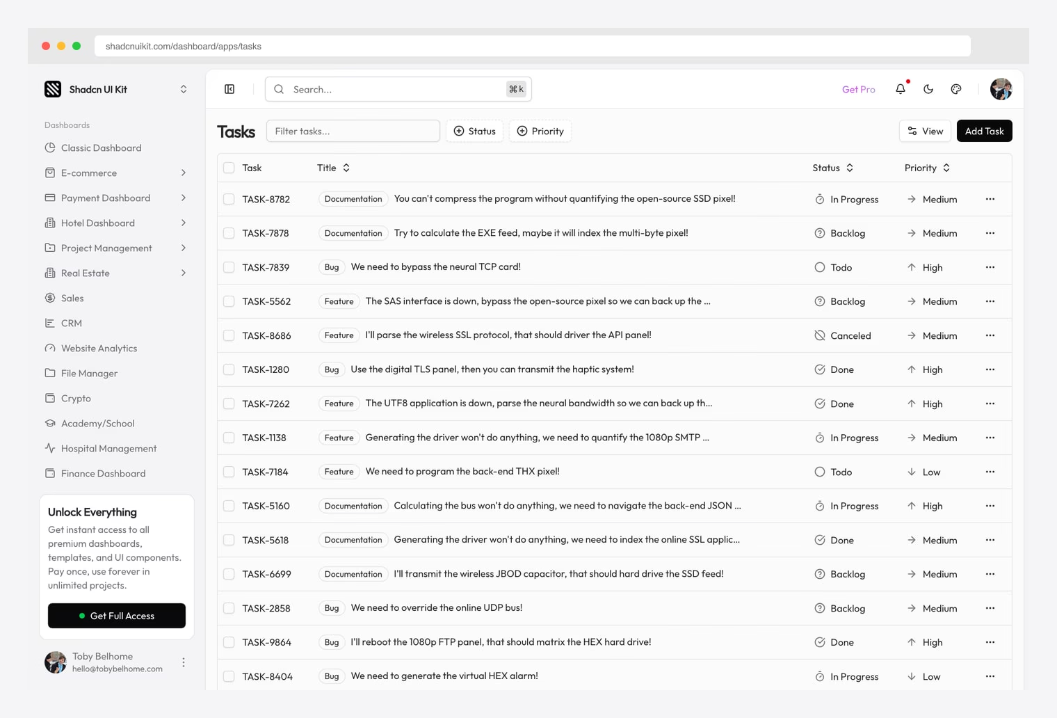
Why we like it: A tasks data table inside the Shadcn UI Kit Pro catalog. Faceted filters (Status, Priority), saved views, status iconography, sortable columns, row selection. One Pro license unlocks all 18 dashboards.
Same Pro license also covers Shadcn UI Kit’s 18 dashboards (covered in our finance, crypto, and LMS roundups).
10. Zenith Dashboard Products Table
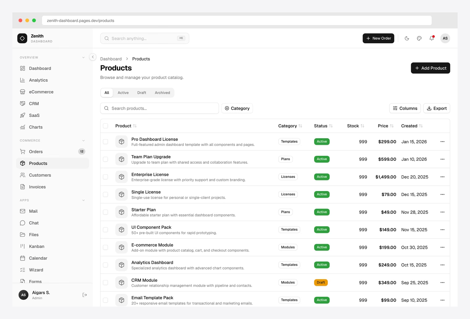
Why we like it: Same Apex table implementation rendered in an achromatic palette with a single accent color via the live theme customizer.
Identical TanStack Table feature set to Apex, identical license. Pick Zenith when minimal chrome and editorial layouts matter.
Disclosure: this is our own product. Our Apex and Flux dashboards ship the same table implementation, so treat this as one entry representing the range rather than three separate takes on the problem — Zenith is simply the one whose demo shows it best.
Checked and left out
- Shadcn View Table — a good reference when it shipped, but untouched since late 2024 and still on React 18 and Tailwind 3, so it no longer matches a current shadcn project.
- next-shadcn-dashboard-starter (Kiranism) — more stars than most of the list, but its dashboard sits behind an authentication wall, so you cannot see the table without signing up.
- Origin UI — the project moved and relicensed to AGPL-3.0, and its table is a display component rather than a data table.
- Tremor — still widely recommended, but development stopped in late 2025.
How to choose
- Does your data fit in the browser? If yes, the official guide is genuinely enough. If no, start from a server-side implementation — that is the gap the docs leave, and retrofitting it is the expensive path.
- How much filtering do you need? One search box is a few lines. Faceted, multi-column, URL-persisted filtering is a project in itself — copy it rather than invent it.
- v8 or v9? Starting fresh, prefer a v9 project so your code matches the documentation. On an existing v8 table there is no urgency to migrate.
- Component or reference? Some of these install as packages; others are codebases to read and steal from. Decide which you want before you clone anything.
shadcn Data Table FAQ
Does shadcn/ui have a data table component?
Not as an installable component. npx shadcn@latest add data-table fails because no such item exists in the registry. What you can install is table, which is styled markup with no behaviour, and the docs then guide you through building the data table yourself on top of TanStack Table. The closest ready-made option is the dashboard-01 block, which ships a complete table implementation.
How do I add sorting and filtering to a shadcn table?
Both come from TanStack Table rather than shadcn. You register the feature you want, hold its state in React, pass a change handler, and wire a control to it — a header button calling toggleSorting for sorting, an input calling setFilterValue for filtering. The official guide demonstrates filtering one column; filtering several at once is something you build or copy.
What is the difference between shadcn Table and Data Table?
Table is the component you install: seven markup wrappers with styling and nothing else. Data Table is not a component at all — it is the guide to combining that markup with TanStack Table so you get sorting, pagination, filtering and selection. Searching for a data-table component and finding only a guide is the usual confusion.
Does the shadcn data table support server-side pagination?
TanStack Table supports it, but the shadcn guide barely covers it — one sentence and no code. Every example in the docs loads the whole dataset and paginates in memory, which breaks down on large tables. If your data comes from an API, start from one of the server-side templates rather than the docs.
Which TanStack Table version does shadcn/ui use?
The documentation moved to TanStack Table v9 in August 2026, and the API changed substantially: useReactTable became useTable, the get*RowModel options became a features object, and flexRender became a component. Because the change was not announced in the changelog, most tutorials online still show v8, and v8 code will not run unmodified on v9.
Is the shadcn/ui data table free to use?
Yes. shadcn/ui is MIT licensed and you own the code it copies into your project, and TanStack Table is MIT too. Most of the templates here are MIT as well; the commercial exceptions are noted with their prices.
Building the whole admin rather than one table? See our shadcn admin dashboard templates roundup, or TanStack Start admin templates if you are working in that stack.

You Might Also Like