8 Best shadcn/ui Onboarding Templates 2026
Need a shadcn/ui onboarding flow that actually moves activation? These 8 picks cover the Onborda Next.js product-tour library, three shadcn.io block patterns (welcome / checklist / guided walkthrough), Shadcnblocks’ broad onboarding library, Shadcn Studio’s multi-step form, the most complete reference flow from shadcnexamples.com, ShadcnStore’s signup-to-onboarding bridge, Origin UI’s MIT-licensed components, and Beste UI’s animated steppers — every demo verified live in May 2026.
A 2026-grade shadcn/ui onboarding flow typically combines one or more of four patterns: a welcome screen (greeting header, feature highlights, get-started CTA), a multi-step wizard (account type, profile, business info, billing — usually with progress strip and review screen), a checklist (expandable setup tasks with progress indicator), and an in-product tour (spotlight overlays and tooltips on real UI). The picks below split by which pattern they cover and whether they’re static blocks or runtime libraries.
We’ve grouped the 8 picks below into one in-product tour library (Onborda — runtime, not blocks), three broad block libraries (shadcn.io with three onboarding sub-blocks, Shadcnblocks, Origin UI under MIT), two complete reference flows (Shadcn Studio multi-step form, shadcnexamples 5-step wizard), one signup-to-onboarding vendor (ShadcnStore), and one animated stepper library (Beste UI). Onborda is the only runtime library; everything else is static blocks you assemble.
Related reading: our shadcn/ui form templates for the form-mechanics complement, auth templates for the pre-onboarding signup surface, marketing templates for the pre-signup funnel, SaaS starter kits for full-stack bundles that ship onboarding patterns built in, and our shadcn/ui templates pillar.
Quick Picks
- Best in-product tour library: Onborda — Next.js + Framer Motion runtime, drop-in spotlight overlays
- Best block library (3 patterns): shadcn.io — welcome, checklist, guided walkthrough variants
- Best broad onboarding library: Shadcnblocks Onboarding — welcome + wizards + checklists + profile setup
- Best wizard pattern: Shadcn Studio Multi-Step Form — progress strip + validation + review
- Best complete reference flow: shadcnexamples.com Onboarding Flow — 5-step canonical SaaS pattern
- Best signup-to-onboarding bridge: ShadcnStore Signup Forms
- Best MIT-licensed components: Origin UI Onboarding — shadcn registry installable
- Best animated steppers: Beste UI Onboarding
1. Onborda (uixmat)
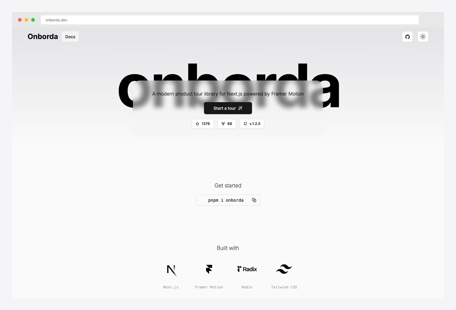
Why we like it: A Next.js onboarding wizard and product-tour library with Framer Motion animations and full shadcn/ui compatibility. Customizable interactive product tours with configurable tooltips, flexible step config, custom icons, and positioning options. Install with one command: pnpm i onborda.
Pick Onborda when the onboarding lives inside the product as guided steps over real UI. The block libraries below all give you pre-product onboarding screens (welcome, multi-step setup) — Onborda gives you in-product spotlight tours. They’re not mutually exclusive; many SaaS use both.
2. shadcn.io Onboarding Blocks
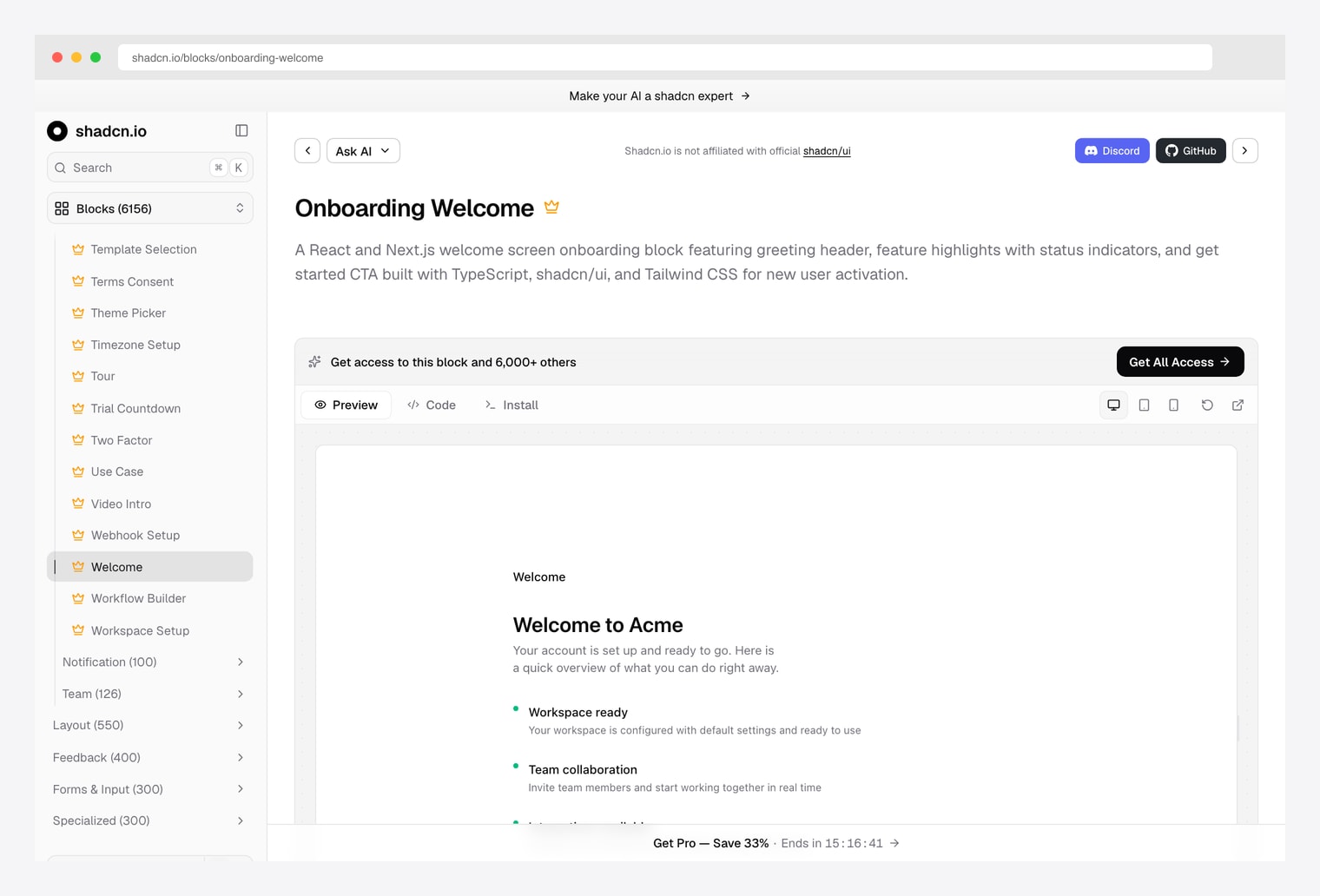
Why we like it: shadcn.io ships three specialized onboarding blocks: an Onboarding Welcome screen (greeting header, status-indicator feature highlights, get-started CTA), an Onboarding Checklist (expandable tasks with progress indicator), and an Onboarding Guided Walkthrough (step-by-step tour). Same vendor we recommended in our pricing, charts, forms, portfolio, and blog roundups.
Pick shadcn.io when you want the canonical pattern for your use case — welcome screen for SaaS first-session, checklist for setup tasks, walkthrough for feature introduction. The three patterns cover ~90% of real onboarding surfaces.
3. Shadcnblocks Onboarding
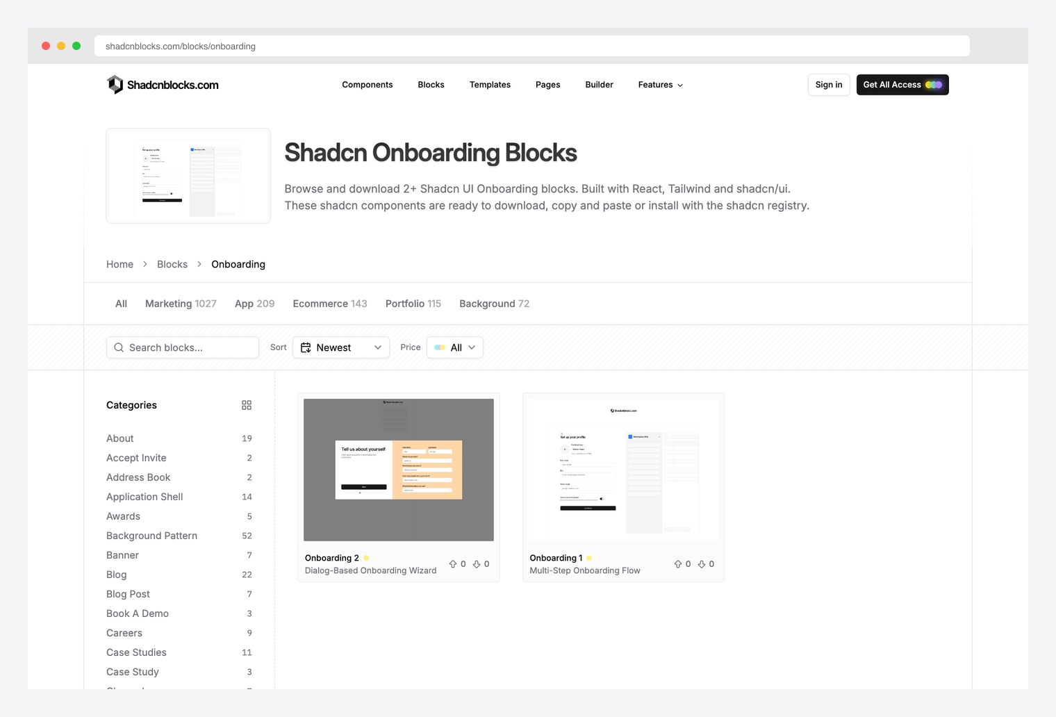
Why we like it: A shadcn block library with onboarding-specific blocks — welcome screens, multi-step wizards, progress bars, profile-setup forms, and feature highlight cards. Sister vendor to the Plasma / Zippay / Metafi multi-page templates in our marketing roundup.
Pick Shadcnblocks when you want to assemble onboarding block-by-block — pick a welcome screen variant, plug in a wizard, attach a checklist. The All-Access plan covers this library plus the full Shadcnblocks catalog (1000+ blocks across all categories).
4. Shadcn Studio Multi-Step Form
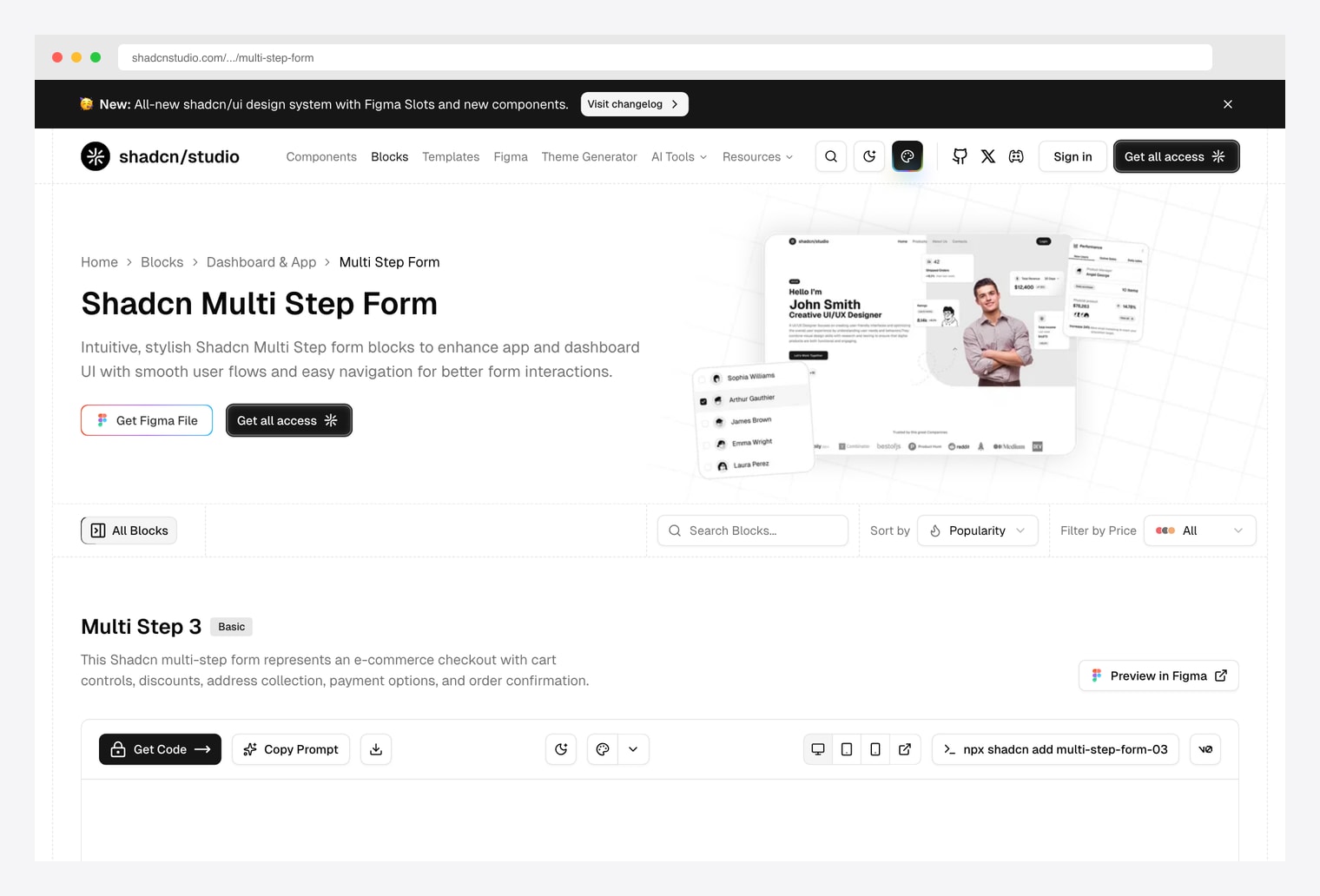
Why we like it: A multi-step form block with responsive step navigation, progress indicator strip, per-step form validation, and a review screen. The canonical wizard pattern with progressive disclosure. Same vendor we covered in our shadcn/ui form templates, pricing, themes, and portfolio roundups.
Pick Shadcn Studio’s multi-step form when the onboarding is form-shaped — collecting profile data, business info, billing, etc. across multiple steps. The progress strip plus validation plus review pattern is the differentiator versus the simpler single-page checklist patterns.
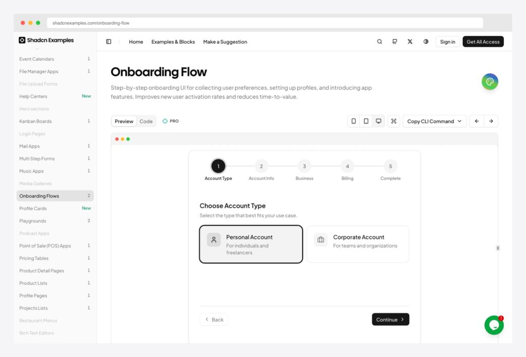
5. shadcnexamples.com Onboarding Flow
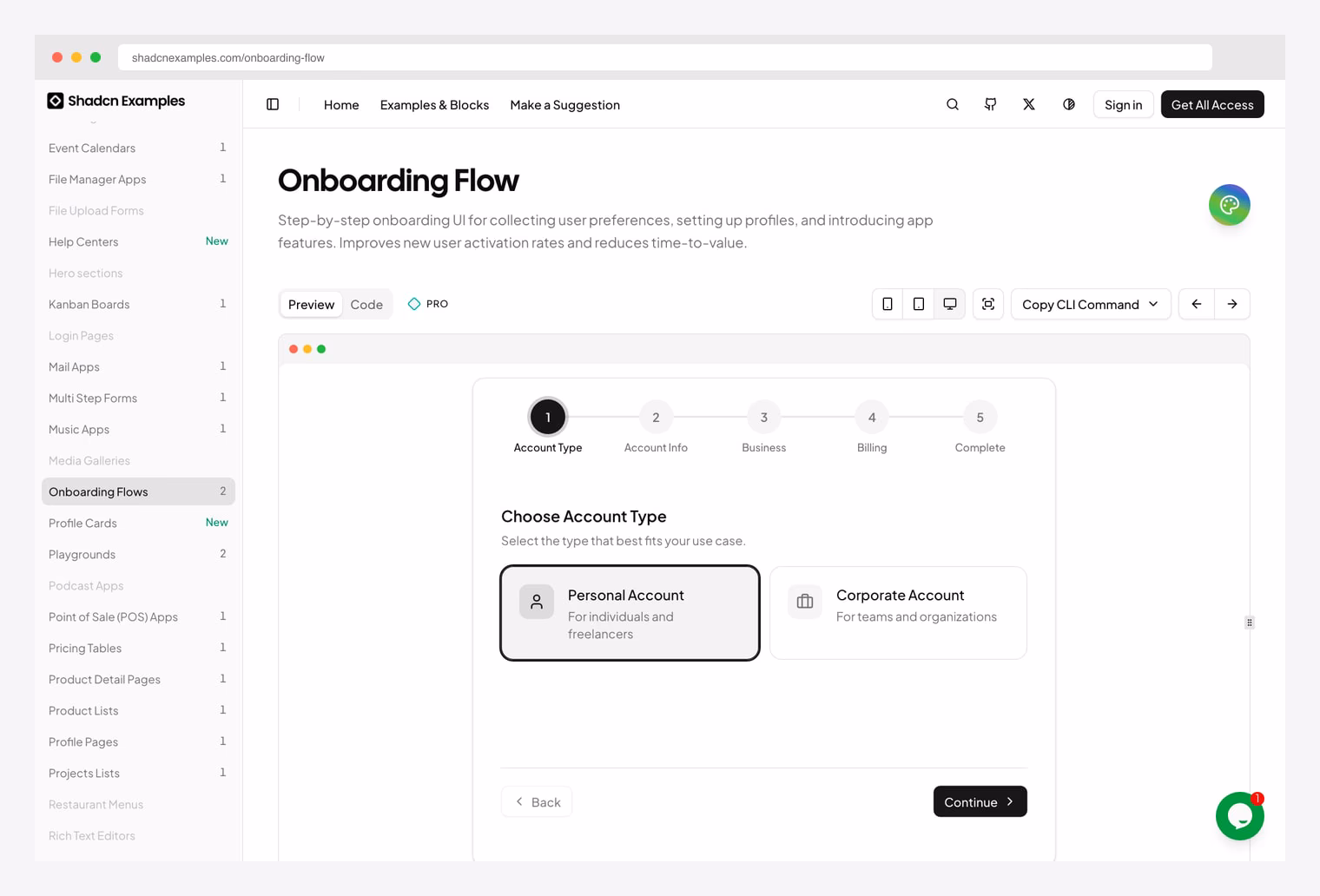
Why we like it: A complete step-by-step onboarding UI that collects user preferences, sets up profiles, and introduces app features over a 5-step wizard. Designed to improve new-user activation rates and reduce time-to-value.
Pick the shadcnexamples flow when you want a reference end-to-end onboarding sequence to clone and adapt. The 5-step pattern (Type → Info → Business → Billing → Complete) is the canonical SaaS account-setup shape.
6. ShadcnStore Signup & Onboarding Components
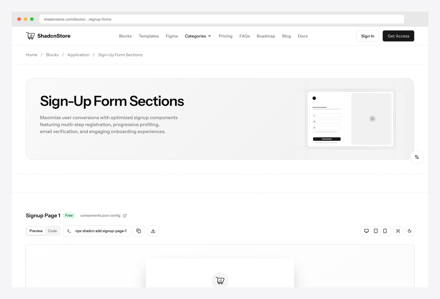
Why we like it: User-registration and onboarding components from ShadcnStore covering the signup-to-first-session bridge: registration forms, multi-step account creation, progress indicators, form validation, and progressive-disclosure layouts. Pairs with ShadcnStore’s free Frontier SaaS landing for the full marketing-to-product funnel.
Pick ShadcnStore when the onboarding starts at signup and continues straight into the first-session setup. The registration-to-onboarding hand-off is often where activation rates collapse — having both surfaces from one vendor keeps the visual language consistent across the seam.
7. Origin UI Onboarding
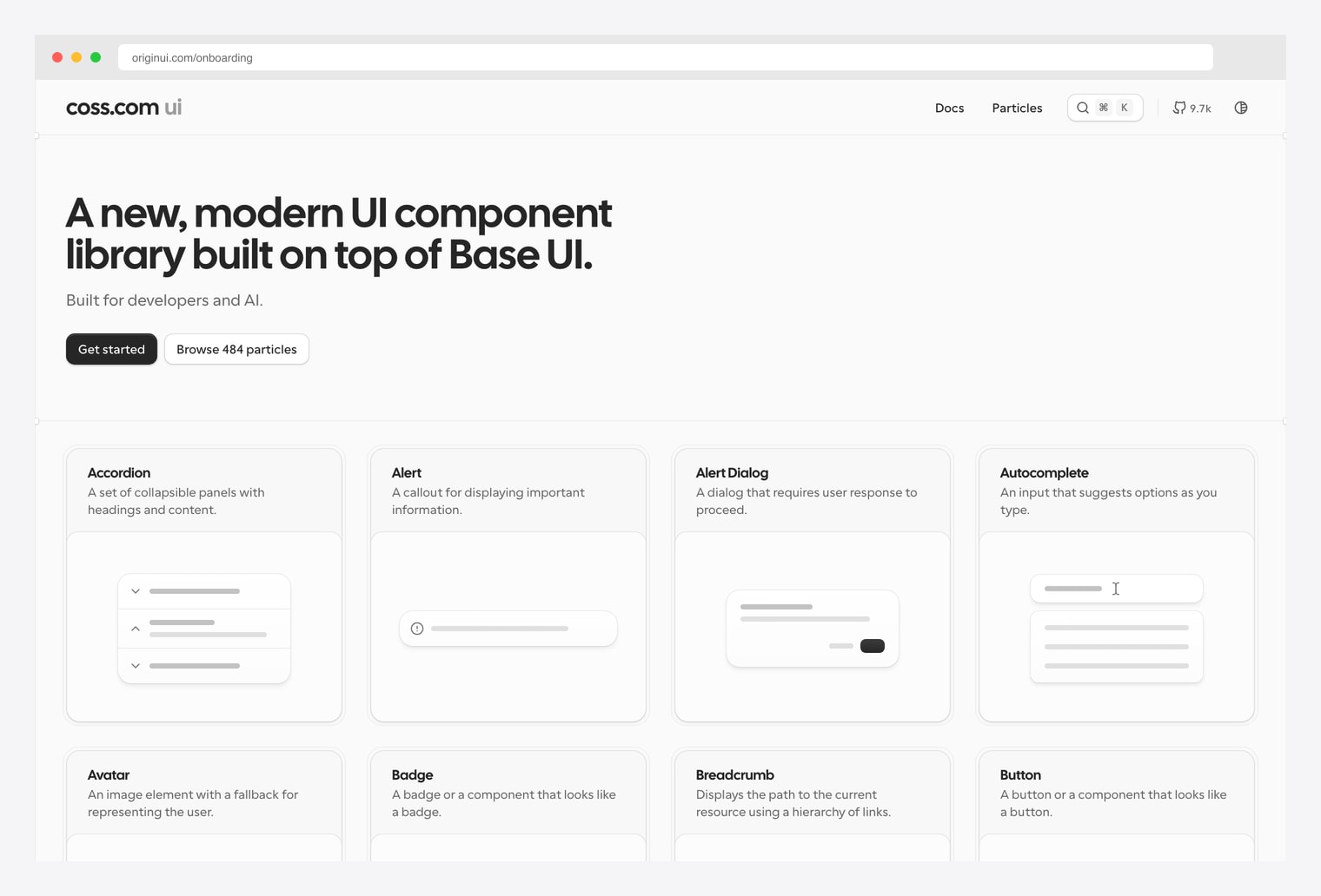
Why we like it: Copy-paste shadcn/ui onboarding components under MIT license — welcome screens, multi-step wizards, progress steppers, and account-setup patterns. Installable via the shadcn registry (npx shadcn@latest add) into any existing shadcn project.
Pick Origin UI when you need free, permissively-licensed onboarding components that drop straight into an existing shadcn project. The shadcn registry install pattern means you get the actual component code in your repo (editable), not a NPM dependency.
8. Beste UI Onboarding
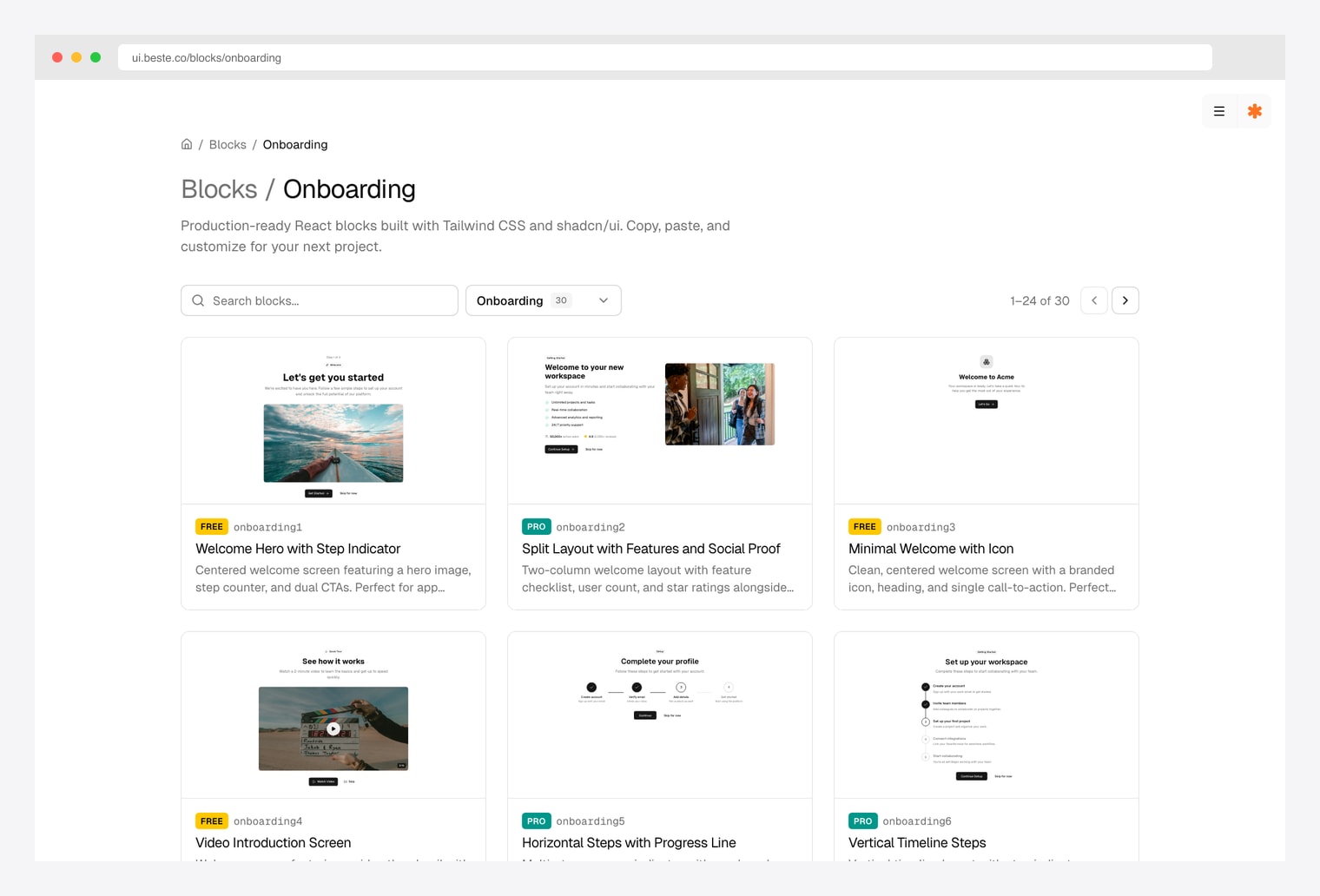
Why we like it: A shadcn-compatible block library with onboarding-specific blocks — centered welcome screens with hero images and step counters, interactive form wizards with segmented progress bars, and animated step wizards with numbered indicators for product walkthroughs.
Pick Beste UI when the visual language of your onboarding leans animated and centered (versus the more utilitarian wizard patterns from Shadcn Studio or shadcnexamples). The numbered-indicator animated stepper is the most distinctive pattern in their catalog.
How to Choose the Right shadcn Onboarding Source
The 8 options split along three practical axes:
By pattern
- In-product spotlight tour over real UI: Onborda — the only runtime library here.
- Welcome screen (first-session greeting): shadcn.io Welcome, Beste UI, Shadcnblocks, Origin UI.
- Multi-step wizard (account / profile / billing setup): Shadcn Studio Multi-Step Form, shadcnexamples Onboarding Flow, ShadcnStore Signup.
- Checklist (expandable setup tasks with progress): shadcn.io Checklist, Shadcnblocks.
- Guided walkthrough (multi-step product introduction): shadcn.io Guided Walkthrough, shadcnexamples 5-step flow.
By integration model
- Runtime library you install: Onborda — npm-installed, mounts over your existing app.
- Static blocks you copy-paste: shadcn.io, Shadcnblocks, Origin UI, Beste UI — all installable via the shadcn CLI registry.
- Complete reference flows you fork and adapt: Shadcn Studio Multi-Step, shadcnexamples Onboarding Flow, ShadcnStore Signup.
By license
- Free / MIT (no strings, paid only for Pro extras): Onborda, Origin UI.
- Free preview + paid full access: shadcn.io, Shadcnblocks, Shadcn Studio, shadcnexamples, ShadcnStore, Beste UI.
A practical pattern in 2026: layer Onborda on top of your in-product UI for spotlight tours, and use one of the static-block reference flows above (shadcnexamples Onboarding Flow for SaaS, Shadcn Studio Multi-Step for form-shaped onboarding) for the pre-product setup wizard. Add shadcn.io’s Checklist for the lingering “complete your profile” surface after first session. Origin UI is the right replacement if you need MIT-licensed components for a commercial product without paying for the Pro tiers above.
You Might Also Like