7 Best shadcn/ui Charts & Data Visualization Templates 2026

Looking for shadcn/ui chart components you can ship this week? These 7 picks cover the canonical official charts library, the largest shadcn-themed chart catalog, the underlying React chart engine (Recharts), two alternative chart engines for variants Recharts doesn’t ship (ApexCharts, Visx), one premium block bundle for charts inside full dashboards (ShadcnStore), and one animated-UI complement (Magic UI) — every demo verified live in May 2026.
A 2026-grade shadcn chart layer handles four surfaces: a chart-component library (area / bar / line / pie / radar built on Recharts), a chart engine you drop down to when prebuilt components don’t cover your case, an alternative engine for chart families Recharts doesn’t ship natively (heatmap, treemap, candlestick), and an animated-UI complement for KPI cards, tickers, and live-update dashboards. Two practical paths: install copy-paste shadcn chart blocks via the registry (npx shadcn add chart-area-interactive) and customize, or compose charts directly from Recharts / ApexCharts / Visx primitives.
We’ve grouped the 7 picks below into the canonical shadcn chart libraries (shadcn/ui Official Charts, shadcn.io Charts), the underlying engine (Recharts), two alternative engines for variants Recharts skips (ApexCharts, Visx), premium charts inside dashboard block bundles (ShadcnStore), and an animated-UI complement (Magic UI). Always start with the official shadcn charts; reach for engines and alternatives when you need a variant or composition the official blocks haven’t built yet.
Related reading: our shadcn/ui pricing page templates for the marketing surface around your dashboard, SaaS starter kits for the full app skeleton, data table templates for the data layer charts read from, our existing analytics dashboard templates roundup for full BI products (Grafana, Superset, Metabase) that complement these chart components, and our shadcn/ui templates pillar.
Quick Picks
- Best canonical source: shadcn/ui Official Charts — start here, reach for third-party only when you need more
- Best dedicated chart catalog: shadcn.io Charts — 53 components across 5 families, MCP server included
- Best for engine-level control: Recharts — the underlying library, drop down for custom compositions
- Best for chart variants Recharts skips: ApexCharts — heatmap, treemap, candlestick, range-area
- Best for D3-level custom visualizations: Visx — Airbnb’s React + D3 primitives
- Best for charts inside full dashboards: ShadcnStore — KPI cards + tables + filters around the chart
- Best animated complement: Magic UI — animated KPI tickers, beams, confetti, marquees
1. shadcn/ui Official Charts
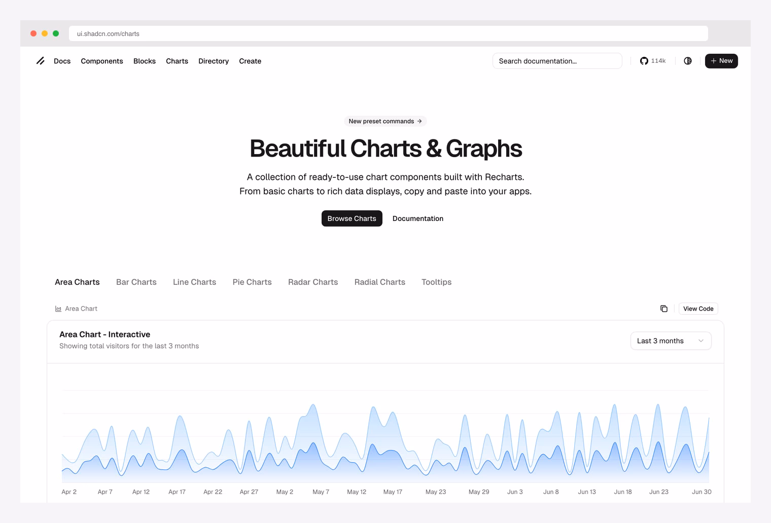
Why we like it: The canonical shadcn chart components by the project author. Built on Recharts, themed to match shadcn primitives, and copy-paste with npx shadcn add chart-area-interactive. MIT, free forever.
ui.shadcn.com/charts — Area, Bar, Line, Pie, Radar, and Radial families plus tooltip variants, all built on Recharts. Copy-paste into any React app or install via the shadcn registry. Always check here first; the third-party libraries below extend or alternative-to this foundation.Pick this as your foundation. Every other entry in this list either uses the same Recharts engine, extends shadcn primitives, or fills a gap the official set hasn’t covered yet. The Area Chart Interactive variant alone covers most SaaS analytics use cases out of the box.
2. shadcn.io Charts
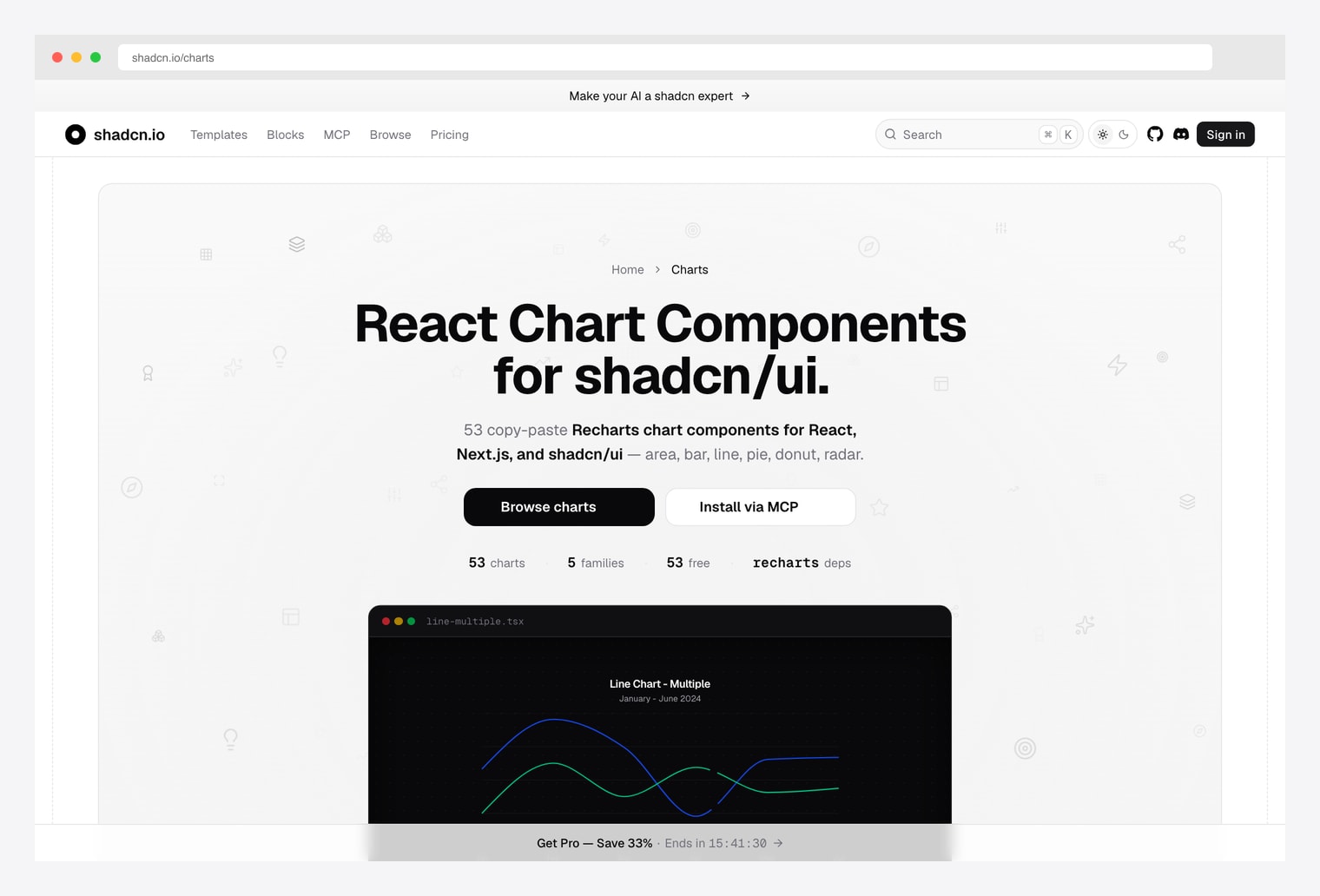
Why we like it: 53 copy-paste Recharts chart components for React, Next.js, and shadcn/ui across 5 families (area, bar, line, pie/donut, radar). Includes an MCP server so AI agents (Claude Code, Cursor) can install chart blocks directly via tool-use.
Same Recharts engine as the official set, more variants per family, plus AI-assisted installation. Pick this when you ship code with AI assistance and want your agent to install the right chart block without round-tripping through copy-paste. Same vendor as our pick in the shadcn pricing roundup.
3. Recharts (the engine)
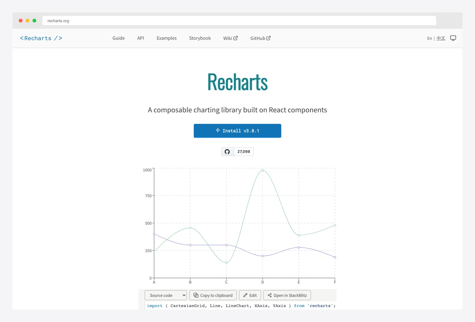
Why we like it: A composable charting library built on React components — the engine behind the shadcn chart catalog. 27k+ stars, declarative API, SVG-based rendering, full control over every axis, tooltip, and grid line.
Pick Recharts directly when the prebuilt shadcn blocks don’t cover your case (custom chart compositions, stacked + grouped + overlay layers, brush selection, synchronized multi-chart views). Same library, more flexibility, more code.
4. ApexCharts (alternative engine)
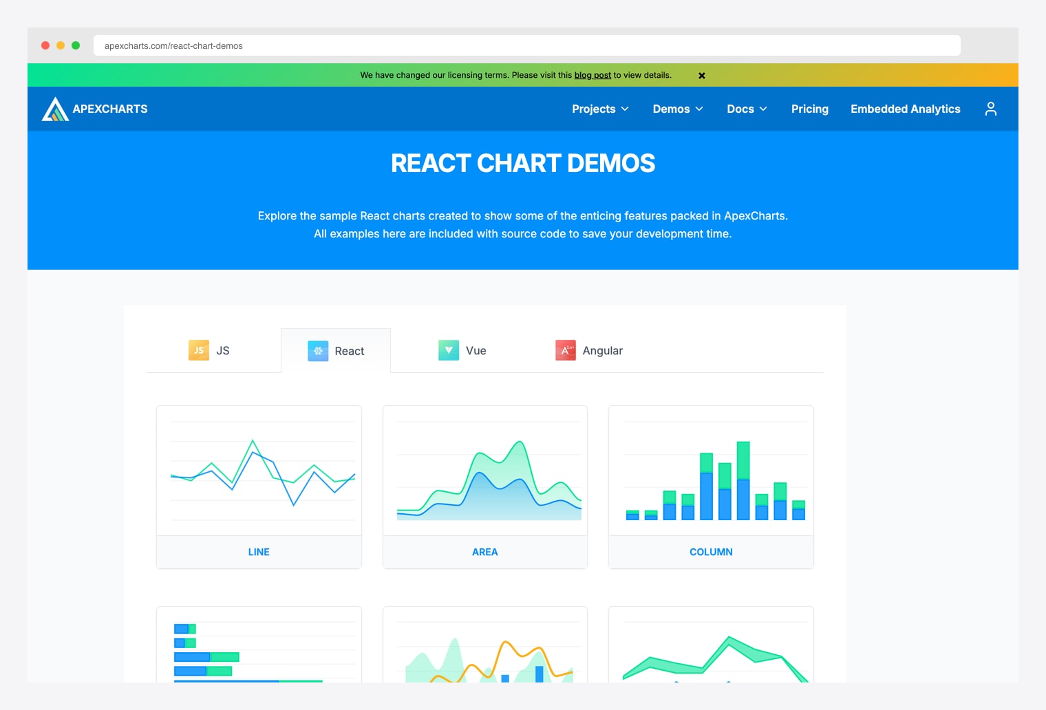
Why we like it: A modern open-source chart library with chart variants Recharts doesn’t cover natively — heatmap, treemap, candlestick, range-area, range-bar, mixed line+column, sparklines, and timeline charts. Same canvas-style API across React, Vue, Angular, and vanilla JS.
Many premium shadcn admin templates (Apex Dashboard, Sneat, Materio, Vuexy) ship ApexCharts integrations alongside Recharts because of the variant breadth. Pick ApexCharts when you need a chart family Recharts doesn’t support — most commonly heatmaps and candlesticks.
5. Visx (Airbnb)
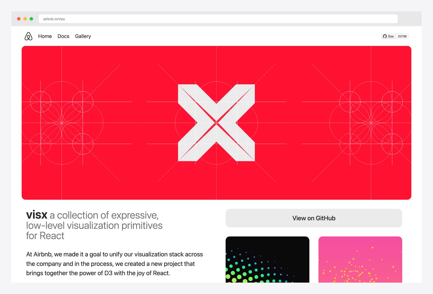
Why we like it: A collection of expressive low-level visualization primitives from Airbnb — combines the power of D3 with the joy of React. 20k+ stars. Use Visx when you’re building a visualization that doesn’t fit any chart-component-library category — hierarchies, networks, custom force-directed layouts, geo maps, packed circles.
Visx is one level lower than Recharts or ApexCharts — instead of “give me a Bar Chart component”, it gives you scales, axes, shapes, and gestures that you compose into whatever visualization your data needs. Pick this when prebuilt chart components can’t represent your data shape.
6. ShadcnStore Blocks
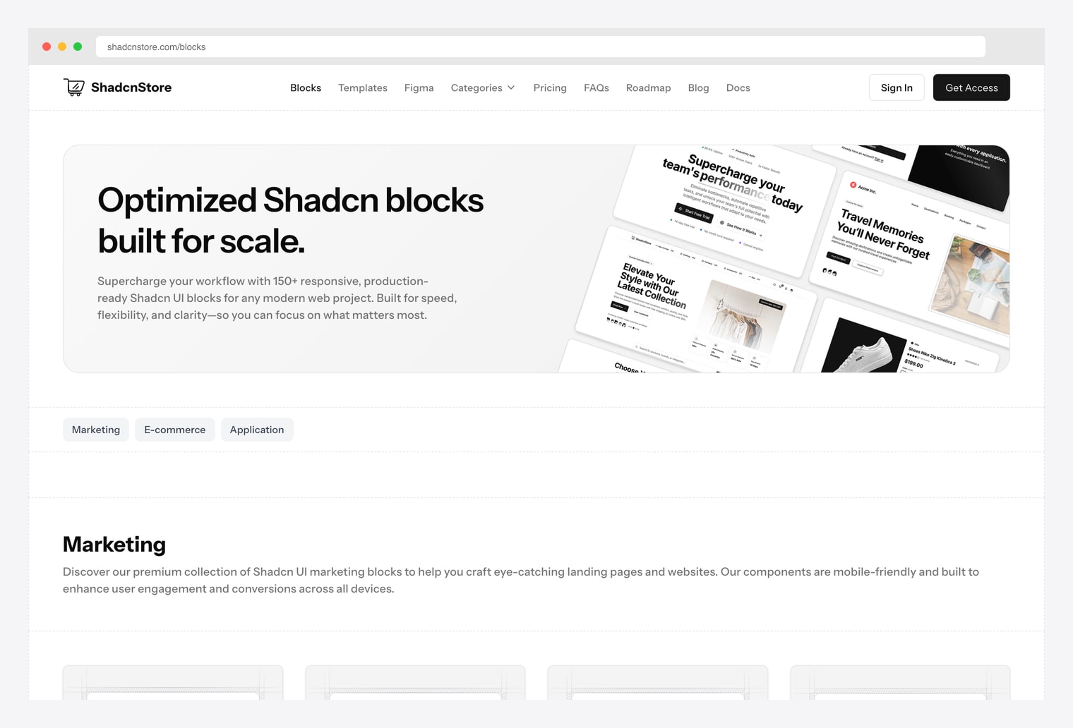
Why we like it: 165+ shadcn blocks across 90+ marketing, 40+ eCommerce, and 40+ application categories. Charts live inside the application bundle alongside KPI cards, data tables, and dashboard layouts. Pick this when you want charts pre-arranged into a complete admin surface, not as standalone chart components.
Trades depth in chart-only variants for breadth across the full admin surface around the chart. If you also need data tables, KPI cards, sidebar nav, and filters wrapped around the chart, this is one license to cover all of them — same vendor we recommended in our shadcn pricing roundup.
7. Magic UI (animated UI complement)
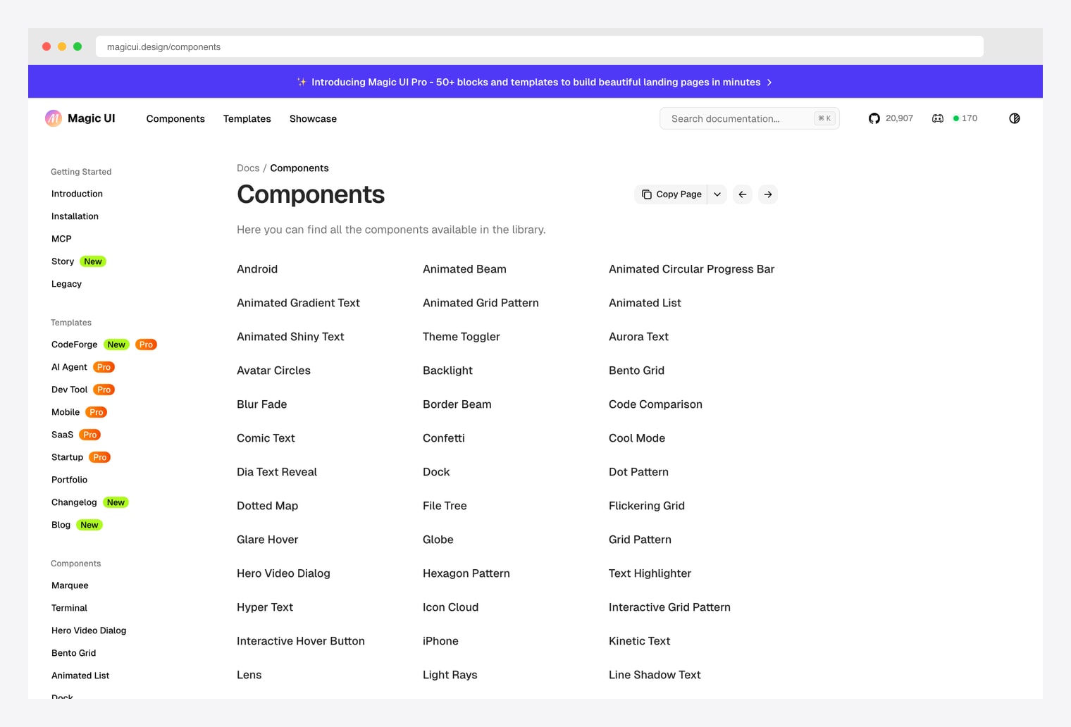
Why we like it: Not a chart library, but the strongest companion to shadcn charts when you want a livelier dashboard surface — Animated List, Animated Beam, Border Beam, Bento Grid, Confetti, Marquee, and Number Ticker primitives that pair with chart components for animated KPI cards and live-updating dashboards.
Pick Magic UI when your charts feel static and you want animated KPI tickers, confetti on goal-met, marquee headlines pulling from chart data, or beam connections between cards. Free under MIT; Magic UI Pro adds 50+ premium blocks and templates.
How to Choose the Right shadcn Chart Source
The 7 options split along three practical axes:
By layer of abstraction
- Prebuilt chart blocks (highest level): shadcn/ui Official Charts, shadcn.io Charts, ShadcnStore. Use these when the prebuilt block matches your case.
- Chart engine (mid level): Recharts (default for shadcn), ApexCharts (alternative). Drop down here for compositions the prebuilt blocks don’t ship.
- Visualization primitives (lowest level): Visx — scales, axes, shapes, gestures you compose into whatever visualization your data needs.
By chart variant coverage
- Standard chart families (area / bar / line / pie / radar): any shadcn-Recharts pick — Official, shadcn.io, or build with Recharts directly.
- Heatmap, treemap, candlestick, range-area, range-bar, sparklines, timeline: ApexCharts — Recharts doesn’t ship these natively.
- Hierarchies, networks, force-directed layouts, geo maps, packed circles: Visx — only library here that gives you the D3 toolkit.
By dashboard surface around the chart
- Standalone chart components only: Official, shadcn.io, Recharts, ApexCharts, Visx.
- Charts wrapped in KPI cards / data tables / filters: ShadcnStore — charts inside complete dashboard blocks.
- Animated complement (KPI tickers, confetti, marquee, beam): Magic UI — layer on top of any chart pick.
A practical pattern in 2026: start at shadcn/ui Official Charts for area / bar / line / pie / radar — copy-paste covers most SaaS analytics. Drop down to Recharts directly when prebuilt blocks don’t fit. Reach for ApexCharts when you need heatmap / treemap / candlestick variants Recharts doesn’t ship. Reach for Visx when prebuilt chart components can’t represent your data shape at all. Add Magic UI on top for animated KPI tickers, beams, and live-update visuals around the chart layer.
You Might Also Like