
18 Best Analytics Dashboard Templates & Platforms 2026

Data-driven decisions start with the right analytics dashboard. Whether you’re tracking website traffic, monitoring infrastructure metrics, visualizing business KPIs, or analyzing user behavior, the right analytics template turns raw data into actionable insights. We evaluated 18 analytics dashboard templates and platforms — from enterprise BI tools with 70K+ GitHub stars to polished premium admin panels with dedicated analytics views.
The options below range from full analytics platforms you can self-host (Superset, Grafana, Metabase) to lightweight web analytics alternatives (Umami, Plausible) to frontend dashboard templates with analytics-specific pages (Apex, Flux, Signal). For each entry, we cover the tech stack, pricing, and what makes it stand out for analytics use cases.
For broader admin dashboard options, check out our roundups of React admin dashboard templates, DevOps monitoring dashboards, and our guide on how to choose the right admin dashboard template.
Quick Picks
- Best BI platform: Apache Superset — 40+ visualization types, drag-and-drop chart builder, connects to 50+ databases
- Best monitoring: Grafana — industry-standard for real-time metrics with 100+ data source plugins
- Best no-SQL analytics: Metabase — visual query builder lets non-technical users build dashboards without SQL
- Best privacy-first: Umami — lightweight Google Analytics alternative with 2KB tracking script
- Best premium template: Apex Dashboard — Dedicated Analytics variant with time-period filters, geographic breakdowns, and 10 chart types
“Analytics dashboard” means three different things, and picking the wrong one costs weeks. Some readers need a self-hosted platform to explore data already sitting in a database. Some need a web analytics tool to replace Google Analytics. Some need a front-end template because analytics is a feature inside the product they are building. This list is grouped by those three jobs, so start with the section that matches yours — and if you actually want a prebuilt Google Analytics report, skip to that section, because none of these is it.
| Option | Type | Cost | Best for |
|---|---|---|---|
| 1. Apache Superset | BI platform | Free, self-hosted | Enterprise BI without enterprise pricing |
| 2. Grafana | BI platform | Free tier, then paid | Real-time metrics and monitoring |
| 3. Metabase | BI platform | Free, self-hosted | Non-technical users building their own charts |
| 4. Redash | BI platform | Free, self-hosted | SQL-first teams querying many databases |
| 5. Lightdash | BI platform | Free, self-hosted | Teams already modelling data in dbt |
| 6. Evidence | BI platform | Free, self-hosted | Reports written as code and version controlled |
| 7. Cube | Semantic layer | Free, self-hosted | One metrics definition shared across tools |
| 8. Umami | Web analytics | Free, self-hosted | Privacy-first traffic analytics, minimal setup |
| 9. PostHog | Product analytics | Free tier, then paid | Funnels, session replay and feature flags |
| 10. Plausible | Web analytics | Paid, or free self-hosted | A simple, cookie-free traffic dashboard |
| 11. Matomo | Web analytics | Free self-hosted, paid cloud | A full Google Analytics replacement |
| 12. Apex Dashboard | Code template | Paid template | Shipping analytics screens in your own product |
| 13. Haze Dashboard | Code template | Paid template | Next.js applications needing a polished shell |
| 14. Admindek | Code template | Paid template | Table-heavy analytics screens |
| 15. Flux Dashboard | Code template | Paid template | Software product metrics and usage views |
| 16. Signal Dashboard | Code template | Paid template | Engineering and DevOps metrics |
| 17. Mantine Analytics | Code template | Free, MIT | React teams already using Mantine |
| 18. Gentelella v4 | Code template | Free, MIT | Bootstrap projects on no budget |
Self-hosted analytics & BI platforms
These are complete applications: you deploy them, point them at a database, and business users build their own charts. Choose one of these when the job is exploring and reporting on data you already have, rather than building an interface of your own.
1. Apache Superset
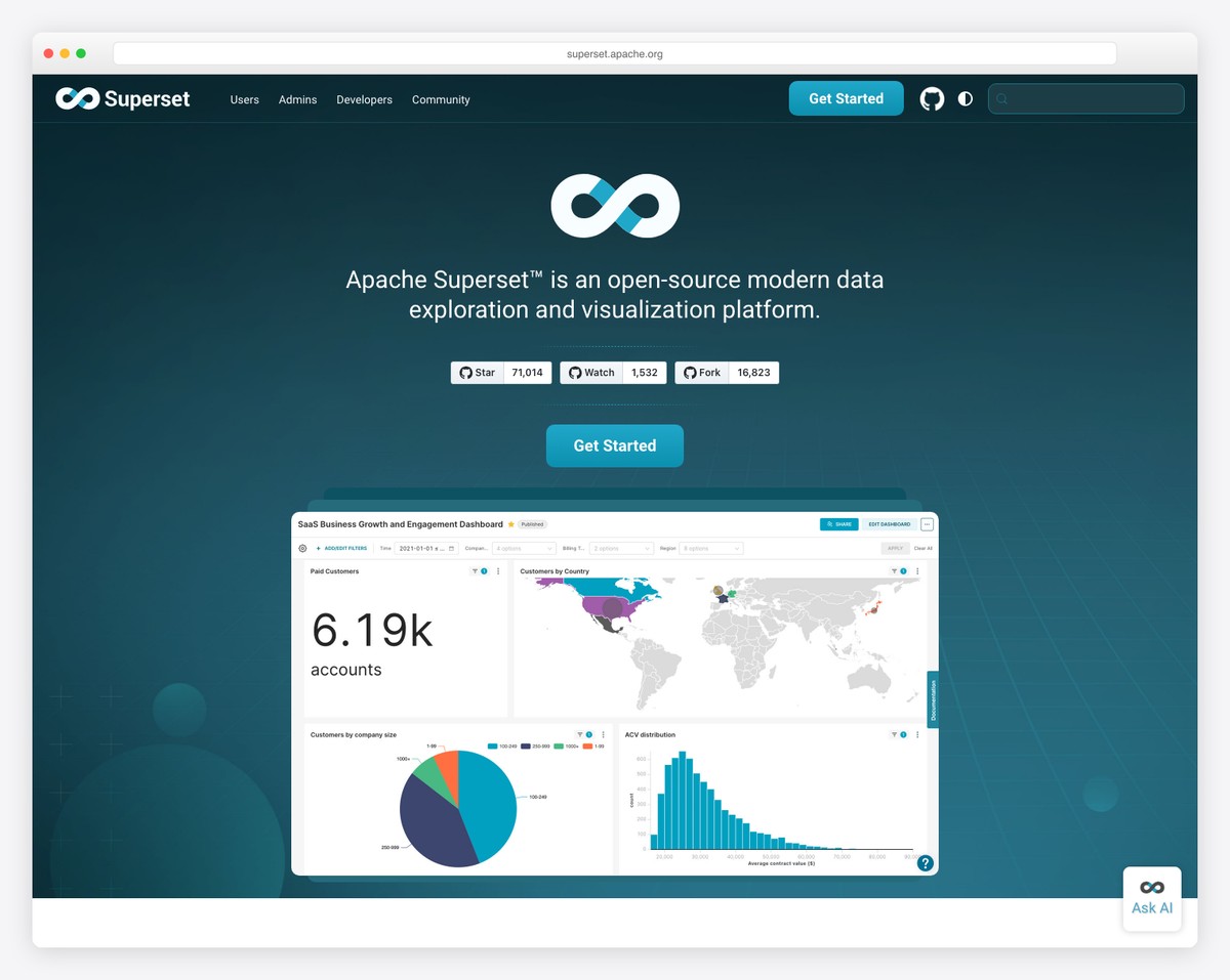
Why we like it: 40+ built-in visualization types with drag-and-drop building — the most versatile open-source BI tool for teams that want Tableau-level capability without the cost.
Apache Superset provides a complete data exploration and visualization platform with 40+ pre-installed chart types, interactive dashboards with cross-filtering, drill-to-detail capabilities, semantic layers for SQL transformations, Jinja templating, and built-in data caching. It’s the go-to choice for data teams who need to build complex analytics dashboards from multiple data sources.
The platform handles everything from simple bar charts to complex geospatial visualizations, with a visual query builder for non-technical users and a full SQL IDE for analysts. Cross-filtering between charts means clicking a bar in one chart filters every other chart on the dashboard.
2. Grafana
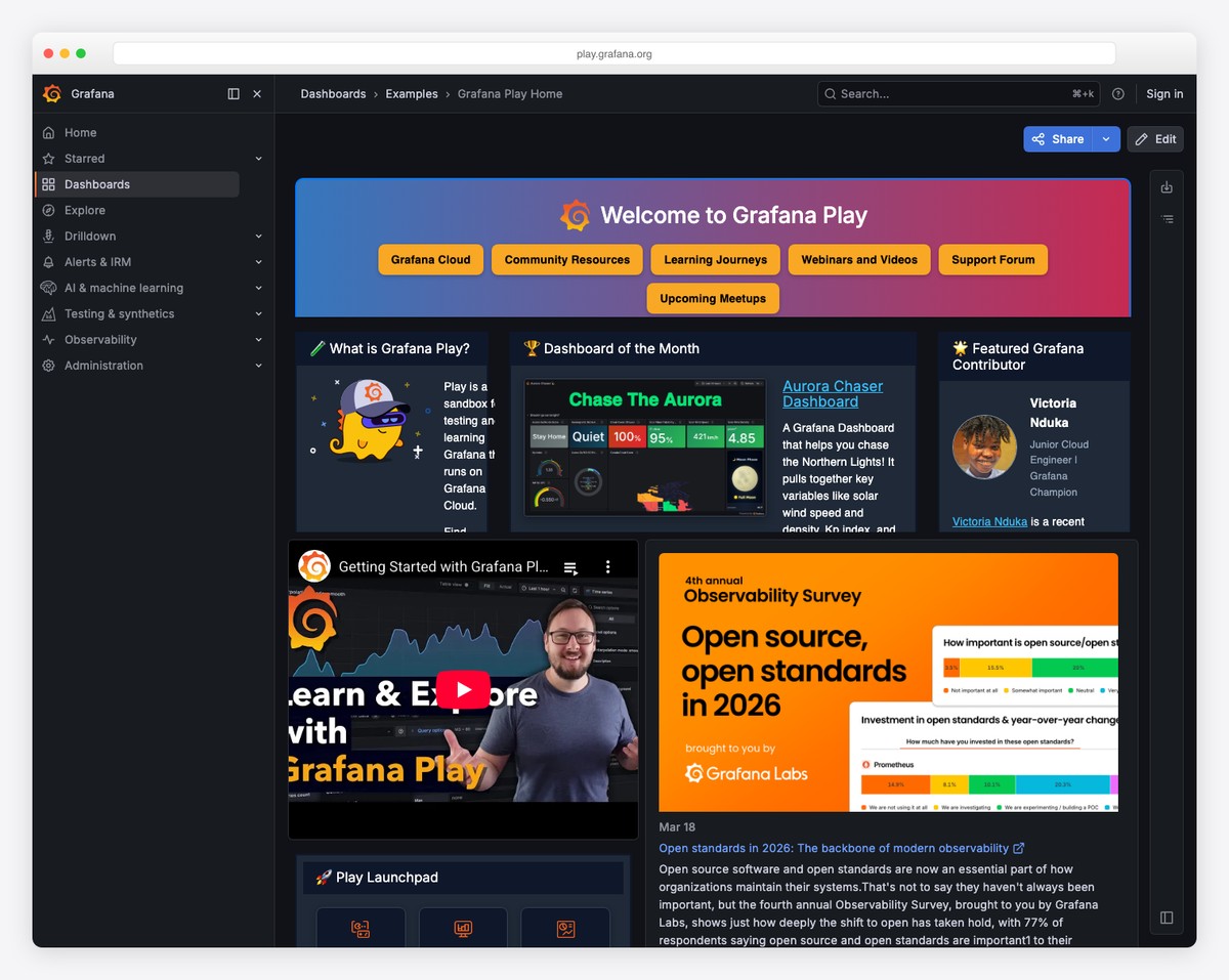
Why we like it: The live playground at play.grafana.org lets you explore fully functional dashboards immediately, and 100+ data source plugins mean it connects to virtually anything.
Grafana (72,700 stars) is the industry-standard open-source observability platform for visualizing metrics, logs, and traces from multiple data sources. Features highly customizable dashboards with panels for time series, heatmaps, histograms, gauges, and more. Supports alerting, annotations, and templated variables for dynamic dashboards.
Pair Grafana with Prometheus for metrics and Loki for logs to build a complete observability stack. The community has published thousands of pre-built dashboards you can import with one click. For more monitoring-focused options, see our DevOps monitoring dashboard templates roundup.
3. Metabase
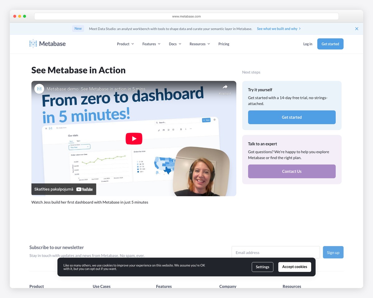
Why we like it: The AI-powered Metabot lets non-technical users ask questions in plain English and get charts back — the lowest barrier to entry of any BI tool on this list.
Metabase (46,400 stars) lets anyone build analytics dashboards through a visual query builder — no SQL required. Features drill-through capabilities, interactive dashboards, and a semantic layer (Data Studio) for curating metrics. Supports 20+ data sources including PostgreSQL, MySQL, MongoDB, BigQuery, and Snowflake. Trusted by 90,000+ companies.
The AI-powered Metabot takes it further — ask “what were our top products last month?” in plain English and get a chart back. For teams where business stakeholders need self-service analytics, Metabase removes the bottleneck of waiting for engineering to build reports.
4. Redash
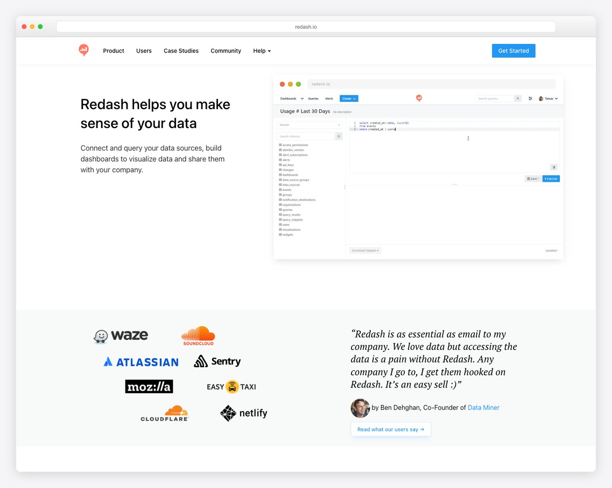
Why we like it: The SQL-first approach with parameterized queries and scheduled refreshes makes it the best choice for analyst teams that live in SQL.
Redash (28,300 stars) lets you query any data source, build visualizations, and assemble them into shareable dashboards. Supports 35+ data sources including relational databases, NoSQL stores, and APIs. Features parameterized queries, scheduled refreshes, alerts based on query results, and a query snippets library for reusable SQL.
For data teams that are comfortable writing SQL, Redash provides the shortest path from query to dashboard. Write your SQL, pick a chart type, and pin it to a shared dashboard. No drag-and-drop builder, no visual query language — just SQL and results.
5. Lightdash
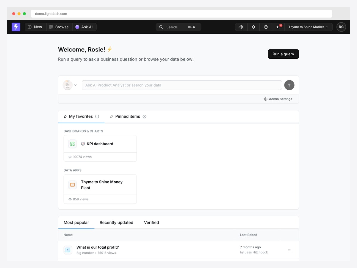
Why we like it: It builds dashboards directly on your dbt models, so metric definitions live in version control instead of being redefined inside the BI tool.
Lightdash takes a different route from Superset and Metabase: rather than defining metrics inside the BI layer, it reads the models and metric definitions you already maintain in dbt. That keeps one definition of “active customer” or “monthly revenue” in your repository, reviewed like any other code, instead of drifting across a dozen saved charts.
The interface reflects that. The home view leads with a natural-language query bar and your pinned dashboards, then lists the most-viewed saved queries with their view counts — a small but useful signal for finding what the rest of the team actually relies on. Charts and dashboards are built from the modelled fields, so business users explore without writing SQL while the definitions stay governed.
It is the strongest option here if you already run dbt. If you do not, the setup cost is real, and Metabase will get you to a working dashboard faster.
6. Evidence
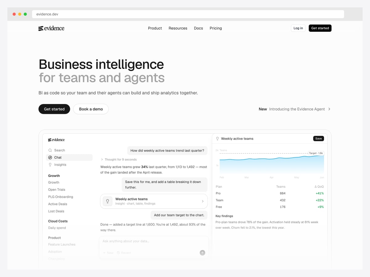
Why we like it: Reports are Markdown files with SQL in them, so your entire analytics layer is a git repository rather than a pile of clicked-together dashboards.
Evidence treats BI as code. You write Markdown containing SQL queries and chart components, and it builds a fast static site from them. That means pull requests, diffs, and code review for analytics — the workflow that dashboards built by clicking through a UI can never offer.
The product has since grown a conversational layer, where a question produces a chart, a supporting table, and a written summary of the finding side by side. That combination is worth studying regardless of which tool you pick: a chart shows the shape, but the written finding is what actually travels into a meeting.
Best suited to analytics engineers comfortable in SQL and git. It is the wrong choice if your primary users are non-technical people who need to build their own views.
7. Cube
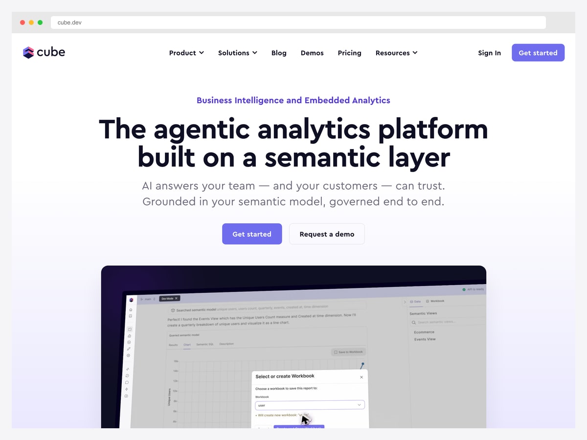
Why we like it: It is the headless option — a semantic layer and API rather than a dashboard, which is exactly what you want when the charts live inside your own application.
Cube is not a dashboard tool. It sits between your database and whatever front end you are building, exposing a governed semantic model over an API with caching and access control built in. You then render the charts yourself with any of the dashboard templates further down this page.
That separation is the point. If you are shipping analytics to your customers inside your product, a hosted BI tool is the wrong shape — you need your own UI, your own auth, and per-tenant data isolation. Cube handles the modelling and query layer so you are not writing raw SQL against production from your React components.
Pair it with one of the template entries below and you have the full stack: Cube for the data layer, a dashboard template for the interface.
Web analytics tools (Google Analytics alternatives)
A different problem entirely: these track visitors on your website and ship their own reporting interface. If you searched for an “analytics dashboard” because you want to see traffic, sources, and conversions, this is the section you want — not a template.
8. Umami
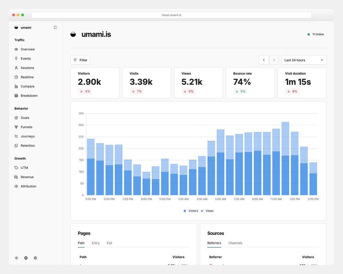
Why we like it: The entire tracking script is ~2KB (vs Google Analytics at ~45KB), making it the fastest-loading analytics solution — perfect for performance-conscious developers.
Umami (35,700 stars) is a modern, privacy-focused web analytics platform serving as a lightweight alternative to Google Analytics. Provides pageview tracking, custom events, real-time visitor data, referrer analysis, browser/OS/device breakdowns, and geographic mapping — all without cookies. Self-hostable or available as managed cloud service.
Built on Next.js with Prisma, Umami is particularly appealing to developers who want analytics they can understand, extend, and self-host. The MIT license means unlimited commercial use with no restrictions.
9. PostHog
Why we like it: The only open-source platform combining product analytics with session replay, feature flags, and A/B testing — replaces 4-5 separate tools.
PostHog (32,100 stars) is an all-in-one product analytics platform combining web analytics, session replay, error tracking, feature flags, A/B testing, surveys, and a data warehouse. Provides funnels, retention analysis, user paths, and cohort breakdowns. Built on ClickHouse for fast analytics queries at scale.
For product teams, PostHog eliminates the integration tax of using separate tools for analytics (Amplitude), session replay (FullStory), feature flags (LaunchDarkly), and A/B testing (Optimizely). Everything lives in one platform with a unified user identity.
Looking for more dashboard options across different use cases? Browse our collections of CRM dashboard templates, e-commerce admin dashboards, and fintech dashboard templates.
10. Plausible Analytics
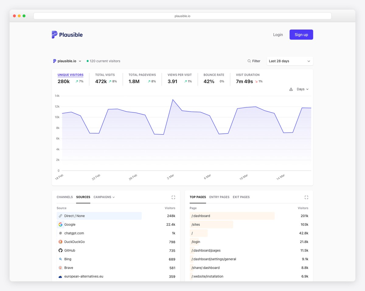
Why we like it: AI tool traffic detection (identifying visits from ChatGPT, Perplexity, Claude) is a uniquely forward-looking feature no other analytics platform offers.
Plausible (24,400 stars) is a lightweight, privacy-friendly web analytics alternative to Google Analytics — with a tracking script 75x smaller than GA. Features a real-time dashboard updating every 30 seconds, automatic scroll depth tracking, UTM campaign tracking with automatic channel grouping, and codeless goal/revenue tracking.
The standout feature in 2026: AI tool traffic detection. Plausible identifies visits from ChatGPT, Perplexity, Claude, and other AI tools — giving you visibility into a traffic source that most analytics platforms can’t distinguish from regular referrals.
11. Matomo
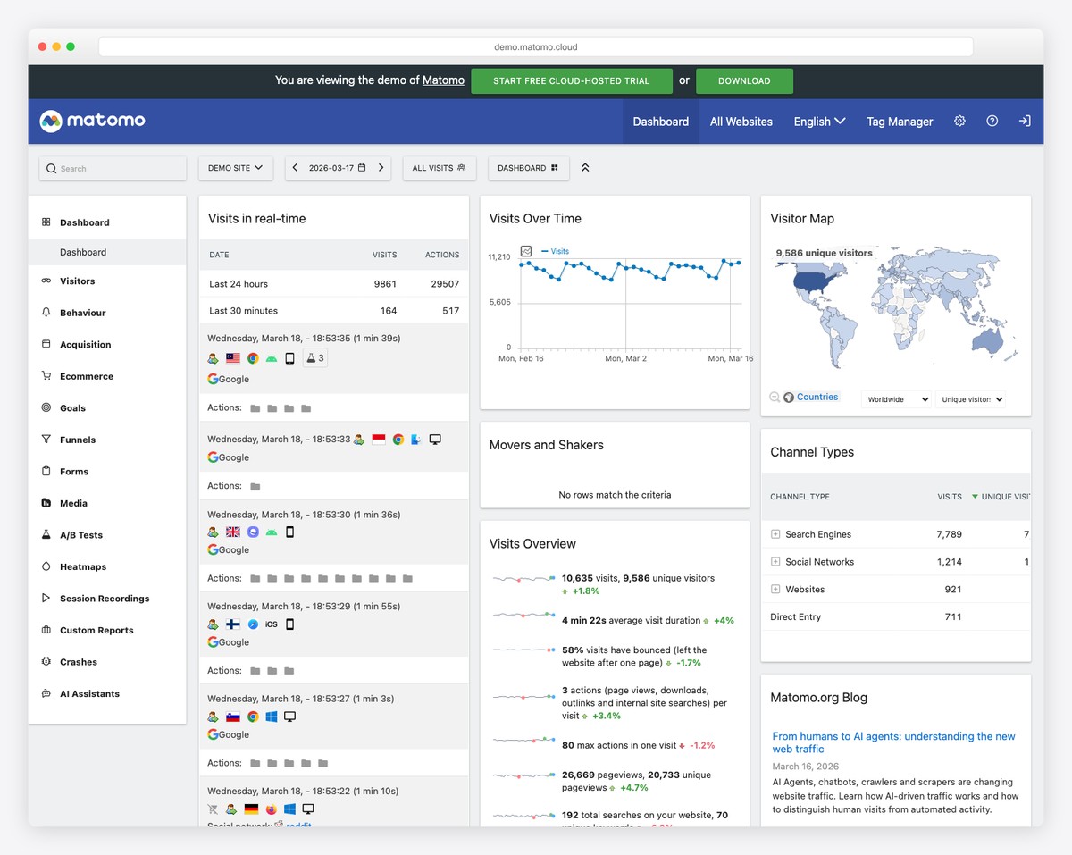
Why we like it: The closest feature-parity replacement for Google Analytics in the open-source world — includes heatmaps, session recordings, and a tag manager that most alternatives lack.
Matomo (21,400 stars, formerly Piwik) is the most feature-complete open-source web analytics platform, offering everything Google Analytics does with full data ownership. Includes real-time analytics, heatmaps, session recordings, A/B testing, funnels, cohorts, custom dimensions, tag manager, and roll-up reporting for multi-site analytics. Used by over 1 million websites including the UN and NASA.
If your organization needs to replace Google Analytics for privacy/compliance reasons but can’t sacrifice features, Matomo is the only open-source option with feature parity — heatmaps, session recordings, tag manager, and ecommerce tracking are all built in.
Analytics dashboard templates for developers
These are front-end templates — the interface, not the data layer. You get charts, KPI cards, and layouts to wire to your own API, which is what you need when analytics is a feature inside your product rather than an internal reporting tool.
12. Apex Dashboard
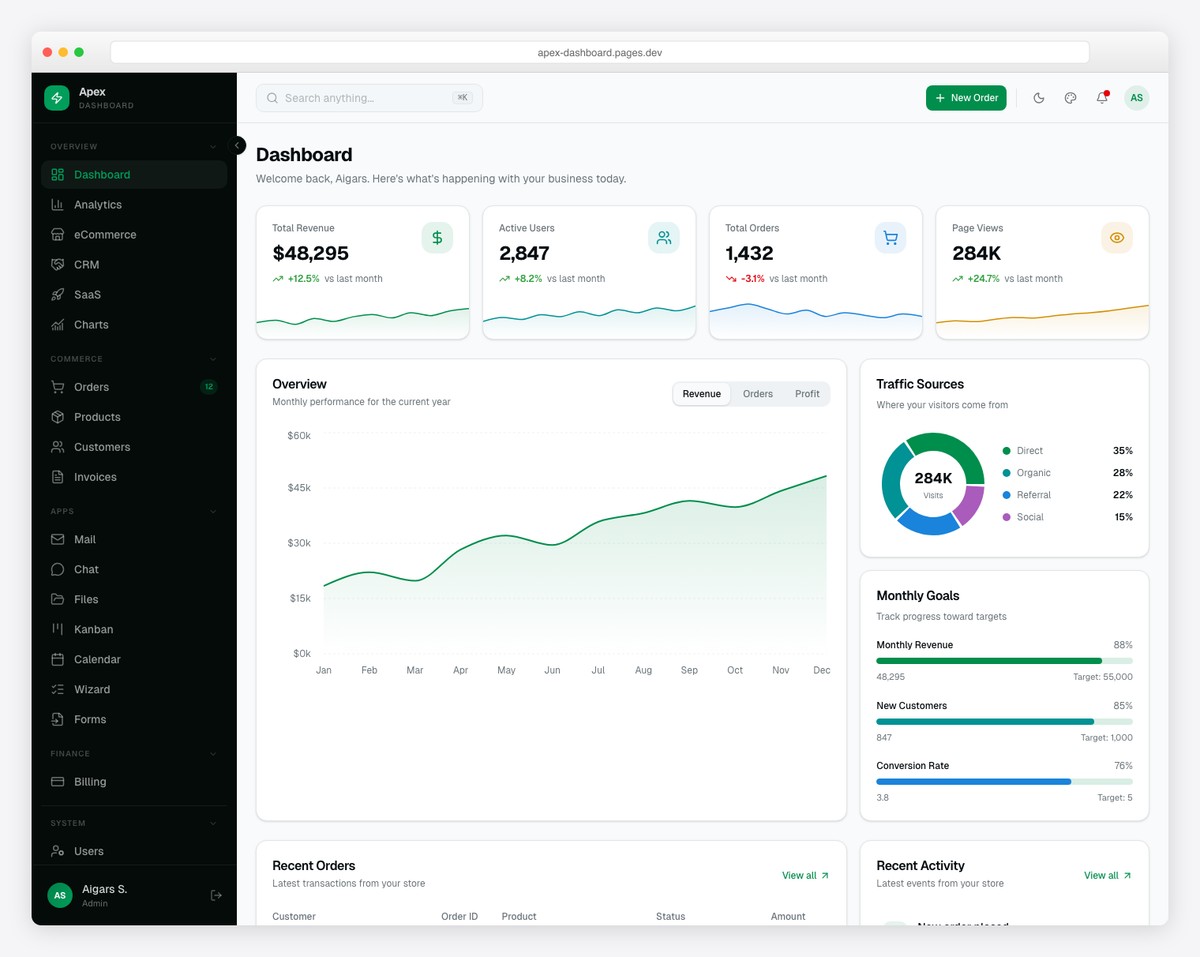
Why we like it: The Analytics dashboard variant is purpose-built for traffic analysis with time-period filters (7d/30d/90d/1y) and geographic breakdowns — not just a generic admin with a chart bolted on.
Apex ships with 12 dashboard variants including a dedicated Analytics view with line/bar charts, time-period filters, date range picker, top pages ranking, and geographic traffic visualization. The template includes 10 Recharts chart types, TanStack Table v8 with CSV export, and a live theme customizer with 6 color presets.
With 216 prerendered pages covering analytics alongside eCommerce, CRM, SaaS, and overview dashboards, Apex provides the most comprehensive analytics-ready admin template available. For more Next.js options, see our Next.js + shadcn/ui dashboard roundup. Version 3.0 adds 114 copy-paste blocks across 14 categories, six layout presets, a world map built from public-domain Natural Earth data with no runtime map library, an AI assistant with tool calls and streaming citations, and role-based access control with a permission matrix.
13. Haze Dashboard — Next.js Edition
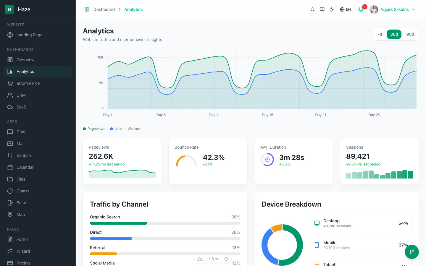
Why we like it: Ships a purpose-built Analytics dashboard variant — traffic sources, device split, top pages, and visitor trends — using recharts visualizations with lazy loading, all swappable for live analytics data.
Haze includes a dedicated Analytics dashboard as one of five variants — not a generic admin retrofitted with a chart widget. The view tracks traffic sources, device breakdown, top-performing pages, visitor trends, and bounce rate, all built with recharts visualizations that lazy-load for performance. Mock data swaps cleanly for real analytics feeds via the 33 mock API routes that power the rest of the template.
Built on a modern Next.js stack: Next.js 16 App Router with Turbopack, React 19 Server Components, TypeScript 5 strict, Tailwind CSS v4 OKLCh tokens, and shadcn/ui primitives. Four additional dashboard variants (Overview, eCommerce, CRM, SaaS) and 8 interactive modules (chat, mail, kanban, calendar, files, charts, Tiptap editor, maps) ship alongside. A runtime theme customizer exposes color mode, accent, density, and RTL toggles. next-intl ships English, German, and French. Production-build green and ESLint-clean.
14. Admindek Dashboard Next.js
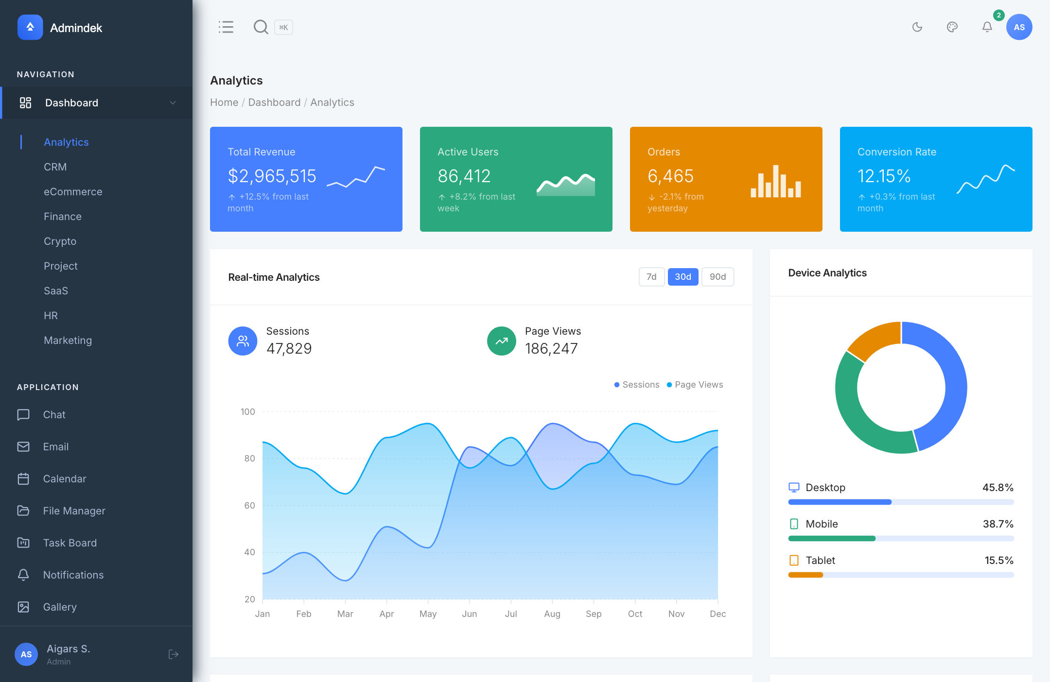
Why we like it: Purpose-built Analytics dashboard with Recharts 3 visualizations, device breakdown, and real-time session tracking — not a generic admin forced to become an analytics tool.
Admindek Next.js ships a dedicated Analytics dashboard tracking real-time sessions, page views, device breakdown (Desktop 45.8%, Mobile 38.7%, Tablet 15.5%), and revenue KPIs with month-over-month comparisons. Built on Next.js 16 App Router, React 19, TypeScript 6, and Tailwind CSS v4 with 35+ vendored shadcn/ui primitives. Recharts 3 handles visualizations — line, area, bar, donut, and radar charts. Nine total dashboard variants (Analytics, CRM, E-commerce, Finance, SaaS, HR, Marketing, Crypto, Project) plus full CRUD flows, chat, calendar, kanban.
15. Flux Dashboard
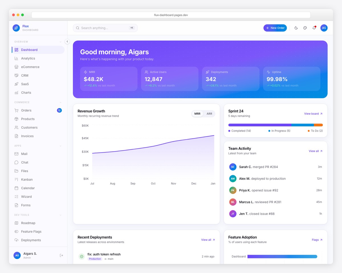
Why we like it: The combination of analytics dashboards with product management pages (roadmap, feature flags, changelog) makes it uniquely suited for SaaS product teams.
Flux delivers 64+ pages across 5 dashboard variants including a dedicated Analytics view with line/bar charts, time-period filters, date range picker, top pages ranking, and geographic traffic tracking. Framer Motion animations and gradient-forward design give it a distinctively modern feel.
What sets Flux apart is the 7 specialty pages — Product Roadmap, Feature Flags, Sprint Board, Deployment Log, and Changelog — alongside the analytics dashboard. For SaaS teams that want both product metrics and development tracking in one admin panel, Flux is the natural choice.
16. Signal Dashboard
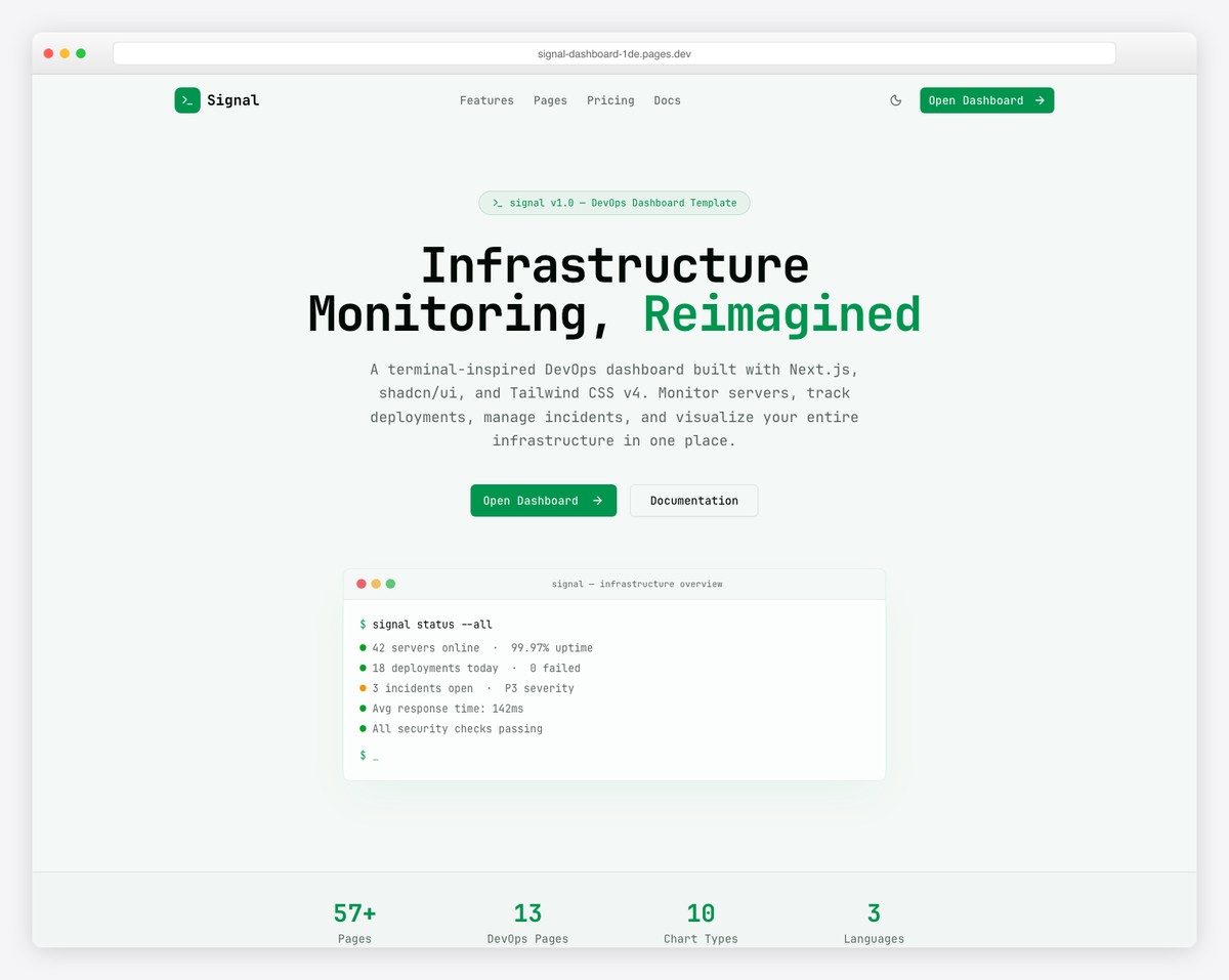
Why we like it: API latency percentile tracking (p50/p95/p99) and Kubernetes health monitoring are analytics features you rarely see in dashboard templates.
Signal takes a terminal-inspired design approach with JetBrains Mono typography and dark-first neon aesthetics. The 57+ page dashboard provides full-stack observability with 13 DevOps-specific pages: Server Fleet, Containers, Deployments, Incidents, Log Explorer, Uptime Monitor, CI/CD Pipelines, Databases, Security Audit, API Monitoring, Kubernetes, Cloud Costs, and public Status Page.
For infrastructure analytics specifically — tracking API latency percentiles, CI/CD success rates, container resource utilization, and cloud spend trends — Signal is purpose-built. The information-dense layouts mirror professional monitoring tools like Datadog and New Relic.
17. Mantine Analytics Dashboard
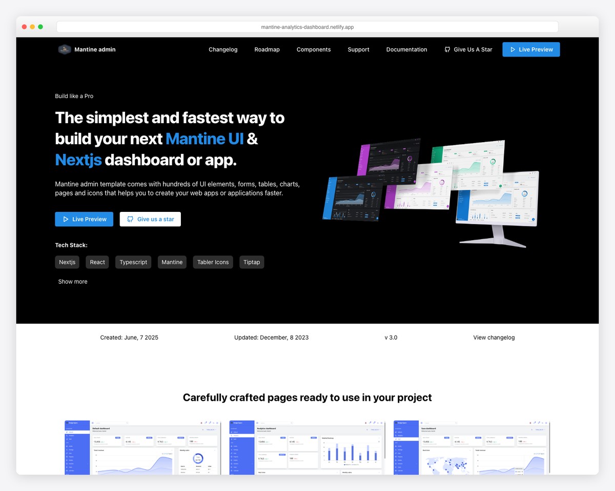
Why we like it: One of the few purpose-built analytics dashboard templates (not a generic admin) that’s MIT-licensed and uses Mantine — a great starting point for Mantine projects.
A free, open-source analytics dashboard template with 2+ dashboard layouts, 45+ UI components, and geographic data visualization via React Simple Maps. Built on Mantine 9 with ApexCharts for data visualization, Mantine DataTable for tabular data, and full dark mode support. Includes 10+ theme color options.
For teams already using Mantine as their component library, this is the most natural analytics dashboard starting point. The MIT license means full commercial freedom, and the purpose-built analytics focus means every component is relevant — no filler pages. For more React component library comparisons, see our Mantine vs Chakra UI vs MUI article.
18. Gentelella v4
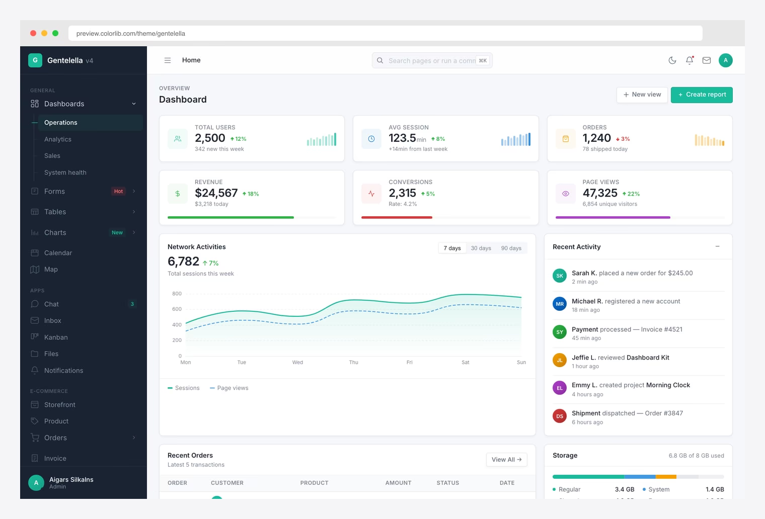
Why we like it: 20 Apache ECharts 6 chart variants out of the box — line, bar, scatter, sankey, candlestick, heatmap, treemap, sunburst, graph, gauge — with no framework runtime to ship.
Gentelella v4 (May 2026) is a free admin dashboard rewritten on Vite 8 with vanilla ES2022 JavaScript and a modular Sass system. The 21.3K-star Colorlib classic has dropped Bootstrap and jQuery entirely. For analytics work specifically, the killer feature is Apache ECharts 6 wired into 20 distinct chart pages — the same chart engine used by Apache Superset and many internal BI tools — plus DataTables.net 2 for ranked tables with export, and Leaflet for geographic visualisations.
Across 58 production pages, v4 ships an Analytics dashboard variant alongside three others, full e-commerce / invoicing flows for revenue tracking, and a ⌘K command palette for jumping between report pages. The live theme generator lets you brand the dashboard without recompiling Sass, no-flash dark mode handles overnight monitoring use cases, and the whole stack installs as a PWA. MIT-licensed.
Looking for Google Analytics report templates?
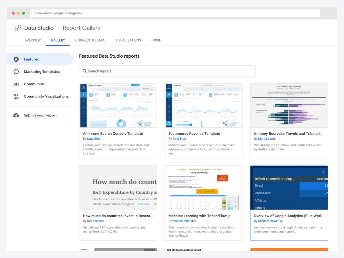
If you arrived searching for “Google Analytics dashboard templates”, none of the options above is quite what you want — and it is worth being direct about that. You are almost certainly looking for a prebuilt report that connects to your existing GA property, not a codebase or a self-hosted platform.
Those live in the Google Data Studio report gallery — the tool you may know as Looker Studio, which Google renamed back to Data Studio — and it is free, connecting directly to Google Analytics, Search Console, Google Ads, and Sheets. The featured templates cover the common cases — an all-in-one Search Console report, ecommerce revenue tracking, a GA channel overview — and you copy one, point it at your own property, and it populates immediately. Agencies such as Porter Metrics and Windsor.ai publish larger free galleries in the same format.
We keep a checked list of SEO dashboard templates in that format, marking which ones run free on Google’s own connectors and which need a paid connector before they show a single number. Use Data Studio when the data already lives in Google’s products and you want reporting without engineering effort. Move to the platforms above when you need to join that data with a database, or to the templates when the dashboard has to live inside your own application.
Analytics dashboard UI patterns worth copying
Whichever route you take, the same handful of interface decisions separate an analytics dashboard people use from one they open once. These recur across every tool on this page.
Lead with a comparison, never a bare number
“48,000 sessions” is unreadable on its own. “48,000, up 12% versus last month” is a fact someone can act on. Every strong analytics dashboard pairs its headline figures with a delta and a period label, and the best ones add a sparkline so the shape of the trend is visible without opening a second view.
Make the time range global and obvious
The single most common analytics interface failure is a dashboard where each panel silently uses a different period. One date-range control at the top, applied to everything beneath it and clearly labelled, prevents an entire class of misreading — and makes the comparison deltas above trustworthy.
Give tight-range series their own axis
Conversion rate moves within a few percentage points; sessions move in thousands. Plotted on a shared scale, the rate flattens into a straight line that hides exactly the movement you care about. Use a second axis, or split them into separate charts.
Break totals down by something actionable
A single revenue or traffic line is the least useful chart you can ship. Split it by channel, device, geography, or plan — dimensions that map onto a decision someone can make. The breakdown is where analytics stops being a report and starts being a tool.
Label values directly and keep the palette small
Legends cost the reader a round trip on every glance. Where a chart has few enough series, put the value on the mark. Reserve saturated colour for the one or two states that matter — a target line, an alert threshold — and keep everything else neutral, so the eye lands on the thing that changed.
How to Choose the Right Analytics Dashboard
The decision depends on whether you need a full analytics platform, a web analytics tool, or a dashboard template:
Full Analytics / BI Platforms
- Visual query builder (no SQL): Metabase — easiest for non-technical teams
- 40+ chart types (power users): Apache Superset — most versatile visualization
- SQL-first workflow: Redash — best for analyst teams comfortable with SQL
- Real-time monitoring: Grafana — industry standard for infrastructure metrics
Web Analytics (GA Alternatives)
- Lightest weight (2KB): Umami — MIT license, Next.js-based
- AI traffic detection: Plausible — identifies ChatGPT/Claude referrals
- Full GA replacement: Matomo — heatmaps, session recording, tag manager
- Product analytics + more: PostHog — analytics + session replay + feature flags + A/B testing
Dashboard Templates (Build Your Own)
- Most comprehensive: Apex — 216 prerendered pages, 12 dashboard variants, 10 chart types
- SaaS product teams: Flux — analytics + roadmap + feature flags
- Infrastructure analytics: Signal — API latency, CI/CD, Kubernetes monitoring
- Mantine users: Mantine Analytics Dashboard — MIT, purpose-built for analytics
Conclusion
The analytics dashboard landscape in 2026 ranges from enterprise BI platforms with 70K+ GitHub stars (Superset, Grafana) to lightweight privacy-first alternatives (Umami, Plausible) to polished premium templates with dedicated analytics views (Apex, Flux, Signal). The right choice depends on whether you need a full analytics platform, a Google Analytics replacement, or a frontend template to build custom analytics into your own application.
For more admin dashboard options, explore our collections of best admin templates, dashboard templates, and our industry-specific roundups for CRM, e-commerce, and fintech dashboards.
Analytics Dashboard FAQ
What is the best free analytics dashboard?
For exploring data in a database, Metabase is the fastest to a working dashboard and Apache Superset the most powerful once you outgrow it; both are free and open source. For website traffic, Umami and Plausible are the lightest Google Analytics alternatives, and Matomo the most full-featured. For building analytics into your own product, start from a dashboard template and pair it with a data layer such as Cube.
What is the difference between an analytics platform and an analytics dashboard template?
A platform such as Superset, Metabase, or Lightdash is a complete application you deploy and point at a database — business users then build their own charts. A dashboard template is front-end code: charts, KPI cards, and layouts you wire to your own API. Platforms answer internal reporting needs; templates are what you want when analytics is a feature inside the product you are shipping.
Where do I find Google Analytics dashboard templates?
In the Looker Studio report gallery, which is free and connects directly to your Google Analytics, Search Console, and Ads data. Copy a featured report, point it at your own property, and it populates immediately. The self-hosted platforms and code templates on this page solve a different problem and will not connect to GA out of the box.
Which analytics dashboard is best for a SaaS product?
If the dashboard is for your own team, PostHog covers product analytics, session replay, and feature flags in one tool. If you are shipping analytics to your customers inside your product, use a headless approach — a semantic layer such as Cube for governed, per-tenant queries, with a dashboard template for the interface.
Can I self-host analytics instead of using Google Analytics?
Yes, and it is the main reason this category exists. Umami and Plausible are lightweight, privacy-focused, and cookie-free by default, which simplifies consent requirements in many jurisdictions. Matomo is the closest feature-for-feature replacement for Google Analytics, and PostHog goes further into product analytics. All can run on your own infrastructure so the data never leaves it.
What should an analytics dashboard show?
Lead with a small number of headline metrics, each carrying a comparison against the previous period rather than a bare figure. Add one global date-range control that applies to every panel. Then break the totals down by a dimension someone can act on — channel, device, geography, or plan — and keep any tight-range series such as conversion rate on their own axis so their movement stays visible.

You Might Also Like


