8 Best shadcn/ui Settings Templates 2026
Need a polished shadcn/ui settings page without writing the form columns from scratch? These 8 picks cover the canonical shadcn-admin reference (the most-forked layout), the Shadcn UI Kit Pro settings module, premium tabbed blocks from shadcndesign, 7+ Shadcnblocks profile variants, Shadcn Studio’s role-based account settings, the shadcnexamples profile page, shadcn.io’s registry-installable block, and Origin UI’s MIT-licensed components — every demo verified live in May 2026.
A 2026-grade shadcn/ui settings surface typically organizes around 4-6 sub-pages: Profile (public display name, bio, avatar, social links), Account (email, password, danger-zone delete), Appearance (theme picker, density, font), Notifications (per-channel toggles), Display (sidebar layout, table density), and optionally Team / Permissions when the product has multi-user accounts. Two practical layouts dominate: a sub-page sidebar with form column (shadcn-admin pattern), or a horizontal tab bar with form panel below (when categories are five or fewer).
We’ve grouped the 8 picks below into the canonical reference template (shadcn-admin), two premium bundles (Shadcn UI Kit, shadcndesign Pro Blocks), three block libraries (Shadcnblocks 7+ variants, Shadcn Studio account settings, shadcn.io single block), one complete reference page (shadcnexamples profile), and one MIT-licensed component set (Origin UI). shadcn-admin is the right starting point for most projects; the others optimize for specific needs (premium polish, role-based access, MIT licensing).
Related reading: our shadcn/ui onboarding templates for the first-session setup surface that feeds into Settings, form templates for the form-mechanics layer underneath, auth templates for the account-creation surface, Next.js shadcn admin dashboards for the full admin context, and our shadcn/ui templates pillar.
Quick Picks
- Best canonical reference: shadcn-admin (satnaing) — 5 sub-pages, sticky sidebar, fork-and-adapt
- Best premium bundle: Shadcn UI Kit Settings — comes with 18 dashboards
- Best premium tabbed blocks: shadcndesign Pro Blocks
- Best variety of layouts: Shadcnblocks Settings Profile — 7+ blocks
- Best for role-based / team permissions: Shadcn Studio Account Settings
- Best complete profile page: shadcnexamples Profile Page
- Best single registry-installable block: shadcn.io Settings Profile
- Best MIT-licensed for commercial use: Origin UI Settings
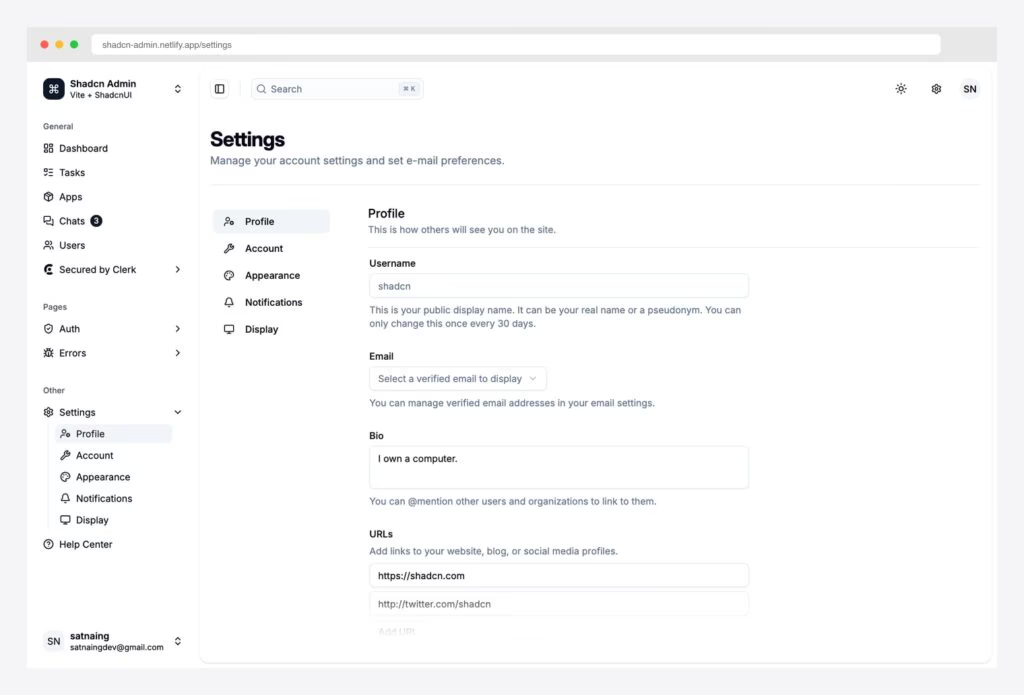
1. shadcn-admin (satnaing)
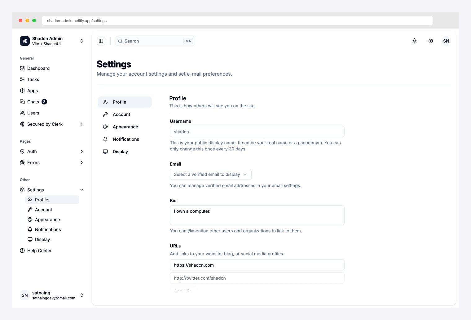
Why we like it: The most-forked shadcn admin template with a fully built-out settings surface — Profile / Account / Appearance / Notifications / Display sub-pages, sticky sub-page sidebar, form fields with inline helper text, and dark-mode appearance picker. Vite + React + TanStack Router stack.
Pick shadcn-admin when you want to fork the canonical settings layout rather than assemble one from blocks. The sub-page sidebar + form-column pattern is what most shadcn admin templates ship — but this is the project that established the pattern.
2. Shadcn UI Kit Settings
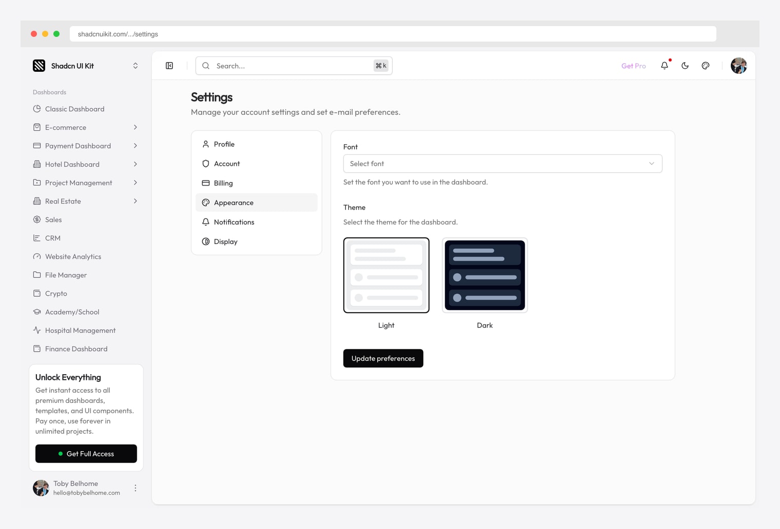
Why we like it: The settings module from the Shadcn UI Kit Pro bundle — tabbed Appearance / Notifications / Account configuration with form-based controls. Bundled with the broader 18-dashboard Pro kit covered across our CRM, finance, crypto, hotel, real estate, and marketing roundups.
Pick Shadcn UI Kit Settings when you’re already on (or considering) the broader Shadcn UI Kit Pro bundle. The settings page is one of dozens of pre-built pages — buying the bundle once covers settings plus all 18 niche admin dashboards.
3. shadcndesign Pro Blocks Settings
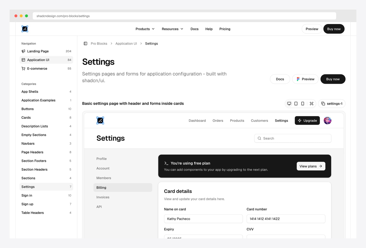
Why we like it: A premium settings block library from shadcndesign with both tabbed and single-page settings layouts for application configuration. Tabs are the right pattern when you have many setting categories; single-page is right when there are five or fewer sections.
Pick shadcndesign’s Pro Blocks when you need the tabbed multi-category layout polished beyond what the free options ship. The tabs-versus-single-page choice is the practical decision — anything beyond five categories is too crowded for a single page.
4. Shadcnblocks Settings Profile
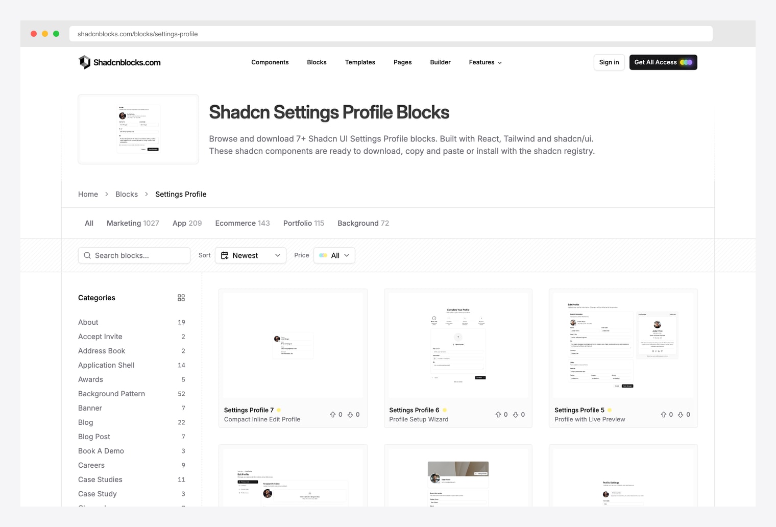
Why we like it: A library of 7+ settings-profile blocks covering the three canonical patterns: card-based form with avatar upload at top, two-column layout separating avatar from text fields, and sectioned forms grouping personal details / contact info / preferences. Same vendor as the marketing template family (Plasma / Zippay / Metafi).
Pick Shadcnblocks when you want to browse multiple settings-page layout variants and pick the one that fits your product. The 7+ blocks let you compare avatar-top versus two-column versus sectioned layouts before committing.
5. Shadcn Studio Account Settings
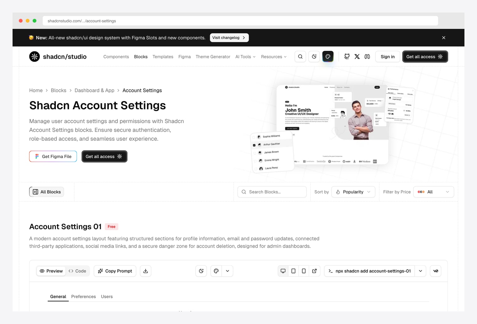
Why we like it: Account Settings blocks designed for user-account management and permissions — secure authentication, role-based access, profile / preferences / users sub-tabs, account-deletion danger zone. Same vendor we recommended in our onboarding, forms, pricing, and portfolio roundups.
Pick Shadcn Studio when the settings page needs to handle team / role / permission management beyond the single-user profile basics. The role-based access pattern is the differentiator versus the profile-only blocks above.
6. shadcnexamples.com Profile Page
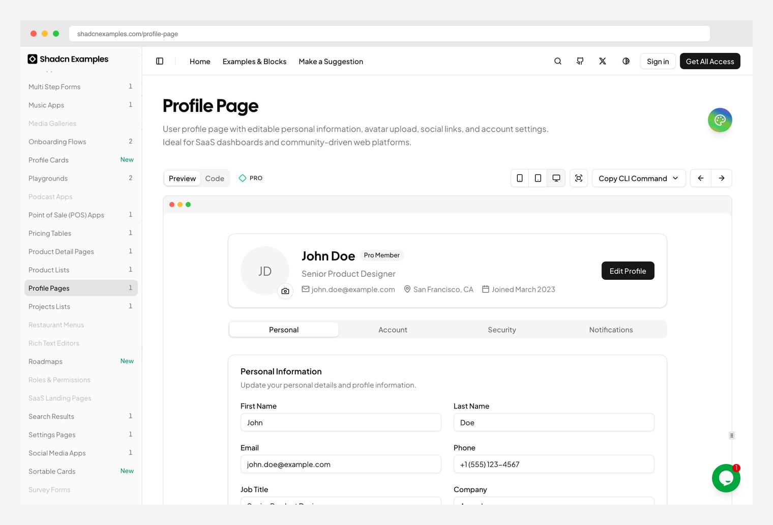
Why we like it: A reference profile-page UI with photo, public display name, bio, social links, and account preference sections in a single-column layout. Pairs with the same vendor’s onboarding flow we covered in our onboarding roundup.
Pick shadcnexamples when you want a finished profile page to clone rather than blocks to assemble. The single-column layout is the right shape for user-facing profile pages where the content is sparse; switch to a sub-page sidebar pattern (shadcn-admin above) when there are many setting categories.
7. shadcn.io Settings Profile
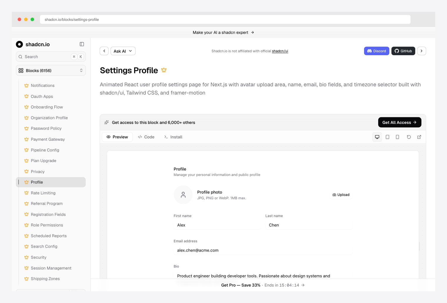
Why we like it: A settings-profile block from shadcn.io with avatar, name, email, bio, social-links, and preferences sections. Installs directly via the shadcn registry. Same vendor we recommended in our pricing, charts, forms, portfolio, blog, and onboarding roundups.
Pick shadcn.io when you need exactly one settings block dropped into an existing shadcn project and want the registry-install pattern (npx shadcn@latest add). Faster than assembling multiple blocks from Shadcnblocks for the same end result.
8. Origin UI Settings
Why we like it: Copy-paste MIT-licensed settings components — profile form, account preferences, notification toggles, danger-zone delete-account section. Installable via the shadcn registry. Same vendor we recommended in our onboarding roundup.
Pick Origin UI when license matters — MIT means you can ship in a closed-source commercial product without buying a Pro tier. The danger-zone delete-account section is the often-missed component that this library actually ships out of the box.
How to Choose the Right shadcn Settings Source
The 8 options split along three practical axes:
By layout
- Sub-page sidebar with form column (5+ categories): shadcn-admin — canonical pattern.
- Horizontal tabs with form panel below (3-5 categories): shadcndesign Pro Blocks, Shadcn UI Kit.
- Single-column form (1-3 sections): shadcnexamples Profile, shadcn.io Settings Profile.
- Variant catalog (pick the layout you want): Shadcnblocks Settings Profile (7+ variants), Shadcn Studio.
- Componentized (assemble piece by piece): Origin UI Settings.
By scope
- User profile only (display name, bio, avatar): shadcnexamples, shadcn.io.
- Full account settings (profile + email + password + danger zone): shadcn-admin, Origin UI, Shadcnblocks.
- Team / role / permissions (multi-user accounts): Shadcn Studio Account Settings.
- Settings as part of a larger dashboard bundle: Shadcn UI Kit, shadcndesign Pro.
By license
- Free / MIT (commercial use, no royalties): shadcn-admin, Origin UI.
- Free preview + paid full access: Shadcnblocks, Shadcn Studio, shadcnexamples, shadcn.io.
- Premium / paid-only: Shadcn UI Kit Pro, shadcndesign Pro Blocks.
A practical pattern in 2026: fork shadcn-admin for the canonical sub-page sidebar layout, swap in the registry-installable blocks from shadcn.io or Origin UI for the form columns, and add Shadcn Studio’s role-based account settings if your product has teams. Skip straight to Shadcn UI Kit when you’re already buying the broader Pro bundle for its 18 admin dashboards — the settings module comes free with it.
You Might Also Like