
How to Use AdminLTE with React (Official Guide, 2026)

AdminLTE powers millions of dashboards, and “how do I use it with React?” has been its most-asked question for years. As of 2026 there’s finally a first-class answer: @adminlte/react — the official React/Next.js component library from the AdminLTE team, with AdminLTE 4 styling on Bootstrap 5.3, TypeScript throughout, and React Server Components support. This guide covers all three integration paths: the official library (recommended), manual integration, and when to pick a React-native alternative instead.
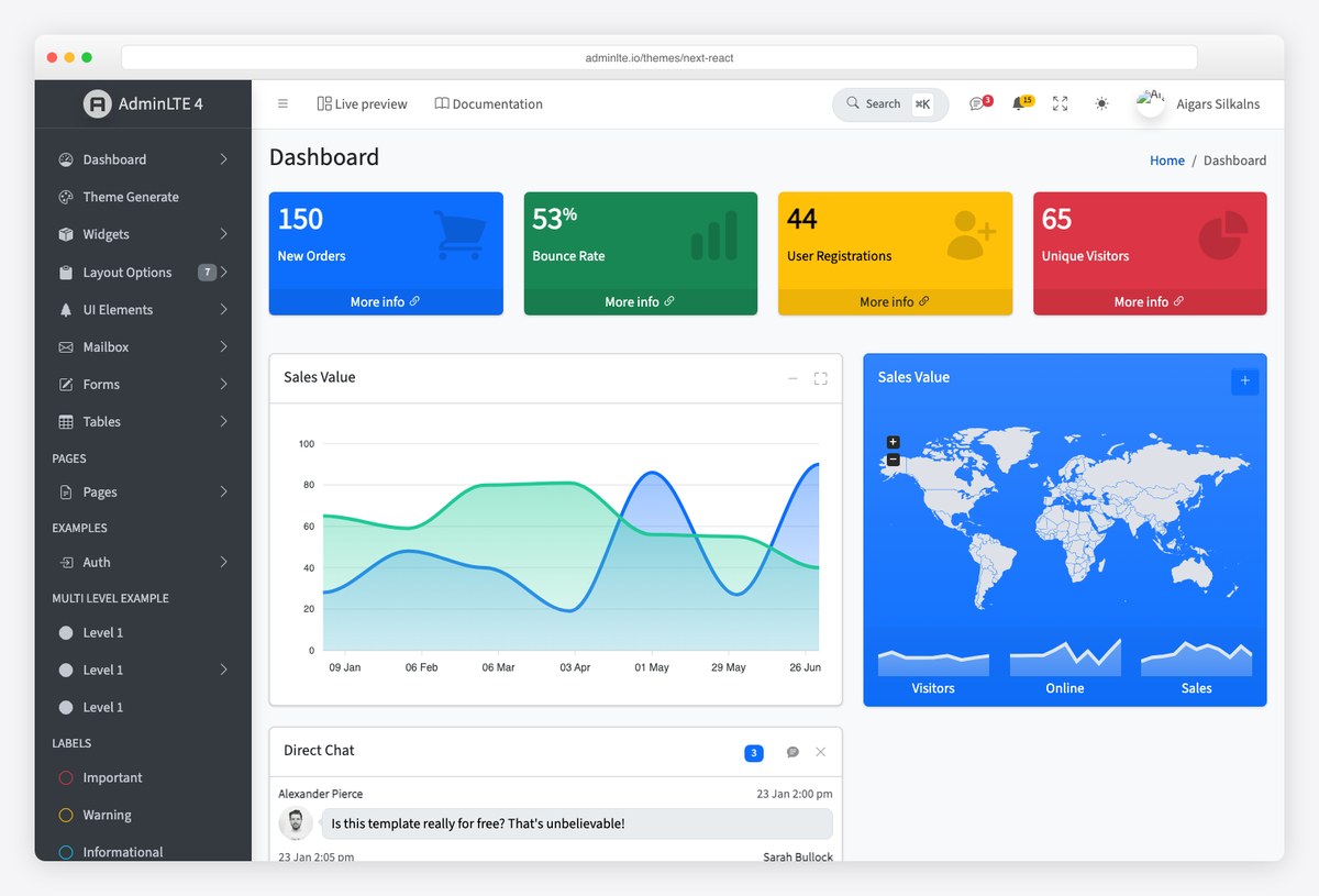
Three ways to use AdminLTE with React
| Approach | Best for | Effort |
|---|---|---|
| 1. @adminlte/react (official components) | New React/Next.js projects that want the AdminLTE look with real components | Low — npm install |
| 2. Manual integration (CSS + markup) | Porting an existing AdminLTE UI, or non-Next React setups | Medium — you write the JSX |
| 3. React-native admin instead | Teams that want a React-first ecosystem over the AdminLTE design | Varies |
Path 1 (recommended): the official @adminlte/react library
@adminlte/react is the AdminLTE team’s own component library — 30+ typed components (layout, widgets, forms, tools) that render the AdminLTE 4 design as real React components rather than ported markup. It’s built for the Next.js App Router: server-first, with only the interactive parts shipping as client components, dark mode driven by Bootstrap’s data-bs-theme, and heavy plugins (Chart.js, Tabulator, Quill, Flatpickr) loading lazily only when you use them. It’s an early release that tracks AdminLTE 4 core closely — MIT-licensed, like AdminLTE itself.
You can see every component running in the live demo (the screenshot above), which also hosts the full documentation under /docs.
Step 1 — Install
npm install @adminlte/react
# peers: React 18+ and Next.js 14+
npm install react react-dom next
# Bootstrap JS (dropdowns, modals) + Bootstrap Icons
npm install bootstrap bootstrap-icons
Next.js is required in practice — the sidebar uses next/navigation for active-link detection. Optional plugin libraries are installed only if you use the matching component (for example npm install chart.js for <Chart>, or tabulator-tables for <Datatable>).
Step 2 — Import the CSS in your root layout
// app/layout.tsx
import '@adminlte/react/css'
import 'bootstrap-icons/font/bootstrap-icons.css'
import Script from 'next/script'

export default function RootLayout({ children }) {
  return (
    <html lang="en">
      <body>
        {children}
        {/* Bootstrap JS for dropdowns, modals, tooltips */}
        <Script src="https://cdn.jsdelivr.net/npm/[email protected]/dist/js/bootstrap.bundle.min.js" strategy="afterInteractive" />
      </body>
    </html>
  )
}
Step 3 — Wrap your pages in the dashboard layout
// app/(dashboard)/layout.tsx
import { DashboardLayout } from '@adminlte/react'
import { menuItems } from '@/lib/menu'

export default function Layout({ children }) {
  return (
    <DashboardLayout
      menuItems={menuItems}
      fixedHeader
      fixedSidebar
      colorModeToggle
    >
      {children}
    </DashboardLayout>
  )
}
Step 4 — Define the sidebar as data
The menu is a typed data model, not markup — groups, headers, and items with Bootstrap Icons classes:
// lib/menu.ts
import type { MenuNode } from '@adminlte/react'

export const menuItems: MenuNode[] = [
  {
    type: 'group',
    text: 'Dashboard',
    icon: 'bi-speedometer',
    children: [
      { type: 'item', text: 'Dashboard v1', href: '/', icon: 'bi-circle' },
    ],
  },
  { type: 'header', text: 'UI ELEMENTS' },
  { type: 'item', text: 'Profile', href: '/profile', icon: 'bi-person' },
]
Step 5 — Build pages from AdminLTE components
// app/(dashboard)/page.tsx
import { AppContent, SmallBox, Card, Progress } from '@adminlte/react'

export default function Dashboard() {
  return (
    <AppContent title="Dashboard">
      <div className="row">
        <div className="col-lg-3 col-6">
          <SmallBox variant="primary" icon="bi-cart" value="150" title="New Orders" href="/orders" />
        </div>
        {/* ...more widgets */}
      </div>
    </AppContent>
  )
}
That’s the whole loop: classic AdminLTE widgets — small boxes, info boxes, cards, progress bars — as typed React components, rendered on the server by default.
Path 2: manual integration (any React setup)
Before the official library, this was the standard route, and it still fits Vite/CRA apps or teams porting an existing AdminLTE codebase. A crucial 2026 update makes it far easier than it used to be: AdminLTE 4 has no jQuery dependency — it’s plain Bootstrap 5.3 + CSS, so the old jQuery-vs-React conflict is gone.
Install AdminLTE core and import its assets
npm install admin-lte@^4 bootstrap bootstrap-icons// src/main.tsx (Vite) or your root entry
import 'admin-lte/dist/css/adminlte.min.css'
import 'bootstrap-icons/font/bootstrap-icons.css'
import 'bootstrap/dist/js/bootstrap.bundle.min.js'Port the markup to JSX
Copy the structure from the AdminLTE 4 demo (below) and convert: class → className, close the void elements, and lift repeated blocks (sidebar items, cards) into your own components. Interactivity comes from Bootstrap’s data attributes (data-bs-toggle) or the Bootstrap JS API — not from React state, so keep the two worlds separate: Bootstrap handles dropdowns and modals; React handles your data.
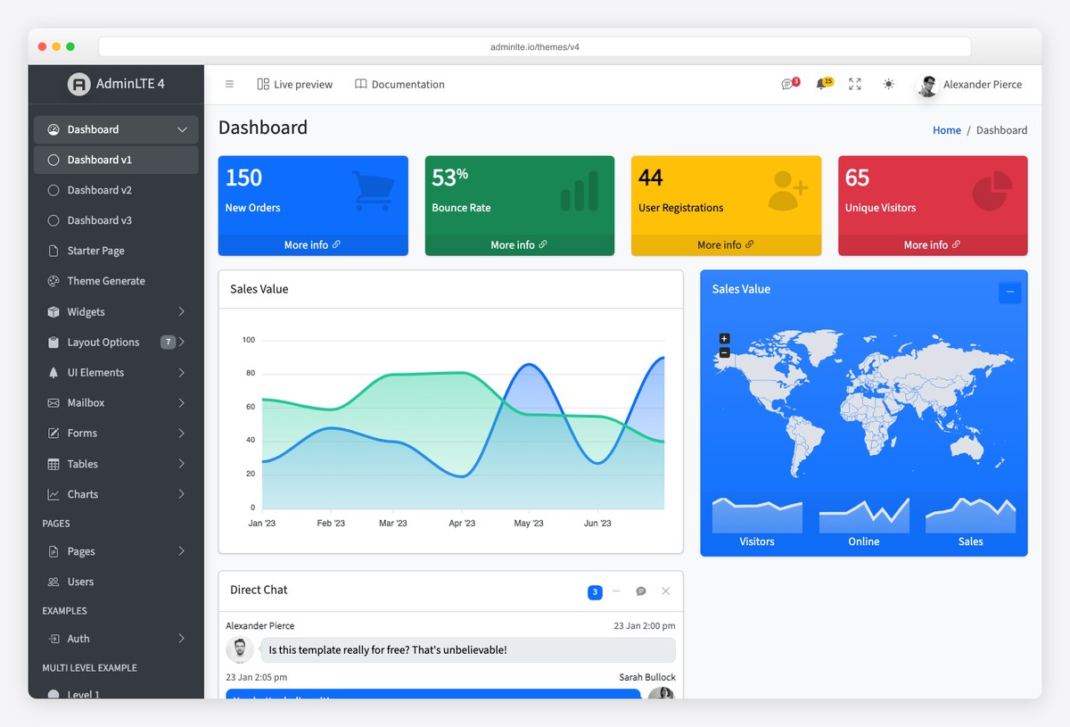
- Gotcha — double-initialization: don’t wire Bootstrap components with both data attributes and JavaScript; pick one per component.
- Gotcha — treeview sidebar: AdminLTE’s sidebar expand/collapse relies on its own JS; in React it’s usually cleaner to reimplement it with state (or use Path 1, where it’s done for you).
- Gotcha — dark mode: toggle Bootstrap’s
data-bs-theme="dark"on<html>; AdminLTE 4 follows it natively. Our AdminLTE customization guide covers theming in depth.
Path 3: when to pick a React-native admin instead
If your team wants a React-first ecosystem more than the AdminLTE design language, that’s a legitimate answer — we maintain a full roundup of React admin dashboard templates (CoreUI React, Material-based kits, shadcn/ui builds and more). The trade: those bring their own design systems; @adminlte/react brings the interface millions of users already know, which matters when retraining admins is a real cost.
The same team also ships official integrations for other stacks — Vue/Nuxt, Angular (our Angular guide is coming this week), Laravel, Django, Symfony, ASP.NET, and Drupal — one dashboard, your stack.
Frequently asked questions
Does AdminLTE work with React?
Yes — three ways: the official @adminlte/react component library (30+ typed React/Next.js components with AdminLTE 4 styling), manual integration (import admin-lte’s CSS and port the markup to JSX — straightforward since AdminLTE 4 dropped jQuery), or choosing a React-native admin template instead.
Is there an official AdminLTE version for React?
Yes: @adminlte/react, published by the AdminLTE/Colorlib team on GitHub (ColorlibHQ/adminlte-react) and npm. It’s an early release tracking AdminLTE 4 core, MIT-licensed, TypeScript-first, and built for the Next.js App Router with React Server Components support. A live demo with full docs runs at adminlte.io/themes/next-react.
Does AdminLTE still require jQuery?
No — AdminLTE 4 removed the jQuery dependency entirely; it runs on Bootstrap 5.3 with vanilla JavaScript. That’s what makes both the official React library and manual React integration clean: there’s no jQuery/React DOM conflict anymore.
Can I use AdminLTE with Next.js?
Yes — Next.js is @adminlte/react’s primary target: import the CSS in your root layout, wrap dashboard routes in DashboardLayout, and define the sidebar as a typed menu model. Components are server-first, so only interactive pieces ship client-side.
Is AdminLTE React free?
Yes — MIT-licensed, like AdminLTE itself. Optional plugin components (charts, datatables, editors) rely on their own open-source libraries (Chart.js, Tabulator, Quill), installed only if you use them.
Next steps: explore the AdminLTE React live demo, grab the code from GitHub, learn theming in our customize AdminLTE guide — or compare the wider field of React admin dashboard templates and Next.js admin dashboards.

You Might Also Like


