
How to Use AdminLTE with Angular (Official Guide, 2026)

“AdminLTE Angular” has been one of the most-searched integrations for a decade — and the answer used to be “wrap the markup yourself.” Not anymore: @adminlte/angular is the official AdminLTE 4 port for modern Angular — a signal-first, standalone-component library on Bootstrap 5.3 with dark mode, a config-driven sidebar, and a ⌘K command palette, no jQuery and no NgModules. This guide walks through the official library step by step, covers manual integration for older setups, and shows when an Angular-native admin is the better call.
Three ways to use AdminLTE with Angular
| Approach | Best for | Effort |
|---|---|---|
| 1. @adminlte/angular (official library) | Modern Angular apps that want the AdminLTE look as real components | Low — npm install |
| 2. Manual integration (CSS + templates) | Legacy Angular versions or porting an existing AdminLTE UI | Medium |
| 3. Angular-native admin instead | Teams preferring Material/PrimeNG ecosystems over the AdminLTE design | Varies |
Path 1 (recommended): the official @adminlte/angular library
@adminlte/angular is the AdminLTE team’s official Angular edition, built for current Angular the way the framework team intends it in 2026: standalone components (no NgModules), signal inputs (input()/output()/model()), the new @if/@for control flow, and zoneless-friendly rendering. You get 40+ components under the Lte prefix — layout, widgets, form controls — plus SSR-safe dark mode and a fuzzy-search command palette wired to the Angular Router. MIT-licensed, with the compiled AdminLTE CSS shipped in the package.
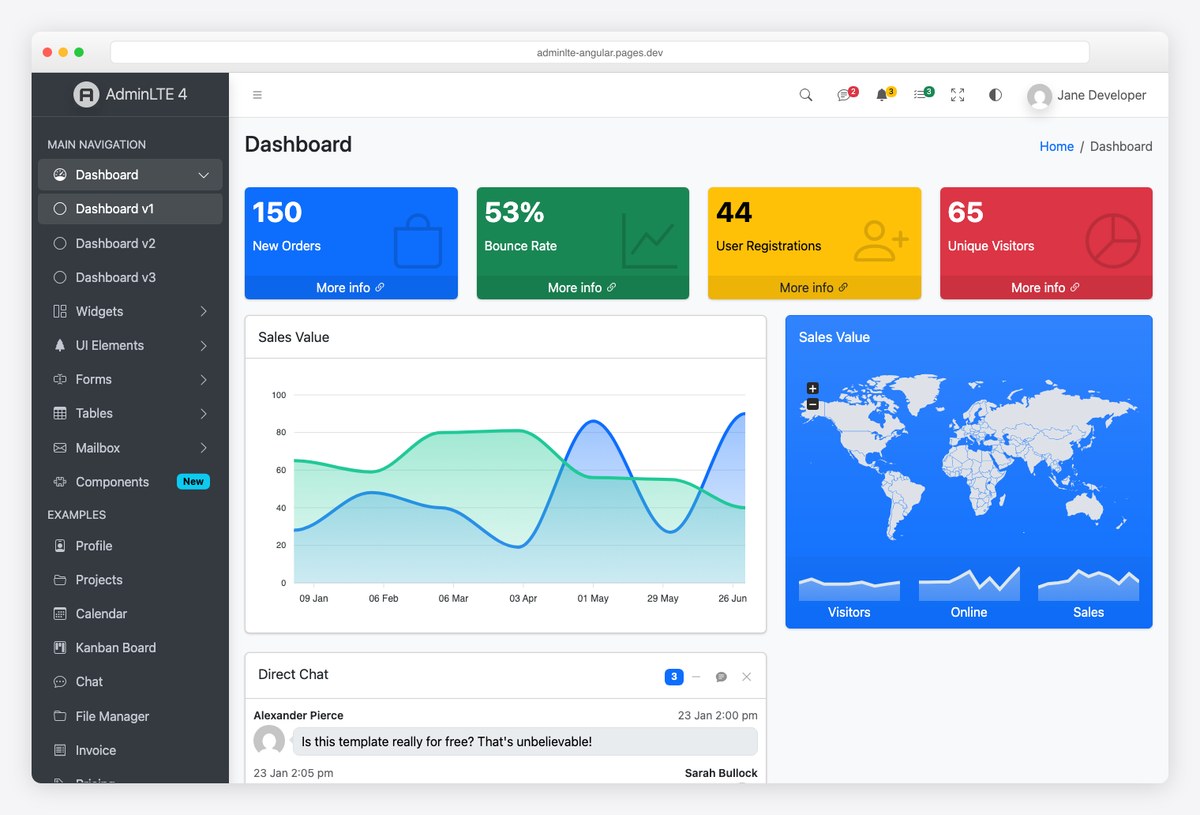
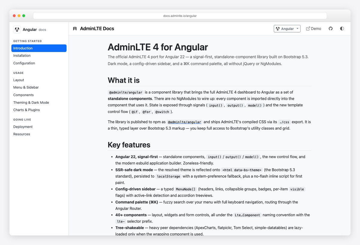
Everything below runs live in the demo (screenshot above), and the full component reference lives at docs.adminlte.io/angular.
Step 1 — Install
npm install @adminlte/angular admin-lte bootstrap bootstrap-icons
# optional, for charts:
npm install chart.js
Peer dependencies are @angular/core, @angular/common, @angular/forms, @angular/router, bootstrap, and admin-lte. Optional plugin components (Chart.js via ChartComponent / <lte-chart>, flatpickr, Tom Select, simple-datatables) lazy-load only when used, so the library stays tree-shakeable.
Step 2 — Add the styles
// angular.json
"styles": [
  "node_modules/bootstrap-icons/font/bootstrap-icons.css",
  "node_modules/@adminlte/angular/css/adminlte.css",
  "src/styles.css"
]
Step 3 — Add the no-flash theme script
Dark mode is driven by Bootstrap’s data-bs-theme and persisted to localStorage with a system-preference fallback. This snippet in your index.html <head> applies the right theme before first paint (the library also exports COLOR_MODE_NO_FLASH_SCRIPT for SSR injection):
<script>
  (function () {
    try {
      var m = localStorage.getItem('lte-theme') || 'auto';
      var d = m === 'dark' || (m === 'auto' && window.matchMedia('(prefers-color-scheme: dark)').matches);
      document.documentElement.setAttribute('data-bs-theme', d ? 'dark' : 'light');
    } catch (e) {}
  })();
</script>
Step 4 — Define the menu and wrap your shell
The sidebar is a typed MenuNode[] — headers, links, collapsible groups, badges, per-item visibility — with active-link detection and accordion treeviews handled for you:
import { Component, signal } from '@angular/core';
import { RouterOutlet } from '@angular/router';
import { DashboardLayoutComponent, type MenuNode } from '@adminlte/angular';

const MENU: MenuNode[] = [
  { type: 'header', text: 'MAIN NAVIGATION' },
  { type: 'item', text: 'Dashboard', route: '/', icon: 'bi-speedometer' },
  {
    type: 'group',
    text: 'UI Elements',
    icon: 'bi-collection',
    children: [
      { type: 'item', text: 'Forms', route: '/forms', icon: 'bi-input-cursor-text' },
      { type: 'item', text: 'Tables', route: '/tables', icon: 'bi-table' },
    ],
  },
];

@Component({
  selector: 'app-shell',
  imports: [DashboardLayoutComponent, RouterOutlet],
  template: `
    <lte-dashboard-layout [menuItems]="menu" [currentPath]="currentPath()" [accordion]="true">
      <router-outlet />
    </lte-dashboard-layout>
  `,
})
export class ShellComponent {
  readonly menu = MENU;
  readonly currentPath = signal('/'); // wire from Router NavigationEnd events
}
Step 5 — Build pages from the widgets
<lte-app-content
  title="Dashboard"
  [breadcrumbs]="[{ label: 'Home', route: '/' }, { label: 'Dashboard' }]">
  <div class="row">
    <div class="col-lg-3 col-6">
      <lte-small-box title="150" text="New Orders" icon="bi-bag" theme="primary" url="#" />
    </div>
  </div>
</lte-app-content>
Small boxes, info boxes, cards, progress bars — the classic AdminLTE vocabulary as typed Angular components, plus the ⌘K palette searching your menu out of the box.
Path 2: manual integration (legacy Angular or ports)
On older Angular versions, or when porting an AdminLTE 3 codebase, the classic route still works — and AdminLTE 4 being jQuery-free makes it cleaner than it ever was:
npm install admin-lte@^4 bootstrap bootstrap-icons// angular.json
"styles": [
"node_modules/admin-lte/dist/css/adminlte.min.css",
"node_modules/bootstrap-icons/font/bootstrap-icons.css",
"src/styles.css"
],
"scripts": [
"node_modules/bootstrap/dist/js/bootstrap.bundle.min.js"
]- Port templates, not behavior: copy structure from the AdminLTE 4 demo into Angular templates; let Bootstrap’s data attributes handle dropdowns/modals and Angular handle your data.
- Sidebar treeview: reimplement expand/collapse with Angular state rather than fighting AdminLTE’s DOM script — or skip straight to Path 1 where it’s a typed config.
- Theming: toggle
data-bs-themeon<html>; see our AdminLTE customization guide for colors and layout options.
Path 3: when an Angular-native admin fits better
If your team is committed to Angular Material or PrimeNG as a component ecosystem, an Angular-native admin may serve you better than any port — we compare the field (ng-matero, Sakai, CoreUI, Fuse, and more, including this same library) in our Angular admin dashboard templates roundup. AdminLTE’s edge is familiarity: the interface pattern millions of admins already know, now in idiomatic Angular.
The official family covers other stacks too — React/Next.js (see our AdminLTE + React guide), Vue/Nuxt, Laravel, Django, Symfony, ASP.NET, and Drupal.
Frequently asked questions
Does AdminLTE work with Angular?
Yes — the official @adminlte/angular library ports AdminLTE 4 to modern Angular as 40+ standalone, signal-first components on Bootstrap 5.3, with a live demo at adminlte-angular.pages.dev. Manual CSS/template integration also works, and is cleaner than ever since AdminLTE 4 dropped jQuery.
Is there an official AdminLTE version for Angular?
Yes: @adminlte/angular, published by the AdminLTE/Colorlib team (GitHub: ColorlibHQ/adminlte-angular), MIT-licensed. It targets current Angular with standalone components, signal inputs, the new control flow, SSR-safe dark mode, a config-driven sidebar, and a ⌘K command palette.
Which Angular version does @adminlte/angular require?
It tracks current Angular and its modern idioms (standalone components, signals, zoneless-friendly). For legacy Angular versions, use the manual integration path — AdminLTE 4’s CSS works anywhere Bootstrap 5.3 does.
Does AdminLTE Angular need jQuery or NgModules?
Neither. AdminLTE 4 removed jQuery from the core, and @adminlte/angular is standalone-components-only — you import components directly, no NgModule wiring.
Is AdminLTE Angular free?
Yes — MIT-licensed like AdminLTE itself. Optional chart/date/table components rely on their own open-source peers (Chart.js, flatpickr, Tom Select, simple-datatables), installed only if used.
Next steps: try the live demo, read the docs, star the repo — or compare the field in our Angular admin dashboard templates roundup and the AdminLTE + React guide for the sibling stack.

You Might Also Like


