
8 Healthcare Dashboard Design Examples 2026

Healthcare dashboards fail differently from other dashboards. When a marketing dashboard is cluttered, someone wastes a few minutes. When a clinical one is cluttered, an abnormal result gets missed. These eight examples — five real products and three templates you can open in a browser — show how the best healthcare interfaces handle density, urgency, and trust.
Healthcare is also unusually hard to research. Almost every electronic health record vendor hides its interface behind a demo request, so the screenshots that circulate online are mostly concept art from design galleries rather than software anyone uses. Every example below was captured from a live product or a public demo, and the observations describe what is actually on screen.
Three constraints shape the whole category. Clinical users are trained daily operators who prefer density to elegance. The data is protected health information, so what you show and to whom is a compliance question as much as a design one. And alert fatigue is a documented patient-safety problem — an interface that flags everything trains its users to ignore flags. Those pressures explain most of the design decisions in this list.
If you are looking for something to download and build on rather than study, our roundup of healthcare dashboard templates covers the buildable options in depth. For design patterns beyond healthcare, see our dashboard templates and UI design examples collection and the SaaS dashboard design examples that started this series.
The examples at a glance
- Full clinical workflow: OpenEMR — the one real EHR you can log into today
- Dark-mode charting: Canvas Medical — density and modern visual design together
- Best scheduling grid: Jane — duration-sized blocks that read as a picture of the day
- Most restrained: SimplePractice — two numbers a solo practitioner can act on
- AI done responsibly: DrChrono — visible, interruptible clinical recording
- Best operational view: Clinova Hospital Overview — bed occupancy coloured by pressure
- Best clinical monitoring: Ember Healthcare — vitals on a proper dual axis
- Best free starting point: Shadcn UI Kit Hospital — accessible monochrome, open it now
8 healthcare dashboard designs worth studying
Ordered from real clinical systems through to reference implementations you can open and inspect. Each entry ends with the single pattern most worth carrying into your own work.
1. OpenEMR
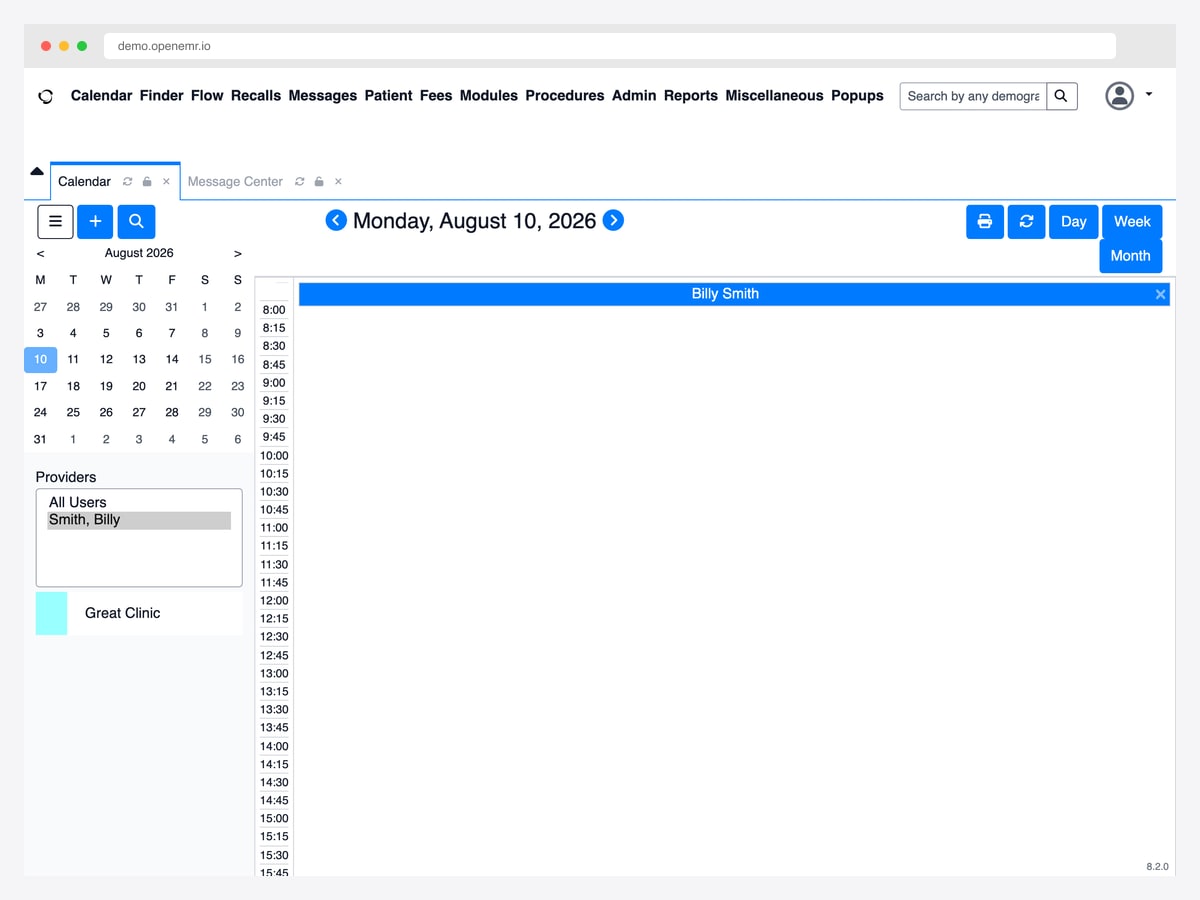
Why it is worth studying: It is the only major EHR you can log into in a browser right now, which makes it the most honest reference for how much information a real clinical interface has to carry.
Most electronic health record software is impossible to study from the outside — you request a demo and get a sales call. OpenEMR is the exception: a public demo runs the complete application, so you can open the scheduling view, the patient finder, and the billing screens and see exactly how a working clinical system is organised. That alone makes it worth an hour of anyone’s time before designing a healthcare interface.
The design language is unapologetically dense. A single top-level bar carries the calendar, patient finder, clinical flow board, recalls, messages, fees, procedures, reports, and administration in one row, and the workspace beneath it is tabbed so a clinician can hold several patients open at once. Nothing is hidden behind progressive disclosure, because the users are trained daily operators who want the whole system one click away rather than a tidy interface that costs them a second click on every task.
The scheduling screen shows the pattern most clearly: a compact month picker and a provider filter on the left, a quarter-hour time grid filling the rest of the canvas, and day, week, and month toggles in the corner. It is not beautiful, but every pixel is doing a job — and the trade-offs it makes are the ones every clinical product eventually has to make.
2. Canvas Medical
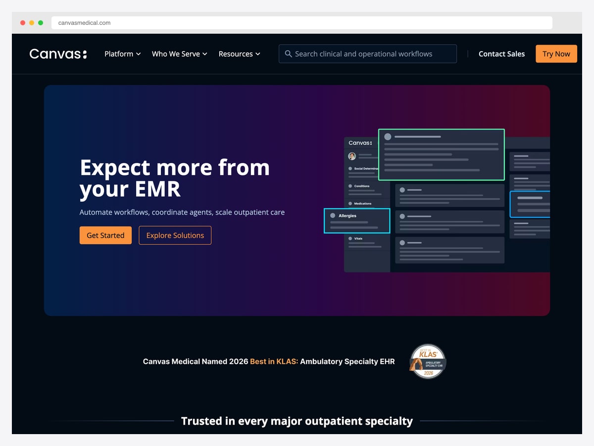
Why it is worth studying: It is the rare EMR that presents itself like a developer tool, and its dark chart interface shows that clinical density and modern visual design are not mutually exclusive.
Canvas positions itself as a programmable EMR rather than a records system with an API bolted on, and the interface reflects that audience. The product imagery leads with a dark charting workspace: a narrow left rail listing the chart sections a clinician moves between — social determinants, conditions, medications, allergies, vitals — and a stack of note cards filling the working area to the right.
The detail worth noticing is how focus is handled. Individual cards are outlined in bright accent colours against the dark surface, so the active item and the section it belongs to are both obvious at a glance. In a dense chart, that pairing does the job that a breadcrumb does in a shallower interface: it answers “where am I” without spending any vertical space on saying so.
Dark mode is still unusual in clinical software, where bright, high-contrast interfaces have been the norm for decades. Canvas is a useful counter-example if you are designing for clinicians who work long shifts on screen, though it is worth testing carefully — dark surfaces can reduce legibility for small numeric values, which is exactly the data healthcare interfaces cannot afford to render ambiguously.
3. Jane
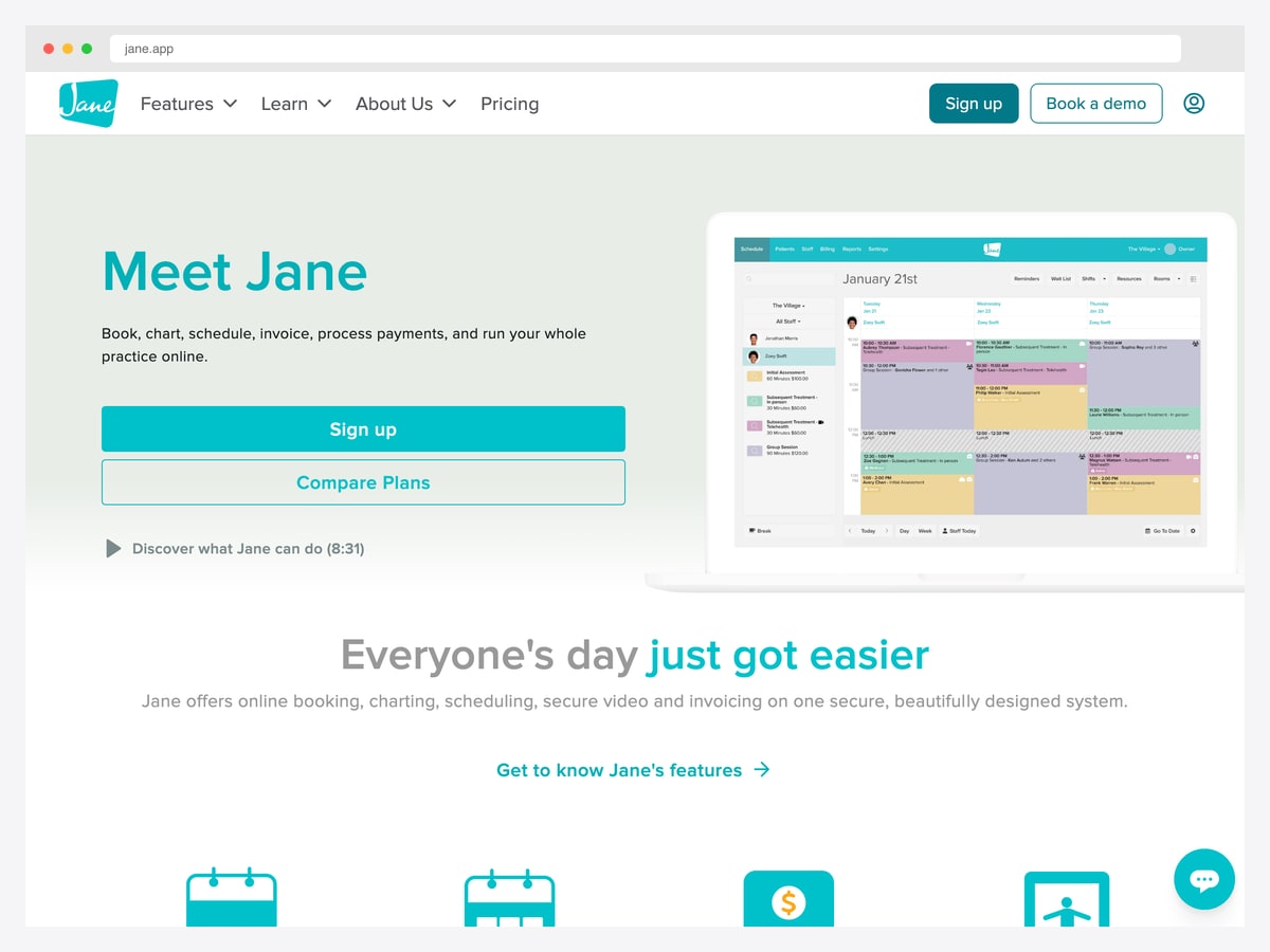
Why it is worth studying: The scheduling grid is the product, and Jane treats it that way — colour carries appointment type and status without a single legend in sight.
Jane runs booking, charting, scheduling, invoicing, and payments for clinics, and its scheduling calendar is the screen practitioners live in all day. The layout puts practitioner columns across the top and time down the side, with each booking rendered as a soft-tinted block sized to its real duration — so a fifteen-minute check-in and a ninety-minute assessment are visually different at a glance rather than identical rows in a list.
Colour is doing quiet, heavy work here. Appointment types are tinted differently, cancellations and breaks are hatched rather than filled, and staff avatars sit inside the blocks so a busy day reads as a picture instead of text. A clinic manager can see the shape of the day — gaps, overloads, back-to-back blocks — without reading a single word.
It is also a good example of restraint in a category that tends toward clutter. The top navigation is a single row of plain-text tabs, the toolbar holds only the controls that change the calendar view, and everything else gets out of the way of the grid. When one screen carries most of a product’s daily value, giving it the whole canvas is usually the right call.
4. SimplePractice
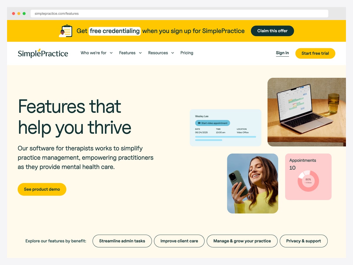
Why it is worth studying: It shows how little a dashboard needs to contain when the user is a solo practitioner rather than an operations team.
SimplePractice serves therapists and small private practices, and its interface is calibrated for a user who is a clinician first and an administrator second. The product surfaces show single-purpose cards rather than a wall of analytics: an appointment card carrying the client name, date, time, location, and a start-video-appointment action, and a summary tile pairing a plain appointment count with a no-show percentage rendered as a small ring.
That pairing is the interesting decision. A count answers “what does my day look like”, and the no-show rate answers “is my practice healthy” — two questions a solo practitioner actually asks, presented without the funnel charts and cohort breakdowns an enterprise product would layer on. Everything else is deliberately absent.
The lesson generalises beyond healthcare. Dashboard scope should track the number of decisions the user can act on, not the number of metrics the database can produce. A solo practitioner cannot restaff a department or reallocate beds, so showing them departmental analytics would be noise dressed up as insight.
5. DrChrono
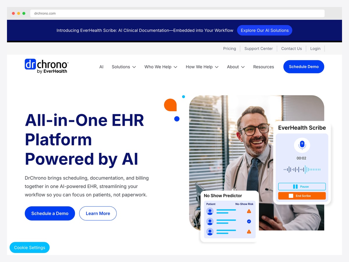
Why it is worth studying: Its two headline features show the most useful pattern in current healthcare software: AI presented as a visible, interruptible tool rather than an invisible automation.
DrChrono combines scheduling, documentation, and billing, and the product page leads with two AI-assisted surfaces that are instructive regardless of what you think about AI in clinical settings. The first is an ambient clinical scribe: a compact recording panel with a live audio waveform, an elapsed timer, and explicit pause and end controls.
That control layout matters more than it looks. Recording a patient encounter is a consequential action with real consent implications, so the interface keeps the recording state permanently visible and gives the clinician a one-tap stop. Compare that with automation that runs silently in the background — the visible-and-interruptible version is what earns trust in a regulated environment.
The second surface is a no-show risk predictor, which lists upcoming patients with a per-row risk indicator. It resists the temptation to show a precise probability score, offering a simple flag instead: enough for a front-desk coordinator to decide who gets a reminder call, without implying a false precision the model cannot support.
6. Clinova Hospital Overview
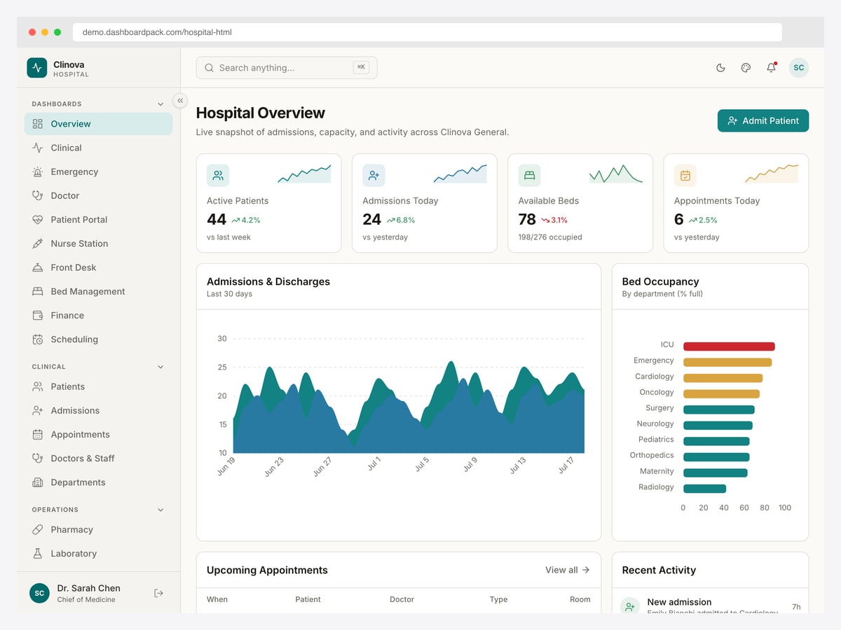
Why it is worth studying: The bed-occupancy panel is the clearest example we have seen of encoding operational urgency in colour rather than in a number.
This hospital overview is built around the four figures a duty manager checks first: active patients, admissions today, available beds, and appointments — each with a sparkline and a change-versus-yesterday indicator, so a number is never shown without its direction of travel. The available-beds tile also carries its own denominator, which turns an abstract count into an occupancy the reader can judge instantly.
The strongest panel is bed occupancy by department. Each department gets a horizontal bar, and the bars are coloured by pressure rather than by department — the intensive care unit runs red while general wards sit in green and amber. A manager scanning the screen sees where the problem is before reading a single label, which is exactly the job an operational dashboard exists to do.
Below that, an admissions-and-discharges area chart plots both flows on one axis so the gap between them — the real driver of occupancy — is visible as shape rather than arithmetic. It is a good reminder that in operations, the relationship between two series is usually the insight, not either series alone.
7. Ember Healthcare Dashboard
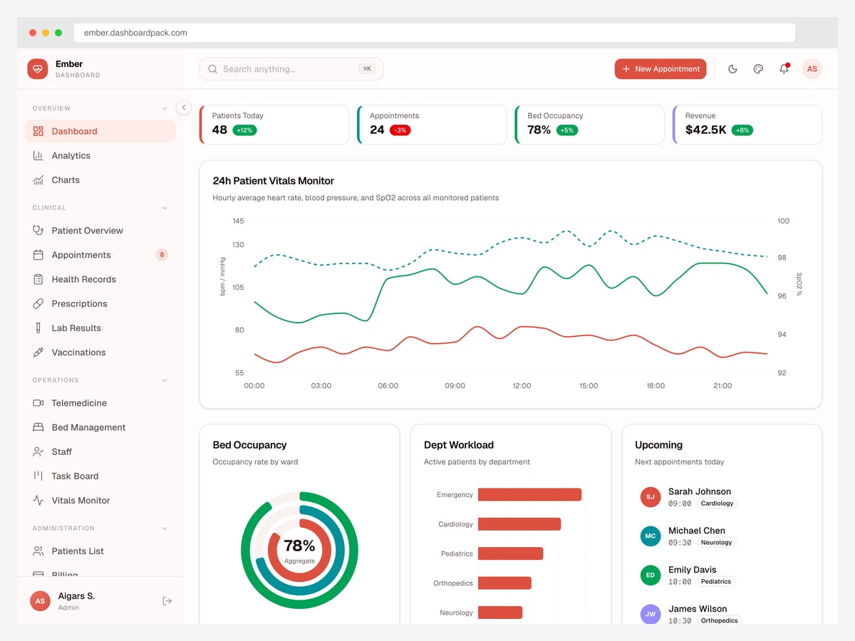
Why it is worth studying: It is the only template in this list that treats continuous patient vitals as a first-class dashboard object rather than a generic line chart.
Ember opens on a clinical overview that mixes administrative and clinical data deliberately: patients today, appointments, bed occupancy, and revenue sit in one KPI row, each with a percentage change. Putting a revenue figure beside a bed-occupancy figure is a defensible choice for an administrator’s view, though it is exactly the mix you would separate for a clinician’s.
The centrepiece is a twenty-four-hour vitals monitor plotting heart rate, blood pressure, and oxygen saturation together on a dual axis — one scale for the pressure and rate series, a second for the tighter oxygen-saturation range. That second axis is the important detail: without it, a saturation series that only ever moves within a few percentage points would flatten into a meaningless straight line beside a heart-rate curve.
The rest of the layout is well-judged. Bed occupancy appears as a radial gauge with an aggregate figure in the middle, department workload as a simple ranked bar list, and upcoming appointments as an avatar-led list with the specialty tagged on each row. The left navigation is grouped into overview, clinical, operations, and administration, which is the clearest expression of role-based sectioning in any of these examples.
8. Shadcn UI Kit — Hospital Management
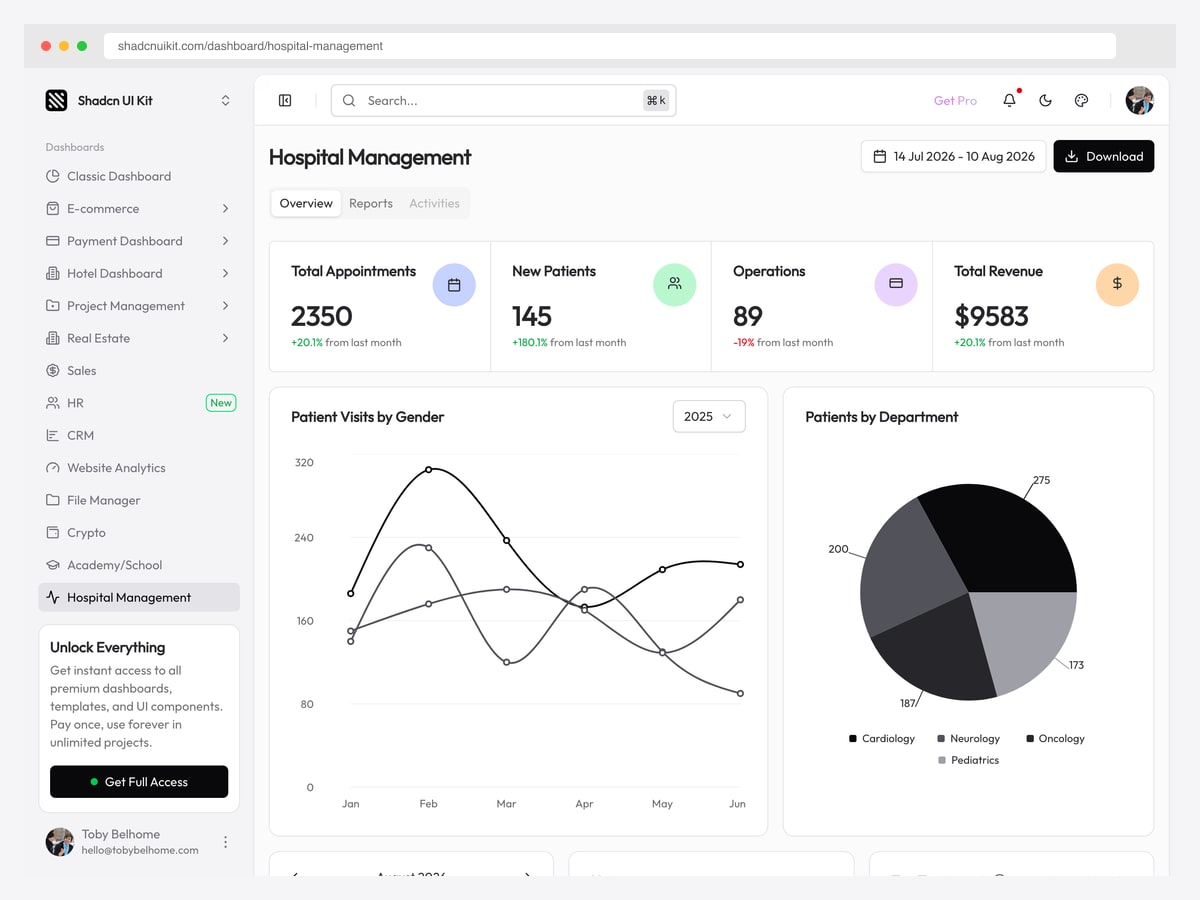
Why it is worth studying: A monochrome healthcare dashboard that proves you can build a credible clinical interface without a single saturated colour.
This hospital management screen is part of a larger shadcn/ui kit, and it is the most contemporary-looking example here. The KPI row covers appointments, new patients, operations, and revenue, each with a soft pastel icon chip and a percentage change coloured green or red — the only real colour on the screen.
Everything else is greyscale, including the charts. Patient visits are plotted as three monochrome lines distinguished by weight and shape rather than hue, and the patients-by-department breakdown is a pie in four shades of grey with values labelled directly on the segments. Labelling values on the segments removes the legend round-trip entirely, and the greyscale palette means the design does not fall apart for colour-blind users — a genuine consideration in clinical software.
The trade-off is honest: monochrome charts get harder to read as series multiply, and this approach would struggle past four or five. But for a dashboard with a handful of series it is a clean, accessible default, and it is free to open and inspect — which makes it a practical starting point rather than just an inspiration screenshot.
The patterns behind good healthcare dashboard design
Decide which of the three dashboards you are building
Healthcare dashboards split into three kinds that are routinely confused with each other. Clinical dashboards serve care decisions for individual patients — vitals, results, medications, allergies. Operational dashboards serve throughput for a unit or a hospital — beds, admissions, staffing, theatre utilisation. Financial dashboards serve the revenue cycle — claims, denials, collections. The audiences barely overlap, and a screen that tries to serve two of them usually serves neither. Ember’s overview mixing bed occupancy with revenue is defensible for an administrator and wrong for a clinician, and that is the whole point: pick the reader first.
Density is a feature, not a failure
Consumer design instincts push toward whitespace and progressive disclosure. Clinical users push the other way: they are trained, they use the system all day, and every extra click is a cost repeated hundreds of times per shift. OpenEMR’s crowded navigation bar looks like a mistake until you count how many of those destinations a nurse touches in an hour. Design for the trained daily operator, not the first-time visitor — then spend your polish budget on legibility rather than on emptiness.
Encode urgency in colour, and spend it sparingly
The single most transferable idea in this list is colouring by pressure rather than by category, as the Clinova bed-occupancy panel does. It works because the palette is otherwise restrained — if every department had its own bright colour, red would mean nothing. Alert fatigue is the failure mode: when an interface flags everything, clinicians learn to dismiss flags, and that is a documented patient-safety risk rather than a usability nitpick. Reserve your strongest colour for the state that must never be missed.
Respect the range of clinical data
Clinical series have narrow, meaningful ranges. Oxygen saturation lives within a few percentage points, and a change inside that band can matter urgently. Plot it on a shared axis with heart rate and it flattens into a straight line that hides exactly what a clinician is watching for. Ember’s dual-axis vitals chart is the right instinct: give tight-range series their own scale, and mark the clinically normal band rather than leaving the reader to remember it.
Design for protected health information from the first screen
Every patient name, date of birth, and diagnosis on screen is regulated data. That has direct interface consequences: role-based sectioning so a scheduler never loads a clinical record they have no reason to see, careful defaults for what appears in list views and exports, and consideration of who else can see the screen — reception monitors and ward tablets are frequently in public view. Ember’s navigation, grouped into overview, clinical, operations, and administration, is a good structural start, because permissions map cleanly onto sections.
Make automation visible
AI features are arriving across clinical software, and DrChrono’s ambient scribe shows the pattern that earns trust: a permanently visible recording state, an elapsed timer, and a one-tap stop. Consequential automation should announce itself and stay interruptible. Its no-show predictor makes the matching point about precision — a simple risk flag is honest where a decimal probability would imply confidence the model does not have.
How to apply these patterns to your own build
Working from a healthcare-specific template is usually faster than adapting a generic admin theme, because the hard parts here are domain-shaped: vitals charts with clinically normal bands, bed and ward management screens, appointment scheduling with practitioner columns, and role-grouped navigation. Generic dashboards give you none of those.
Two of the examples above are directly buildable. The Clinova hospital template covers the operational side — capacity, admissions, bed management, and department workload. Ember covers the clinical monitoring side with its vitals dashboard and role-grouped navigation. The Shadcn UI Kit hospital screen is the free option worth opening first if you want to inspect a modern implementation before committing to anything.
For the full set of buildable options across HTML, React, Next.js, and Vue — including the open-source clinical systems — see our healthcare dashboard templates roundup. And whichever route you take, validate the result with actual clinical users early: this is a domain where the interface conventions were set by people doing the work, and outside instincts about clutter and colour are usually wrong here.
Healthcare dashboard design FAQ
What is a healthcare dashboard?
A healthcare dashboard is an interface that brings clinical, operational, or financial health data into a single view for a specific audience — a clinician tracking patient vitals, a duty manager tracking bed capacity, or a finance team tracking claims and collections. The three types serve different users and are usually best kept as separate screens rather than combined.
What should a hospital dashboard show?
An operational hospital dashboard typically leads with active patients, admissions and discharges, available beds against total capacity, and appointments, then breaks occupancy down by department or ward. The most useful versions colour those breakdowns by how close each unit is to capacity, so pressure is visible before any label is read.
Should healthcare dashboards use dark mode?
Dark mode is uncommon in clinical software but not wrong — Canvas Medical uses it well for an audience that spends long shifts on screen. Test it carefully before committing: dark surfaces can reduce the legibility of small numeric values, and clinical numbers are precisely the data you cannot afford to render ambiguously.
How do you design for HIPAA compliance?
Compliance is mostly an architecture and access-control question, but it has real interface consequences: role-based sectioning so users only load records they need, conservative defaults for what appears in lists and exports, audit trails for record access, and awareness that reception and ward screens are often visible to the public. Treat those as design requirements from the first wireframe rather than as a later audit.
Why do medical interfaces look so dense compared with consumer apps?
Because their users are trained daily operators rather than first-time visitors. Every additional click costs a clinician time that repeats hundreds of times a shift, so clinical systems trade whitespace for immediate access. The right response is to invest in legibility and clear hierarchy within the density, not to hide functionality behind progressive disclosure.
Where can I find healthcare dashboard templates to build on?
Our healthcare dashboard templates roundup covers the buildable options across HTML, React, Next.js, and Vue, including open-source clinical systems such as OpenEMR and Medplum. The free Shadcn UI Kit hospital screen is the quickest one to open and inspect if you want to review an implementation before choosing.

You Might Also Like


