
18 Best React UI Frameworks & Component Libraries 2026

Choosing the right React UI framework can make or break your project’s development speed, design quality, and long-term maintainability. The React ecosystem has matured dramatically — the frameworks that dominate in 2026 look very different from just a few years ago. For more options, check out our collection of React admin templates.
We evaluated each framework based on active maintenance, component quality, TypeScript support, accessibility, theming capabilities, and real-world adoption. Whether you need a full-featured component library or lightweight headless primitives, this guide covers the best options for every type of React project.
Quick Picks
- Safest default: MUI — the largest component set and the deepest hiring pool
- Most control: shadcn/ui — components copied into your repo, owned outright
- Best for data-heavy admin: Ant Design — tables, forms and enterprise patterns out of the box
- Best developer experience: Mantine — hooks and components that feel designed together
- Best new headless option: Base UI — unstyled primitives from the MUI team
- Best accessibility foundation: React Aria — Adobe’s behaviour layer, the most rigorous available
- Best for dashboards: Tremor — charts and KPI blocks purpose-built for analytics
- Best Microsoft-stack fit: Fluent UI — native look for Office and Teams contexts
1. MUI (Material UI)

MUI remains the most widely adopted React component library with over 95,000 GitHub stars and millions of weekly npm downloads. Now at version 6, MUI has evolved far beyond its Material Design roots — the Joy UI layer lets you build completely custom designs without any Google aesthetic, and the team’s unstyled primitives now ship separately as Base UI.
The library offers 50+ production-ready components, a powerful theming engine with CSS-in-JS or Emotion, and excellent TypeScript support. MUI X extends the core with premium data grids, date pickers, and charts for enterprise applications. The documentation is industry-leading, with interactive examples for every component.
2. shadcn/ui
shadcn/ui has exploded in popularity since its 2023 launch, becoming the default choice for Next.js and Tailwind CSS projects. Unlike traditional component libraries, shadcn/ui gives you the source code directly — you copy components into your project and own them completely. No dependency lock-in, no version conflicts, no black boxes.
Built on Radix UI primitives, every component is accessible, composable, and styled with Tailwind CSS. The CLI makes adding components effortless (npx shadcn@latest add button), and the growing registry of community blocks and templates accelerates full-page development. It has quickly become the foundation for many popular admin dashboards and SaaS templates.
3. Ant Design

Ant Design (antd) is a comprehensive enterprise-grade React UI framework developed by Alibaba’s Ant Group. With 97,000+ GitHub stars and now at version 6, it offers 60+ meticulously designed components covering everything from basic buttons to complex data tables, tree views, and form builders.
What sets Ant Design apart is its opinionated design system — consistent spacing, typography, and color tokens that make enterprise dashboards look professional without a designer. The built-in internationalization (50+ locales), powerful form handling with validation, and a ProComponents library for complex business scenarios make it the go-to choice for data-heavy applications.
4. Mantine
Mantine has rapidly grown to 30,000+ GitHub stars by offering the best developer experience of any React component library. With 100+ hooks and 120+ components, it covers an extraordinary range of use cases — from rich text editors and date pickers to notifications, spotlight search, and drag-and-drop.
Mantine 8 introduced CSS modules support alongside the existing Emotion-based styling, giving teams flexibility in how they approach CSS. The library excels at form management with built-in validation, and its hook library (@mantine/hooks) is valuable even if you don’t use the UI components. Version 9 is on the roadmap for mid-2026 with further performance improvements.
5. Haze Dashboard — Next.js Edition
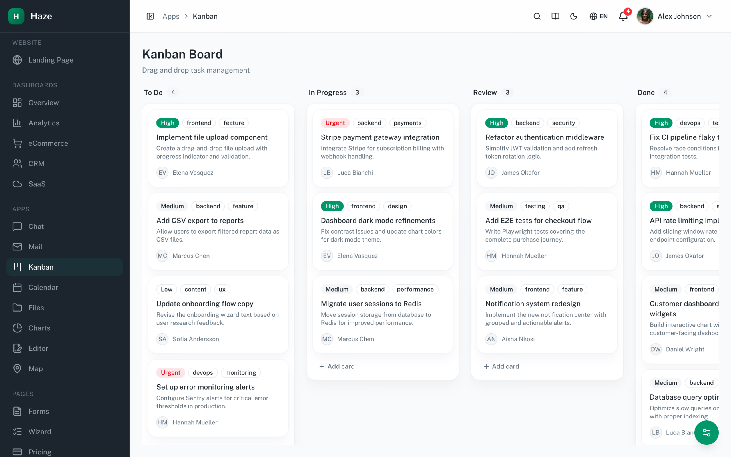
Most entries on this list are component libraries or design systems. Haze is the application built on top of them — a complete Next.js admin product showing what shadcn/ui looks like at scale. The kanban board pictured above demos @dnd-kit drag-and-drop with multiple status columns, tag badges, assignee avatars, and card priorities, all composed from shadcn/ui primitives with no custom CSS.
Across its 96 pages, Haze exercises shadcn/ui in nearly every shape you’d use in production: data tables with sorting and pagination, modals and sheets, complex forms with react-hook-form + Zod validation, multi-step checkout flows, command palettes, dropdowns, calendars, charts via recharts, and a Tiptap 3 rich text editor. Built on Next.js 16 App Router with Turbopack, React 19, TypeScript 5 strict, and Tailwind CSS v4 with OKLCh tokens. A runtime theme customizer panel toggles color mode, accent, density, and RTL across the entire app. From $69 (Personal) to $349 (Lifetime).
6. Radix UI
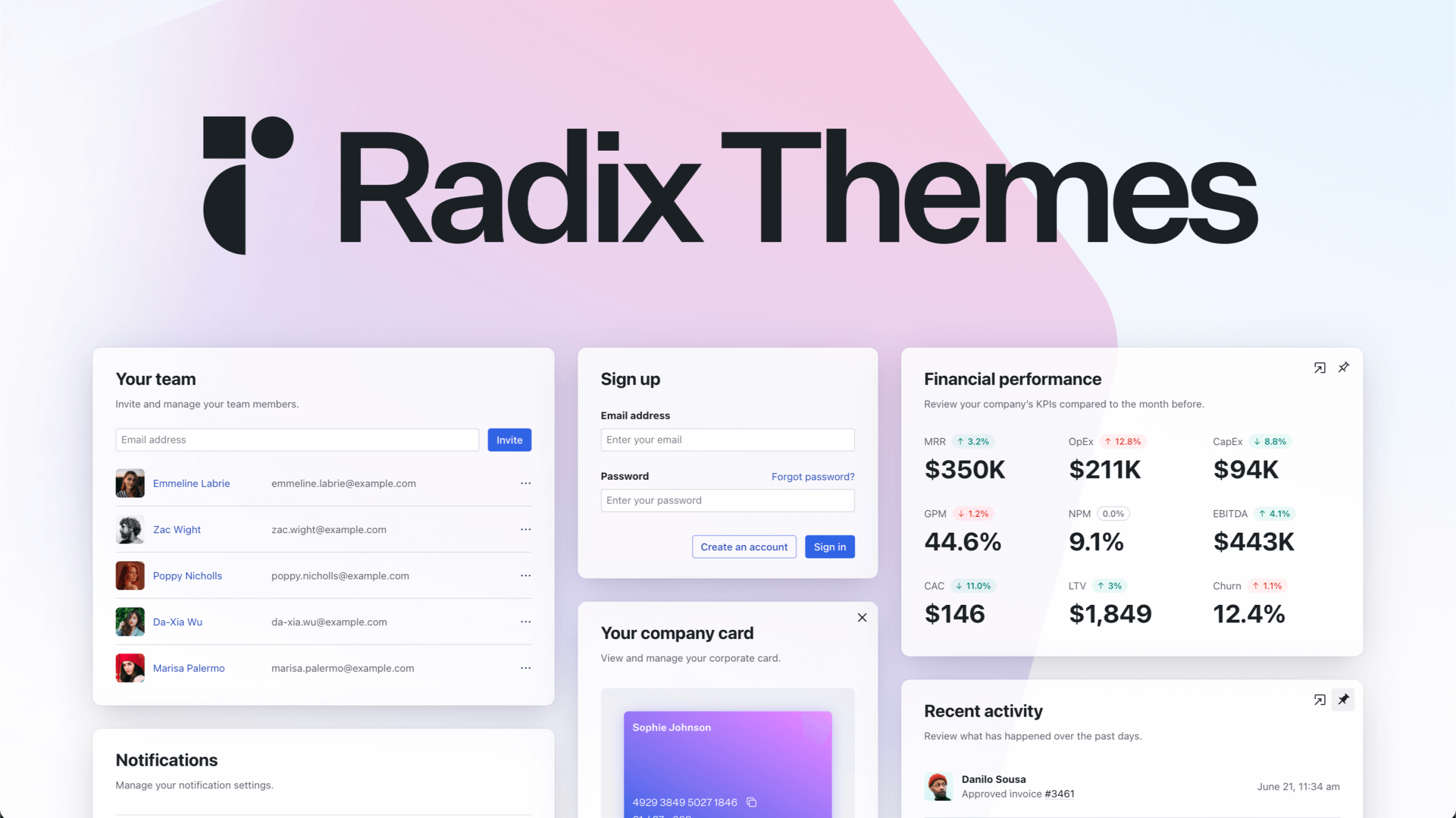
Radix UI provides unstyled, accessible React primitives that serve as the foundation for many popular component libraries — including shadcn/ui. The Primitives package offers 30+ headless components (Dialog, Dropdown Menu, Tooltip, Popover, etc.) with rock-solid accessibility, keyboard navigation, and focus management built in.
Radix Themes adds an optional styling layer on top of the primitives for teams that want a polished default look. The headless approach means you get WAI-ARIA compliance without fighting someone else’s CSS — you bring your own styling system (Tailwind, CSS Modules, styled-components) and build exactly the UI you envision. You might also find our comparison of shadcn/ui vs MUI vs Ant Design helpful when choosing a component library.
7. Chakra UI
Chakra UI emphasizes developer experience with a prop-based styling API that feels natural to React developers. Instead of switching between JSX and CSS files, you style components inline with semantic props like bg="blue.500", p={4}, and rounded="lg". With 38,000+ GitHub stars, it remains one of the most beloved React UI libraries.
Version 3 brought significant performance improvements with a zero-runtime CSS engine, smaller bundle sizes, and improved server component support. Chakra excels at rapid prototyping — you can build beautiful, accessible UIs remarkably fast. The theming system is intuitive, and the component API is consistent enough that you rarely need to check the docs after the initial learning curve.
8. HeroUI (formerly NextUI)

HeroUI (rebranded from NextUI) is a visually stunning React component library built on Tailwind CSS and React Aria. It stands out with smooth Framer Motion animations, beautiful default styles, and a design that feels modern and premium out of the box — without extra customization effort.
Each component is fully accessible thanks to the React Aria foundation, and the Tailwind CSS integration means you can customize everything using utility classes you already know. HeroUI is particularly popular for landing pages, SaaS products, and any project where visual polish matters as much as functionality.
9. Headless UI
Headless UI, built by the Tailwind Labs team, provides completely unstyled, accessible UI components designed to pair perfectly with Tailwind CSS. It focuses on the hardest interactive patterns — Menu, Listbox, Combobox, Dialog, Popover, Tab, Disclosure, and Transition — and nails every accessibility detail.
The component count is intentionally small (around 10), but each one handles edge cases that would take weeks to implement correctly from scratch. If you are already using Tailwind CSS and want full design control without sacrificing keyboard navigation and screen reader support, Headless UI is the lean, focused choice.
10. Fluent UI

Fluent UI is Microsoft’s official React component library, powering Microsoft 365, Teams, Azure Portal, and other Microsoft products used by billions of people. The React implementation (Fluent UI React v9) provides 60+ components with the Fluent Design System’s subtle depth, motion, and color language.
If you are building enterprise applications that need to feel native alongside Microsoft products, Fluent UI is the obvious choice. It offers excellent accessibility (Microsoft tests with real assistive technology users), comprehensive theming, and tight integration with the Microsoft ecosystem. The Griffel CSS-in-JS engine delivers near-zero runtime overhead.
11. PrimeReact
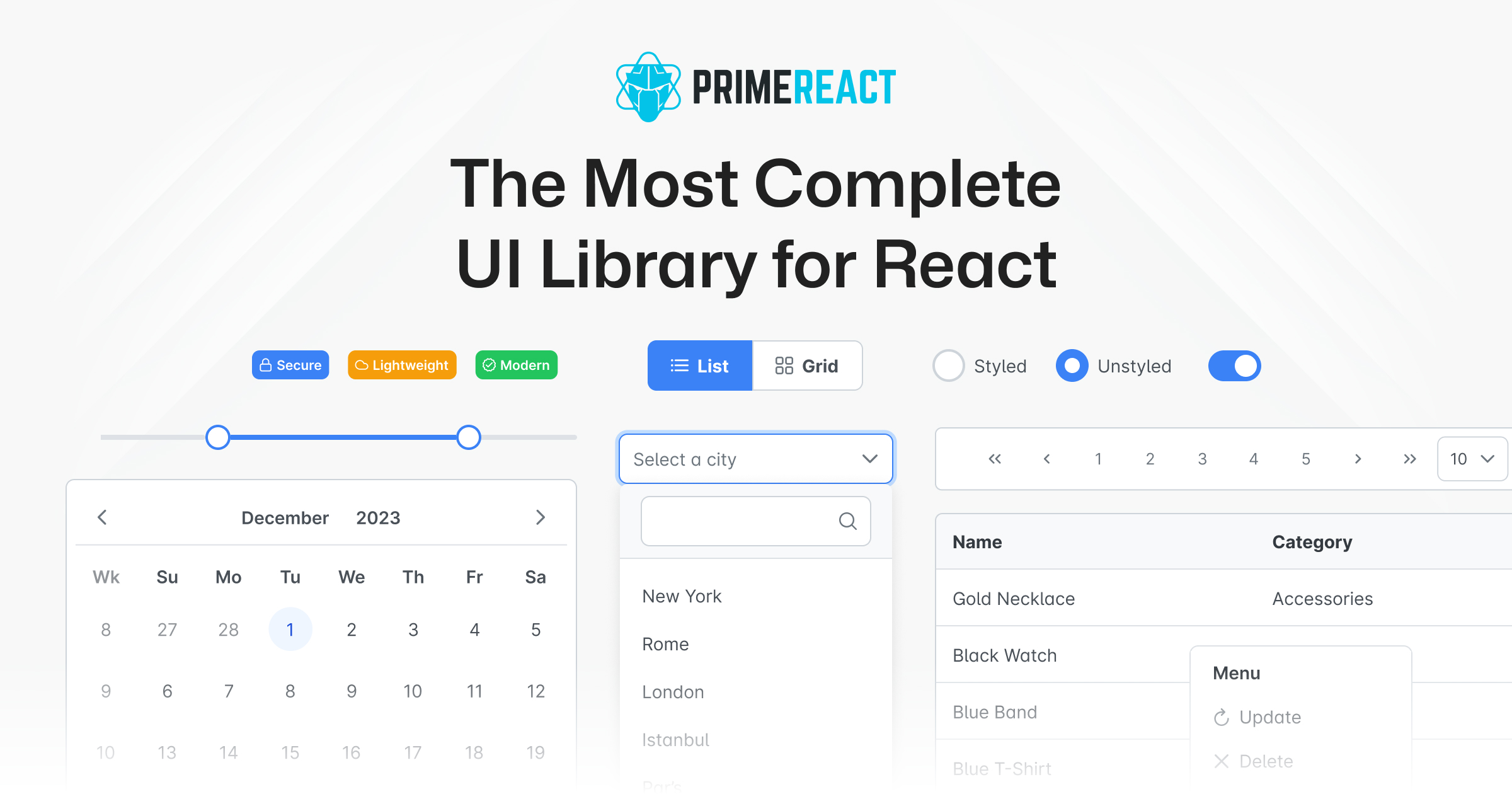
PrimeReact boasts the largest component collection of any React UI library — over 90 components covering everything from basic inputs to advanced data tables, charts, org charts, tree tables, and WYSIWYG editors. If a component exists in the enterprise UI world, PrimeReact probably has it.
The library supports multiple themes (Material, Bootstrap, Tailwind, and custom), includes a visual theme designer, and provides PrimeBlocks — pre-built page sections you can drop into your application. PrimeFlex, their utility CSS library, rounds out the package.
Licence change to know about: PrimeTek has moved PrimeReact to its commercial PrimeUI licence from version 11 onward, and the public GitHub repository was archived in mid-2026. Earlier releases remain MIT-licensed permanently, so existing projects are unaffected, but new major versions ship as compiled npm packages rather than open source. A free Community tier covers smaller organisations — broadly under $1M revenue, fewer than five developers and under ten employees — while everyone else needs a paid licence. Worth confirming against PrimeTek’s current terms before you standardise on it.
12. Tremor
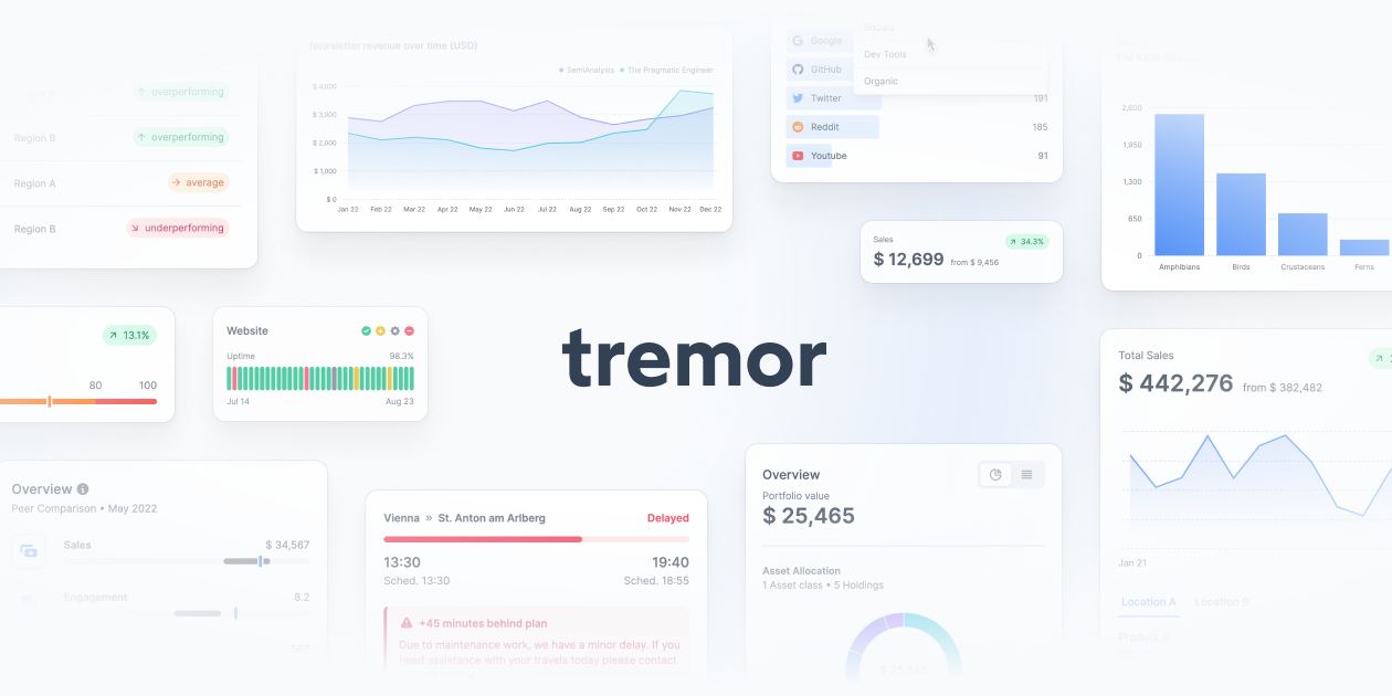
Tremor is a purpose-built React library for dashboards and analytics interfaces. Unlike general-purpose component libraries, Tremor focuses exclusively on data visualization — bar charts, line charts, area charts, donut charts, KPI cards, and data tables — all styled beautifully with Tailwind CSS. For a deeper comparison, see our guide on Mantine vs Chakra UI vs MUI.
If you are building an analytics dashboard, monitoring tool, or any data-heavy application, Tremor eliminates the need to piece together separate charting and UI libraries. Each component is responsive, accessible, and designed to present data clearly. It works seamlessly with Next.js and integrates well with shadcn/ui for a complete application stack.
13. React Aria (Adobe)
React Aria is Adobe’s headless component library that takes accessibility more seriously than any other option. Developed by the Adobe Spectrum team, it provides hooks and components that handle accessibility, internationalization, and interaction patterns according to WAI-ARIA authoring practices — without any styling opinions.
The library powers Adobe’s own products (Creative Cloud, Experience Platform) and is battle-tested at massive scale. React Aria’s hook-based API (useButton, useDialog, useTable) gives you surgical control over behavior while you handle all the styling. For teams where accessibility compliance is non-negotiable, React Aria is the gold standard.
14. Blueprint
Blueprint by Palantir is a React UI toolkit designed specifically for data-dense desktop web applications. Now at version 6, it excels at building interfaces where users need to process large amounts of information — think financial terminals, developer tools, and enterprise analytics platforms.
The library provides advanced components like editable cells, query builders, tag inputs, and multi-select with type-ahead that are rarely found in other frameworks. Blueprint’s design language prioritizes information density and readability over visual flair. If your application is a power-user tool rather than a consumer product, Blueprint is purpose-built for that niche.
15. Park UI
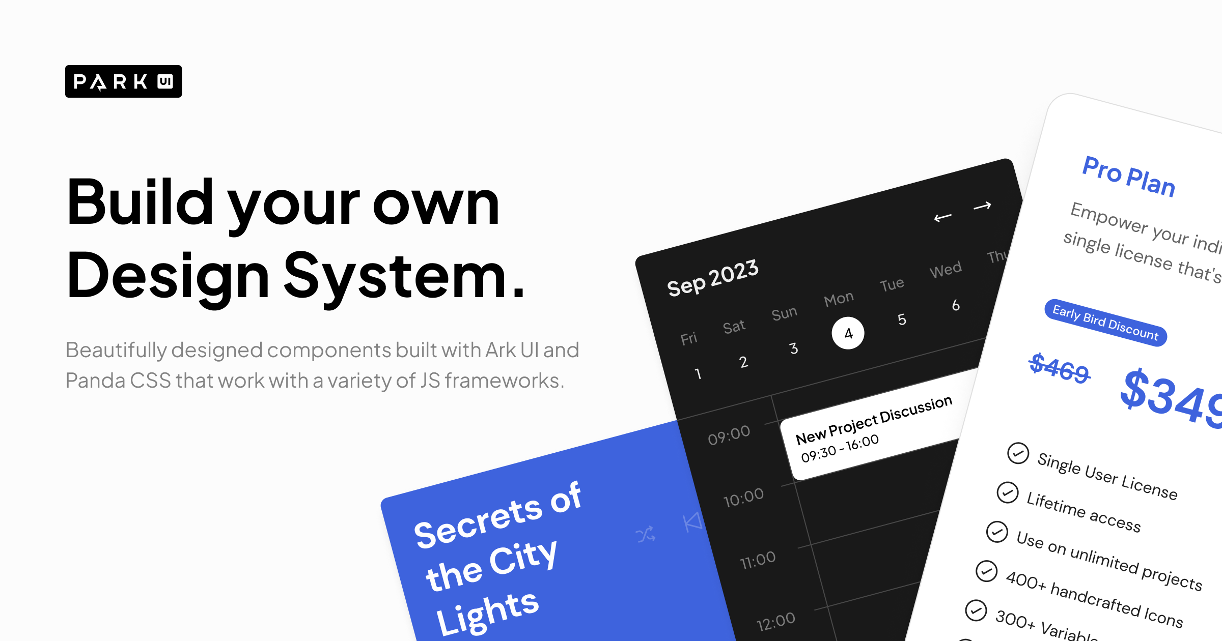
Park UI is a newer entrant that combines Ark UI headless primitives with beautifully designed, pre-styled components — similar to shadcn/ui’s approach but built on a different foundation. It supports React, Solid, and Vue, and styles components with either Tailwind CSS or Panda CSS.
The design is clean and modern, with thoughtful defaults that look great without customization. Park UI is a strong choice for developers who like the shadcn/ui copy-paste model but want an alternative to Radix primitives, or who need multi-framework support for the same design system.
16. RSuite
RSuite (React Suite) is an enterprise-grade React component library with 9,000+ GitHub stars that offers a comprehensive set of components for management systems and data-heavy applications. It features a clean, modern design language and excellent TypeScript support.
RSuite stands out with its powerful table component (virtual scrolling, column resizing, tree tables), advanced date and time pickers, and cascading select components for hierarchical data. The library supports Next.js SSR, has built-in dark mode, and provides LESS-based theming. It is actively maintained and particularly popular in the enterprise development community.
17. Grommet
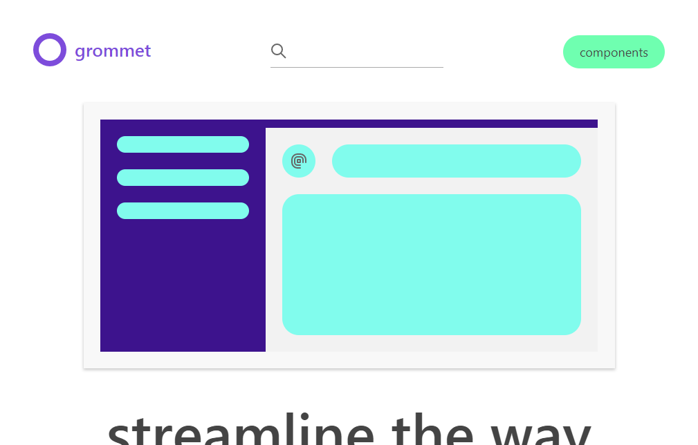
Grommet, developed by HPE (Hewlett Packard Enterprise), is a React component library focused on accessibility, modularity, and responsive design. With 8,300+ GitHub stars, it provides a well-rounded set of components with strong WCAG 2.1 compliance and built-in keyboard navigation.
The library uses CSS Grid and Flexbox for layouts, supports dark mode out of the box, and offers a design-kit for Figma. Grommet’s theming system is straightforward — you define a theme object and wrap your app in a <Grommet> provider. While it has a smaller community than MUI or Ant Design, it is actively maintained and ideal for accessibility-focused enterprise applications.
Choosing the Right React UI Framework
The best framework depends on your project’s specific needs:
- Full-featured out of the box: MUI, Ant Design, or Mantine — pick based on design preference
- Tailwind CSS integration: shadcn/ui, HeroUI, or Headless UI
- Maximum accessibility: React Aria, Radix UI, or Headless UI
- Enterprise dashboards: Ant Design, PrimeReact, or Blueprint
- Data visualization: Tremor (purpose-built for analytics dashboards)
- Microsoft ecosystem: Fluent UI
- Own the code (no dependency): shadcn/ui or Park UI
All frameworks listed above are actively maintained, have strong TypeScript support, and are free to use in commercial projects. Start with the one that matches your tech stack and design requirements — you can always swap individual components later without rewriting your entire application.
18. Base UI
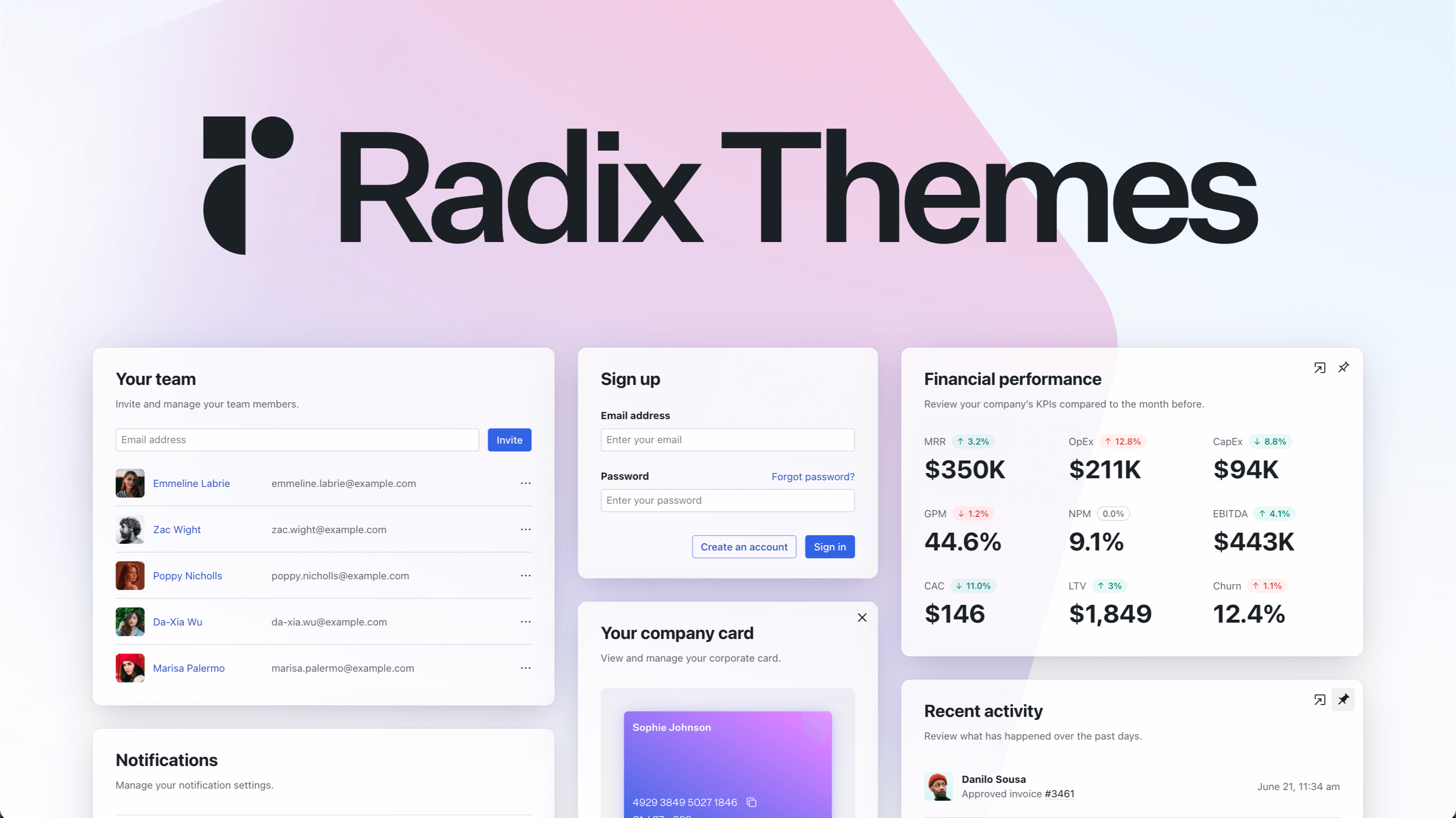
Base UI is the unstyled component library from the team behind MUI, and it is the most significant addition to this list since shadcn/ui. It ships accessible, behaviour-only primitives — dialogs, menus, selects, popovers, tooltips — with no styling opinions at all, which makes it the foundation layer for building a design system rather than adopting one.
It matters because the headless space had effectively been Radix UI’s alone, and Radix’s maintenance pace has been a recurring concern for teams betting a design system on it. Base UI arrives with the MUI team’s resources behind it and a deliberate focus on accessibility, giving that architectural choice a serious second option. If you are building a bespoke design system on Tailwind or CSS modules and want primitives you style entirely yourself, this is now the first thing to evaluate alongside Radix and React Aria.
The trade is the same one every headless library asks for: you write all the CSS. That is the point if you have a design system to honour, and unnecessary overhead if you would have been happy with MUI or Mantine’s defaults.
React UI Framework FAQ
Which React UI library should I use in 2026?
For most teams, MUI remains the safest default — the largest component set, the best documentation, and the easiest hiring. Choose shadcn/ui if you want to own the component code outright, Ant Design if your product is data-heavy admin software, and Mantine if developer experience matters most. Pick a headless library such as Base UI, Radix, or React Aria only when you have a design system to honour and intend to write all the styling yourself.
What is the difference between a styled and a headless component library?
A styled library such as MUI, Ant Design, or Mantine ships components that already look finished, so you adopt its design language and theme it. A headless library such as Base UI, Radix UI, or React Aria ships behaviour and accessibility only — keyboard handling, focus management, ARIA wiring — and leaves all appearance to you. Headless costs more up front and pays off when you have a bespoke design system to match.
Is shadcn/ui a component library?
Not in the usual sense. shadcn/ui is a collection of components you copy into your own repository with a CLI rather than install as a dependency, built on Radix primitives and Tailwind CSS. That means no upgrade treadmill and no fighting a maintainer’s decisions, at the cost of maintaining the code yourself. It has become the default choice for teams that want full control without building primitives from scratch.
Which React UI framework is best for admin dashboards?
Ant Design and MUI both ship the data tables, forms, and layout primitives admin panels lean on hardest. Tremor is worth adding when the dashboard is analytics-heavy, since its charts and KPI blocks are purpose-built for that. If you are starting from a prebuilt admin template rather than assembling one, our React admin dashboard templates roundup covers those options.
Do these libraries support React Server Components?
Support varies and is worth checking against the current release rather than any article. The general rule is that headless and CSS-first libraries adapt most easily, while runtime CSS-in-JS approaches have needed the most rework. If you are building on the Next.js App Router, confirm the library’s current server-component guidance before committing.
Are free React UI libraries good enough for production?
Yes — most of this list is open source and used in production at large companies. MUI, Ant Design, Mantine, Chakra, and shadcn/ui are all free and thoroughly battle-tested. Paid tiers generally buy advanced data grids, charts, and support rather than better core components, so start free and upgrade only when a specific component justifies it.

You Might Also Like


