
7 SaaS Landing Page Design Patterns Worth Stealing 2026

SaaS landing pages have converged on a template, and the interesting ones are where companies deliberately break it. These seven pages — all captured live — are organised by the single reusable pattern each does best, so you can take the specific decision rather than a vague impression of “clean design”.
Worth saying plainly: most landing page roundups are screenshot galleries. A screenshot on its own teaches nothing, because the reason a page works is usually a decision you cannot see — why the headline is a full sentence rather than a fragment, why the proof sits above the fold instead of below it, why minimalism reads as confidence on one site and vagueness on another. Each entry below names one pattern, explains the reasoning, and states the condition under which copying it would be a mistake.
Every page here converges on the same four jobs above the fold: say what the product is, prove someone trusts it, show what using it looks like, and give one obvious next action. What differs is the order and the emphasis — and that ordering is the actual design work.
If you would rather start from a template than a blank page, our SaaS landing page templates roundup covers the buildable options, with Next.js and Tailwind CSS collections for those stacks specifically.
The patterns at a glance
- Show the product instead of describing it: Linear
- Write the value proposition as a real sentence: Stripe
- Earn minimalism with brand recognition: Vercel
- Use the announcement bar as a second headline: Attio
- Lead with the objection, not the feature: Clerk
- Let typography carry the differentiation: Resend
- Put third-party validation above the headline: Amie
7 SaaS landing page patterns worth stealing
Each entry covers one decision you can apply to your own page, with the condition attached — because most of these patterns fail when lifted into the wrong context.
1. Linear — Show the product instead of describing it
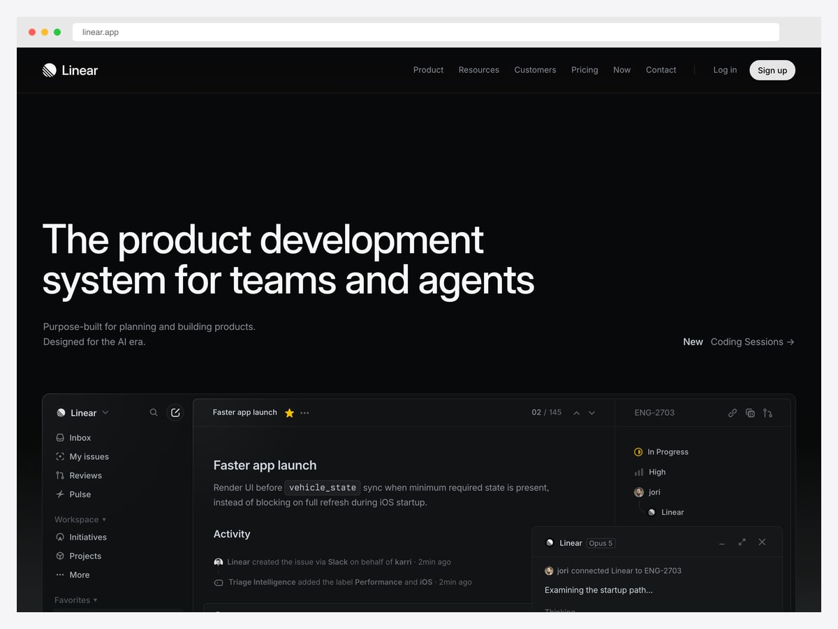
Why it works: The headline occupies barely a fifth of the screen and the rest is the actual interface — a page that argues by demonstration rather than adjective.
Linear’s hero is two lines of headline, two lines of subhead, and then the product itself: a real issue view with the sidebar, an activity feed, and an agent panel visible. There is no illustration, no abstract graphic, and no stock photography anywhere near it. For a tool whose entire pitch is that it feels fast and considered, showing the interface is the argument.
The dark palette is doing deliberate work too. Developer tools skew dark because their users’ editors are dark, so the marketing site feels continuous with the environment the product lives in. That is a real consideration rather than an aesthetic one — the page should not feel like a different species from the thing it sells.
The trade-off is that this only works when the interface is genuinely attractive and self-explanatory at a glance. If your product’s main screen is a dense form, showing it full-width will hurt you. Be honest about which category you are in.
2. Stripe — Write the value proposition as a real sentence
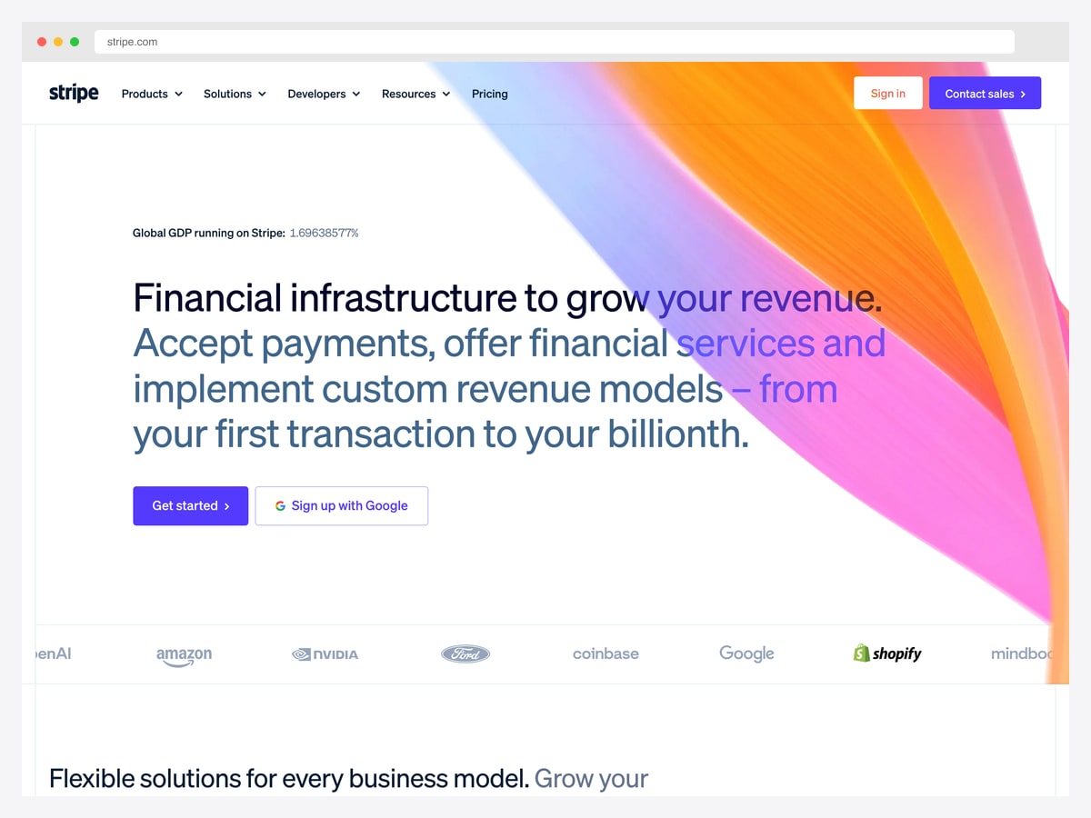
Why it works: It resists the three-word-headline convention and instead writes a full, specific sentence that tells you exactly what the product does and who it scales to.
Most SaaS heroes compress into a punchy fragment that could belong to any company. Stripe does the opposite: a multi-line sentence naming payments, financial services, and custom revenue models, and closing with a range — “from your first transaction to your billionth” — that speaks to a startup and an enterprise in the same breath.
That last clause is the craft. A single phrase resolves the most common objection for both ends of the market at once: the small team wondering if this is overkill, and the large one wondering if it will scale. Specific beats punchy when the specificity removes a doubt.
The customer logo wall immediately beneath is placed exactly where it earns its keep — the moment after a bold claim, answering “says who” before the visitor has to scroll to look for proof.
3. Vercel — Earn minimalism with brand recognition
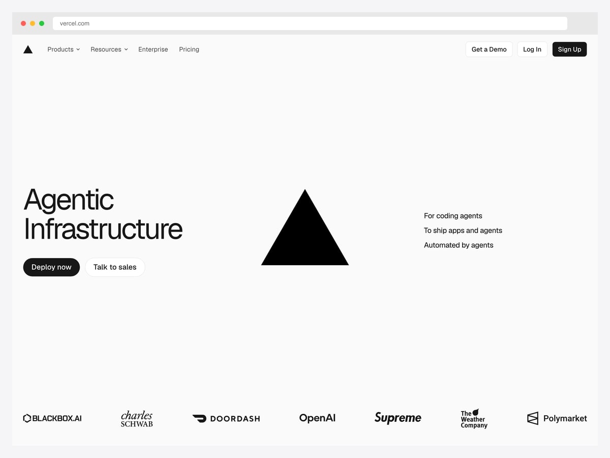
Why it works: A two-word headline and a logo mark. It is the most stripped-back page here, and it only works because of who is already looking at it.
Vercel’s hero is two words, two buttons, three short supporting lines, and its triangle logo. No screenshot, no explanation of what deployment means. The page assumes you already know the company and are choosing rather than learning.
This is the pattern most often copied badly. Radical minimalism reads as confidence when the audience arrives already informed, and as vagueness when it does not — a visitor who cannot infer your category from two words simply leaves. Vercel can spend that budget; a startup nobody has heard of cannot.
What is worth copying regardless is the logo row directly beneath the fold: recognisable customers immediately after a minimal claim, which is how the page gets away with saying so little above them.
4. Attio — Use the announcement bar as a second headline
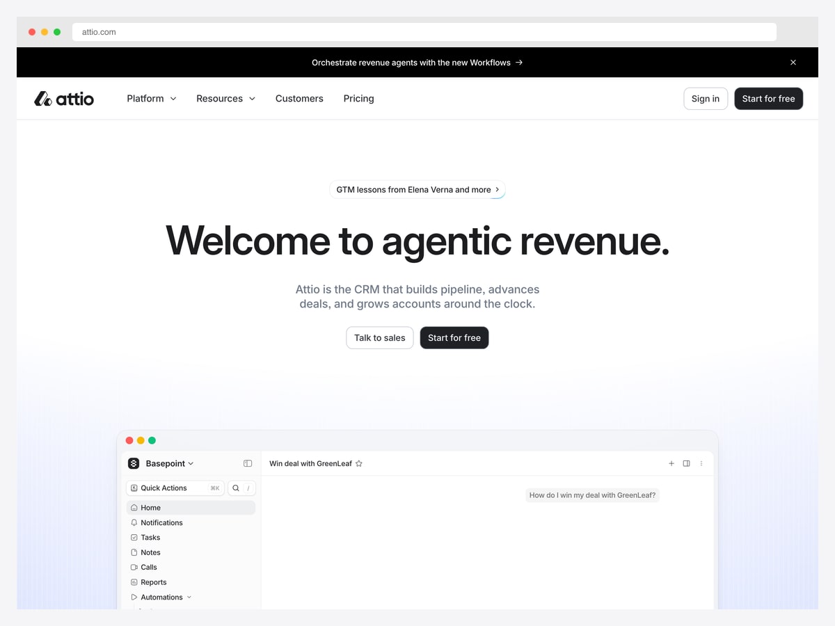
Why it works: It runs a persistent bar above the navigation for the newest thing it ships, which lets the main headline stay stable while the page still feels current.
The bar across the top promotes a specific new capability, above a headline that states the category positioning. That division of labour is useful: the headline can stay put for a year while the bar carries whatever launched this month, so the page reads as active without anyone rewriting the hero every quarter.
Beneath the fold, the product interface appears in a browser-style frame showing a real record with an AI conversation in progress. Framing the screenshot as a window rather than bleeding it to the edge makes it read as a discrete artefact — useful when the interface is dense and would otherwise compete with the copy above it.
The subhead is also worth noting for its restraint: one sentence naming the category (“the CRM that…”) and three verbs. Visitors who do not already know what Attio is get told plainly, without a paragraph.
5. Clerk — Lead with the objection, not the feature
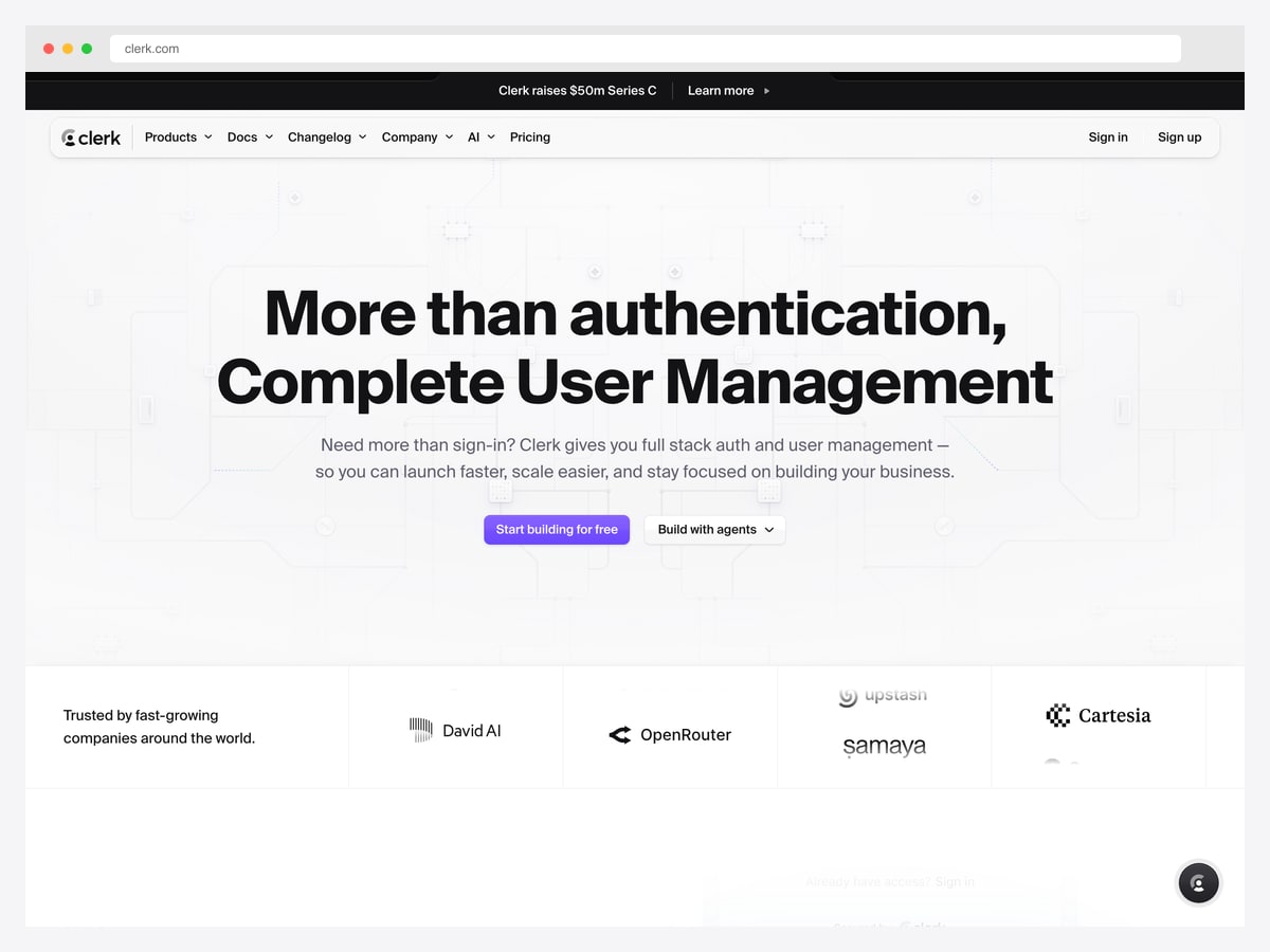
Why it works: The headline begins by conceding what people assume the product is, then corrects it — a structure that works whenever your category label undersells you.
“More than authentication, Complete User Management” does something most headlines do not: it names the visitor’s existing mental model and then expands it. Clerk knows people file it under “auth”, and that the category label is smaller than the product, so the headline argues with the label directly.
The subhead continues that thread by opening with a question — “Need more than sign-in?” — which is the exact phrase a developer would think when their auth requirements outgrow a login form. Copy that mirrors the reader’s internal wording converts better than copy that describes the product from the inside.
The trusted-by band sits immediately under the fold with a short label on the left and logos across, so the proof arrives before the first feature section rather than after it.
6. Resend — Let typography carry the differentiation
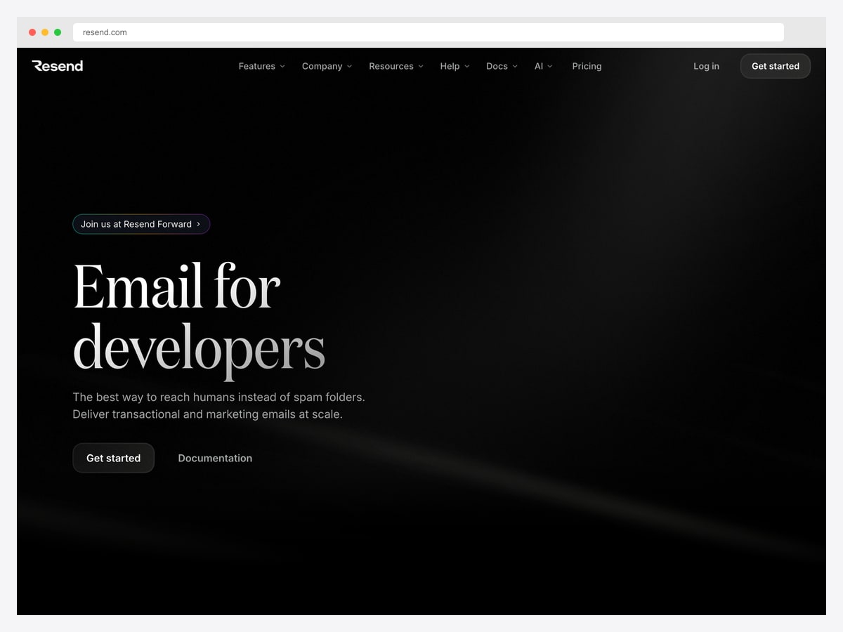
Why it works: A large serif display face on near-black — an unusual choice in developer tooling that does more brand work than any illustration would.
“Email for developers” is set in a high-contrast serif at display size, against an almost entirely black canvas with a single soft light streak. In a category where everything is set in the same geometric sans, choosing a serif is instantly recognisable — you can identify the brand from a thumbnail.
The rest of the page is deliberately quiet: two lines of subhead naming the problem (“instead of spam folders”), a primary button, and a documentation link as the secondary action. Putting docs in the hero is a strong signal to a developer audience, which often wants to evaluate before it wants to sign up.
This is the cheapest differentiation available to a small team. Typeface and restraint cost nothing compared to custom illustration or 3D work, and they age considerably better.
7. Amie — Put third-party validation above the headline
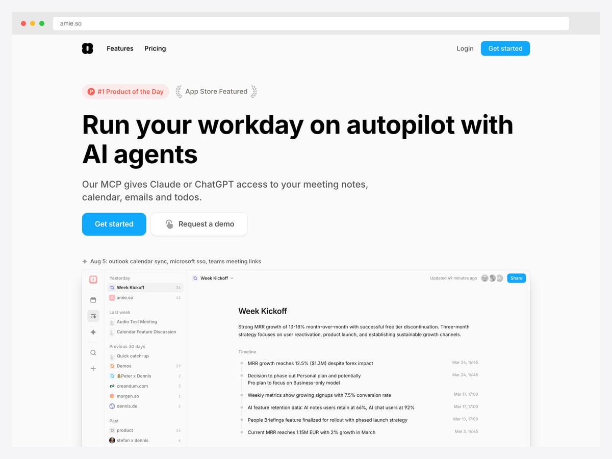
Why it works: It places its Product Hunt and App Store recognition above the headline — proof before claim, which is the reverse of the usual order.
The first elements on the page are two small badges recording independent recognition, sitting above the headline rather than in a trust band lower down. For a smaller product without famous customer logos to display, third-party validation is the available substitute, and putting it first borrows credibility before making any claim.
The headline then states the outcome rather than the mechanism, with the subhead naming the specific integration that makes it plausible. Outcome first, mechanism second, is the right order — but the mechanism has to appear quickly, or the outcome reads as marketing noise.
A dated changelog line sits just above the product screenshot, showing recent shipping activity. For an early-stage tool, visible momentum answers the “will this still exist next year” question that logo walls answer for larger companies.
The anatomy every one of these pages shares
Strip away the styling and all seven answer the same four questions in the first screen and a half. The order changes; the questions do not.
- What is it? — a headline that names the category or the outcome. Stripe uses a full sentence, Vercel two words; both make it answerable.
- Who says so? — proof, arriving early. Logo walls for companies that have them, third-party badges and shipping momentum for those that do not.
- What does it look like? — the interface, shown rather than described, either full-width or framed as a window.
- What do I do now? — one primary action, at most one secondary. Note how often the secondary is documentation rather than a demo request when the audience is developers.
Where most pages go wrong
Three failures recur. Copying minimalism you have not earned — a two-word headline from an unknown brand is a bounce, not a statement. Burying proof below three feature sections, so the visitor has to take the claim on faith exactly when they are most sceptical. And describing the interface instead of showing it, usually because the interface is not ready to be shown — which is a product problem the landing page cannot fix.
Dark or light?
Four of these are dark and three are light, and the split is not stylistic. The dark pages sell to developers whose editors and terminals are dark, so the site feels continuous with the working environment. The lighter pages sell to broader business audiences where the convention still favours light. Match your audience’s environment rather than the current trend.
SaaS landing page design FAQ
What makes a good SaaS landing page?
It answers four questions in the first screen and a half: what the product is, who already trusts it, what using it looks like, and what to do next. The pages that work are specific about the first and early with the second — proof placed immediately after the main claim, rather than buried below several feature sections.
Should a SaaS landing page be dark or light?
Match your audience rather than the trend. Developer-focused products increasingly go dark because their users work in dark editors and terminals, so the marketing site feels continuous with the product environment. Products selling to broader business audiences generally still convert better light, where the convention is more established.
How long should the headline be?
Long enough to be answerable. The two-word headline works for companies whose category the visitor already knows; for everyone else a full specific sentence performs better, and it lets you resolve your most common objection in the same breath. If a stranger cannot tell what you sell from the headline alone, it is too short.
Where should social proof go on a landing page?
Directly after the first strong claim, usually immediately below the fold. That is the moment scepticism peaks, and every page here places its logo wall or validation badges there rather than further down. If you have no recognisable customers yet, third-party awards and a visible changelog do comparable work.
Should I show a screenshot of my product in the hero?
Yes, if the interface is attractive and legible at a glance — showing it proves more than describing it. If your main screen is a dense form or a data table, frame a specific, well-chosen view rather than the whole thing, or move the screenshot below a stronger explanatory section.
Where can I find SaaS landing page templates to build on?
Our SaaS landing page templates roundup covers the buildable options, with dedicated collections for Next.js and Tailwind CSS. Starting from a template is sensible for structure, but the patterns above are what you should change once the scaffolding is in place — the layout is the commodity, the decisions are not.

You Might Also Like


