shadcn/ui vs MUI vs Ant Design: Which React UI Library Should You Choose in 2026?

The React UI library you pick shapes every component you build, every design decision you make, and how painful your next major upgrade will be. In 2026, three libraries dominate — and they represent fundamentally different philosophies about how component libraries should work.
We compared shadcn/ui, MUI (Material UI), and Ant Design using real data: npm downloads, GitHub activity, bundle size, component quality, and developer experience. No hand-waving — just the information you need to make the right choice for your project.
The Three Philosophies
shadcn/ui says: “Here’s the source code. Copy it, own it, change it.” No npm package to install — components live in your project as local files styled with Tailwind CSS. You trade convenience for total control.
MUI says: “We’ll give you everything, professionally maintained.” A traditional npm library with 70+ components, enterprise-grade data grids, and a mature theming system. You trade flexibility for comprehensiveness.
Ant Design says: “Enterprise applications need enterprise components.” Built by Alibaba for complex, data-heavy B2B applications. 60+ components with the richest built-in form handling and data table features of any React library.
By the Numbers (March 2026)
| Metric | shadcn/ui | MUI | Ant Design |
|---|---|---|---|
| GitHub Stars | 109,413 | 98,062 | 97,758 |
| npm Weekly Downloads | 1.87M | 6.74M | 2.43M |
| Current Version | CLI v4.0.5 | v7.3.9 | v6.3.2 |
| Components | ~76 | ~70+ (Core) + MUI X | 60+ |
| YoY Download Growth | ~10x | ~2.3x | ~1.5x |
| npm Dependencies | 0 (local code) | 12 | 48 |
| Styling | Tailwind CSS | Emotion / Pigment CSS | CSS-in-JS (cssinjs) |
| License | MIT | MIT (Core) / Paid (X) | MIT |
shadcn/ui — Deep Dive
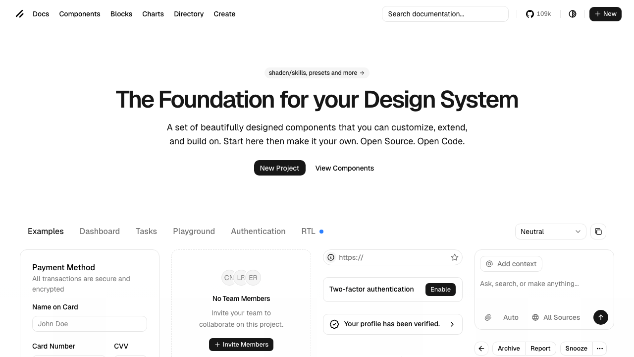
shadcn/ui isn’t a library in the traditional sense. You run npx shadcn add button and the component source code — a TypeScript file styled with Tailwind CSS — gets copied directly into your project. You own it. No version to upgrade, no breaking changes to navigate, no runtime dependency.
Built on Radix UI primitives, every component has strong WAI-ARIA compliance, keyboard navigation, and focus management. The CLI (v4.0.5 as of March 2026) supports React, Next.js, Vite, Remix, Astro, Laravel, and TanStack frameworks.
Strengths
- Zero bundle overhead — Components are local source files. Ship only what you use with zero library runtime.
- Total customization — You modify the actual source code. No fighting theme overrides or !important hacks.
- No version lock-in — No major version upgrades to deal with. The code is yours forever.
- AI-ready — Open code pattern works naturally with AI assistants and code generation tools.
- Tailwind CSS native — If your project already uses Tailwind, shadcn components slot in perfectly.
Weaknesses
- Fewer complex components — No advanced data grid, tree view, or transfer list built-in.
- You maintain the code — Bug fixes from upstream require manual integration.
- Requires Tailwind knowledge — Not ideal if your team standardized on a different CSS approach.
- No paid support — No commercial entity behind it for enterprise SLAs.
Best For
Startups, SaaS products, Next.js/Tailwind projects, teams wanting a unique design system, developers using AI-powered workflows. Browse our curated list of shadcn/ui templates to see what’s available across dashboards, SaaS starters, and landing pages.
MUI (Material UI) — Deep Dive
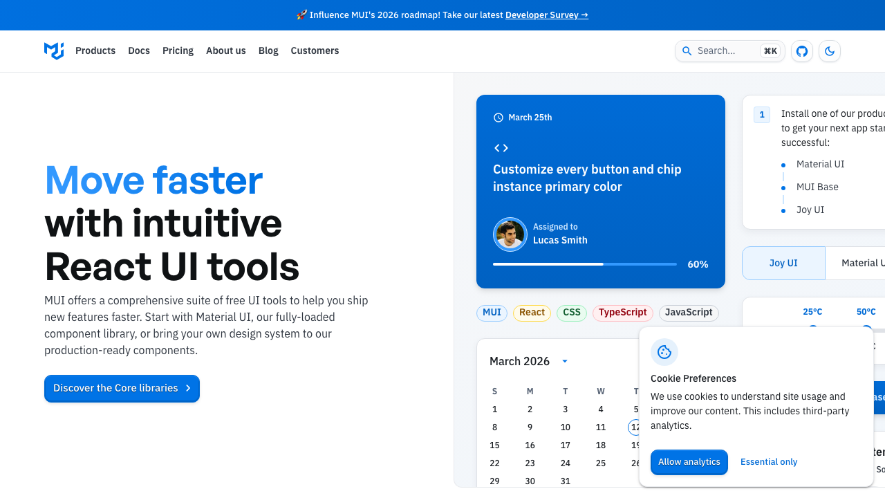
MUI is the industry standard by download volume — 6.7 million weekly npm installs. Now at v7, it has matured well beyond Material Design. The Joy UI and Base UI layers let you build completely custom designs without Google’s visual language.
MUI X extends the core with premium components: advanced data grids with grouping and aggregation, date/time pickers, charts, and tree views. These are among the best data components in the entire React ecosystem, which is why enterprise teams keep choosing MUI despite the emergence of newer alternatives.
Strengths
- Most comprehensive ecosystem — 70+ core components plus MUI X for enterprise data needs.
- 6.7M weekly downloads — Massive community, extensive StackOverflow coverage, abundant tutorials.
- Advanced data components — MUI X Data Grid is arguably the best React data grid available.
- v7 CSS variables — Runtime theme switching without full re-render. Pigment CSS (experimental) offers zero-runtime styling.
- Corporate backing — MUI SAS is a funded company with paid support tiers and long-term stability.
Weaknesses
- Material Design fatigue — Apps can look “samey” unless you invest in custom theming.
- Emotion runtime overhead — CSS-in-JS has measurable performance cost (Pigment CSS aims to fix this).
- Complex theming API —
createTheme(), slots, sx prop, styled() — many ways to customize, steep learning curve. - Painful major version migrations — v5→v6→v7 migrations each required significant effort.
- Premium pricing for advanced features — MUI X Pro and Premium require commercial licenses.
Best For
Enterprise dashboards, Material Design adherents, projects needing advanced data grids, teams that value extensive documentation and commercial support. If you’re evaluating options for an admin panel, our React admin templates roundup covers the best choices across all UI libraries.
Ant Design — Deep Dive
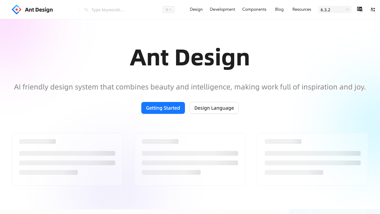
Ant Design is built by Alibaba’s Ant Group for the kind of applications that power financial systems — dense data tables, complex multi-step forms, cascading selectors, and transfer lists. Now at v6, it offers 60+ components with the deepest enterprise features of any free React library.
The v6 release (November 2025) added semantic component structure, resizable drawers, InputNumber spinner mode, and a ~40% improvement in dev render performance. The Ant Design Pro framework and ProComponents layer add higher-level patterns for rapid admin development.
Strengths
- Richest enterprise components — Table, Form, Tree, Transfer, Cascader, Mentions — all built-in and free.
- Ant Design Pro ecosystem — Full admin framework with ProTable, ProForm, ProLayout for rapid development.
- Everything is free — No paid tier. All components, all features, MIT licensed.
- Built-in i18n — 50+ locales out of the box. RTL support included.
- Opinionated design system — Consistent tokens and spacing make enterprise apps look professional without a designer.
Weaknesses
- Heavy dependency tree — 48 direct npm dependencies, the heaviest of the three.
- Documentation quality varies — Some docs are Chinese-first with English translations that lag behind.
- CSS-in-JS runtime — Same performance concerns as MUI’s Emotion approach.
- Less flexible design language — Harder to make an Ant Design app not look like Ant Design compared to Tailwind-based approaches.
- Weaker accessibility historically — Improving in v6, but still behind MUI and shadcn/Radix on ARIA compliance.
Best For
Enterprise admin panels, B2B SaaS, data-heavy CRUD applications, Chinese/Asian market products, teams that need the most built-in components for free.
Head-to-Head Comparison
| Category | Winner | Why |
|---|---|---|
| Bundle Size | shadcn/ui | Zero runtime — local source files, ship only what you use |
| Component Count | MUI | 70+ core + MUI X enterprise components |
| Enterprise Components | Tie: MUI X / Ant Design | MUI X data grid is best; Ant Design has more free enterprise components |
| Customization | shadcn/ui | You own the source code — infinite flexibility |
| Accessibility | shadcn/ui | Radix UI primitives have the strongest WAI-ARIA compliance |
| Learning Curve | shadcn/ui | Simple if you know Tailwind; components are just React + CSS |
| Documentation | MUI | Industry-leading docs with interactive examples |
| Growth Trajectory | shadcn/ui | ~10x YoY growth vs ~2.3x (MUI) and ~1.5x (Ant Design) |
| Community Size | MUI | 6.7M weekly downloads, massive StackOverflow presence |
| Data-Heavy Apps | Ant Design | Table, Form, Tree, Transfer — all free, deeply featured |
| Design Flexibility | shadcn/ui | Tailwind utilities make any design achievable |
| SSR / RSC Support | shadcn/ui | Radix primitives work natively with React Server Components |
The Verdict: Which Should You Choose?
Choose shadcn/ui if you’re building a new project with Next.js and Tailwind CSS, you want total control over your component code, or you’re building a product where unique design matters. It’s the future-forward choice with the fastest growth trajectory and best AI/tooling integration.
Choose MUI if you need the most comprehensive out-of-the-box solution, your team values extensive documentation, you need advanced data grid features (MUI X), or you want commercial support and long-term enterprise backing.
Choose Ant Design if you’re building data-heavy enterprise applications, you need the richest free component set, your product targets the Chinese/Asian market, or you want ProComponents for rapid admin panel development.
The uncomfortable truth: Migration between any of these three is a major rewrite — different styling approaches, different component APIs, different patterns. Choose carefully upfront, because switching later means weeks to months of work depending on your app size.
If you’re starting a greenfield project today, the market is moving toward shadcn/ui’s model of owning your component code. For another perspective on the component library landscape, see our Mantine vs Chakra UI vs MUI comparison. But MUI and Ant Design aren’t going anywhere — their ecosystems are too large and too entrenched. The best choice depends entirely on what you’re building and who’s building it.
You Might Also Like


Comments (No Comments)