7 Trading Dashboard Design Examples Worth Studying 2026
Trading interfaces break the rules other dashboards follow. They are denser than anything a usability guide would approve, almost always dark, and they refresh continuously. They are also among the most heavily refined interfaces in software, because their users spend entire days inside them and a design mistake costs money directly. These seven examples were all captured from live products.
What makes them worth studying is that their constraints are extreme versions of ordinary ones. Every dashboard has to balance density against clarity; a trading terminal has to fit five live regions on one screen. Every dashboard uses colour to signal state; here red and green carry an unambiguous meaning that cannot be diluted. Solutions that work under those conditions tend to work anywhere.
Three forces shape the category. Density is the requirement, because switching views costs time a trader does not have. Colour is reserved, since red and green mean direction and nothing else may compete. And mistakes are expensive, so the layout itself is a safety mechanism — which is why the best order forms make the wrong action structurally hard rather than merely warning against it.
If you are looking for something to build on rather than study, our crypto and DeFi dashboard templates roundup covers the buildable options, and fintech and banking dashboard templates covers the wider financial set. For design work beyond trading, see our fintech dashboard design examples and the dark mode dashboard collection.
The examples at a glance
- The reference workspace: TradingView — fixed chart centre, permanent tool edges
- Best density discipline: Binance — five live regions that all stay readable
- Safest order entry: OKX — buy and sell side by side, never a toggle
- Most flexible layout: Kraken Pro — detachable panels the user arranges
- Best overview visual: TradingView Heatmap — 500 companies in one glance
- Best retail portfolio: Vault — performance against a benchmark, light theme
- Best institutional view: Fortress — risk, compliance and multi-desk P&L
7 trading dashboard designs worth studying
Ordered from public charting tools through exchange terminals to the portfolio and institutional views. Each entry closes with the one pattern most worth carrying into your own work.
1. TradingView
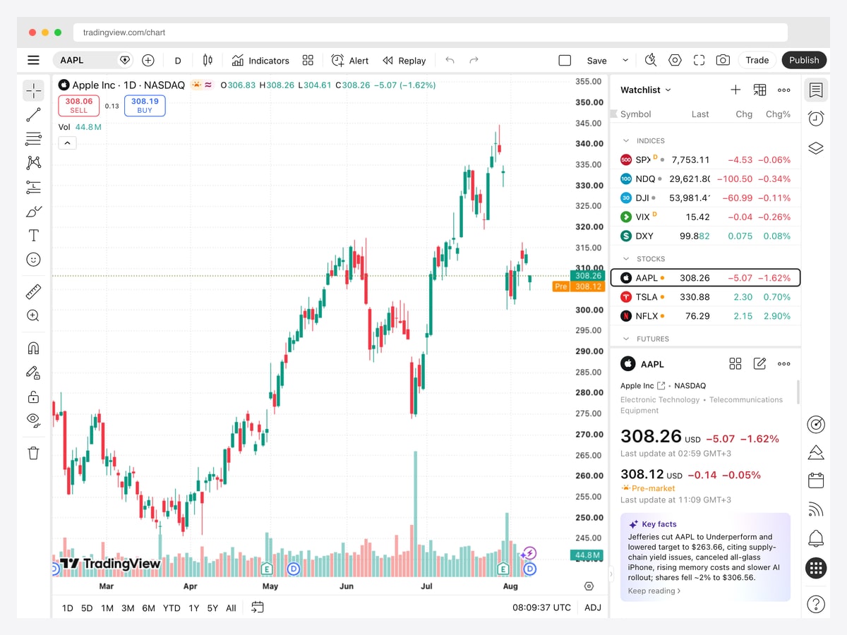
Why it is worth studying: It is the interface every other charting tool is measured against, and the layout it settled on — chart centre, tools left, context right — has become the default across the category.
TradingView’s workspace puts the chart at the centre and gives everything else a fixed edge. Drawing tools run down the left as a single icon column, the timeframe and indicator controls sit in one top bar, and the right side stacks a watchlist above a symbol detail panel. Nothing floats, nothing overlaps, and the chart keeps the largest share of the canvas at every window size.
The detail worth studying is how much information the right rail carries without feeling heavy. The watchlist groups symbols under collapsible headings for indices, stocks, and futures, each row reduced to symbol, last price, and change in both absolute and percentage terms. Underneath, the selected symbol expands into its full quote with a pre-market figure and a plain-language summary of recent news. It is three levels of zoom — list, quote, narrative — in one column.
Note also what the toolbar does not do: it never hides behind a hamburger, and it never animates. In a tool where users repeat the same actions hundreds of times a session, muscle memory is worth more than visual tidiness, and TradingView consistently chooses the former.
2. Binance
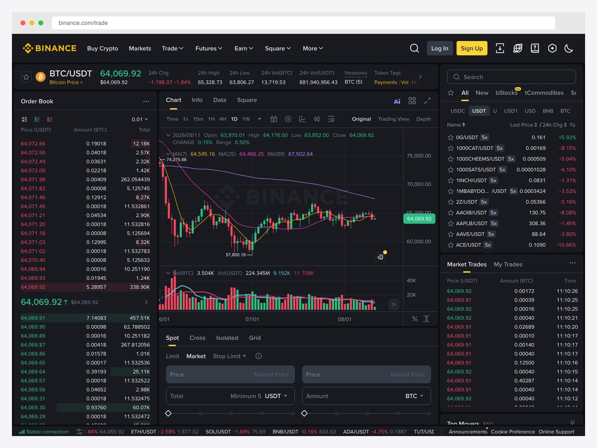
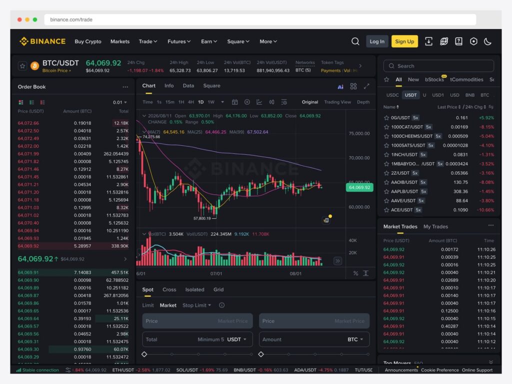
Why it is worth studying: Five distinct live data regions share one screen without any of them getting lost — the clearest lesson in dense-layout discipline we found.
The Binance spot terminal runs the order book down the left, the candlestick chart with its moving averages in the centre, the market list and trade feed on the right, and the order entry form beneath the chart. Every one of those regions updates continuously, and the layout still reads because each is given a hard boundary and a consistent internal rhythm — the order book is nothing but price, amount, and total, repeated.
Colour does the heaviest lifting. Red and green are reserved almost entirely for direction: sell pressure above the spread, buy support below it, and the same pairing on the trade feed and the percentage changes in the market list. Because the rest of the interface is near-monochrome on a dark surface, those two colours stay legible even at the small type sizes the density forces.
The order book also shows a pattern worth borrowing beyond finance: each row carries a faint horizontal fill proportional to its cumulative volume, so the shape of the book — where the real depth sits — is visible as a silhouette behind the numbers. It is a second data dimension added at zero layout cost.
3. OKX
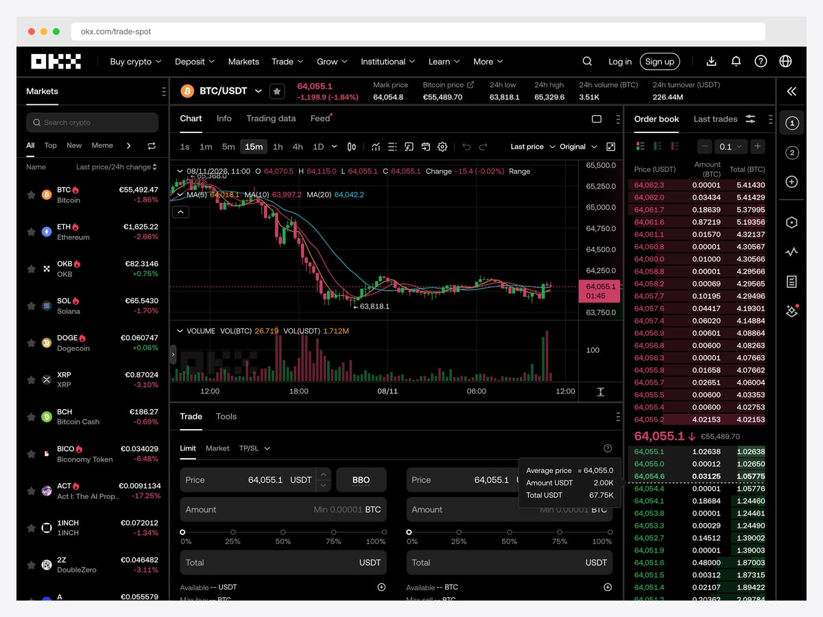
Why it is worth studying: It shows the buy and sell forms side by side rather than behind a toggle, which removes an entire category of expensive user error.
OKX lays out a similar terminal to Binance’s — market list left, chart centre, order book right — but diverges at the order form. Instead of one form with a buy/sell switch, it renders both forms simultaneously, side by side, each tinted toward its direction. A trader can never be confused about which side they are submitting, which matters because that mistake costs real money and is completely preventable in the layout.
Both forms carry a percentage slider under the amount field with quarter-point stops. That is a small affordance with an outsized effect: “sell 50% of my position” is the actual intent far more often than a specific token quantity, so the slider matches how people think while the numeric field stays available for precision. Offering both, rather than choosing, is the right call.
The market list on the left is also worth noting for its restraint. Each row is a symbol, a price, and a change percentage, with a small flame icon marking activity. No sparklines, no extra columns — because the list exists for switching markets, not analysing them, and the chart is one click away.
4. Kraken Pro
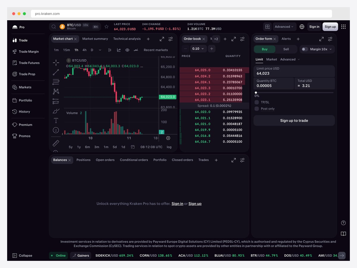
Why it is worth studying: Every panel is a closeable, detachable module with its own header controls — the interface is a workspace the user assembles, not a page you designed for them.
Kraken Pro treats the trading screen as a set of independent modules. The market chart, order book, order form, and the balances area each sit in a titled panel with a close button and its own expand and settings controls. Panels can be rearranged, and the tabbed strip at the bottom — balances, positions, open orders, conditional orders, portfolio, closed orders, trades — lets one region host many views without stealing space from the chart.
This is the right pattern when your users’ jobs differ enough that no single layout serves them. A margin trader wants the order book large and permanent; someone managing longer positions wants the portfolio tab open and the book collapsed. Rather than guessing, the interface supplies the parts and lets each person build the desk they need.
The cost is real and worth naming: modular layouts need sensible defaults, persistence between sessions, and a reset path when someone breaks their own workspace. Kraken handles the first by shipping a complete arrangement out of the box, which is the part most implementations get wrong.
5. TradingView Stock Heatmap
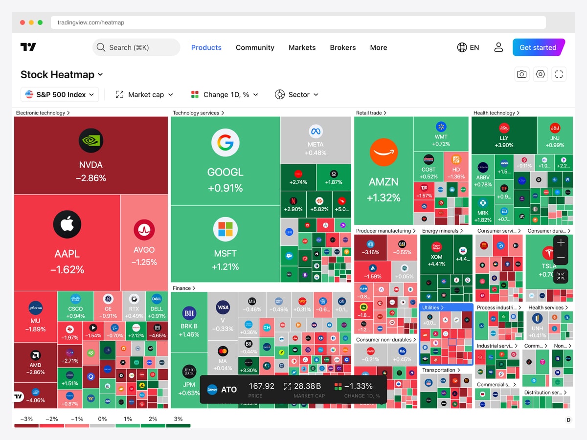
Why it is worth studying: A treemap that answers “what is the market doing” faster than any table or chart could, by encoding size and direction simultaneously.
The heatmap renders the S&P 500 as nested rectangles: each company sized by market capitalisation, coloured by its daily change, and grouped into sector blocks. In one glance you get three facts that would otherwise need three separate views — which sectors are moving, which individual names dominate them, and how strong the move is.
The colour scale is the important design decision. It runs red through grey to green across a small percentage range, with a legend along the bottom showing the exact breakpoints. Grey for “roughly flat” is what makes the extremes readable — without a neutral midpoint, every tile would be tinted and the eye would have nothing to anchor against.
Labels degrade gracefully as tiles shrink. Large tiles carry a logo, ticker, and percentage; medium ones drop to ticker and percentage; the smallest keep only a logo, with the rest available on hover. That progressive drop-off is what lets one view span five hundred companies without turning into noise.
6. Vault (DashboardPack)
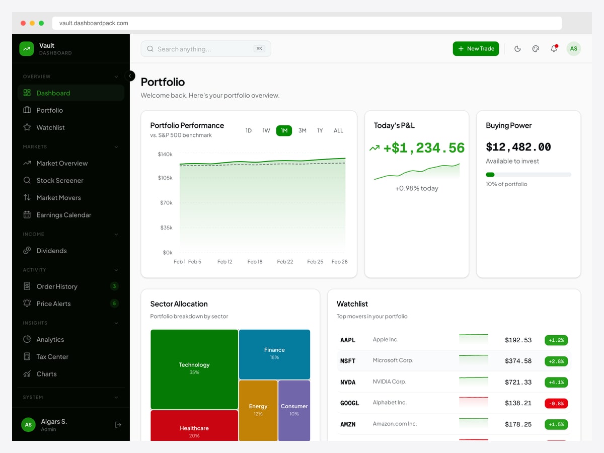
Why it is worth studying: It is the counter-example to every dark terminal here — a portfolio view built for investors who check positions daily rather than trade them by the second.
Vault answers a different question from the exchange terminals. Instead of “what is the price right now”, it opens with portfolio performance plotted against an S&P 500 benchmark, today’s profit and loss with its own sparkline, and available buying power shown as a proportion of the whole portfolio. That benchmark comparison is the detail most portfolio screens omit and the one that actually tells an investor whether they are doing well.
Below that, sector allocation is a treemap rather than the usual donut — the same size-plus-colour idea as the heatmap, applied to one portfolio — and the watchlist gives each holding a sparkline beside its price and change badge. Sparklines earn their space here because a daily investor cares about the shape of the last week, not the tick.
The light theme is a deliberate choice worth defending. Dark interfaces suit screens watched continuously in dim trading rooms; a portfolio you check with morning coffee has no such constraint, and light surfaces make the long-form numbers and labels easier to scan.
7. Fortress (DashboardPack)
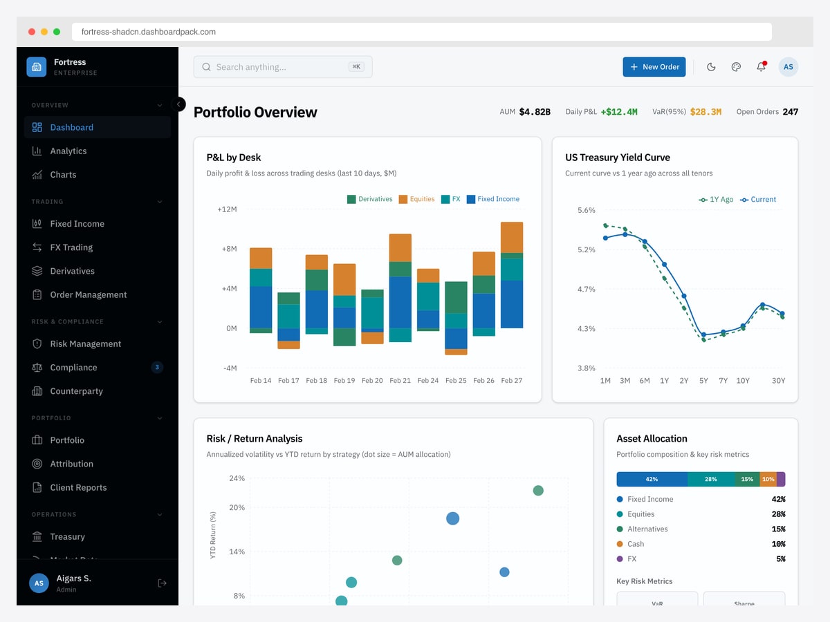
Why it is worth studying: The only example here designed for the people who supervise traders rather than the traders themselves — and the metrics change completely as a result.
Fortress opens on assets under management, daily profit and loss, value at risk at the ninety-five percent confidence level, and open order count, pinned as a header strip rather than as cards. That row is the institutional equivalent of a price ticker: the four numbers a desk head needs continuously, always in the same place.
The panels beneath it are all comparative rather than absolute. Profit and loss is stacked by desk so contribution is visible per business line, the Treasury yield curve is plotted against the same curve a year earlier, and risk versus return is a scatter where each strategy’s dot is sized by its allocation. That last chart carries three variables at once and is the most information-dense idea in this list.
The navigation reveals how much of institutional finance is not trading: fixed income, FX, and derivatives sit above a whole risk and compliance section with a pending-items badge on compliance. If you are building for regulated finance, that badge is the pattern to copy — surfacing outstanding obligations in the navigation rather than burying them in a report.
The patterns behind good trading dashboard design
Treat density as a requirement, not a failure
Every instinct from consumer design says these screens are too full. They are full because switching views costs time, and in trading, time is the product. The right response is not to add whitespace but to make density legible: hard boundaries between regions, one consistent rhythm inside each, and type sizes chosen for scanning rather than reading. Binance fits five live regions on a screen and stays readable because each region does exactly one thing.
Spend red and green on direction only
In finance, red and green are not decoration — they mean down and up, and every user reads them instantly. That meaning survives only if nothing else competes for those colours, which is why these interfaces are otherwise near-monochrome. If your product uses green for a primary button and green for a gain, you have diluted the one signal your users cannot afford to misread. Reserve the pair, and build the rest of the palette in neutrals.
Make the dangerous action structurally hard
OKX shows both order forms at once so buy can never be mistaken for sell. That is a layout decision doing the work a confirmation dialog usually does badly — warnings get dismissed reflexively, whereas a form that is simply always on the correct side cannot be misfired. Wherever two actions are opposites with asymmetric consequences, separate them in space rather than behind a toggle.
Add dimensions without adding columns
The best ideas here are all second data dimensions bought for free: depth as a background fill in order book rows, market cap as tile size in the heatmap, allocation as dot size in the risk-return scatter, and a week of history as a sparkline beside a price. Each adds real information to an existing element instead of demanding new layout space — the single most useful habit to take from these interfaces.
Choose dark for duration, light for glances
Dark themes dominate this category for a practical reason: these screens are watched for hours in dim rooms, and a bright canvas becomes fatiguing. But it is a trade, not a law. Vault is deliberately light because a portfolio is checked briefly rather than monitored continuously, and light surfaces read better for the labels and long-form numbers that view carries. Match the theme to the session length, not to the genre.
Give people the parts when their jobs differ
Kraken Pro’s detachable panels exist because a margin trader and a long-term holder need different screens. Modular layouts are the honest answer when no single arrangement serves everyone — but they only work with a strong default, persistence between sessions, and an obvious way to reset. Ship the assembled desk first; let rearranging be the option, not the requirement.
How to apply these patterns to your own build
Trading interfaces are unusually expensive to build from scratch, because the hard parts are all infrastructure: streaming price updates without re-rendering the world, charts that stay smooth under continuous data, order books that reconcile against a live feed, and number formatting that never misleads. Starting from a template that already handles the chart and table layer saves the least interesting weeks of the project.
Two of the examples above are directly buildable. Vault covers the retail investing side — portfolio performance, watchlists, allocation, and order history. Fortress covers the institutional side with its risk, compliance, and multi-desk views. For the crypto-specific set, our crypto and DeFi dashboard templates roundup lists the buildable options.
Whatever you start from, test with real market data early. Trading layouts that look balanced with sample numbers fall apart the moment a value goes to five decimal places, a percentage turns negative, or a symbol name runs long — and those are the normal cases, not the edge cases.
Trading dashboard design FAQ
What makes a good trading dashboard design?
Density that stays legible, colour reserved strictly for direction, and a layout that makes costly mistakes structurally difficult. The best trading interfaces give the primary chart a fixed centre, keep controls on permanent edges so muscle memory works, and add extra data dimensions inside existing elements — background fills, tile sizes, sparklines — rather than adding columns.
Why are trading dashboards almost always dark?
Because they are watched continuously for hours, often in dim rooms, and a bright canvas becomes fatiguing over a long session. Dark surfaces also let the reserved red and green stay vivid against near-monochrome surroundings. It is a trade rather than a rule: portfolio views that people check briefly, such as Vault, work well in a light theme.
What should a stock trading dashboard show?
For an active trader: a price chart with timeframe controls, an order book or depth view, a market or watchlist for switching symbols, an order entry form, and open positions. For an investor rather than a trader: portfolio performance against a benchmark, profit and loss, allocation by sector, and a watchlist. The two audiences need genuinely different screens.
How do you design an order entry form safely?
Separate opposing actions in space rather than behind a toggle — OKX renders buy and sell forms side by side so the wrong side cannot be submitted by accident. Offer percentage sliders alongside numeric inputs, because “sell half my position” is the more common intent, and keep the final confirmation showing the resulting total in the currency the user actually thinks in.
What chart types work best for market data?
Candlesticks remain the standard for price over time because they carry open, high, low, and close in one mark. For whole-market overviews, a treemap sized by market capitalisation and coloured by change communicates more per pixel than any list. For comparing strategies or holdings, a scatter with dot size as a third variable does the job of three charts.
Where can I find trading dashboard templates to build on?
Our crypto and DeFi dashboard templates roundup covers the buildable options for exchange-style interfaces, and the fintech and banking templates collection covers the wider financial set. Vault and Fortress, both featured above, cover the retail-investing and institutional cases respectively and can be opened as live demos before you commit.

You Might Also Like