
Fintech Dashboard Design: 9 Real Products, Analyzed (2026)

Fintech dashboards carry a burden other UIs don’t: every pixel either builds or erodes trust in what happens to someone’s money. Below are 9 real banking and fintech dashboard design examples — Mercury, Stripe, Ramp, Brex, Wise, Revolut, Plaid — each with a fresh screenshot and the pattern worth stealing, plus what a banking dashboard should actually show and a build-your-own lane. Shopping for templates instead? See our fintech & banking dashboard templates roundup.
Short on time? Mercury is the design benchmark, Stripe owns financial tables, and Ramp shows where AI-era finance UI is heading.
Quick Picks
- Design benchmark: Mercury — editorial calm that reads as credibility
- Tables & reporting: Stripe — tabular figures, state-only color
- AI-era workflows: Ramp — work queues over chart walls
- Enterprise density: Brex — exception-first spend oversight
- Multi-currency: Wise Business — balance cards + fee transparency
- Dark-mode finance: Revolut Business — cinematic, high-contrast numerals
- Infrastructure side: Plaid — developer-facing data dashboards
- Build lane: trading: Vault — our dark-first portfolio template
- Build lane: banking: Fortress — our risk & treasury analytics template
What should a banking dashboard show?
The question behind most searches for these examples. The consensus layout across the products below, top to bottom:
- Verdict row: total balance / net position with trend — the “am I okay?” answer, largest type on the page.
- Money in motion: upcoming and pending payments, transfers in flight, cards awaiting approval — anything that changes the number above.
- Cash flow view: income vs spending over time, one chart, with period comparison.
- Transactions feed: a dense, filterable table with merchant, category, status — the workhorse surface (Stripe’s specialty).
- Alerts & exceptions: low balances, failed payments, policy flags (Brex’s specialty) — surfaced, never buried in tabs.
- Trading additions: portfolio P&L, allocation, watchlists, buying power (see Vault); institutional additions: desk P&L, yield curves, risk metrics (see Fortress).
The examples at a glance
| Product | Category | Signature pattern | Study it for |
|---|---|---|---|
| Mercury | Business banking | The banking-dashboard design benchmark | Editorial polish that builds trust |
| Stripe | Payments | Financial data tables done right | Reporting, tables & drill-downs |
| Ramp | Spend management | Spend management with AI woven in | Workflow-first finance UI |
| Brex | Corporate cards & banking | Enterprise finance, consumer-grade UI | Scaling density for enterprise |
| Wise Business | Cross-border banking | Multi-currency clarity with bold branding | Multi-currency balance design |
| Revolut Business | Business banking | Dark, dense, product-as-brand | Dark-mode financial UI |
| Plaid | Fintech infrastructure | The data layer’s own dashboard patterns | Developer-facing fintech dashboards |
| Vault | React template · DashboardPack | dark-first investment dashboard | Building trading/portfolio UIs |
| Fortress | React/shadcn template · DashboardPack | banking & risk analytics | Building banking/risk dashboards |
9 fintech & banking dashboards, analyzed
1. Mercury
The banking-dashboard design benchmark
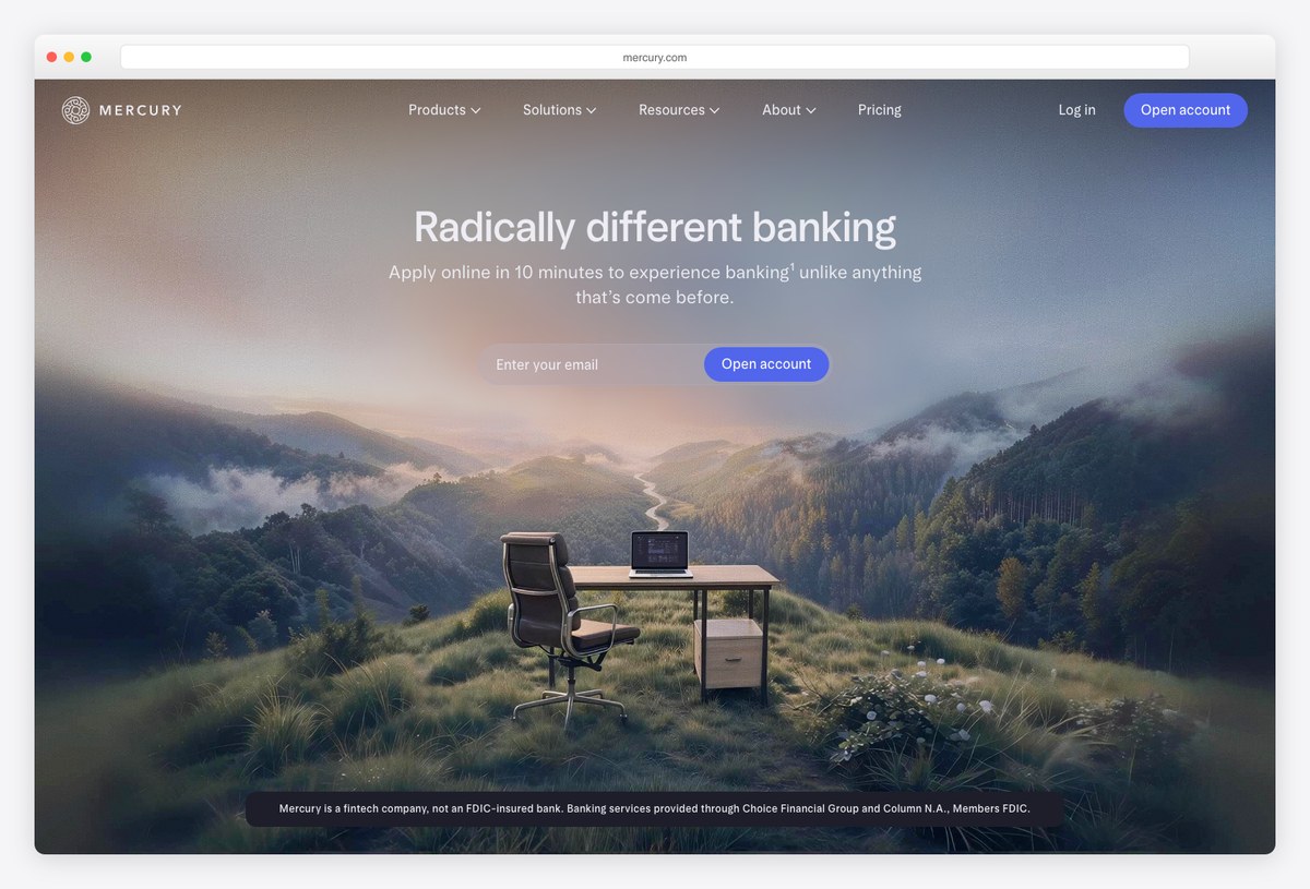
What to steal: Mercury made a bank account feel like a designed product — editorial typography, disciplined color, and balance/transaction views that read like a well-set financial statement.
Mercury tops best-designed-fintech lists for a reason: its dashboard treats money with visual calm. Accounts, cards, and cash-flow views share one confident voice, and dense transaction tables stay scannable through type discipline rather than decoration.
Steal its restraint: in financial UI, calm is credibility.
2. Stripe
Financial data tables done right
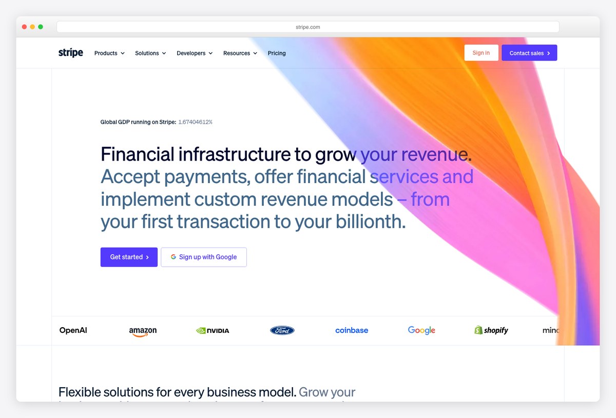
What to steal: The Stripe Dashboard remains the reference for financial reporting UI — right-aligned tabular figures, inline sparklines, and drill-downs that never lose your place.
Stripe leads with tables and treats charts as summaries: the home view balances a revenue graph with payment lists and status chips, all in a neutral palette where color only ever means state (succeeded, refunded, failed).
Steal the numerals discipline: tabular figures, right alignment, currency formatting everywhere.
3. Ramp
Spend management with AI woven in
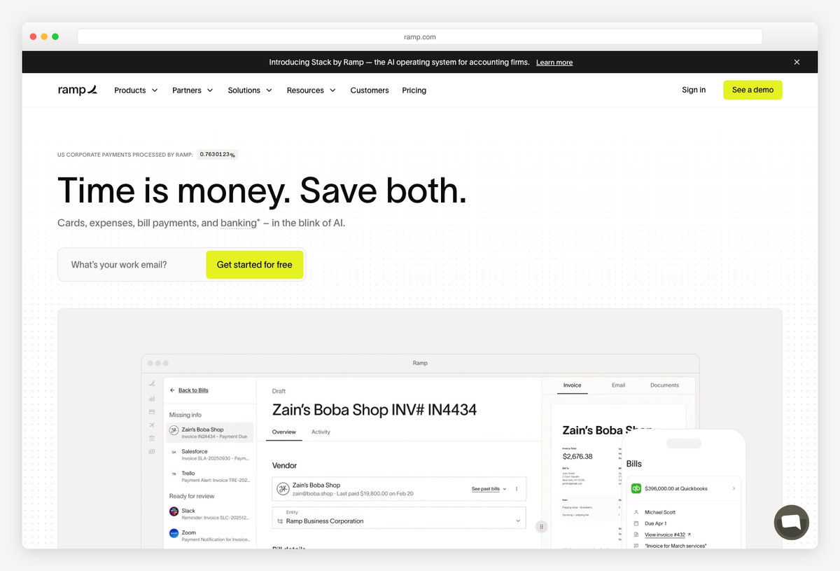
What to steal: Ramp’s dashboard is built around what finance teams do — approve, match, close — with AI handling receipts and coding, and the interface showing work remaining rather than charts for their own sake.
Ramp designs for throughput: inboxes of bills and expenses, automation status, and month-close progress take the prime real estate, with analytics one level down. Its AI-first positioning shows up as fewer forms, not more chrome.
Steal the work-queue pattern: finance dashboards are to-do lists wearing charts.
4. Brex
Enterprise finance, consumer-grade UI
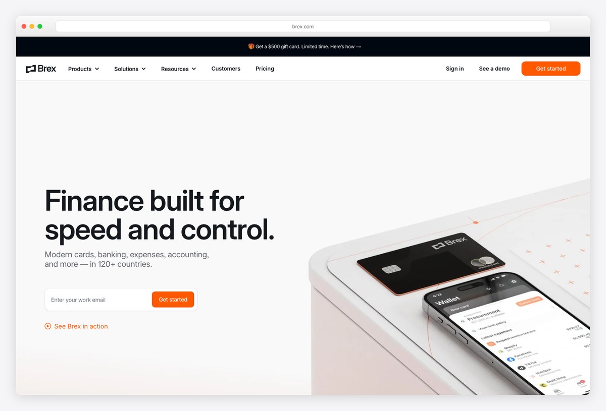
What to steal: Brex handles enterprise complexity — entities, policies, global cards — while keeping a consumer-app feel: strong hierarchy, dark accents, and dashboards that surface exceptions instead of everything.
Where Ramp optimizes for the queue, Brex optimizes for the controller’s overview: spend against budgets by team and entity, policy exceptions flagged, forecasts inline. The visual system stays composed even with a dozen dimensions in play.
Steal exception-first design: show what needs attention, hide what’s on track.
5. Wise Business
Multi-currency clarity with bold branding

What to steal: Wise proves a financial dashboard can carry a loud brand (that green!) and stay legible — stacked currency balances, mid-market rate transparency, and transfer flows that explain fees before asking for money.
Wise’s business dashboard solves a genuinely hard layout problem — many currencies, jars, and transfer states — with balance cards and honest fee breakdowns. The brand-heavy visual language works because the data layer underneath is rigorously plain.
Steal the fee-transparency pattern: showing costs up front is a design decision, not just a policy.
6. Revolut Business
Dark, dense, product-as-brand
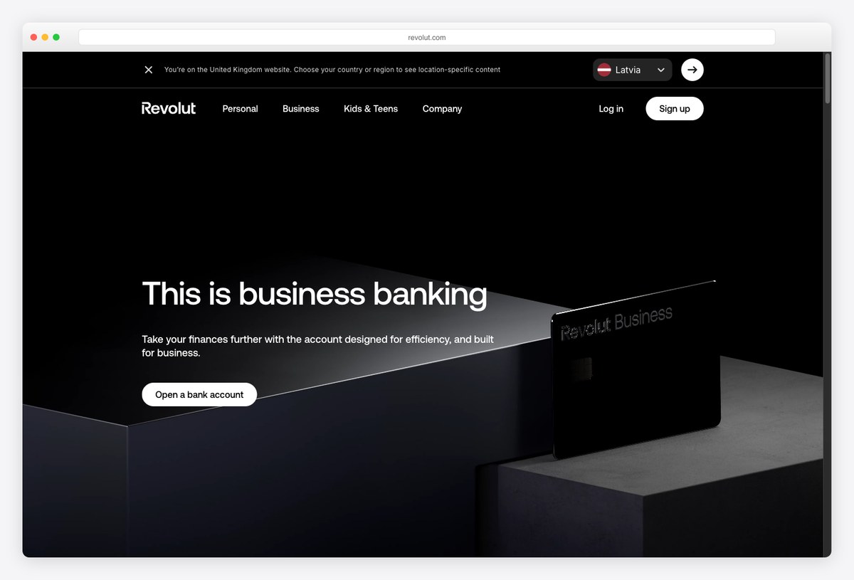
What to steal: Revolut Business leans into a dark, cinematic interface — cards, FX, treasury, and spend in one app whose design IS the marketing.
Revolut demonstrates the dark-first end of fintech design: high-contrast numerals, glassy panels, and motion used sparingly for state changes. It’s the aesthetic our own Vault and Fortress templates build on — power-user finance tools increasingly default to dark.
Steal its contrast discipline: dark financial UIs live or die on numeral legibility (see our dark-mode guide).
7. Plaid
The data layer’s own dashboard patterns
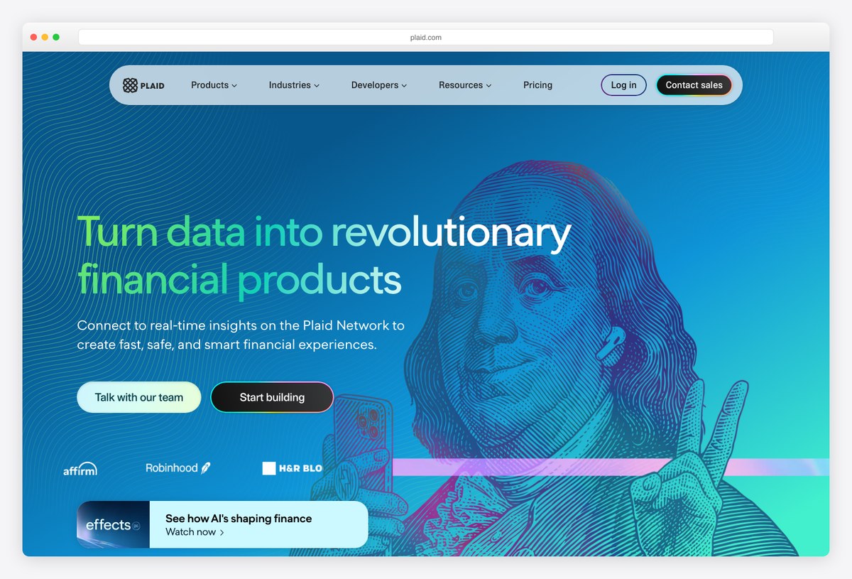
What to steal: Plaid’s console and marketing UI show the infrastructure side of fintech design — API usage, institution coverage, and data flows visualized for developers rather than account holders.
Most fintech dashboards in this list face customers; Plaid’s faces builders. Its patterns — environment switching, usage meters, connection health — are the ones to study when your “fintech dashboard” is really an ops console over financial data.
Steal the connection-status vocabulary: financial data pipelines need visible health states.
8. Vault
Build lane: dark-first investment dashboard
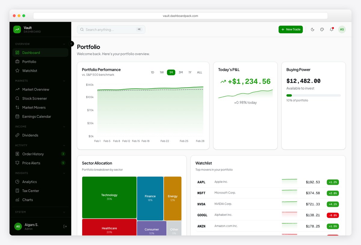
What to steal: Vault is our dark-first investment dashboard template — portfolio P&L, watchlists, allocation treemaps, and buying-power cards ready to wire to your market data.
When the products above inspire but you need to ship your own, Vault is the trading-desk starting point: the screenshot is its live demo — portfolio performance, service allocation, and watchlist patterns pre-built in the Revolut-adjacent dark aesthetic.
Disclosure: ours — built specifically from the patterns this article catalogs.
9. Fortress
Build lane: banking & risk analytics
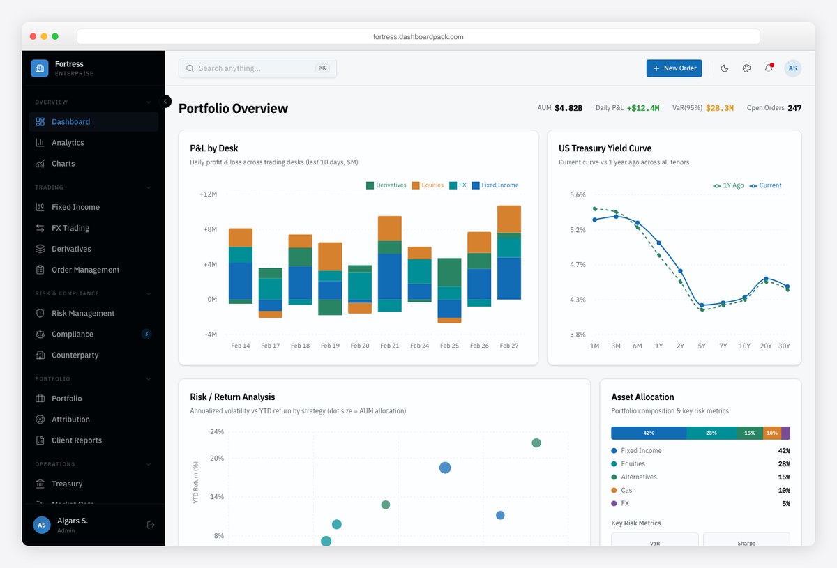
What to steal: Fortress covers the institutional side — P&L by desk, treasury yield curves, risk and return analysis, asset allocation — as a shadcn-style React template.
Fortress is the second half of our fintech build lane: where Vault is retail-trading flavored, Fortress speaks bank — dense analytic grids, yield curves, and risk panels in a composed dark UI. Together they cover most “we need it to look like Mercury/Revolut but ours” briefs.
Also ours — pair either with the design rules below and the products above as taste references.
Fintech dashboard design patterns that work
- Color means state, nothing else. Green/red carry profit/loss semantics — spending them on decoration (gradients, brand flourishes in the data area) breaks the instrument.
- Numerals are the typography that matters. Tabular figures, consistent decimal places, currency symbols set lighter than values — Stripe and Mercury agree on all three.
- Design the pending state. Money is often in-flight; ambiguous “processing” UI generates support tickets. Wise’s transfer timeline is the reference.
- Dark mode is a requirement in trading, an option in banking. Power users at screens all day expect it (Revolut, Vault); occasional-use SMB banking can stay light-first — our dark mode dashboard guide covers the contrast math.
- Trust is cumulative microcopy. Fee breakdowns before confirmation, exact timestamps, explicit exchange rates — transparency rendered as UI, not buried in terms.
From example to your own fintech dashboard
- Pick the taste reference for your product: SMB banking → Mercury/Wise; payments/reporting → Stripe; spend ops → Ramp/Brex; trading → Revolut.
- Then build from a template that encodes it: Vault (trading/portfolio) or Fortress (banking/risk) from our line, or the wider picks in fintech & banking dashboard templates.
- Data-viz layer: currency-aware charts are Tremor’s specialty — see our Tremor guide.
- General design fundamentals: the KPI-hierarchy and chart-restraint rules in our SaaS dashboard design guide apply doubly when the numbers are money.
Frequently asked questions
What makes a good fintech dashboard design?
Visual calm (trust reads as restraint), numerals set in tabular figures with consistent precision, color reserved strictly for financial state, explicit pending/in-flight states, and fee/rate transparency rendered in the UI. Mercury and Stripe are the canonical references; the design-patterns section above breaks the rules down.
What should a banking app dashboard show?
Top to bottom: total balance with trend, money in motion (pending payments and transfers), a single cash-flow chart, a dense filterable transaction feed, and surfaced alerts/exceptions. Trading products add portfolio P&L, allocation, and watchlists; institutional tools add desk P&L and risk metrics.
Should a fintech dashboard be dark or light?
Trading and markets tools skew dark-first (long sessions, screen-heavy users — Revolut, most terminals); SMB banking and payments skew light-first (Mercury, Stripe, Wise). Either way, contrast on numerals is the non-negotiable — WCAG-check the profit/loss greens and reds especially.
Are there fintech dashboard templates I can build from?
Yes — our fintech & banking dashboard templates roundup collects them, and from our own line Vault covers trading/portfolio UIs while Fortress covers banking and risk analytics, both React + Tailwind in the dark-first style these examples popularized.
Which fintech has the best dashboard design?
By consensus and by these screenshots: Mercury for overall polish, Stripe for data/reporting, Ramp for AI-era workflow design, Wise for multi-currency clarity, and Revolut for dark-mode execution. “Best” depends on which of those problems your product shares.
Completing the design cluster? See SaaS dashboard design examples, CRM dashboard examples, client dashboard design, and the dark mode dashboard guide — or go straight to fintech dashboard templates to build.

You Might Also Like


