9 Best CRM Dashboard Examples & Designs (2026)
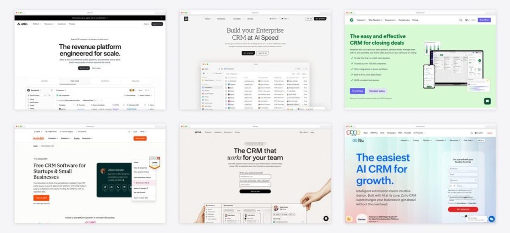
The fastest way to design a CRM dashboard is to study the products that get it right. Below are 9 real CRM dashboard examples — Salesforce, HubSpot, Pipedrive, Zoho, monday, Attio, Twenty, Close, and folk — each with a fresh screenshot and the design pattern worth stealing, plus the dashboard types and KPIs every sales team actually needs. Looking for a template to build with instead? See our companion roundup of CRM dashboard templates.
Short on time? Pipedrive is the pipeline-design reference, Attio shows what AI-native CRM dashboards look like, and Twenty is the open-source example you can read in code.
Quick Picks
- Role-based architecture: Salesforce — dashboards as role-specific report windows
- Full-funnel clarity: HubSpot — template-first dashboards teams actually read
- Pipeline design: Pipedrive — kanban stages + velocity metrics
- Analytics depth: Zoho CRM — targets, cohorts and AI anomaly flags
- Composable widgets: monday CRM — boards anyone can turn into dashboards
- AI-native: Attio — AI summaries as designed components
- Open source: Twenty — a modern CRM UI you can inspect on GitHub
- Activity-first: Close — rep activity leaderboards for inside sales
- Minimalism: folk — proof that less dashboard is often more
CRM dashboard types and the KPIs they track
Before copying any design, decide which dashboard you’re actually building — the examples above each excel at different ones:
| Dashboard type | Key KPIs | Best for |
|---|---|---|
| Sales manager overview | Revenue vs target, pipeline value, win rate, forecast | Weekly team reviews and quota tracking |
| Leads & pipeline | New leads by source, stage conversion, time-in-stage, pipeline velocity | Spotting where deals stall |
| Deals & forecasting | Weighted forecast, deal age, average deal size, expected close dates | Revenue predictability |
| Activity | Calls, emails, meetings per rep, response times, sequences completed | Managing inputs in high-velocity teams |
| Customer service | Open tickets, first-response time, resolution time, CSAT | Post-sale health and support load |
9 real CRM dashboard examples worth studying
1. Salesforce
The configurable-dashboard benchmark
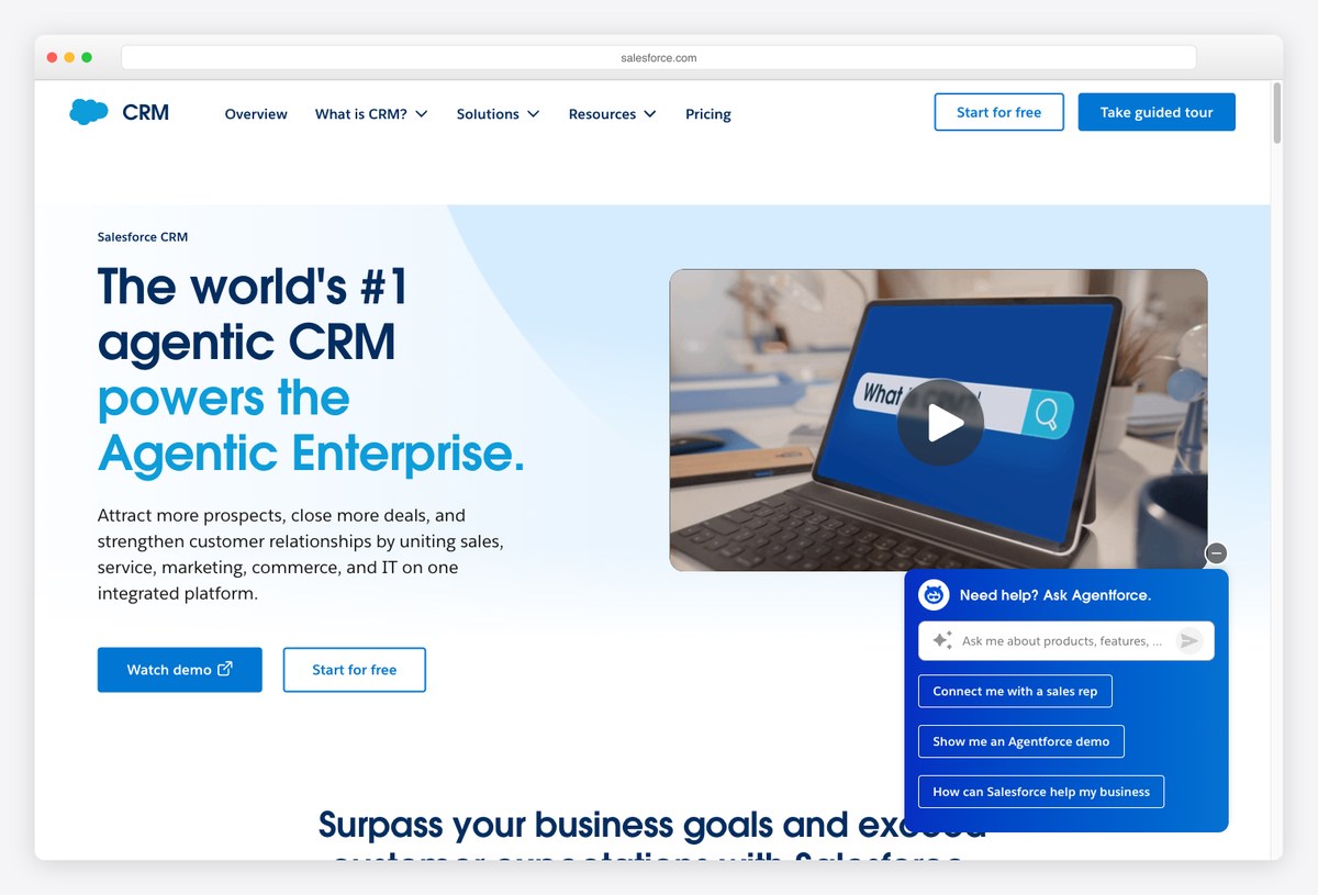
What to steal: Salesforce dashboards are built per role — rep, manager, executive — from a component library of charts, gauges, and tables over any report. The lesson: a CRM dashboard is a system of views, not one screen.
Love it or fight it, Salesforce defined what CRM reporting means: every dashboard is assembled from report-backed components with per-role visibility, drill-down to records, and now AI (Agentforce) layered over the data. Its density teaches restraint by counter-example — the best Salesforce dashboards are the ones admins prune ruthlessly.
Study it for the architecture: reports as the source of truth, dashboards as role-specific windows onto them.
2. HubSpot
The approachable full-funnel dashboard
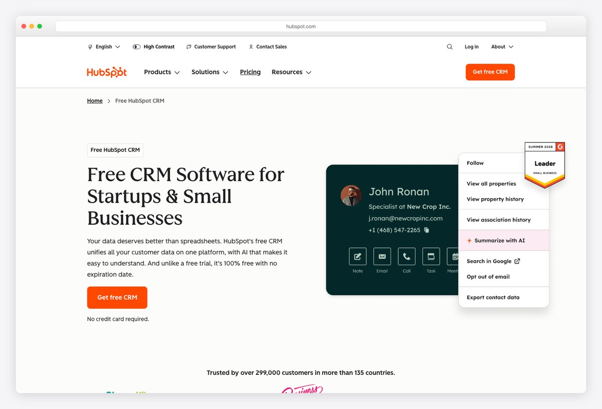
What to steal: HubSpot’s dashboards span the whole funnel — traffic, leads, deals, tickets — in a friendly visual language that non-analysts actually read. Its free CRM made this level of reporting the baseline expectation.
HubSpot excels at making cross-team dashboards legible: consistent card grids, plain-language report names, and templates per team (sales manager, marketing, service). The design carries a lot of the product’s famous ease-of-use reputation.
Steal its template-first approach: users pick a purpose (“sales manager weekly”), not a blank canvas.
3. Pipedrive
The pipeline-first design pattern
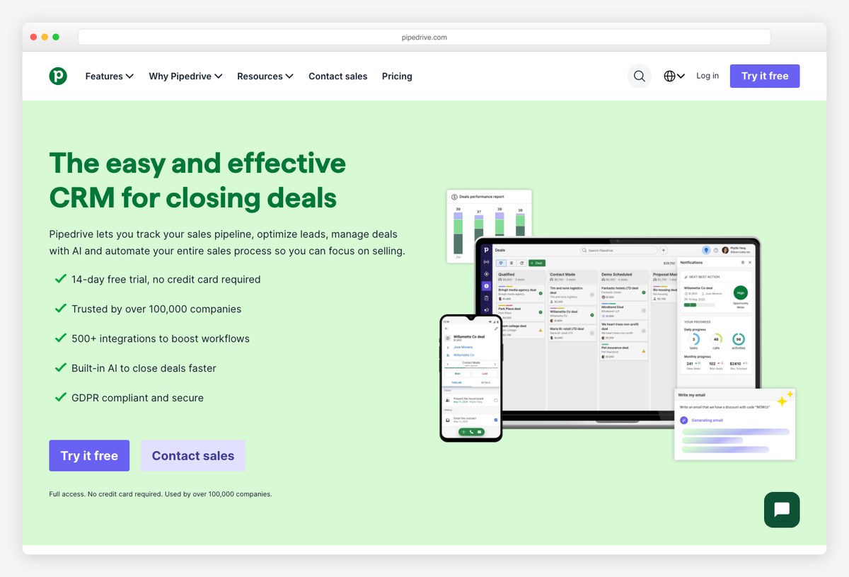
What to steal: Pipedrive made the kanban pipeline the center of CRM design — deals as cards moving through stages, with Insights dashboards reading velocity, conversion per stage, and forecast off that structure.
If your dashboard needs to answer “where is revenue stuck?”, Pipedrive is the reference: stage-conversion funnels, deal-age indicators, and rep leaderboards all derive from the visual pipeline metaphor. The design keeps activity (calls, emails) one click from every number.
Steal the funnel-plus-velocity pairing: stage conversion rates next to time-in-stage tells the whole pipeline story.
4. Zoho CRM
Analytics depth at SMB prices
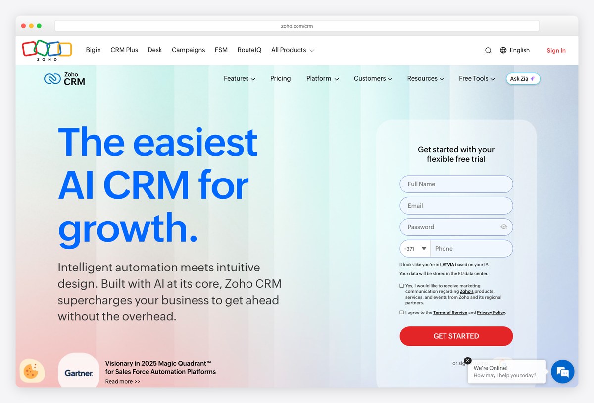
What to steal: Zoho’s dashboard builder ships surprisingly deep components — KPI cards with targets, cohort grids, quadrant charts, and Zia’s AI anomaly detection — showing what “analytics included” can mean in an affordable CRM.
Zoho CRM dashboards let SMBs build what enterprises pay consultants for: target-vs-actual meters per rep, funnel and cohort analysis, and AI-flagged anomalies on any metric. The visual polish trails Attio or folk, but the analytical vocabulary is the most complete in its price class.
Steal its KPI-card grammar: every number paired with a target and a trend, never floating alone.
5. monday CRM
Composable widget-board dashboards
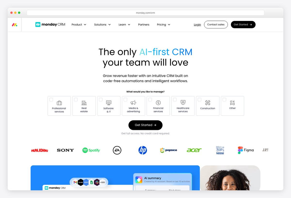
What to steal: monday treats a dashboard as just another board — drag in widgets (funnel, numbers, battery, leaderboard) over any pipeline data, recolor everything, done. The empowerment model is the design lesson.
monday CRM’s cheerful, color-coded boards double as dashboards: reps see their pipeline as rows, managers pivot the same data into funnel and workload widgets without IT help. The visual language is louder than most on this list, and its users love it for exactly that.
Steal the widget-board model when your users want to assemble their own views.
6. Attio
The AI-native CRM dashboard
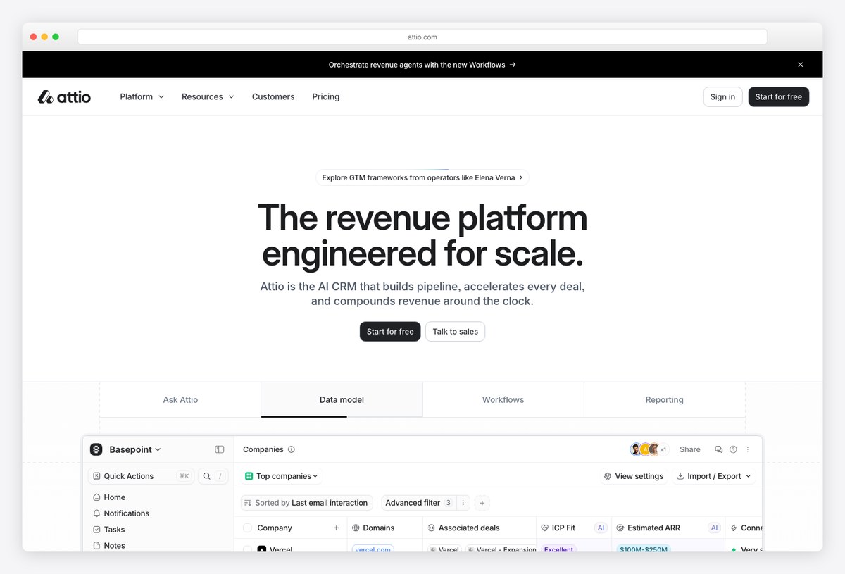
What to steal: Attio’s record pages and reports embed AI as a first-class surface — deal summaries, suggested next actions, and “Ask Attio” queries rendered as designed components, not a chat bubble bolted on.
Attio represents where CRM dashboards are heading: a spreadsheet-fast data model underneath, with AI doing the reading — summarizing pipeline health, drafting strategy per deal, and answering questions inline. The restrained, Linear-adjacent visual style keeps the intelligence layer legible.
Steal the pattern of AI output with layout, hierarchy, and citations — treat model text like any other designed data.
7. Twenty
The open-source CRM you can inspect
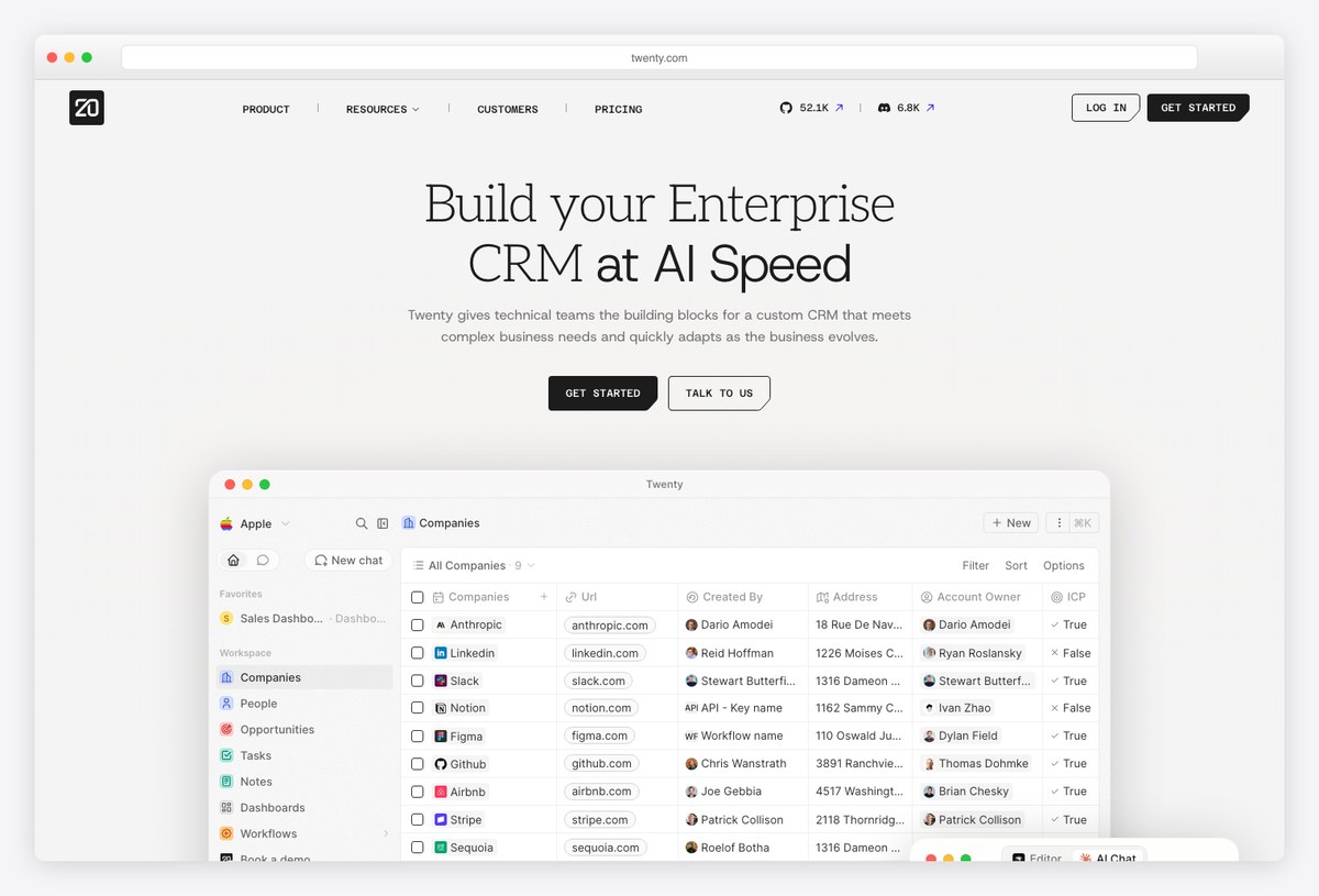
What to steal: Twenty is a genuinely modern open-source CRM — Notion-like tables, kanban pipelines, clean record pages — and the whole interface is on GitHub, making it the one example here whose design you can read in code.
For developers building CRM-ish dashboards, Twenty is a double win: a polished reference UI (React, with the table/kanban patterns of this list implemented properly) and an open-source codebase (AGPL v3) to learn from or self-host. It pairs naturally with the templates in our CRM roundup when you need a head start.
Study it freely — it’s open source, though the AGPL license means reusing its code in your own product carries copyleft obligations.
8. Close
Activity-first dashboards for inside sales
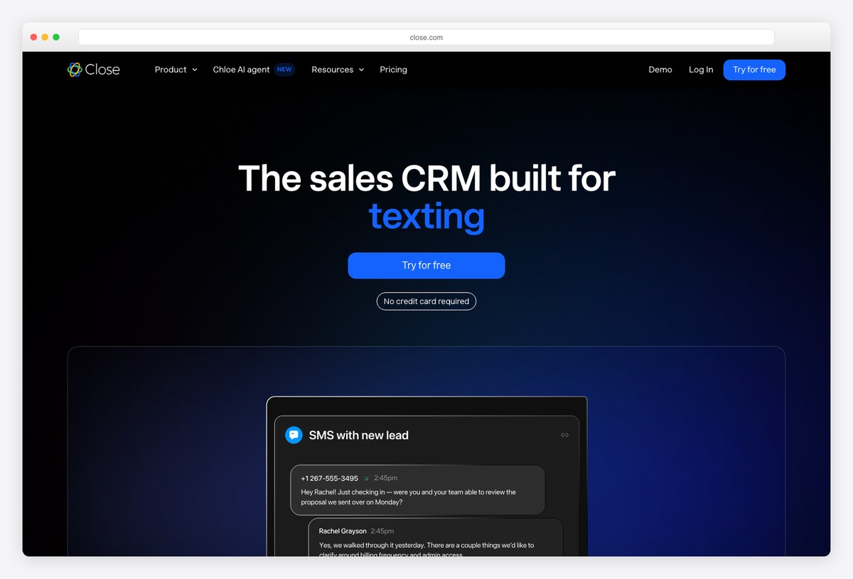
What to steal: Close designs around communication volume — calls, emails, SMS — with dashboards and leaderboards that read rep activity first and pipeline second, the right hierarchy for high-velocity inside sales.
Where most CRMs lead with revenue charts, Close leads with what reps did today: call counts, talk time, email sequences, and comparisons across the team. Its built-in calling UI keeps the dashboard one keystroke from the work itself.
Steal the activity-leaderboard pattern for any team whose inputs (not just outcomes) need managing.
9. folk
The minimal CRM that fights dashboard bloat
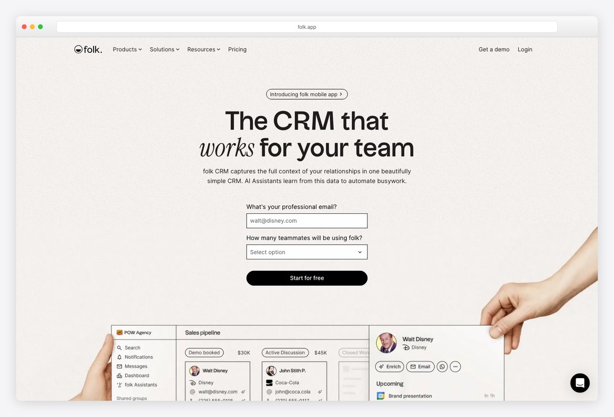
What to steal: folk strips CRM down to relationships — simple pipelines, clean contact groups, and just enough reporting — proving that for many teams the best dashboard is a short, well-designed list.
folk’s design bet is that most teams are over-dashboarded: it shows pipeline status and follow-up reminders with editorial-quality typography and calm color, and skips the wall of charts entirely. For agencies, founders, and deal-flow teams, that restraint is the feature.
Steal its discipline: add a chart only when a list stops answering the question.
CRM dashboard design patterns that work
- KPI cards with context. Every headline number needs a target and a trend (Zoho does this well) — “45 deals” means nothing without “of 60 target, ↑12%”.
- The pipeline funnel is the anchor. Stage-by-stage conversion with time-in-stage (Pipedrive’s pattern) answers more questions than any other single visualization in a CRM.
- Lead with tables for records, charts for trends. Reps work lists; managers read shapes. Twenty and Attio show the modern spreadsheet-fast table done right.
- Design the activity layer. Calls, emails, and next steps deserve first-class placement (Close’s lesson) — dashboards that only show outcomes can’t be acted on.
- Resist the chart wall. folk proves a disciplined list often beats a grid of donuts; add visualizations only where a trend or distribution carries the insight — the same chart-restraint rule from our SaaS dashboard design guide.
From example to your own CRM dashboard
A practical path:
- Pick the reference for your sales motion: pipeline-driven → Pipedrive; high-velocity inside sales → Close; relationship/deal-flow → folk; enterprise reporting → Salesforce.
- Borrow the AI patterns early: Attio‘s designed summaries are quickly becoming the expectation, not the differentiator.
- Then build from a template that encodes these patterns: our roundups of CRM dashboard templates, shadcn/ui CRM dashboards, and sales dashboard templates cover free and premium options — or study Twenty‘s open-source code directly.
- Dark-mode or theming requirements? The contrast rules in our dark mode dashboard guide apply doubly to data-dense CRM screens.
Frequently asked questions
What is a CRM dashboard?
A CRM dashboard is the visual reporting layer of a CRM — KPI cards, pipeline funnels, activity metrics, and record tables that summarize sales and customer data for a specific role. Good CRMs ship several (manager overview, pipeline, activity, service) rather than one screen for everyone.
What KPIs should a CRM dashboard track?
The core set: pipeline value and stage conversion rates, revenue versus target, win rate, average deal size and age, forecast, lead volume by source, and rep activity (calls, emails, meetings). Pick per dashboard type — an activity dashboard and a forecasting dashboard share almost no KPIs, and cramming both into one screen is the most common design failure.
Which CRM has the best dashboard design?
Depends on the yardstick: Attio leads on modern, AI-native design; Pipedrive on pipeline visualization; HubSpot on approachable full-funnel reporting; folk on minimalist polish. Salesforce remains the most powerful builder, if not the prettiest default.
Is there a free CRM dashboard I can use or study?
HubSpot’s free tier and Zoho’s free plan both include real reporting. For developers, Twenty is a polished open-source CRM whose dashboard UI you can self-host and read in code — and our CRM dashboard templates roundup collects free and premium templates to build your own.
CRM dashboard examples vs templates — which do I need?
Examples (this page) are real products to learn design patterns from; templates are code you build with. Study the examples to decide what your dashboard should say, then start from a template — see our CRM dashboard templates guide — so you’re not rebuilding tables and charts from scratch.
Ready to build? Start from the best CRM dashboard templates or sales dashboard templates — and for the broader design fundamentals behind these products, see our guides to SaaS dashboard design and analytics dashboard templates.

You Might Also Like