6 HR Dashboard Design Examples Worth Studying 2026
Most HR dashboards fail before a single chart is drawn, by not deciding whose screen they are. An HR platform serves employees doing self-service tasks, managers approving and reviewing, and an HR team analysing the workforce — three audiences with almost no overlap. These six examples, all captured live, show how the best products handle that split and which metrics actually earn their place.
The category has a second problem: HR data is sensitive and slow-moving. Salary, performance ratings, and leave records carry access-control requirements that sales metrics do not, and headcount changes by a few people per month rather than by the hour. Interfaces borrowed from real-time analytics tools tend to misrepresent both — showing daily deltas on numbers that only move quarterly, and exposing fields that should be role-gated.
If you are looking for something to build on rather than study, our HR dashboard templates roundup covers the buildable options. For design patterns beyond HR, see the dashboard templates and UI design examples collection and our SaaS dashboard design examples.
The examples at a glance
- Design the employee view, not just the admin view: HiBob
- Show the workflow, not the record: Rippling
- Route by intent before showing anything: Deel
- Make the goal the object, not the person: Lattice
- The analytics view, done with restraint: Shadcn UI Kit — HR Dashboard
- Pair every metric with its trend: Admindek HR (DashboardPack)
6 HR dashboard designs worth studying
Four commercial platforms and two templates you can open in a browser. Each entry closes with the single pattern most worth carrying into your own work.
1. HiBob — Design the employee view, not just the admin view
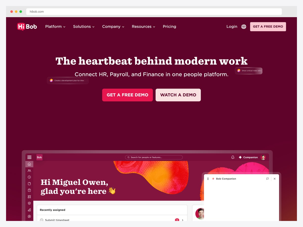
Why it is worth studying: Its home screen is built for the employee rather than the HR administrator — a distinction most HR dashboard designs miss entirely.
HiBob’s product imagery leads with what an individual employee sees when they log in: a personalised greeting, a short list of tasks assigned to them, and an assistant panel docked to the side. There is no headcount chart, no attrition trend, no departmental breakdown — because none of that is any use to the person whose only reason for opening the tool is to submit a timesheet or book leave.
That is the split most HR interfaces get wrong. An HR system has at least three audiences with almost no overlap: the employee doing a self-service task, the manager approving and reviewing, and the HR team analysing the workforce. Serving all three from one screen produces a dashboard nobody finds useful, and the usual result is an analytics view shown to people who cannot act on any of it.
The task list is the pattern worth taking. For the employee audience, an HR dashboard should be a to-do list with the org’s branding on it, not a report.
2. Rippling — Show the workflow, not the record
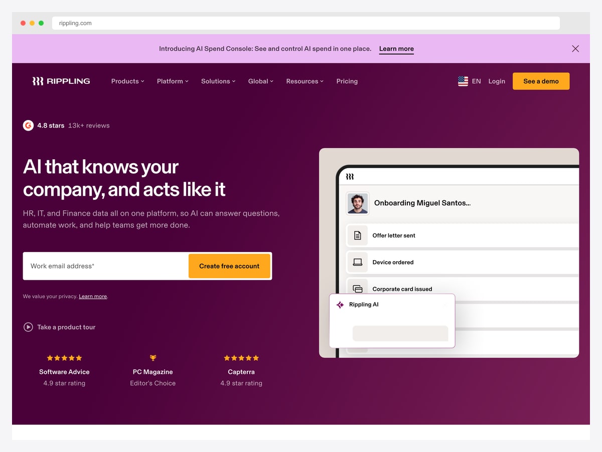
Why it is worth studying: It renders onboarding as a visible sequence of completed steps, which communicates the product’s value faster than any feature list could.
Rippling’s product panel shows a single new hire progressing through a chain of steps — offer letter sent, device ordered, corporate card issued — each as its own row with an icon and a status. The pitch is that HR, IT, and finance actions happen in one flow, and the interface demonstrates that by showing them stacked in one list rather than describing it in copy.
As an interface pattern this is worth borrowing well beyond HR. Any process that spans several systems benefits from being rendered as a visible sequence with per-step state, because it answers the two questions a coordinator always has: what has happened, and what is next. A record view answers neither.
Note also that each row carries its own icon type. When steps come from different domains — a document, a laptop, a payment card — iconography does the categorisation work without adding a column of labels.
3. Deel — Route by intent before showing anything
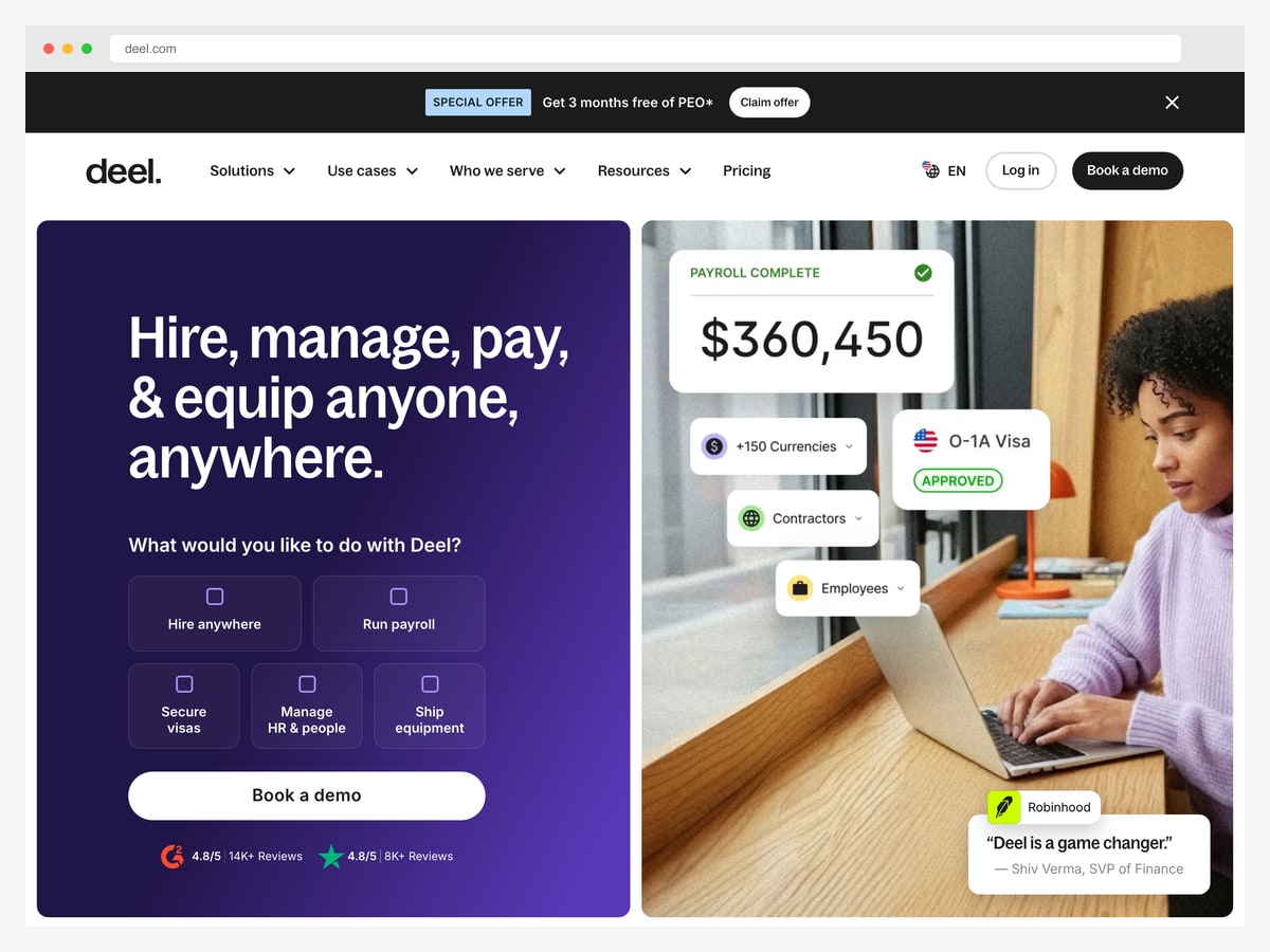
Why it is worth studying: It opens by asking which job you came to do, then routes accordingly — the right move when one product serves several barely-overlapping needs.
Rather than a single headline claim, Deel’s hero asks the visitor what they want to do and offers a small grid of options: hire internationally, run payroll, secure visas, manage people, ship equipment. Each is a genuinely different job with a different buyer, and forcing them all through one generic value proposition would serve none of them well.
The same logic applies inside an HR product. If your platform covers payroll, performance, and recruitment, an intent selector on the landing screen will outperform a dashboard that averages all three into a summary nobody asked for. It is the interface equivalent of asking rather than guessing.
Supporting cards then surface concrete proof points — a completed payroll run, an approved visa, contractor and employee toggles — which keeps the abstract capability list grounded in visible outcomes.
4. Lattice — Make the goal the object, not the person
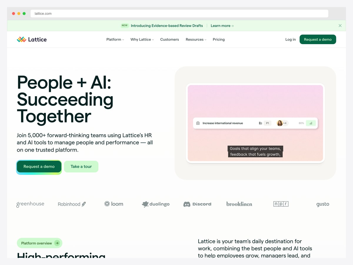
Why it is worth studying: Its central object is a goal with owners attached, rather than an employee with goals attached — a modelling choice that changes the whole interface.
The product card Lattice leads with is a single objective, carrying a priority tag, a stack of owner avatars, and a completion percentage. The goal is the record; people are an attribute of it. That inversion matters because objectives in most organisations are shared, and an interface built around individuals cannot represent shared ownership without duplicating the goal under each person.
Performance tooling lives or dies on this modelling decision. Goal-as-object supports cascading company objectives to teams and rolling progress back up; person-as-object produces a tidy profile page and an impossible rollup.
The customer logo wall directly beneath is placed conventionally but well — recognisable names immediately after the claim, which for HR software is doing more work than usual, because buyers in this category are unusually reference-driven.
5. Shadcn UI Kit — HR Dashboard — The analytics view, done with restraint
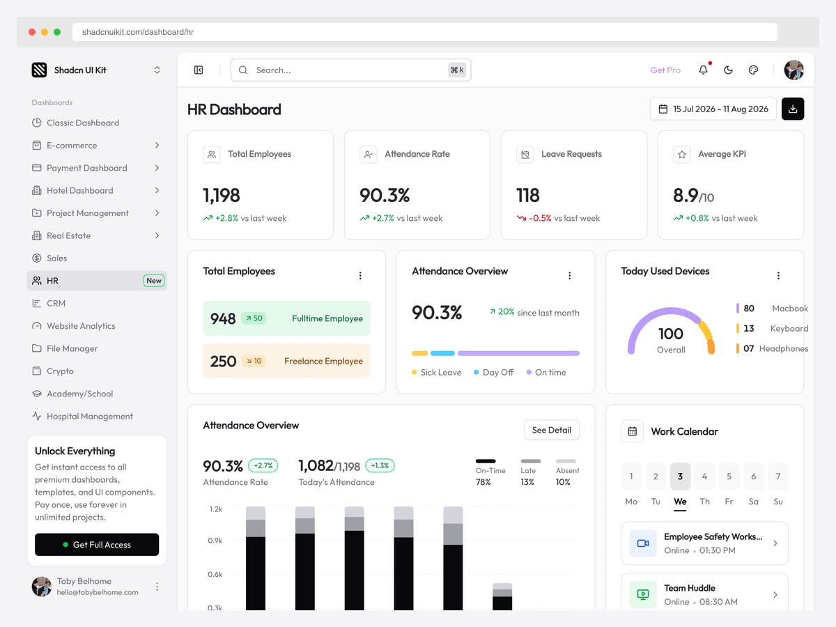
Why it is worth studying: A clean take on the HR-team view — headcount, attendance, leave, and an average KPI score — with the composition split that most HR templates fumble.
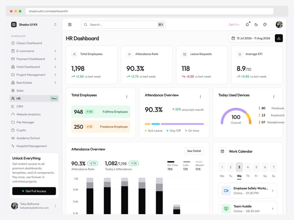
This is the screen the HR team actually wants, and it is organised sensibly: four headline figures across the top, each with a change against the previous week, then attendance broken into on-time, sick leave, and day-off segments, a fulltime-versus-freelance split, and a work calendar listing upcoming sessions.
The composition detail worth copying is the fulltime/freelance panel. Total headcount is a nearly useless number on its own — the actionable version is its composition, because a team growing entirely through contractors is a different situation from one growing through permanent hires, and the single total hides that completely.
Being free and openable makes it a practical reference rather than an inspiration screenshot. Treat the demo values as placeholders, though: several are obviously synthetic.
6. Admindek HR (DashboardPack) — Pair every metric with its trend
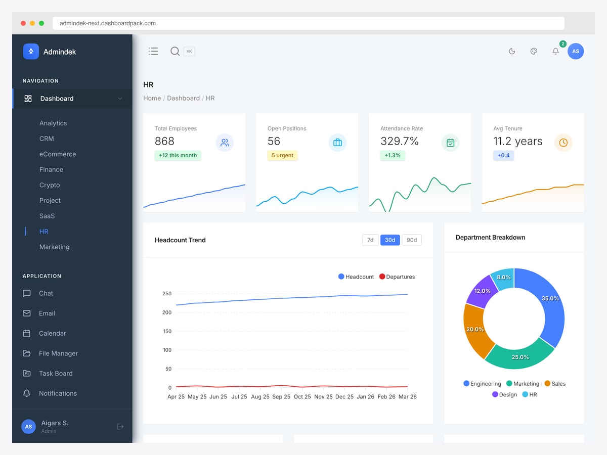
Why it is worth studying: Every headline figure carries an inline sparkline, and the main chart plots headcount against departures — the comparison that makes growth legible.
The KPI row here covers employees, open positions, attendance, and average tenure, and each one sits above its own sparkline rather than a bare delta badge. For workforce metrics that is the right call: headcount moves slowly, and a single percentage change month over month tells you far less than the shape of the last year.
The strongest panel plots headcount and departures on the same axes. Net growth is the difference between two flows, and showing only the net line hides whether a flat month meant nothing happened or that heavy hiring exactly offset heavy attrition. Those are opposite situations requiring opposite responses.
Average tenure is a good inclusion too — it is the metric most HR dashboards omit and one of the few leading indicators of retention problems. The department breakdown donut rounds it out, though as always a donut is fine for four or five segments and unreadable past that.
The patterns behind good HR dashboard design
Pick the audience first
This is the decision everything else follows from. An employee needs a task list; a manager needs their team’s approvals and reviews; the HR team needs workforce analytics. Trying to serve all three on one screen produces a page that shows attrition charts to someone who only wanted to book a holiday. Build separate landing views per role and let permissions decide which one loads.
Composition beats totals
Headcount, on its own, is close to meaningless. Its composition — permanent against contract, by department, by tenure band — is where the decisions live. The same applies to attendance: a single rate hides whether absence is spread evenly or concentrated in one team, which is the only version of the number anyone can act on.
Show flows, not just levels
Workforce numbers are the net result of two flows. Plotting headcount alongside departures, as Admindek does, distinguishes a stable month from one where heavy hiring masked heavy attrition. Any metric that is really a balance — headcount, open positions, leave balances — should show its inflow and outflow rather than only the level.
Match the cadence to the data
HR data moves slowly. Tenure shifts over years, headcount over months, engagement over quarters. Applying a real-time analytics vocabulary — daily deltas, live counters, hourly refresh — to numbers that move quarterly manufactures noise and trains people to ignore the dashboard. Default the period to something meaningful for the metric, and prefer trend shape over a change badge.
Treat access control as a design problem
Salary, performance ratings, and medical leave are not fields you hide with CSS. Role-based sectioning has to be structural, decided at the layout level, so a manager’s view never assembles data they are not entitled to see. This is also why the employee, manager, and HR views should be genuinely separate screens rather than one screen with conditional widgets — the latter is where leaks happen.
How to apply these patterns to your own build
Starting from an HR-specific template saves the domain-shaped work: employee directories, org structures, leave calendars, and headcount trend charts are all tedious to build from a generic admin theme. Two of the examples above are directly openable — the Shadcn UI Kit HR dashboard is the free one worth inspecting first, and Admindek’s HR view covers the trend and retention side.
For the full set of buildable options across HTML, React, Next.js, and Vue, see our HR dashboard templates roundup. Whichever you start from, replace the demo data early — HR templates ship with placeholder values that are frequently nonsensical, and a layout that looks balanced against invented numbers often falls apart against a real org chart with one 400-person department and six teams of three.
HR dashboard design FAQ
What should an HR dashboard show?
It depends entirely on who is looking. For an employee, a task list — outstanding approvals, timesheets, leave balances — and little else. For a manager, their team’s pending approvals, reviews, and absences. For the HR team, workforce analytics: headcount composition, open positions, attendance broken down by team, average tenure, and headcount plotted against departures. One screen cannot serve all three well.
What is a people analytics dashboard?
It is the HR-team view specifically: workforce data aggregated for analysis rather than for completing a task. Typical contents are headcount and its composition, attrition and retention rates, average tenure, time-to-hire, and engagement or performance distributions. The distinguishing feature is that every number exists to support a decision about the workforce as a whole rather than about one person.
Which HR metrics actually belong on the main screen?
Headcount with its composition rather than the bare total, open positions against a target, attendance or absence broken down by team, average tenure as a retention leading indicator, and hires against departures on the same chart. Resist adding metrics that only move quarterly to a screen people check weekly — put those in a periodic report instead.
How do you handle sensitive data in an HR dashboard?
Structurally, not cosmetically. Salary, performance ratings, and medical leave should be gated at the layout and query level so a view never assembles data the viewer is not entitled to, rather than hidden in the front end. This is a strong argument for genuinely separate employee, manager, and HR screens instead of one screen with conditional widgets, since the conditional version is where leaks happen.
Should employees and HR staff see the same dashboard?
No. Their jobs share almost nothing. An employee opens the system to complete a task and should land on a task list; the HR team opens it to understand the workforce and needs analytics. HiBob’s employee home is a good model for the first, and the template examples above for the second. Route by role on login.
Where can I find HR dashboard templates to build on?
Our HR dashboard templates roundup covers the buildable options across several stacks. The Shadcn UI Kit HR dashboard is free and the quickest to open and inspect, and Admindek’s HR view is the stronger reference for workforce trend and retention screens. Both can be opened as live demos before you commit to anything.

You Might Also Like