15 Marketing Dashboard Examples From 14 Different Tools
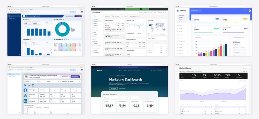
Every marketing dashboard roundup on the first page of Google shows one company’s product ten times over. The screenshots are all the same tool, the “examples” are all that tool’s own templates, and the recommendation at the bottom is always the same company that wrote the page.
This one is not that. The 15 examples below come from 14 different makers across four categories — hosted reporting platforms, copyable reports, live analytics tools you can open without an account, and a template you host yourself. Each was opened and screenshotted while writing, and each entry says plainly what it costs to run.
What a marketing dashboard is actually for
Before the examples, the distinction that decides which of them fits. A marketing dashboard answers one of three questions, and the ones that fail usually try to answer all three at once.
| Audience | The question | What belongs on it |
|---|---|---|
| Executive | Is marketing working | Spend, pipeline or revenue, cost per acquisition, trend against target. Under ten numbers |
| Channel owner | Which of my campaigns is working | Campaign tables, creative or keyword breakdowns, week-on-week movement |
| Client | What did I get for my money | Agreed metrics only, last period beside this one, and written commentary |
15 marketing dashboard examples
| Example | What it is | Cost to run | Best for |
|---|---|---|---|
| 1. Databox marketing dashboards | Hosted platform | Free tier, then paid | Browsing layout ideas |
| 2. AgencyAnalytics marketing dashboard | Hosted platform | Per client, no free tier | Agencies sending the same monthly report across a stable client list |
| 3. Klipfolio marketing dashboards | Hosted platform | No free tier | Learning which metrics belong on a marketing dashboard and why |
| 4. Geckoboard marketing dashboards | Hosted platform | No free tier | Team screens and standing displays where legibility beats detail |
| 5. DashThis dashboard examples | Hosted platform | Per dashboard | Small agencies with few clients but many channels each |
| 6. Coupler.io marketing dashboards | Template gallery | Copy free, refresh paid | Teams committed to Power BI or Tableau who still want a prebuilt marketing layout |
| 7. All-in-one marketing dashboard | Copyable report | Copy free, refresh paid | Seeing how a genuine multi-channel summary is laid out before building one |
| 8. Google Ads vs Facebook Ads dashboard | Copyable report | Copy free, refresh paid | Budget conversations that come down to a split between two platforms |
| 9. Facebook, Google and LinkedIn ads dashboard | Copyable report | Copy free, refresh paid | B2B teams running paid social alongside search |
| 10. Matomo live demo | Live analytics tool | Free, open source | Seeing the underlying reports a marketing dashboard condenses |
| 11. Umami public dashboard | Live analytics tool | Free, open source | A minimal reference for what a one-screen dashboard can carry |
| 12. Fathom Analytics demo | Live analytics tool | Paid, public demo | Campaign-level reporting without a full analytics stack |
| 13. Marketing Dashboard template | HTML template | Paid template, open demo | Developers building marketing reporting into an application they ship |
| 14. Cal.com open metrics dashboard | Open-source BI, embedded | Free self-hosted | Marketing data that already sits in your own database or warehouse |
| 15. Grafana Play | Open-source dashboards | Free self-hosted | Design reference |
Reporting platforms — the dashboards agencies actually send
These are hosted products: they own the connectors, host the dashboard and handle client access, and you pay to be relieved of the maintenance. Their example galleries are also the best free design reference in this space, so they are worth browsing even if you never subscribe. The pricing models differ more than the features do — per client, per dashboard, or a flat platform fee — and that difference usually decides the choice.
1. Databox marketing dashboards by Databox
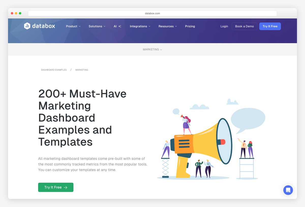
The largest prebuilt marketing library of any reporting platform, and the most useful place to browse layouts even if you never subscribe. Dashboards are grouped by channel and by source, so you can see how a paid search view differs from a content one without building either.
- Best for: Browsing layout ideas, and hosted reporting with a genuinely free entry tier
- What it is: Hosted platform
- Cost to run: Hosted, paid
- Watch out for: Using a template needs a signup, and the free tier stops at three data sources and one dashboard.
2. AgencyAnalytics marketing dashboard by AgencyAnalytics
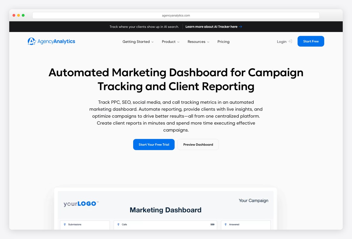
Built around the agency roster rather than the channel, which shows in the layout: everything assumes one client per dashboard, white-labelled, with rank tracking already inside rather than bolted on. It is the closest thing here to a report you could send without editing.
- Best for: Agencies sending the same monthly report across a stable client list
- What it is: Hosted platform
- Cost to run: Hosted, paid
- Watch out for: Priced per client, so the bill scales linearly with the roster and has risen sharply in recent years.
3. Klipfolio marketing dashboards by Klipfolio
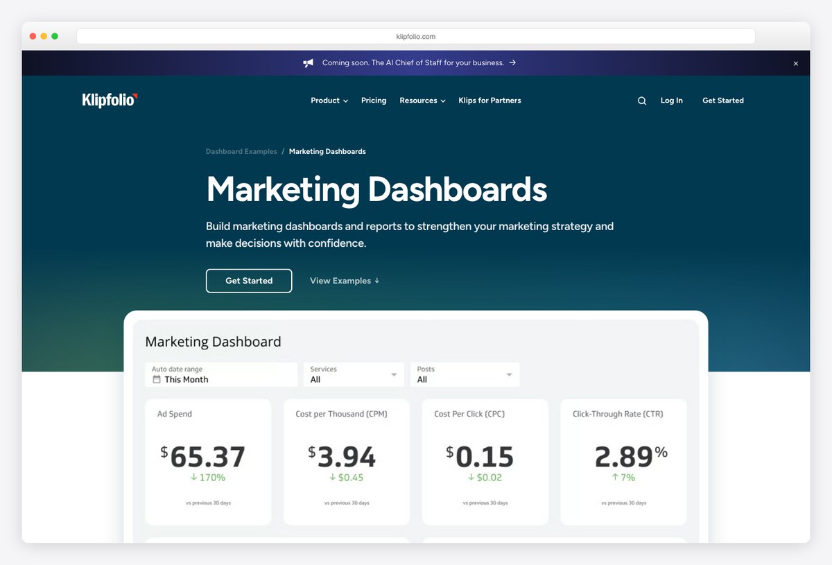
The most metric-literate examples in this list. Klipfolio’s pages explain what each panel is for and how the number is calculated, which makes them worth reading as a design reference even though the product itself sits at the expensive end.
- Best for: Learning which metrics belong on a marketing dashboard and why
- What it is: Hosted platform
- Cost to run: Hosted, paid
- Watch out for: No free tier, and entry pricing is well above the per-client and per-source alternatives.
4. Geckoboard marketing dashboards by Geckoboard
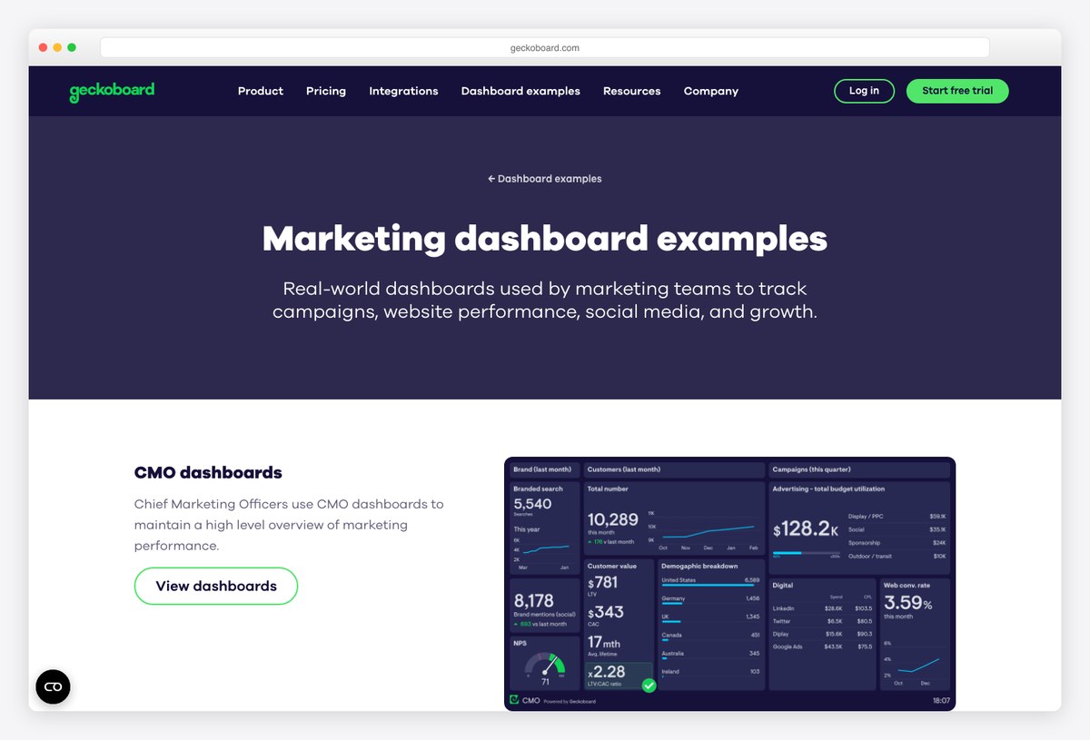
Designed for a screen on the office wall rather than a PDF in an inbox, and that constraint produces the clearest layouts here — very large numbers, very few of them, no tables. Worth studying if your dashboard is read at a glance rather than studied.
- Best for: Team screens and standing displays where legibility beats detail
- What it is: Hosted platform
- Cost to run: Hosted, paid
- Watch out for: Built for internal visibility rather than client reporting, so there is no white-label story.
5. DashThis dashboard examples by DashThis
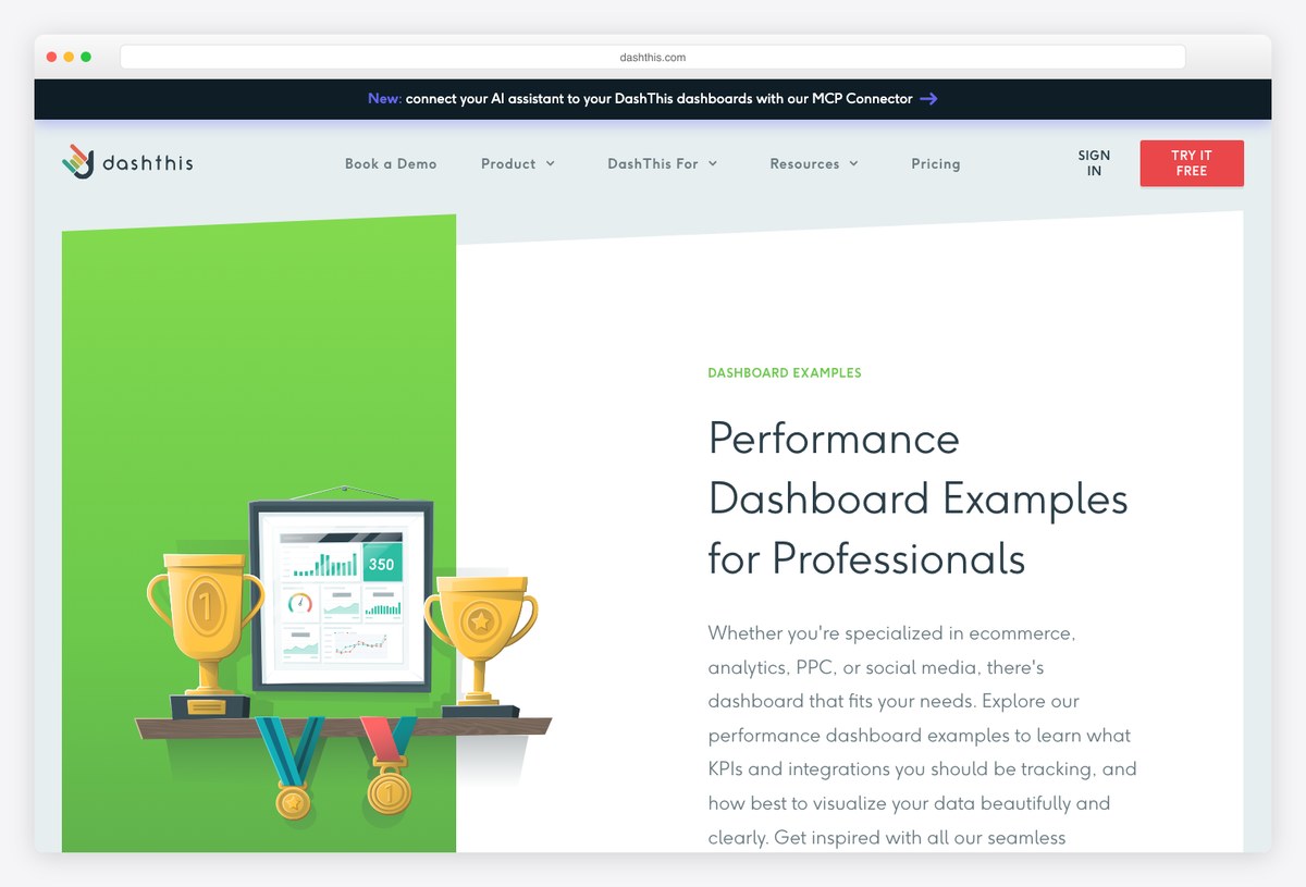
Priced by the number of dashboards rather than clients or data sources, which is the friendliest model here for a small agency with a few big accounts. The examples are organised by role and by channel, so it is easy to find the nearest thing to what you need.
- Best for: Small agencies with few clients but many channels each
- What it is: Hosted platform
- Cost to run: Hosted, paid
- Watch out for: The per-dashboard model turns expensive the other way round: many small clients means many dashboards.
6. Coupler.io marketing dashboards by Coupler.io
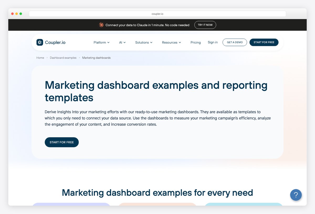
The only gallery here that ships the same dashboard for several destinations — Looker-style reports, Google Sheets, Power BI and Tableau — so it is the best place to look if your organisation has already standardised on a BI tool you would rather not leave.
- Best for: Teams committed to Power BI or Tableau who still want a prebuilt marketing layout
- What it is: Template gallery
- Cost to run: Hosted, paid
- Watch out for: The templates are free to copy and then need a Coupler subscription to populate; the free tier is capped at a hundred rows per run.
Multi-channel reports you can open right now
Three published reports that demonstrate cross-channel design rather than describing it. All three are public: open the link and the whole layout is there to study, then copy it if you want it. The catch is the same in each case — joining paid social to paid search needs a connector Google does not provide free, which is covered in our list of free Data Studio templates and what they really cost.
7. All-in-one marketing dashboard by Coupler.io
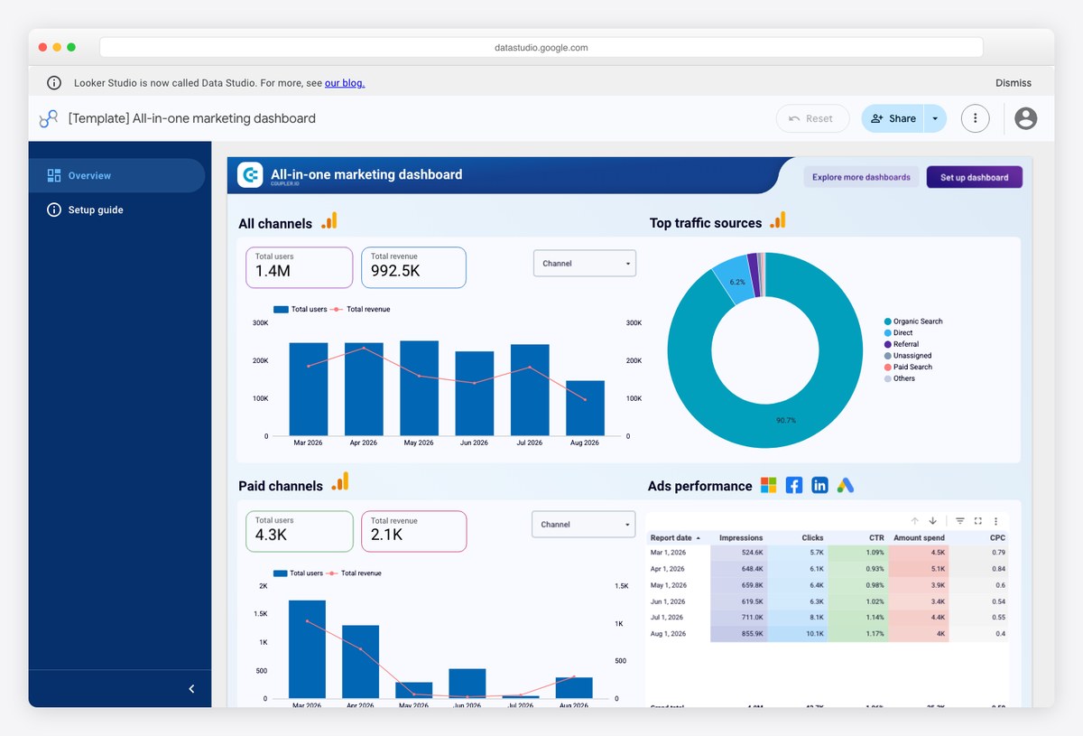
The clearest worked example of the cross-channel summary most people mean by “marketing dashboard”: paid, organic, social and email on one page, with spend and return reconciled rather than reported separately. Open it and you can see the whole design decision at once.
- Best for: Seeing how a genuine multi-channel summary is laid out before building one
- What it is: Copyable report
- Cost to run: Copy free, refresh paid
- Watch out for: Blending this many sources is exactly what free connector tiers exclude, so running it costs money even though copying it does not.
8. Google Ads vs Facebook Ads dashboard by Windsor.ai
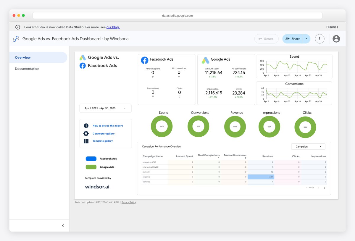
A single question answered well: which of the two big ad platforms is returning more for the money. Putting the pair side by side on identical axes is a more useful design than the usual approach of giving each channel its own page.
- Best for: Budget conversations that come down to a split between two platforms
- What it is: Copyable report
- Cost to run: Copy free, refresh paid
- Watch out for: Facebook has no free connector, so the comparison cannot be rebuilt on Google connectors alone.
9. Facebook, Google and LinkedIn ads dashboard by Two Minute Reports
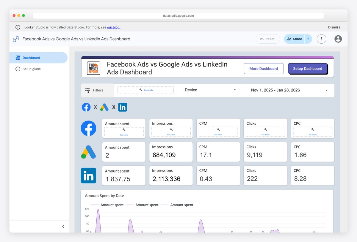
The same comparison extended to three platforms, which is where the layout problem gets interesting — three sets of very different cost metrics on one page without the reader losing track of which is which. It solves that with repetition rather than cleverness, and it works.
- Best for: B2B teams running paid social alongside search
- What it is: Copyable report
- Cost to run: Copy free, refresh paid
- Watch out for: Two Minute Reports has no free tier at all, so this one carries a cost from the first day.
Live dashboards you can use without an account
Not reporting layers but the analytics tools underneath them, each publishing a real dashboard with real numbers and no signup wall. They are the honest answer for a small site: if your marketing is one or two channels, this may be the whole dashboard you need.
10. Matomo live demo by Matomo
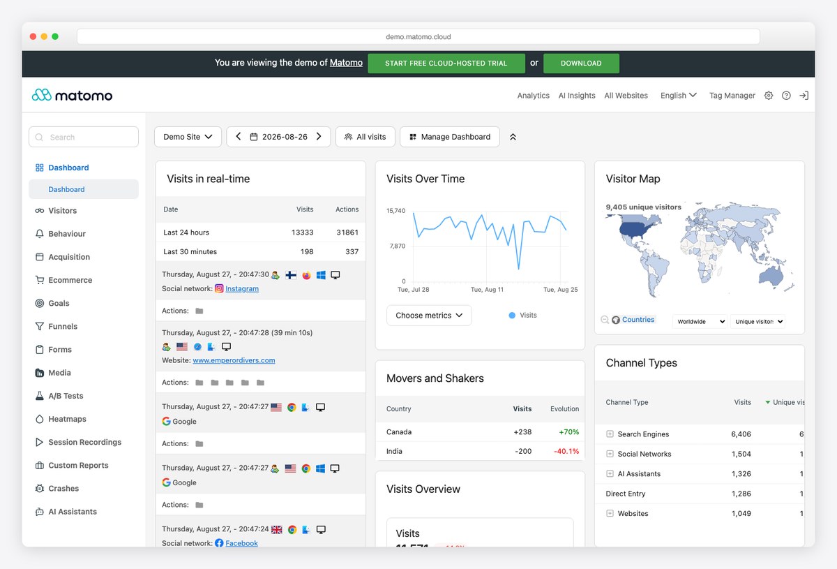
A complete analytics suite you can click through right now with no account, including the acquisition and campaign reports that most marketing dashboards are trying to summarise. Useful as an example precisely because it is the raw material rather than a summary of it.
- Best for: Seeing the underlying reports a marketing dashboard condenses
- What it is: Live analytics tool
- Cost to run: Free
- Watch out for: It is an analytics tool rather than a reporting layer, so cross-channel spend data has to come from somewhere else.
11. Umami public dashboard by Umami
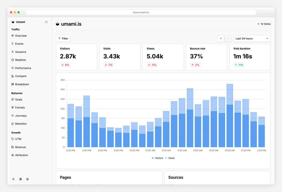
The whole dashboard on one screen with no navigation at all, showing real traffic for the company’s own site. Whether you use the tool or not, it is a good argument for the idea that a marketing dashboard should fit on a single page.
- Best for: A minimal reference for what a one-screen dashboard can carry
- What it is: Live analytics tool
- Cost to run: Free
- Watch out for: Deliberately shallow: no funnels, no attribution, no campaign cost.
12. Fathom Analytics demo by Fathom
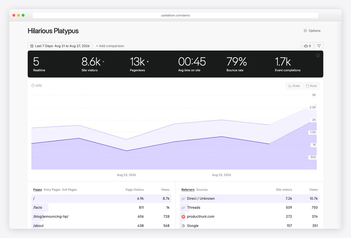
Similar minimalism to Umami, with UTM campaign and event reporting given more prominence — which makes it the better of the two as a model for a dashboard that has to answer where the traffic came from rather than just how much there was.
- Best for: Campaign-level reporting without a full analytics stack
- What it is: Live analytics tool
- Cost to run: Free
- Watch out for: The product is paid; only the demo is open.
Building the dashboard into something you own
When the dashboard has to live inside your own product, a client portal or an internal tool, you need a front end and a data layer rather than a subscription.
13. Marketing Dashboard template by DashboardPack
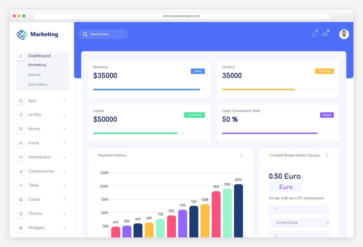
A front end rather than a report: campaign, traffic and conversion screens already built, ready to wire to whatever API your data lives behind. This is the route when the dashboard has to sit inside your own product or client portal instead of in somebody else’s tool.
- Best for: Developers building marketing reporting into an application they ship
- What it is: HTML template
- Cost to run: Template, self-hosted
- Watch out for: It ships with placeholder data and no backend, so the demo is static until you build the data layer.
14. Cal.com open metrics dashboard by Metabase
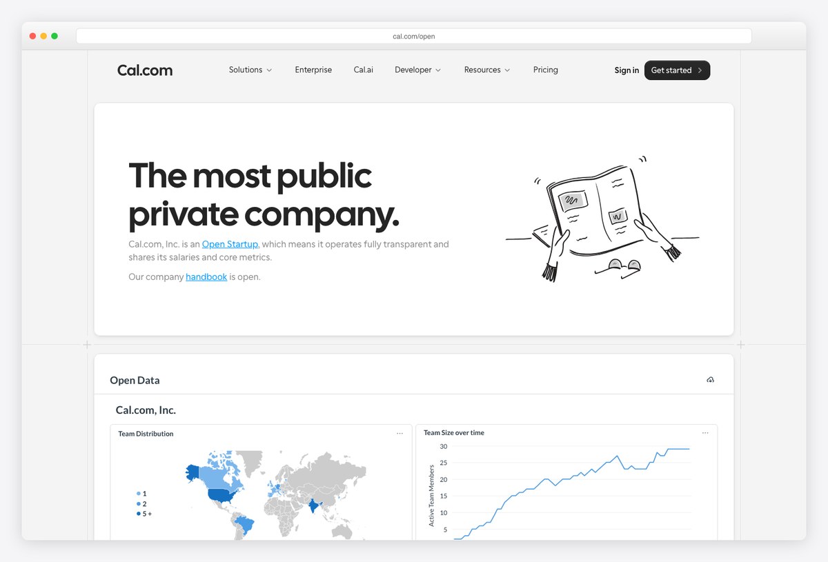
A live Metabase dashboard embedded directly into a public web page, which is how Cal.com publishes its own company numbers. It earns its place as the clearest demonstration of the self-hosted route: real charts, their own database, and no reporting subscription anywhere behind it.
- Best for: Marketing data that already sits in your own database or warehouse
- What it is: Open-source BI, embedded
- Cost to run: Free
- Watch out for: The metrics on display are company-wide rather than marketing, and Metabase connects to no ad platform on its own — getting the data in is your job.
15. Grafana Play by Grafana
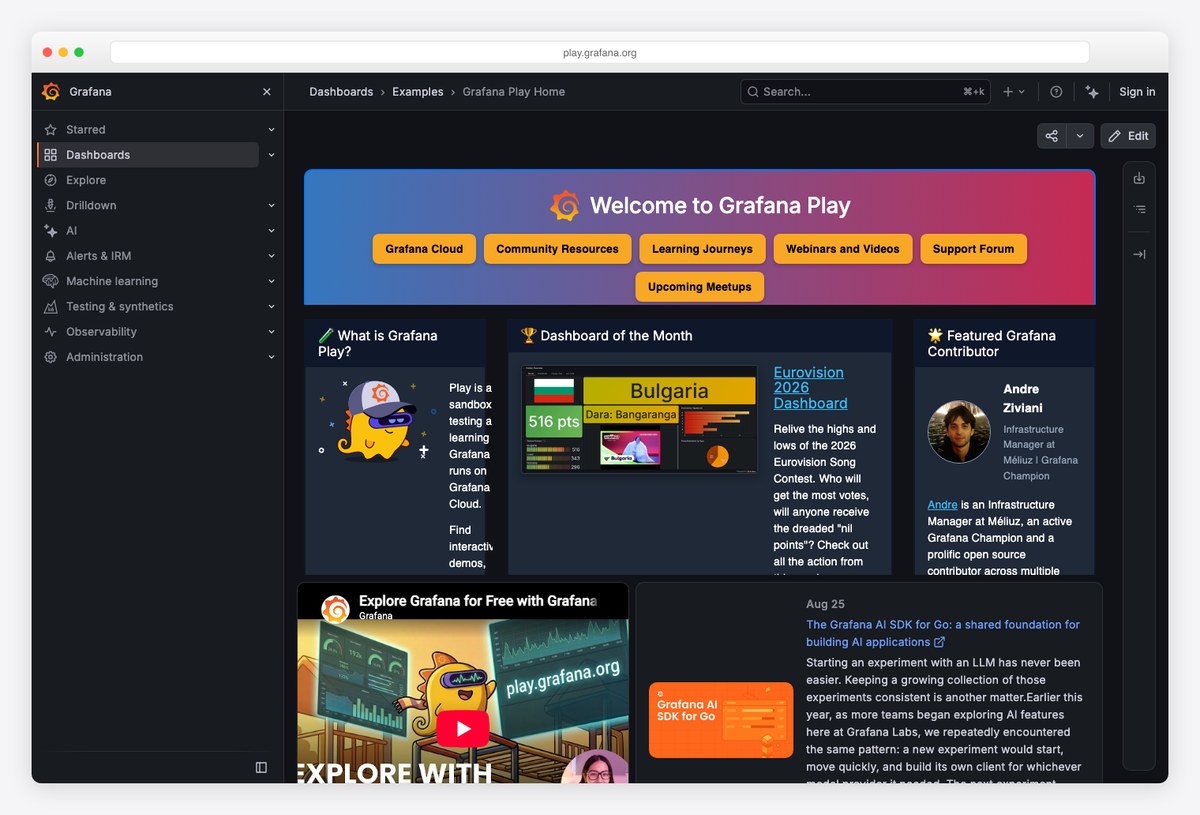
A live public Grafana instance with dozens of browsable dashboards. It is built for infrastructure rather than marketing, and it is here because the panel design is a decade ahead of most marketing tools — worth borrowing from even if you never use it for this.
- Best for: Design reference, and marketing teams already running Grafana for other reasons
- What it is: Open-source dashboards
- Cost to run: Free
- Watch out for: Marketing use is a genuine hack: connecting ad platforms needs a plugin or an ETL step, and nothing about it is supported out of the box.
Designing one that survives past the first month
The examples above differ in tooling and barely at all in structure, because the structure is the part that is solved. Four rules cover most of it.
- One reader, one dashboard. The executive summary and the channel manager’s working view are different documents. Merging them produces something neither will open twice.
- Put the answer at the top. The first row should say whether things are better or worse than last period. Everything below it exists to explain that row.
- Every panel needs a decision attached. If nobody can name an action a chart would change, it is decoration, and decoration is what makes dashboards feel like homework.
- Comparison beats absolutes. A number on its own is unreadable. The same number against last month, against target, or against the other channel is a finding.
The commonest failure is subtler than any of these: a dashboard that reports what is easy to connect rather than what the business is judged on. Ad platforms hand over impressions and clicks readily and revenue reluctantly, so dashboards drift towards the metrics that arrive without effort. If the top row of yours is not the row your manager asks about, the tooling has quietly chosen your priorities for you.
Marketing dashboard FAQ
What should a marketing dashboard include?
At the top, the two or three numbers the business is actually judged on — usually spend, an outcome such as leads or revenue, and cost per acquisition, each shown against the previous period or a target. Below that, a channel breakdown so the headline can be explained, and below that the campaign-level detail. If a panel does not help explain the row above it, it belongs somewhere else.
What is the difference between a marketing dashboard and a marketing report?
A dashboard updates itself and is read whenever someone wants to know how things are going. A report is a snapshot with an argument attached, produced on a cadence and usually accompanied by written commentary. Most agencies need both, and the useful trick is to build the dashboard first and let the report quote from it rather than rebuilding the numbers by hand each month.
Can I build a marketing dashboard for free?
Yes, if your data is in Google’s own products. Google Analytics, Google Ads, Search Console, Sheets and YouTube all have free connectors that never expire, so a dashboard built only on those costs nothing to run permanently. The moment you add Facebook, LinkedIn, TikTok or an email platform you need a paid connector, because Google publishes none for them.
How many metrics should a marketing dashboard have?
Fewer than you want. A useful discipline is that the first screen should hold no more than about seven numbers, because that is roughly what someone can take in before deciding whether to read further. Detail is not the enemy, but it belongs on the second screen rather than competing with the summary on the first.
How often should a marketing dashboard update?
Daily is enough for almost every marketing team, and for client reporting even weekly is usually plenty. Real-time refresh is a feature that gets sold hard and changes very few decisions, because marketing decisions are rarely made on an hour’s data. What matters far more is that the update happens without anyone remembering to trigger it.
What is the best free marketing dashboard tool?
For Google-only data, a copyable report on Google’s free connectors, which costs nothing indefinitely. For a small site measuring its own traffic, a self-hosted analytics tool such as Matomo or Umami is free and often sufficient on its own. For anything blending paid social with paid search there is no genuinely free option, and the honest answer is to choose the cheapest connector rather than to look for a free one.
Should each client get their own dashboard?
Almost always, and the pricing model you choose should follow from that answer rather than the other way round. If every client needs a separate branded view, per-client pricing is predictable and per-dashboard pricing gets expensive quickly. If a few large accounts each need many views, the reverse is true.
Why do marketing dashboards get abandoned?
Usually because they were built for the wrong reader, or because they report what was easy to connect rather than what anybody is judged on. A dashboard nobody opens is nearly always one that cannot answer the question its reader actually has, and adding more panels makes that worse rather than better.
Choosing between them
If you are an agency reporting to clients, the decision is a pricing model rather than a feature list: per client, per dashboard or per data source, priced at the roster you actually have rather than the one on the pricing page. If you are reporting internally on Google data alone, do not buy anything — copy one of the free reports and spend the time on the layout instead. If the numbers already sit in your own database, open-source business intelligence will go further than any marketing tool.
And if the dashboard has to be part of a product you ship, none of the hosted options apply and you want a front end you control. We keep separate lists of analytics dashboard templates for that, and of SEO dashboard templates for the organic-search half of the reporting.

You Might Also Like