12 Reporting Dashboard Templates
“Reporting dashboard template” means three completely different things, and the reason most searches for it end badly is that the results mix all three together. One person wants a document to fill in and send. Another wants a live dashboard that updates itself. A third wants a front end to build reporting into their own software. The same phrase, three unrelated answers.
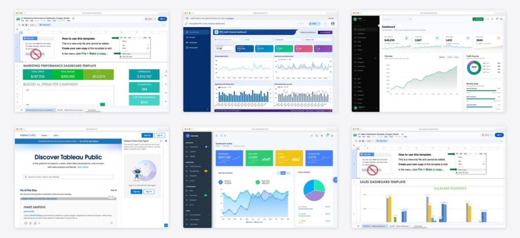
So this list is organised by where the report has to live rather than by vendor. 4 spreadsheet templates you can copy and use in a minute, 3 live connected dashboards, and 5 front-end templates for building reporting into a product. Every link was opened and screenshotted while writing, and each entry says what has to happen before it shows real numbers.
Which of the three do you actually need
| If you need to… | You want | Effort to first report | Effort to keep it running |
|---|---|---|---|
| Send a report to somebody once a month | A spreadsheet template | Minutes | An hour, every month, forever |
| Stop assembling the same report by hand | A live connected dashboard | An afternoon, plus connector costs | Almost none, once it works |
| Show reporting to your own customers | A front-end template | Development work | Yours to maintain, like any code |
The honest summary of that table: a spreadsheet is cheap to start and expensive forever, a connected dashboard is the reverse, and a code template is not really a template at all but the beginning of a build. Pick the row that matches the commitment you are actually willing to make.
12 reporting dashboard templates
| Template | Lives in | Data comes from | Best for |
|---|---|---|---|
| 1. KPI dashboard template for Google Sheets | Google Sheets | Typed in or pasted | A monthly report somebody assembles by hand and sends |
| 2. Project dashboard template for Google Sheets | Google Sheets | Typed in or pasted | Delivery and status reporting to a client or steering group |
| 3. Marketing performance dashboard for Google Sheets | Google Sheets | Typed in or pasted | Marketing reporting on a zero budget |
| 4. Sales dashboard template for Google Sheets | Google Sheets | Typed in or pasted | Small sales teams whose CRM reporting is harder to use than a spreadsheet |
| 5. Power BI sample reports | Power BI | Sample data included | Organisations already on Microsoft 365 with Power BI included |
| 6. Tableau Public gallery | Tableau | Author’s own | Learning dashboard design from finished work rather than templates |
| 7. PPC multi-channel reporting dashboard | Data Studio | Connected, paid pipe | Seeing what a fully connected multi-channel report looks like before buying one |
| 8. Apex Dashboard | HTML template | Your own API | Developers building reporting screens into an application or client portal |
| 9. Admindek | HTML template | Your own API | Report screens that are mostly tables rather than charts |
| 10. Tabler | HTML template | Your own API | Internal reporting tools where nothing needs to look bespoke |
| 11. CoreUI free admin template | HTML template | Your own API | Teams that need the same reporting UI across more than one framework |
| 12. AdminLTE 4 | HTML template | Your own API | Reporting UI where longevity and community answers matter more than novelty |
Spreadsheet reports you fill in and send
The unglamorous answer, and the right one more often than the industry admits. These four open directly in Google Sheets — no signup, no connector, no trial. Copy one, replace the numbers, send it. They are also the escape hatch for data that has no free connector, because a Sheet can feed a live dashboard later without you rebuilding the report.
1. KPI dashboard template for Google Sheets by Smartsheet
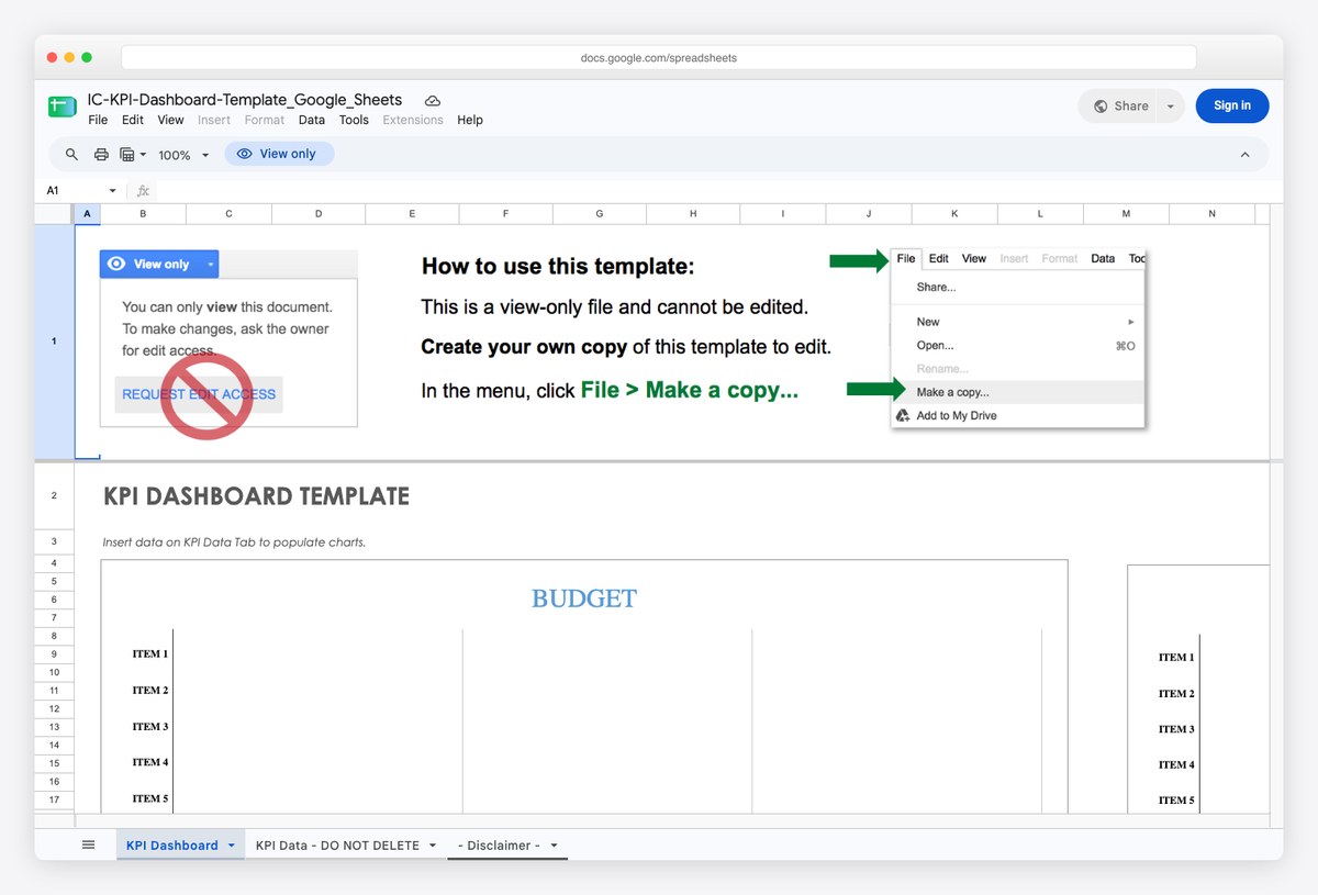
The plainest useful thing in this list: metric rows, a target column, and the variance between them. It is the format most people actually mean when they ask for a reporting template, and it works without connecting anything to anything.
- Best for: A monthly report somebody assembles by hand and sends
- Lives in: Google Sheets
- Data comes from: Typed in or pasted
- Watch out for: Nothing updates on its own. That is the trade — no setup, no maintenance, but somebody types the numbers every month.
2. Project dashboard template for Google Sheets by Smartsheet
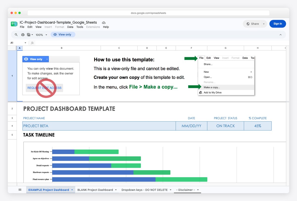
Task status, milestones and completion rolled into a summary view. Reporting on delivery rather than performance, which is the half of “reporting dashboard” that the marketing tools ignore entirely.
- Best for: Delivery and status reporting to a client or steering group
- Lives in: Google Sheets
- Data comes from: Typed in or pasted
- Watch out for: Built around a task list you maintain in the same file, so it does not read from a project tool.
3. Marketing performance dashboard for Google Sheets by Smartsheet
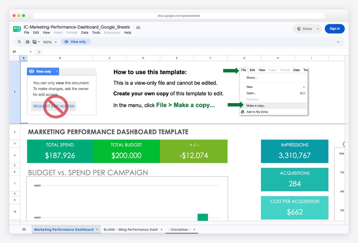
Channel performance laid out as a spreadsheet rather than a connected dashboard. Worth knowing because a Sheet is also the cheapest way to get data with no free connector into a live report — you export to the Sheet, and the Sheet feeds the dashboard.
- Best for: Marketing reporting on a zero budget, or as a data source for a live report
- Lives in: Google Sheets
- Data comes from: Typed in or pasted
- Watch out for: Manual unless you automate the export, which is the point where most people start paying for a connector instead.
4. Sales dashboard template for Google Sheets by Smartsheet
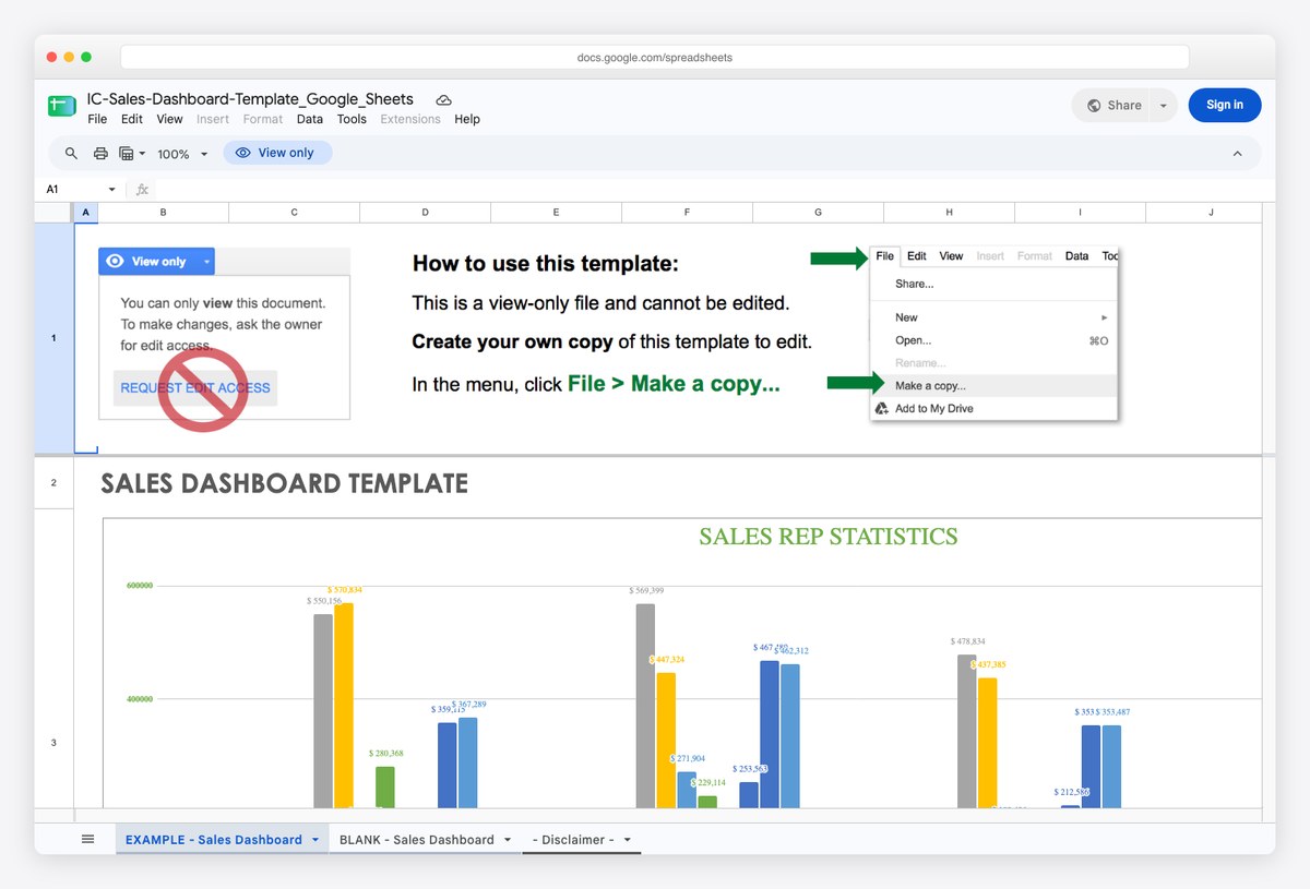
Pipeline and quota tracking in the format sales managers already think in. Most CRMs report this natively and worse, which is why the spreadsheet version has outlived every prediction of its death.
- Best for: Small sales teams whose CRM reporting is harder to use than a spreadsheet
- Lives in: Google Sheets
- Data comes from: Typed in or pasted
- Watch out for: Duplicating CRM data into a Sheet means two versions of the truth; keep the Sheet a view, not a record.
Live dashboards that update themselves
The point of this category is that nobody assembles anything each month. You connect the data once and the report maintains itself, which is worth real money if you are currently spending a day a month on it. The catch is that connecting the data is where the cost sits, and it varies enormously depending on what you need to read. For the open-source route on data you already hold in a database, see the Metabase example in our marketing dashboard examples.
5. Power BI sample reports by Microsoft
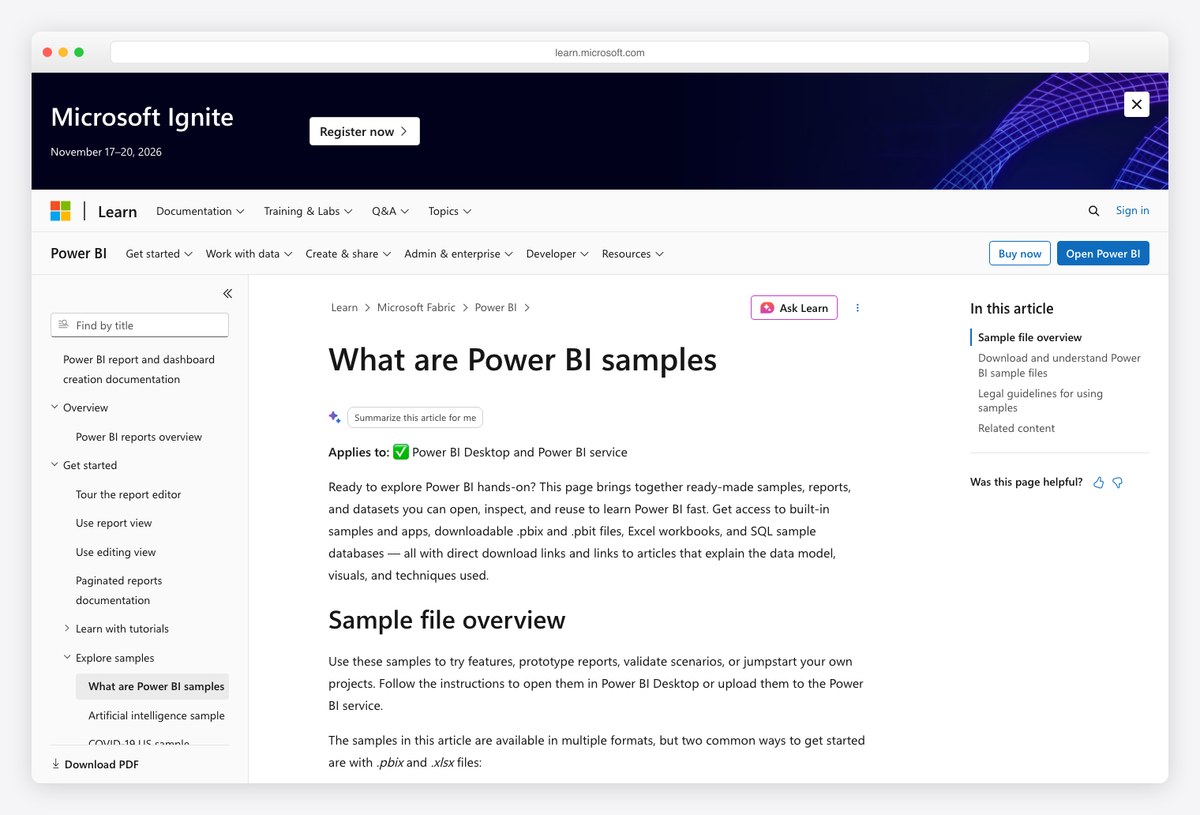
Microsoft publishes complete sample reports with the data behind them, free, covering sales, retail, procurement, HR and IT spend. If your organisation already pays for Power BI, this is the fastest route to a working report and it costs nothing extra.
- Best for: Organisations already on Microsoft 365 with Power BI included
- Lives in: Power BI
- Data comes from: Sample data included
- Watch out for: The samples are the easy part; the licensing and workspace setup around Power BI is where the effort actually goes.
6. Tableau Public gallery by Tableau
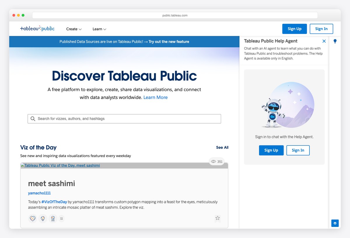
Thousands of finished, interactive dashboards published openly, most of which you can download and pull apart to see how they were built. As a design reference it is the deepest resource in this entire list, and none of it costs anything to browse.
- Best for: Learning dashboard design from finished work rather than templates
- Lives in: Tableau
- Data comes from: Author’s own
- Watch out for: Anything you publish to Tableau Public is public by definition, so it is not a route for client data.
7. PPC multi-channel reporting dashboard by Coupler.io
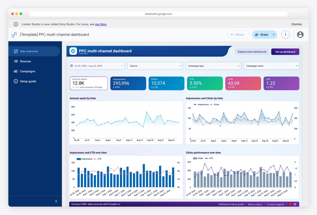
A worked example of the connected end of the spectrum: one report reading several ad platforms at once, updating without anyone touching it. Open it to see what the automated version of the spreadsheets above actually looks like.
- Best for: Seeing what a fully connected multi-channel report looks like before buying one
- Lives in: Data Studio
- Data comes from: Connected, paid pipe
- Watch out for: Free to copy, then a paid connector to populate. Which sources are genuinely free is covered in our list of free Data Studio templates.
Front-end templates for reporting inside your own product
A different kind of project. Nothing here is a report — they are interfaces, and you supply the data layer. This is what you need when your customers log in and see reporting, because none of the hosted tools above will let you ship their dashboard as part of your software.
8. Apex Dashboard by DashboardPack
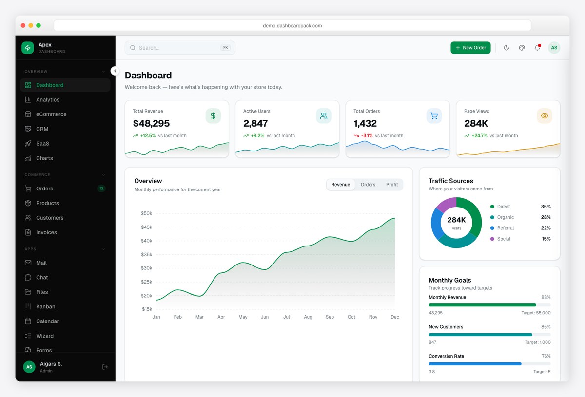
A front end for reporting rather than a report: charts, tables, filters and export controls already built and styled, waiting to be wired to your data. This is the category when the reporting has to live inside a product you ship.
- Best for: Developers building reporting screens into an application or client portal
- Lives in: HTML template
- Data comes from: Your own API
- Watch out for: Ships with placeholder data and no backend, so everything is static until you build the data layer.
9. Admindek by DashboardPack
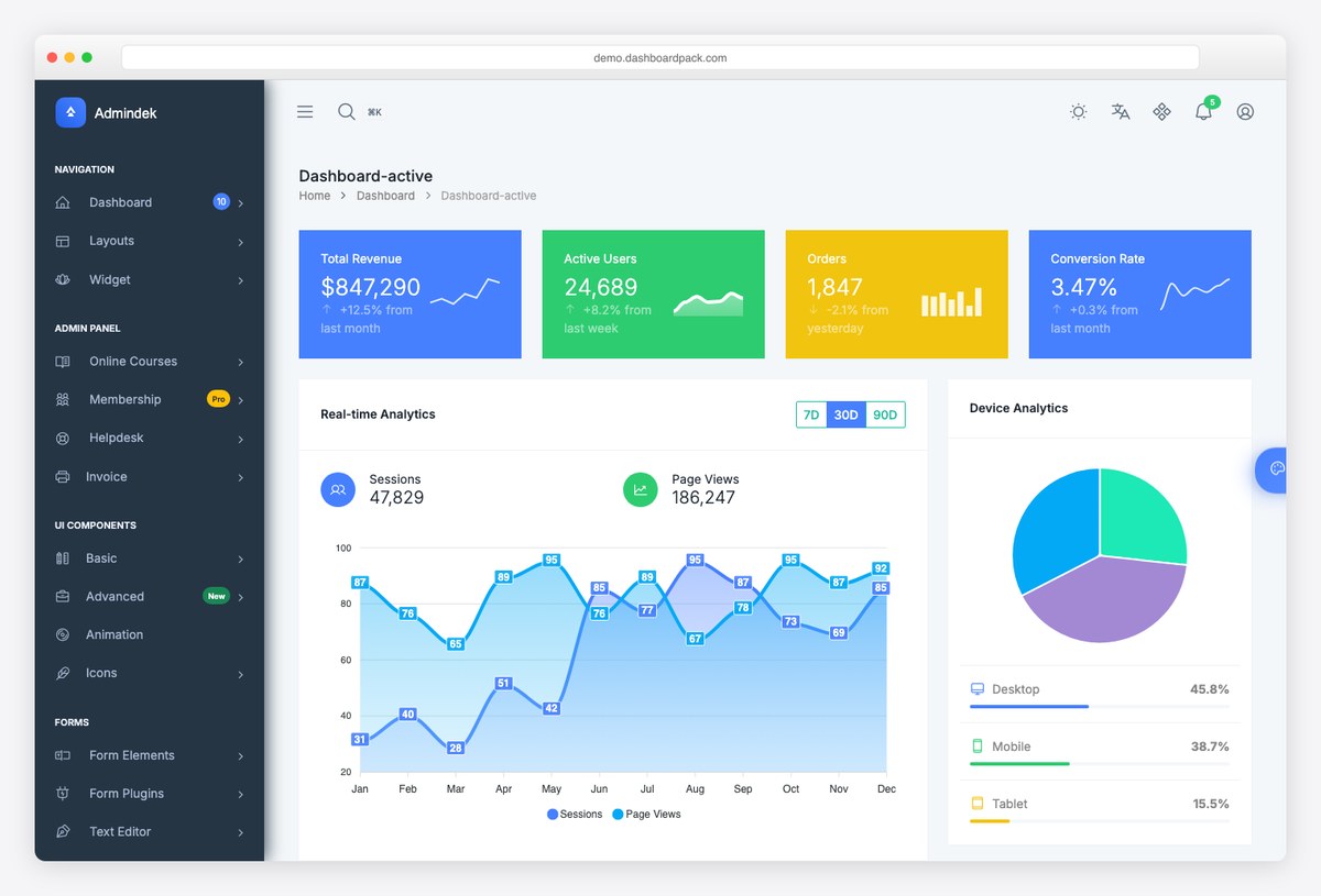
Denser than Apex and more table-heavy, which suits reporting screens where the point is rows of data rather than headline figures. Worth comparing the two side by side before committing to either.
- Best for: Report screens that are mostly tables rather than charts
- Lives in: HTML template
- Data comes from: Your own API
- Watch out for: Same caveat as any front-end template: the data layer is yours to build.
10. Tabler by Tabler
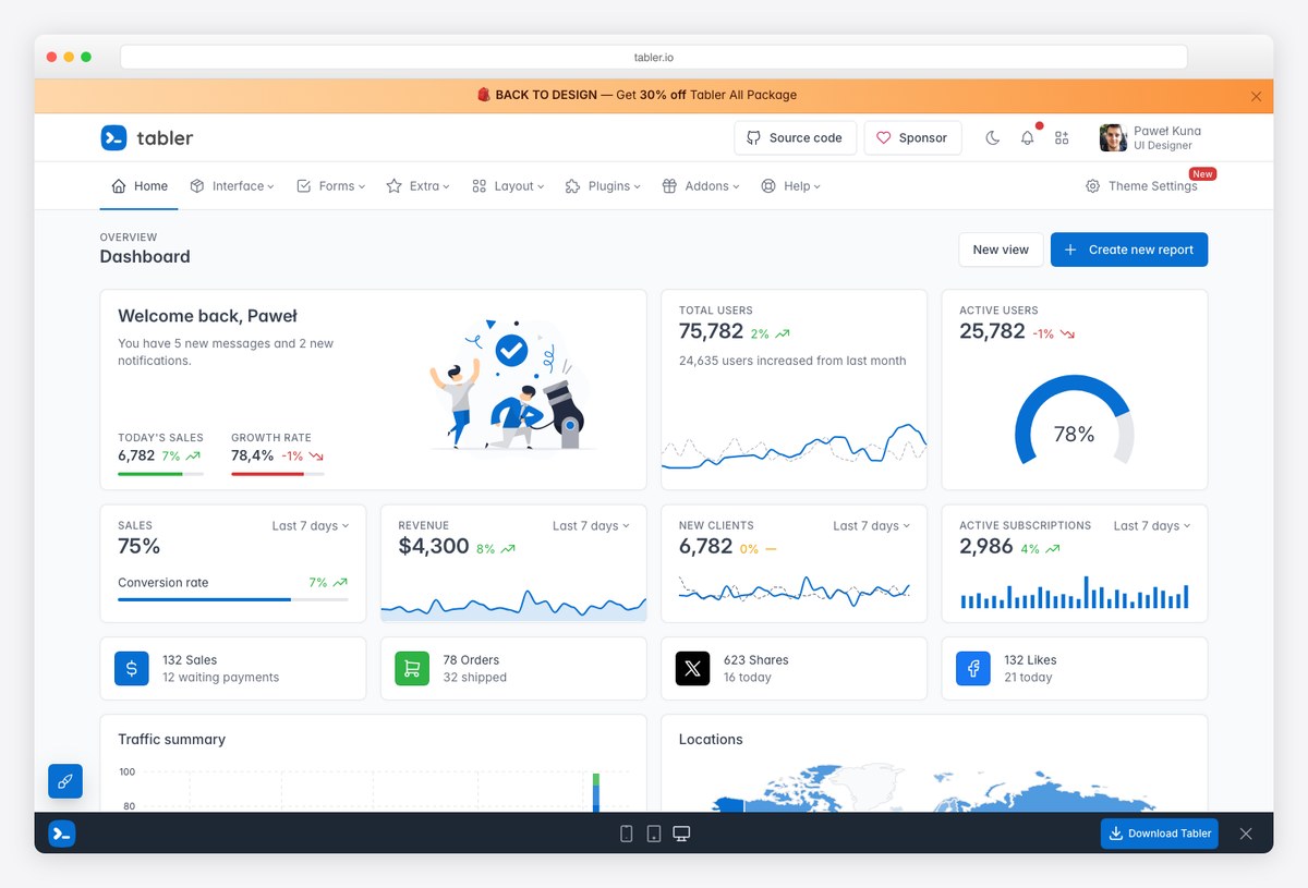
Free and MIT-licensed, with a component set clean enough that plenty of paid templates borrow from it. If the reporting UI is internal and the budget is nothing, start here rather than paying for polish nobody will see.
- Best for: Internal reporting tools where nothing needs to look bespoke
- Lives in: HTML template
- Data comes from: Your own API
- Watch out for: Free means no support and no roadmap commitment; you own whatever you build on it.
11. CoreUI free admin template by CoreUI
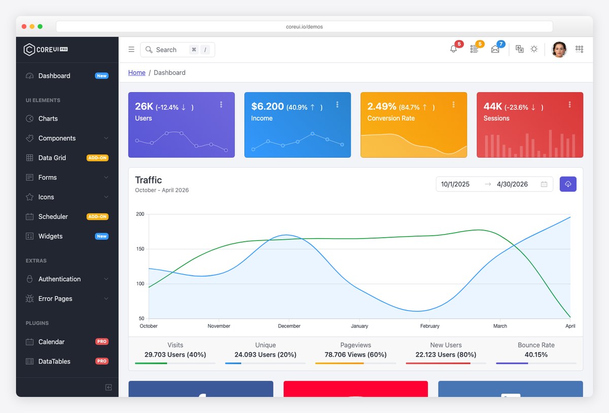
The other well-maintained free option, with the advantage of official React, Vue and Angular builds alongside the plain HTML one — so the choice does not lock your front-end stack in the way single-stack templates do.
- Best for: Teams that need the same reporting UI across more than one framework
- Lives in: HTML template
- Data comes from: Your own API
- Watch out for: The free edition is deliberately narrower than the paid one; check the component list against your requirements first.
12. AdminLTE 4 by AdminLTE
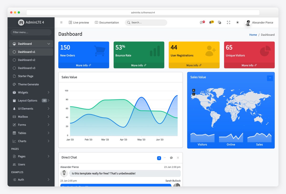
Open source, built on Bootstrap 5, and the most widely deployed template of this kind by a large margin — which mostly matters because it means every layout question you hit has already been answered by somebody.
- Best for: Reporting UI where longevity and community answers matter more than novelty
- Lives in: HTML template
- Data comes from: Your own API
- Watch out for: Its ubiquity is also its limitation: without theming work, the result looks like a lot of other software.
What goes on a reporting dashboard
Whichever of the three you pick, the structure that works is the same, and it is worth writing down because most templates get it only half right.
- Lead with the verdict. The top of the report should say whether the period was better or worse than the last one. Not the biggest number, the most decision-relevant one.
- Every figure needs a comparison. A number alone cannot be read. Against last period, against target, or against another channel — pick one and apply it consistently.
- Explain the movement, then the detail. The middle of the report exists to explain the top of it. Raw tables belong at the bottom, or on a second page.
- Write the commentary. The single thing that separates a report someone reads from one they file is a sentence saying what happened and what you are doing about it.
The failure this prevents is the most common one in reporting: a page that is accurate, comprehensive, and answers no question anybody asked. If you cannot say which decision each section informs, the section is decoration — and decoration is what makes recipients stop opening the report.
Reporting dashboard FAQ
What is a reporting dashboard?
A reporting dashboard is a single view that collects the numbers somebody needs to judge how something is going, arranged so the headline is readable before the detail. In practice the term covers three different artefacts: a spreadsheet you fill in and send, a connected dashboard that updates itself, and a reporting screen built into a piece of software. They solve the same problem with completely different amounts of effort.
What is the difference between a dashboard and a report?
A dashboard is standing and self-updating: you look at it whenever you want to know the current state. A report is a snapshot for a specific period, usually with an argument attached about what happened and why. Many teams need both, and the efficient arrangement is a dashboard that stays current plus a short written report that quotes from it rather than rebuilding the numbers.
Are there free reporting dashboard templates?
Yes, and genuinely so. The Google Sheets templates in the first section open and copy with no account beyond a Google login. Power BI’s sample reports are free if you already have Power BI. Tableau Public is free to browse and publish. Metabase, Tabler, CoreUI and AdminLTE are open source. The costs in this space attach to connectors that read third-party platforms, not to the templates themselves.
How do I make a reporting dashboard update automatically?
Connect it to the source rather than typing numbers into it. If your data is in Google products, Analytics, Ads, Search Console and Sheets all have free connectors that never expire. If it is in Facebook, LinkedIn, a CRM or an email platform, you need a paid connector because no free one exists. The cheap middle route is an automated export into a Google Sheet, which the dashboard then reads for nothing.
What should a monthly reporting dashboard include?
The two or three numbers the reader is judged on, each shown against the previous period or a target; a breakdown explaining which part of the business moved them; and a short written comment saying what you are doing about it. Everything else is optional. A monthly report that fits on one screen and answers the obvious question beats a comprehensive one nobody finishes.
Can I put a reporting dashboard inside my own software?
Not with the hosted tools — their licences do not allow you to ship their dashboard as part of your product. You either embed a tool built for it, which most business intelligence vendors sell as a separate and more expensive tier, or you build the reporting screens yourself from a front-end template and connect them to your own API. The last section of this page covers that route.
Is a spreadsheet good enough for reporting?
Very often, yes. A spreadsheet is the right answer when the report is monthly, the audience is small, and the numbers are few enough to gather by hand in under an hour. It stops being the right answer at the point where somebody is spending a day a month assembling it, because at that point a connector subscription is cheaper than the labour.
How many pages should a reporting dashboard have?
One, if you can manage it. The value of a dashboard falls sharply after the first screen, because most readers never scroll. If the material genuinely does not fit, put the summary on page one and the detail behind it rather than spreading the story across several pages of equal weight.
Choosing between them
Start with the honest question of how often the report is needed and by whom. A monthly report for two people is a spreadsheet, and treating it as an engineering problem wastes a week. A weekly report across several channels for a client who pays you is a connected dashboard, and assembling it by hand is a slow way to lose margin. Reporting your own customers see inside your product is a build, and no subscription substitutes for it.
If your answer is the middle one, the next decision is which sources you need and what reading them costs, which is the subject of our list of free Data Studio templates and what they really cost. For the marketing-specific version of this question, see marketing dashboard examples, and for organic search reporting the SEO dashboard templates list.

You Might Also Like