20 Best Tailwind CSS Templates for Business Websites (2026)

The Tailwind CSS ecosystem has matured significantly, and 2026 brings a fresh collection of production-ready templates that demonstrate modern frontend patterns. Whether you’re building admin panels, SaaS marketing sites, or business applications, these templates provide solid architectural foundations.
What makes these templates relevant for dashboard developers? Each one showcases data presentation patterns—filtering, sorting, forms, and visualizations—that transfer directly to admin panel development. Built on Astro 5 with Tailwind CSS, they ship with 95+ Lighthouse scores and full TypeScript support. For more Tailwind resources, explore our Tailwind CSS templates collection, Tailwind landing page templates, and SaaS landing page templates.
For more dashboard-specific resources, check out our free admin templates and Tailwind CSS website examples.
We’ve selected 20 templates that best demonstrate patterns useful for business application development:
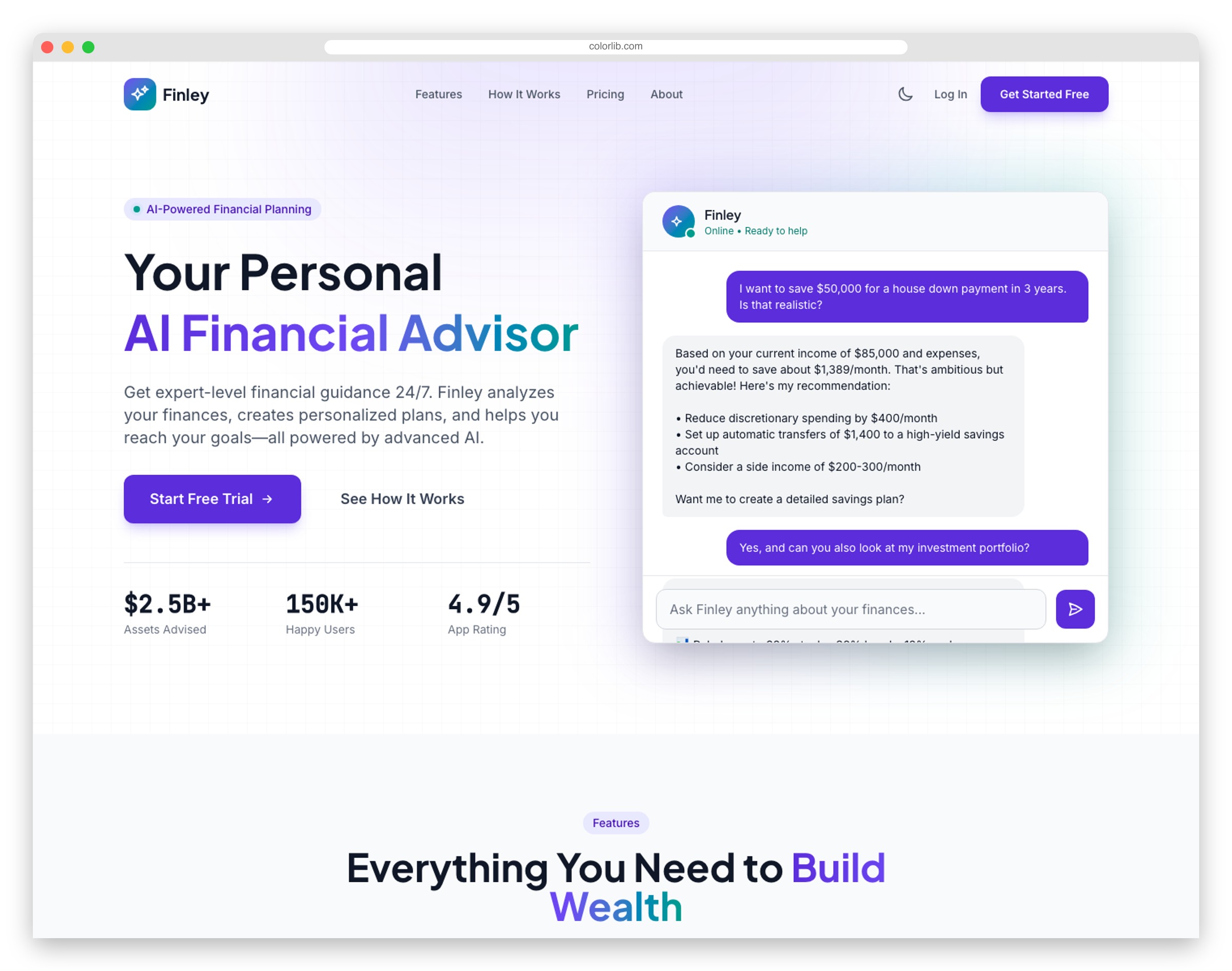
1. FinanceFlow
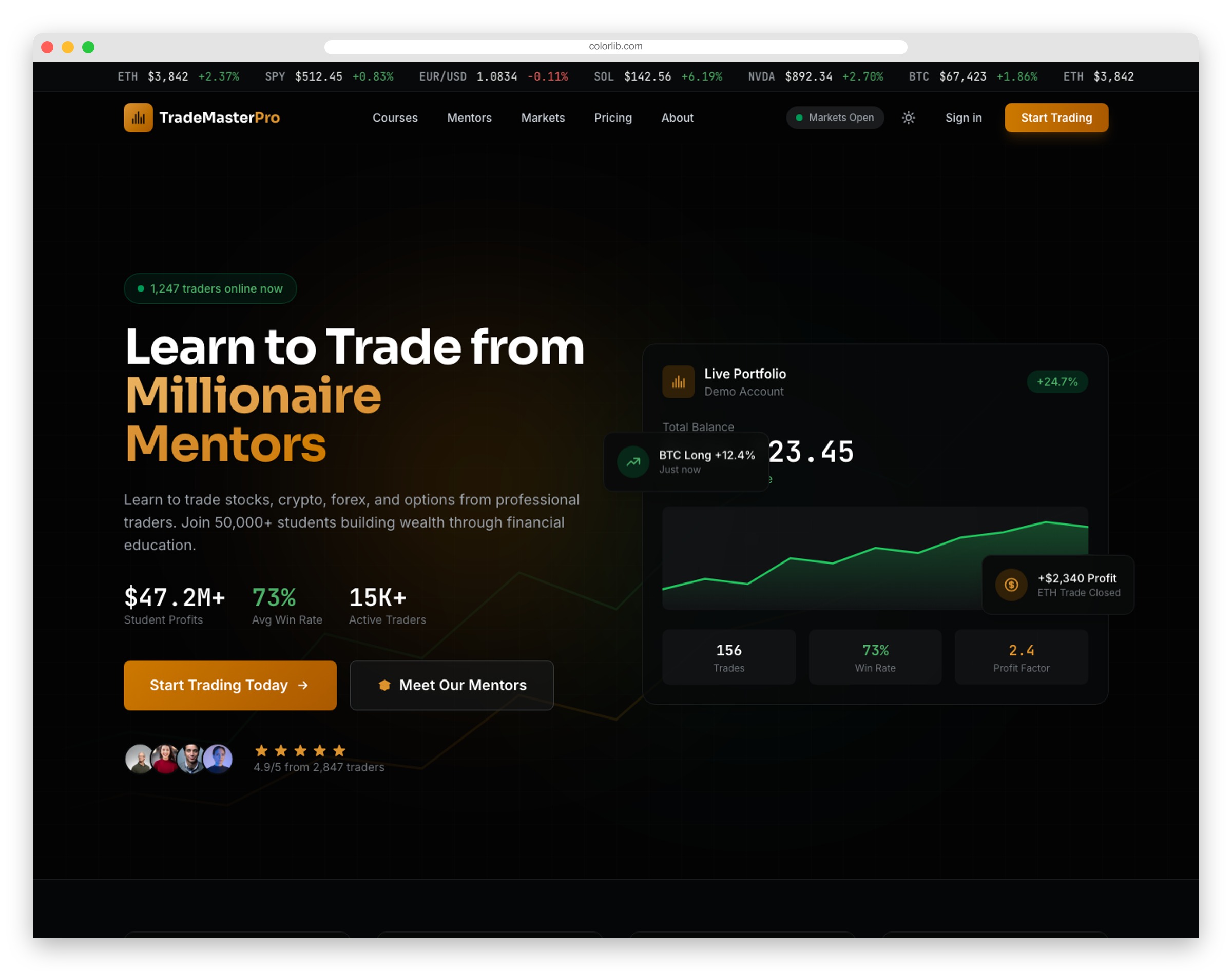
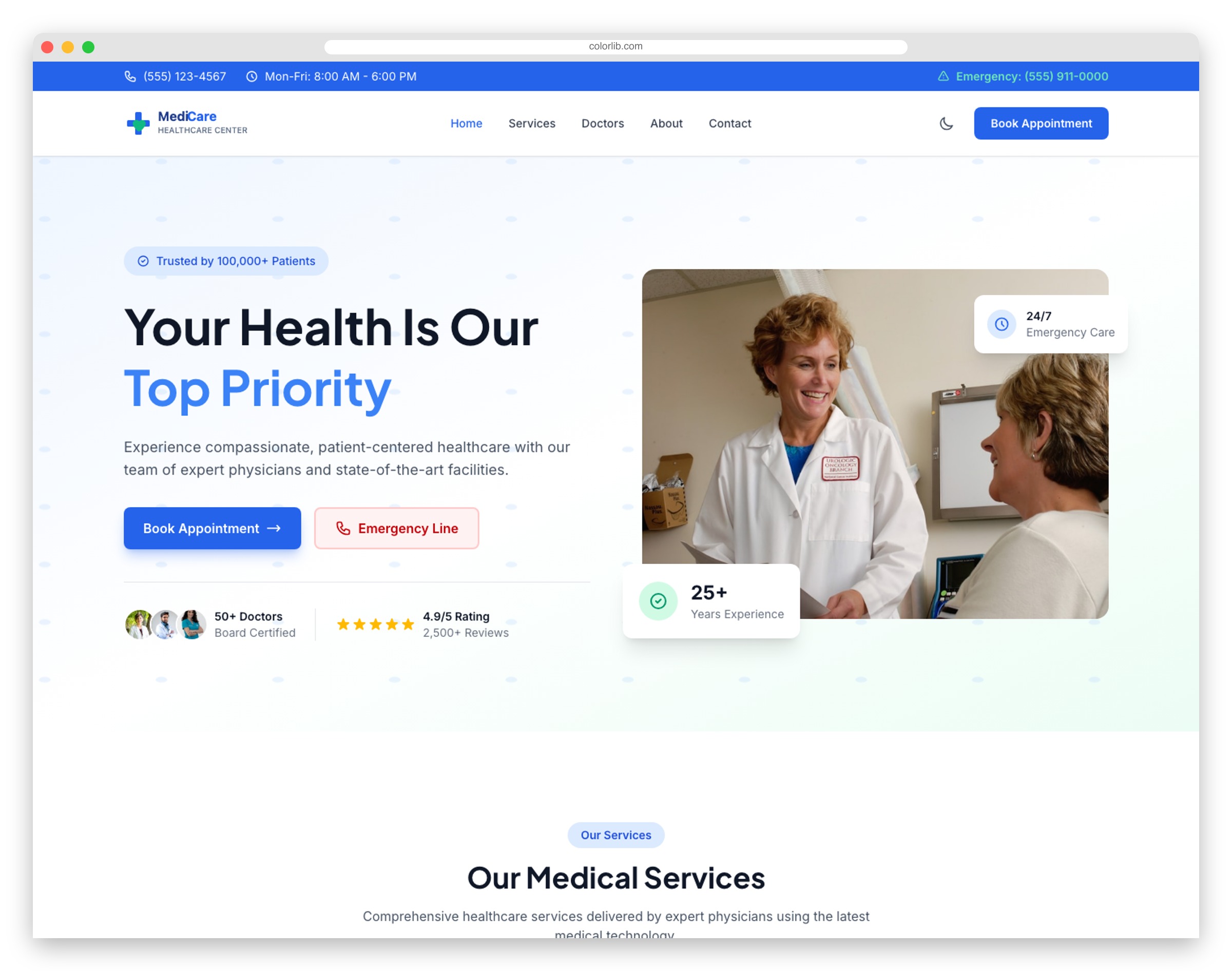
Fintech applications live and die by their UX. FinanceFlow showcases dashboard-style interfaces that users actually want to use.
Dashboard mockups with transaction history, card management, and account overviews demonstrate sophisticated UI patterns. Interactive calculators for loans and mortgages showcase computation capabilities.
If you’re building financial dashboards, check out our Bootstrap dashboard examples for more admin panel inspiration.
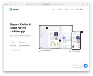
2. SaaSify
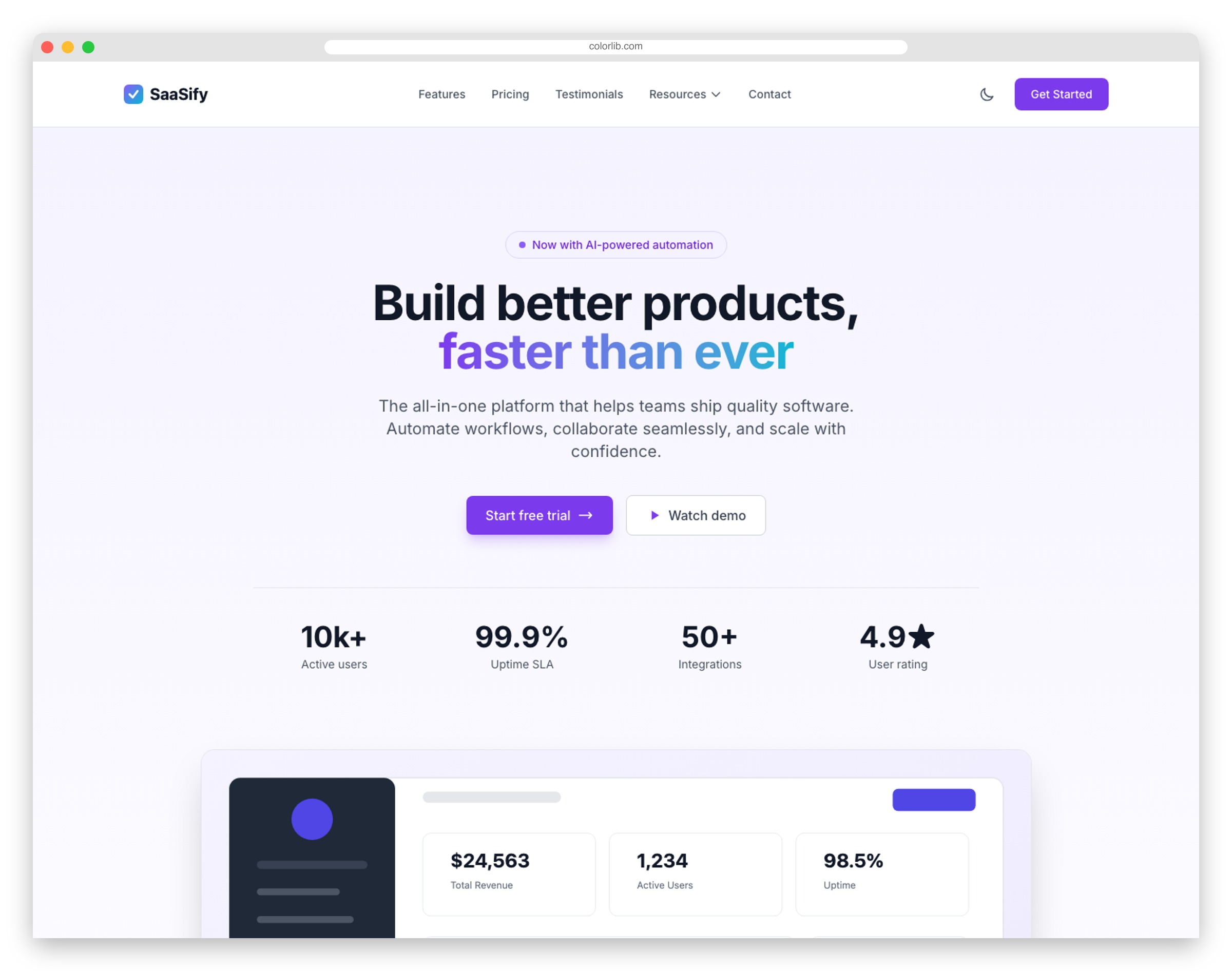
Every SaaS product needs a marketing site that converts. SaaSify provides the landing page foundation—tiered pricing tables, feature comparisons, and conversion-focused layouts.
The pricing section with monthly/yearly toggles matches what users expect from modern software marketing. Testimonials, FAQ accordions, and integration showcases complete the conversion funnel.
Looking for admin panel templates to pair with your SaaS? Browse our Tailwind CSS templates collection.
3. InvestPro
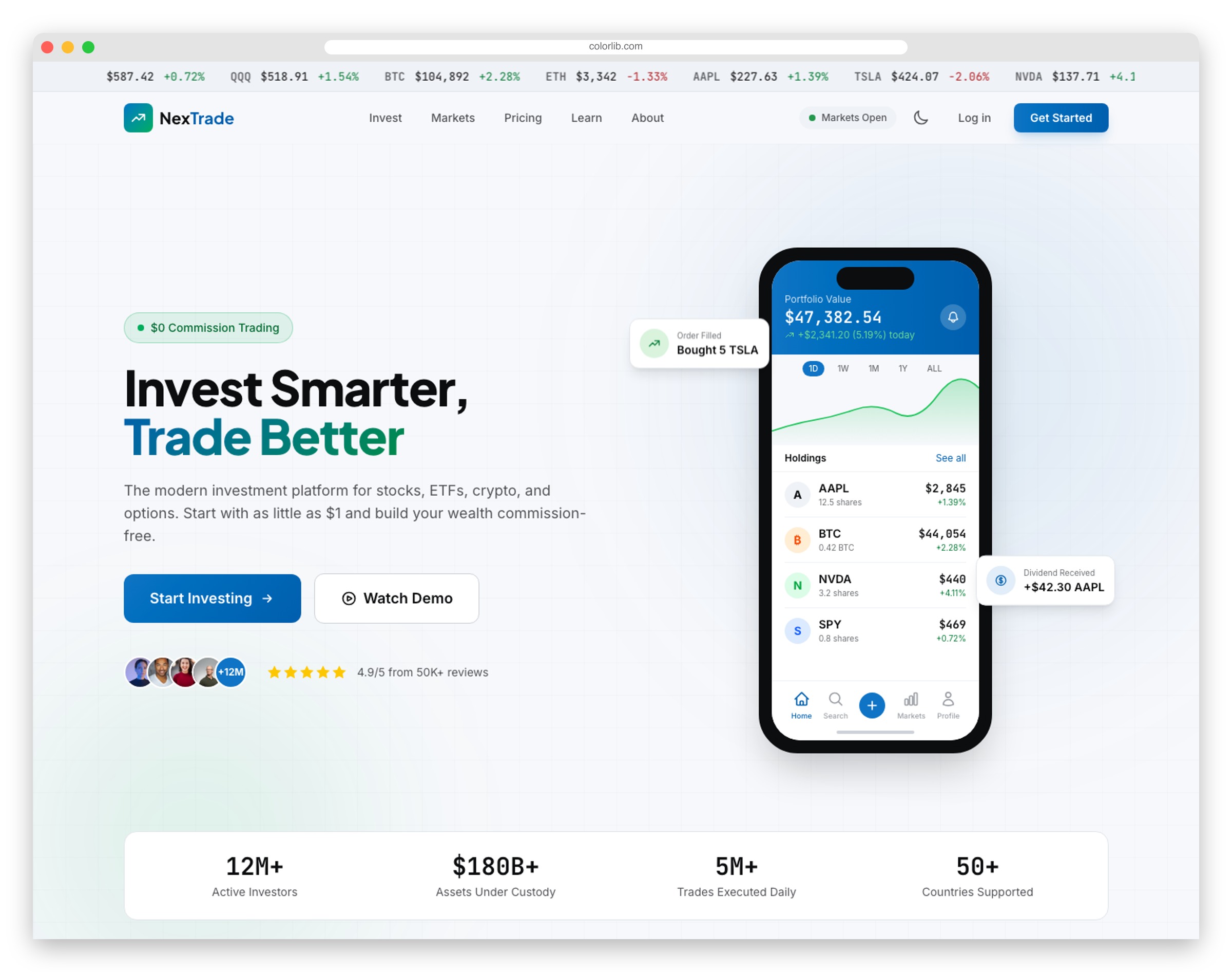
Investment platforms require interfaces that communicate complexity without overwhelming users. InvestPro nails this balance.
Portfolio performance visualizations, fund comparison tools, and risk assessment questionnaires showcase data-rich interfaces. Strategy explanations educate while account signup flows capture qualified leads.
The template demonstrates how to present financial data professionally—useful patterns for any dashboard builder.
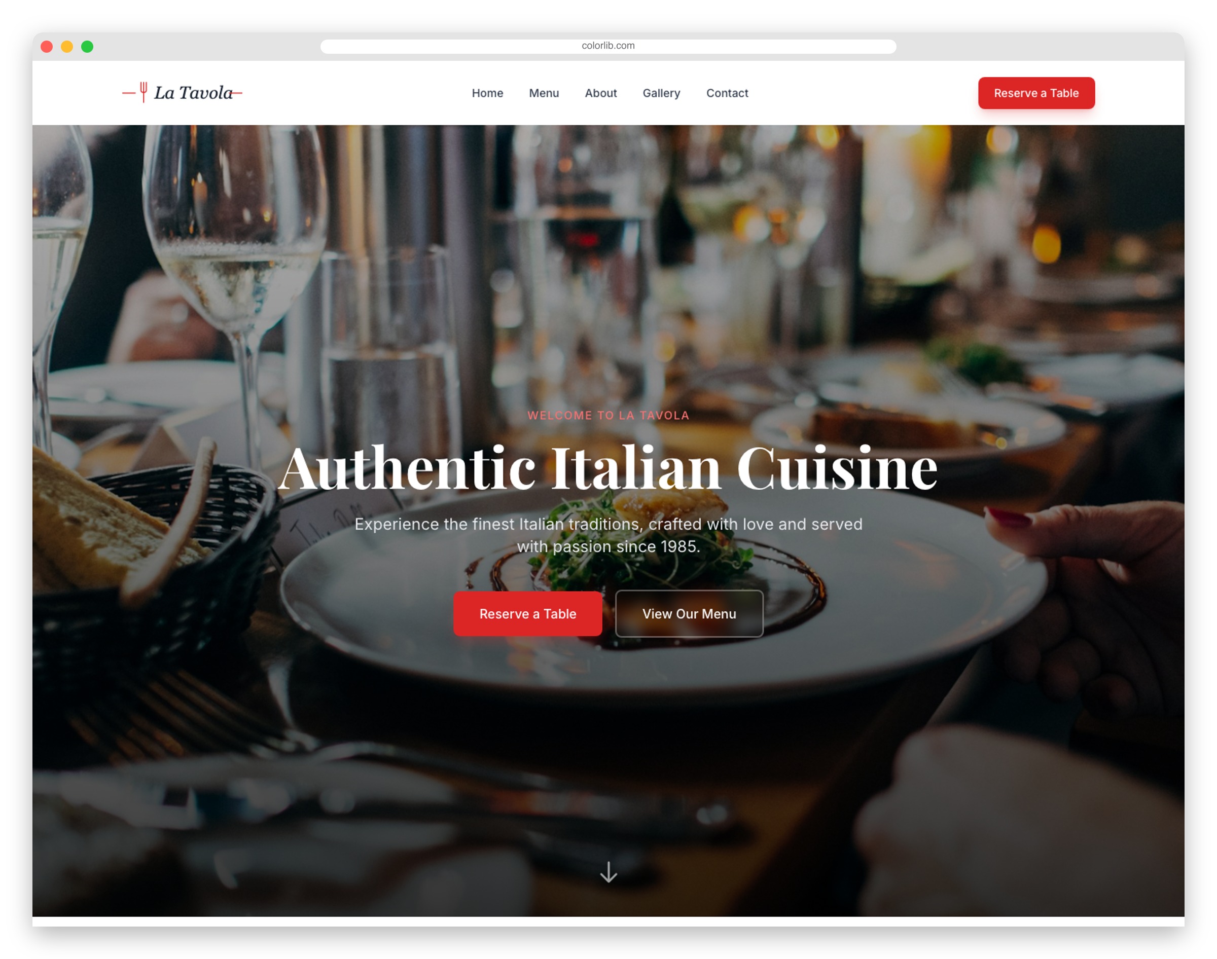
4. LogiTrans
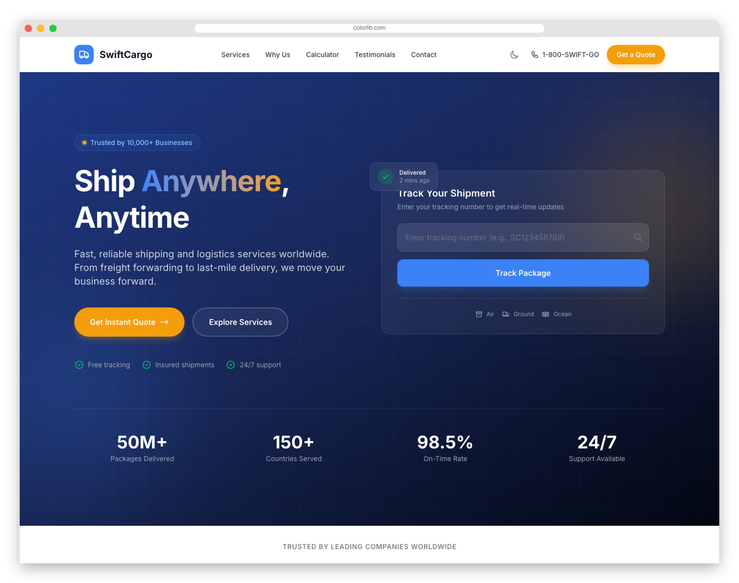
Logistics companies run on data—coverage areas, transit times, tracking status. LogiTrans presents all three clearly.
Dashboard-adjacent features:
- Shipment tracking forms
- Service coverage maps
- Fleet showcases
- Instant quote calculators
These patterns transfer directly to logistics admin panels and tracking dashboards.
5. WealthWise
Financial advisor websites need credibility signals fast. WealthWise front-loads them—certifications, fiduciary commitments, and performance metrics all visible immediately.
Interactive calculators for retirement and investment returns demonstrate the kind of tools that could power a full financial planning dashboard. The complimentary consultation form captures qualified leads efficiently.
Clean, trustworthy design that projects stability.
6. Creativex
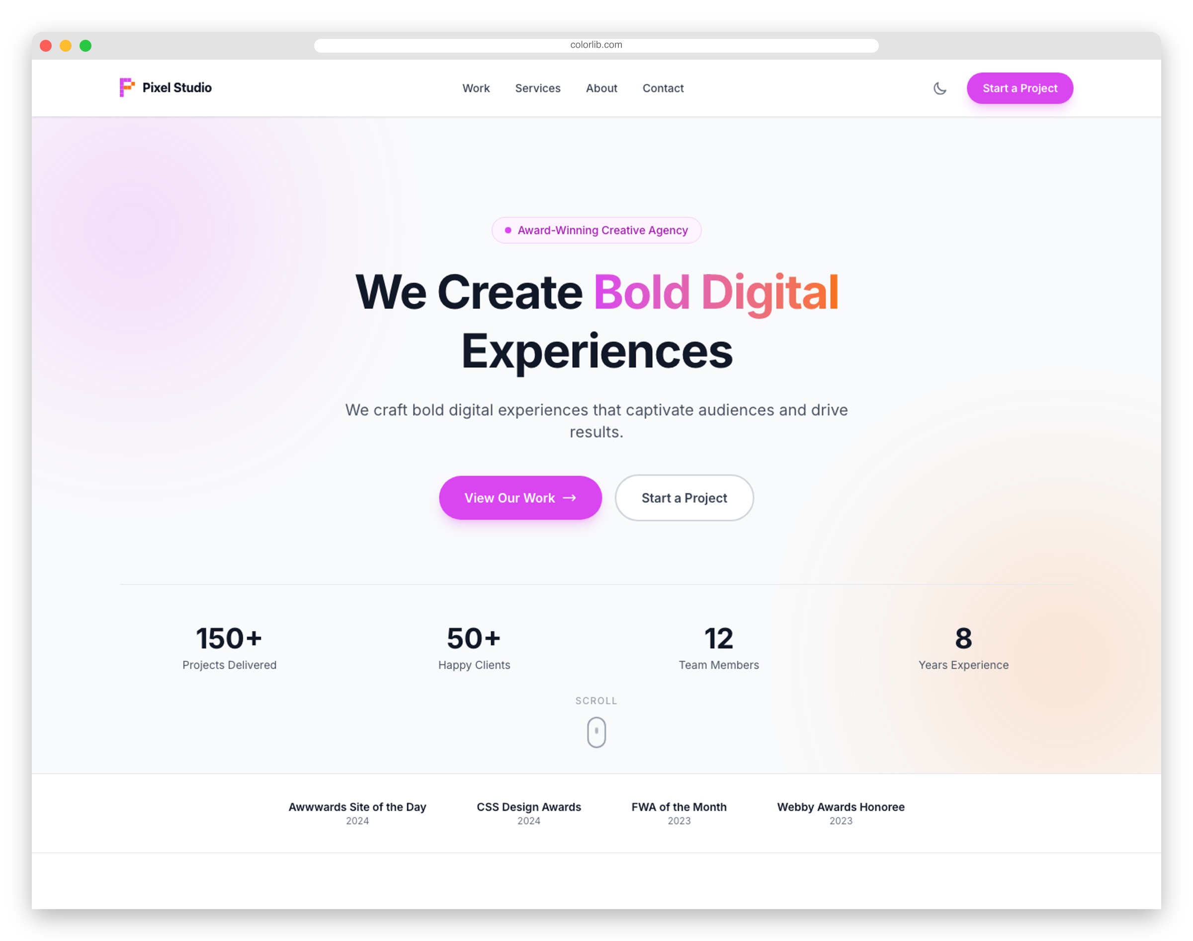
Agency project management starts with showcasing work. Creativex provides the portfolio foundation.
The filterable gallery demonstrates sorting and filtering patterns useful in any data-heavy interface. Case studies with metrics show how to present KPIs attractively.
Budget range selectors in forms showcase smart input patterns for business applications.
7. EstateHub
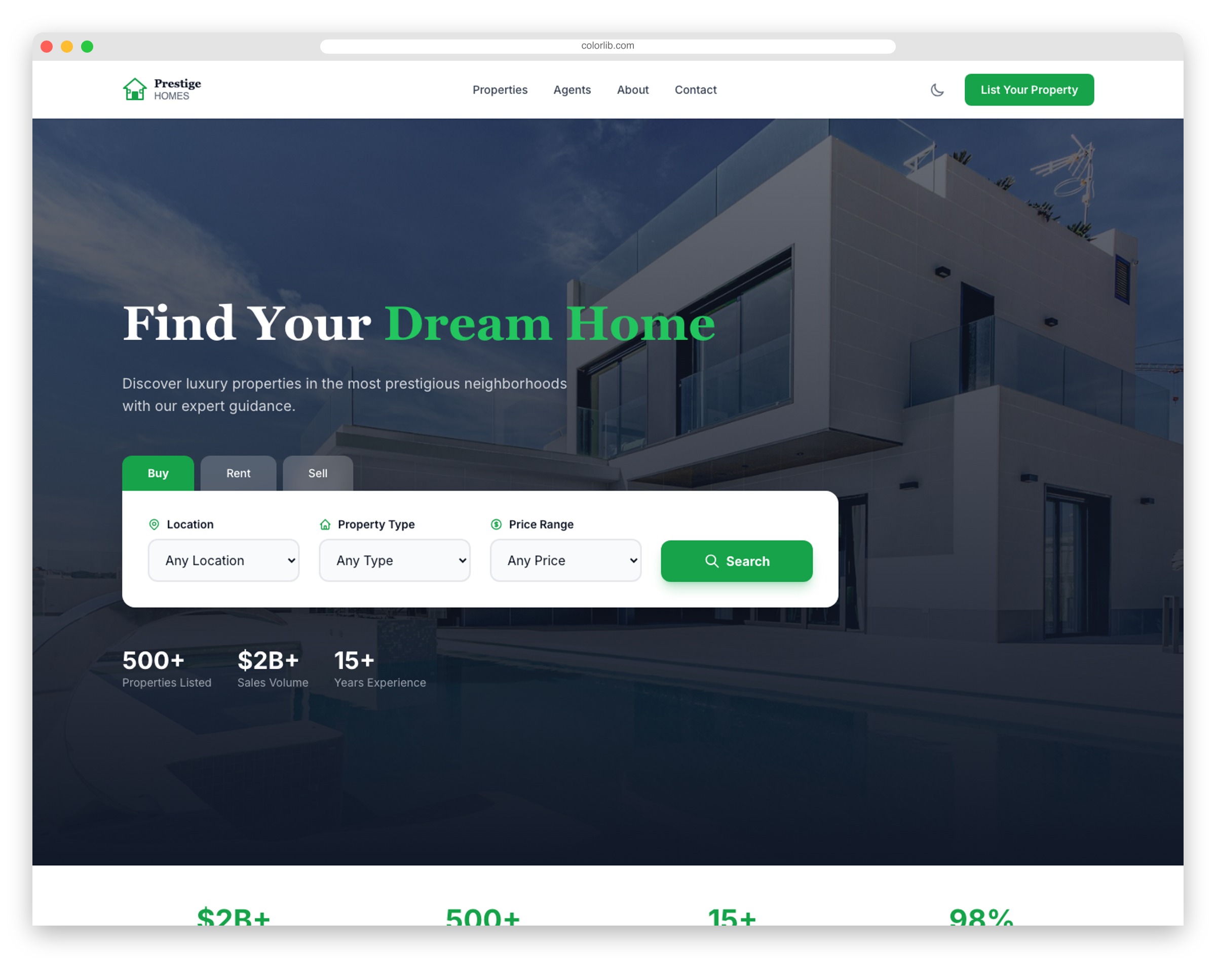
Real estate platforms are essentially property databases with great UI. EstateHub shows how to present listings effectively.
Advanced filtering (beds, baths, price ranges), property grids with full-bleed photography, and detail pages with galleries—these patterns power major real estate portals.
Mortgage calculators and agent contact forms round out the business functionality.
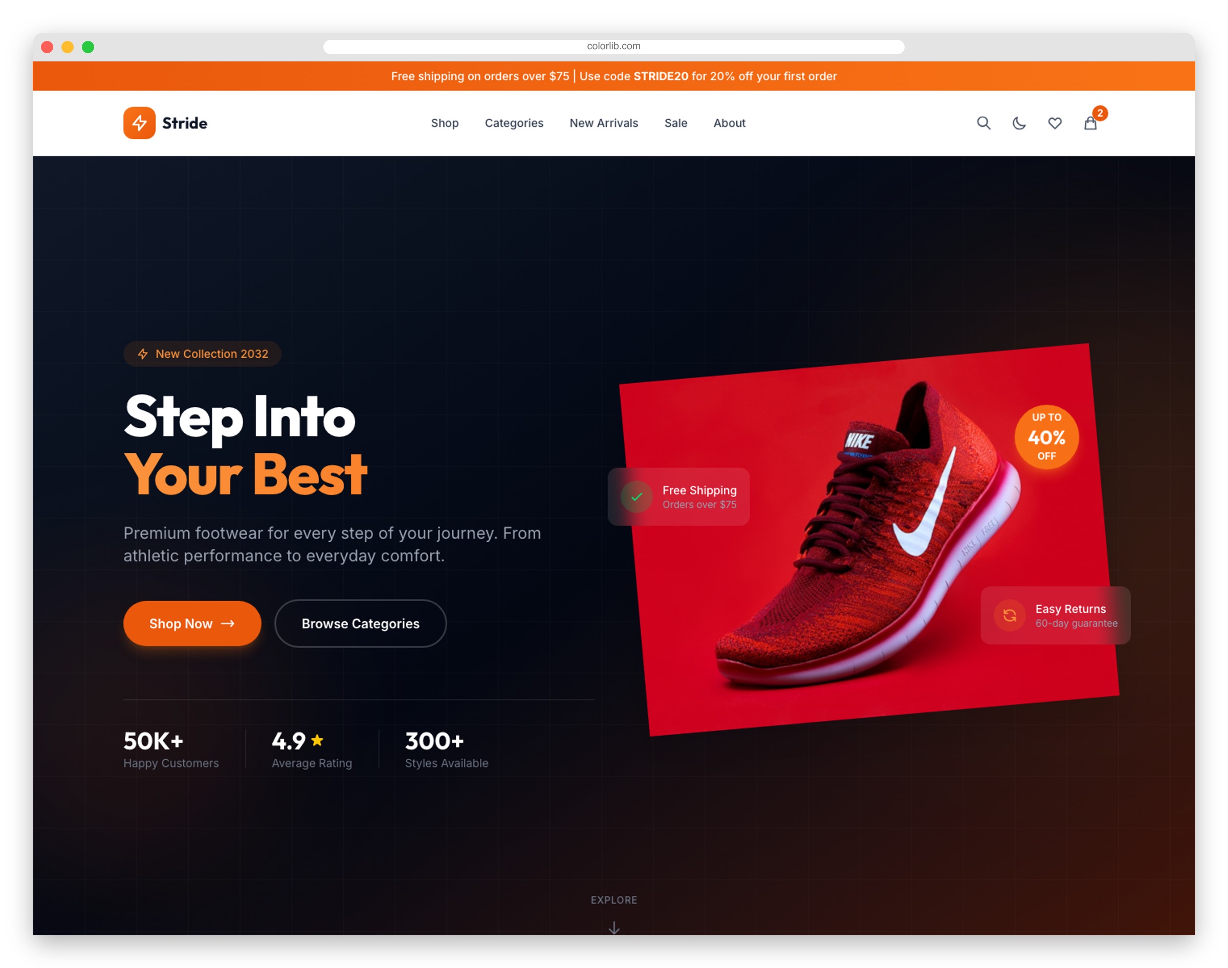
8. Shopper
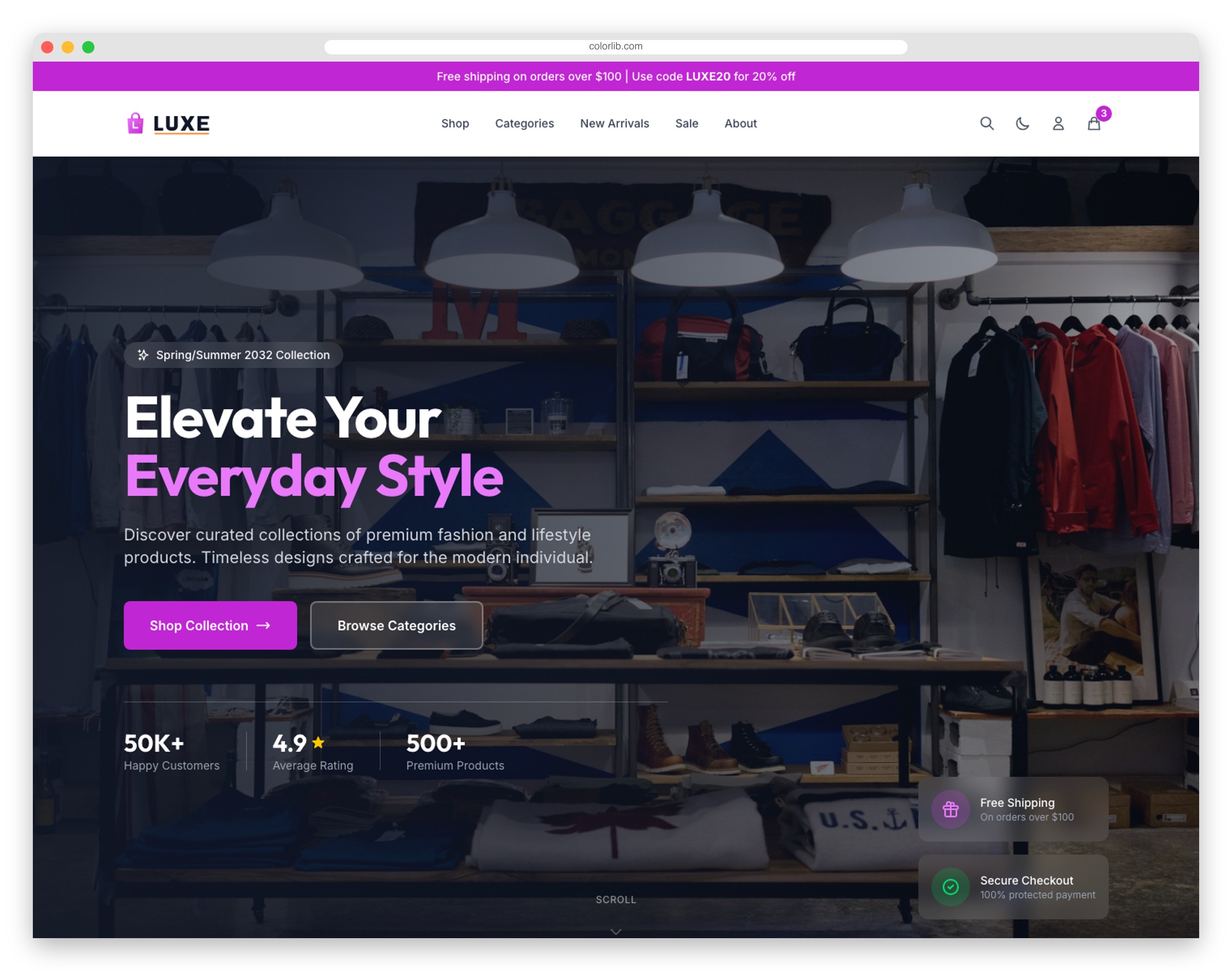
E-commerce interfaces require sophisticated state management—carts, wishlists, filters. Shopper demonstrates these patterns cleanly.
Key UI components:
- Product grids with smart filtering
- Quick-view modals
- Persistent cart + wishlist state
- Size guide presentations
Useful patterns for any product catalog or inventory dashboard.
9. Vitality
Healthcare systems demand clear information architecture. Vitality shows how to present complex service offerings accessibly.
Business-relevant features: Appointment booking with department selection, doctor profiles with credentials, service catalogs, insurance info sections.
The booking flow demonstrates form patterns that reduce friction—valuable for any scheduling system.
10. LearnHub
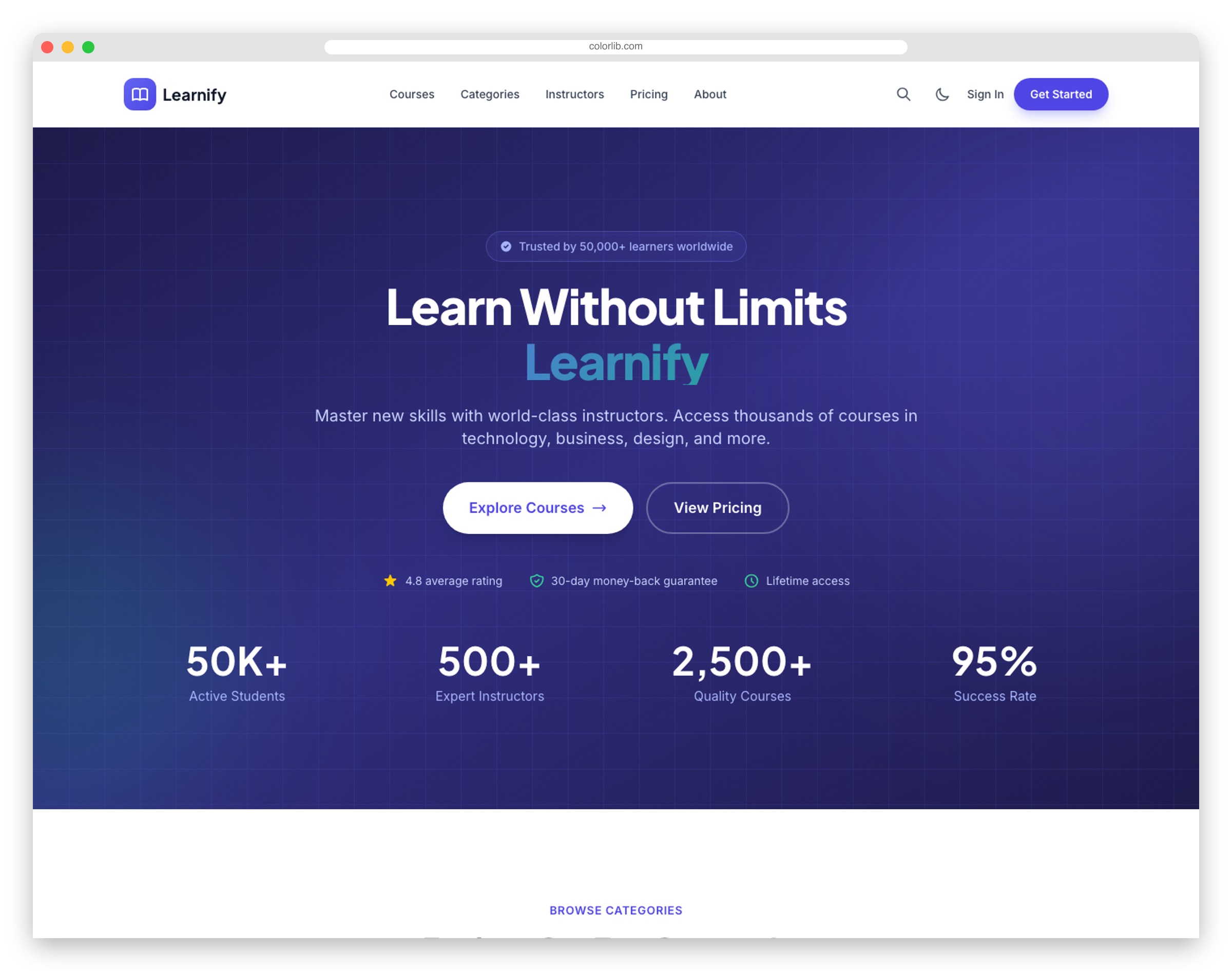
LMS interfaces need to communicate curriculum structure clearly. LearnHub shows how.
Course breakdowns with module structures, instructor profiles, student testimonials with outcomes, and enrollment flows—these patterns transfer directly to learning management dashboards.
Certificate previews and progress indicators demonstrate gamification elements.
11. AI Summit
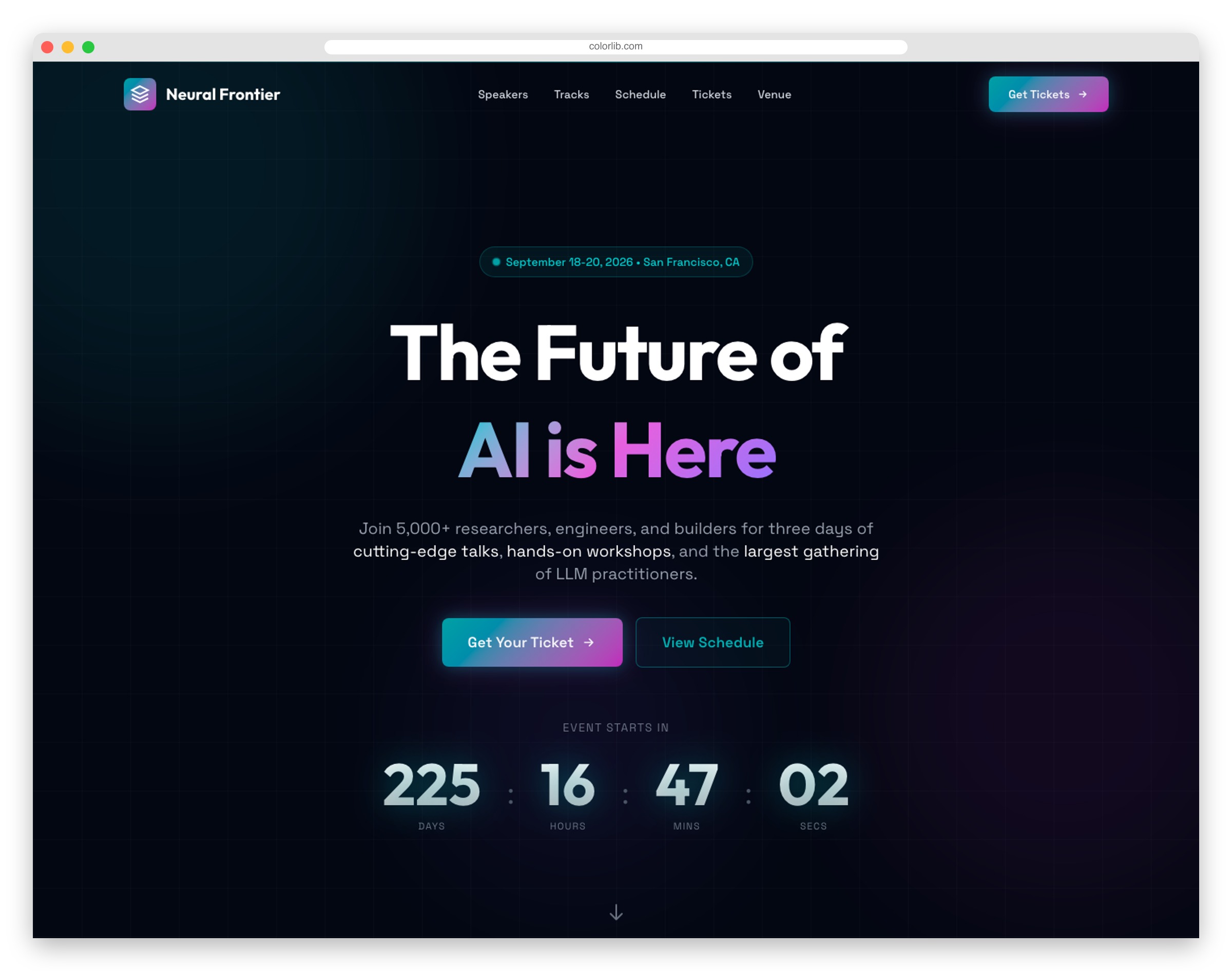
Conference management systems need clean schedule displays. AI Summit demonstrates multi-track agenda presentation.
Speaker profiles, session breakdowns by track, workshop details, and ticket tier comparisons—all patterns useful for event management dashboards.
Countdown timers and early-bird pricing use urgency mechanics to drive conversions.
12. Eventor
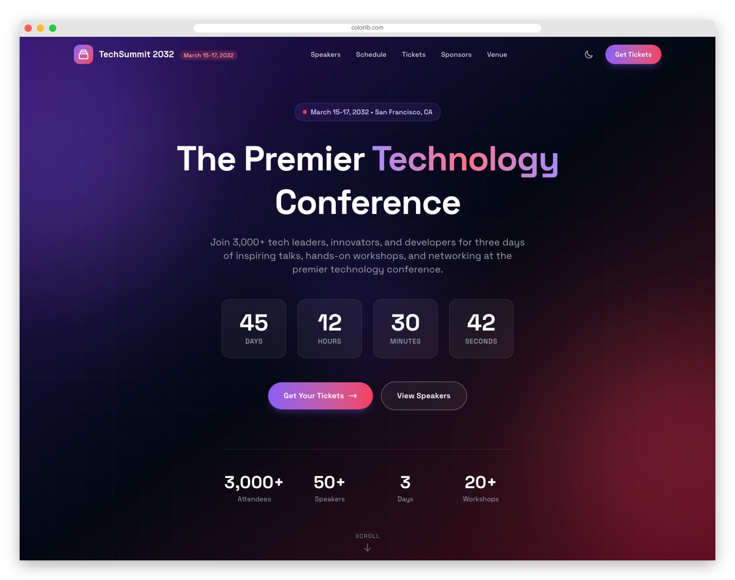
Event registration flows need to minimize friction while capturing necessary data. Eventor balances both.
Speaker showcases, schedule displays, tiered ticket pricing, and venue information with maps—essential components for event management platforms.
Sponsor logo displays and countdown timers add social proof and urgency.
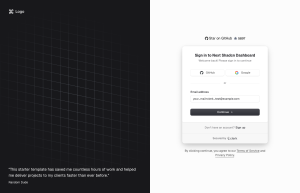
13. LegalEdge
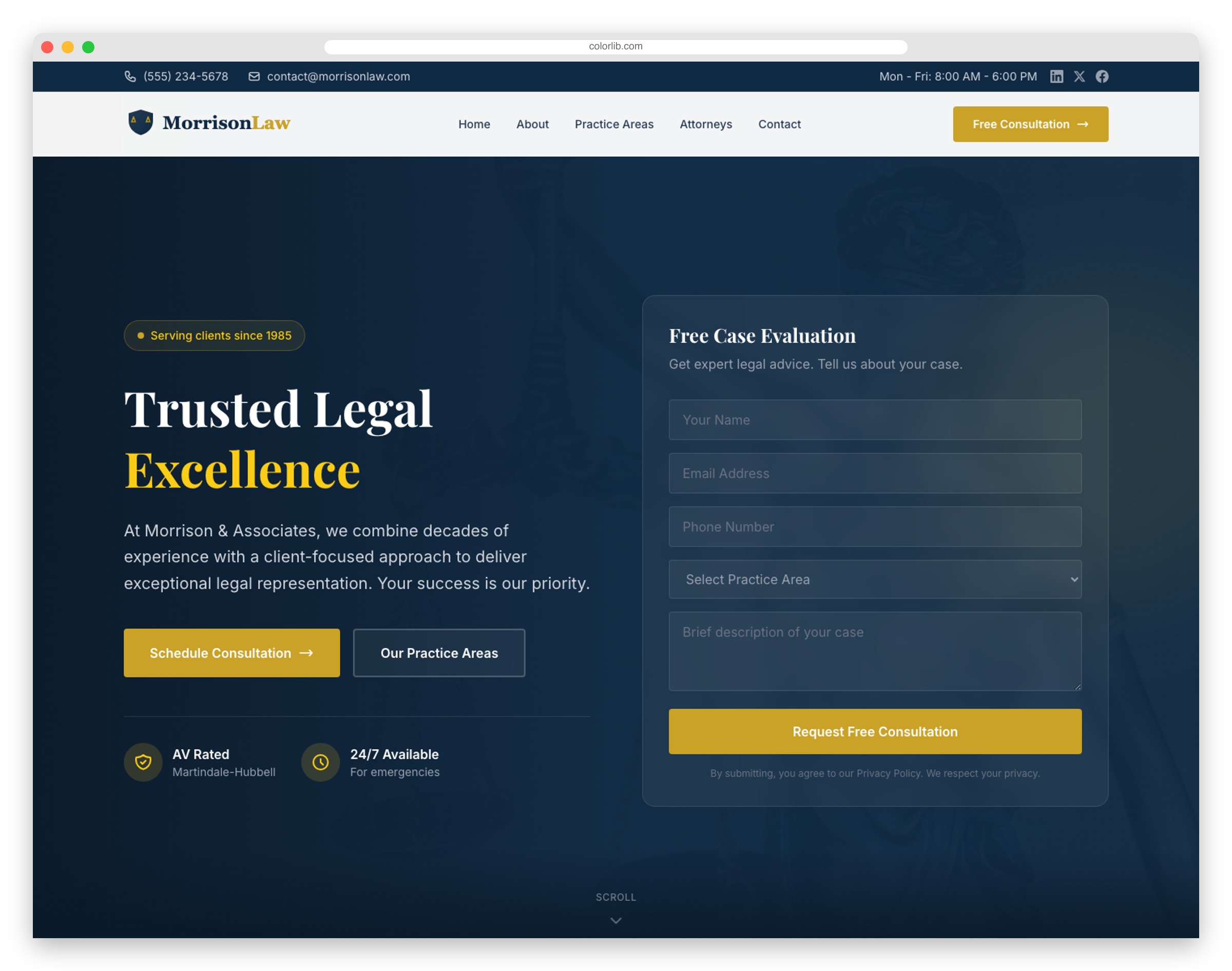
Law firm websites serve as lead qualification systems. LegalEdge demonstrates how professional services present credentials and capture inquiries.
Practice area categorization, attorney profiles with case results and credentials, resource libraries, and consultation request forms.
Dark mode support is included—practical for late-night research sessions common in legal contexts.
14. Academix
Educational platforms need to present program catalogs clearly. Academix shows how to organize complex academic information.
Key structures:
- Program catalogs with pathways
- Faculty directories
- Admission timelines
- Virtual tour sections
These information architecture patterns work for any organization with complex offerings.
15. HopeFoundation
Nonprofit platforms track donations, volunteers, and impact metrics. HopeFoundation shows how to present this data compellingly.
Campaign progress bars, impact statistics, donor recognition, and transparency sections—dashboard components that build trust.
Donation forms with suggested amounts and volunteer registration showcase smart form design.
16. Wanderlust
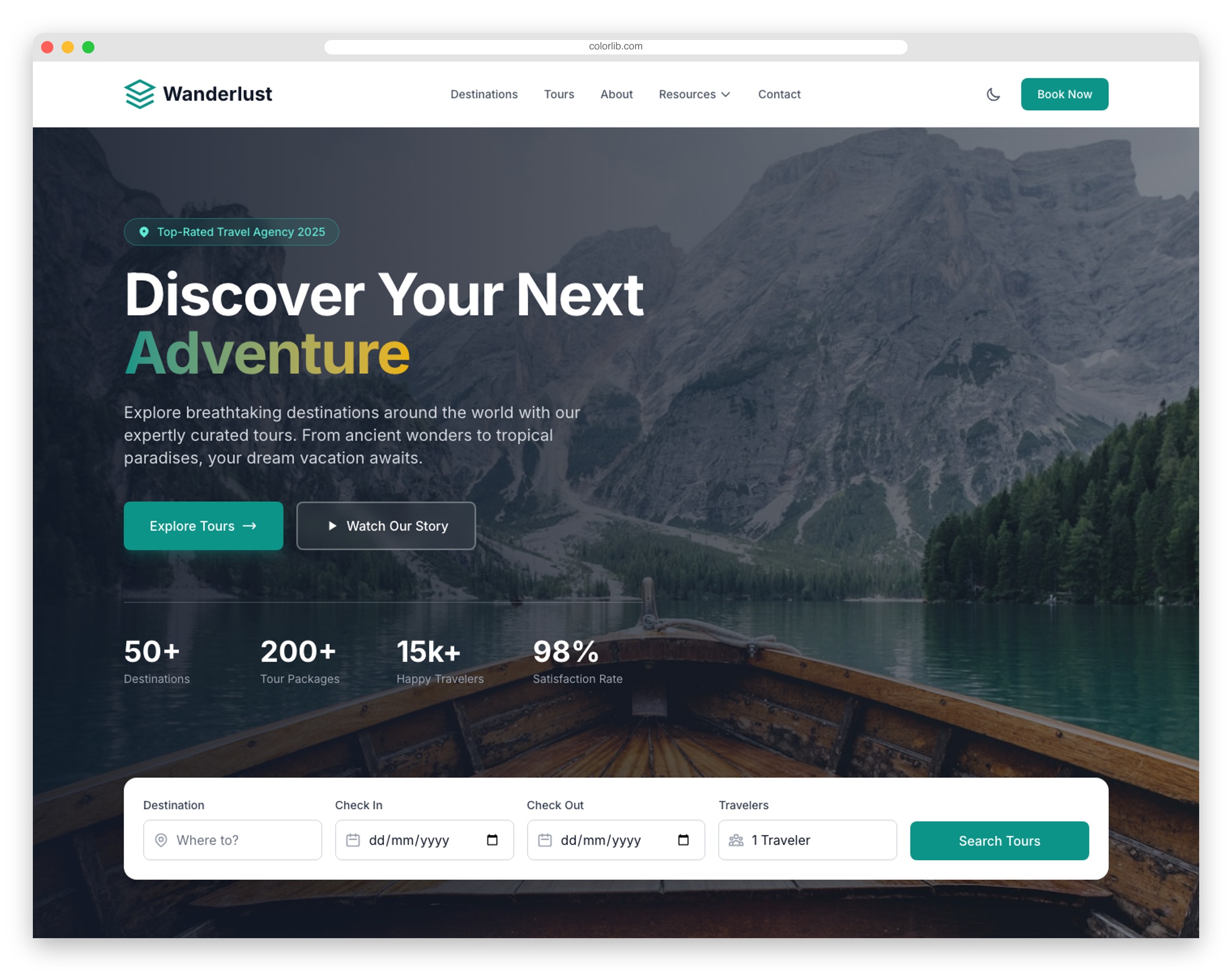
Travel booking platforms are complex data applications. Wanderlust demonstrates how to present destinations and packages attractively.
Destination showcases, tour package breakdowns with pricing, traveler reviews, and booking forms with date selection—patterns for any reservation system.
Photo galleries and travel resources establish authority.
17. Flavor
Restaurant POS and ordering systems need clean menu presentations. Flavor shows how to organize food catalogs.
Digital menus with categories and pricing, reservation systems, chef profiles, and special offer displays—patterns applicable to any hospitality management dashboard.
Location info with hours demonstrates multi-location business patterns.
18. PawPal
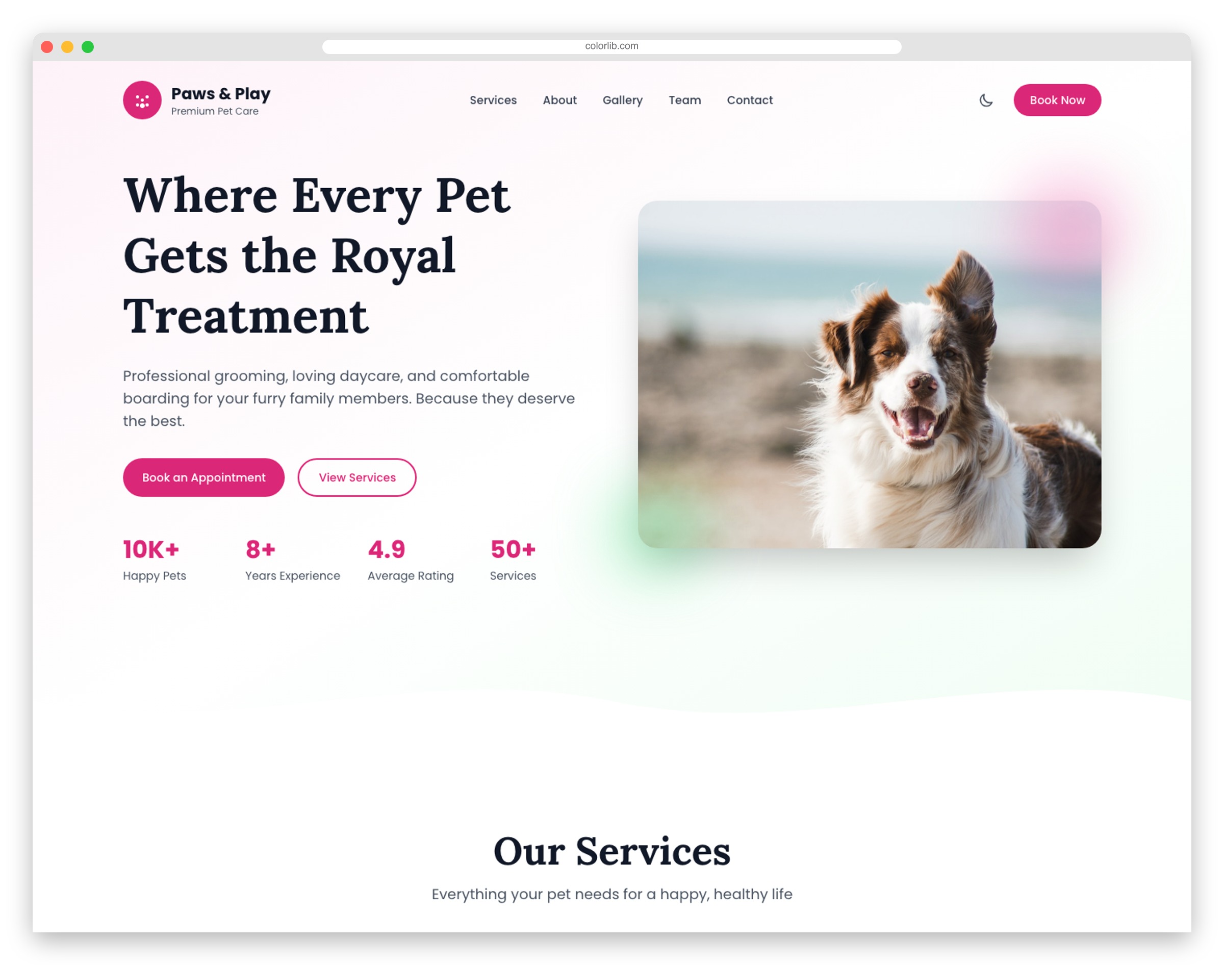
Pet service businesses manage appointments, client profiles, and service catalogs. PawPal shows how to present these elements.
Service menus with transparent pricing, appointment booking forms, team profiles, and emergency contact prominence.
Gallery displays and testimonials build trust—essential for service businesses of any type.
19. SoleStyle
Inventory management requires sophisticated filtering and product presentations. SoleStyle demonstrates these e-commerce patterns.
Brand filtering, size guides with fit feedback integration, multiple product angles, and collection curation.
The new release and trending sections highlight priority inventory—patterns applicable to any product catalog system.
20. BrewHouse
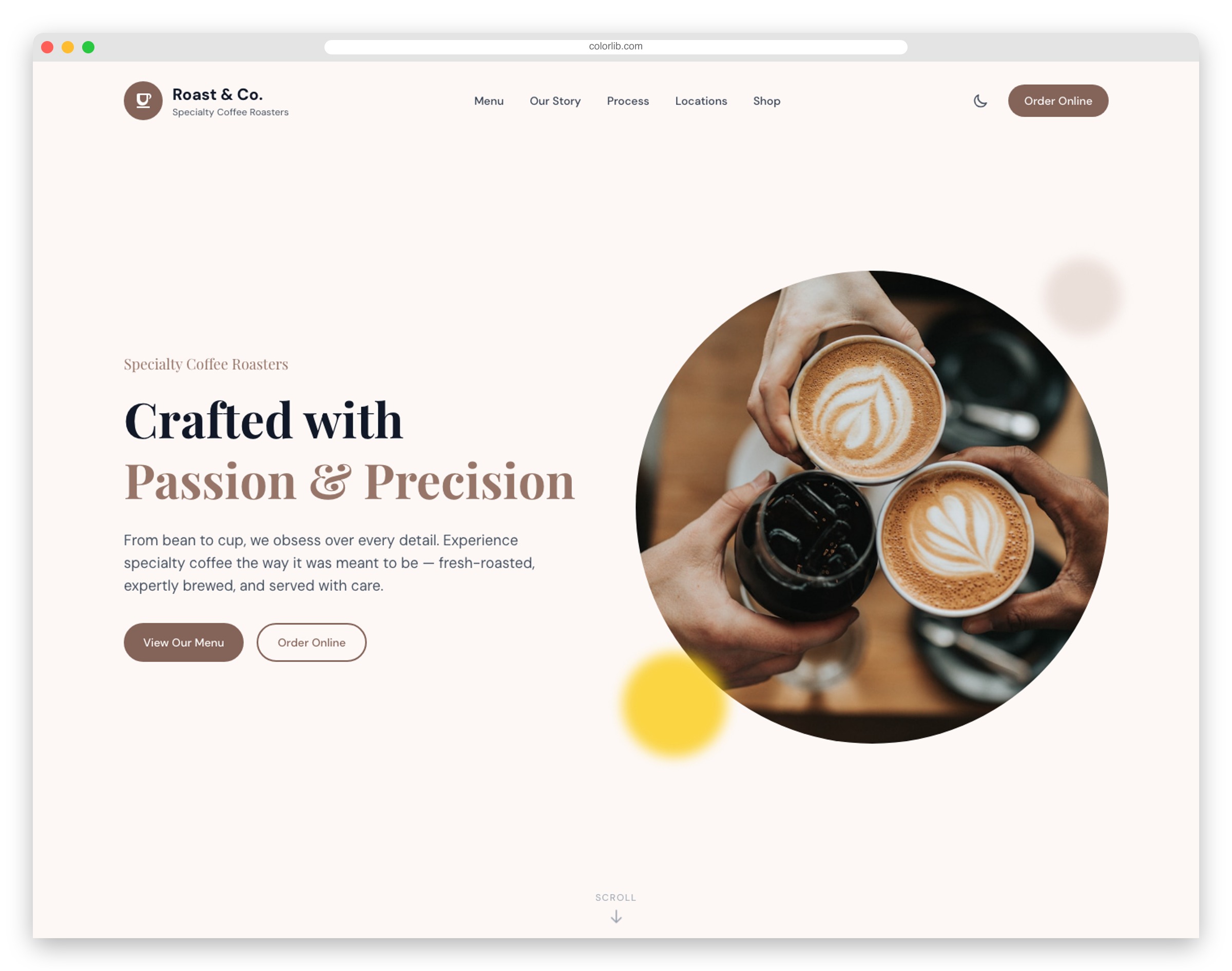
Coffee shop management involves menus, locations, and loyalty programs. BrewHouse presents all three elegantly.
Product catalogs with customization options, multi-location support, online ordering flows, and loyalty program integration.
Team spotlights and origin stories demonstrate content patterns for brand building.
Building Better Interfaces
These 20 Tailwind CSS templates showcase modern frontend patterns that go beyond marketing pages. Filtering systems, data tables, form flows, and interactive components—patterns that every dashboard developer can learn from.
Each template is built on Astro 5 with full TypeScript support, dark mode, and responsive design. They represent what modern frontend architecture looks like in 2026.
Looking for more admin-focused resources? Explore our collections of React admin templates and Bootstrap dashboard examples for additional dashboard inspiration.
Questions about implementation patterns? Leave a comment below!
You Might Also Like

Comments (No Comments)