15 Bootstrap Login & Signup Page Examples You Can Copy-Paste (2026)
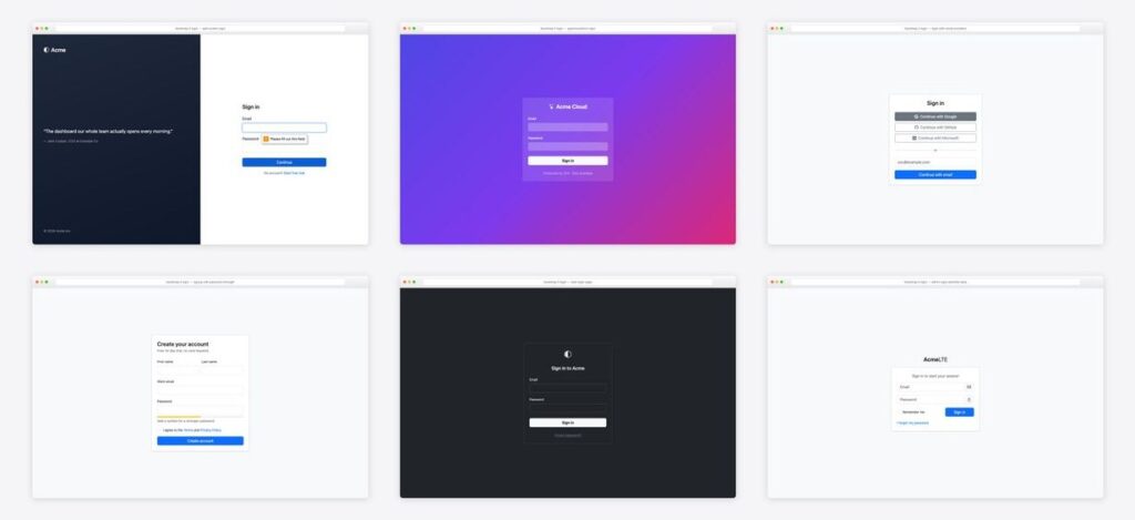
Every product has a front door, and most templates only give you one style of it. Here are 15 copy-paste Bootstrap 5 login and signup page examples covering the full authentication journey — sign-in (centered, split-screen, dark, social, passkey-first), registration (with password strength and multi-step), and the pages everyone forgets: two-factor entry, forgot-password, magic link, lock screen, and session-expired. Each comes with a screenshot, complete code, working autocomplete attributes, and the accessibility details that make browsers and password managers cooperate. Pure Bootstrap 5.3 — custom CSS only where the design demands it. Want a ready-made login form to download rather than markup to paste? Browse our free Bootstrap login form templates. Building in React with a real auth backend instead? See our Better Auth starter kits roundup.
Jump to a page
- Centered login card — The canonical login
- Split-screen login — The SaaS classic
- Dark login page — The dark variant via data-bs-theme=”dark”
- Login with social providers — OAuth-first ordering
- Signup with password strength — Registration with the two details that reduce abandonment
- Two-factor code entry — The 2FA screen as six single-character inputs with inputmode=”numeric” (mobile keyboards switch to digits) and per-box aria-labels. Wire auto-advance in a few lines of JS; the backup-code escape hatch is non-optional UX.
- Forgot-password page — The reset request page plus the response state
- Magic-link login — Passwordless via emailed link
- Glassmorphism login — The showpiece
- Admin login (AdminLTE-style) — The AdminLTE lineage
- Passkey-first login — The 2026 pattern
- Multi-step signup (wizard) — Multi-step registration
- Login in a modal — Login without leaving the page
- Lock screen (re-authentication) — The re-auth lock screen
- Session-expired page — The page nobody designs until users complain
1. Centered login card
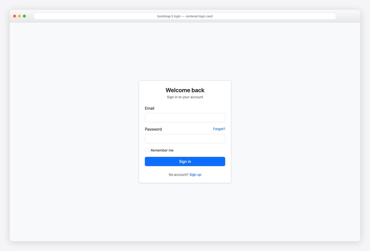
The canonical login: a centered card on min-vh-100 flex, email + password with the forgot link on the label row. The invisible essentials are the autocomplete attributes — username and current-password are what make password managers and iCloud/Google autofill behave.
<main class="d-flex align-items-center justify-content-center min-vh-100 bg-body-tertiary">
  <div class="card shadow-sm" style="width: 380px">
    <div class="card-body p-4">
      <h1 class="fs-4 fw-semibold text-center mb-1">Welcome back</h1>
      <p class="text-body-secondary text-center small mb-4">Sign in to your account</p>
      <form action="#" method="post">
        <div class="mb-3">
          <label for="email" class="form-label">Email</label>
          <input type="email" class="form-control" id="email" autocomplete="username" required>
        </div>
        <div class="mb-3">
          <div class="d-flex justify-content-between">
            <label for="password" class="form-label">Password</label>
            <a href="#" class="small text-decoration-none">Forgot?</a>
          </div>
          <input type="password" class="form-control" id="password" autocomplete="current-password" required>
        </div>
        <div class="form-check mb-3">
          <input class="form-check-input" type="checkbox" id="remember">
          <label class="form-check-label small" for="remember">Remember me</label>
        </div>
        <button class="btn btn-primary w-100" type="submit">Sign in</button>
      </form>
      <p class="text-center small text-body-secondary mt-4 mb-0">No account? <a href="#" class="text-decoration-none">Sign up</a></p>
    </div>
  </div>
</main>
2. Split-screen login
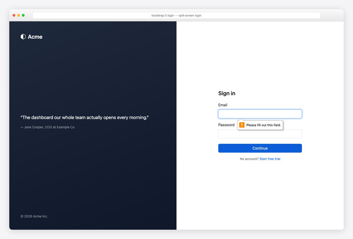
The SaaS classic: brand/testimonial panel left, form right, panel hidden below lg so mobile gets a clean single column. Social proof next to the form is prime real estate — use a real quote.
<main class="container-fluid min-vh-100">
<div class="row min-vh-100">
<div class="col-lg-6 d-none d-lg-flex flex-column justify-content-between text-white p-5" style="background: linear-gradient(160deg, #1e293b, #0f172a)">
<div class="fs-4 fw-semibold"><i class="bi bi-hexagon-half me-2"></i>Acme</div>
<blockquote class="mb-5">
<p class="fs-5">“The dashboard our whole team actually opens every morning.”</p>
<footer class="text-white-50 small">— Jane Cooper, COO at Example Co</footer>
</blockquote>
<span class="small text-white-50">© 2026 Acme Inc.</span>
</div>
<div class="col-lg-6 d-flex align-items-center justify-content-center p-4">
<form class="w-100" style="max-width: 360px" action="#" method="post">
<h1 class="fs-4 fw-semibold mb-4">Sign in</h1>
<div class="mb-3">
<label for="s-email" class="form-label">Email</label>
<input type="email" class="form-control" id="s-email" autocomplete="username" required>
</div>
<div class="mb-4">
<label for="s-pass" class="form-label">Password</label>
<input type="password" class="form-control" id="s-pass" autocomplete="current-password" required>
</div>
<button class="btn btn-primary w-100 mb-3" type="submit">Continue</button>
<p class="small text-body-secondary text-center mb-0">No account? <a href="#" class="text-decoration-none">Start free trial</a></p>
</form>
</div>
</div>
</main>
3. Dark login page
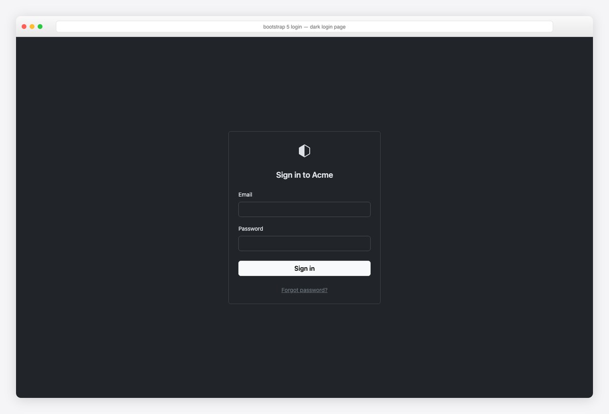
The dark variant via data-bs-theme="dark" — every token re-maps, and the light primary button (btn-light) gives the CTA maximum contrast on dark. Pair with the no-flash theme script if the rest of your app is theme-switchable.
<!-- data-bs-theme="dark" on <html> or this wrapper -->
<main class="d-flex align-items-center justify-content-center min-vh-100 bg-body" data-bs-theme="dark">
  <div class="card border-secondary-subtle" style="width: 380px">
    <div class="card-body p-4">
      <div class="text-center mb-4"><i class="bi bi-hexagon-half fs-2"></i></div>
      <h1 class="fs-5 fw-semibold text-center mb-4">Sign in to Acme</h1>
      <form action="#" method="post">
        <div class="mb-3">
          <label for="d-email" class="form-label small">Email</label>
          <input type="email" class="form-control" id="d-email" autocomplete="username" required>
        </div>
        <div class="mb-4">
          <label for="d-pass" class="form-label small">Password</label>
          <input type="password" class="form-control" id="d-pass" autocomplete="current-password" required>
        </div>
        <button class="btn btn-light w-100 fw-semibold" type="submit">Sign in</button>
      </form>
      <p class="text-center small text-body-secondary mt-4 mb-0"><a href="#" class="link-secondary">Forgot password?</a></p>
    </div>
  </div>
</main>
4. Login with social providers
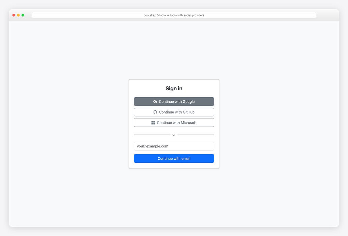
OAuth-first ordering: providers on top, the email fallback under an “or” divider (two hrs flanking a span — no custom CSS). Keep provider buttons neutral (btn-outline-secondary) — fake brand-colored buttons violate most providers’ guidelines.
<main class="d-flex align-items-center justify-content-center min-vh-100 bg-body-tertiary">
  <div class="card shadow-sm" style="width: 400px">
    <div class="card-body p-4">
      <h1 class="fs-4 fw-semibold text-center mb-4">Sign in</h1>
      <div class="d-grid gap-2 mb-3">
        <button class="btn btn-outline-secondary" type="button"><i class="bi bi-google me-2"></i>Continue with Google</button>
        <button class="btn btn-outline-secondary" type="button"><i class="bi bi-github me-2"></i>Continue with GitHub</button>
        <button class="btn btn-outline-secondary" type="button"><i class="bi bi-microsoft me-2"></i>Continue with Microsoft</button>
      </div>
      <div class="d-flex align-items-center my-3">
        <hr class="flex-grow-1"><span class="px-2 small text-body-secondary">or</span><hr class="flex-grow-1">
      </div>
      <form action="#" method="post">
        <div class="mb-3">
          <label for="so-email" class="form-label visually-hidden">Email</label>
          <input type="email" class="form-control" id="so-email" placeholder="[email protected]" autocomplete="username" required>
        </div>
        <button class="btn btn-primary w-100" type="submit">Continue with email</button>
      </form>
    </div>
  </div>
</main>
5. Signup with password strength
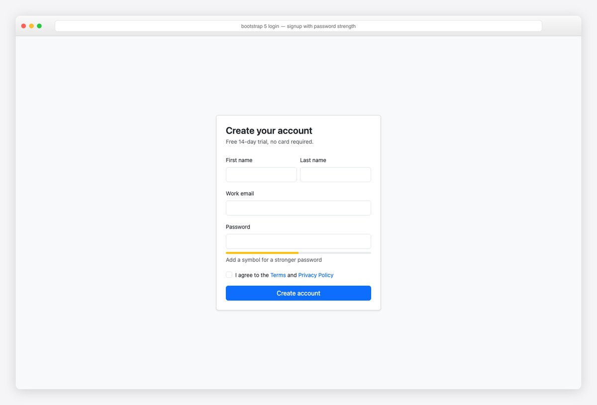
Registration with the two details that reduce abandonment: a password-strength meter (a 5px progress bar + one guidance line, updated from your validation JS) and a terms checkbox with required so the browser enforces it.
<main class="d-flex align-items-center justify-content-center min-vh-100 bg-body-tertiary py-4">
  <div class="card shadow-sm" style="width: 420px">
    <div class="card-body p-4">
      <h1 class="fs-4 fw-semibold mb-1">Create your account</h1>
      <p class="text-body-secondary small mb-4">Free 14-day trial, no card required.</p>
      <form action="#" method="post">
        <div class="row g-2 mb-3">
          <div class="col"><label for="fn" class="form-label small">First name</label><input class="form-control" id="fn" autocomplete="given-name" required></div>
          <div class="col"><label for="ln" class="form-label small">Last name</label><input class="form-control" id="ln" autocomplete="family-name" required></div>
        </div>
        <div class="mb-3">
          <label for="su-email" class="form-label small">Work email</label>
          <input type="email" class="form-control" id="su-email" autocomplete="username" required>
        </div>
        <div class="mb-2">
          <label for="su-pass" class="form-label small">Password</label>
          <input type="password" class="form-control" id="su-pass" autocomplete="new-password" aria-describedby="pw-strength" required>
        </div>
        <div class="progress mb-1" style="height: 5px" id="pw-strength" role="progressbar" aria-label="Password strength">
          <div class="progress-bar bg-warning" style="width: 50%"></div>
        </div>
        <p class="small text-body-secondary mb-3">Add a symbol for a stronger password</p>
        <div class="form-check mb-3">
          <input class="form-check-input" type="checkbox" id="terms" required>
          <label class="form-check-label small" for="terms">I agree to the <a href="#" class="text-decoration-none">Terms</a> and <a href="#" class="text-decoration-none">Privacy Policy</a></label>
        </div>
        <button class="btn btn-primary w-100" type="submit">Create account</button>
      </form>
    </div>
  </div>
</main>
6. Two-factor code entry
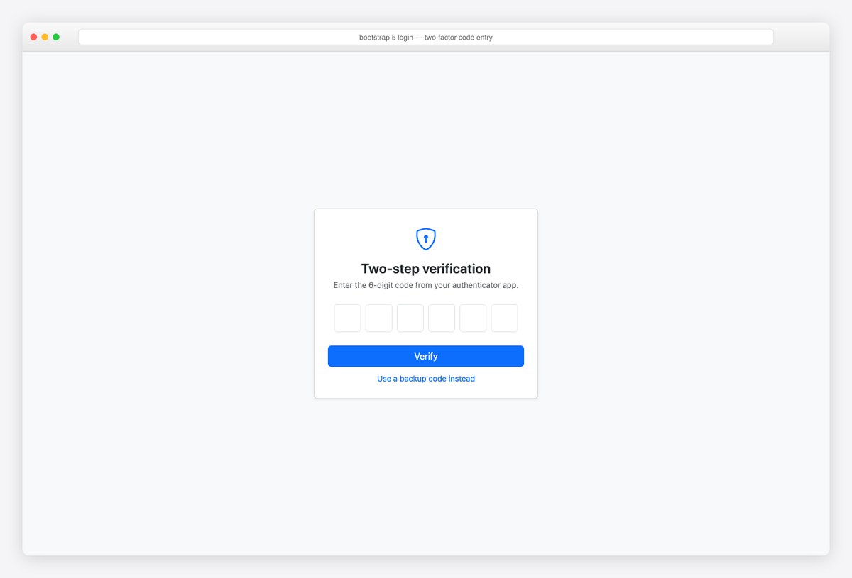
The 2FA screen as six single-character inputs with inputmode="numeric" (mobile keyboards switch to digits) and per-box aria-labels. Wire auto-advance in a few lines of JS; the backup-code escape hatch is non-optional UX.
<main class="d-flex align-items-center justify-content-center min-vh-100 bg-body-tertiary">
  <div class="card shadow-sm text-center" style="width: 400px">
    <div class="card-body p-4">
      <i class="bi bi-shield-lock fs-1 text-primary"></i>
      <h1 class="fs-4 fw-semibold mt-2 mb-1">Two-step verification</h1>
      <p class="text-body-secondary small mb-4">Enter the 6-digit code from your authenticator app.</p>
      <form action="#" method="post">
        <div class="d-flex gap-2 justify-content-center mb-4">
          <input class="form-control text-center fs-4" style="width:48px" maxlength="1" inputmode="numeric" aria-label="Digit 1">
          <input class="form-control text-center fs-4" style="width:48px" maxlength="1" inputmode="numeric" aria-label="Digit 2">
          <input class="form-control text-center fs-4" style="width:48px" maxlength="1" inputmode="numeric" aria-label="Digit 3">
          <input class="form-control text-center fs-4" style="width:48px" maxlength="1" inputmode="numeric" aria-label="Digit 4">
          <input class="form-control text-center fs-4" style="width:48px" maxlength="1" inputmode="numeric" aria-label="Digit 5">
          <input class="form-control text-center fs-4" style="width:48px" maxlength="1" inputmode="numeric" aria-label="Digit 6">
        </div>
        <button class="btn btn-primary w-100 mb-2" type="submit">Verify</button>
        <a href="#" class="small text-decoration-none">Use a backup code instead</a>
      </form>
    </div>
  </div>
</main>
7. Forgot-password page
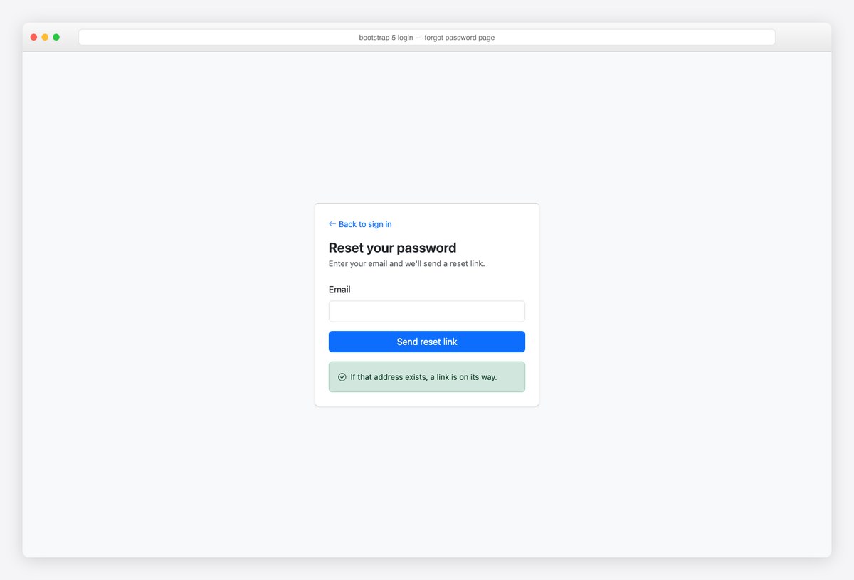
The reset request page plus the response state — note the success alert is deliberately vague (“if that address exists”) so the form can’t be used to enumerate accounts. The back link keeps users from feeling stranded.
<main class="d-flex align-items-center justify-content-center min-vh-100 bg-body-tertiary">
  <div class="card shadow-sm" style="width: 400px">
    <div class="card-body p-4">
      <a href="#" class="small text-decoration-none"><i class="bi bi-arrow-left me-1"></i>Back to sign in</a>
      <h1 class="fs-4 fw-semibold mt-3 mb-1">Reset your password</h1>
      <p class="text-body-secondary small mb-4">Enter your email and we'll send a reset link.</p>
      <form action="#" method="post">
        <div class="mb-3">
          <label for="f-email" class="form-label">Email</label>
          <input type="email" class="form-control" id="f-email" autocomplete="username" required>
        </div>
        <button class="btn btn-primary w-100" type="submit">Send reset link</button>
      </form>
      <div class="alert alert-success small mt-3 mb-0 d-flex align-items-center"><i class="bi bi-check-circle me-2"></i>If that address exists, a link is on its way.</div>
    </div>
  </div>
</main>
8. Magic-link login
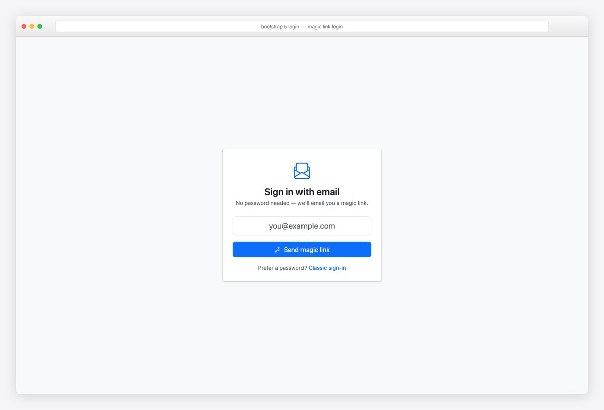
Passwordless via emailed link: one large centered email input and an honest explanation. Always offer the classic path below — magic links fail in corporate mail filters more than dashboards admit.
<main class="d-flex align-items-center justify-content-center min-vh-100 bg-body-tertiary">
  <div class="card shadow-sm text-center" style="width: 400px">
    <div class="card-body p-4">
      <i class="bi bi-envelope-paper fs-1 text-primary"></i>
      <h1 class="fs-4 fw-semibold mt-2 mb-1">Sign in with email</h1>
      <p class="text-body-secondary small mb-4">No password needed — we'll email you a magic link.</p>
      <form action="#" method="post">
        <div class="mb-3">
          <label for="m-email" class="form-label visually-hidden">Email</label>
          <input type="email" class="form-control form-control-lg text-center" id="m-email" placeholder="[email protected]" autocomplete="username" required>
        </div>
        <button class="btn btn-primary w-100" type="submit"><i class="bi bi-magic me-2"></i>Send magic link</button>
      </form>
      <p class="small text-body-secondary mt-3 mb-0">Prefer a password? <a href="#" class="text-decoration-none">Classic sign-in</a></p>
    </div>
  </div>
</main>
9. Glassmorphism login
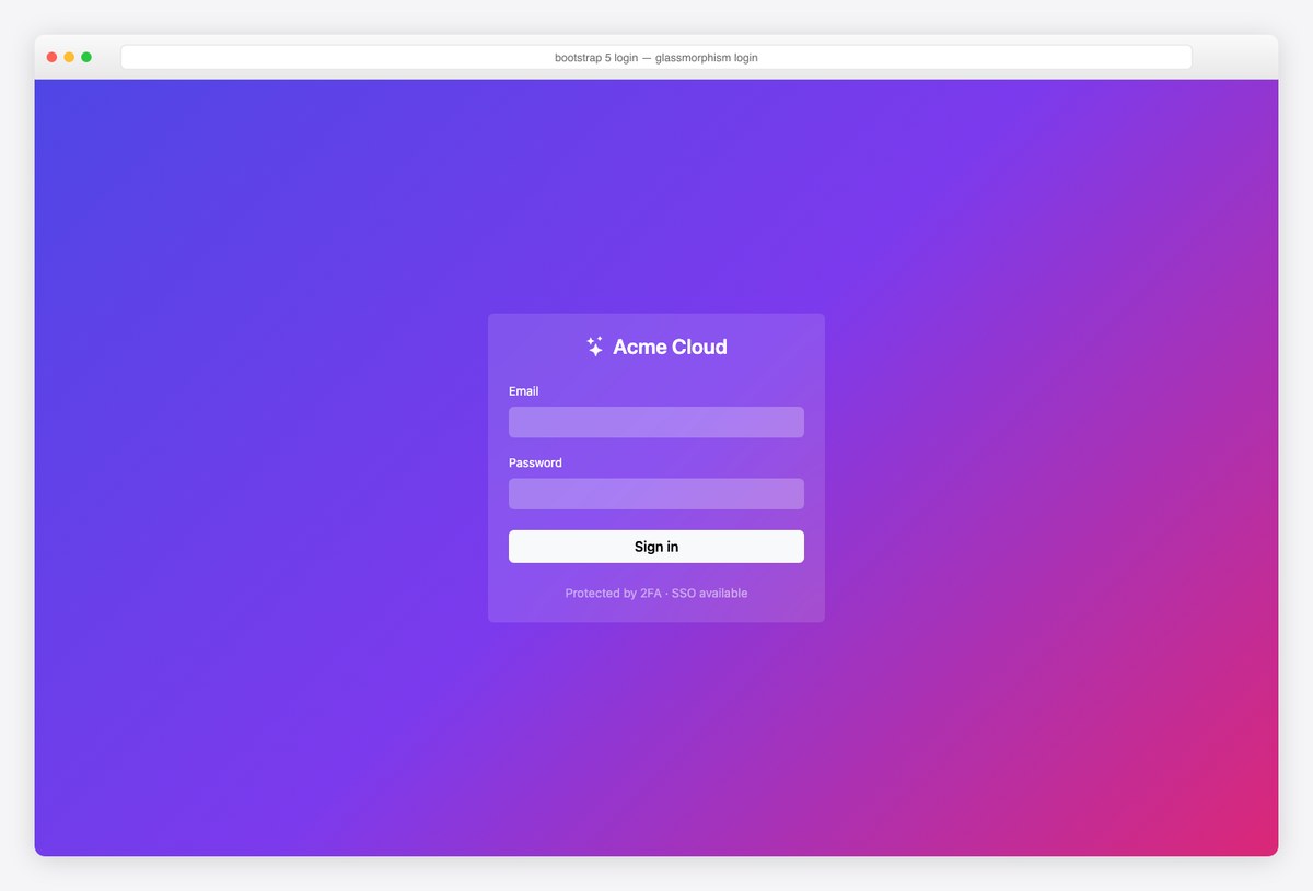
The showpiece: gradient backdrop, translucent card with backdrop-filter: blur(), white-on-glass inputs. Two inline styles are the entire custom budget. Contrast-check placeholder text — glass UIs fail WCAG quietly.
<main class="d-flex align-items-center justify-content-center min-vh-100" style="background: linear-gradient(135deg, #4f46e5, #7c3aed 50%, #db2777)">
  <div class="card border-0 text-white" style="width: 390px; background: rgba(255,255,255,.12); backdrop-filter: blur(14px)">
    <div class="card-body p-4">
      <h1 class="fs-4 fw-semibold text-center mb-4"><i class="bi bi-stars me-2"></i>Acme Cloud</h1>
      <form action="#" method="post">
        <div class="mb-3">
          <label for="g-email" class="form-label small">Email</label>
          <input type="email" class="form-control bg-white bg-opacity-25 border-0 text-white" id="g-email" autocomplete="username" required>
        </div>
        <div class="mb-4">
          <label for="g-pass" class="form-label small">Password</label>
          <input type="password" class="form-control bg-white bg-opacity-25 border-0 text-white" id="g-pass" autocomplete="current-password" required>
        </div>
        <button class="btn btn-light w-100 fw-semibold" type="submit">Sign in</button>
      </form>
      <p class="text-center small mt-4 mb-0 text-white-50">Protected by 2FA · SSO available</p>
    </div>
  </div>
</main>
10. Admin login (AdminLTE-style)
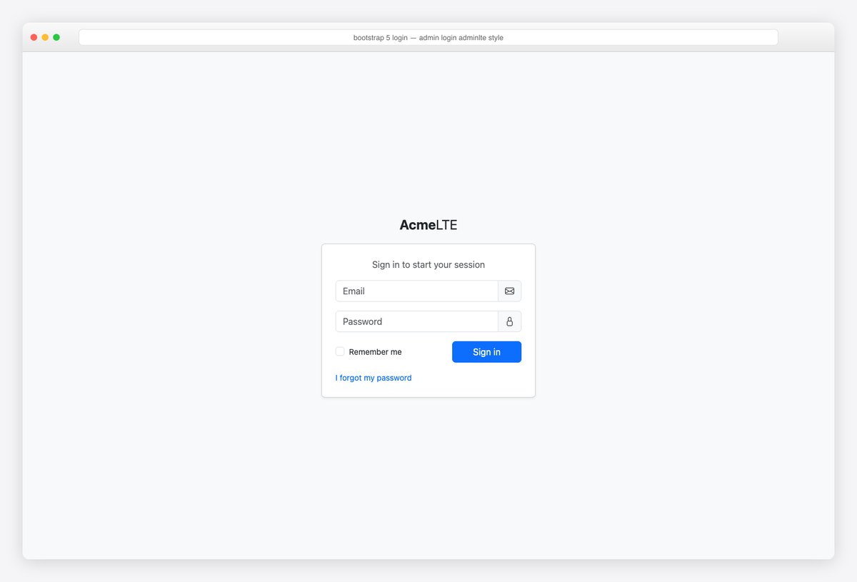
The AdminLTE lineage: input-group fields with trailing icons, remember-me beside the submit, plain link for recovery — the login millions of admins recognize. The official React/Angular libraries ship this page as components.
<main class="d-flex align-items-center justify-content-center min-vh-100 bg-body-tertiary">
  <div style="width: 380px">
    <div class="text-center mb-3 fs-4"><b>Acme</b>LTE</div>
    <div class="card shadow-sm">
      <div class="card-body p-4">
        <p class="text-center text-body-secondary mb-3">Sign in to start your session</p>
        <form action="#" method="post">
          <div class="input-group mb-3">
            <input type="email" class="form-control" placeholder="Email" aria-label="Email" autocomplete="username" required>
            <span class="input-group-text"><i class="bi bi-envelope"></i></span>
          </div>
          <div class="input-group mb-3">
            <input type="password" class="form-control" placeholder="Password" aria-label="Password" autocomplete="current-password" required>
            <span class="input-group-text"><i class="bi bi-lock"></i></span>
          </div>
          <div class="row align-items-center">
            <div class="col-7">
              <div class="form-check"><input class="form-check-input" type="checkbox" id="a-rem"><label class="form-check-label small" for="a-rem">Remember me</label></div>
            </div>
            <div class="col-5"><button class="btn btn-primary w-100" type="submit">Sign in</button></div>
          </div>
        </form>
        <div class="mt-3 small"><a href="#" class="text-decoration-none">I forgot my password</a></div>
      </div>
    </div>
  </div>
</main>
11. Passkey-first login
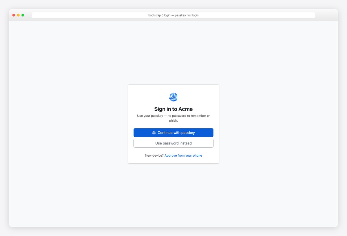
The 2026 pattern: passkey-first with password as fallback. The fingerprint icon + one-line explainer does the education; wire the button to the WebAuthn navigator.credentials.get() call and hide it when unsupported.
<main class="d-flex align-items-center justify-content-center min-vh-100 bg-body-tertiary">
  <div class="card shadow-sm text-center" style="width: 400px">
    <div class="card-body p-4">
      <i class="bi bi-fingerprint fs-1 text-primary"></i>
      <h1 class="fs-4 fw-semibold mt-2 mb-1">Sign in to Acme</h1>
      <p class="text-body-secondary small mb-4">Use your passkey — no password to remember or phish.</p>
      <button class="btn btn-primary w-100 mb-2" type="button"><i class="bi bi-fingerprint me-2"></i>Continue with passkey</button>
      <button class="btn btn-outline-secondary w-100" type="button">Use password instead</button>
      <p class="small text-body-secondary mt-4 mb-0">New device? <a href="#" class="text-decoration-none">Approve from your phone</a></p>
    </div>
  </div>
</main>
12. Multi-step signup (wizard)
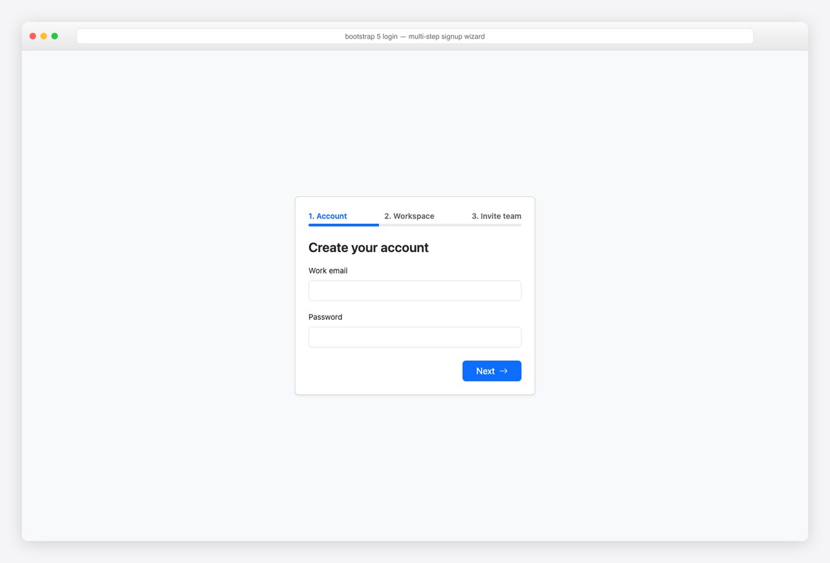
Multi-step registration: labeled steps with a slim progress bar (aria-valuenow synced to the step). Splitting signup raises completion when the full form would exceed ~6 fields — ask for the minimum first.
<main class="d-flex align-items-center justify-content-center min-vh-100 bg-body-tertiary py-4">
  <div class="card shadow-sm" style="width: 440px">
    <div class="card-body p-4">
      <div class="d-flex align-items-center justify-content-between mb-1 small fw-semibold">
        <span class="text-primary">1. Account</span><span class="text-body-secondary">2. Workspace</span><span class="text-body-secondary">3. Invite team</span>
      </div>
      <div class="progress mb-4" style="height: 5px" role="progressbar" aria-label="Signup progress" aria-valuenow="33" aria-valuemin="0" aria-valuemax="100">
        <div class="progress-bar" style="width: 33%"></div>
      </div>
      <h1 class="fs-4 fw-semibold mb-3">Create your account</h1>
      <form action="#" method="post">
        <div class="mb-3"><label for="w-email" class="form-label small">Work email</label><input type="email" class="form-control" id="w-email" autocomplete="username" required></div>
        <div class="mb-4"><label for="w-pass" class="form-label small">Password</label><input type="password" class="form-control" id="w-pass" autocomplete="new-password" required></div>
        <div class="d-flex justify-content-end"><button class="btn btn-primary px-4" type="submit">Next<i class="bi bi-arrow-right ms-2"></i></button></div>
      </form>
    </div>
  </div>
</main>
13. Login in a modal
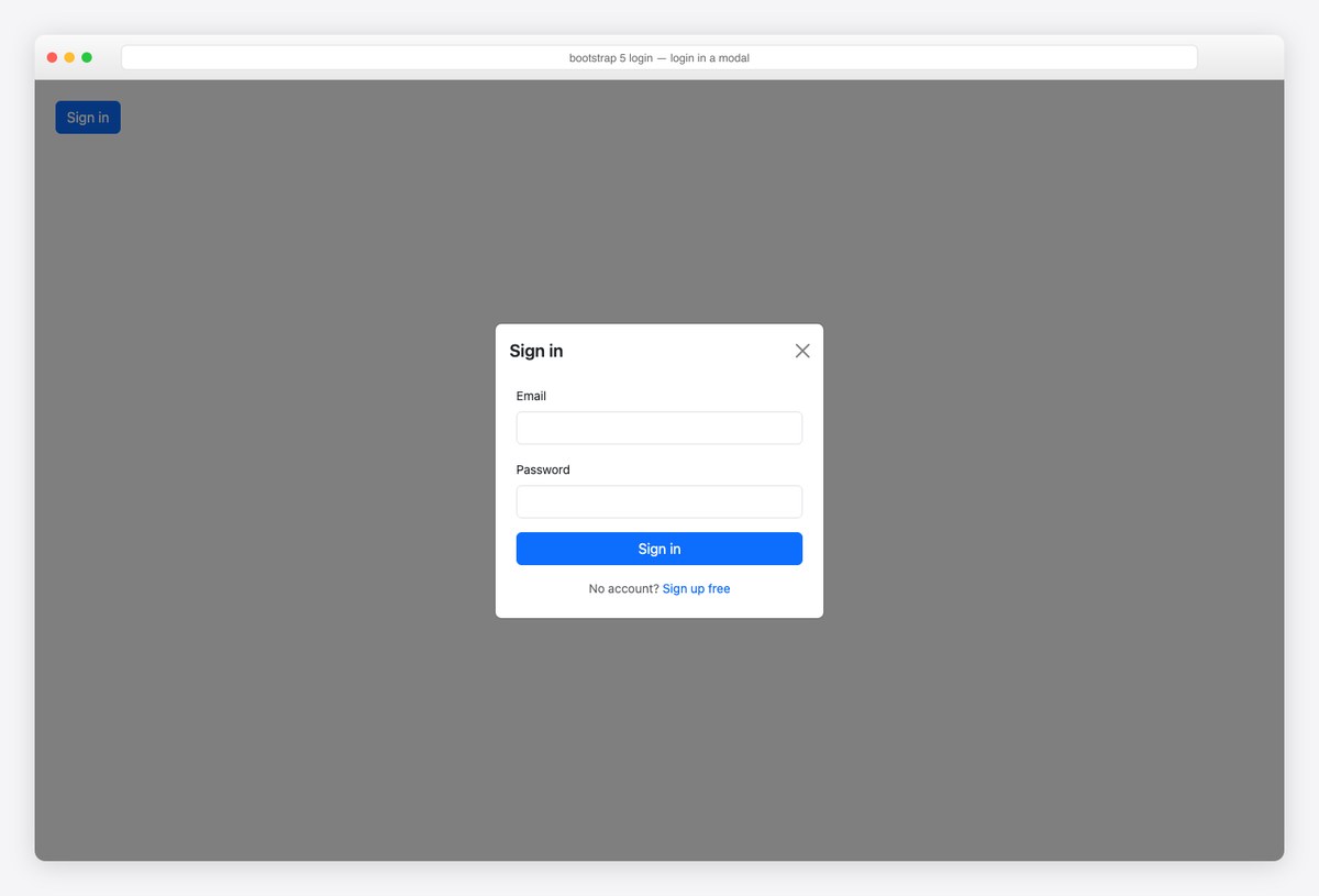
Login without leaving the page: a centered Bootstrap Modal, focus-trapped and Escape-dismissable for free. Best for content sites where auth is optional; for app entry points prefer a dedicated page (deep-linkable, no layout shift).
<!-- Trigger anywhere in your page -->
<button class="btn btn-primary m-4" data-bs-toggle="modal" data-bs-target="#loginModal">Sign in</button>

<div class="modal fade" id="loginModal" tabindex="-1" aria-labelledby="loginModalLabel" aria-hidden="true">
  <div class="modal-dialog modal-dialog-centered" style="max-width: 380px">
    <div class="modal-content">
      <div class="modal-header border-0 pb-0">
        <h1 class="modal-title fs-5 fw-semibold" id="loginModalLabel">Sign in</h1>
        <button type="button" class="btn-close" data-bs-dismiss="modal" aria-label="Close"></button>
      </div>
      <div class="modal-body p-4">
        <form action="#" method="post">
          <div class="mb-3"><label for="mo-email" class="form-label small">Email</label><input type="email" class="form-control" id="mo-email" autocomplete="username" required></div>
          <div class="mb-3"><label for="mo-pass" class="form-label small">Password</label><input type="password" class="form-control" id="mo-pass" autocomplete="current-password" required></div>
          <button class="btn btn-primary w-100" type="submit">Sign in</button>
        </form>
        <p class="text-center small text-body-secondary mt-3 mb-0">No account? <a href="#" class="text-decoration-none">Sign up free</a></p>
      </div>
    </div>
  </div>
</div>
14. Lock screen (re-authentication)
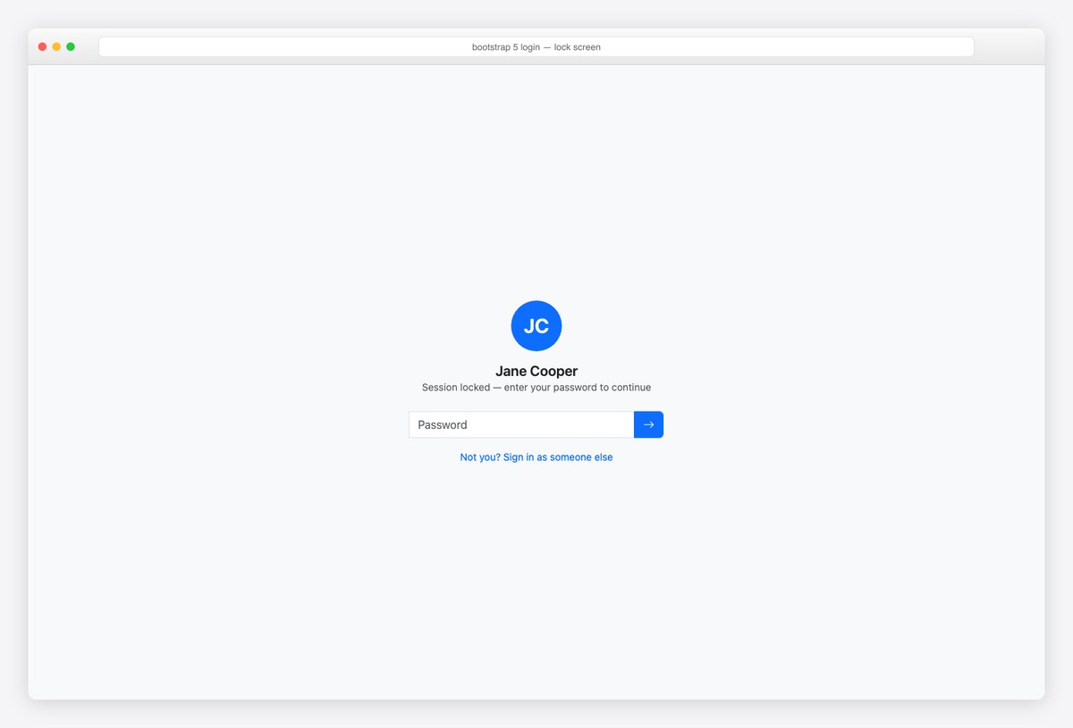
The re-auth lock screen: avatar, name, single password field with an arrow submit. Session timeouts feel less hostile when the UI acknowledges who you are — and the “not you?” link handles shared machines.
<main class="d-flex align-items-center justify-content-center min-vh-100 bg-body-tertiary">
  <div class="text-center" style="width: 360px">
    <span class="rounded-circle bg-primary text-white d-inline-flex align-items-center justify-content-center mb-3" style="width:72px;height:72px"><span class="fs-3 fw-semibold">JC</span></span>
    <h1 class="fs-5 fw-semibold mb-0">Jane Cooper</h1>
    <p class="text-body-secondary small mb-4">Session locked — enter your password to continue</p>
    <form class="input-group" action="#" method="post">
      <label for="l-pass" class="visually-hidden">Password</label>
      <input type="password" class="form-control" id="l-pass" placeholder="Password" autocomplete="current-password" required>
      <button class="btn btn-primary" type="submit" aria-label="Unlock"><i class="bi bi-arrow-right"></i></button>
    </form>
    <a href="#" class="small text-decoration-none d-inline-block mt-3">Not you? Sign in as someone else</a>
  </div>
</main>
15. Session-expired page
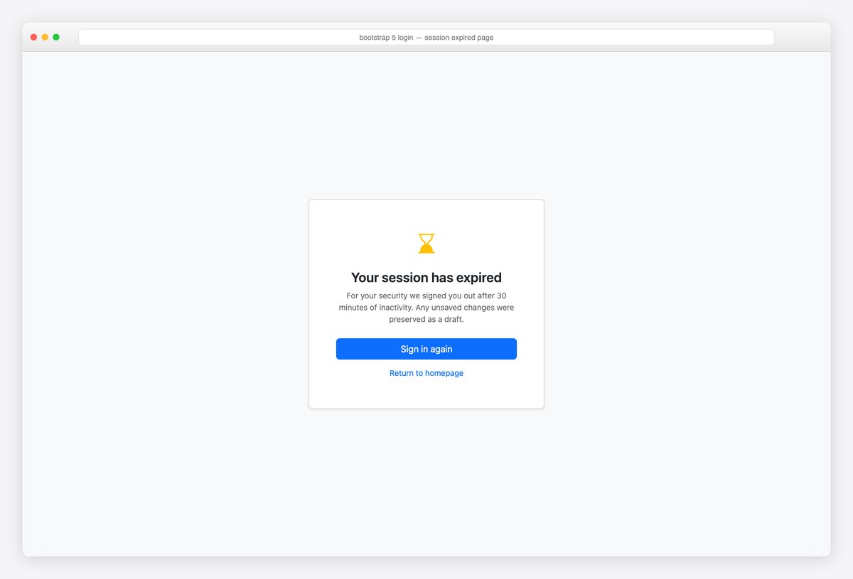
The page nobody designs until users complain: explain why (security), reassure about drafts, one primary action. A designed session-expired page turns an annoyance into evidence the product is careful.
<main class="d-flex align-items-center justify-content-center min-vh-100 bg-body-tertiary">
  <div class="card shadow-sm text-center" style="width: 420px">
    <div class="card-body p-5">
      <i class="bi bi-hourglass-bottom fs-1 text-warning"></i>
      <h1 class="fs-4 fw-semibold mt-3 mb-2">Your session has expired</h1>
      <p class="text-body-secondary small mb-4">For your security we signed you out after 30 minutes of inactivity. Any unsaved changes were preserved as a draft.</p>
      <a href="#" class="btn btn-primary w-100 mb-2">Sign in again</a>
      <a href="#" class="btn btn-link btn-sm text-decoration-none">Return to homepage</a>
    </div>
  </div>
</main>
Login page details that actually matter
autocompleteis not optional:username+current-passwordon sign-in,new-passwordon registration — this is what makes password managers fill, generate, and update credentials correctly.- Never enumerate accounts: reset and signup responses should read identically whether the email exists or not (example 7’s alert copy).
- Label everything, hide labels visually if needed:
visually-hiddenkeeps minimal designs accessible; placeholder-as-label fails the moment the field is filled. - Show the whole journey: 2FA, magic-link, lock, and expired screens (examples 6, 8, 14, 15) belong to the same design system as the login — users notice when the “boring” pages look abandoned.
- Passkey-first is the 2026 default posture (example 11): render the passkey button when
window.PublicKeyCredentialexists, fall back to password otherwise.
Frequently asked questions
How do I make a login page with Bootstrap?
Center a card on a min-vh-100 flex container, add email and password form-controls with proper autocomplete attributes, and a w-100 primary button — example 1 is the complete canonical markup. The other 14 examples restyle that skeleton for split-screen, dark, social, passkey, and the rest of the auth journey.
Is there a free Bootstrap login template?
All 15 on this page are free to copy — full pages, not fragments, built on stock Bootstrap 5.3. For login pages already wired into complete admin templates, see our free admin panels roundup; for React apps with working authentication, the Better Auth starter kits.
How do I center a login form vertically in Bootstrap?
One wrapper: d-flex align-items-center justify-content-center min-vh-100. No margins, no transforms — the flex utilities center the card at every viewport size.
What autocomplete attributes should a login form use?
Sign-in: autocomplete=”username” on the email and “current-password” on the password. Registration: “new-password” so managers offer to generate one. Names: “given-name”/”family-name”. These attributes drive password-manager integration — omitting them is the most common login-form bug.
Should login be a page or a modal?
A dedicated page for app entry points: it’s deep-linkable, works as an OAuth redirect target, and survives refreshes. A modal (example 13) suits content sites where signing in is optional mid-task. Never both for the same flow.
Building the rest of the app? Continue with our 17 Bootstrap sidebar examples and 18 Bootstrap footer examples — or start from a complete shell in free admin panels, with real authentication via the Better Auth starter kits.

You Might Also Like