18 Free Responsive Bootstrap Templates For 2026

With mobile devices accounting for over 60% of web traffic and Google using mobile-first indexing, responsive design is the foundation of every successful website. Bootstrap 5.3 makes this easier than ever with refined breakpoints, improved grid utilities, and a leaner, jQuery-free codebase that loads fast on any device. Also worth checking out is our list of free Bootstrap 5 templates.
The ten templates below are built on Bootstrap 5, ship with clean source code, and are completely free for personal and commercial projects. We selected them based on design quality, responsive behavior, and real-world usefulness across industries — from consulting and education to creative agencies and law firms. For an even wider selection, browse our roundup of free responsive templates covering additional frameworks and styles.
What Makes a Template Truly Responsive
Before diving into the list, it helps to understand the key characteristics that distinguish a genuinely responsive template from one that merely resizes. Knowing what to look for will help you evaluate not only the templates below but any template you encounter in the future.
Fluid grid layouts: A responsive template uses percentage-based column widths rather than fixed pixel values. Bootstrap’s 12-column grid system handles this elegantly, allowing content to reflow naturally as the browser window changes size. The best templates leverage nested grids and responsive utility classes to create layouts that feel intentional at every breakpoint — not just cobbled together as an afterthought.
Flexible images and media: Images should scale within their containers without overflowing or distorting. Modern templates use max-width: 100% and height: auto as baseline rules, and many go further with responsive image techniques like the <picture> element or srcset attributes to serve appropriately sized files to different devices, improving both visual quality and load performance.
Breakpoint-aware navigation: Desktop mega-menus and multi-level dropdowns simply do not work on touchscreens. Quality responsive templates transform navigation into mobile-friendly patterns — typically an offcanvas sidebar or a collapsible hamburger menu — that are easy to tap and navigate with one hand. The transition between desktop and mobile navigation should be seamless and never leave users stranded without a way to move through the site.
Performance under constraints: Mobile users are often on slower connections. A well-optimized responsive template minimizes HTTP requests, uses modern CSS instead of heavy JavaScript for animations, lazy-loads offscreen images, and avoids render-blocking resources. Templates built on Bootstrap 5 benefit from its smaller footprint compared to Bootstrap 4, since jQuery is no longer a dependency. For a deeper look at the Bootstrap 5 ecosystem, explore our collection of free Bootstrap 5 templates.
Touch-friendly interactions: Hover states are meaningless on touch devices. Responsive templates should use click and tap events for interactive elements, ensure buttons and links have adequate touch target sizes (at least 44×44 pixels per accessibility guidelines), and implement swipe gestures for carousels and galleries where appropriate.
The 10 Best Free Responsive Bootstrap Templates
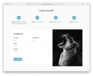
1. Megasis
Megasis is a polished business template designed for companies that want to make a strong first impression. Its full-width hero slider immediately draws visitors in with bold imagery and overlay text, while the service cards section below provides a clean grid layout that adapts beautifully from desktop to mobile.
The portfolio grid uses a masonry-style arrangement with filterable categories, giving potential clients an elegant way to browse through your work samples. Testimonial cards with client photos and star ratings add social proof, and the contact section includes a working form layout with map integration. The overall design strikes a balance between corporate professionalism and modern aesthetics that works across industries.
- Full-width hero slider with overlay text
- Filterable portfolio grid layout
- Client testimonial cards with ratings
- Integrated contact form and map section
2. ConsultingBiz
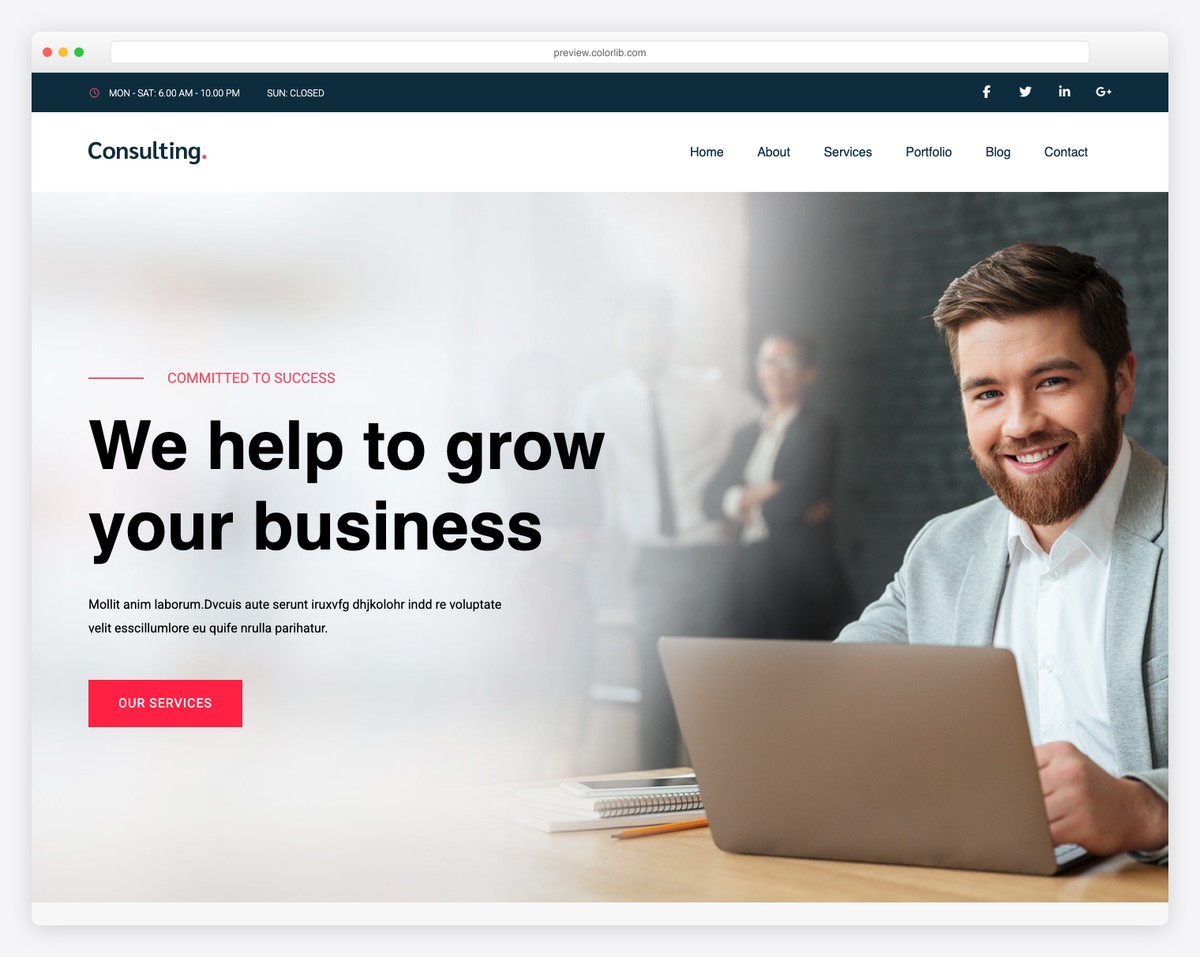
ConsultingBiz is purpose-built for consulting firms, advisory agencies, and professional service businesses that need to establish credibility quickly. The template features dedicated sections for showcasing areas of expertise with icon-driven cards, detailed case study layouts that let you walk visitors through your methodology and results, and a team bios section with professional headshots and role descriptions.
The color scheme leans into trust-building blues and grays, and the typography hierarchy makes dense informational content easy to scan. On mobile, the multi-column expertise grid collapses into a single-column stack without losing visual impact, and the case study cards maintain their readability across all screen sizes.
- Expertise showcase with icon cards
- Structured case study layouts
- Team member profiles with bios
- Trust-building color palette and typography
3. Logistic
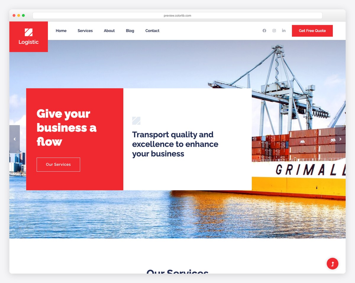
Logistic caters to transportation, shipping, and logistics companies with a design language that feels industrial and dependable. The template includes sections for service tracking information, fleet showcases with vehicle or equipment imagery, and route details that can be adapted for delivery zones or coverage maps.
What makes this template particularly useful for the logistics industry is its emphasis on clear data presentation — pricing tables, service comparison grids, and stat counters all render cleanly on both desktop and mobile. The header includes a prominent call-to-action bar with phone number and quote request button, ensuring that potential customers can reach out immediately regardless of which device they are browsing from.
- Service tracking and route information sections
- Fleet and equipment showcase gallery
- Pricing tables and service comparisons
- Sticky header with phone number and quote CTA
4. Imagine
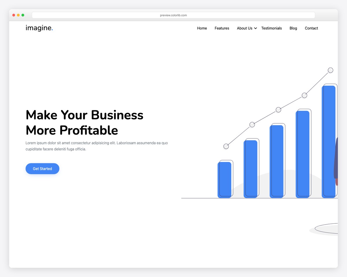
Imagine is built for creative agencies, design studios, and freelancers who want their website to be as visually striking as their portfolio work. The template opens with a stunning full-screen hero section that supports background video or high-resolution imagery, setting a dramatic tone right from the first scroll. The portfolio section uses hover-reveal animations that display project details when users interact with each thumbnail, creating a gallery experience that feels dynamic without being distracting.
Smooth scroll-triggered transitions and subtle parallax effects add depth throughout the page. Despite the visual richness, the template remains lightweight and performs well on mobile, where the animations gracefully degrade to maintain fast load times. If you work in a creative field and need a portfolio-focused starting point, also take a look at our Bootstrap portfolio templates collection for even more options.
- Full-screen hero with video support
- Hover-reveal portfolio animations
- Smooth scroll-triggered transitions
- Lightweight despite rich visual effects
5. Confer
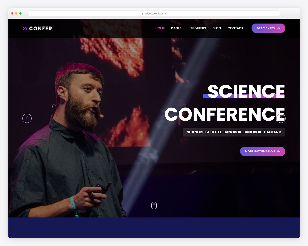
Confer is a conference and event template that covers every aspect of event promotion, from initial awareness through registration. The speaker profiles section presents each presenter with a photo, bio, and topic title in a responsive card grid that stacks neatly on mobile. The schedule section uses a tabbed day-by-day layout that works particularly well on smaller screens, where attendees can quickly swipe between days to plan their agenda.
Venue information includes space for an embedded map, address details, and nearby accommodation suggestions. Multiple strategically placed registration call-to-action buttons ensure that no matter where a visitor is on the page, they are never more than a scroll away from signing up. For admin-focused designs, explore our Bootstrap 5 admin templates.
- Speaker profile cards with bios
- Tabbed day-by-day schedule layout
- Venue section with map integration
- Multiple registration CTAs throughout
6. Lendo
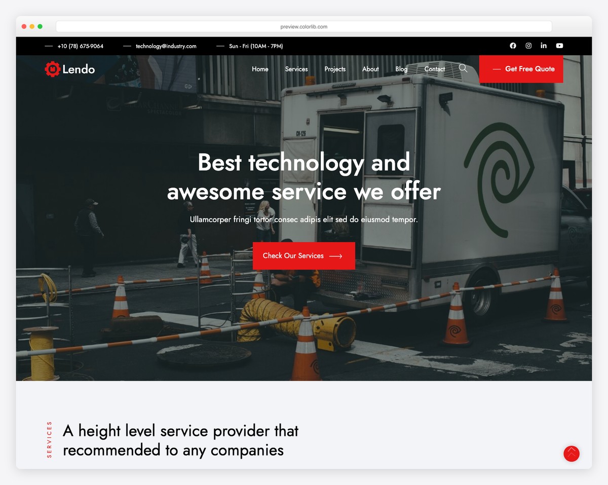
Lendo targets the finance and lending industry with a clean, trustworthy design that puts clarity above all else. The template includes placeholder sections for loan calculator tools, side-by-side service comparison tables, and client testimonial carousels — all the elements that financial service websites need to convert cautious visitors into leads.
The color scheme uses calming blues and whites that reinforce reliability, while the typography is large and readable to accommodate the often complex financial terminology. On mobile, the comparison tables intelligently reflow from horizontal grids to vertical card stacks, preventing the dreaded horizontal scrolling that plagues poorly responsive data tables. Every interactive element has generous touch targets, making the template comfortable to use on smartphones.
- Loan calculator section placeholder
- Service comparison tables with mobile reflow
- Client testimonial carousel
- Trust-focused color scheme and large typography
7. Solicitor
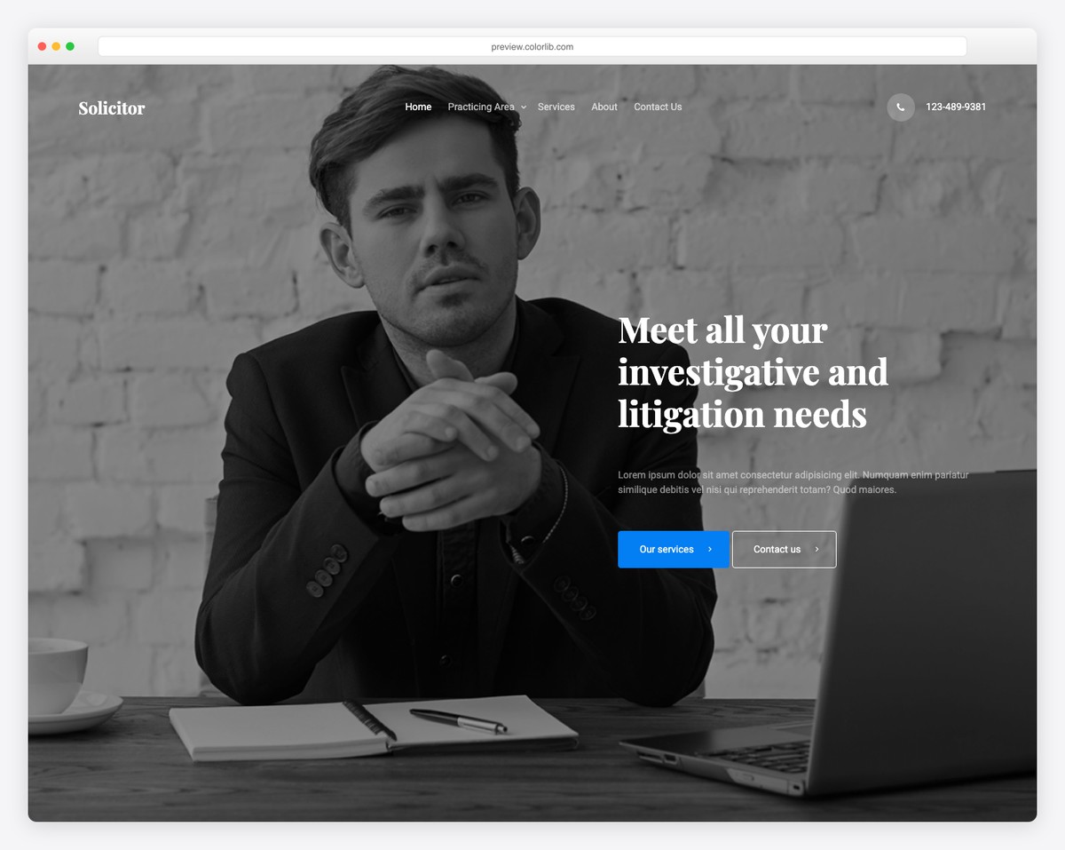
Solicitor is a sophisticated template tailored for law firms, legal practices, and individual attorneys. The design immediately conveys professionalism and authority through its use of dark accent colors, serif typography touches, and structured content blocks. Dedicated sections for practice areas allow firms to present each legal specialty with an icon, description, and link to more details.
The attorney profiles section features professional headshots alongside credentials, bar admissions, and areas of focus. A case results or track record section lets firms highlight notable outcomes with statistics, which are presented using animated counters that trigger on scroll. The entire layout is structured to build trust with potential clients who are often under stress and need to quickly determine whether a firm can handle their specific legal matter.
- Practice areas with detailed descriptions
- Attorney profiles with credentials
- Animated case results counters
- Authority-building dark color scheme
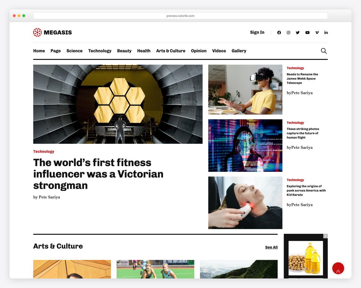
8. Pato
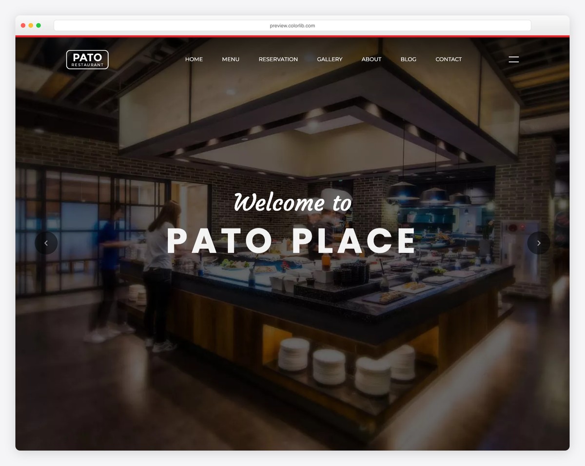
Pato is a multipurpose template that adapts to virtually any type of business or personal project. Its flexible section-based architecture means you can mix and match components — services, portfolio galleries, blog post grids, team members, pricing tables, and contact forms — to build a page structure that fits your specific needs. The design is intentionally neutral and modern, using generous whitespace, clean lines, and a restrained color palette that can be easily customized to match any brand.
Each section is independently responsive, so you can reorder or remove blocks without breaking the layout on any screen size. For anyone building a website from scratch and unsure which direction the content might evolve, Pato provides maximum flexibility without sacrificing design quality. If you are exploring broader HTML template options beyond Bootstrap, our curated list covers frameworks of all types.
- Modular mix-and-match sections
- Portfolio, blog, pricing, and contact blocks
- Brand-neutral design easy to customize
- Independently responsive section architecture
9. Digilab
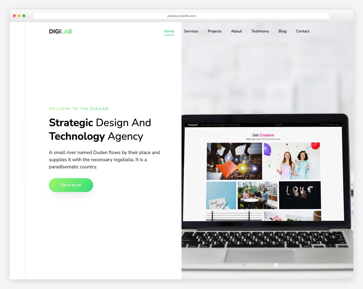
Digilab is designed specifically for digital marketing agencies, web development studios, and tech startups that want to showcase their capabilities with energy and confidence. The template features animated stat counters that tick up as visitors scroll past them, creating an engaging way to highlight metrics like projects completed, clients served, or years in business.
The project showcase section uses a grid layout with category filters, allowing visitors to sort through work samples by type — branding, web design, app development, and so on. Team introduction cards include social media links and role descriptions, reinforcing the human side of the agency. The overall aesthetic is bold and contemporary, with vibrant accent colors and dynamic section transitions that reflect the fast-paced nature of the digital industry.
- Animated scroll-triggered stat counters
- Filterable project showcase grid
- Team cards with social media links
- Bold, contemporary design aesthetic
10. UniversityEdu
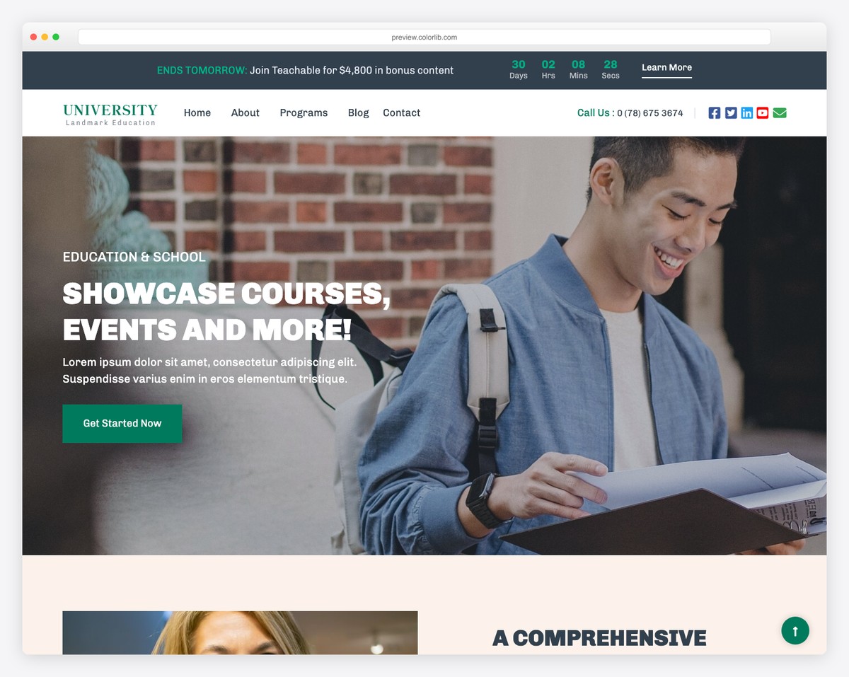
UniversityEdu is a comprehensive education template built for universities, colleges, online learning platforms, and training institutions. The template includes dedicated sections for course catalogs with category filtering, faculty profiles with academic credentials and research interests, campus tour imagery with lightbox support, and an admissions information area with clear step-by-step enrollment instructions.
The design uses an academic color palette — deep blues and greens with clean white backgrounds — that conveys institutional authority while remaining welcoming to prospective students. On mobile, the course catalog switches from a multi-column grid to a scrollable card list, making it easy for students to browse programs on their phones. The admissions section is particularly well-designed for mobile, with collapsible accordion panels that keep the enrollment process clear without overwhelming small screens.
- Course catalog with category filtering
- Faculty profiles with academic credentials
- Campus tour gallery with lightbox
- Accordion-based admissions section for mobile
11. Framework
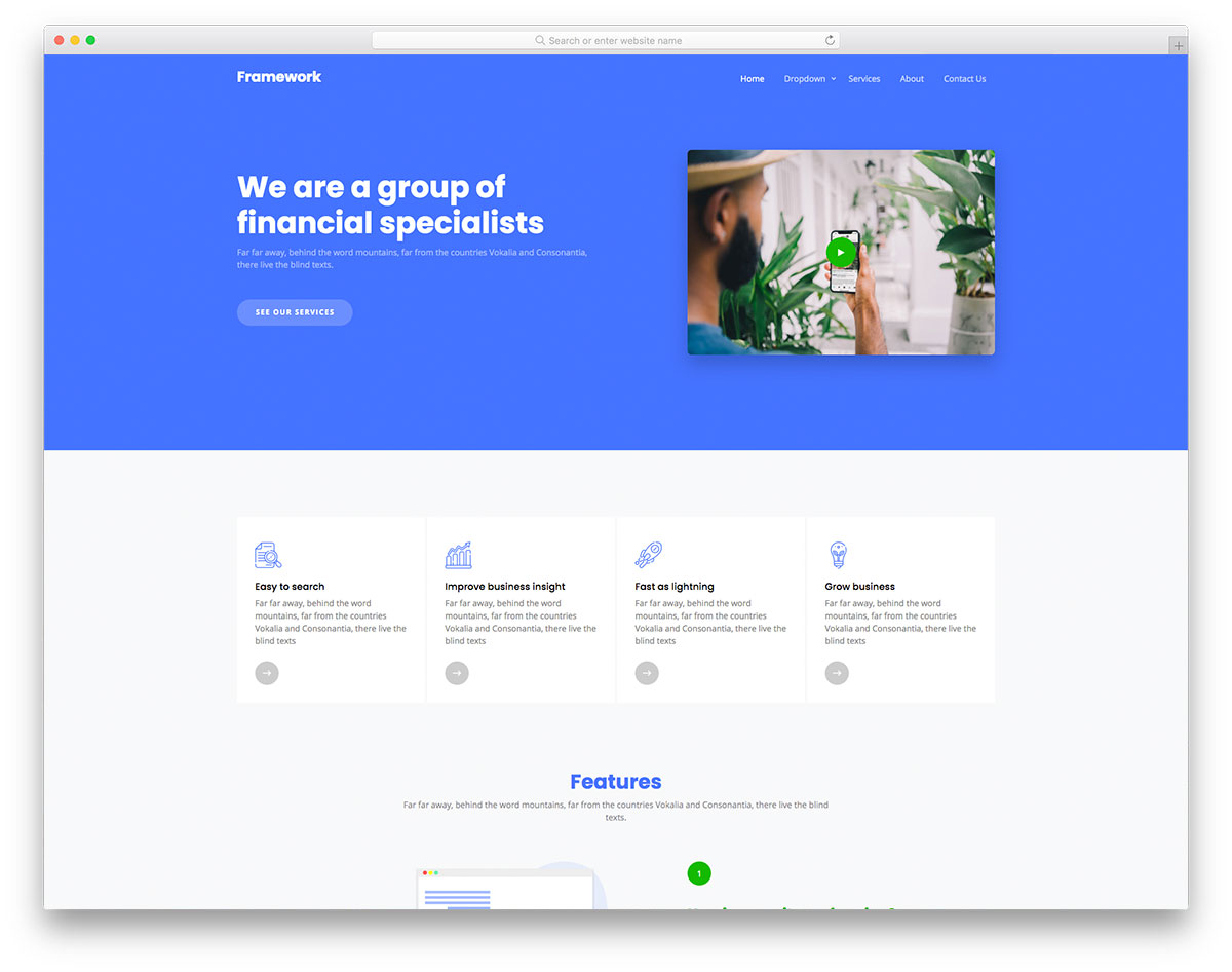
Framework is a polished financial consultancy template with a refined design that communicates expertise and trust from the first scroll. The layout includes testimonial carousels, tiered pricing plan displays, and subtle scrolling animations that add visual depth without distracting from your message.
Built on Bootstrap 5 with clean, well-organized code, Framework is retina-ready and fully responsive across all devices. The hover effects on service cards and team sections add interactivity, while the overall structure makes it easy to customize colors, fonts, and content to match any consulting brand.
- Testimonial carousels
- Tiered pricing plan displays
- Scrolling animations and hover effects
- Retina-ready responsive design
12. Echo
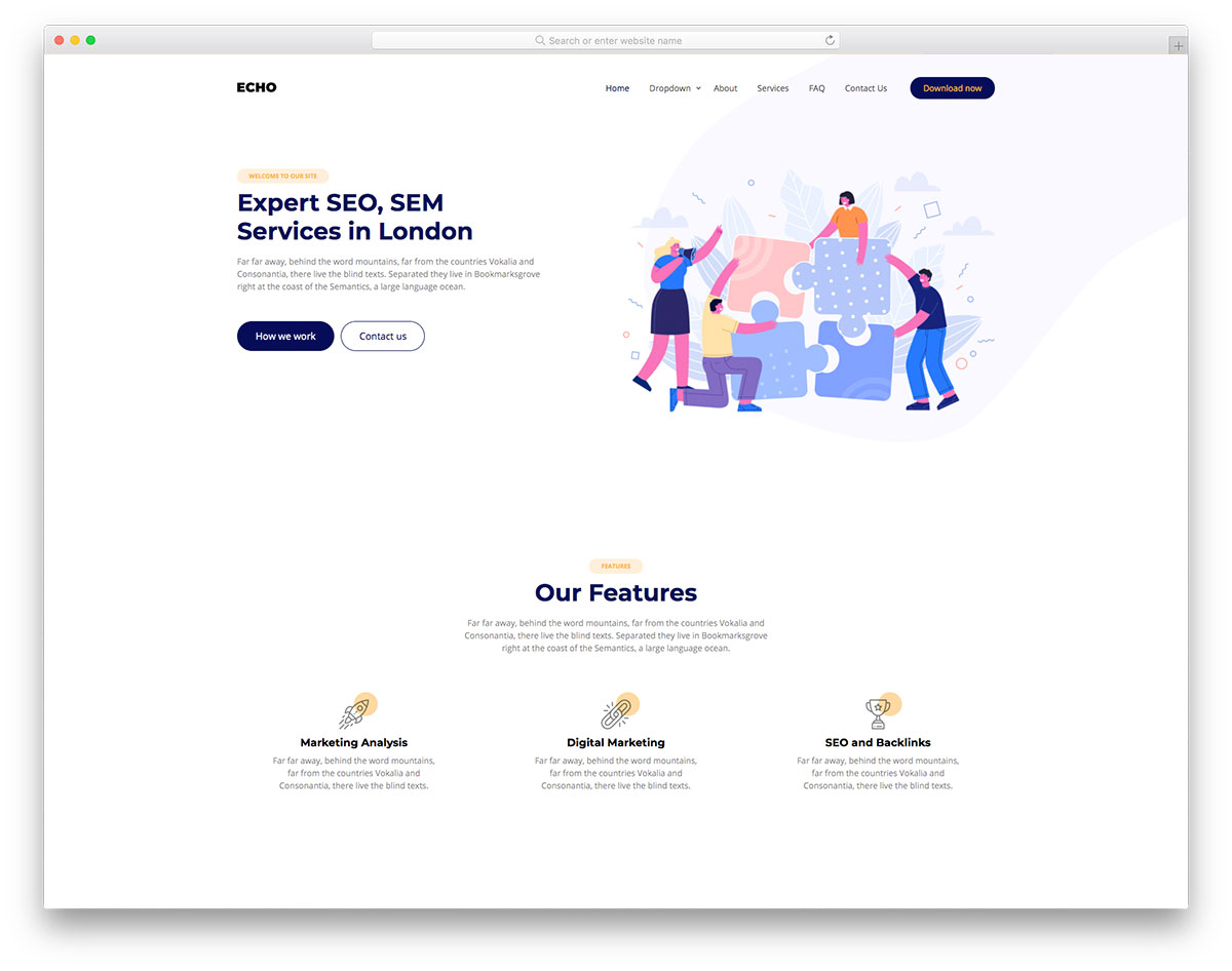
Echo is a creative digital marketing and SEO agency template with a clean, minimal design that puts your services front and center. The multi-level dropdown menus handle complex site navigation elegantly, while hover effects on service cards and portfolio items add visual engagement.
The template includes a testimonial section, an accordion-based FAQ that saves vertical space, a functional contact form, and a blog layout for content marketing. Echo is built on Bootstrap 5 and adapts perfectly to every screen size from desktop monitors to smartphones.
- Multi-level dropdown navigation
- Accordion FAQ section
- Portfolio with hover effects
- Blog and contact form
13. Saita
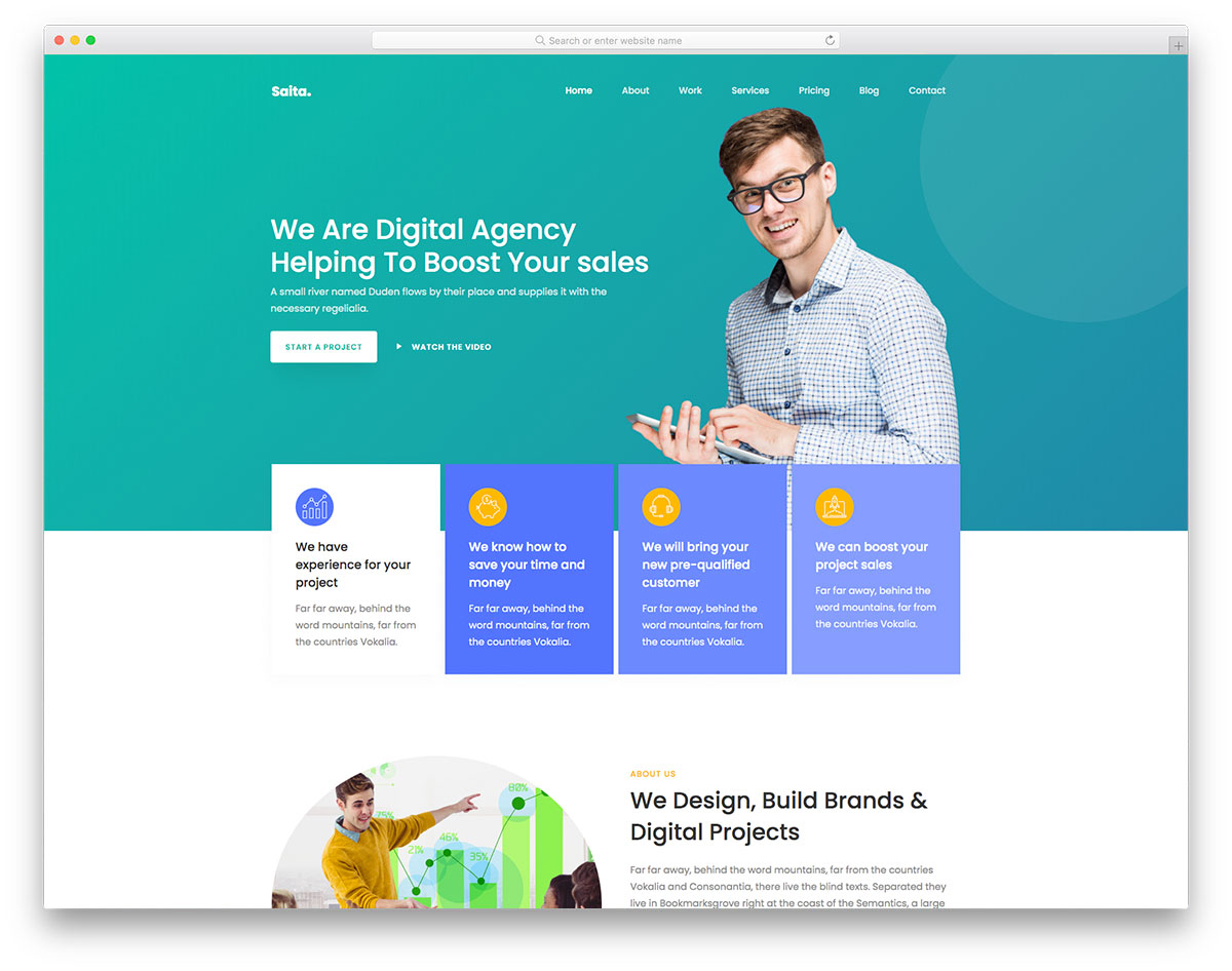
Saita is a dynamic web agency template designed for digital service providers who want to showcase their work and convert visitors into clients. The filterable portfolio section lets potential clients browse projects by category, while pricing plans present your service tiers clearly. You can also explore our curated list of Bootstrap HTML templates for more options.
CTA buttons and hover effects guide visitors through the page, and client testimonials add social proof at key decision points. The template also includes a blog section for establishing thought leadership and a contact form for capturing leads — all on a Bootstrap 5 foundation.
- Filterable portfolio section
- Clear pricing plan displays
- Client testimonial section
- Blog and lead capture form
14. Victor
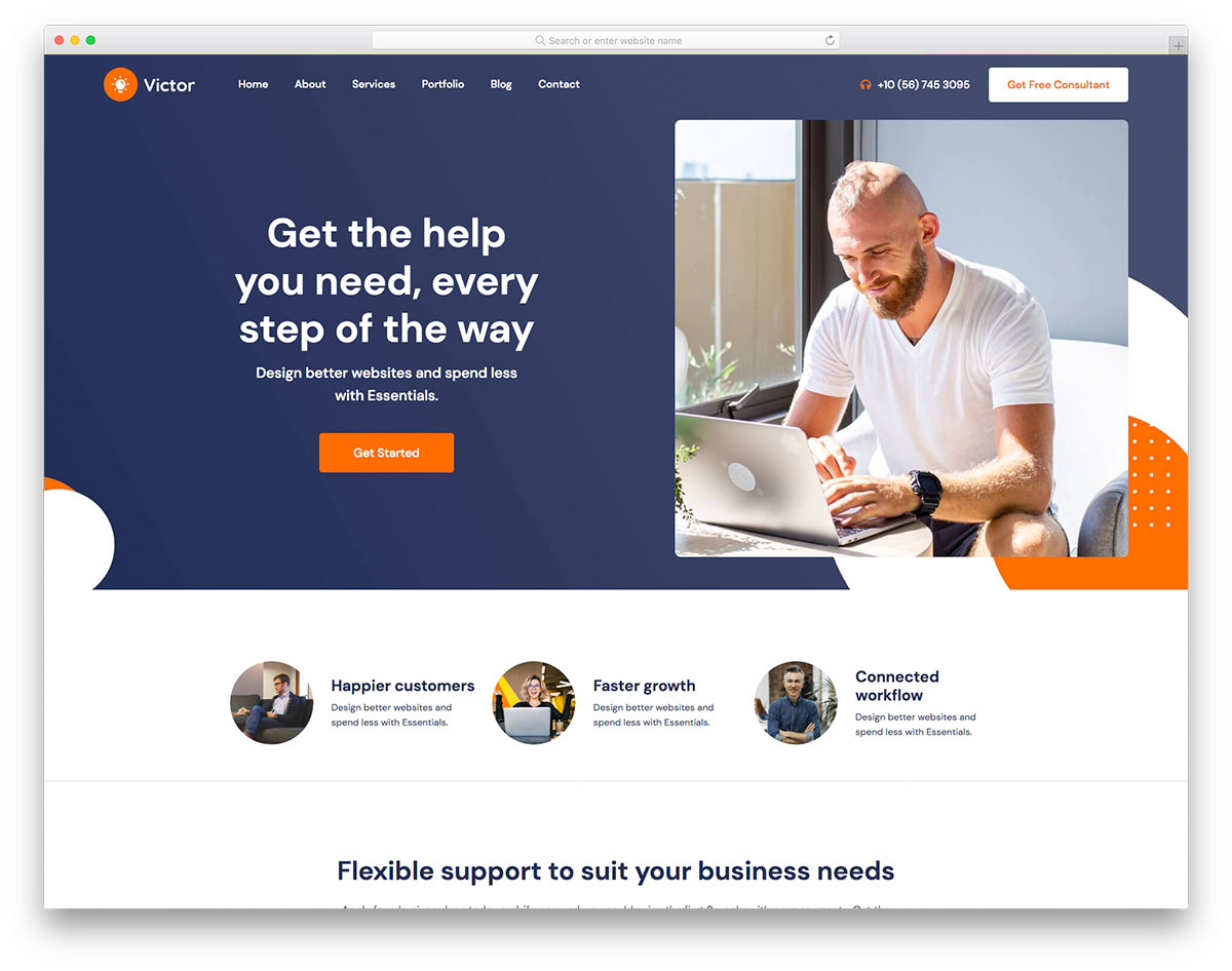
Victor is a business advisor template with a professional design that inspires confidence. Floating navigation stays accessible as visitors scroll through service descriptions, case studies, and team profiles. Accordion components let you present detailed information without overwhelming the page.
The template includes a blog section, Google Maps integration for office locations, social media links, and a working contact form. Carousels showcase client testimonials and featured projects with smooth transitions. Victor is fully responsive and works perfectly on every device.
- Floating navigation bar
- Accordion content sections
- Testimonial carousels
- Blog, maps, and contact form
15. Express
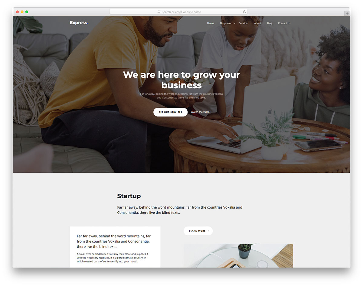
Express is a versatile consulting template with a full-screen hero banner that makes a strong first impression. The multi-level dropdown menu handles complex site navigation for firms with multiple service lines, while the clean layout keeps the focus on your expertise.
The template supports both multi-page and one-page configurations, giving you flexibility in how you structure your site. A blog section, hover effects on service cards, and a functional contact form round out a template that works for consulting firms, agencies, and professional service providers alike.
- Full-screen hero banner
- Multi-page and one-page support
- Multi-level dropdown navigation
- Blog and contact form
16. Financier
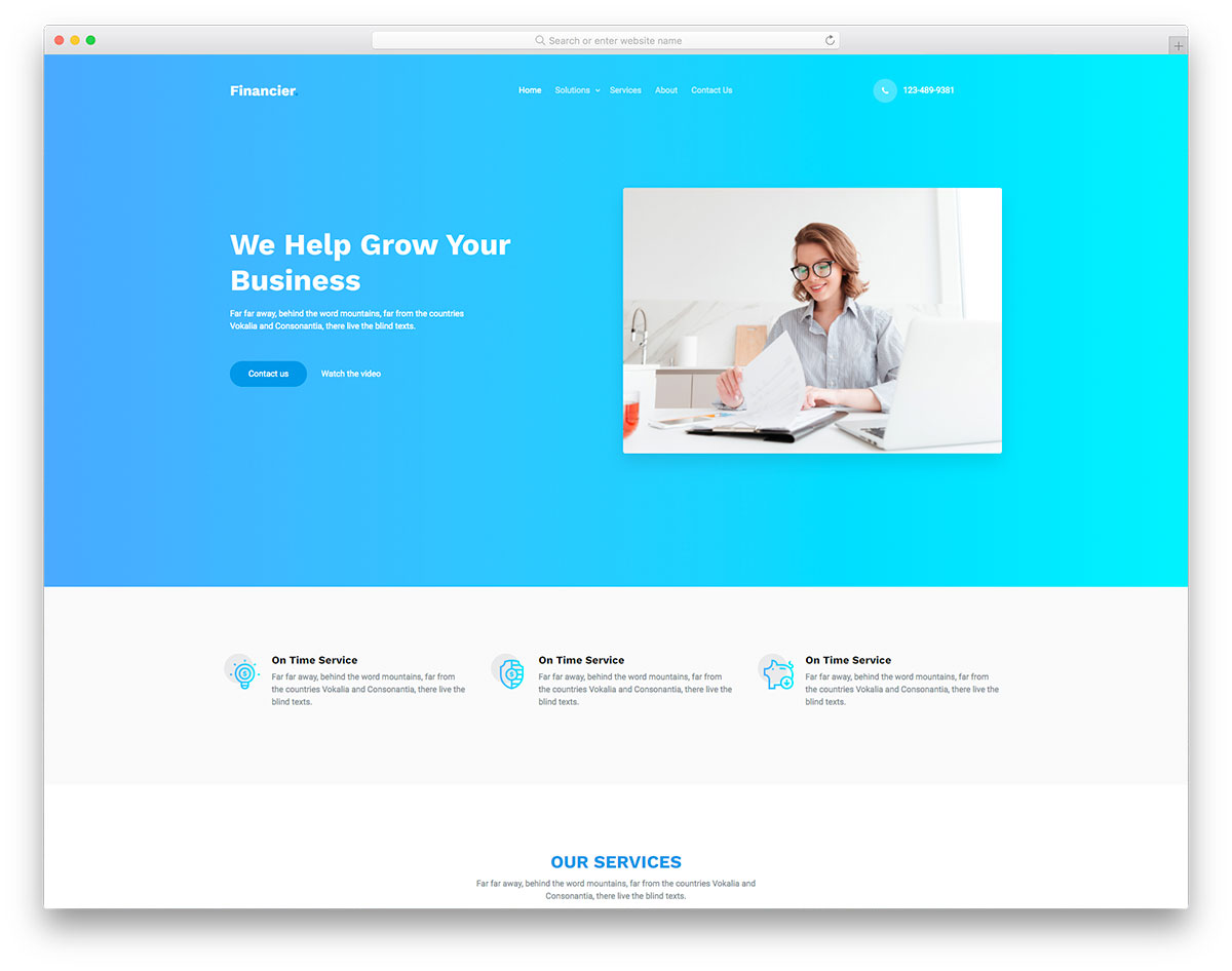
Financier is a sophisticated template built specifically for financial services firms, investment advisors, and insurance companies. The design communicates stability and professionalism through measured typography, clean layouts, and a muted color palette that feels boardroom-appropriate.
The template includes testimonial sections for client reviews, carousels for showcasing services and case studies, social media integration, multi-level navigation menus, and a contact form for lead generation. Every page is fully responsive and built on Bootstrap 5 with semantic HTML.
- Professional financial aesthetic
- Multi-level navigation menus
- Testimonial and service carousels
- Contact form for lead generation
17. Consultation
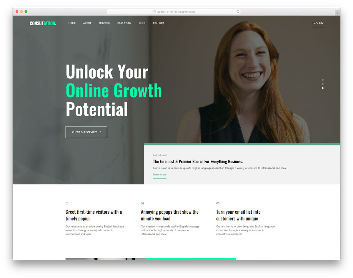
Consultation is a modern business consulting template with well-organized code that makes customization straightforward even for developers who are new to Bootstrap. The layout supports service promotion, case studies, team profiles, and company information pages.
The template includes a blog section for thought leadership content, testimonials for social proof, and a contact form for inquiries. Built on Bootstrap 5, Consultation is fully responsive and performs well across all devices and browsers with a clean, professional design.
- Well-organized modular code
- Case study and team pages
- Blog and testimonial sections
- Contact form with clean layout
18. Oraxol
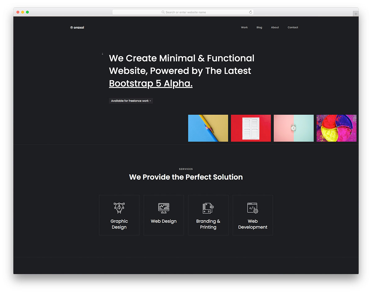
Oraxol is a dark-themed creative portfolio template that makes an instant visual impact. Designed for designers, developers, and creative agencies, the template uses a bold color scheme against dark backgrounds to create a portfolio browsing experience that feels distinctive and premium.
Features include progressive content loading on scroll, a testimonial slider, team section, blog pages, social media integration, and a working contact form. Built on Bootstrap 5, Oraxol is fully responsive and looks equally stunning on desktop monitors and mobile screens.
- Bold dark color scheme
- Progressive scroll loading
- Testimonial slider and team section
- Blog and contact form
Frequently Asked Questions
Are these templates really free to use for commercial projects?
Yes, all ten templates are free to download and use in both personal and commercial projects. They are released under open-source licenses that allow modification and redistribution. The only typical requirement is maintaining the footer credit link to the original author, though most templates allow you to remove it with a one-time license purchase if you prefer a fully white-labeled solution.
Do I need to know Bootstrap to customize these templates?
A basic understanding of HTML and CSS is enough to make simple changes like updating colors, text, and images. However, familiarity with the Bootstrap 5 grid system and utility classes will make structural modifications — like rearranging sections, adding new columns, or adjusting breakpoint behavior — significantly easier. Bootstrap’s official documentation is excellent, and the source code of these templates serves as practical learning material in itself. If your project is WordPress-based, you might also want to explore our roundup of Bootstrap WordPress themes that offer similar designs with CMS editing capabilities built in.
How do I test whether a template is truly responsive before committing to it?
The simplest method is to open the live preview link in your browser and resize the window from full width down to the narrowest point. Watch for content overflow, horizontal scrolling, overlapping elements, and navigation that becomes unusable. For more thorough testing, use your browser’s developer tools (F12) to simulate specific devices like iPhone, iPad, or popular Android phones. Pay particular attention to the navigation menu behavior, image scaling, table layouts, and any interactive elements like sliders or tabs — these are the areas where poor responsive implementations tend to break down first.
You Might Also Like