12 Best Dashboard Design Examples 2026
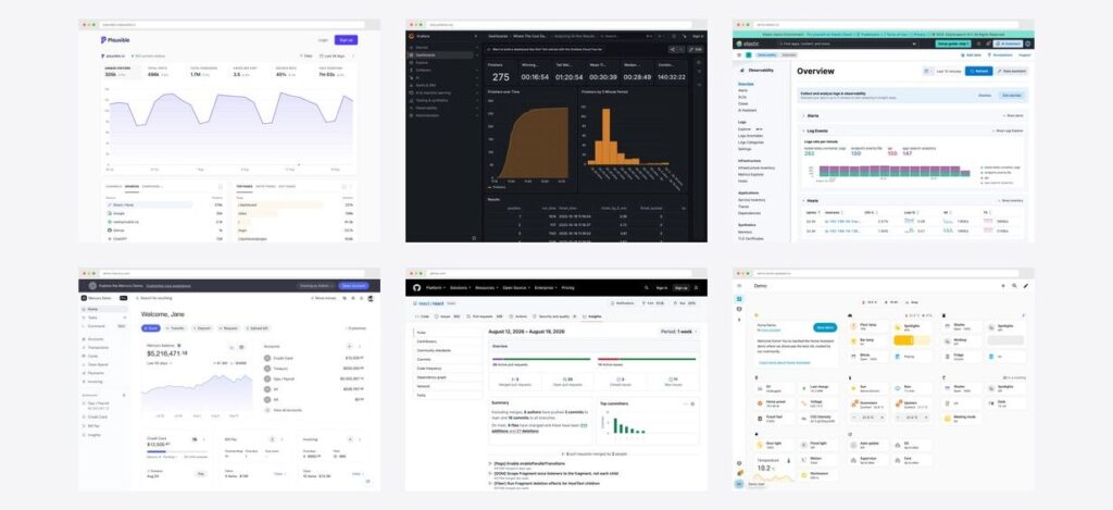
Almost every dashboard design roundup shows you pictures you cannot interrogate. Dribbble concepts that were never built, agency portfolio work from five years ago, or vendor marketing shots of a product you would need a sales call to see. You can admire the composition, but you cannot click a filter, change a date range, or find out what the empty state looks like.
Every dashboard below is a real, running product, and you can open all twelve yourself right now — no account, no sales call, no trial. Each entry says what it is, what pattern is worth stealing, and links straight to the live interface so you can poke at it rather than take our word for it.
This piece is about what good dashboards look like. For the rules underneath — layout patterns, hierarchy, colour, the light-versus-dark decision — see our admin dashboard design guide, which covers the principles these examples demonstrate.
Quick Picks
- Best minimalist analytics: Plausible — six numbers and a chart, nothing else
- Best data-dense layout: Matomo — how to fit a lot on one screen and stay readable
- Best dark-mode example: Grafana — the reference for monitoring UI
- Best financial dashboard: Mercury — the design benchmark, and its demo is public
- Best business/ERP dashboard: Odoo — KPI tiles done properly
- Best activity dashboard: GitHub Pulse — progress as the primary visual
- Most unusual layout: Home Assistant — control surface, not a report
- Best starting point to build: AdminLTE 4 — free, and the layout is the classic
The twelve at a glance
| Dashboard | Category | Style | Signature pattern |
|---|---|---|---|
| Plausible | Web analytics | Light | Radical subtraction |
| Umami | Web analytics | Light + dark | KPI row over one chart |
| Matomo | Web analytics | Light | Configurable widget grid |
| Grafana | Monitoring | Dark | Stat row, then detail |
| Kibana | Observability | Light | Progressive disclosure |
| Odoo | Business / ERP | Light | Tinted KPI tiles |
| ERPNext | Business / ERP | Light | Dashboard as launcher |
| Mercury | Banking | Light | One number, then the work |
| GitHub Pulse | Developer activity | Light + dark | Progress bars over counts |
| Home Assistant | Connected home | Light + dark | Every card is a control |
| AdminLTE 4 | Admin template | Light + dark | The classic admin shell |
| Signal | DevOps template | Light + dark | Status grid at a glance |
Web analytics dashboards
Three products solving one problem — who visited, from where, and what did they read — with three completely different answers about how much to show. Read together they are the clearest lesson in density on this page.
1. Plausible
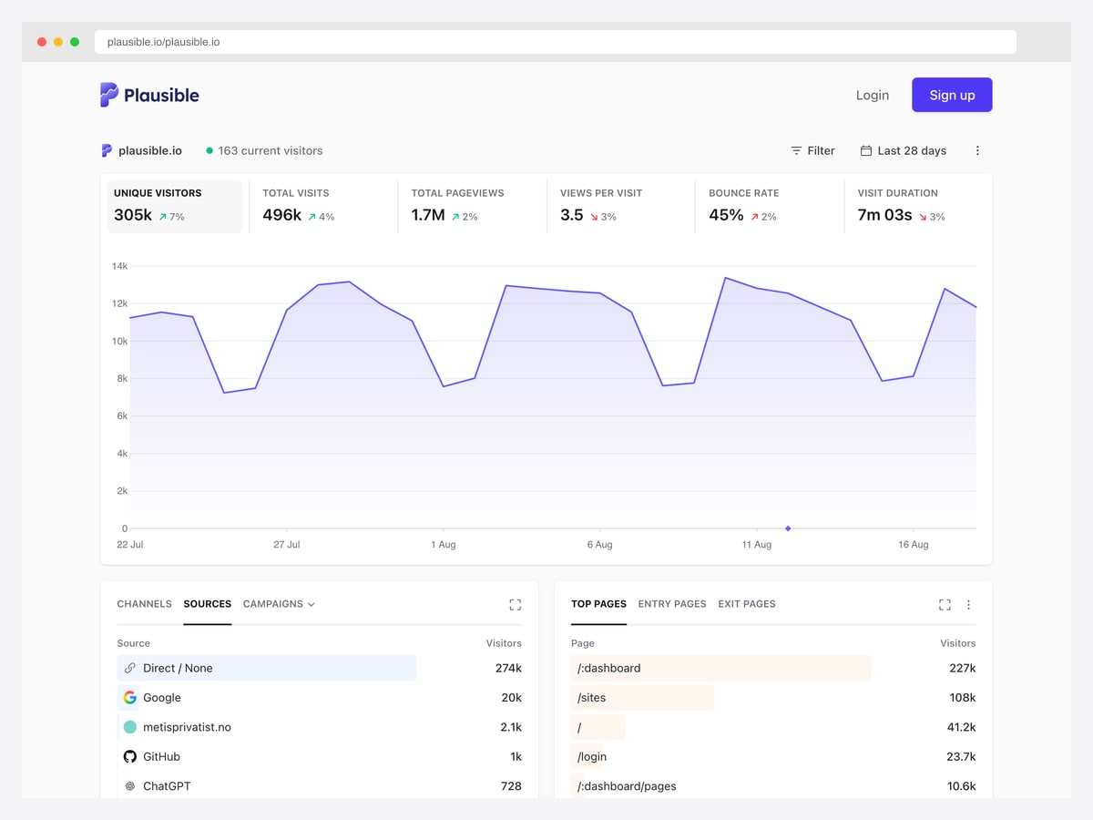
What to steal: The whole dashboard is six numbers, one chart, and four panels. Plausible’s design argument is that most analytics tools answer questions nobody asked, and the interface is the argument made visible.
The restraint is doing real work. There is one chart, not a wall of them, so it carries the trend and nothing competes with it. The six KPIs sit in a single row with their change percentages attached, which means the “how are we doing” question resolves in about two seconds. Everything else is a tabbed panel — Sources, Top Pages, Devices — so depth is available without being on screen by default.
What makes this example unusually instructive is that Plausible publishes its own production stats. The numbers are real traffic, not seeded demo data, so you are looking at how the design holds up under actual use rather than under a designer’s tidy fixture.
2. Umami
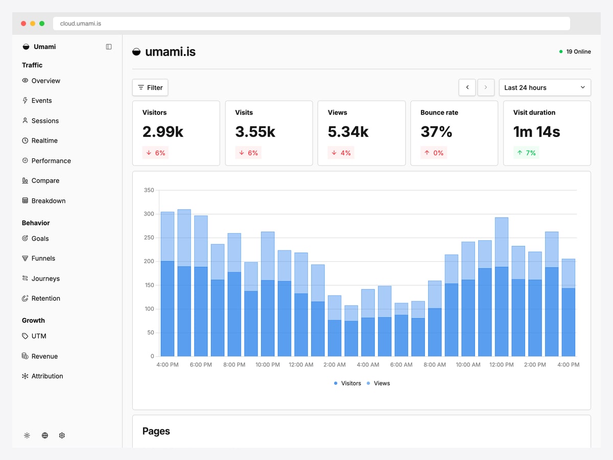
What to steal: The five-card metric row with the delta chip tucked underneath each number — the most copyable single component on this page, and it reads correctly at a glance because the chip is coloured by direction, not by sentiment.
Umami takes Plausible’s position and adds one layer: a left rail that groups capability into Traffic, Behavior and Growth. That grouping is the interesting decision. Rather than a flat list of twelve reports, it tells you what kind of question each section answers, which is navigation doing explanatory work.
The main chart is a stacked bar rather than an area, which suits hourly buckets better than a smooth line would — a small choice, but the right one, and worth noting if your data is genuinely discrete rather than continuous.
3. Matomo
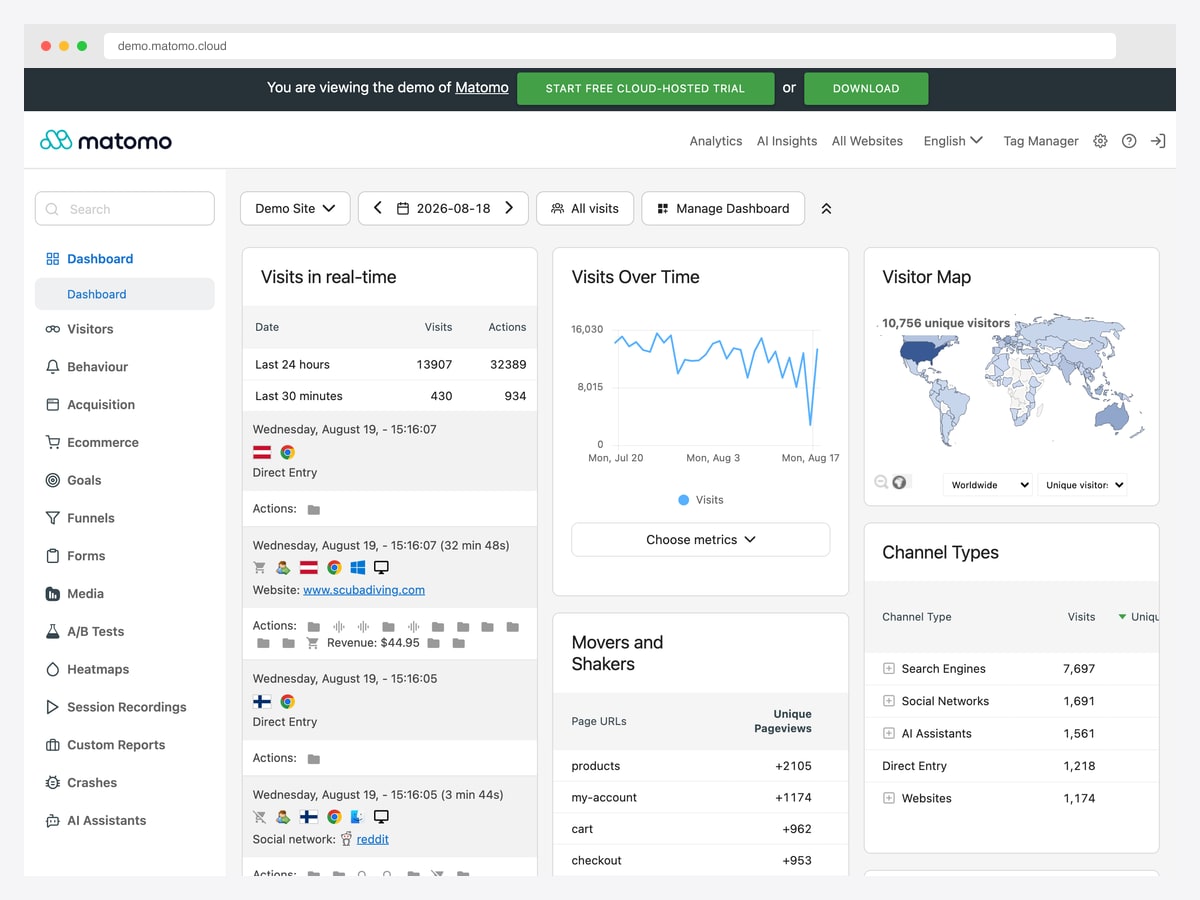
What to steal: The three-column widget grid, where each widget owns a titled card with its own controls. It is the opposite bet from Plausible, and it works because the card boundaries do the organising that whitespace does elsewhere.
Put Matomo next to Plausible and you have the density debate in two screenshots. Matomo shows a real-time visitor feed, a visits-over-time chart, a world map, a movers-and-shakers table and a channel breakdown, all above the fold. Nothing is hidden, and the price is that nothing is emphasised either — you have to know what you came for.
That is a legitimate trade for a tool used daily by someone who does know. The lesson is not that one approach beats the other; it is that density should follow expertise. Build Plausible for occasional users and Matomo for people who live in the thing.
Monitoring and observability dashboards
Where dashboards stop being reports and become instruments. Both of these are designed for someone scanning for an anomaly rather than reading for comprehension, which changes almost every decision.
4. Grafana
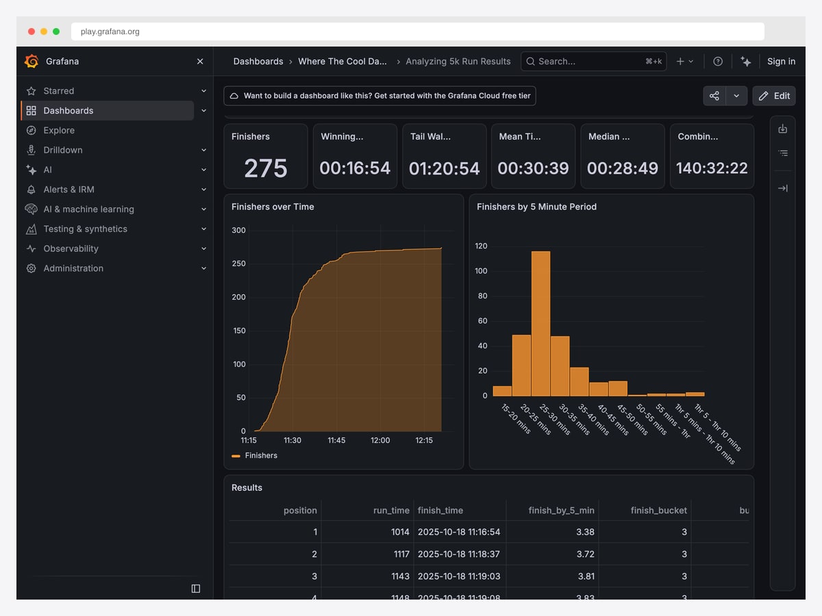
What to steal: The stat-row-then-detail rhythm — big single numbers across the top, charts beneath, raw table at the bottom. It is the most durable dashboard layout ever devised and it survives being copied badly.
Grafana is the reference for dark dashboard design, and the reason it works is discipline about colour. The background is near-black, the type is grey, and saturated colour appears only on the data itself. Nothing is coloured decoratively, so when something turns red it means something.
Worth knowing: Grafana Play hosts hundreds of anonymously readable dashboards, so you can browse dozens of layouts from one visit — many of them far denser than the one shown here. If dark mode is your specific interest, our dark mode dashboard templates roundup goes deeper.
5. Kibana
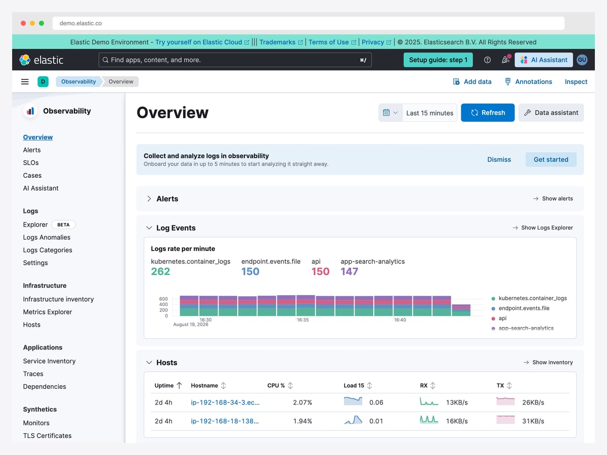
What to steal: Every section — Alerts, Log Events, Hosts — is a collapsible block with a “Show all” escape hatch. It lets one overview serve both the two-second scan and the ten-minute investigation without becoming two products.
Kibana is the light-mode counterpart to Grafana, and the comparison is instructive precisely because the information is so similar. Elastic leans on sparklines inside table rows rather than separate chart panels, which packs trend data into a list without spending vertical space on it.
It is also the most complex interface here, and honest about the cost: the left navigation runs to several dozen entries. That is what happens when one product covers logs, metrics, traces, uptime and security — and it is worth studying as a warning as much as a model.
Business and ERP dashboards
The least glamorous category and, if you build internal tools, the most relevant. These are dashboards that have to survive a hundred modules and still open on something useful.
6. Odoo
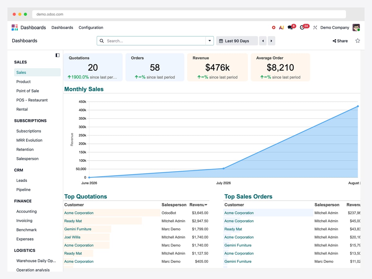
What to steal: Softly tinted KPI tiles — blue, orange, amber — where the tint separates cards without shouting. Compare them with the saturated primary-colour stat boxes on most admin templates and the restraint is obvious.
Odoo’s dashboard has a hard job: the product spans thirty-plus modules, and this screen has to be useful to someone who lives in Sales without pretending the rest does not exist. It solves it with a categorised sidebar — Sales, Subscriptions, CRM, Finance, Logistics — so the dashboard is scoped while the breadth stays one click away.
The layout underneath is the conventional one done well: four metrics, a trend chart, two ranked tables. Nothing invented, everything legible.
7. ERPNext
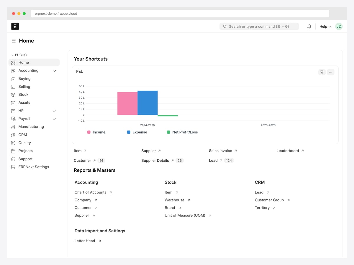
What to steal: Treating the home screen as a launcher with one chart on it, rather than forcing a dashboard where people actually arrive intending to go somewhere else.
ERPNext makes a decision most teams get wrong. Its home is mostly links — Reports & Masters, organised by domain — with a single P&L chart and a few number cards above them. It is closer to a well-designed index page than to a dashboard, and for an ERP that is probably correct: nobody opens their accounting system to admire a chart.
The number cards are worth copying for their honesty. They show a count and a label and nothing else — no sparkline, no delta, no false precision where a delta would be meaningless.
Finance, developer and connected-home dashboards
8. Mercury
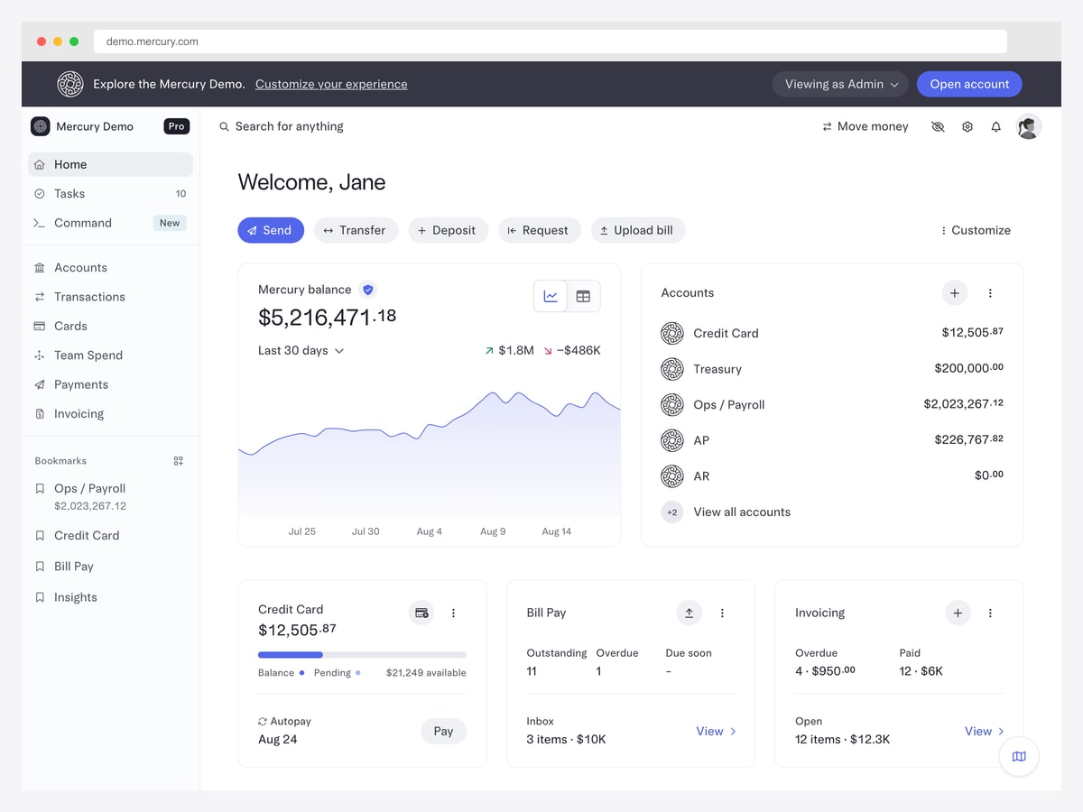
What to steal: One number is unmistakably the most important thing on screen, and everything else is work you might need to do. The balance is set large with the cents in a smaller weight — a typographic detail that keeps precision without letting it dominate.
Mercury tops most best-designed-fintech lists, and unusually for a bank it publishes a fully seeded demo, so this is the real application rather than a marketing render. Below the balance sit the things that change it: accounts, credit card utilisation, bill pay counts, outstanding invoices. Money in motion, in other words, which is the correct second priority for a business banking screen.
Colour is reserved almost entirely for state and action. For more in this vein, our fintech dashboard design examples piece analyses nine finance products including Stripe, Ramp and Wise.
9. GitHub Pulse
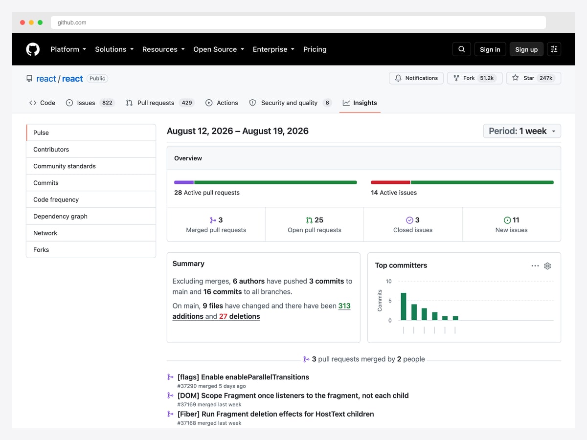
What to steal: The plain-English summary paragraph — “6 authors have pushed 3 commits to main” — sitting beside the charts. Almost no dashboard writes its own headline, and it is the fastest thing on the page to read.
Pulse is a dashboard most developers have used without thinking of it as one. It answers a single question — what happened here lately — and leads with two proportion bars for active pull requests and issues, so the shape of the work registers before any number does.
It is also a good demonstration of scoping. There is no attempt to be a complete project analytics suite; that lives elsewhere in GitHub’s Insights. Pulse does one week, one repository, one question, and stops.
10. Home Assistant
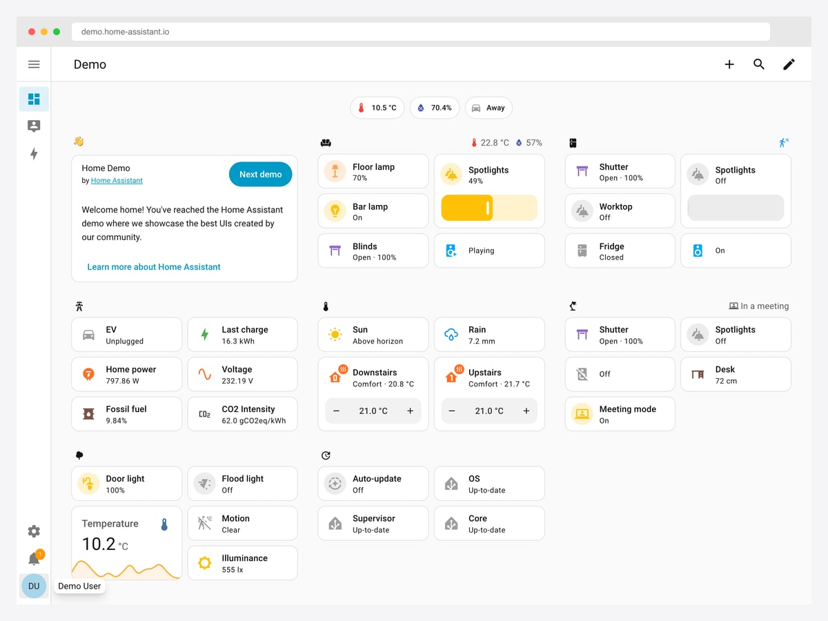
What to steal: Every card is simultaneously a readout and a control — the light card shows 70% and is the slider that changes it. Most dashboards separate the two and make you go somewhere else to act.
This is the most structurally different example here, and the most useful if you are building an operational tool rather than a reporting one. There is no hero metric and no trend chart, because the question is not “how are we doing” but “what is the state of things, and what do I want to change”.
Note how status is carried by icon plus colour plus a text value rather than colour alone, so a card reads correctly even if you cannot distinguish the amber from the grey. The demo also cycles through several community-built layouts, which is a free tour of how differently one component set can be arranged.
Two you can start building from
The ten above are shipped products — you can study them, but you cannot have their code. These last two are templates, included because the gap between “nice screenshot” and “working dashboard” is where most of these projects actually die. Both are ours, and the demos are as public as everything else on this page.
11. AdminLTE 4
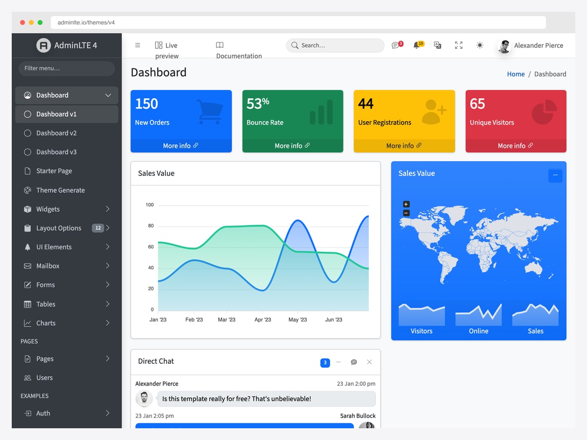
What to steal: The sidebar-plus-content shell that half the dashboards in this article are variations on. If you are building an admin panel and have no strong opinion about layout, this is the default for good reason.
AdminLTE’s small-box stat cards are the most-copied dashboard component on the web, and seeing them next to Odoo’s tinted tiles above is a useful contrast in how loud a KPI card should be. Ours is the louder answer; Odoo’s ages better on a screen you look at all day.
It is free under MIT and wires into any backend. Working in PHP specifically? Our PHP admin dashboard templates guide covers converting it into includes.
12. Signal
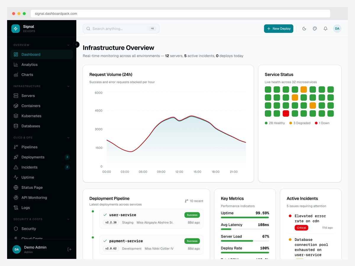
What to steal: The service status grid — thirty-two small squares, coloured by health, with a legend counting each state. It communicates fleet health in one glance in a way a table of thirty-two rows never could.
Signal is our take on the Grafana problem in application form: request volume, service health, deployment pipeline and an incident queue on one screen. Where Grafana is a tool you configure, this is an app you extend — the trade being that you own the code and give up the query builder.
Included here because the status-grid pattern is worth stealing regardless of whether you buy anything; it is straightforward to rebuild in any framework.
What the good ones have in common
Five things recur across all twelve, whatever the category:
- One thing is clearly the most important. Mercury’s balance, Grafana’s stat row, GitHub’s proportion bars. If everything on your dashboard is the same size, you have not decided what it is for.
- Colour means state, not decoration. The restrained examples here use colour on data and status only. Grafana’s near-black canvas is the extreme version — red genuinely means something because nothing else is red.
- Density follows expertise. Plausible and Matomo solve the same problem oppositely and both are right, for different users. Pick which one you are building for before you lay anything out.
- Status is never colour alone. Home Assistant pairs icon, colour and a text value on every card. Roughly one in twelve men has some colour vision deficiency, so colour-only status is a straightforward accessibility failure.
- The best ones answer one question. Pulse does a week of one repository and stops. Scope is a design decision, and usually the first one.
The reasoning behind each of these — layout patterns, the five-second rule, the light-versus-dark framework, and the mistakes that break them — is laid out in our admin dashboard design guide.
Dashboard Design FAQ
What makes a good dashboard design?
A clear hierarchy where one element is obviously the most important, colour used only for state rather than decoration, a density matched to how expert the user is, status communicated by more than colour alone, and a scope tight enough that the screen answers one question well. Every example on this page does those five things; the guide linked above explains why each works.
How many metrics should a dashboard show?
Fewer than you want to. Plausible leads with six and hides everything else behind tabs; Umami uses five. The useful test is not a number but whether a user can name the single most important figure within a couple of seconds — if they hesitate, the problem is hierarchy rather than count, and adding another card will not fix it.
Should a dashboard be light or dark?
Match the room and the session length. Monitoring tools that sit on a wall or run all day skew dark — Grafana is the reference. Analytics and business tools used in short daytime bursts skew light, which is why Plausible, Matomo, Odoo and Mercury all are. Several products here ship both and let the user decide, which is the safe answer if you can afford to build it.
Where can I find real dashboard design examples rather than concepts?
Public product demos, which is exactly what this article collects — every entry links to a running interface you can open without an account. That matters because concept shots on design galleries never had to handle an empty state, a loading state, a long label or a hundred rows, and those are the states that decide whether a real dashboard works.
What is the difference between an analytics dashboard and an admin dashboard?
An analytics dashboard is for reading — you arrive with a question and leave with an answer, as with Plausible or Matomo. An admin dashboard is for working — you arrive to change something, so it needs tables, forms and actions, as with Odoo or Home Assistant. The mistake is building a beautiful reporting screen for people who came to do a job.
What chart types work best on a dashboard?
Line and area charts for trends over time, bars for comparing discrete buckets, tables when someone needs the actual values, and a single large number when the answer is a single number. Umami’s stacked bars for hourly traffic and Grafana’s histogram both illustrate the rule that discrete data wants bars rather than a smoothed line. Avoid pie charts beyond two or three slices.
Going further: the admin dashboard design guide for the principles, SaaS dashboard design examples and fintech dashboard design examples for those verticals, or dashboard templates when you are ready to build.

You Might Also Like