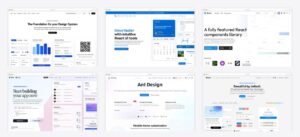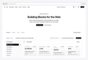
Admin Dashboard Design: Principles, Layouts & Examples (2026)
Admin dashboard design is a solved problem that most dashboards still get wrong. The patterns are known — a handful of proven layouts, a short list of principles, clear rules for light and dark — yet cluttered, untrustworthy admin panels remain the norm. This guide is the complete reference: the three dashboard families and how their rules differ, the five layout patterns with real examples, the principles behind every good dashboard UI, the light-versus-dark decision, and links into our deep dives for every vertical.
In this guide
- The three dashboard families — operational, analytical and embedded, and why the rules differ
- Layout patterns — the five admin layouts and when each wins
- Design principles — hierarchy, density, color, typography
- Light vs dark — the decision framework (and the light-mode rules nobody writes down)
- The measurable rules — contrast, cognitive load, scanning, targets
- Common mistakes — the eight failure modes to avoid
- Design by vertical — SaaS, CRM, fintech, client-facing — our deep dives
- From design to build — templates that already follow these rules
The three dashboard families, and why the rules differ
Most dashboard design advice fails because it treats “dashboard” as one thing. It is three, and they disagree about nearly everything — refresh rate, density, how much interpretation the screen owes the reader. Placing yourself here first makes every principle below concrete rather than generic.
- Operational dashboards — the admin panel, the ops console, the internal tool. Someone is working in it, changing records, resolving exceptions. Density is a feature, the data is current, and the job is to make action cheap. Everything in the layout section below is aimed here.
- Analytical dashboards — reporting and BI. Nobody edits anything; they are reading trends to make a decision. Comparison is the whole point, so every number needs a reference — versus last period, versus target, versus the other segment. A bare figure with no baseline is decoration.
- Embedded and client-facing dashboards — the view your customer sees inside your product or portal. The audience did not ask to learn your interface, so this is the one family where less density genuinely wins and where the screen has to interpret rather than just display.
The failure mode is borrowing across families without noticing. A dense analytics wall handed to a customer reads as noise. An operational console built with a client dashboard’s restraint forces its actual users into three clicks for something they do forty times a day. When a design feels wrong and you cannot say why, this is usually the reason.
What “good” means in each
An operational dashboard is good when a competent user can spot what needs them and act on it without navigating away. Judge it on time-to-first-action, not on how it photographs.
An analytical dashboard is good when a reader can tell whether a number is fine or a problem without asking anyone. That requires context on the screen — a trend, a target, a comparison — not just the current value.
An embedded dashboard is good when someone who has never seen it understands it in a few seconds. That usually means fewer metrics, plainer labels, and a stated conclusion where an internal tool would show raw data.
Dashboard design versus dashboard UI
These get used interchangeably and are not the same work. Dashboard UI is the surface — components, spacing, colour, typography, the chart library. Dashboard design is the decision layer above it: which metrics earn a place, what each one is compared against, what the reader is expected to do next, and what gets deliberately left off.
This matters because UI problems are cheap to fix and design problems are not. Restyling cards is an afternoon. Discovering that your dashboard shows twelve numbers and answers no question is a rebuild. If you are starting from a template, you are buying the UI — the design decisions are still yours, and they are the ones that determine whether anyone opens the thing twice.
If you are commissioning rather than building
Custom dashboard work goes wrong in a predictable way: the brief specifies screens instead of questions. A brief that says “a dashboard with revenue, churn and pipeline” gets you exactly that and no more. A brief that says “the weekly revenue review currently takes an hour in spreadsheets; the dashboard should answer it in five minutes” gets you something usable, because it gives the designer a way to judge their own work. Bring the questions and the decisions attached to them; let the layout follow.
The five admin dashboard layout patterns
1. Classic sidebar — the default for a reason
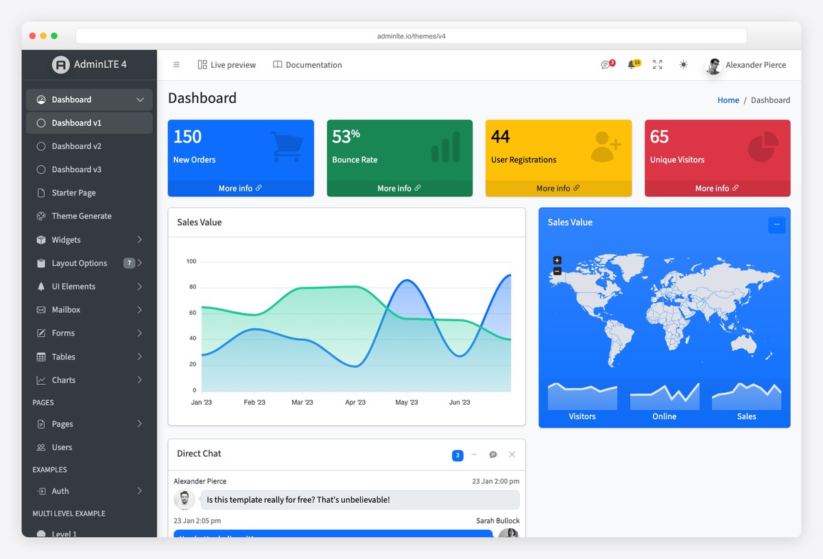
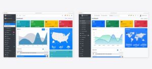
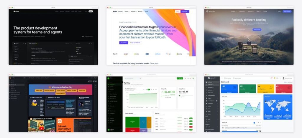
Fixed left sidebar for navigation, top bar for search/user/actions, content area in cards. It scales from five menu items to fifty (collapsible groups), keeps orientation obvious, and every admin user on earth already knows it. AdminLTE has shipped this pattern to millions of dashboards — when in doubt, this is the layout. Choose it for: internal tools, CRUD-heavy admins, anything with deep navigation.
2. Minimal top-nav — when focus beats breadth
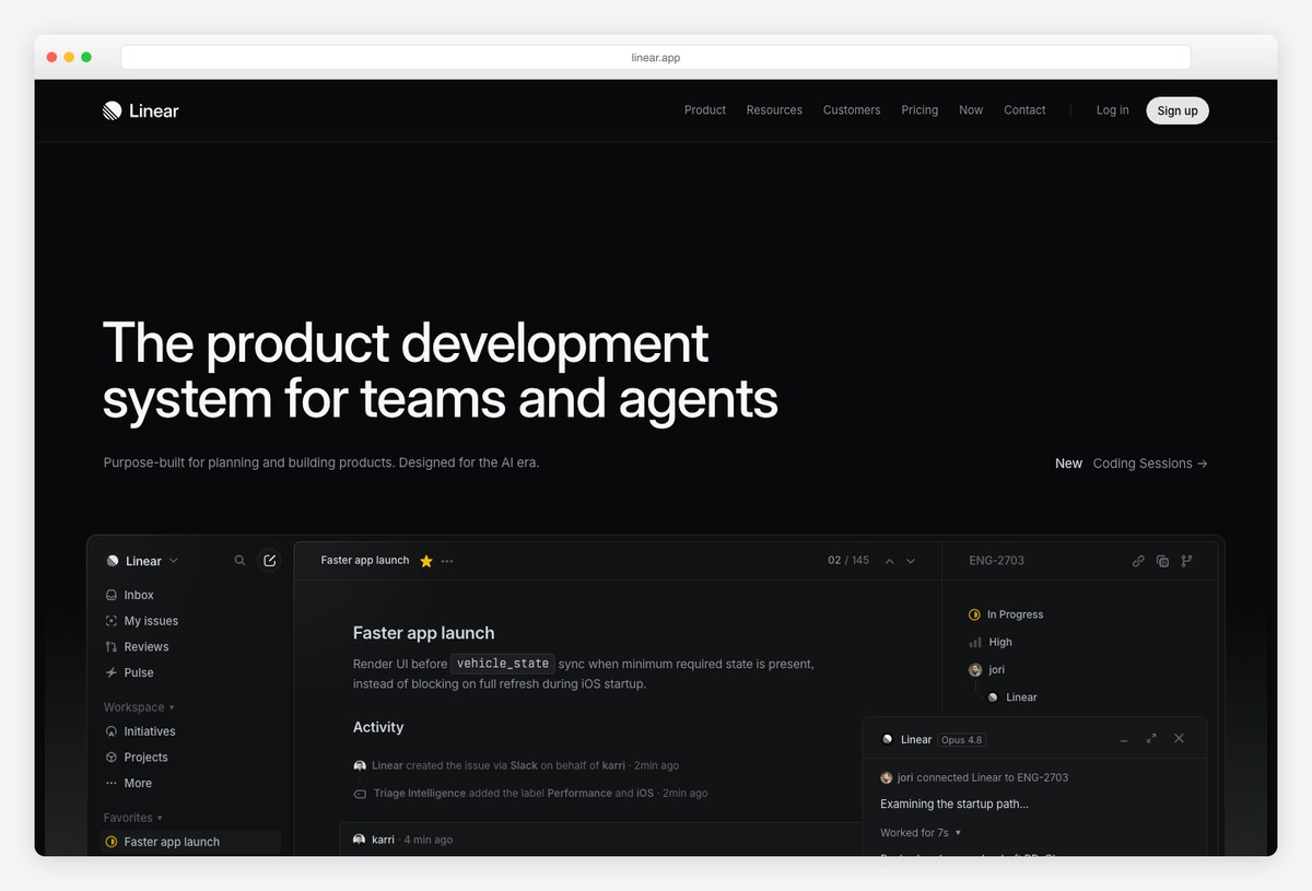
Linear’s pattern: navigation collapsed to a slim top bar (or command palette), nearly all pixels given to the work surface. Density comes from typography, not chrome. Choose it for: product tools with few top-level sections and keyboard-centric users — and steal its restraint even in sidebar layouts. More in our SaaS dashboard design examples.
3. Table-first — when the data IS the interface
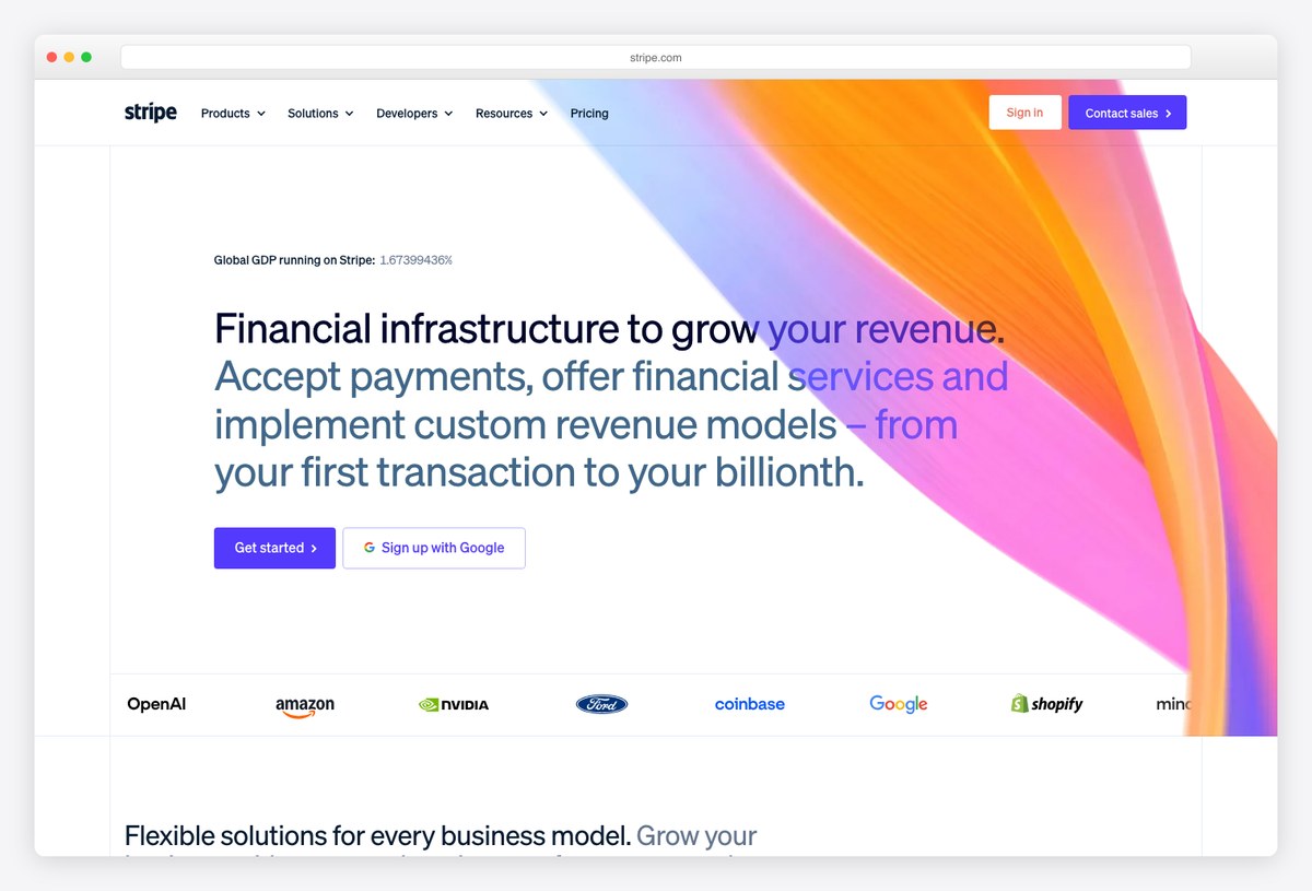
Stripe’s pattern: the primary surface is a dense, impeccably-set table; charts are summaries above it, not the main event. Right-aligned tabular numerals, muted gridlines, status as colored chips. Choose it for: transactions, orders, records — anywhere users scan rows and drill in.
4. Dense grid — monitoring and analytics walls
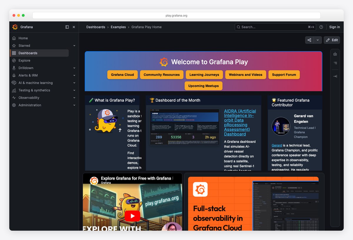
Grafana’s pattern: a configurable grid of panels, each one metric, glanceable from across the room. Works because every panel follows the same anatomy (title, value, trend) and color means state. Choose it for: ops, monitoring, TV dashboards — and resist it for business reporting, where fewer, larger numbers persuade more.
5. Dark-first workstation — for all-day screens
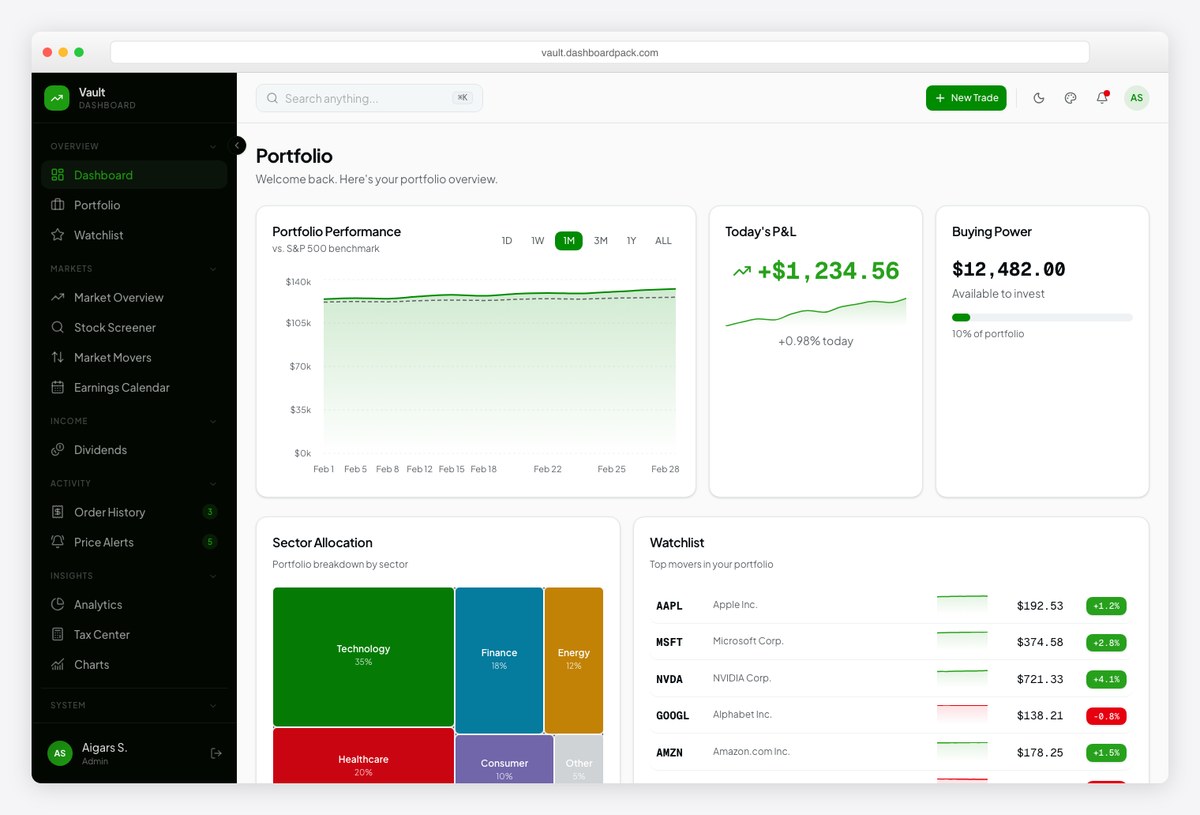
The trading-desk pattern (our Vault template above): dark surfaces, high-contrast numerals, red/green reserved strictly for loss/gain. Dark-first isn’t a skin — it changes elevation (lighter = closer), chart palettes, and contrast math. The full rules live in our dark mode dashboard guide.
Admin dashboard design principles
- One verdict per screen. Decide the single number or status a user came for; give it the top-left slot and the largest type. Everything else supports it.
- Hierarchy from type and space, not boxes. Modern admin UI (Linear, Mercury) draws few borders — weight, size, and whitespace do the grouping. If you need a border, you probably need more spacing.
- Color is a signal channel. Reserve it for state (success, warning, danger, P&L). Brand color belongs in the chrome, never in the data. Palette specifics: our admin dashboard color schemes guide.
- Numerals are your real typography decision. Tabular figures, consistent precision, units set lighter than values — the difference between amateur and credible financial UI.
- Progressive disclosure. Summary → detail on demand. A dashboard that shows everything at once answers nothing.
- Design the empty and pending states. New accounts see zeros and spinners first; both are onboarding surfaces, not afterthoughts.
- Density is a user setting, not a philosophy. Power users want compact tables; occasional users want air. The best admins (Grafana, Stripe) let rows tighten.
Light or dark? The decision framework
The rule of thumb from across our design research: session length decides. Tools used for hours daily (dev, trading, monitoring) default dark; occasional-use business admins default light. Support both via prefers-color-scheme either way. And since “best light mode dashboard design” is quietly its own search: light mode has rules too —
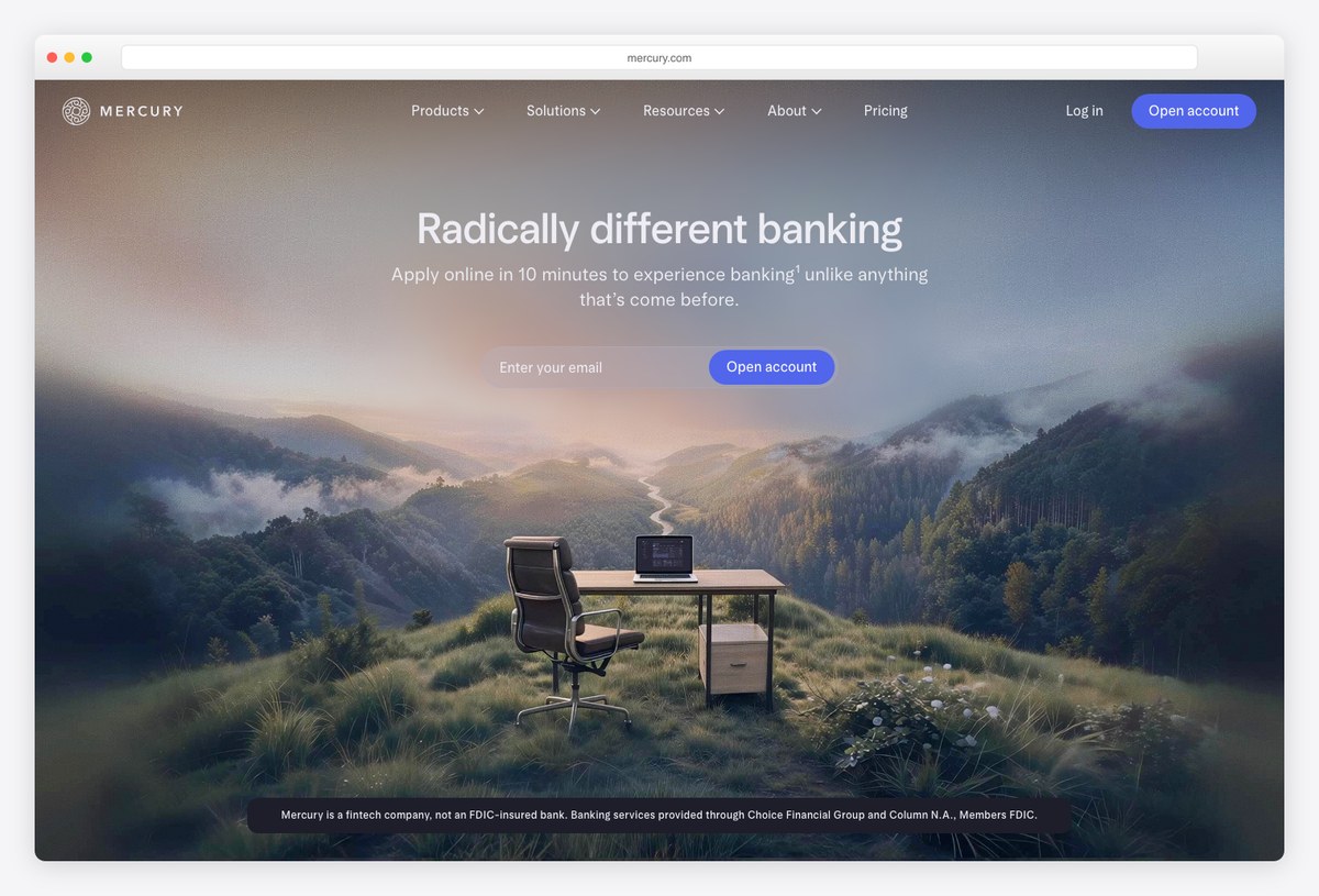
- Off-white beats pure white for large surfaces (Mercury uses warm near-whites); pure white is for content cards only.
- Shadows, not borders, for elevation in light mode — the inverse of dark mode’s lighter-surface rule.
- Desaturate status colors slightly on light backgrounds; the same green that glows on dark screams on white.
- Test both modes with real data density — a palette that works on the marketing screenshot often fails on a 40-row table.
The measurable rules most dashboards break
The principles above are judgment calls. These are not — they are the numbers behind a dashboard that reads clearly and passes an audit. Most admin panels fail at least three of them.
- Contrast is a hard number. WCAG 2.2 AA requires 4.5:1 for body text and 3:1 for large text (roughly 24px, or 18.66px bold) and for UI components and chart elements. Dark mode is held to the same ratios — dim grey on charcoal usually fails. Check it, don’t eyeball it.
- Never carry meaning in hue alone. About 1 in 12 men has a colour-vision deficiency, so a red/green that is the only difference between “up” and “down” is invisible to them (and fails WCAG 1.4.1). Pair every status colour with an icon, arrow, or label.
- Respect working memory (Miller’s 7±2). People hold about seven items in mind at once. Cap top-level navigation and above-the-fold KPI tiles near five to seven; group or collapse the rest. A screen with twenty equal widgets is a screen with none.
- Design for scanning, not reading. Dense record and table screens are scanned in an F-pattern — the metric and labels users need belong top-left. Lighter summary screens follow a Z-pattern. Lay out for the eye path, not the source order.
- Pass the five-second test. A user should read the one status they opened the dashboard for within about five seconds. If they can’t, the problem is hierarchy, not data — make the primary verdict bigger and move everything else down.
- Size targets by frequency (Fitts’s law). Frequent actions get larger, closer controls; destructive ones get distance and a confirm step. Give any interactive control at least a 44×44px hit area (WCAG 2.5.8), even when the visible icon is smaller.
- Keyboard and focus are not extras. Admins live on the keyboard. Visible focus rings, a logical tab order, and arrow-key-navigable tables are the line between a tool and a toy — and they are required for accessibility, not nice-to-haves.
Common admin dashboard design mistakes
Every principle above has a matching failure mode. These are the ones we see most often when we review admin UIs — and the quickest wins when you fix them.
- Everything at once. Twelve equal-weight widgets answer no question. Decide the single number or status the screen exists for, give it the top-left slot and the largest type, and demote the rest.
- Chart junk. 3D pies, gauges, and gradient fills where a right-aligned figure would persuade more. If a KPI fits in one number, don’t draw a chart around it.
- Colour as decoration. Brand colour bleeding into the data, rainbow categorical palettes, green sitting on red. Colour is a signal channel — spend it on state, keep the brand in the chrome.
- Boxes instead of space. Bordering every card to fake grouping. Whitespace and type weight group more cleanly; reach for a border only after spacing has failed.
- No empty, loading, or error states. New accounts see zeros and spinners first, and unhandled they read as “broken.” Treat all three as onboarding surfaces, designed on purpose.
- Sloppy numerals. Proportional figures that jitter column to column, inconsistent decimal places, units set at the same weight as values. Tabular figures plus fixed precision buy instant credibility.
- One fixed density. Power users want compact rows; occasional users want air. Ship a comfortable/compact toggle instead of guessing which user you have.
- Dark mode as an inverted skin. Flipping the CSS without re-checking contrast, elevation (in dark UI, lighter means closer), and chart palettes. Dark mode is a redesign of the contrast math, not a filter over the light theme.
Design by vertical: our deep dives
- SaaS dashboards — Linear, Stripe, Vercel, Attio, PostHog and the 2026 trends.
- CRM dashboards — Salesforce to Attio, plus the KPI tables per dashboard type.
- Fintech & banking — Mercury, Ramp, Wise, and what a banking dashboard should show.
- Client dashboards & portals — designing for the skeptical skimmer.
- Analytics & reporting — the analytical family, and what separates a report from a dashboard.
- Ecommerce & retail — orders, inventory and the metrics a store actually runs on.
- Healthcare & clinical — where density and clarity carry real consequences.
- Dark mode dashboards — the contrast math and 19 examples.
- Color schemes — the palette engineering underneath all of it.
From design to build
Every principle above is already encoded in the better template ecosystems: browse the full dashboard templates collection, free admin panels, and SaaS admin dashboards — or start from AdminLTE itself with our customization guide and the official React and Angular component libraries.
Frequently asked questions
What is the best layout for an admin dashboard?
The classic fixed-sidebar layout remains the default for admin tools with deep navigation — it’s what users already know. Use minimal top-nav for focused product tools (Linear-style), table-first for record-heavy screens (Stripe-style), and dense panel grids only for monitoring. The five patterns above map each to its use case.
What makes a good admin dashboard design?
One clear verdict per screen, hierarchy built from typography and spacing rather than boxes, color reserved for state, tabular numerals, progressive disclosure, and designed empty states. Style varies; these fundamentals don’t.
Should an admin dashboard be light or dark mode?
Session length decides: all-day tools (dev, trading, ops) default dark, occasional-use business admins default light — and both should respect prefers-color-scheme with a manual toggle. Each mode has its own elevation and color rules, covered in the light-vs-dark section above.
How do I design an admin panel from scratch?
Start from the user’s single most frequent question and design that screen’s verdict first. Pick the layout pattern that matches navigation depth, apply the principles checklist, choose light/dark by session length, then build on a template that encodes the conventions instead of hand-rolling the shell.
What are the admin dashboard design trends right now?
Quiet chrome with higher information density, dark-first for power tools, tables reclaiming primacy over chart walls, AI summaries as designed components rather than bolted-on chat, and design-system consistency across app and site. Our SaaS design examples piece tracks these with real screenshots.

You Might Also Like