
Ecommerce Dashboard Design: 7 Real Admin UIs, Analyzed (2026)

Most “ecommerce dashboard design” galleries show you Dribbble shots. The 7 examples below are real admin interfaces you can open today — the design system Shopify publishes for its admin, Medusa’s open-source admin and component library, and five dashboards built from those patterns, including two of our own. Each study says what the screen shows, which of the three ecommerce lenses it serves — sales, funnel or operations — and what is worth stealing for your own store’s admin.
Quick Picks
- The reference: Shopify admin via Polaris — the published rules behind the most-used ecommerce admin
- Open source: Medusa admin and Medusa UI — the component library rendered live in its docs
- Build lane: orders-first: Haze eCommerce — our Next.js dashboard with the order pipeline up top
- Build lane: four-metric header: Apex eCommerce — revenue, orders, AOV, conversion — with comparisons
- Free starting point: TailAdmin — a monthly-target gauge on a free MIT template
What should an ecommerce dashboard show?
Three different people search for these examples, and they want three different screens. The examples below are labelled by which lens they serve:
- Sales and revenue: revenue with period comparison, orders, average order value, conversion rate, and a breakdown by category or channel. The four-metric header on Apex is the canonical version; TailAdmin adds a target gauge.
- Marketing funnel: sessions by source, sales by location, campaign performance, cart abandonment. Platform admins usually move this into an analytics section; Shadcn UI Kit keeps it on the overview.
- Operations: the order pipeline (pending, processing, shipped), stock levels, returns and refunds, and the activity feed of what just happened. Haze leads with it, NextAdmin puts inventory beside sales, and the platform admins (Shopify, Medusa) treat orders as the home page’s real job.
If your project is the analytics product itself rather than a store’s admin, the analytics dashboard templates roundup separates the self-hosted platforms from the front-end templates. For the general rules of KPI hierarchy and chart restraint, start with admin dashboard design.
The examples at a glance
| Example | Type | Signature pattern | Study it for |
|---|---|---|---|
| Shopify admin (via Polaris) | Hosted platform · design system | The reference: a published design system for the admin | Information architecture and component vocabulary |
| Medusa admin (and Medusa UI) | Open-source platform · component library | Open source: the admin and its component library, both public | Tables, forms and drawers in a modern headless admin |
| Haze eCommerce | Next.js template · DashboardPack | an orders-first dashboard on Next.js | Order-pipeline dashboards for your own store |
| Apex eCommerce (Svelte edition) | SvelteKit template · DashboardPack | the four-metric header done properly | Revenue, orders, AOV and conversion on one row |
| Shadcn UI Kit — E-Commerce Dashboard | Next.js + shadcn/ui template | A shadcn/ui take on the store overview | Location and traffic-source breakdowns |
| TailAdmin — Ecommerce | Tailwind CSS template (free) | The free default: customers, orders and a monthly target | A target gauge instead of a bare number |
| NextAdmin — E-commerce overview | Next.js template (free tier) | Inventory beside sales | Sales versus revenue over time, plus inventory |
7 ecommerce dashboard design examples worth studying
1. Shopify admin (via Polaris)
The reference: a published design system for the admin
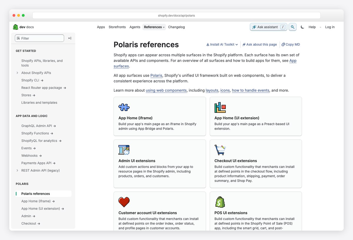
What to steal: Shopify does not screenshot its admin for you; it documents the system behind it. Polaris defines the page, card, index-table and status-badge patterns every merchant sees, and the app-design guidelines tell third parties how to fit in — study those two documents and you have the admin’s rules without a login.
The Polaris references page (above) is the map — Polaris is now Shopify’s unified UI framework built on web components — with App Home components for pages inside the admin, and separate UI-extension surfaces for the admin, checkout, customer accounts and POS. That split is itself a design decision — the merchant-facing admin gets one component vocabulary, and everything a third party adds must use it, so an installed app looks like a native page rather than a widget.
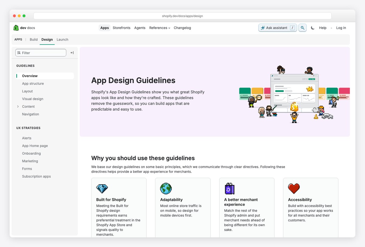
The app-design guidelines make the values explicit: adaptability across screen sizes, accessibility as a requirement, and “a better merchant experience” as the test for every screen. Read the guidelines for the layout rules — a page has a title bar with primary and secondary actions, content sits in cards, and dense lists use an index table with bulk selection, filters and saved views.
What it teaches: an ecommerce admin is a system of a few repeated page shapes (list, detail, settings, report), not a collection of custom screens. If you design the four shapes well, every entity — orders, products, customers, discounts — inherits them.
2. Medusa admin (and Medusa UI)
Open source: the admin and its component library, both public
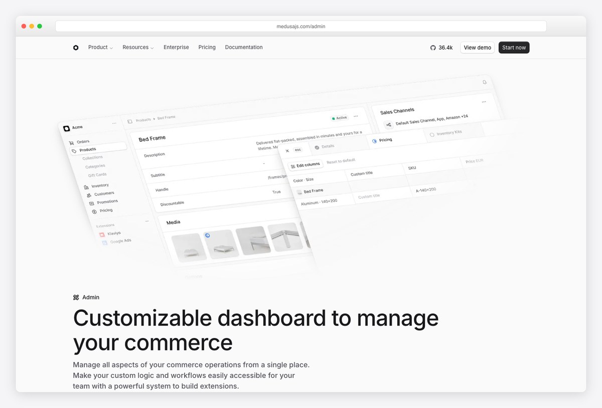
What to steal: Medusa ships its admin’s design system as a separate package, Medusa UI, with every component rendered live in the docs. The Table page (second image) shows the exact row density and header treatment the real admin uses — you can inspect the design without running the platform.
The product page presents the admin as “customizable dashboard to manage your commerce”, and the honest takeaway from the marketing shot is structural: a slim left navigation and a wide, card-based content column. The component library fills in the rest — it ships a Drawer, which is how the admin edits a record in a side panel without leaving the list behind it.
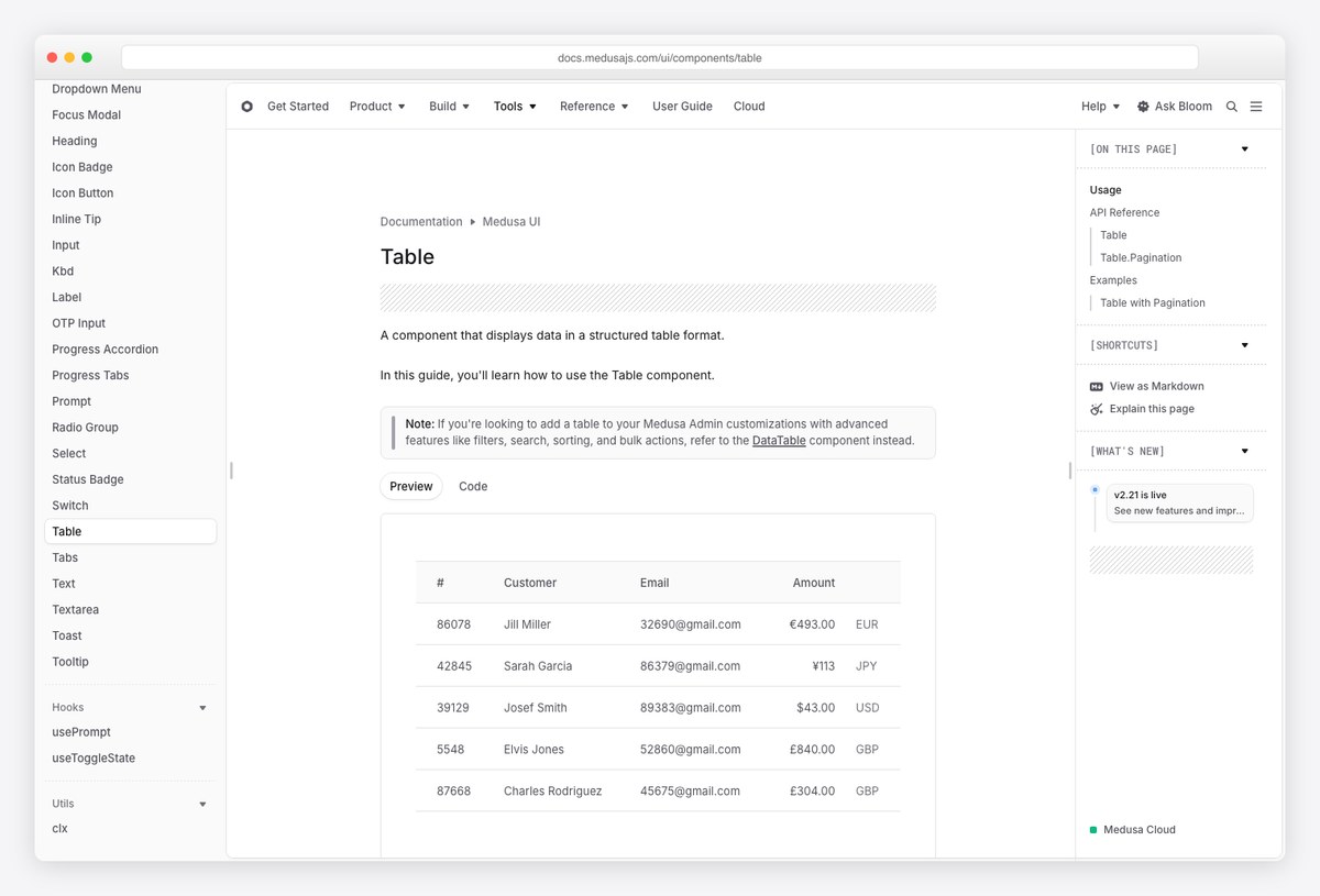
Medusa UI is the more useful artefact for a designer. The Table preview is a deliberately quiet grid — a light header row, generous row height, no zebra striping, amounts right-aligned with the currency code set apart in grey — and the docs point you to DataTable for filters, search, sorting and bulk actions, which is where the admin’s list pages live. Status badges, prompts, toasts and the focus modal follow the same restrained, monochrome-plus-one-accent language.
The build note: Medusa is also entry #4 in our ecommerce admin dashboard templates roundup if you want to run it rather than study it.
3. Haze eCommerce
Build lane: an orders-first dashboard on Next.js
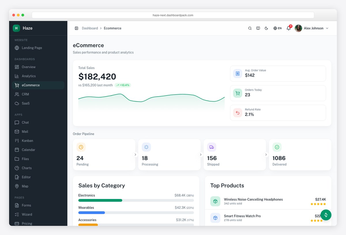
What to steal: Haze is our own eCommerce dashboard, built from the patterns this article catalogs. The screenshot is its live demo: total sales against last month with a sparkline, average order value, orders today and refund rate in the header, then the order pipeline (pending, processing, shipped, delivered) as four counters, sales by category, and top products — the operational lens first, the vanity metrics second.
The layout answers the first question a store manager has in the morning — what needs handling — before the second one — how are we doing. Each pipeline counter is a card with a chevron, an invitation to click through to that slice of the order list; the category breakdown is a bar list with share percentages rather than a pie, because bars compare and pies decorate.
Disclosure: ours. It is the Next.js edition; the dark sidebar and light content area come from the same dual-tone convention Shopify and Medusa use to separate navigation from work.
4. Apex eCommerce (Svelte edition)
Build lane: the four-metric header done properly
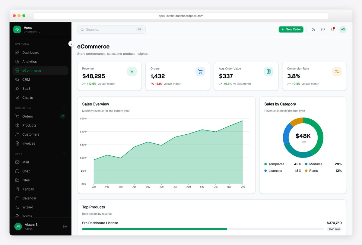
What to steal: Apex’s eCommerce variant leads with the four numbers that actually describe a store — revenue, orders, average order value, conversion rate — each with a comparison to last month, then a monthly sales area chart, a category donut with the total in the centre, and a top-products list with units sold.
AOV and conversion are derived metrics, and putting them beside the raw counts is the difference between a dashboard and a report: revenue up with orders down is a different business from revenue up with orders up, and this header shows it in one glance.
Disclosure: ours. The same dashboard ships in the React, Angular, Laravel, Django and other editions of Apex, so the pattern carries across stacks.
5. Shadcn UI Kit — E-Commerce Dashboard
A shadcn/ui take on the store overview
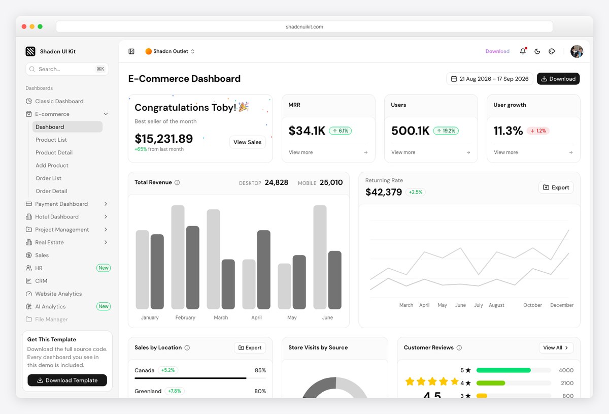
What to steal: The shadcn/ui version of the store dashboard: a best-seller-of-the-month card beside three KPI tiles (MRR, users, user growth), a total-revenue bar chart split desktop against mobile, a returning-rate line, then sales by location, store visits by source and customer reviews — the marketing-funnel lens that most admin templates leave out. A single date-range picker in the title bar governs the page.
Sales by location and visits by source are the two widgets to note. They belong to the acquisition side of the funnel (where do buyers come from), which platform admins usually push into a separate analytics section; a template that puts them on the overview is taking a stance that the store owner is also the marketer.
The customer-reviews panel is the other unusual choice: qualitative feedback next to quantitative KPIs, which is worth stealing for any store where reviews drive conversion.
6. TailAdmin — Ecommerce
The free default: customers, orders and a monthly target
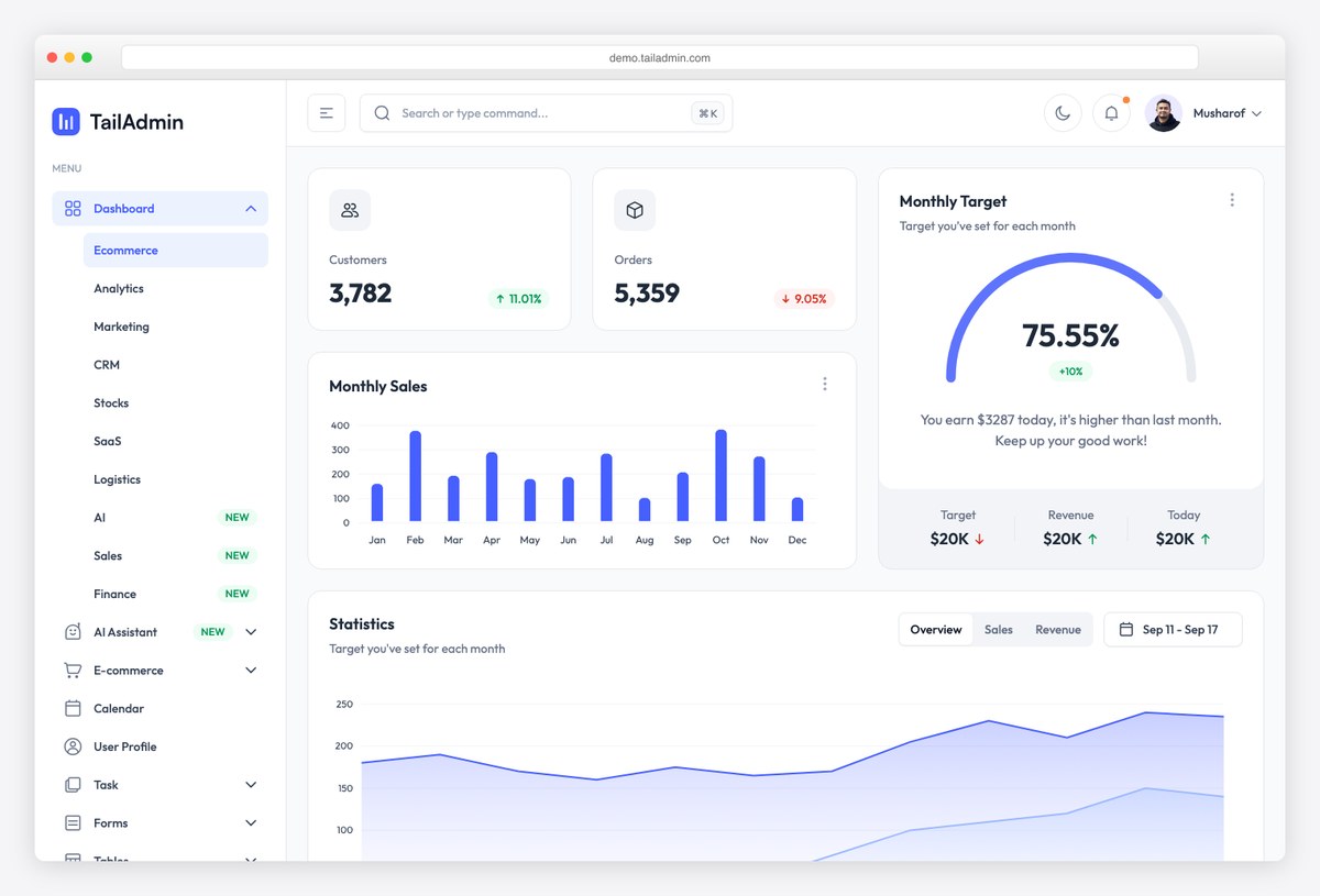
What to steal: TailAdmin’s default dashboard is an ecommerce overview: customers and orders with trend arrows, a monthly-target gauge showing progress toward a revenue goal with target, revenue and today figures beneath it, monthly sales bars, and a statistics area chart with its own date range and overview/sales/revenue tabs.
The target gauge is the pattern to copy. A revenue number alone asks “is that good?”; a percentage of this month’s target answers it, and the small print underneath (target, revenue so far, today) gives the manager the three numbers needed to act.
TailAdmin is free and widely forked, so this layout is one you will meet in many storefront back-ends built on it. Our Tailwind admin templates roundup covers the wider family.
7. NextAdmin — E-commerce overview
Inventory beside sales
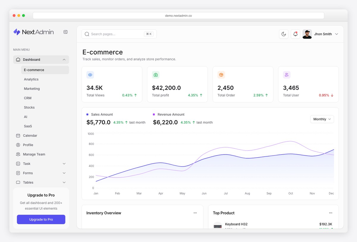
What to steal: NextAdmin’s e-commerce page pairs a sales-versus-revenue line chart with an inventory overview and a top-product panel under the four KPI tiles (views, profit, orders, users). Inventory on the overview is the operational lens: a store cannot sell what it does not have.
Plotting sales count and revenue on the same time axis is a cheap way to expose AOV changes without a separate metric — when the lines diverge, the basket size moved. The inventory panel below it closes the loop from demand to supply.
Note how little chrome the page uses: white cards, one accent colour, thin borders. The restraint is what lets six widgets share a screen without competing.
Ecommerce admin design patterns that work
- Orders are the home page’s job. Every platform admin puts new and unfulfilled orders where the eye lands first; revenue charts come second. A store manager opens the admin to act, not to admire.
- Four page shapes, reused everywhere. List (index table with filters, bulk actions and saved views), detail (with a side drawer or a two-column layout), settings and report. Polaris and Medusa UI both encode exactly these; design them once and every entity inherits them.
- Status is a vocabulary, rendered as badges. Paid, unfulfilled, shipped, refunded, out of stock — a fixed set of words with fixed colours, identical on the list and the detail page. Ambiguous status is the top cause of support tickets in any store admin.
- Derived metrics beside raw counts. Average order value and conversion rate turn revenue and orders into a diagnosis. Show the comparison period on every number, or the number cannot be judged.
- Tables are the workhorse; charts are summaries. Product images in the first column, tabular numerals right-aligned, an actions column pinned to the edge, pagination in the footer. Medusa UI’s Table component is a compact reference implementation.
- One date range controls everything. Shopify’s analytics applies the period selector to every widget at once; per-widget ranges are a design smell.
- Dark navigation, light workspace. The dual-tone shell (Haze, Apex, Medusa) separates wayfinding from work and keeps product photos on a neutral background — see our dark dashboard templates guide before going fully dark, because product imagery and colour swatches read best on light.
From example to your own ecommerce dashboard
- Pick the lens your users need first: a store owner’s daily check-in is sales + operations (Apex, Haze); a marketing team wants the funnel (Shadcn UI Kit); a fulfilment desk wants the order pipeline and stock (Haze, NextAdmin).
- Then build from a template that already encodes it: our ecommerce admin dashboard templates roundup lists the platforms you can install (Medusa, Bagisto, Saleor, Vendure, PrestaShop and more) and the front-end templates you connect to your own backend, including Haze and Apex from our line.
- Running on Shopify or WooCommerce? You are not designing the admin; you are designing what goes into it. Follow Polaris for Shopify apps, and WooCommerce’s own admin components for extensions, so your screens look native.
- Design fundamentals: the KPI-hierarchy and restraint rules in SaaS dashboard design examples apply directly; client dashboard design covers the customer-facing side of a store’s data.
Frequently asked questions
What should an ecommerce dashboard include?
It depends on who opens it. A store owner’s overview needs revenue with a comparison period, orders, average order value, conversion rate and a category or channel breakdown. An operations view needs the order pipeline by status, stock levels and returns. A marketing view needs sessions by source, sales by location and campaign results. The best admins put orders first and keep the three lenses on separate screens.
What is the best ecommerce dashboard design?
By the standards above, Shopify’s admin remains the reference, and its design system is public as Polaris, so you can study the rules without an account. Medusa’s admin is the closest open-source equivalent, with its component library documented live. For templates that encode the same patterns, Apex and Haze from our line and TailAdmin among free options are the ones this article studies.
How do I design a dashboard for a Shopify store?
If it lives inside the Shopify admin, follow Polaris: pages with a title bar and primary action, content in cards, dense data in index tables with filters and bulk actions, and the standard status badges. If it lives outside Shopify and pulls data through the API, any of the templates in this article work; keep the same status vocabulary so the two screens agree.
What KPIs belong on an ecommerce dashboard?
Revenue, number of orders, average order value and conversion rate are the core four, each with a comparison to the previous period. Add the order pipeline counts for operations, and sessions by source plus cart abandonment for marketing. Resist adding more until a user asks for a number by name.
Are there ecommerce dashboard templates I can build from?
Yes. Our ecommerce admin dashboard templates roundup covers open-source platforms with a full admin (Medusa, Bagisto, Saleor, Vendure, PrestaShop and others) and front-end templates you connect to your own API, including Haze and Apex from DashboardPack and free options such as TailAdmin and NextAdmin.
Should an ecommerce admin be dark or light?
Light workspace, optionally dark navigation. Product photos, colour swatches and thumbnails are judged on a white background in every marketplace, so a dark content area misrepresents them. The dual-tone shell used by Shopify, Medusa, Haze and Apex keeps the navigation dark for contrast and the work area light.
Completing the design cluster? See SaaS dashboard design examples, fintech dashboard design, client dashboard design and the hub, admin dashboard design. For the templates behind these examples, start with ecommerce admin dashboard templates.

You Might Also Like


